


The design on this pot is especially well done, and it fits the pot perfectly. This is as fine a signed Annie pot as I have seen.
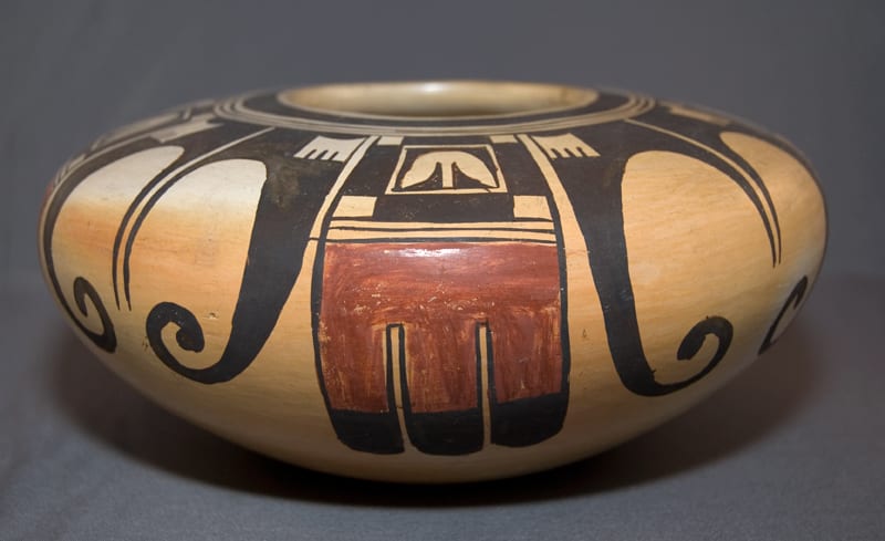
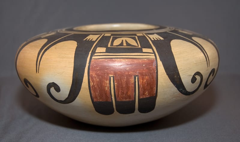
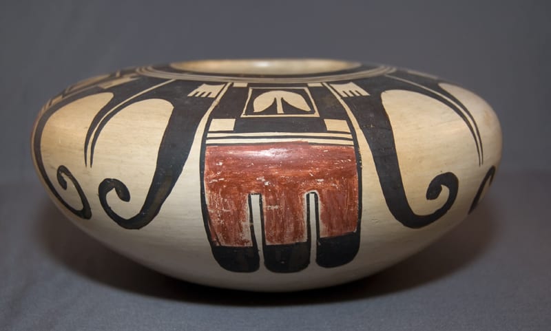
When viewed from above, the monochromatic black design is particularly delicate, intricate, and perfectly balanced—a bit like a snowflake.
In contrast, when seen from the side, the design has more tension and shares many of the design characteristics Annie’s mother used. As on pot 2005-16 by Nampeyo, the black eagle feather elements on 2009-04 curl around and thrust upward. The linear lines centered between the wings thrust downward and give this section of the design internal tension and energy. (Note that Nampeyo’s similar design on 2005-16 is more lightly drawn using thinner and shorter lines and is thus more subtle than Annie’s is.)
The use of negative (unpainted) space plays a central role in the side design on 2009-04. If seen in the negative, the empty space enclosed by the black wings reinforces the upward energy of the wings. The “mushroom-like” elements above the linear red tail feathers have a self-contradictory thrust: If seen as a black design composed of two triangles, there is upward energy that contradicts the downward thrust of the red tail feathers below. If seen in the negative, this same “mushroom” design attracts the eye downward and thus adds to the downward pull of the red tail design. The eye is given a similar choice on how to see the traditional square elements set into the shoulder of the black wings, with the same result of internal tension. Furthermore, if the eye focuses on just the negative (unpainted) spaces, it is pulled in contradictory directions: one (within the wings) pulls the eye up while both the small square design in the shoulder of the black wings and the small “mushroom” design (over the red tails) pull downward.
Thus, as with great Nampeyo pots, the side view of 2009-04 has both linear and curvilinear elements, painted and negative space. Together, these give the pot great energy and tension.
As noted in the discussion of 2005-16 in Appendix C, Nampeyo tends to use areas of red to pull together and unify her designs (see 1993-04, 2002-03, 2006-02, and 2006-08). On pot 2009-04, Annie has failed to do this: the design can be seen as monochromatic with the red tail feathers just “stuck on” and not fully integrated into the overall design.
There are two other signed Annie pots in the collection (see 1999-13 and 2000-06). The catalog entries for those pots discuss Annie signatures.
The signature on 2009-04 is unlike the other two signatures (which also differ from each other). This variance lends credence to the belief that Annie could not write, so she had a variety of relatives (particularly Fannie, Beatrice, and Rachel Namingha) sign her pots for her. The signature on 2009-04 is off-center and the lettering appears hesitant and more child-like than the signatures on 1999-13 or 2000-06. While the design of the pot is careful and studied, the signature seems to have been applied quickly and without much care.
