
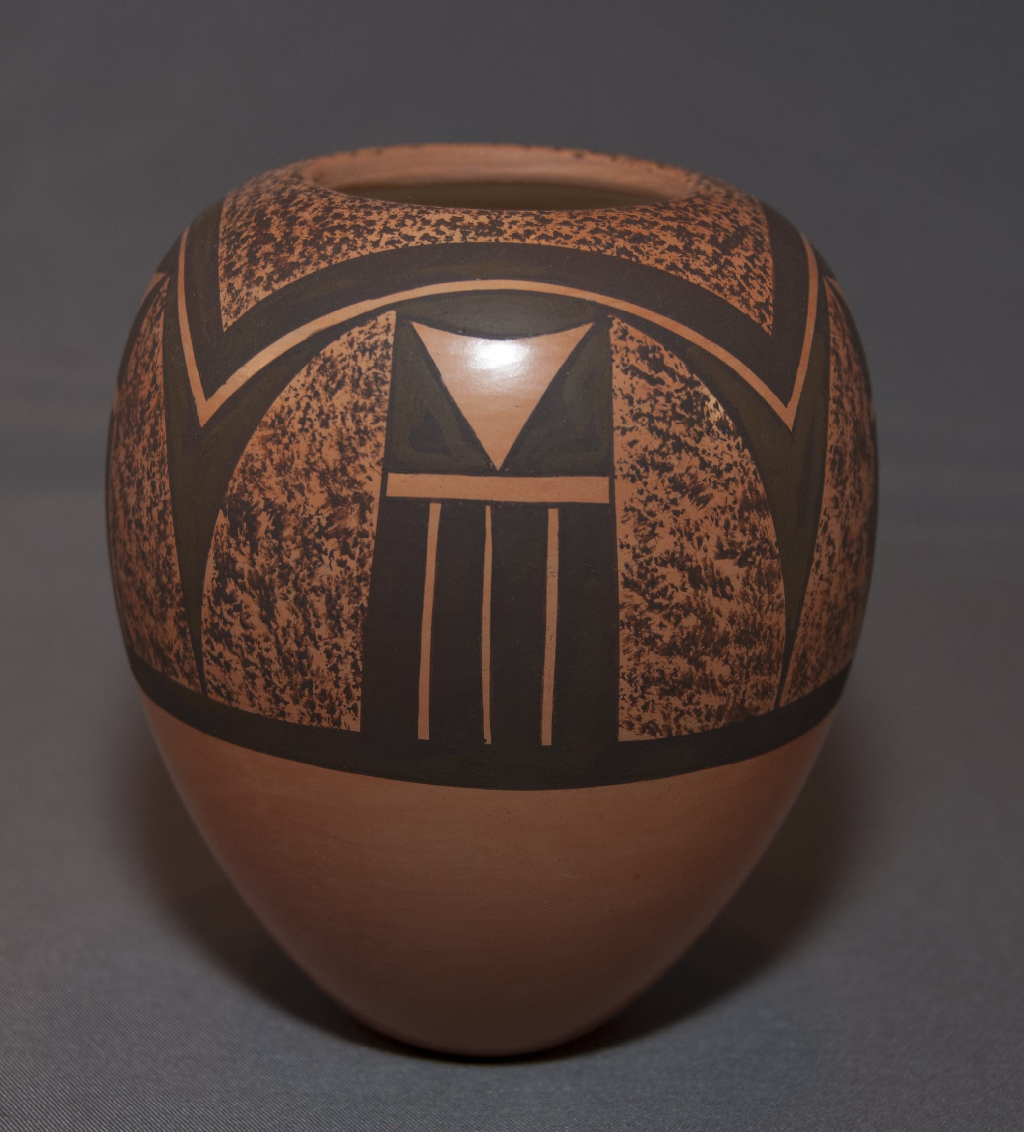

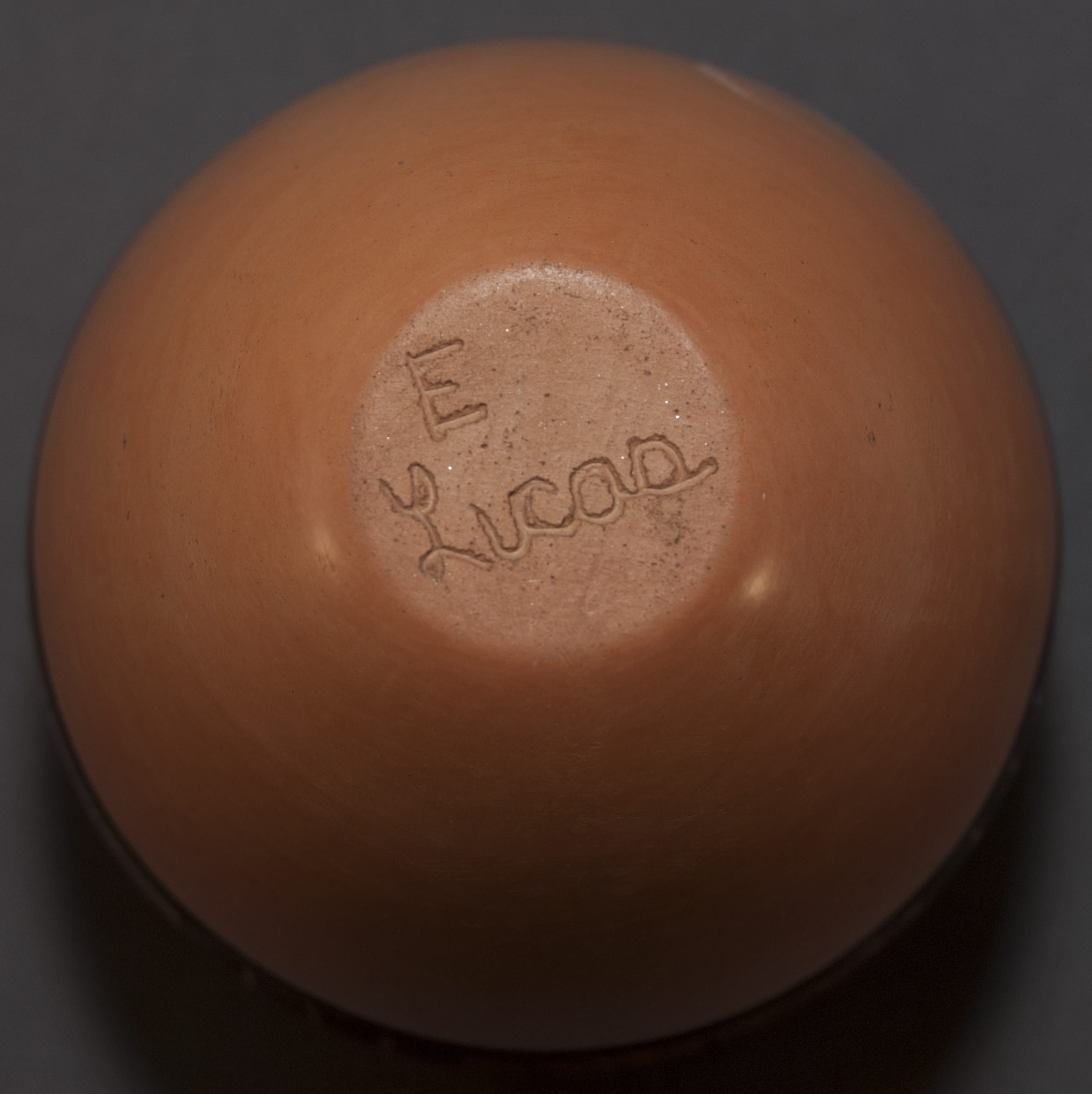
This strikes me as a somewhat formal pot, in part because the design is monochromatic black. The solid paint is particularly inky and dark and contrasts with the stippled areas, which gives some variation in texture. The four linear tails on each side of the pot contrast with all the other design elements, which are curvilinear. It is carefully done and well balanced.
There’s nothing wrong with the design; it’s just not energized or exciting. Almost half of the lower surface of the pot is unpainted, the upper and lower half of the pot being separated by a black band. The design seems as if it is draped over the top of the jar and then just stops, which leaves the top of the pot visually unconnected to the bottom. The jar itself is a beautiful shape. A friend commented that this pot reminded him of a Faberge egg (by shape and formality).
I seem more attracted to less-formal, more energized designs that incorporate more of the available surface area. For a jar with this latter sensibility by the same potter, see 2011-25.
