


If you think of this bowl as consisting of form, design and signature, it is unusual in two of these three criteria. The painting is typical of Hopi/Tewa pottery; the form and signature are very different than typical and therein lies a tale, imperfectly known.
Form:
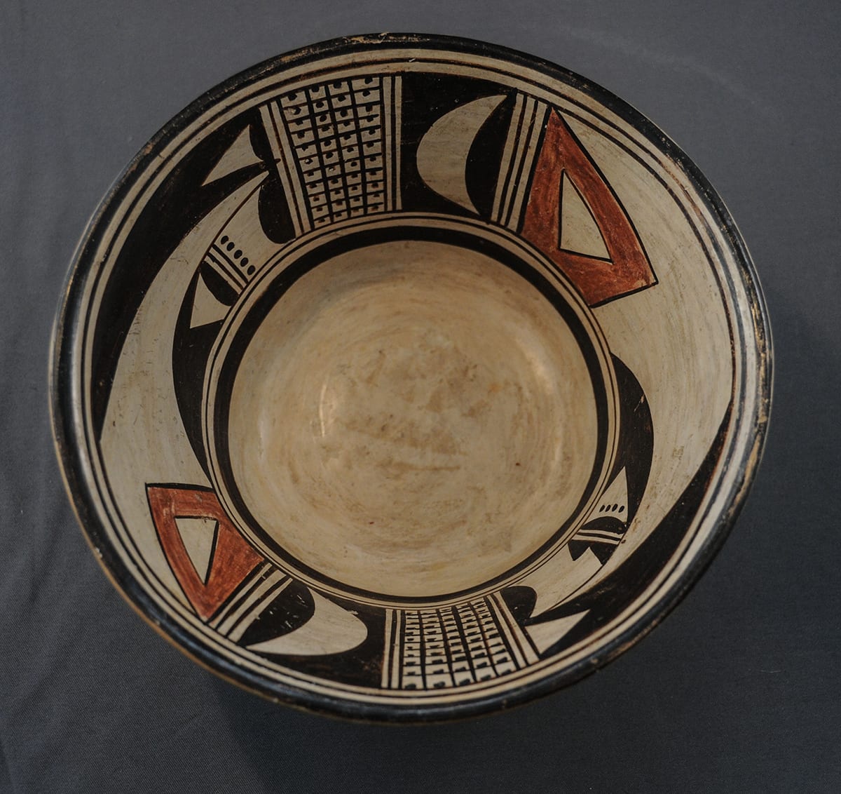
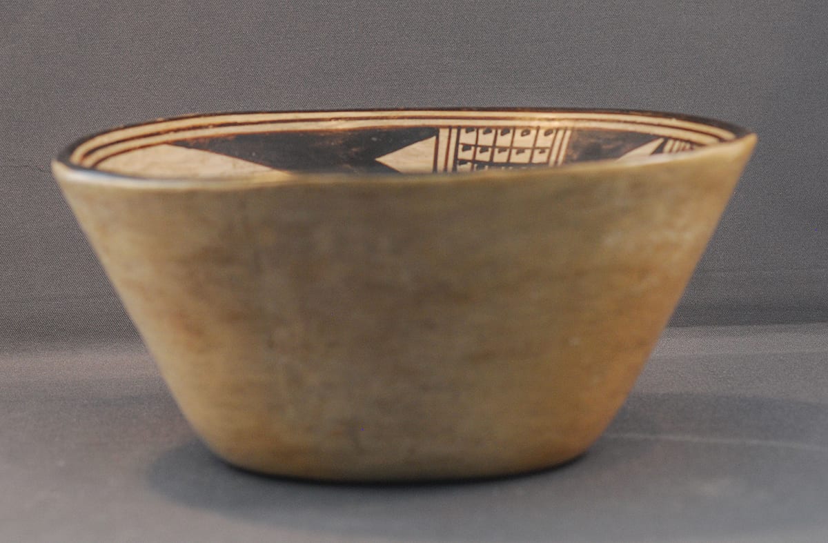
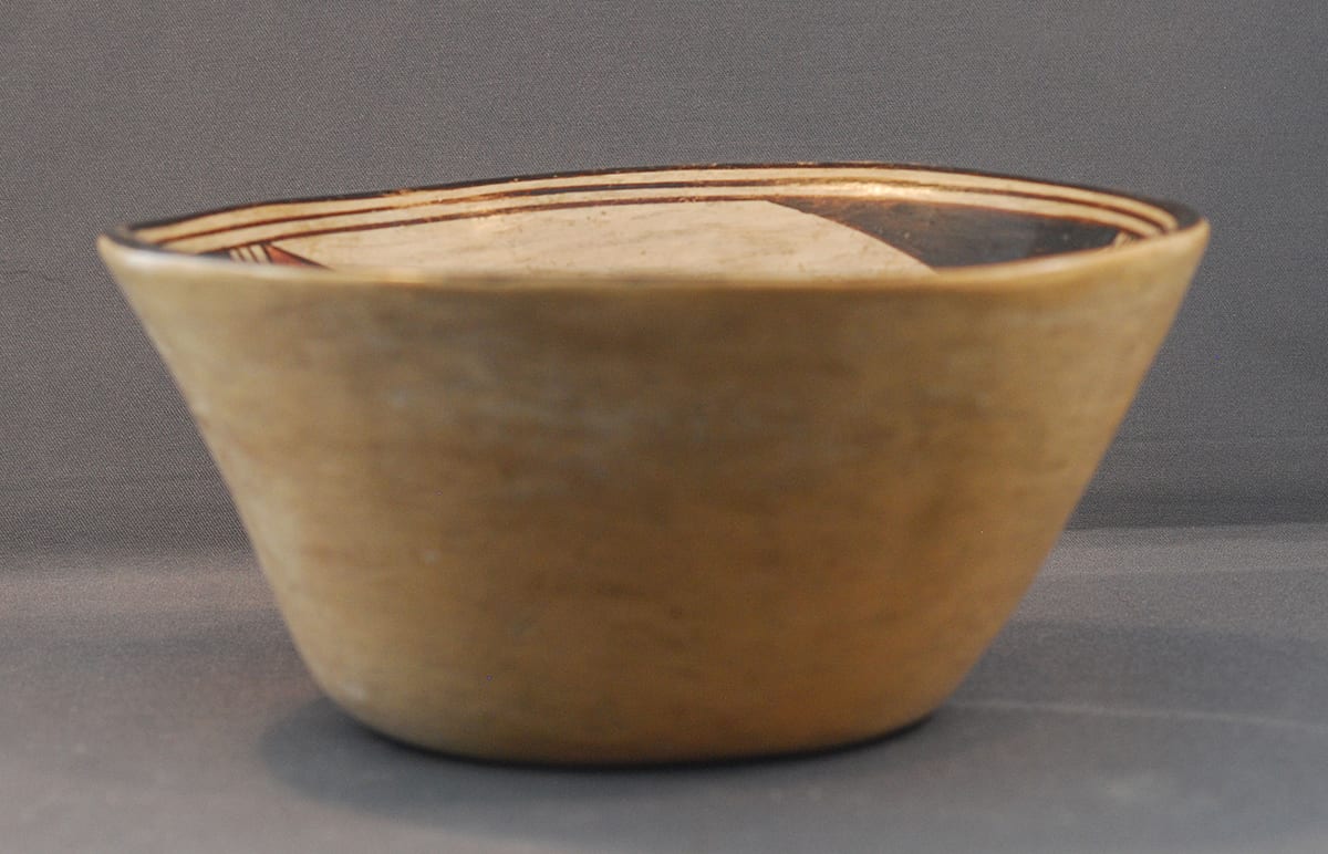
The exterior of the bowl is undecorated. The form well displays the interior design.
This is the only conical Hopi/Tewa pot I have seen. The bowl is well-formed with walls of an even thickness. Its shape is more “mid-century” Anglo than Native; similarly shaped bowls were produced in the mid to late 20th century by Bennington potters in Vermont, a world away from Hopi. For several years after I had purchased bowl 2012-25, all I could do was note the unusual shape. Then, in August 2015, Steve Demant of Fine Arts of the Southwest, Santa Fe, offered a similarly-signed pot for sale. The Demant pot is even more dramatically Anglo in its shape. Demant calls his pot a “pitcher.” It looks to me like the sort of ewer you might find for pouring olive oil in an Italian restaurant. It has a single handle, is flat-bottomed, with a flattened round convex body topped by a tall neck with a lip. (Photograph on file.)
Bowl 2012-25 and the Demant ewer are linked by the odd signature, to be discussed below. That both pots have shapes that are alien to the Hopi suggests to me that they both were special-order items and that the buyer, not the potter defined the shape. For example, bowl 2012-25 lacks the extra rim coil that is characteristic of Nampeyo’s pottery. Its pure speculation, but perhaps the ewer and bowl were designed as a pitcher/bowl set.
Design:
The skill of the painter is particularly seen in the black lip, an encircling thin framing line, and a second framing line that forms the top edge of the design. The distance between these three elements is unusually constant and forms a sort of two-lane road that runs cleanly around the inner edge. A similar two-lane design encircles the bottom of the design except that here the bottom line is considerably thicker and frames the undecorated interior bottom. This same two-lane design is drawn vertically, thus separating the interior motifs and connecting the top and bottom horizontal renditions of this design.
A panel of three design motifs is repeated twice inside the bowl, each element is placed opposite its mate, a typical Hopi/Tewa pattern (Bunzel, 1929).
The first motif is a grid of squares, each square containing a dot. This design is generally believed to represent kernels of corn, a central concern of Hopi culture. Both renditions of this pattern have eleven rows, with one set having four columns (44 kernels) and the other five rows (55 kernels).
The next design element is an unpainted crescent embedded in a black background.
The final design panel is the most complex of the three and occupies two-thirds of the decorated surface. The central portion of this design is unpainted. On the left border of this space is an unpainted isosceles triangle floating in an irregular red polygon. This is the only red element in the design and the shapes of the two renditions of this red form differ significantly from each other.
Occupying the top right section of this panel is a thin black arrow form with its base against the right vertical edge of the panel and its point to the left. Embedded in its base is another unpainted isosceles triangle pointing in the same direction. Note that one version of this small triangle has a flat base while the other is slightly convex.
Occupying the bottom right section of this panel is a beak-like form with a curved top edge and a flat bottom edge that is concurrent with the bottom framing line. Internally the two renditions are substantially different. Both have a half-circle black base surmounted by an unpainted area. The unpainted area in one (side #1) contains a row of 5 black dots followed by the familiar lines forming a “highway” design. The opposite rendition (side #2) lacks such dots in this position but instead displays two black consecutive scalene right triangles that form saw teeth followed, again, by the highway design. Both variations then have another black half circle with side #1 containing another imperfectly-formed unpainted and empty triangle, followed by a solid black beak. Side #2 has a similar pattern except that the unpainted triangle contains four black dots. In short, the two renditions of the beak contain similar motifs somewhat differently arranged (the series of dots) but with some elements unique to only one depiction (the scalene right triangles forming a saw teeth).
The central unpainted portion of this third design panel is thus infringed upon by all three elements in this panel. The residual unpainted shape forms two or three points (side #1 and side #2, respectively) that run in contrary directions, thus creating visual tension.
As detailed in the discussion in Appendix B, there are six defining characteristics of Nampeyo’s mature painting style and which differentiate her work from other Hopi and Hopi/Tewa potters. All six of these strategies are seen on bowl 2012-25:
- A tension between linear and curvilinear elements often represented as a contrast between heavy and delicatee:lementsHere the curved form of the unpainted half moons, the black half-circle elements and the two beaks contrast with the linear sides of the many triangular shapes incorporated in the design and the rectangular corn motifs. The negative points of the unpainted section and the red elements pull the viewer’s eye to the right. The black beak and the many left-pointing triangles pull the eye to the left.
- A deliberate asymmetry of design:Although at first glance the design seems symmetrical with each panel repeated twice, the many differences between the two black beak designs in the large design panel subtly throw the design out of symmetry. The two “corn” panels have different numbers of columns. Similarly the two red elements are of slightly different shape and this difference also required the central unpainted central areas in the large panel to be asymmetric.
- The use of color to integrate design elements:The two similar red elements draw together the opposite sides of the design. This use of color to integrate the design is not as prominent as on many of Nampeyo’s wide, shallow bowls which offer a larger canvass.
- The use of empty (negative) space to frame the painted image:The central unpainted area in design panel three highlights the design patterns in this panel, though (again) the effect is not as dramatic as on Nampeyo’s shallow bowls. Particularly when looked at from an angle, the unpainted exterior of the bowl and the unpainted interior bottom also frame the interior painted band of design.
- The use of a thick above a thin framing line on the interior rim of her bowls:The rim has framing lines, however those these are all thin in the Polacca ware tradition. The bottom interior framing lines are thin over thick, the reverse of the order expected on the rim of a Nampeyo bowl. This reversal of the expected order is unusual for a Nampeyo bowl but does reflect the order Nampeyo used on the bottom of her small canteens.
- Confident, bold, and impulsive painting:The painting is particularly well-done with a confident hand. The “two lane” element found in the framing lines and vertically between the design pannels is very even and consistent. So to are the grids from the corn motifs. You cannot see where Nampeyo started and stopped her line work.The aysemetric details show that the painter was not locked into some predetermined pattern but was impulsively playing with the design as she worked her way around the bowl.
In short, the painting on bowl 2012-25 fits the style we expect of Nampeyo and I am confident that this is her work, even without a signature.
Signature:
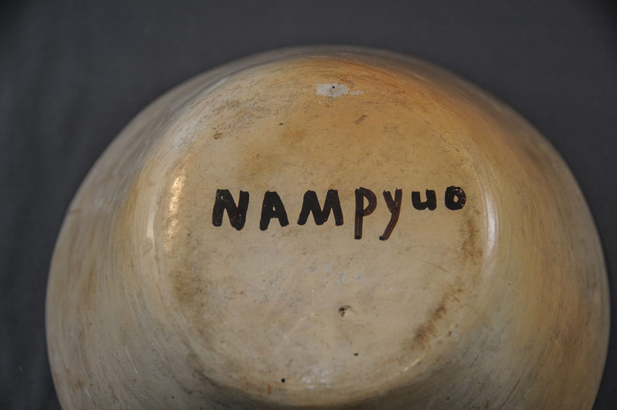
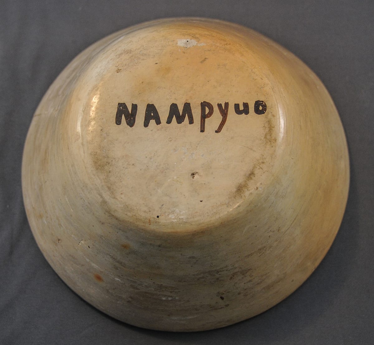
Most striking about bowl 2012-25 is the signature on the bottom: “NAMpyuo.” For a detailed review of “Nampeyo” signatures, see Appendix E.
The odd conical conical shape of bowl 2012-25 and this pecular signature indicate an early and unusual pedigree.
In order to be written, the sound of a person’s name in the Tewa language must be translated into letters of American English. The process of translation is idiosyncratic. Writing in 1892, Alexander Stephen refers to “Numpe’yo” (1936:130, 173, 198, 1020). “Nampeya, Hopi pottery maker” is noted on an historic postcard featuring a 1901 photograph (Kramer, 1996:79 and postcard on file). Walter Hough refers to “Nampeo” in a 1901 report (1901:347). Bowl 2015-11 in this collection is signed “Nu m pa yo” and was created in 1906. The signature, written in Nampeyo’s hand, follows the spelling defined for her by Matthew Murphy. Agnes C. Laut, writing before 1913 refers to Nampeyo as “Nampaii” (1913:132). A jar in the Arizona State Museum is signed “NAMPUYA,” reversing the “yu” on jar 2012-25 (Blairs, 1999:color portfolio, p. XIII, fig. 3.16). Jar 2015-14 in this collection carries the signature “Nempayo.” In August 2015, Steve & Dottie Diamant had a pot signed “NAMPEYUO” for sale in Santa Fe.
What are we to make of jars with odd spelling of Nampeyo’s name on the bottom?
The story that follows is speculative but may offer an explanation.
Some background information that sets up the story:
- Beginning about 1905, paper labels reading “Made by Nampeyo – Hopi” were used by The Fred Harvey Company at its stores and company literature featured her as the “best” Hopi potter. As a result, Nampeyo became the first Native artist known by name to Anglo tourists and potery labeled with her name commanded premium prices. (For an example of such a label, see bowl 2011-16 made in 1915.)
- Nampeyo could neither speak nor write English. Pots signed before firing with the conventional spelling “Nampeyo” were produced after 1930 when Nampeyo was functionally blind but still shaping pottery that was then painted by a daughter, granddaughter or other relative who signed them (Kramer, 1996:139). (See Artist listing “Nampeyo 3 for examples.) These pots are fairly common. Some have the name “Nampeyo” written on the bottom with a capital “E” and others spell Nampeyo with a small “e.” All pots that I have seen that are signed “Fannie Nampeyo” have Nampeyo spelled with a capital “E,” so I attribute post-1930 pots signed simply “Nampeyo” to Fannie if thy have a capital “E.” The NAMPEYUO” pot for sale by Steve Diamant in 2015 has a capital “E” in the signature. The handwriting on Steve’s jar and bowl 2012-25 are identical, though my pot’s signature lacks an “E.” Given this slight evidence, I think Fannie indeed signed both bowls. The letters are very clear and controlled.
- In 1910 a United States Land and Irrigation Exposition was held in the Coliseum in Chicago. The Field Museum and the Fred Harvey Company planned a railroad exhibit in the form of a Southwestern mission. The Harvey Co. arranged for Navajos and Hopis to live in the mission and entertain tourists. Nampeyo, her husband Lesso, teenage daughter Nellie and a young friend were among the Natives present. “Because they were not allowed to fire pottery in the Coliseum, they may have carried some finished pots to sell to Easterners…unfired vessels made by Nampeyo were thrown away (Kramer,1988:51-52).” Kramer writes that the Fred Harvey Company arranged for Nampeyo to leave the reservation only three times: 1905 and 1907 to Hopi House and this 1910 trip to Chicago.
- An international exposition was organized in 1915 in San Diego to celebrate the opening of the Panama Canal. The exposition remained open for two years and especially showcased Native American life. At the center of the fair was a seven-acre “Painted Desert”exhibit including cement cliffs, two large units of Pueblo-style dwellings and dance plazas. These provided living and working space for “real Indians” to live, perform dances, and demonstrate their crafts, including pottery making. (See the brochure “Painted Desert Exhibit, San Diego Exposition” on file.)
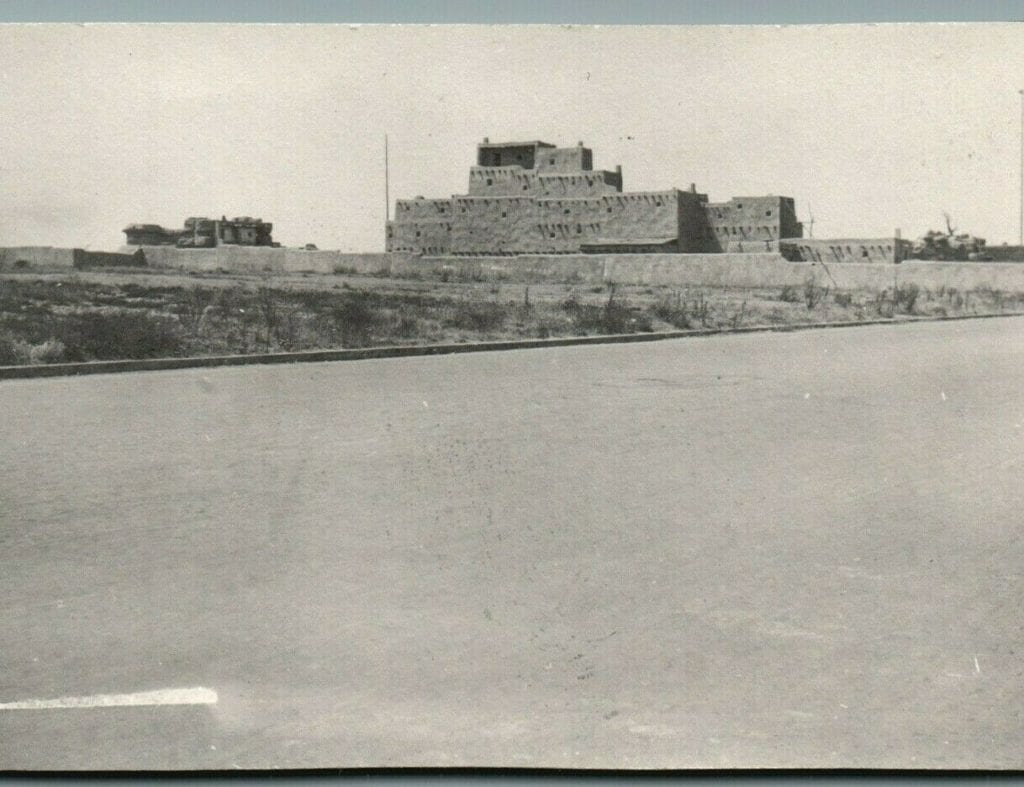
Hopi House in Balboa Park, San Diego
- Nampeyo’s youngest daughter Fannie was born somtime between 1900 and 1904. By the time she was 6 years old, Fannie was enrolled in the Keams Canyon Boarding School (Blairs, 1999: 68-69).
The Story:
Ed Wade tells the following story: Robert Ashton, Jr, a published authority on Nampeyo (1976), once asked Fannie about the unusual “NAMpyuo” signature seen on bowl 2012-25 and a few other pots. Fannie told Ashton that a dealer asked her mother to make a number of pots to sell at one of the 1910 or 1915 expositions. Fannie had learned how to write at the Keams Canyon Boarding School. Perhaps inspired by the Harvey paper labels, either Fannie’s mother or the Anglo trader asked Fannie to sign the pots with her mother’s name before they were fired. Fannie signed these exposition pots “NAMpyuo.” The sound of this spelling may be closer to the original Tewa pronunciation than the usual spelling (Phone conversation, August 27, 2015).
Barbara Kramer is a particularly careful researcher and found no evidence that Nampeyo attended the 1915 San Diego Exposition. Ed Wade believes that Nampeyo attended both expositions, though he has not yet found documentation for Nampeyo’s attendance at the San Diego fair. Bowl 2012-25 and the Demant ewer might have been made at Hopi and shipped to either Chicago or San Diego. If evidence is found that proves that Nampeyo and family attended the San Diego exposition, these pots might have been formed and fired there.
If bowl 2012-25 was sold at the 1910 Chicago Exposition, Fannie would have been 6 to 10 years old when she signed her mother’s name. If made for the 1915 San Diego Exposition, Fannie would have been 11 to 17 years old when she signed for her mother, the range caused by the uncertainty of her birth date and the two-year run of the exposition.
If Fannie learned her penmanship particularly well at a young age, then following Kramer, I think this bowl was intended for sale at the 1910 Chicago Exposition. If such clear lettering is thought to require an older scribe, then perhaps Wade is correct and the bowl could have been made for the 1915-1917 San Diego Exposition, whether Nampeyo attended or not.
In any case, bowl 2012-25 was likely produced around 1910 to 1915, far earlier than the more conventionally signed “Nampeyo” pots of 1930 to 1942.
Pots signed “NAMpyuo” are rare. Of the many hundreds of Hopi pots that Ed Wade has seen, this is only the seventh example he remembers. Aesthetically jar 2012-25 is a “fine” but not a “great” Hopi pot. . For several years after buying bowl 2012-25 I was unwilling to attribute it to Nampeyo because of the odd signature. Robert Ashton died several years ago, so I cannot verify his story. With an acknowledgement of some uncertainty, I now am inclined to accept the Ashton story as true and this, in addition to the competent form and painting of the bowl, have changed my assessment. I now attribute both the forming of bowl 2012-25 and it’s painting to Nampeyo, with the signature added by a young Fannie.
The unusual spelling “NAMpyuo”” on pot 2012-25 can be seen in the context of other pots with odd spellings of the name. See also pots 2015-14 (“Nempayo”) and 2019-18 (“NAMPEyuo”).
For a 1906 bowl both formed and painted by Nampeyo with a “Nu m pa yo” signature written by her hand, see 2015-11.
