
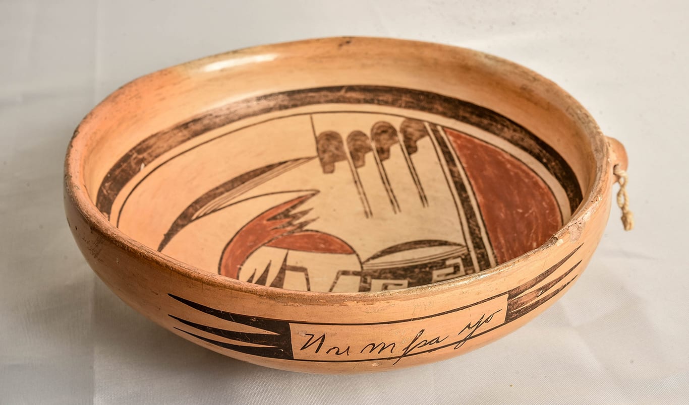


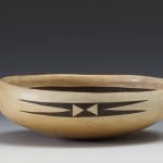
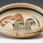
Some pots belong in this collection because of their spectacular form (cf. 1993-05); some are notable because of their spectacular design (cf. 2014-07). Though by Nampeyo, bowl 2015-11 is an ordinary form and carries an attractive but typical Nampeyo design.
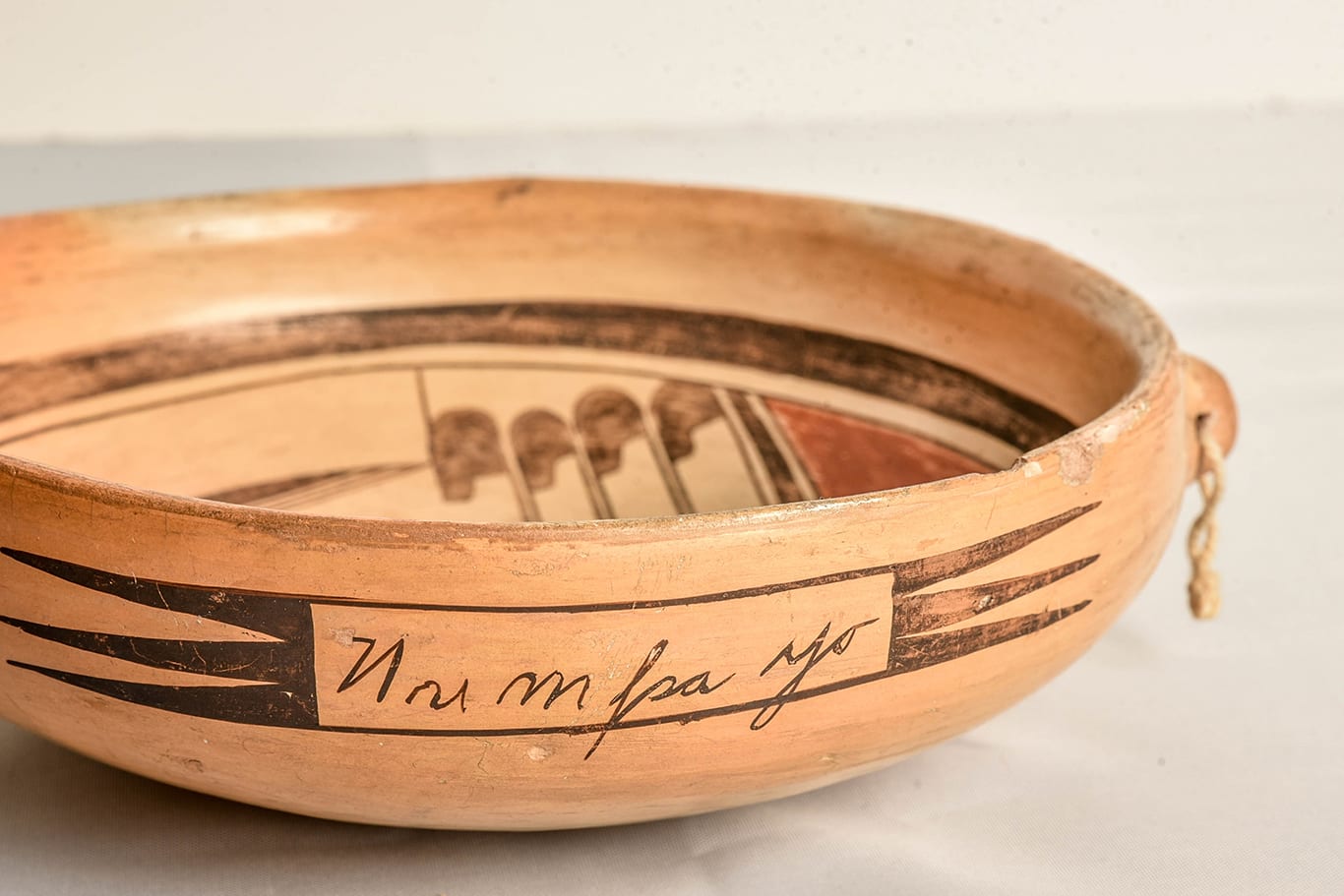
What is notable about this bowl is the name “Nu m pa yo” written on its exterior side. We know that Nampeyo was illiterate and could not write, yet we now know that this bowl displays her signature written by her hand.
Unexpectedly, the signature on this bowl functions as a natural experiment measuring Nampeyo’s ability. I’m not sure what the legal definition of a signature is, but for the illiterate Nampeyo, her name was simply a design. Were I to try copying a signature written in Arabic or Chinese, I assume the result would be unintelligible to a native of those cultures. We have long known that Nampeyo had a good eye; the imperfect accuracy of her letter formation on bowl 2015-11 is a measure of how skilled she was at seeing a design and reproducing it.
The script is cursive, though the name has been broken up into four groups of letters, maybe representing the emphasis of pronunciation. The letters of the signature seem laboriously but inaccurately formed and are elegant. Only one other example of this signature is known and these two examples are also the oldest known signed Hopi or Hop-Tewa pots. There is an interesting story to tell here, unknown until this bowl came to market with a note of provenance.
Before the storytelling, I should describe the bowl.
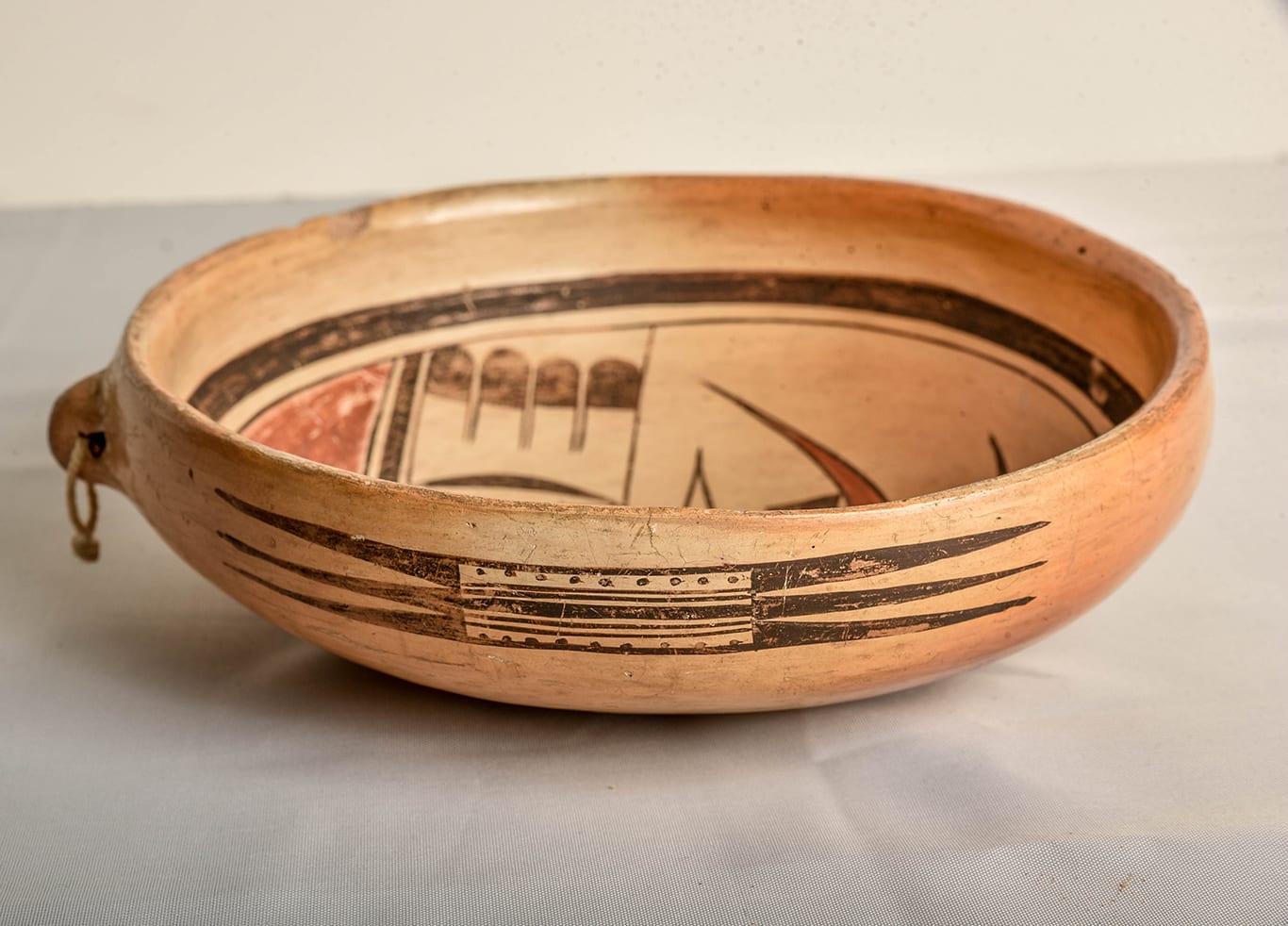
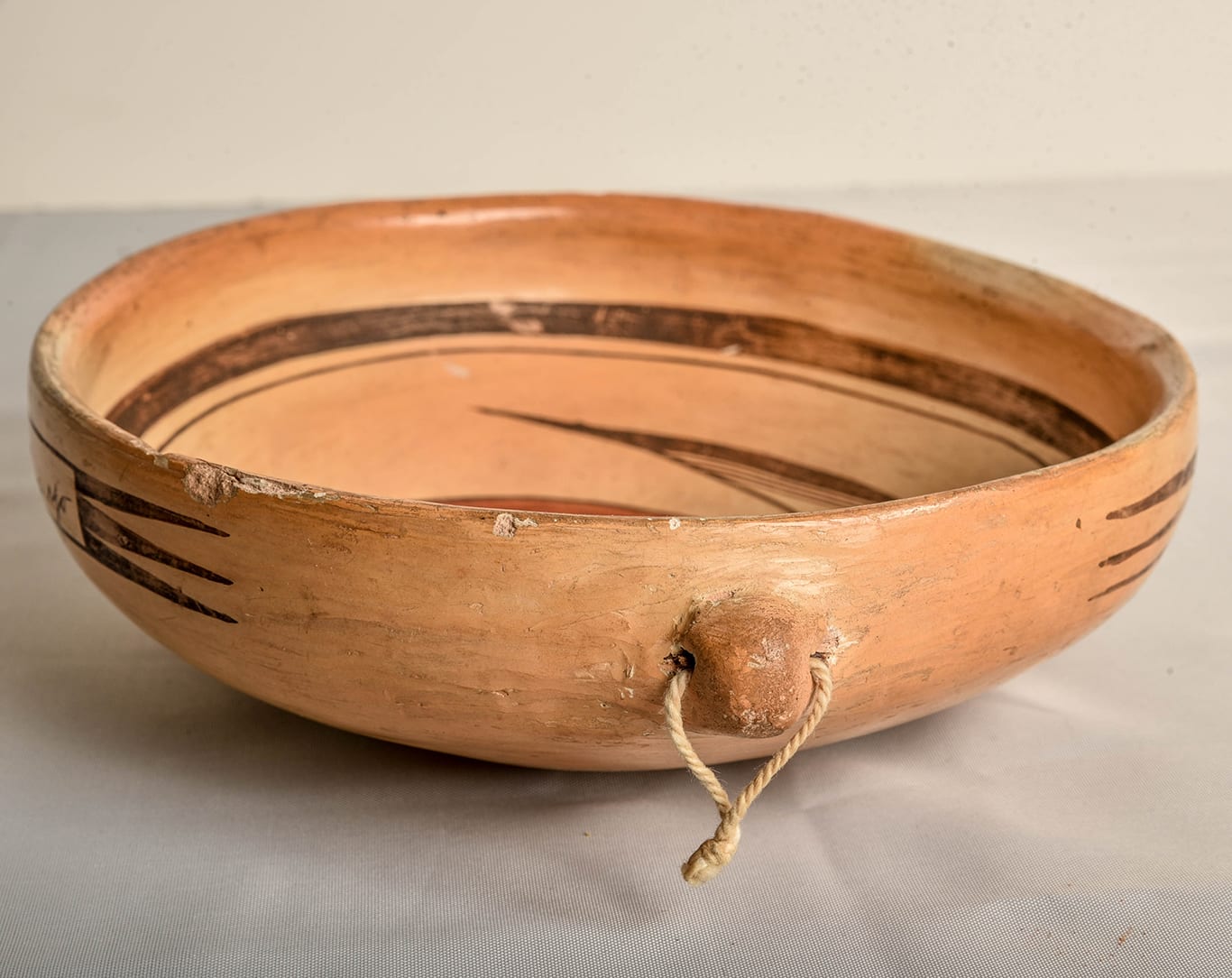
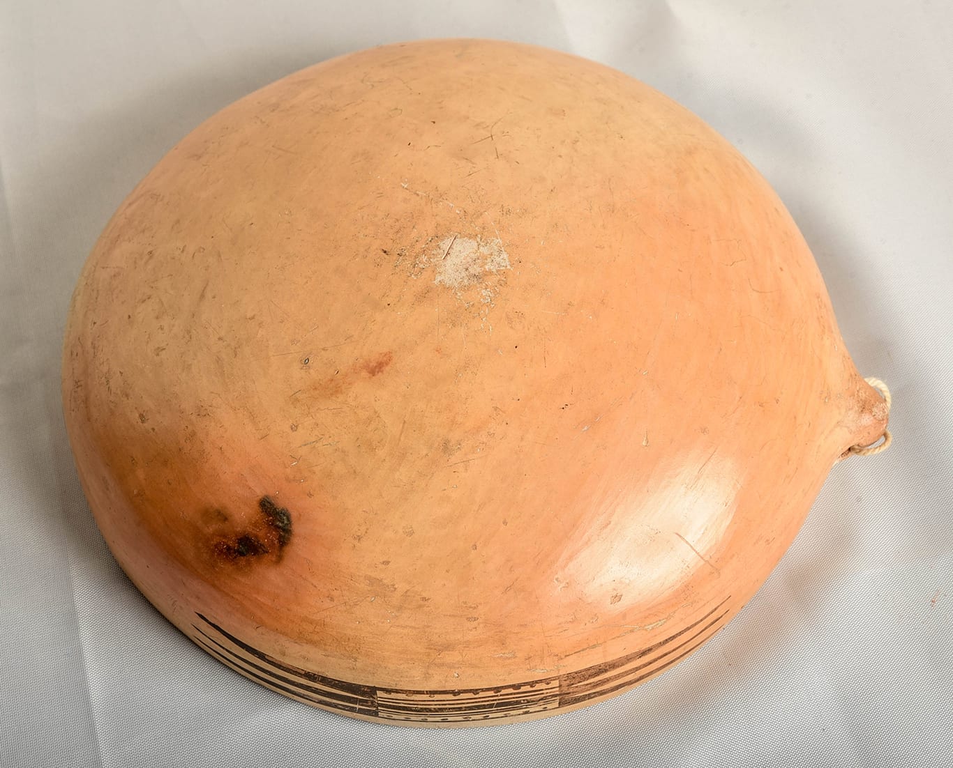
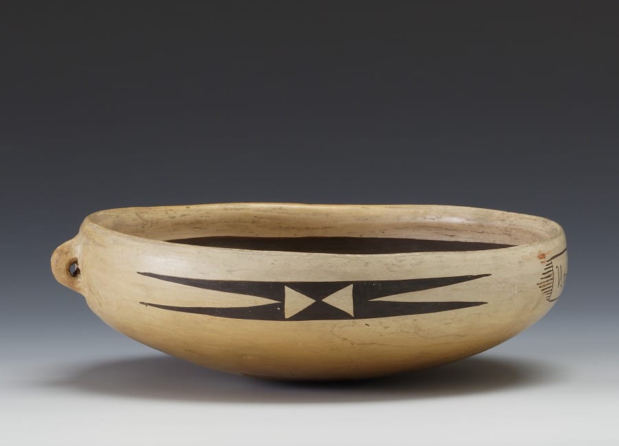
The walls of bowl 2015-11 are even, though somewhat thick. Characteristic of Nampeyo, there is an extra coil of clay on the interior top edge, though here the coil has been flattened on its top so as to slope into a somewhat thinner rim. There is a clay lug built into the side of the bowl, with a string for hanging.
I had always thought that such lugs were intended for the tourist trade so buyers could take a bowl home and hang it up for display. I’m now told that lugs were actually an indigenous feature dating back several centuries and used to hang bowls for storage on the wall. The placement of the lug lends itself to the bowl hanging with the interior against the wall in a pueblo home. Nampeyo frequently built lugs into her bowls before her 1905 residence in Hopi House. Her work at the Grand Canyon was her first sustained contact with large numbers of tourists and she found little interest among Anglos in the lug. Visitors to the southwest wanted a “real Indian” souvenir of the Southwest that would display its interior design. The built-in lug did not lend itself to this orientation. For Nampeyo making bowls without lugs was easier, so the incorporation of a lug into the form of the bowl was less common on her bowls after 1905.
The interior of bowl 2015-11 is a variation of the “bird hanging from sky band” design of Sikyatki origin that Nampeyo used from at least the early the 1890’s until she was functionally blind and unable to paint in the 1920’s (Kramer, 1996: 48-49. 167 and Streuver, 2001:29). For an early rendition by Nampeyo, see 1993-04. For other examples, see the Category List.
The layout of the design is quite formalized, with a (usually red) lunette occupying about a third of the space within the double framing lines. On bowl 2015-11 the red lunette is about half as wide as typical, with much of the interior space reserved for avian elements. Separating this lunette from the design above is a thick black line flanked by two thin black lines, like a two-lane street with an esplanade.
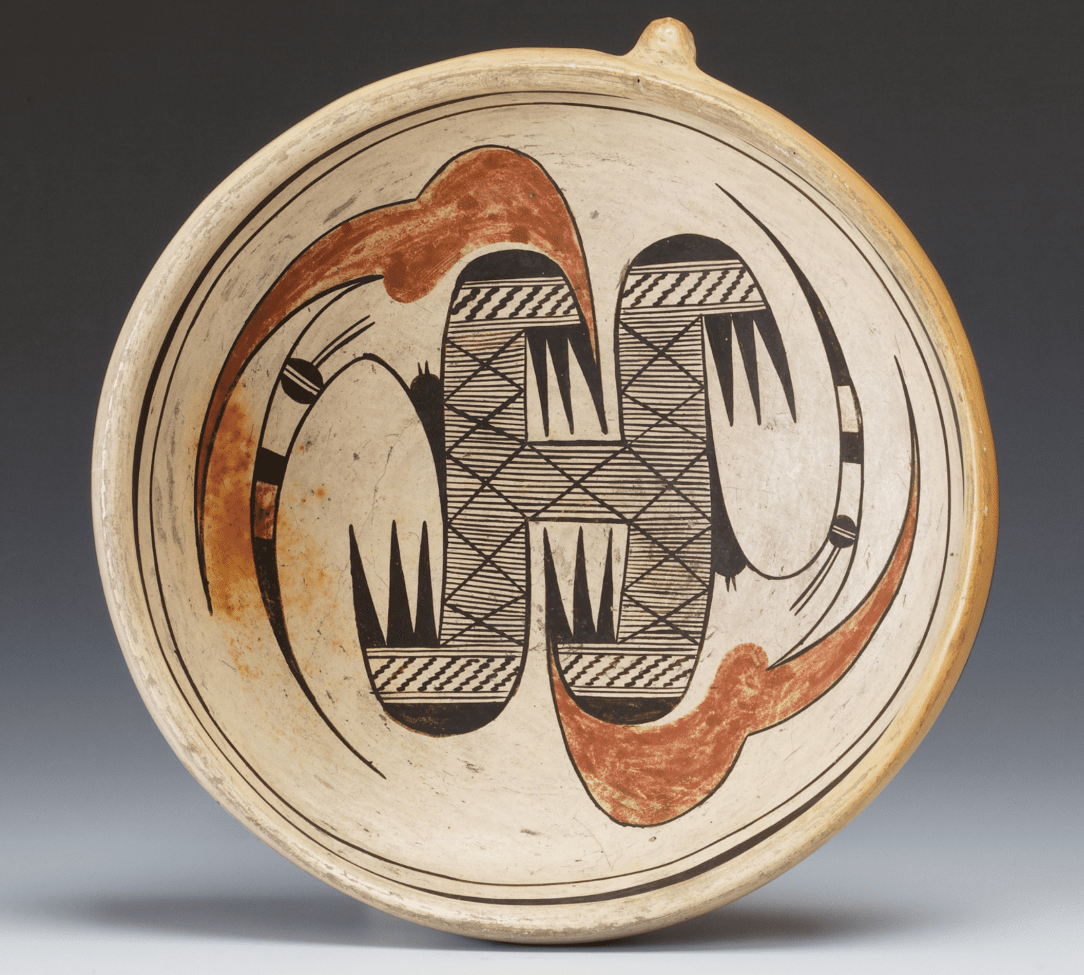
Immediately above the red lunette is an area of linear design occupying a third of the painted surface. At first glance this section of the design seems symmetrical: two sets of four linear tails anchor each end of this section, with the lower tails touching the framing lines. In between there is a black rectangle flanked by sets of three lines (forming another two-lane “highway”). Embedded in the black rectangle are two unpainted areas within which are painted black crooks. Large black curved lines, like huge parenthesis, then enclose these central elements.
On second look, there are strong asymmetric features to this linear area. On one set of four tails the black tips have a straight bottom edge. On the facing set the bottom edge is notched. The central medallion is internally symmetrical, except that the imbedded crooks curve in opposite directions. This central medallion, however, is not placed in the center of the bowl, but closer to the un-notched tails, making these tails shorter in length than the notched tails on the other side of the bowl. Imbalance within balance is a formula for visual energy and is characteristic of Nampeyo. This linear section is strikingly similar to the earlier rendition of this design by Nampeyo referenced above, 1993-04.
Rising off this base are two curved elements, the upper painted with a black tip that continues down the upper side of the curve. On the side of this black area are four parallel lines that form a three-lane “highway” that ends at the base of the curve where it touches the top notched feather. The second curve is solid red and it joins the linear base with a series of three size-graduated red points, thus creating a mirrored set of unpainted points that rise out of the base. Between these two sets of points a thick black boundary line forms a zigzag pattern.
As the top line of the base swings up to form the bottom of the red curve, it forms a wide arc that then bends back towards the base, leaving a tear-drop shape below the red curve, something like the cross section of an airplane wing. Built into this space is a two-element design. One is a large “V” with sidebars, what Barbara Kramer called Nampeyo’s “clown face” design: “She whimsically tucked variations of the clown face into many designs throughout her career (1996:188).” Above the clown face is a pile of three black scalene triangles with the larger at the base and pointing in the opposite direction than the clown face. These black triangles leave an unpainted surface that forms two triangular points headed in an opposite direction.
The external designs on bowl 2015-11 are two monochromatic glyphs consisting of a rectangle flanked by three black triangles, thus continuing the use of triangular sets seen in the interior design. One glyph has its central rectangle filled with five parallel lines, the central line being thicker than the others and thus appearing that it is flanked by the now familiar two-lane “highway.” On the top and bottom of this linear pattern are rows of nine dots.
The second glyph also has a central rectangular section but instead of a linear design, the area has letters spelling out the name of its maker. This alphabetic glyph makes bowl 2015-11 extraordinary and will be discussed at length below.
While visually busier than many of her pots, even without the signature, the design easily meets the six design strategies I defined in Appendix B as characteristic of the mature Nampeyo:
- A tension between linear and curvilinear elements often represented as a contrast between heavy and delicate elements.
The two sets of four linear tails form the base of the design of bowl 2015-11 and contrast sharply with the curve of the two arcs rising above. Embedded in the linear base are two curvilinear parentheses, providing an additional source of visual tension. The large “V” of the clown face is placed between linear and curved elements and has attributes of each, being made of straight lines (like the base) but coming to a point (like the arcs), providing both linkage and contrast. - A deliberate asymmetry of design.
As we have seen, the linear base of the design is deliberately thrown off symmetry by placing the central medallion nearer one edge of the bowl than the others. The two arcs are oriented in slightly different directions. A large red half circle forms the large lunette at the base of the design and is echoed by the small red lunette that forms a cap to the clown section of design, but these two lunettes are oriented at ninety degrees to each other. Most obviously, the clown face and stacked triangles under the lower arc are not balanced by a similar design. - The use of color to integrate design elements.
The red arc and the neighboring small red lunette that caps the clown face are visually tied by form and color to large red lunette that lies adjacent to the linear base. Imagine if only the large lunette were painted red. The rest of the design would be all black and simply sit on a red base, a visually less integrated design. - The use of empty (negative) space to frame the painted image.
While the interior design of bowl 2015-11 is quite busy, Nampeyo leaves sufficient unpainted space around the two arcs and the clown face to highlight these elements. - The use of a thick above a thin framing line on the interior rim of her bowls.
Such framing lines are found on this bowl. - Confident, bold, and impulsive painting.
While I always mention that this is the most subjective of the six criteria that define a pot painted by a mature Nampeyo, the hand of the “Old Lady” is unmistakable here, even without the side signature. The painting is “confident”: precise without being perfect or labored. One exterior glyph has exactly two sets of nine dots; Nampeyo was counting. The two examples of stacked triangles on the interior of the bowl are unexpected, small motifs tucked into a design that does not require them but added as flourishes, the resulting black zigzag element at the base of the red arc mirroring the black stacked triangles to its left. Simple details like parallel lines are repeated four times inside the bowl and then again in the graphic glyph, quietly integrating the painted surfaces. Such an internal structure of design is characteristic of Nampeyo and missing from other Hopi and Hopi/Tewa potters, including her daughters.
And now for the story of that external signature “Nu m pa yo.”
The Dartmouth bowl:
-
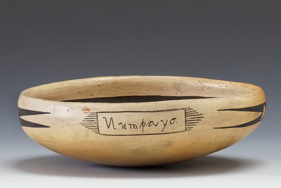
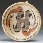
- The signature on the Hood Museum bowl, Dartmouth College
-
- Hood Museum , Dartmouth College
-
- Hood Museum , Dartmouth College
-
- Hood Museum , Dartmouth College
Barbara Kramer discusses the Dartmouth bowl:
“A few vessels made by Nampeyo were signed, but they are the exception. The exterior of an early bowl purchased by Frank and Clara Churchill around 1904-1907 (Hood Museum of Art, Dartmouth College, cat #46-17-101) is signed in unconnected script letters ‘Numpayo,’ but the catalog card for the item states the the signature appears to have been added after firing. (The bowl was not) signed by Nampeyo herself because she was unable to write… (1996:163, emphasis added).”
A photograph of the Hood Museum bowl and its signature are shown here and, although there are slight differences, it is clear that both my example and the Hood Museum bowl were signed by the same person. Both, for example, display the reversed “N” mentioned by Schwartz. The two bowls are exactly the same size. Following Kramer, my initial estimate of the age of bowl 2015-11 is also 1904-1907.
As we will see, Kramer’s assertion that Nampeyo could not have signed the bowl proved incorrect. Also note that the signature on bowl 2015-12 is unaffected by acetone and thus was added before firing. I believe that the catalog entry for the sister bowl at Dartmouth is simply wrong when it suggests their signature was added after firing. Hood Museum curators are checking this detail.
The Blairs print a photograph of both the interior and side signature of the Dartmouth bowl (1999:84).
As noted above, the Dartmouth bowl was donated to The Hood Museum by Clara Churchill. Her husband, Frank Carroll Churchill (1850-1912), was appointed a revenue inspector of the Cherokee Nation in Indian Territory on December 20, 1902 and later served as inspector in ten states and territories, including Arizona. “He and his wife, Clara, traveled as part of his duties…Col. Churchill’s philosophy was such that he believed education to assimilate and Christianize Indians was their only chance of survival… (Smithsonian: Museum of The American Indian, data base).”
The Hood Museum catalog entry contains a January 1986 comment about their bowl by Robert Ashton, author of the first comprehensive article on Nampeyo (1976):
“According to Fannie Nampeyo, her mother never signed any pottery as she was illiterate. Many of the Hopi children, however, including Nampeyo’s daughters were attending the nearby school. Possibly it was one of Nampeyo’s daughters who signed the pot for her mother.”
Ashton’s speculation is a reasonable guess, but is not correct.
In March of 1986 G.C. Schwarz added his evaluation to the catalog record of the Hood Museum bowl:
“Note the “N” of Nampeyo is reversed. The other letters are also written in a style that suggests someone who is not too familiar with English but has had some training. I would suggest that Nampeyo’s daughter may have signed this. Another possibility is that the daughter wrote out the name (or perhaps someone else – i.e. Mrs. Churchill) wrote out the name and Nampeyo copied it….As no other “signed” pots like this seem to exist I would suggest that Mrs. Churchill, being interested as she was in recording information, asked Nampeyo to sign her bowl….”
As we will see, Schwartz’s speculation of “another possibility” was close to accurate.
The desire to feature Nampeyo’s name on bowl in a glyph frame is entirely Anglo in origin. The external glyphs on bowls are a prehistoric Jeddito tradition (LeBlanc and Henderson, 2009), but hollowing-out the center of the glyph to form a blank rectangular frame into which a signature could be placed is completely outside of Native tradition. The form seems to have been used only twice and then dropped from Nampeyo’s repertoire. Something particular and Anglo is going on here.
That is all that was known about this signature before bowl 2015-11 came to the market as part of a box lot of three Hopi pots that included large and small jars.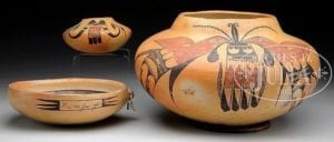
The grouping of pots sold as a box lot, including bowl 2015-11.
I asked that the jars be shipped to two pueblo pottery dealers who are friends and offered to sell them for me, thus reducing the price of the bowl. It was not until six weeks later that one of these dealers told me that the large jar contained a note of provenance that completed the history of the Hood Museum and my bowls.
The note reads:
July 19, 1975
Oak Run, Ca.
To Whom It Might Concern:
When I was a boy I lived on and around the Navajo reservation from around 1905-1912 at Tuba City, Arizona. My father was an Indian agent for the Navajo and Hopi at this time. He had some pots made for him and he had the Indian woman copy the signature he wrote for her and put it on the pots. He spelled her name out for her as it sounded —“Numpayo.”
They have been in my family since 1906. This Indian woman, Numpayo, couldn’t write at all—she copied it from him.
At the time the pots were made, she was known as “Nampayo, the pottery maker” and lived near Maincopi or First Mesa that is on the Hopi reservation.
My father’s name was Matthew Michael Murphy. He was associated in Indian work for the government for about thirteen years.
Francis F. Murphy
July 19, 1975
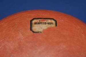
Beginning in 1905 The Harvey Company featured Nampeyo in its literature and she became the first Native artist known by name in the Anglo world. Hopi and Hopi/Tewa people do not like to be seen as “exceptional.” Seventy years after bowl 2015-11 was formed, most Hopi potters still did not sign their name (Stanislawsk, 1976).
By 1906 it seems that Matthew Murphy was well aware of the reputation Nampeyo developed during her seven-week sojourn at Hopi House the year before, a reputation embellished by the “Made by Nampeyo – Hopi” stickers applied by Harvey company employees to feature her work, an example shown here:
Apparently desiring a similar cachet, Murphy directed Nampeyo to copy her name on the side of two bowls of the same size, and thus presumably price.
Since Matthew Murphy was the U.S. Allotting Agent for The Hopi Reservation between 1906 and 1912 (Murphy, 1928) and Frank Churchill was Revenue Inspector on the Hopi Reservation during this time, the two men must have known each other. Based on the information provided by Francis Murphy in his 1975 note, in 1906 either Matthew Murphy ordered two bowls with the external signature from Nampeyo and gave one to Frank Churchill, or more likely the two men (perhaps with their wives) visited Nampeyo and ordered the two bowls with external glyph signatures. Given their reservation connection, I believe the orders were placed at First Mesa with the signature “Nu m pa yo” a substitute for the “Made by Nampeyo — Hopi” label that was only available at Hopi House and other Harvey Co. stores.
The provenance of the Frank and Clara Churchill bowl in the Hood Art Museum and the provenance offered by Francis Murphy in his 1975 letter about bowl 2015-11 are strikingly compatible. Each points to the purchase of a bowl by a U.S. government agent attached to the Hopi reservation and each cites a similar date. This concurrence gives me confidence in the validity of the story told here.
A side note:
On February 18, 2019 I was speaking by phone with Rachael Sahmie. Her mother, Priscilla Namingha was born in 1924 and was thus was 12 years old when her great grandmother Nampeyo died. Priscilla remembered Nampeyo well and told her children stories about “the Old Lady.” Rachael and I were discussing the signature on the exterior of bowl 2015-11 and she told me the following story related to her by Priscilla.
“Nampeyo said that when White people tried to teach her to use a pencil, she was mystified. ‘What did this stick has to do with a piece of paper?’ she thought. Apparently the White folks kept on trying to correct how she held the pencil when she tried to make her mark and Nampeyo never recognized the relationship between pencil and paper to the satisfaction of Whites.”
Rachael and I laughed about how those Anglos might have responded if they had been handed a yucca leaf and a lump of clay and been told to paint a pot.
Pots signed on the bottom “Nampeyo” are not particularly rare and almost all were formed between 1930 and 1942 by Nampeyo when she was largely blind and painted and signed by a daughter or other relative (See “Nampeyo group 3” in the artist list.) There are two exceptions to this pattern of signature use, both now represented in this collection:
- Bowl 2015-11 formed, painted and signed “Nu m pa yo” by Nampeyo and dated 1906.
- Bowl 2012-25 formed and painted by Nampeyo as 1) a special order for sale at 1910 or 1915 International Expositions and signed NAMpyuo by Fannie, or 2) an irregular spelling of Nampeyo’s name typical of the period 1925 to about 1930. See Appendix E for a discussion of Nampeyo signatures.
Pre-1930 signed Nampeyo pots are extremely rare and unrecognized by the market.
The Arizona State Museum in Tucson has an extraordinary collection of southwest Native pottery, including a bowl with both design and corrugation that is signed on the bottom:
J R Willis
NAMPUYA
I don’t know the history of this bowl, but Willis was a photographer who visited Hopi in the early years of the 20th century. It’s speculation on my part, but he might have commissioned this bowl from Nampeyo, written out his name and hers on a piece of paper and asked her to put these names (designs to Nampeyo) on the bottom of his bowl. Thus it is possible that the Arizona State Museum bowl has a history somewhat like bowl 2015-11 and the example in the Hood Museum, Dartmouth.
