
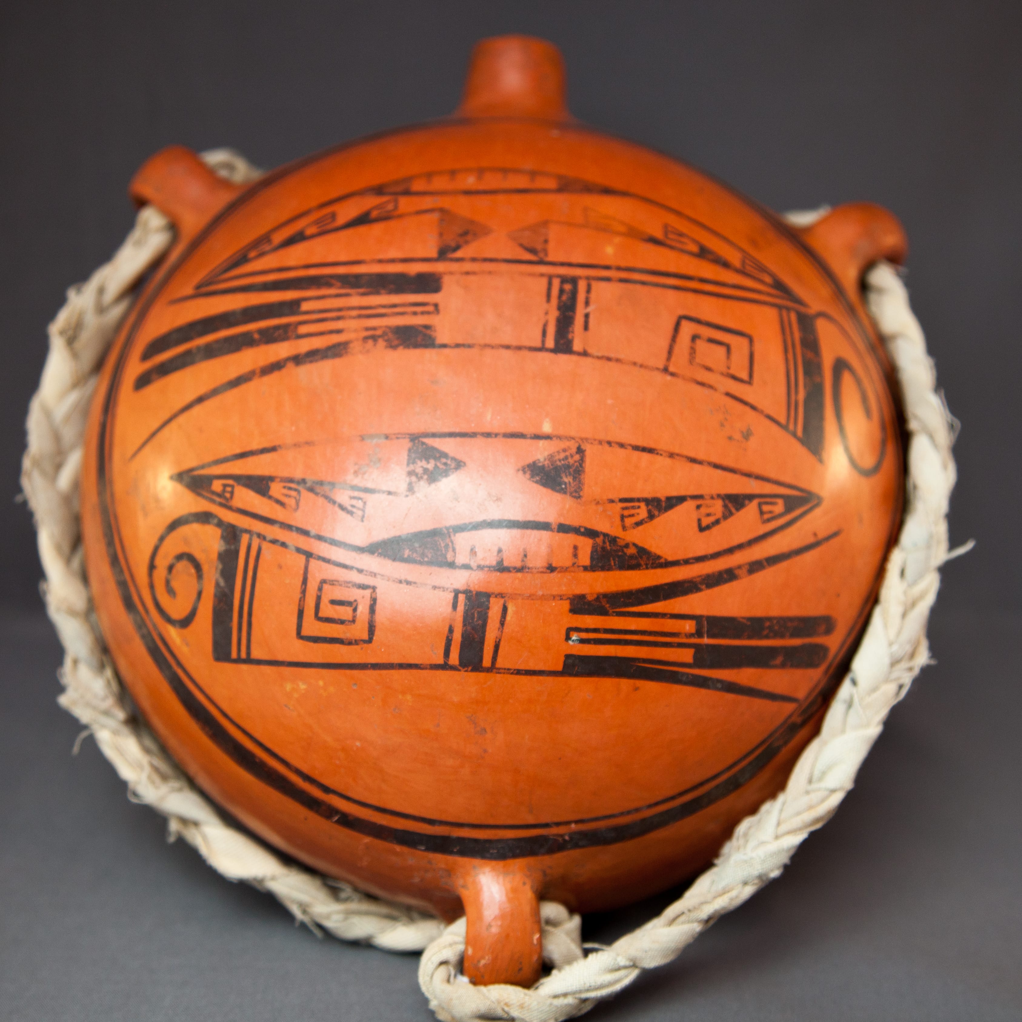

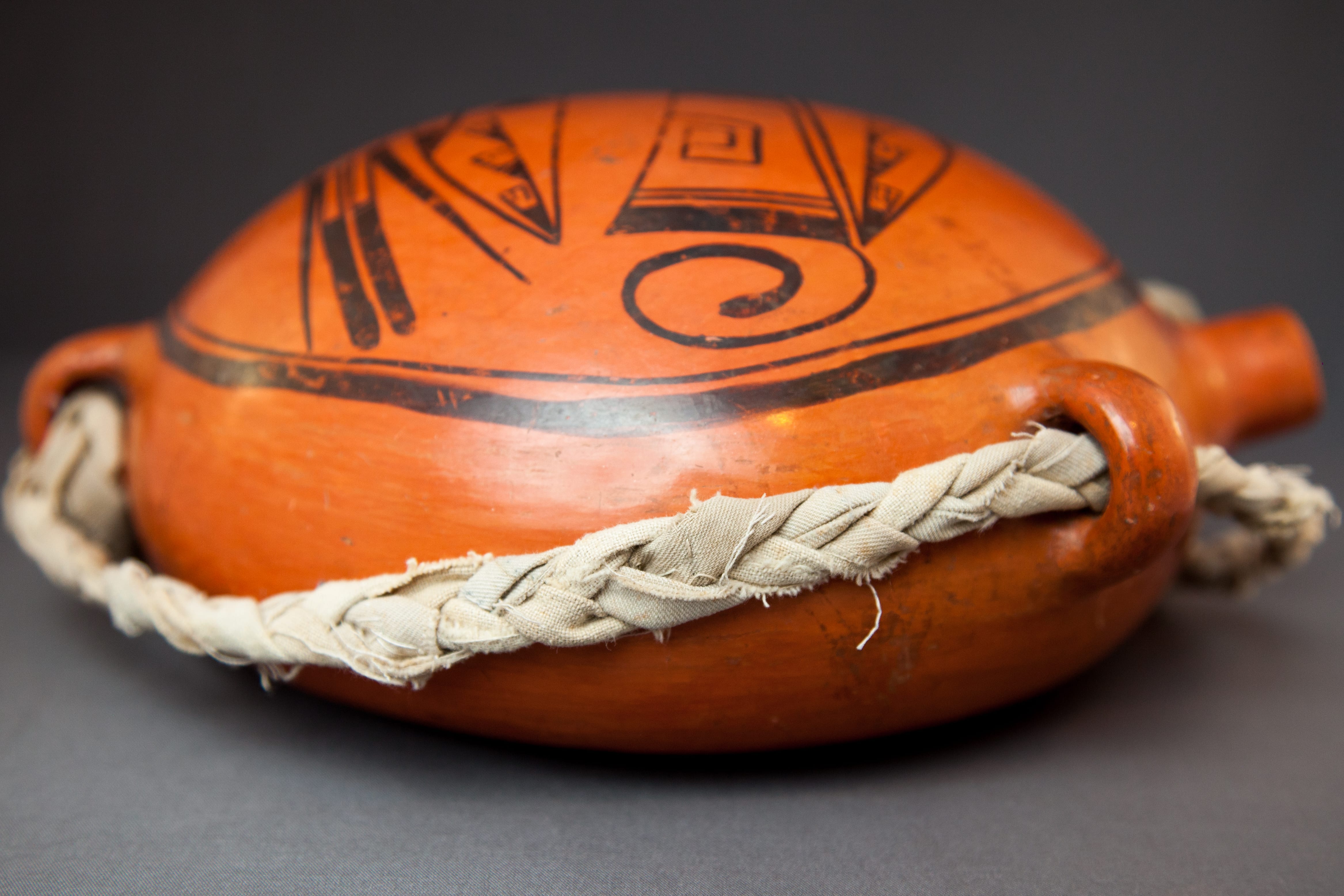
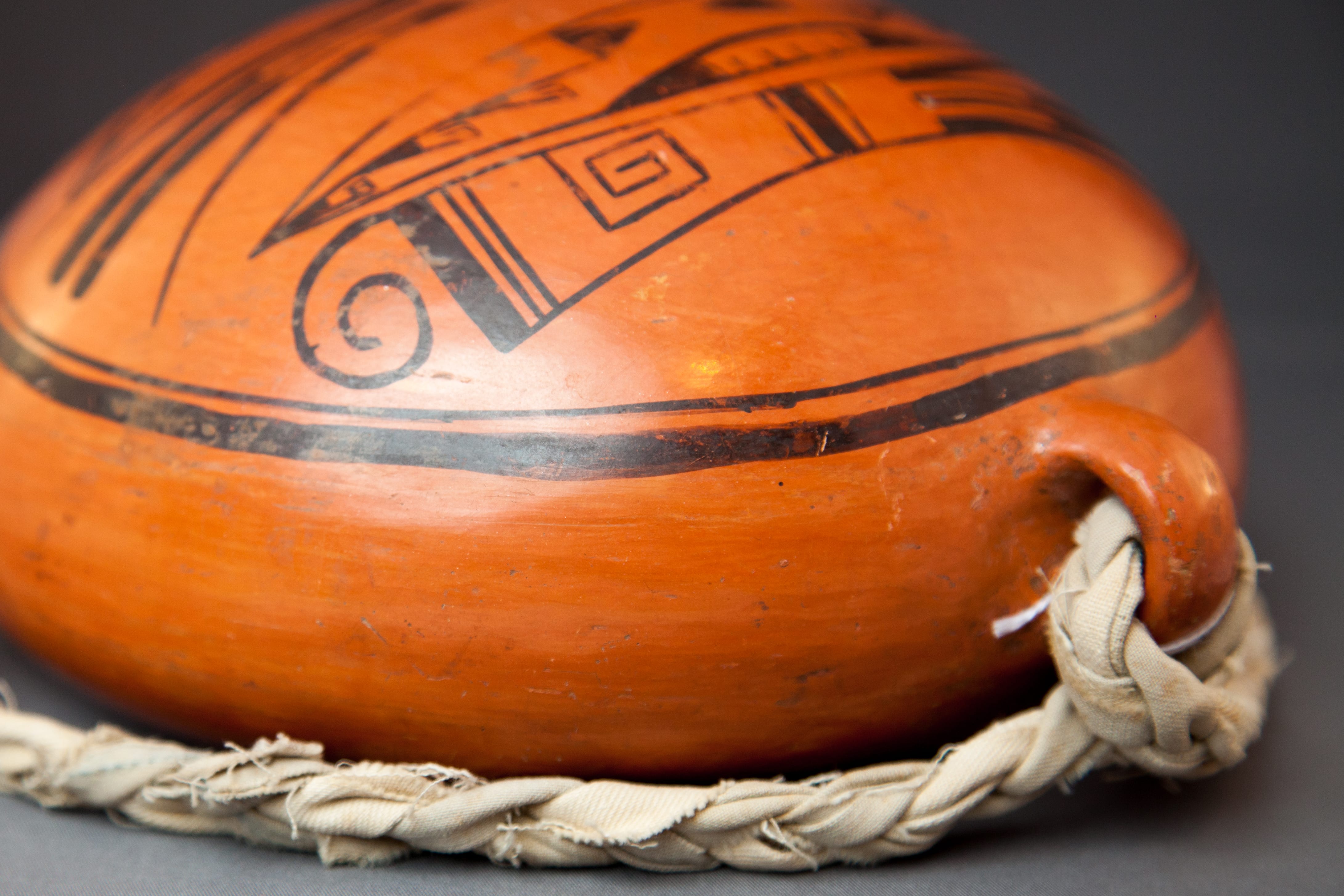

Nampeyo frequently formed canteens, but the flat shape, red slip and three-lug configuration of canteen 2017-05 make this an unusual vessel. This form is not a Native shape and is testimony to Nampeyo’s powers of observation and willingness to innovate.
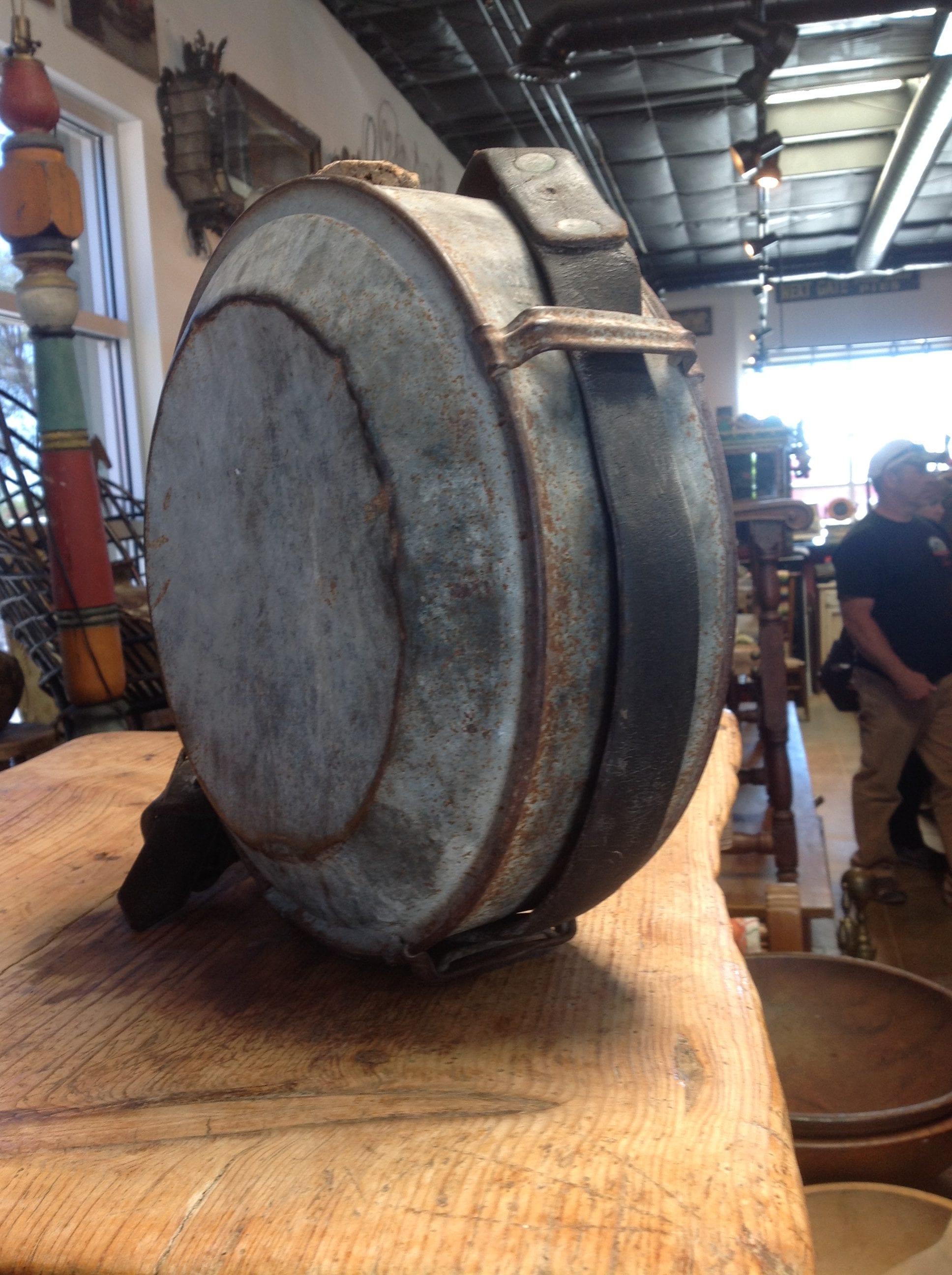
U.S. Army canteen ca. 1905
The unusual shape of 2017-05 is apparently modeled after a pre-World-War-1 U.S. Army standard canteen which was round, flat and had a strap that ran around its parameter and was held on by raised metal strips. A picture of such a canteen is seen here. The only other 3-lug Hopi canteen I know of was for sale (2016/2019) at Steve Elmore Indian Arts in Santa Fe. (Photograph on file.) Both canteens are slipped with red slip and both are by Nampeyo. Steve dates his canteen as ca 1900; I would suggest that canteen 2017-05 was probably made in the first decade of the 20th century.
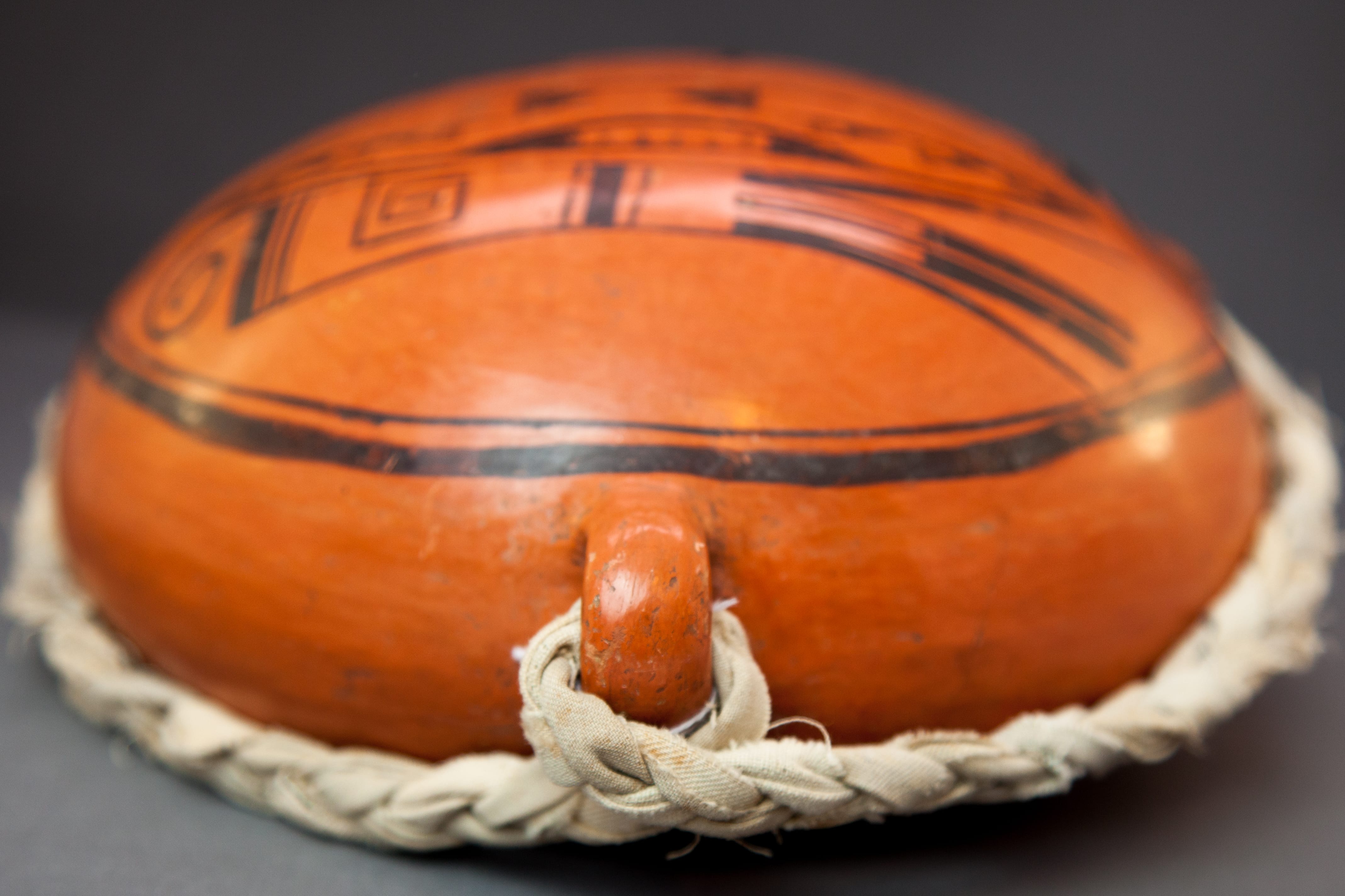
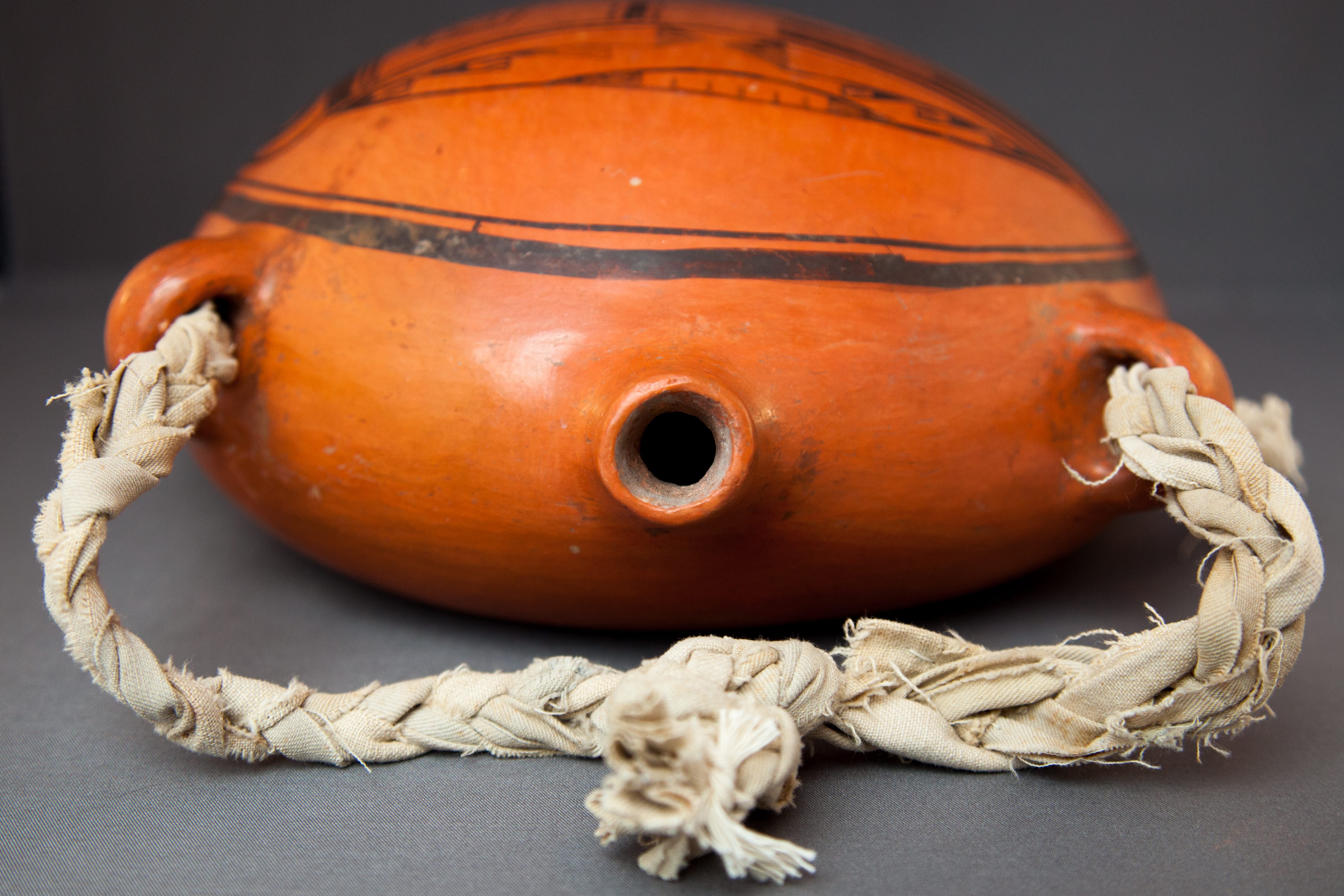
A look inside the spout of canteen 2017-05 confirms that the body of the canteen is made with grey clay with yellow clay (which fires red) used as a slip. The spout of the canteen is tilted upward, a characteristic of many of Nampeyo’s canteens (Struever, 2001:108). Red-slipped Nampeyo pottery is unusual. Of the 60 pots in this collection formed or formed and painted by Nampeyo, only 3 others have red slip (1988-01, 1997-04, and 2015-04). Perhaps because designs do not adhere well to the red slip, Nampeyo used this slip for only a short period at the beginning of the 20th century. All the red-slipped Nampeyo pottery in this collection is monochromatic.
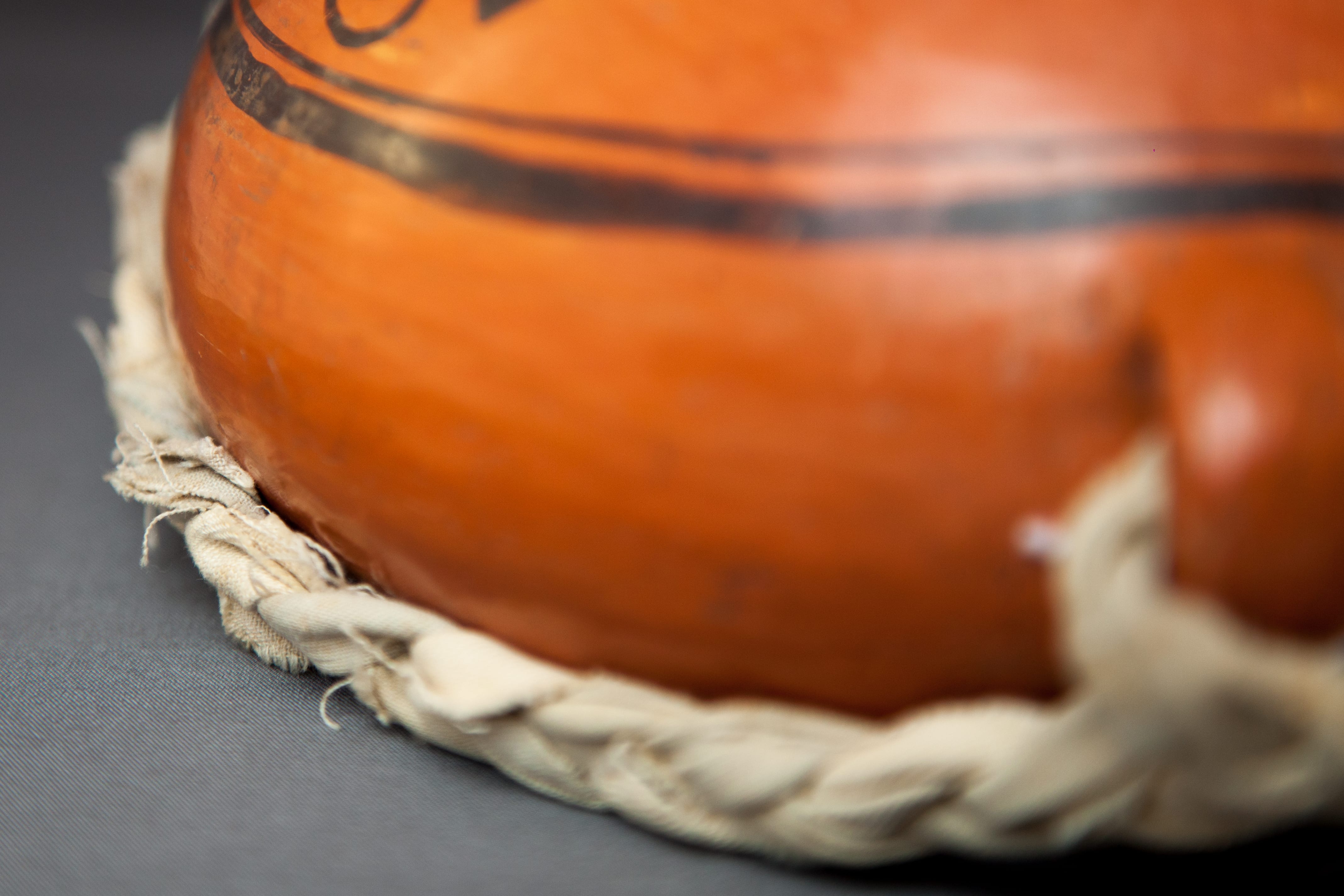
A thin crack extends across the flat back of canteen 2017-05. Because the backs of Hopi canteens are flat and relatively large, internal tensions develop as the clay dries and these flat surfaces often crack when the pot is fired. (See the catalog entry for large water haul canteen 1998-01 for such a crack and the Native repair.) I believe the crack in 2017-05 occurred during firing.
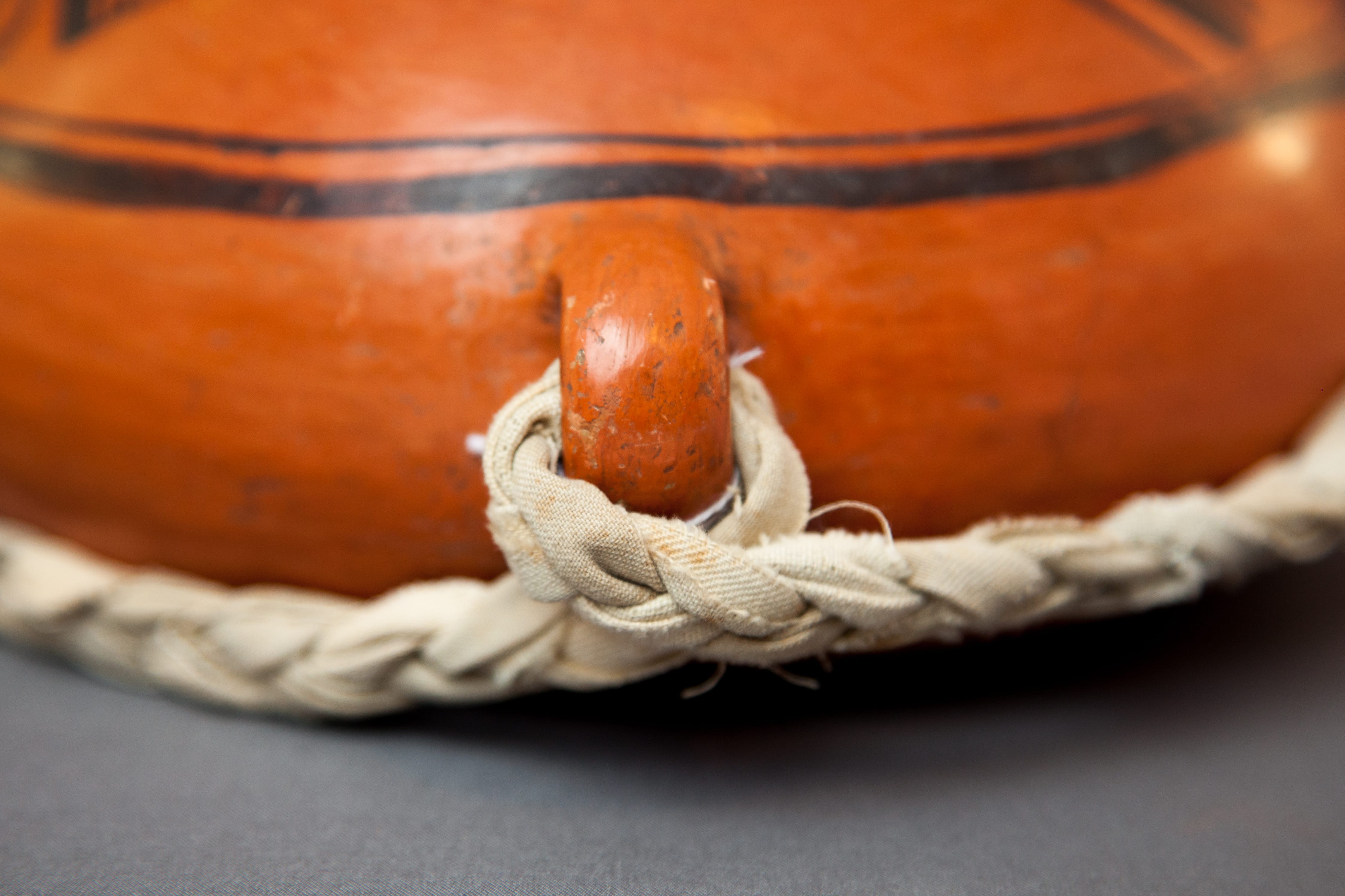
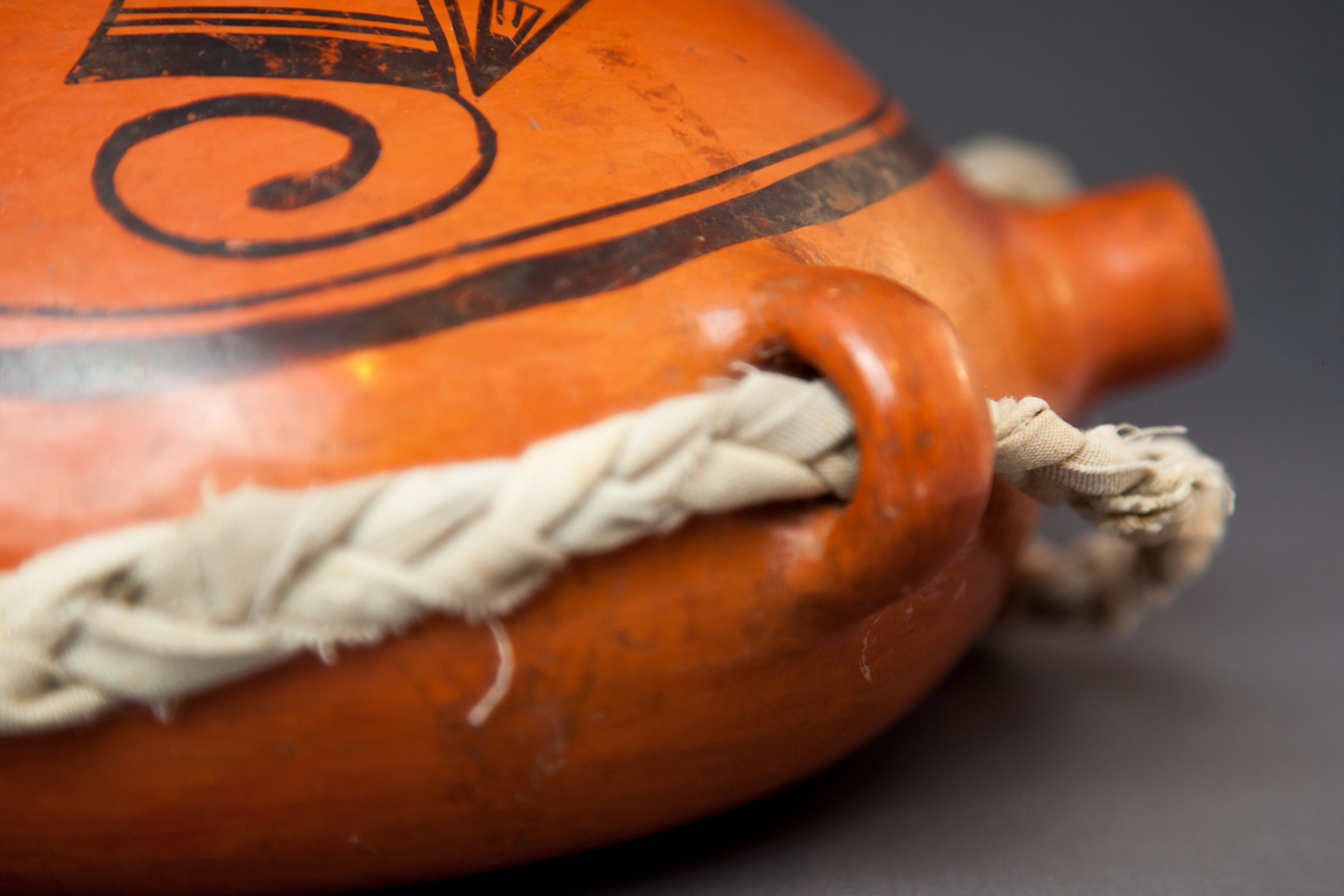
I wove the cloth strap on 2017-05. It is not of Native origin.
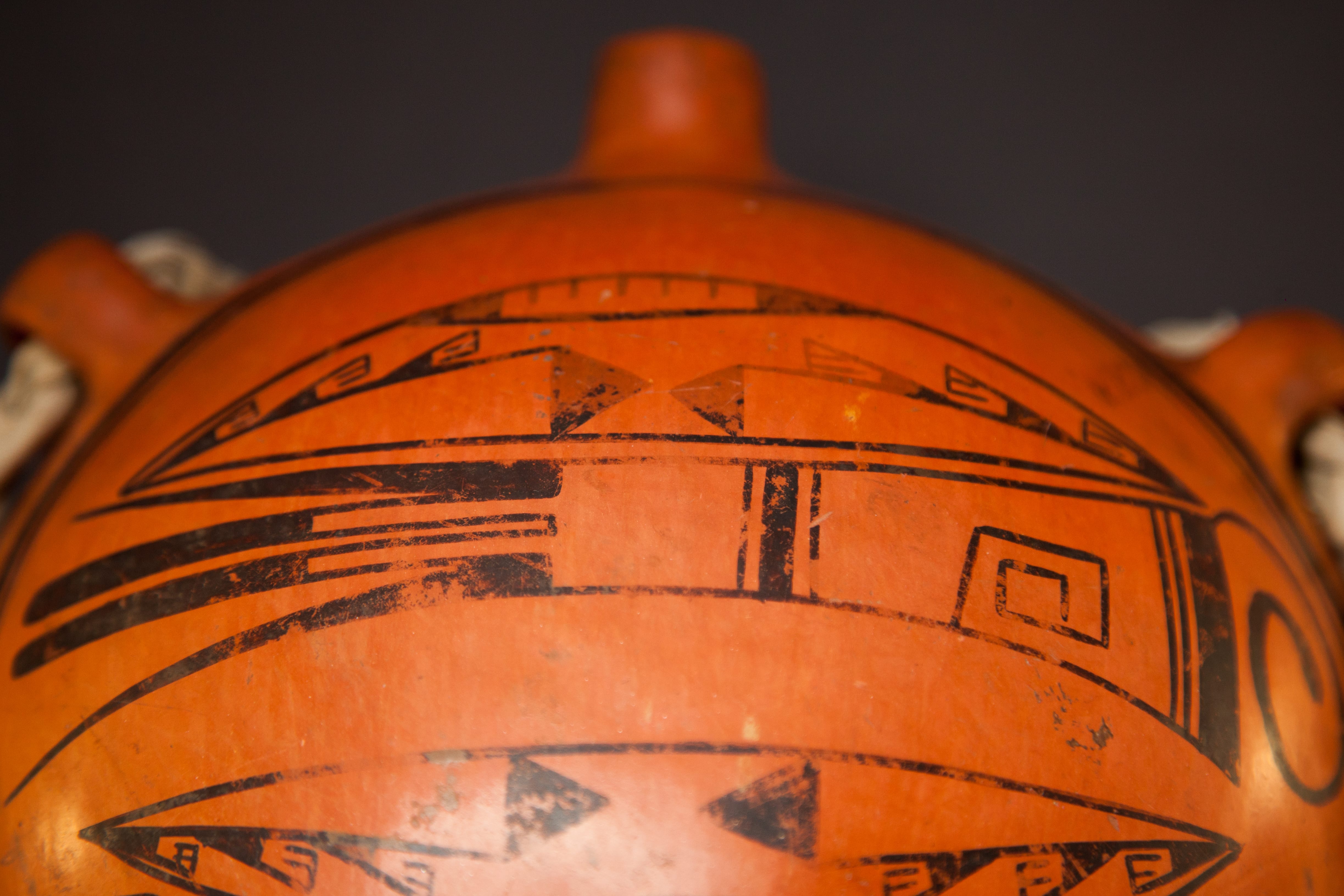
The design on the low belly of this canteen is encircled by two framing lines, the outer one thicker than the inner. Nampeyo treats the painted surface her canteens as if they were convex bowls, hence the order of the framing lines. There are two other elements to the design and each is repeated twice.
Design #1:
The first design is enclosed in a lens (an oval with pointed ends). Attached to one long side are two solid black triangles with their points almost touching. This same configuration is found in the external glyph on Nampeyo’s bowl 2012-21 in this collection. Strung out in a line from the point of the lens to a point on each triangle is a series of three crooks, which may be germination symbols (Patterson, 1994: 152-154). Finally, enclosed in the large lens and attached the wall opposite the two triangles is a smaller solid black lens with an unpainted center. Within this unpainted center are drawn fine parallel lines attached to the framing lens. Collectively these designs form an interesting but somewhat fragmented pattern. Notice that the two versions of this design are identical. If in your mind you a) remove the avian design between the two depictions of design #1, b) move the two lenses together, and c) use the two triangles elements as a hinge, the designs would fit together like a clam shell and the designs would overlap.
Design #2:
The second design is more coherent and reminds me of a bird. Rendition #1 is nearest the spout and “flies” to the right. Rendition #2 is closer to the bottom of the canteen and “flies” to the left.
Bird rendition #1 near the spout: The sides of the body are thin black lines that bow in to create a slightly concave form as they run from head to tail. The head is a curlicue that emerges from the top of the body and circles clockwise. Behind it is one very thick black line and then two parallel thin black lines. Next is a large empty space and placed in the space is a large squared crook that also circles clockwise. Notice that the end of this crook turns back on itself and forms a small square. Notice also that the curlicue head and this large crook emerge from opposite sides of the body. Continuing towards the tail is a somewhat thick line framed by smaller thin black lines, essentially a reordering of the three elements at the base of the head. Finally there is an unpainted area that divides into two linear tails with solid black tips. Flanking these tails are pointed feather elements. Such linear tails with round ends flanked by pointed feathers are a favorite design of Nampeyo and are found on pots 1988-01, 1996-05, 2002-03, 2013-03, 2014-17, 2015-12 and 2019-12, all by Nampeyo and in this collection.
Bird rendition #2, near the bottom: The elements of this bird are the same as its first rendition, but there are small differences, the most obvious is that the two bird forms are “flying” in different directions. Given that these two bird designs are painted in opposite directions, it is optically difficult to compare them. Nevertheless, if the two designs were laid side by side headed in the same direction, the following differences would be noted: a) The version nearest the spout (rendition #1) has a curlicue head that moves in a clockwise direction; in the second version this direction is reversed. b) In rendition #1 the curlicue head emerges from the bottom of the bird’s body; in the second version it emerges from the top. c) In rendition #1 the large square crook bends back on itself to form a square; in the second version this crook remains open.
Is this canteen by Nampeyo?
When deciding if a pot is “by Nampeyo,” I compare its painting to six design strategies that characterize of Nampeyo’s mature style. As developed in “Appendix B,” they are:
1) A tension between linear and curvilinear elements often represented as a contrast between heavy and delicate elements.
The dramatic curlicue heads of the birds provide most of the curvilinear energy of this design. They are in tension with both the thick linear line from which they emerge and the overall forward thrust of the bird’s body. The bowed shapes of the two lens elements are in tension with the linearity of the bird bodies, especially the linear tails.
2) A deliberate asymmetry of design.
Most obviously the two birds fly in different directions. The two designs alternate position such that the pattern cannot be folded so that similar designs align with each other. The two bird images are slightly different.
3) The use of color to integrate design elements.
Nampeyo paints her red-slipped pots with monochromatic designs, so this criterion does not apply to this canteen. “Color” is supplied by the slip, not the design.
4) The use of negative (empty) space to frame the painted images.
There is notable empty space at the 12 and 6 o’clock positions on the face of the canteen, but otherwise the design is unusually crowded within the framing lines. This crowding reduces the visual power of the design.
5) The use of thick above thin framing lines on the interior rim of her bowls.
Thick and thin framing lines surround this design, though their order is reversed because of the concave surface on which they are painted.
6) Nampeyo’s painting is confident, bold and somewhat impulsive compared to the more-studied, plotting and careful style of her daughters, descendents and other Hopi and Hopi-Tewa potters.
As I always point out, this is both the most critical and yet also the most subjective of the criteria I use to judge a pot. On this canteen the framing lines are not perfectly drawn. Particularly on the thin line you can see where the painter ended and then renewed her brush stroke. Nevertheless, the other elements are painted with confident lines that are characteristic of Nampeyo. Overall the four designs have great energy that seems constrained within the framing lines, much as a bomb has energy within its shell. The subtle differences between the two bird designs are evidence of Nampeyo’s tendency to improvise as she developed the design of a pot.
In short all of the five relevant markers of Nampeyo’s painting style are found on canteen 2017-05, but in somewhat muted form. This is not an exceptional example of her work, but her hand is clearly evident.
The curlicue heads are the most distinctive and unusual feature of this design, and its shows up on at least two other pots identified as “by Nampeyo.” The Milcent Rodgers Museum in Taos, N.M. holds the Maria Martinez family collection of pottery, but until 2013 they did not own a pot by Nampeyo. In June of that year they announced the purchase of their first Nampeyo pot, a jar with two curlicue-headed birds as its central design. (Photograph on file.) Currently Mark Sublette’s Medicine Man Gallery offers a Nampeyo jar for sale that also features curlicue-headed birds. (Photograph on file.) To my eye, the bird images on these two pots are simpler, chunkier and more disjointed than the birds on canteen 2017-05.
In January of 2003 I bought a small, unsigned and round-bottomed Hopi jar because I was intrigued by the quality of the painting and the usual decoration: two curlicue-headed birds (2003-01). Until canteen 2017-05 focused my attention on this design, I had not considered that Nampeyo might be the maker of that small jar. Now I will reconsider. The design on 2003-01 is not as elegant as on canteen 2017-05, but is finer than the curlicue birds on either the Milcent Rodgers or Medicine Man jars.
In short, as the result of the design analysis of canteen 2017-05, another 3-lug canteen identified as “by Nampeyo,” and additional examples of her use of curlicue-headed birds, I am convinced that canteen 2017-05 is by Nampeyo.
The shape of this canteen is eccentric and the execution of the design is not the best example of Nampeyo’s work, but canteen 2017-05 is a fine addition to a collection that seeks to document the full range of her work.
