
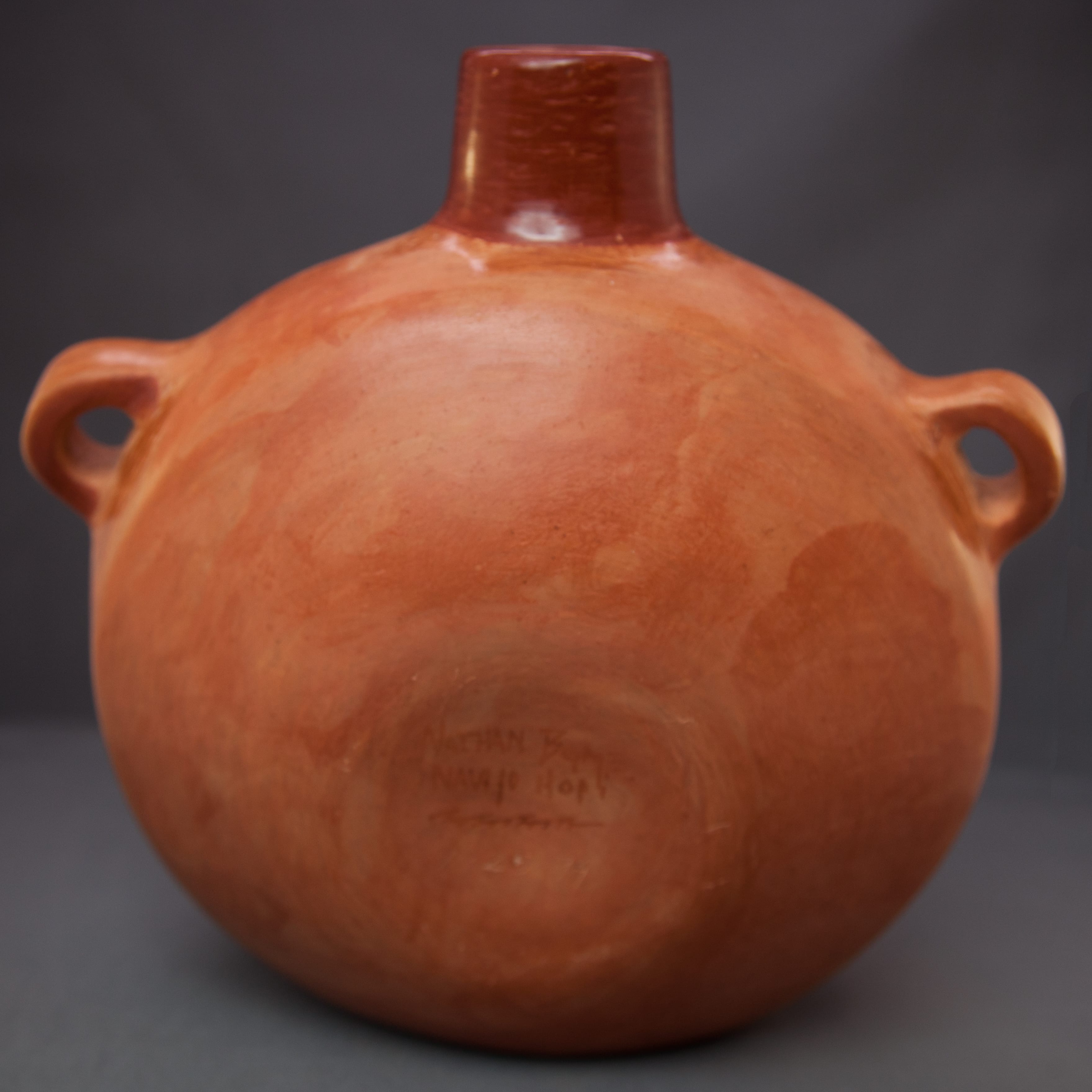

This canteen carries a magnificent, detailed and unsettling image with a blessing message.
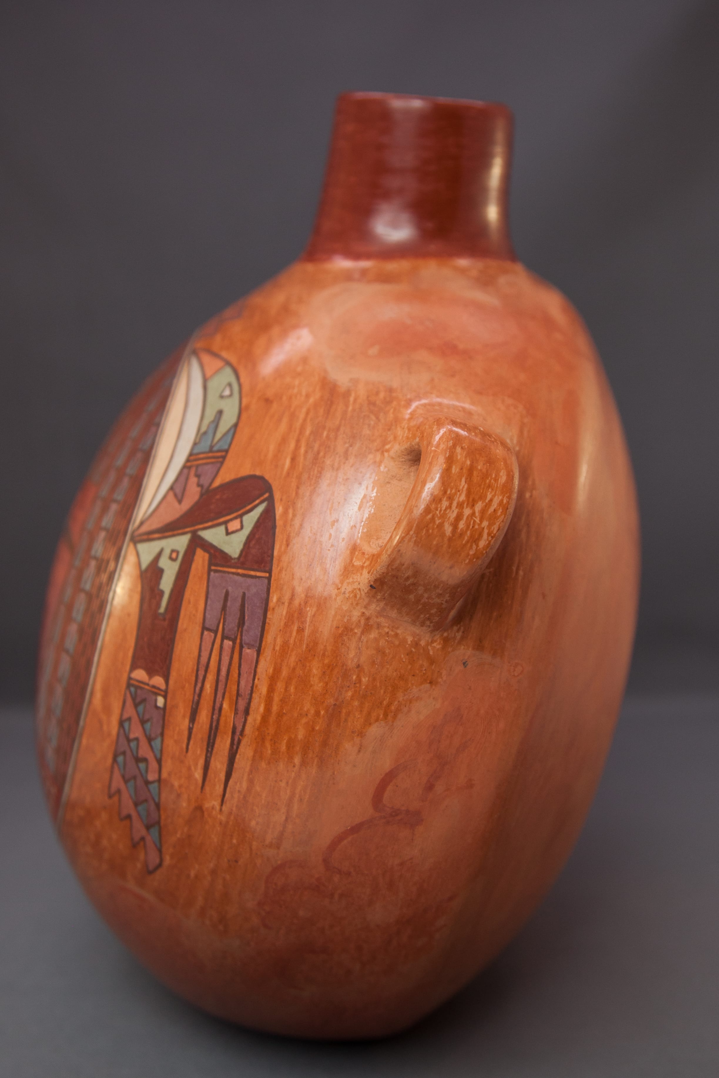
While this pot has the bulbous shape of a typical Hopi canteen, Nathan made the bottom flat for ease of display. Judging from the interior of the spout, the raw clay fired a pale brick red and may be commercial. Much of the unpainted surface has been stone polished to a rough luster, but other unpainted surfaces remain unpolished, for example between the handles and the spout. As described below, Nathan intended that these “buff swirls” (the polished areas?) to represent clouds.
The handles remain unpainted, though polished.
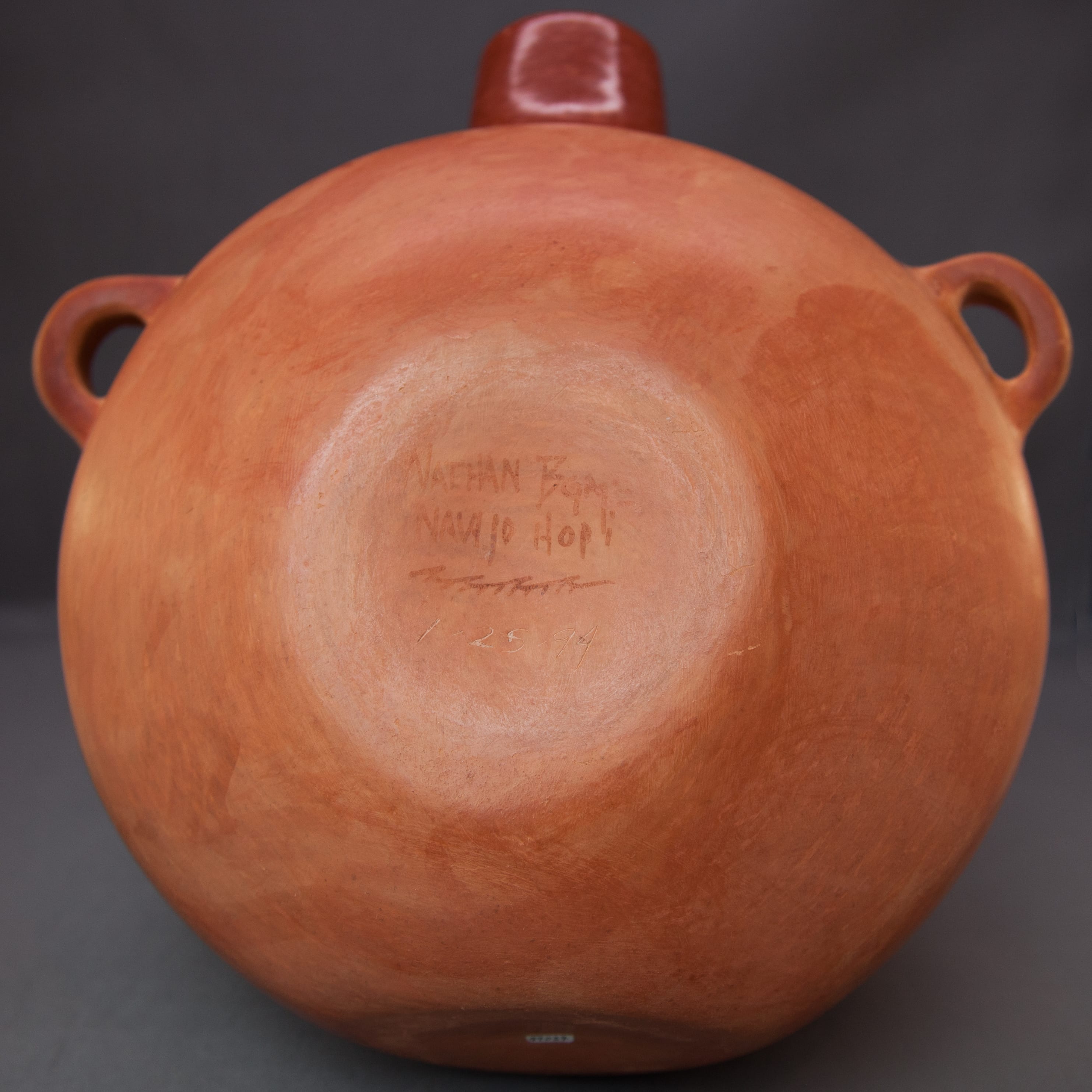
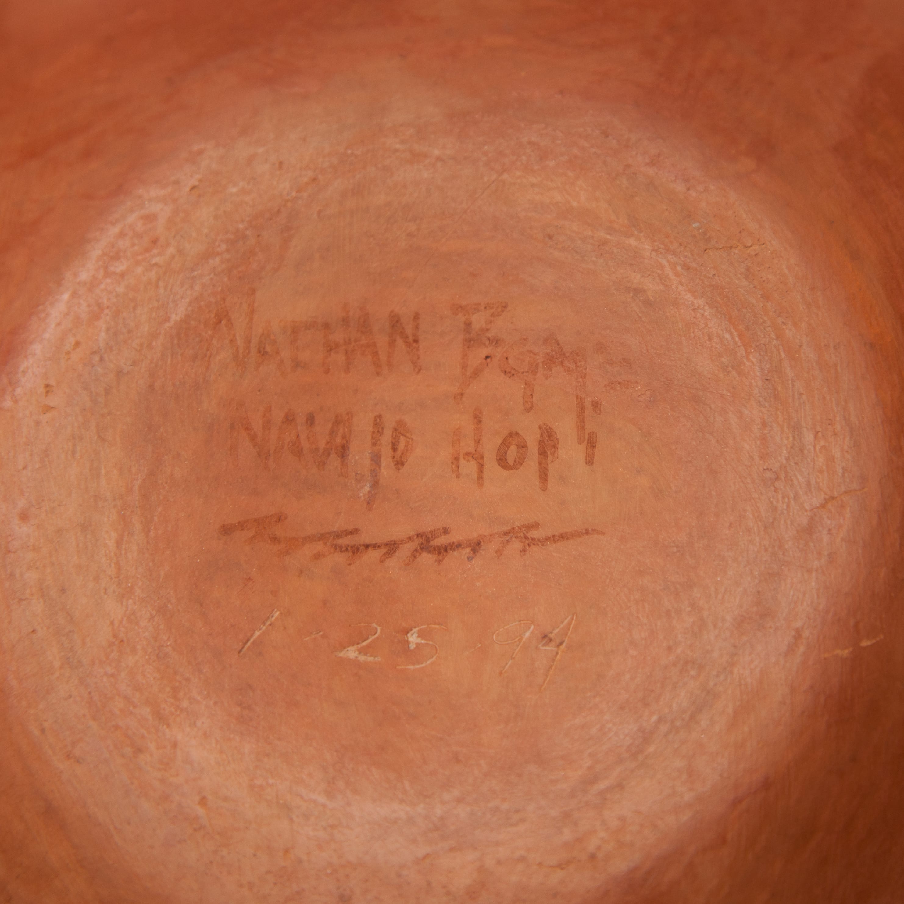
The canteen is signed on the back:
Nathan Begaye
Navajo Hopi
////
1-25-94
The Painted design: Hair
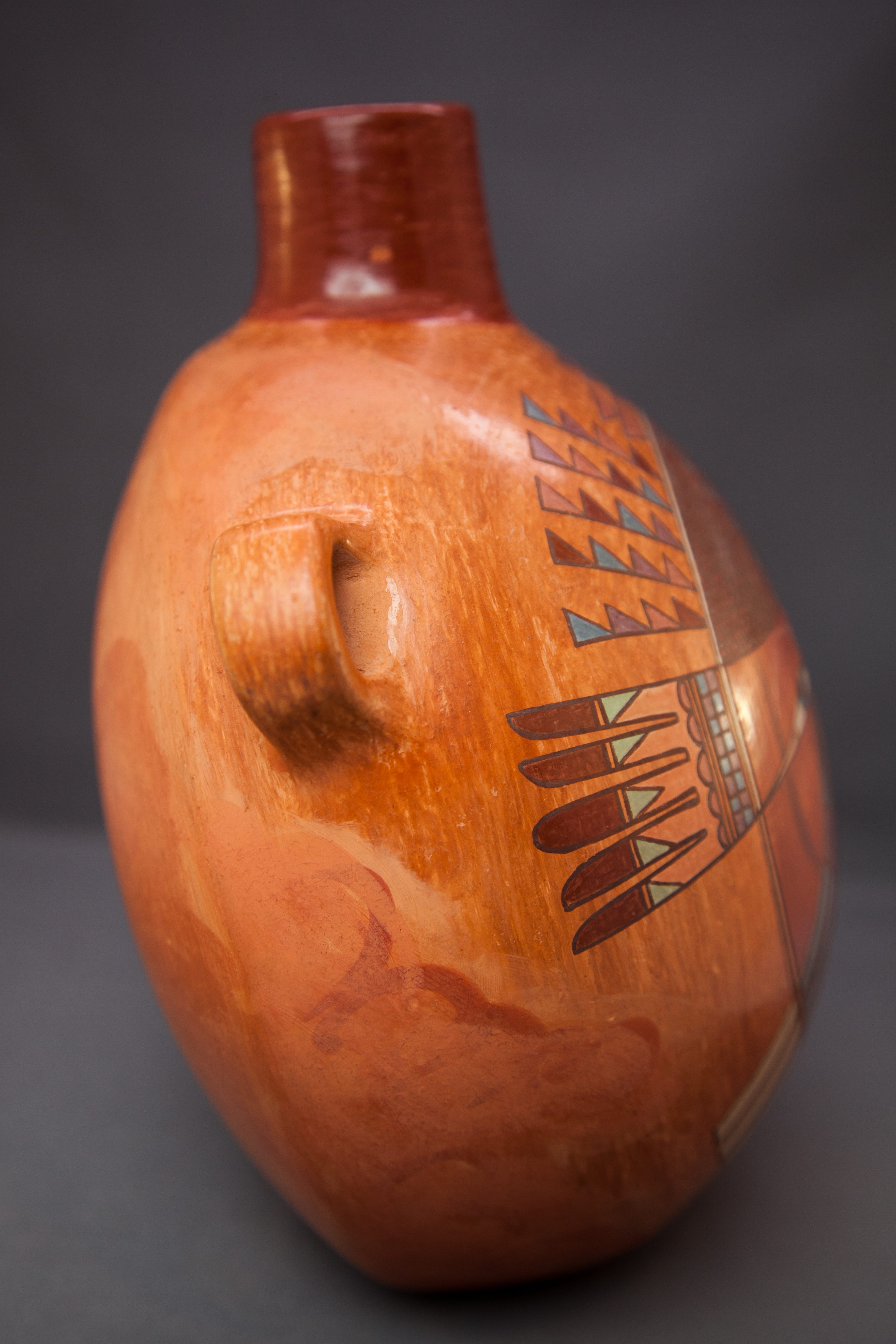
The neck of the canteen is painted red with only a small fleck of missing paint..
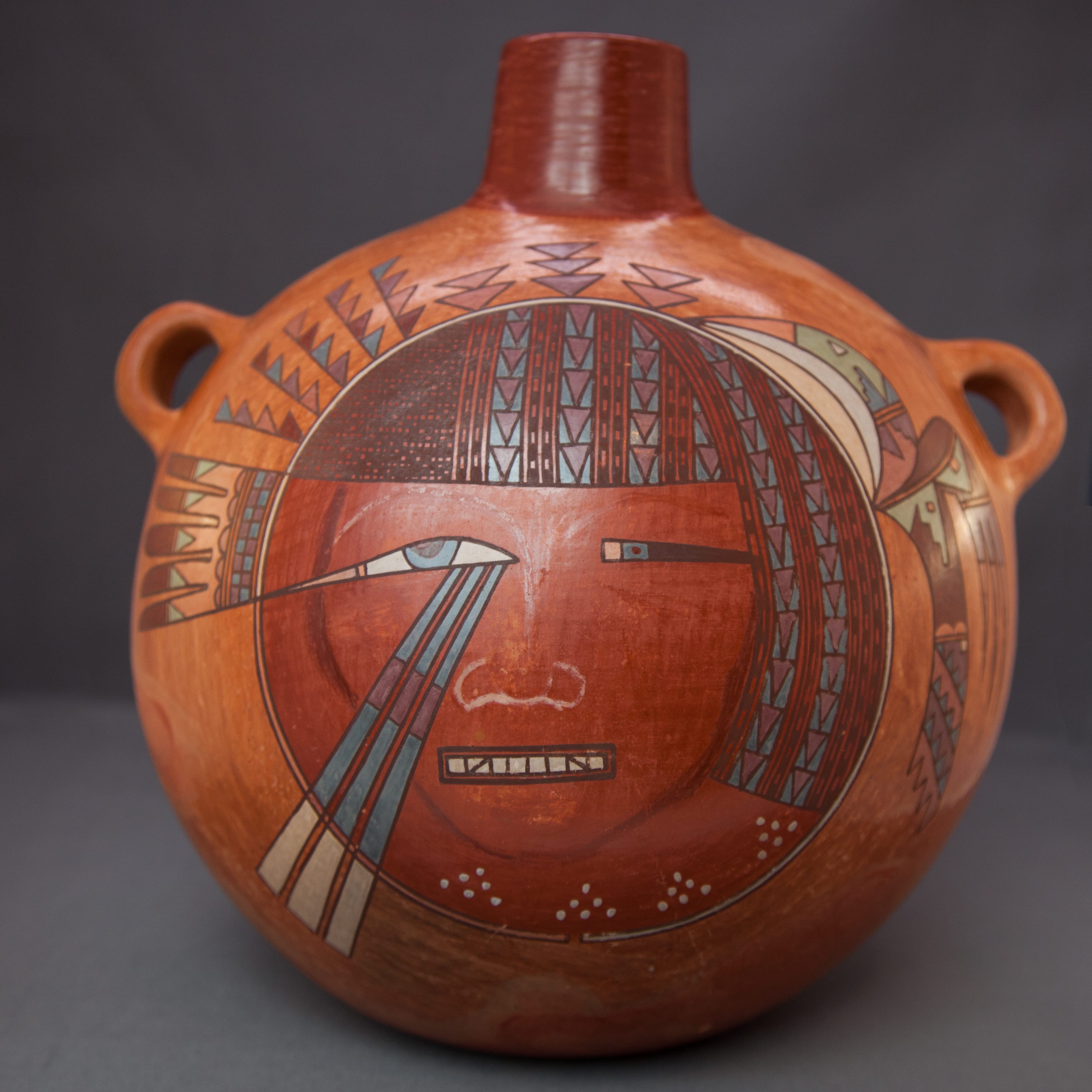
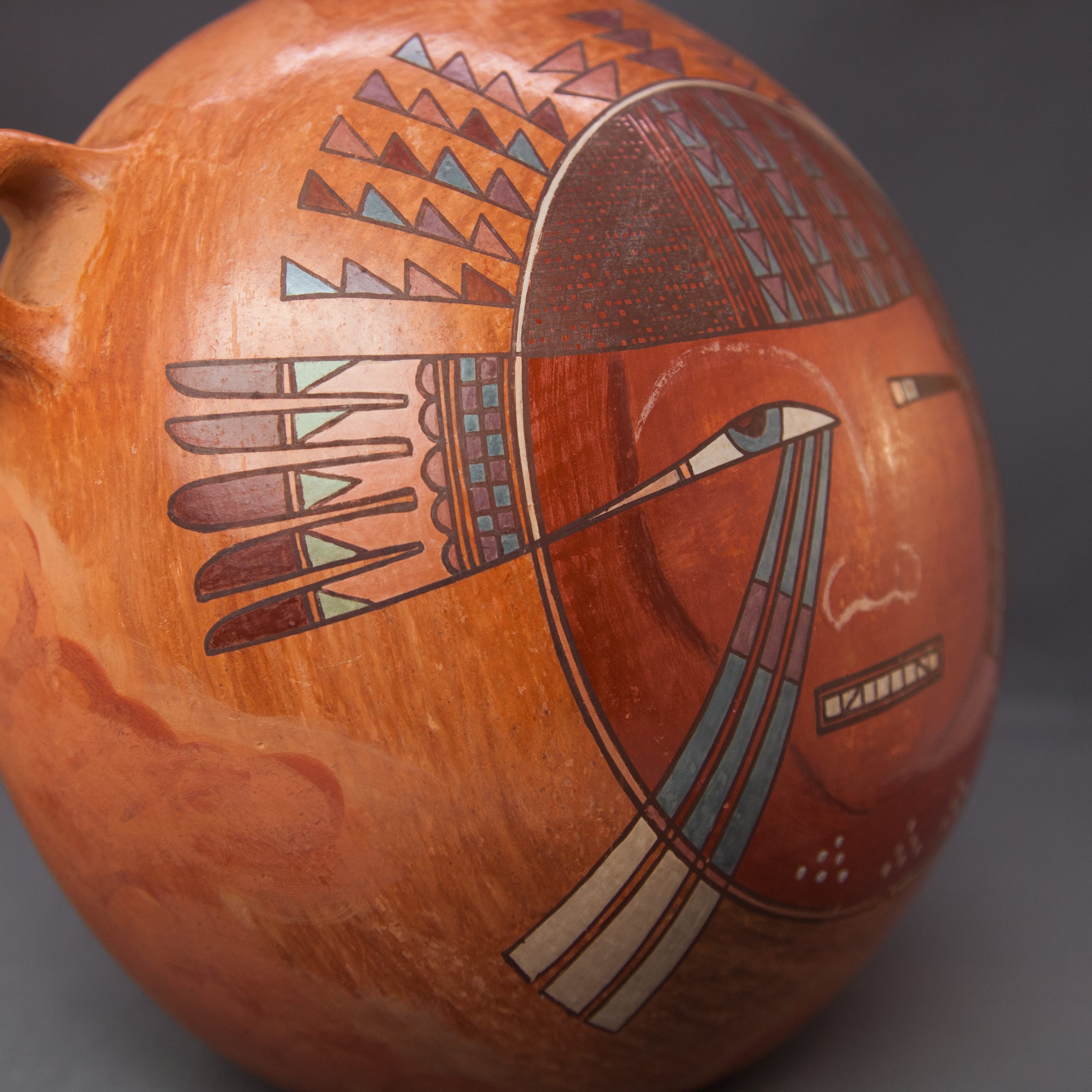
The power of 2017-06 is its painted face. The face is bounded by two perfectly round thin framing lines with the tiny area between painted white. A shield-shaped visage is outlined in dark red and looks directly at us from an elaborate framing coiffure. Done in the style of ancient Egypt or perhaps African cornrows, the imagination of this design and its execution are the finest ever realized on a Hopi pot. I know this sounds like hyperbole, but take a closer look. Only other work by Nathan (2018-10) or the work of Jake Koopee may be comparable (2013-08). The overall impression is like a richly-woven cloth.
The left-most section of hair has a cross-hatched pattern of about 30 columns and 40 rows in an area of about 1.75” by 1.5”. The resulting cells are irregularly unpainted and filled with black paint..
The rest of the hair is indicated by two design motifs painted with some variation. First is a 5-lane “highway” reminiscent of a design element frequently used by Nampeyo. The first, third and fifth lanes are monochromatic red and thus highlight the remaining two lanes that are filled with 14 cells, alternating sections of red and black paint.
This element is repeated four times across the forehead and alternates with the second design: columns consisting of purple triangles painted against a blue background. The fourth column of this design is substantially hidden by a long lock of hair that flows from the top and down the head, ending about level with the mouth.
No fundamentally new design elements are introduced in this long expanse of hair. The red and black four-lane “highways” continues in slightly modified form: two undecorated red lanes, followed by one lane with alternating black and red cells and ending with an undecorated lane. This pattern is repeated twice and ends with an eight-lane section alternating solid red and painted lanes. Similarly, columns of purple triangles painted against a blue background are repeated twice In this longer expanse of hair.
Perhaps this complex hair pattern can be summarized by grouping the design into pairs of design elements: the first and second design patterns seen together. This pair is repeated six times across the face, ending with a single but expanded example of the first element.
The painted design: face
In a letter of attribution (reprinted below), Nathan identifies this face as the full moon in winter.
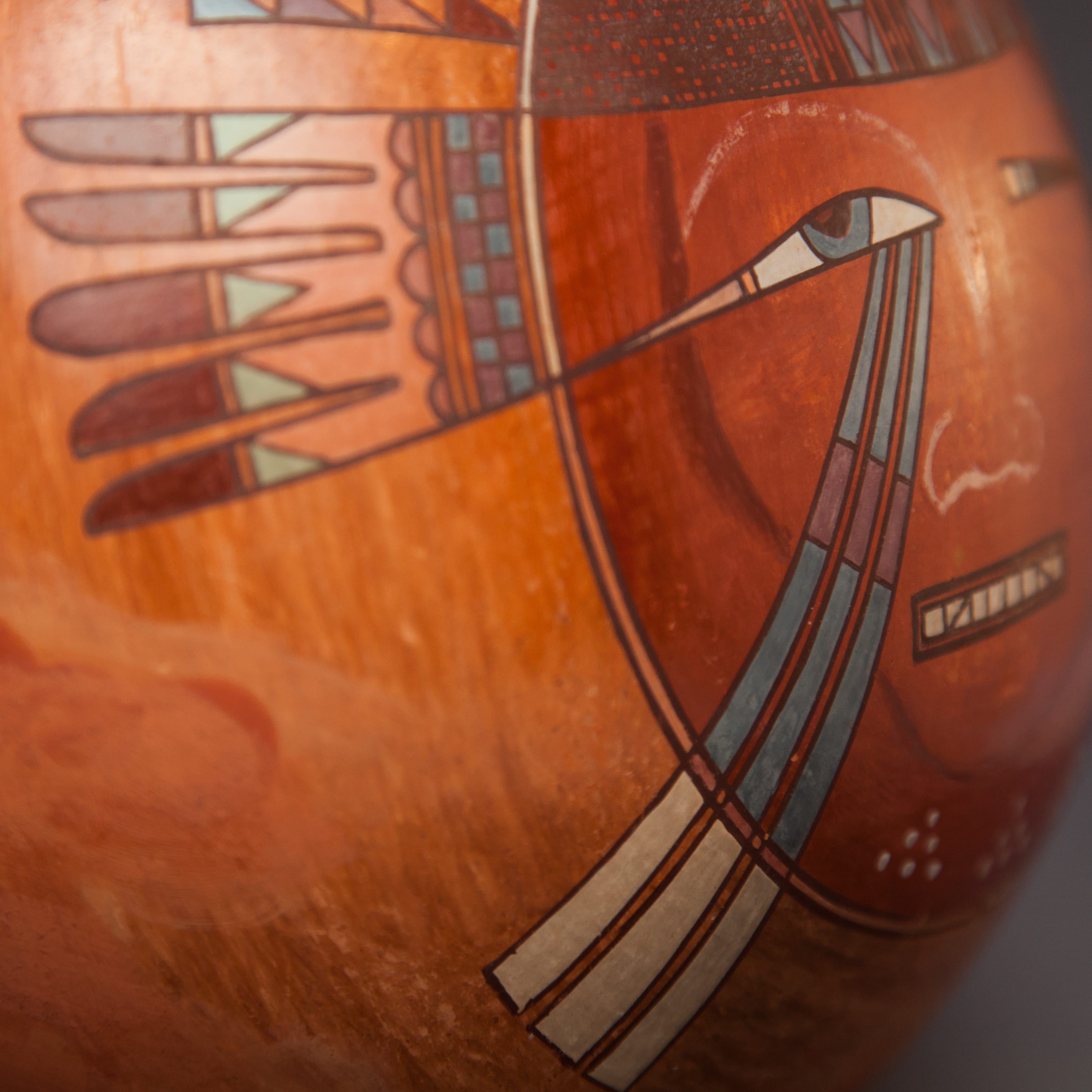
From the viewer’s point of view, the left eye is large and detailed and realistic and takes the form of a left-skewed “normal curve.” The shape is reminiscent of the Egyptian “Eye of Horus,” representing protection, power and health. The black pupil is surrounded by a blue iris, all against a white background. A small yellow area fills the left edge of the eye. The skewed tail continues outside of the plane of the face and evolves into a feather decoration. The right eye has quite a different form: small, linear and slit-like. The left two-thirds is black. To its left is a square blue iris with a small black center, followed by a square of yellow. The layout and use of color is the same in both eyes, but their size and form are dramatically different.
The nose of the face is indicated by a minimal light white line that continues upward to form the eyebrow of the left eye. The right eye has a simple arch as an eyebrow, but this is almost invisible since it is painted with the same red paint that forms the skin color of the face. The mouth seems a bit fierce to me. It is formed by two black rectangular boxes enclosing eight white teeth; the second and seventh teeth are bisected by a black line. Three blue rays emerge from the left eye and turn white as the cross the edge of the face. Below the chin but still withing the circle of the moon are three triangles, each formed by seven white dots.
The painted design: tabula
Outside of the circular framing lines of the face are four designs worn like a kachina tabula. On the left, originating from the extension of the eye is a fan of five feathers. The base of the fan consists of two rows of eight purple and blue squares, each column starting with a different alternating color so that, left to right, the pairs alternate purple/blue then blue/purple, etc. Above this is an unpainted two-lane highway surmounted by a row of five purple half rounds. Above each round is and unpainted area that divides into five tubes that form the shafts of the feathers. Blue triangles follow, with the lower two scalene triangles pointing toward the base of the canteen and the upper two pointing toward the spout. The center arrow features a blue isosceles triangle. Two black lines then fame a single-lane road, followed by long purple tips. The bottom two tips are flat on the bottom, the top two are flat on the top. The middle arrow has a fully rounded tip. The variation in color and form give this fan design energy and attract the eye.
Next along the edge of the face are five flagpole-like elements with four scalene triangles flying like flags filling all available space on the hidden pole. The flags are red, pink, purple and blue with a different order used on each flagpole. They remind me of the flags I’ve seen in movies with a medieval setting: colorful and proud.
Moving clockwise, we find three stacks of triangles, the middle stack (painted purple)composed of three isosceles triangles pointed down towards the head, the outer two stacks (painted pink) containing two such triangles. These triangles sometimes represent women (Patterson, 1994:253), though Nathan offered a different explanation (see below).
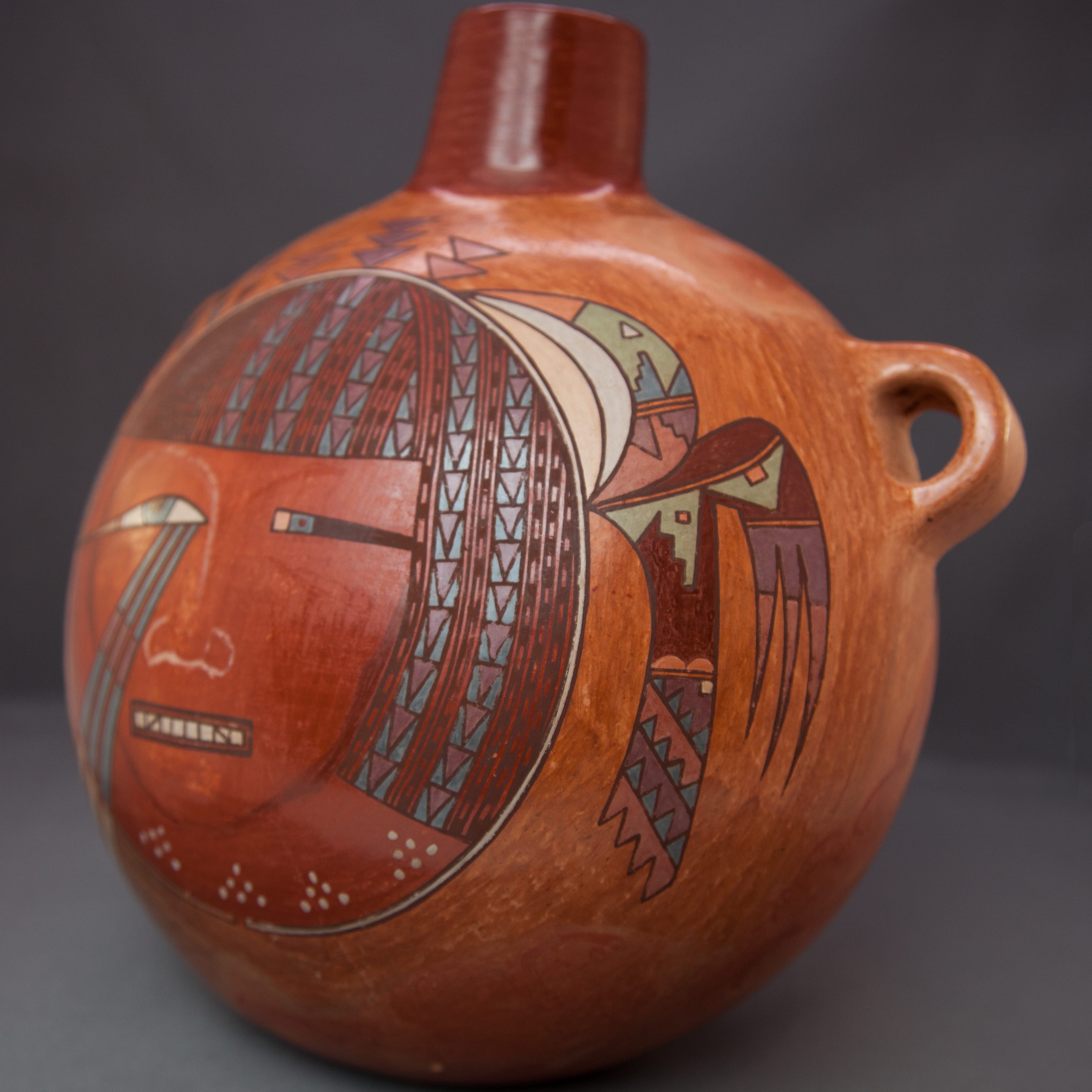
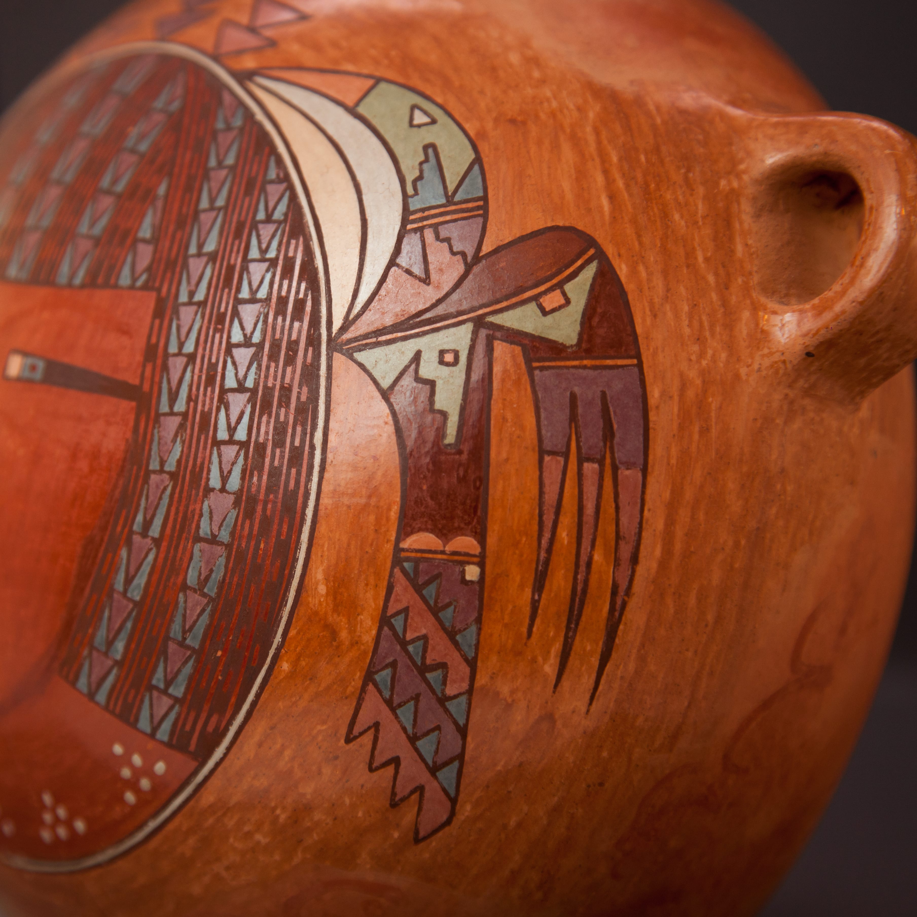
Finally, perched on the right side of the moon is an elaborately-conceived bird with a long, curved head. Two crescents are placed between the round edge of the moon and the bottom of the head, one yellow and the second light blue. The head displays a pink bill, followed by a green face mask with a triangular white eye. at the base of the head is an unpainted two-lane “highway,” and on either side of it are a stepped rain cloud and a scalene triangle. The set closest to the head is painted darker blue and the rain cloud is to the left of the triangle. The set closer to the body reverses this order and is painted purple. Below, this same triangle/stepped-cloud imagery (in pink) forms as residual mirror image of the purple rendition.
The top edge of the wing is red and has the same shape as the left “Eye of Horus” on the moon face. Following another one-lane highway buffer, is a fourth and green rendition of the rain cloud/triangle elements, though this time the triangle is isosceles. To the right is larger isosceles triangle, also painted green. Both the green stepped rain cloud and the green isosceles triangle incorporate small pink squares.
Below these green elements is an irregularly-shaped red area whose upper edge mirror the elements above it. This red form becomes the body of the bird and forms the base of the wing. On the body, the red area ends with two small pink hills sitting on another of those one-lane highways. The tail begins at this point and consists of four rows of triangular flags as on the crest of the head, but here set at a diagonal. Three sets of flags are entirely blue and are set against alternately purple and pink backgrounds. The last set of flags is implied, forming the jagged edge of the tail. In the purple background above the flags nearest the body is set a small pink square that visually ties to the two similar squares on the wing.
Finally the wing tip is built on that irregular red form, the base of the wing tip a one-lane highway followed by a purple area that divides into three feather elements. Pink pointed tips complete the feathers.
The painted surface on this canteen is about 9.5” by 7”. Within that small area Nathan developed an unusually complex original design painting elements that range from small to microscopic in size. The design is balanced but not at all symmetrical. Common elements help tie the design unto a unified whole. Nathan used seven colors of natural slip paint on this canteen: black, red, blue, pink, yellow, white and green, far more colors than used on any other pot in this collection. This is an extraordinary achievement by a master potter.
Generally Hopi and Hopi/Tewa potters do not paint designs with narrative meanings. The monikers applied to common designs (i.e. “migration pattern”) are the result of market pressure to entice collectors but do not have Native roots. Sometimes Nathan was the exception to this rule and intended narrative meaning (cf 2014-04 and perhaps 2015-02). In the case of canteen 2017-06, he intended meaning.
The previous owner of the canteen, Betty Melaver, purchased canteen 2017-06 from Robert F. Nichols Gallery in Santa Fe. Margret M. Rea, an employee of the gallery, wrote Ms. Melaver the following note. I received the note with the canteen (on file). Apparently the Melavers were in Santa Fe for Indian Market.
August 22, 1994
Dear Mr. and Mrs. Mclaver,
Nathan Begaye came into the shop after you left today and he offered a more detailed description of the canteen you purchased.
The slight imperfection on the neck was caused during the firing. A shard protecting this pot in the fire probably fell and hit the canteen.
The designs on the canteen represent several things. The face is representative of the full moon in winter, with moon rays shining from the left eye. The triangular shapes above and around the face are snow clouds. The white dots below the face represent snow kachina maidens. The parrot on the right is shown because parrots are thought to bring moisture to the South. To the left of the face, the tail of a rain bird is depicted. The buff swirls on the back and sides are clouds.
We hope you will enjoy your new canteen.
Sincerely,
Margaret M. Rea
Nathan was a potter of immense, impatient talent who produced an extraordinarily diverse range of pottery. His style was directly influenced by his turbulent life. (See especially the catalog entries for pots 2013-01, 2015-02 and 2017-07 for his biography). I encourage the reader to view his pottery in this collection as a group to see the range of his work, before savoring the aesthetic of each piece individually.
