
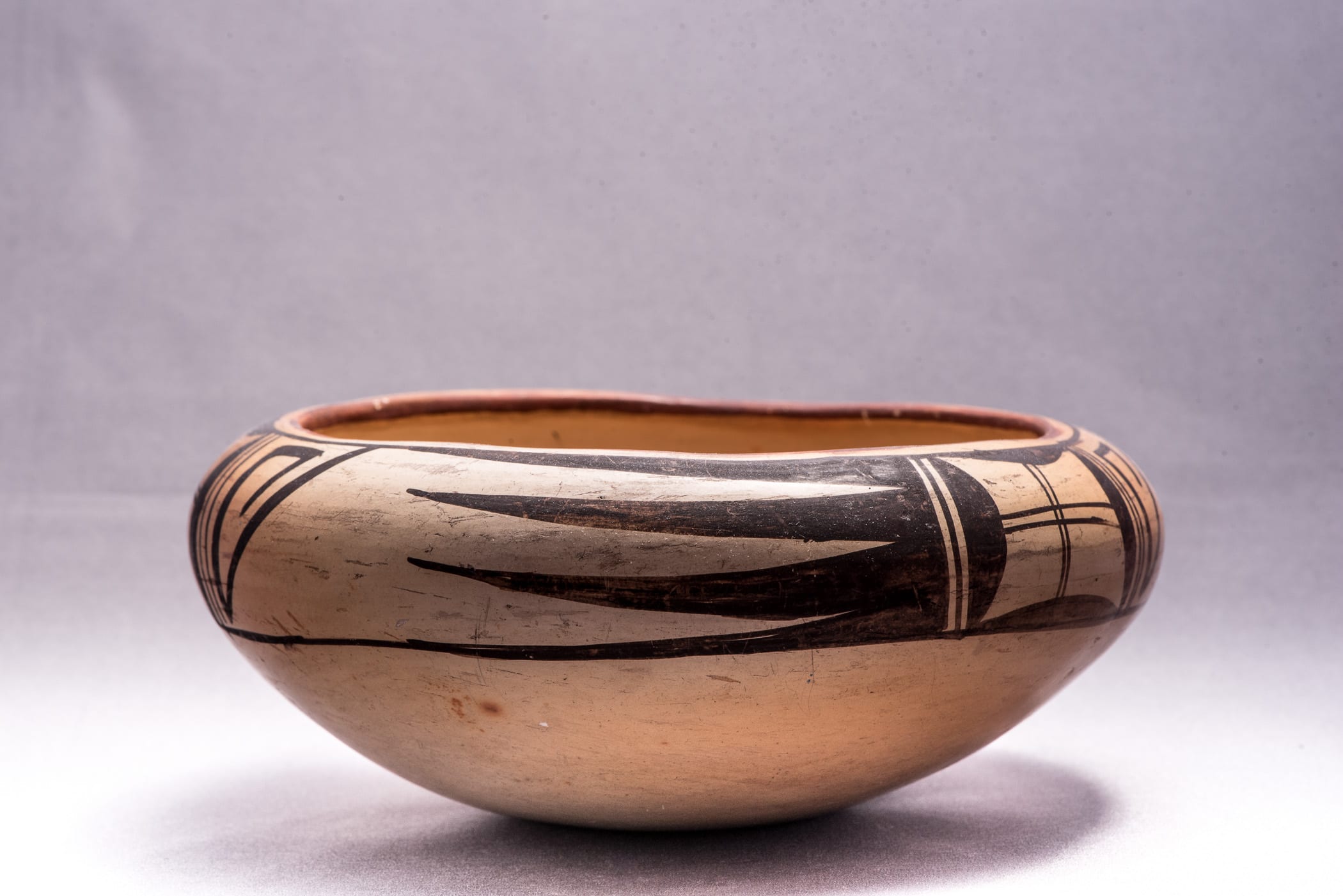
Both the form and painting of this bowl are unusual and complicated, which not only intrigues the eye but also gives the pot a special place in this collection. I believe that Nampeyo probably formed and painted this bowl, which gives this discussion a bit of gravitas.
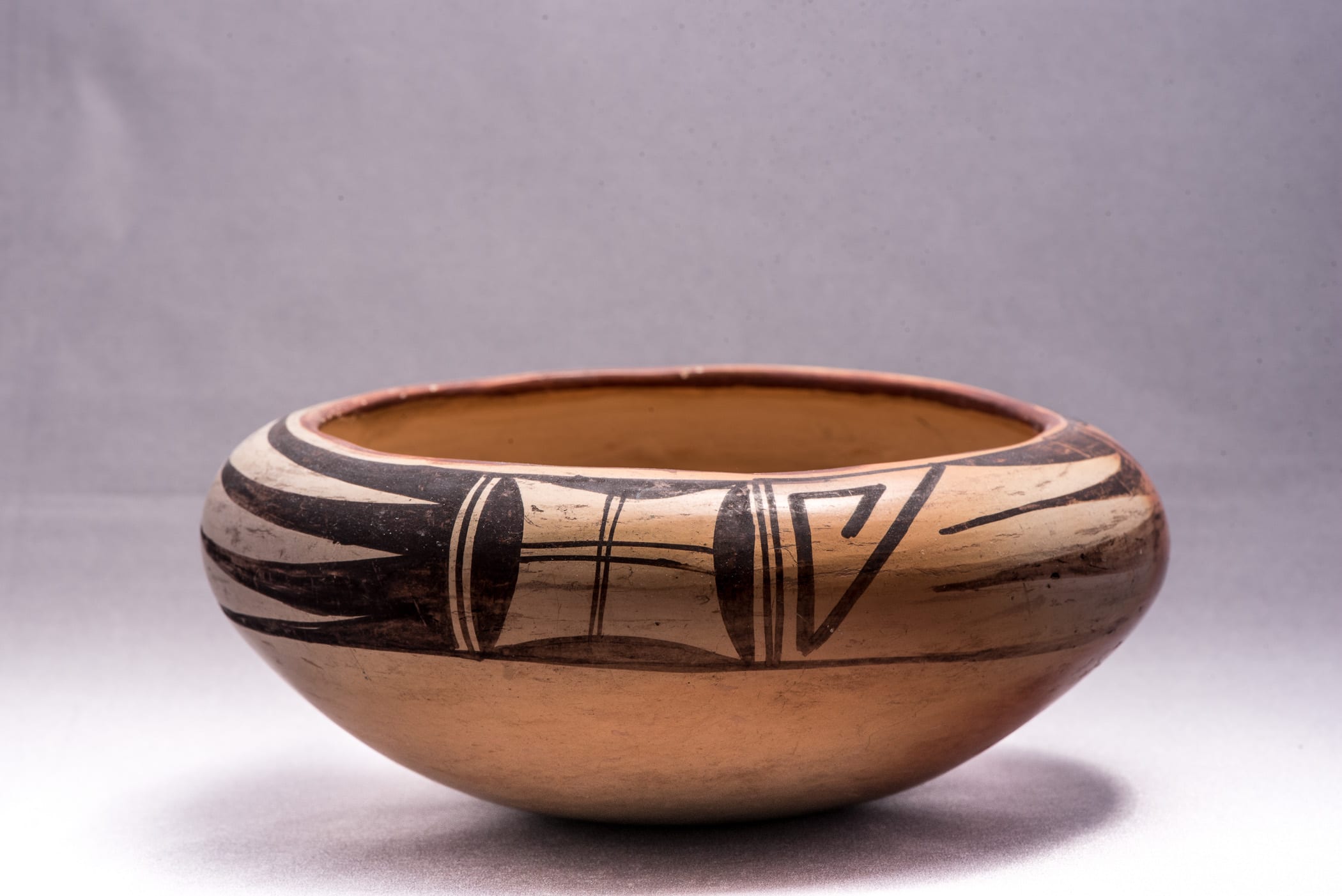
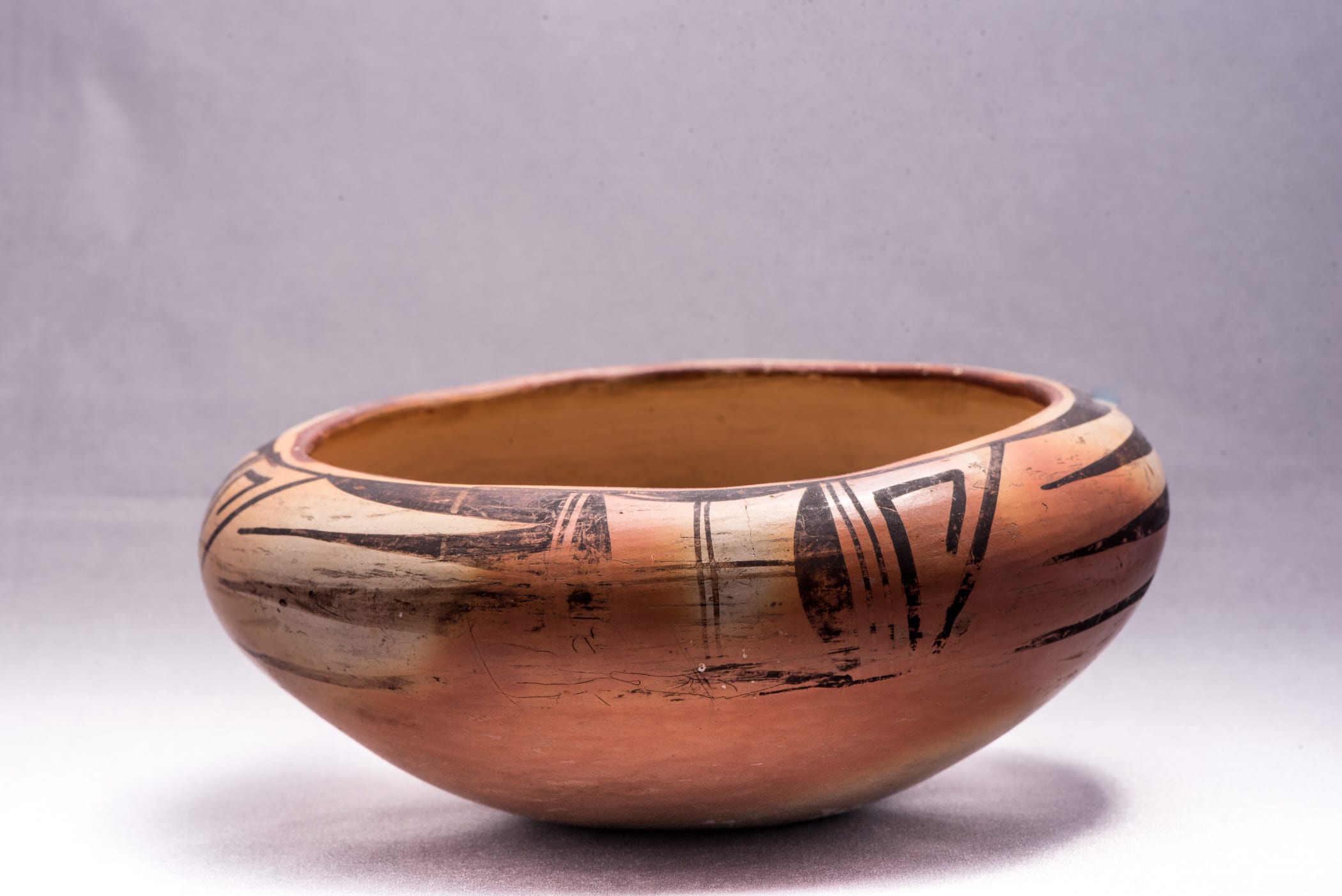
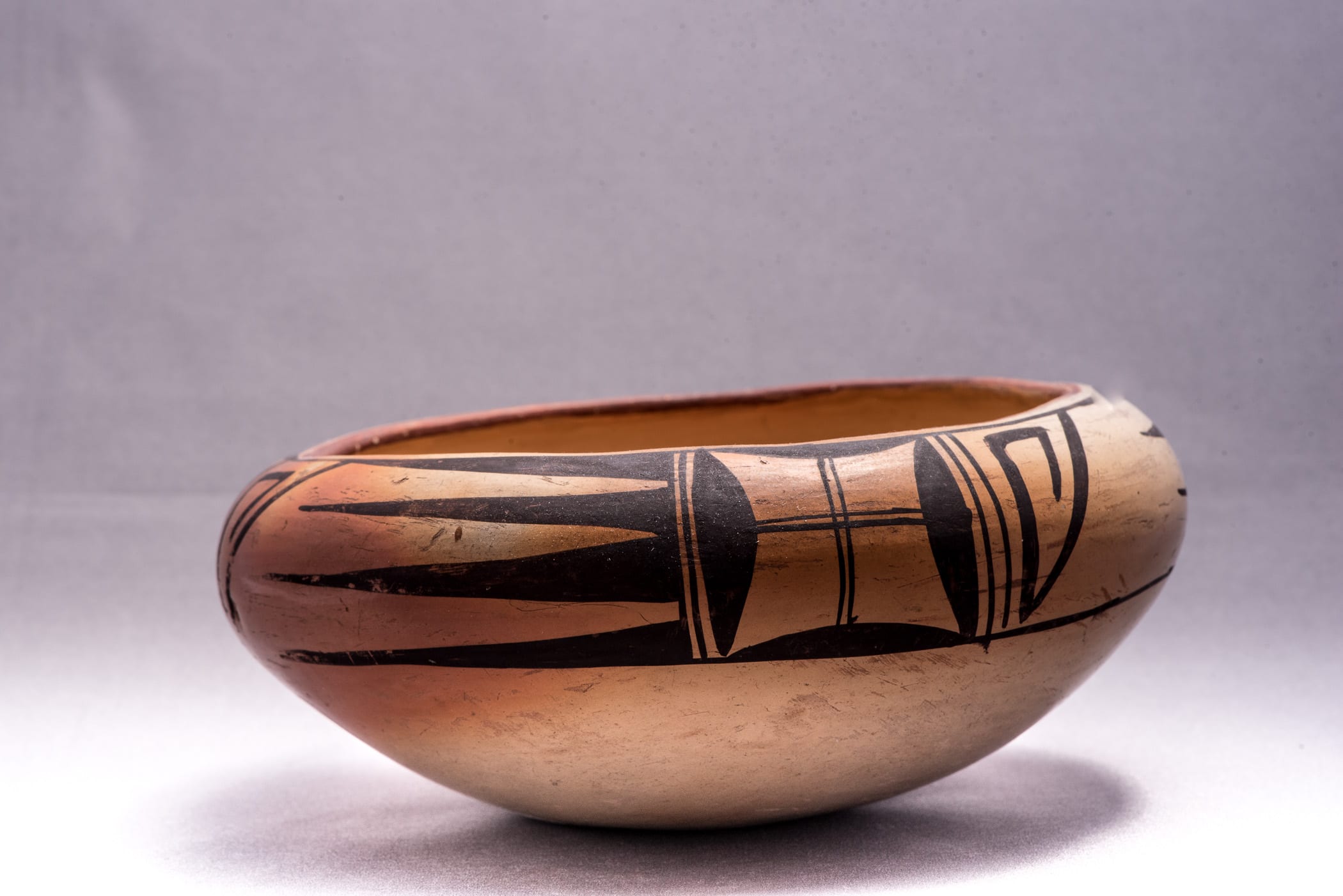
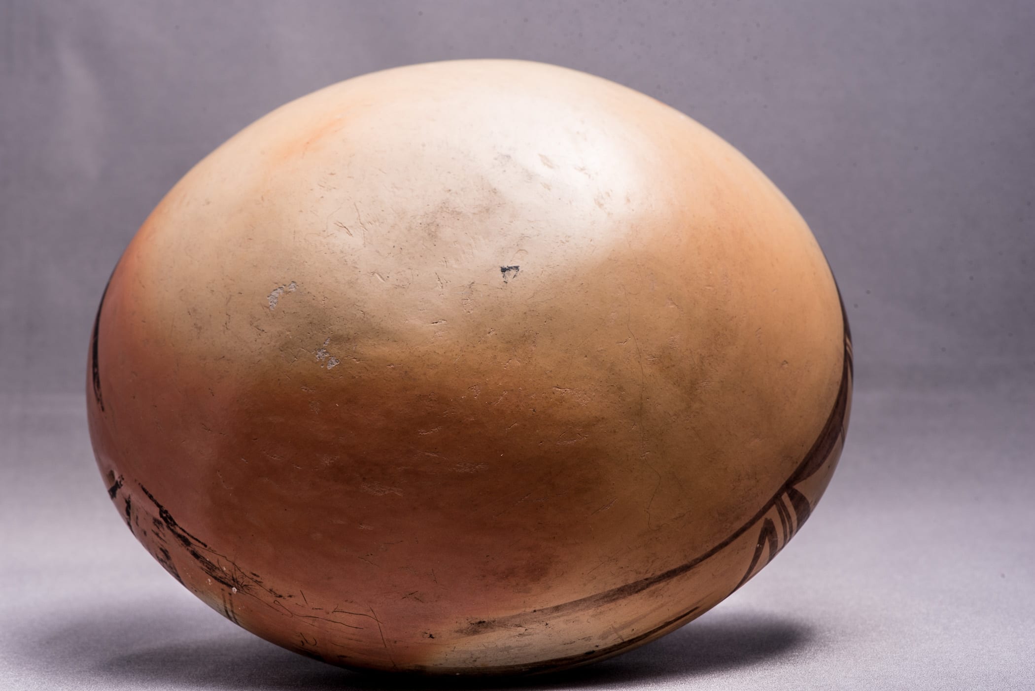
This small bowl has a notably thick bottom that was probably formed in a puki. It seems that this section ends at about the point where the decoration begins on the exterior, with thinner walls rising from this point and ending with the incurved rims. The body of the bowl was slipped with a fine-textured clay that was stone-polished and has allowed the slip to adhere with almost no flaking. (In this it is similar to Nampeyo pitcher 2012-08 in this collection.) Only in a couple of very small areas on the bottom exterior has the slip flaked, allowing a view of a rougher-textured, gray clay body beneath. This slip appears to be lightly micaceous, which is particularly noticeable on the interior. The inside curve of the rim is so narrow that it was not sanded as smoothly as the rest of the bowl. This surface of the inner curve is much lighter than other areas, perhaps because it was protected from the heat of the fire and did not blush at all. This area also seems to lack the micaceous slip. A thick rim coil characterizes Nampeyo bowls, but that criterion is irrelevant here given the incurved form of the rim.
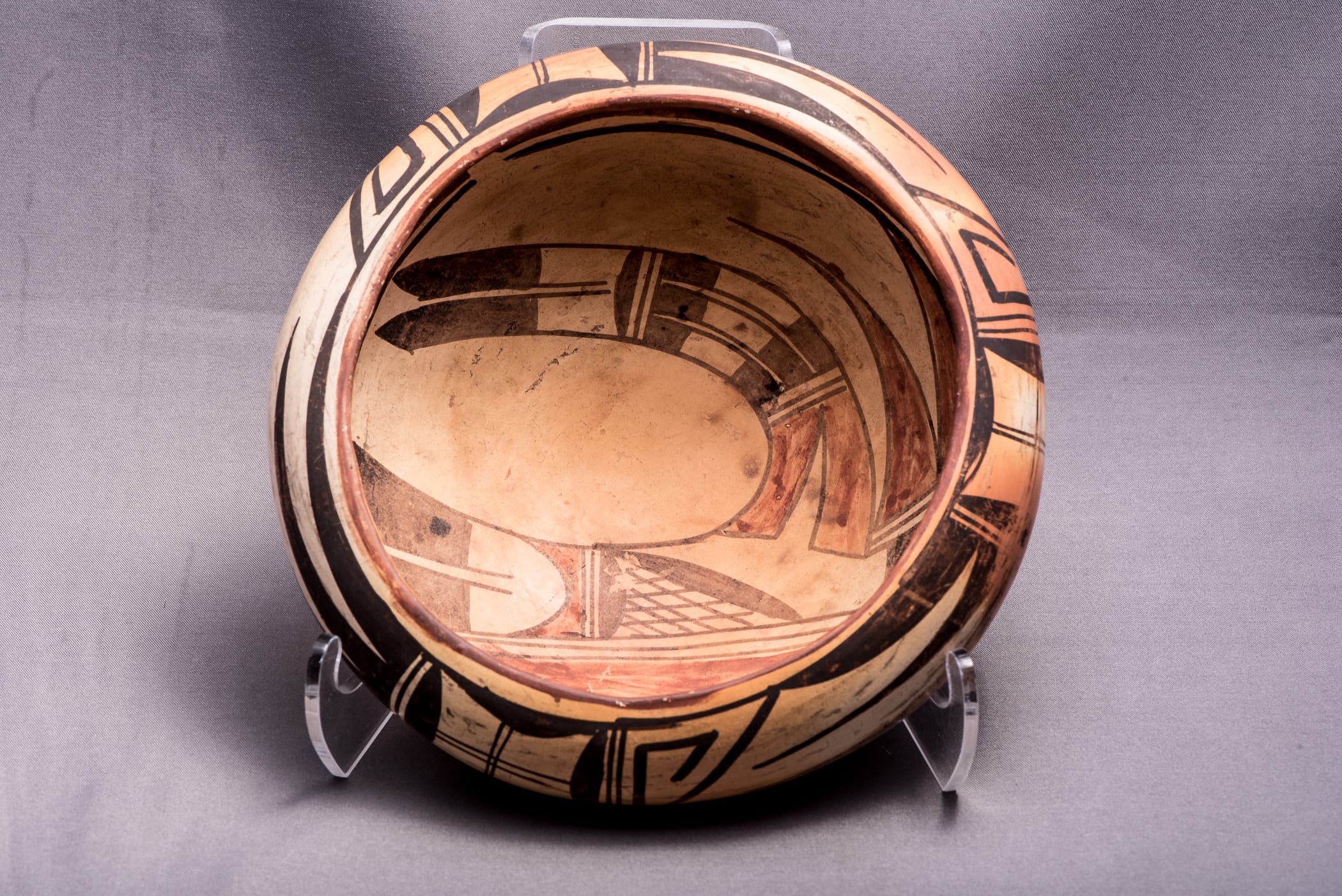
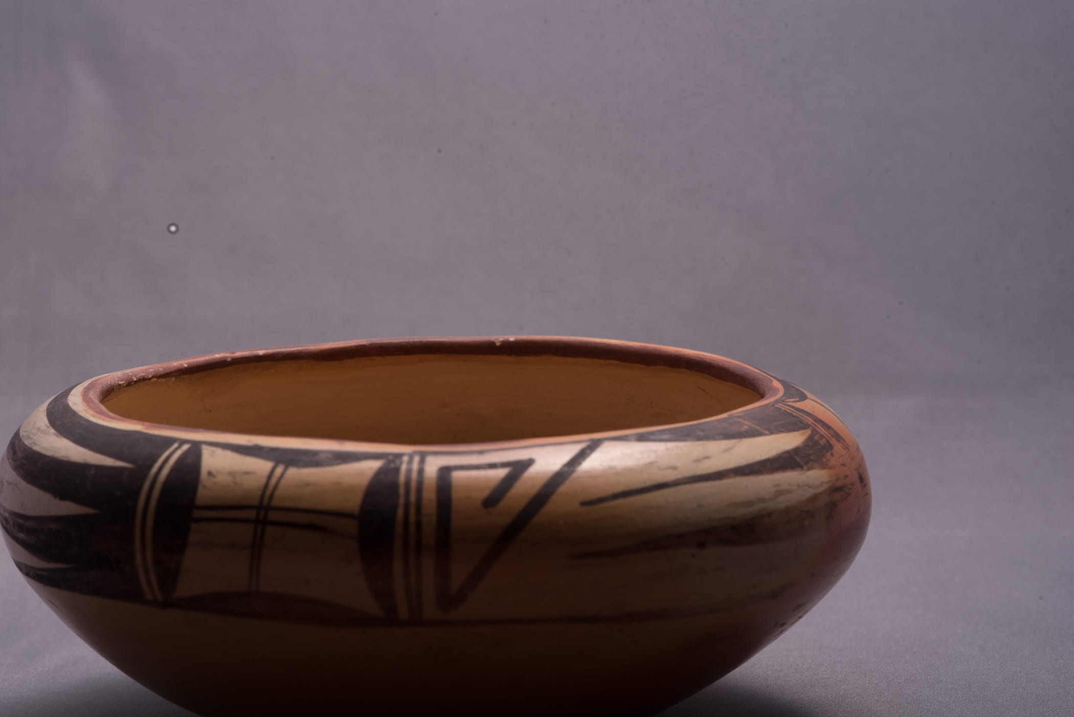
The bowl is heavily painted. Because of the incurved rim, when seen from directly above, all surfaces appear decorated and all of the design on the pot (with the exception of a sliver of the external design) can be seen at one glance. It’s an impressive view.
The rim is painted red, a holdover from the older Polacca ware tradition. (See 1990-03, 1994-14 and other Polacca Ware in the Index of Categories.) Just below the rim are a series of monochromatic exterior designs, the upper boundaries of which form a black line just below and parallel to the red rim. The lower boundary of these designs forms a second black line that encircles the bowl and demarcates the painted exterior surface from the undecorated area below. The red rim and the design motif lead me to conclude that this is an early Sikyatki Revival bowl ca. 1905.
The exterior design consists of a set of three elements forming a panel, which is repeated, three times around the bowl. The first element is a V-shaped hook, which Alexander Stephen may have interpreted as Ho-ho-bo, or whirlwind (Breath God) (Patterson, 1994:250). The central design element in each panel consists of four black spines with the upper and lower spines sometimes truncated by the framing lines. (In one of the three panels there is substantial wear and only three of the four spines can be seen.) The unpainted surface in which these spines are painted form a series of three reflected spines, what Lydia Wyckoff has called “figure-ground reversal” or “negative design” so that “when you look at the pot the figure and the background against which it is placed keep changing places, the figure becomes the background and the background becoming the figure” (1985:100 and 94-103). The third and final design is a “window pane” element with the four sides consisting of curved solid forms and the “pane” delineated by a double-line cross. This simple windowpane design is frequently used by Nampeyo, may be unique to her, and thus is an important clue about the origin of the pot. (See the discussion for vase 2013-03.)
The design on the interior is even more complicated. About 0.75” below the rim there are the thick-over-thin framing lines typical of Nampeyo’s work and showing a spirit break, which is not typical of her work. The painting of these lines is rough, with the thick line lacking consistent width or straight edges. The thin framing line is more consistently drawn, but because of the relative roughness of the thick band above, there is a noticeable irregularity of space between the two lines. If one imagines a yucca brush in one’s fingers and tries to insert one’s hand inside the bowl in position to paint the upper thick framing line, the reason for the irregularity is quickly apparent.. The incurved rim on this small bowl creates a great visual form, but given the resulting 4.8” width of the opening, the rim makes it very difficult for even a woman with small hands to paint the upper interior surface.
The central motif of the interior is a version of the “bird hanging from sky band” design. (See the Category list for more than a dozen pots in this collection with this design.) The red lunette occupies 22% of the radius of the area within the framing lines, oddly exactly the same percentage as on large bowl 1993-04 of the same design by Nampeyo. The design on 2014-01 lacks the central “butterfly” element and the “nakwakwoci” prayer feathers at the end of the curved element of the 1993-04 bowl. Nevertheless the interior design on 2014-01 is far more complicated than on the larger, open surface of 1993-04. There is a folk art tradition of building ship models inside a bottle. The best of these ships show great detail. A similar process seems at work here, with the painter of bowl 2014-01 choosing a particularly complex rendition of the “hanging bird” design in spite of the small size of the pot and the interior surface being constricted by the incurved rim.
The linear “body” of the bird is especially complex with parallel black tail feathers forming the left- most elements. Immediately to the right of the two tail feathers is a bullet-shaped unpainted area that emerges from the space between the tails, draws the eye to the right, and abuts a red element. Continuing to the right, three black lines form a familiar two-lane “highway” followed by a solid black half circle, perhaps a version of an old San Bernardo design that Alexander Stephen interpreted as a cloud emblem (Patterson, 1994: 43 and 141). A triangular area of cross-hatching bordered by curved black elements follows, then an unpainted area that forms the base of the large curvilinear element that launch from the linear body. This unpainted area resolves into a “clown face” or “kilroy” shape that Kramer calls characteristic of Nampeyo’s work (1996:188). Finally, the far right element of the linear body is a solid black prism that serves as the base for two red curvilinear forms.
As on bowl 1993-04 by Nampeyo, two species of curved forms launch off of the linear avian body on bowl 2014-01. The more complex curve emerges from the clown face within the red area that begins the curve. Because of the clown face, this initial element in the curve can also be seen a two red tails. Next is a pattern of black rectangles flanking an unpainted rectangle and this form is repeated three times in parallel renditions. The black highway/half circle design seen in the body is then repeated, now facing in an opposite direction. Finally this curvilinear form ends with two parallel, unpainted rectangles followed by black and pointed tail feathers, a familiar Nampeyo construct. (See the discussion of vase 2013-03.) If the red base is viewed as parallel tail feathers, they contrast with the two black tail feathers that cap this arc.
The second type of curved element attached to the linear body is quite simple. Emerging from yet another set of parallel “highway” lines, two solid red arcs rise above the first curved motif. The framing line of the top red arc merges into the thin framing line of the interior.
The question that remains is one of attribution. I have often cited Marty Cusick’s caution that “It is exceedingly difficult to ascertain whether specific pottery specimens were constructed and painted by Nampeyo (1984:7),”and attributing bowl 2014-01 to Nampeyo is more problematic than some other bowls in the collection (cf: 2014-07). For guidance I turn to a typology of Nampeyo painting that I developed more than a twenty years ago:
As defined in Appendix B and often repeated in my item descriptions, the characteristics of Nampeyo’s mature Sikyatki Revival painting style are:
- A tension between linear and curvilinear elements, often represented as a contrast between heavy and delicate elements.
- A deliberate asymmetry of design.
- The use of color to integrate design elements.
- The use of empty (negative) space to frame the painted image.
- The use of a thick above a thin framing line on the interior rim of her bowls.
- Confident, bold, and impulsive painting.
All six of these characteristics are seen on bowl 2014-01:
- A tension between linear and curvilinear elements, often represented as a contrast between heavy and delicate elements.
Such a tension is built into the “bird hanging from sky band” design with its linear body and curvilinear elements. The heavier linear body of the bird contrasts with the lighter curvilinear elements above it. The three-line “highway” form appears 5 times on the bowl’s interior and provides an additional linear presence, mostly inside the curved designs. - A deliberate asymmetry of design.
The “bird hanging from sky band” design is inherently asymmetric. Perhaps that is why Nampeyo painted it so often: aysymetry energizes a design. - The use of color to integrate design elements.
The black exterior designs serve as a frame around the internal design and this black border is continued with the interior thick over thin framing lines. In contrast, the top and bottom elements of the central interior design are red. The linear avian body alternates color: black, unpainted then red areas, with this sequence repeating twice and ending as it began with black. A red area that can be seen as a set of feathers serves as the base for the large curvilinear element, with its alternating black then white design and ending with a similar set of black feathers. The similar end forms unite the curve; the different colors create tension. The two smaller curves are the reverse of the first curve: red curves emerging from a black base. This is a complicated and busy color scheme with the viewer’s eye drawn to the red internal elements. Seen from directly above, the effect is a bit like looking into one of those hollow Easter eggs containing a panorama. All Hopi and Hopi/Tewa potters mix black, red and unpainted surfaces, but only Nampeyo does it with this degree of sophistication and integrative purpose. - The use of empty (negative) space to frame the painted image.
While not as dramatic as on some Nampeyo pots (e.g. 2010-11 and 2014-07), negative space is an important design element on bowl 2014-01 An egg-shaped negative space rests between the body and the first arc and highlights these designs. Similarly, at the top of the internal design a large unpainted area mirrors the two red arcs, thus forming an area of “figure-ground-reversal” that energizes the viewer’s eye. - The use of a thick above a thin framing line on the interior rim of her bowls.
As noted above, these framing lines are unusually shaky for a Nampeyo pot, but the irregularity seems to be caused by the awkwardness of painting in the small space defined by the incurving rim. If we are able to conclude that bowl 2014-01 is by Nampeyo, the shaky drawing of these framing lines is particularly interesting because they define the limiting condition of Nampeyo’s ability to draw precisely. Note that the framing lines have spirit breaks, an unusual (but not unknown) pattern for “The Old Lady.” - Confident, bold, and impulsive painting.
Except for the framing lines discussed above, both the exterior and interior painting on bowl 2014-01 seems to meet Nampeyo’s standard of confidence. This is a particularly subjective criterion, but the exterior painting is both controlled (see, for example, the regularity of the V-shaped hook) and impulsive (note the inexact form of the double crosses forming the “window-panes.”) Similarly the sweep of the three arcs on the interior are confident and clean, as one would expect of Nampeyo. See especially the symmetrical egg-shaped unpainted area, a cleanness of line shared with bowl 2014-07. Note that the “figure-ground-reversal” of red and unpainted pointed elements on the interior of the bowl is mirrored by a similar pattern of black and unpainted pointed elements on the exterior of the bowl, thus linking exterior and interior designs. Rarely is such effective detail present on a Hopi pot.
In many ways, bowl 2014-01 is much like canteen 1999-03 by Nampeyo. Both have small design areas; both have similar “bird hanging from sky band” motifs. . The surface of canteen 1999-03 is, of course, convex and more accessible to the painter than the concave interior of bowl 2014-01. For me, the critical similarity is that on both pots the painter has chosen to show her virtuosity by making these designs visually and compositionally complex, in spite of the small design area.
Ed Wade has seen far more Nampeyo pots than I and has widely published on Hopi pottery, including a recent book focused on Nampeyo (Wade and Cooke, 20012). Having seen a photograph of bowl 2014-01, he questions my attribution of bowl 2014-01:
“My first impression of the bowl is a later dating than your thinking say c. 1920’s The shape is the clue since these incurving shoulders were not an early trait of the Nampeyo family. The designs have Nampeyo elements but seems like an early Fannie or very later Annie to me. The shape reminds me of Marsha Ricky (email 4/x/14, on file).”
A critical element in understanding bowl 2014-01 is the date of its production. Both Ed and I believe that Nampeyo was substantially blind by about 1920, certainly too blind for the fine brushwork on this bowl. If somehow it could be proved that 2014-01 was made in the 1920’s or later, than I would agree with Ed that Nampeyo did not paint it.
Key to dating the pot is its red rim. As noted near the start of this discussion, such red rims are holdovers from the Polacca style of painting that ended about 1900. Three pots by Nampeyo in this collection have red rims similar to 2014-01:
—small dish 2009-08,
—piki bowl 2009-17 and
—handled pitcher 2012-08.
These three pots are estimated to have been produced from 1890 to 1905. One additional pot in the collection (2002-09) has a red rim, is dated about 1905, and Ed Wade and I believe it may be the joint product of Nampeyo and Annie.
The Allan Cooke collection assembled with the help of Ed Wade contains four pots by Nampeyo with red rims; see p. 36, item 27 on p. 112, item 36 on p. 154 and item 41 on page 168 (2012). Ed believes these pots were produced from 1880 to 1905.
Thus I know of no Nampeyo pots with red rims that are estimated to have been produced later than 1905 and this is the basis of my estimate of that date of production, a date earlier than Ed Wade’s opinion. In 1905 Nampeyo had sufficient eyesight to paint bowl 2014-01.
Ed further writes that “ these incurving shoulders (as on bowl 2014-01) were not an early trait of the Nampeyo family.” I have reviewed published photographs of the Hopi pottery collection of The Museum of Northern Arizona and find no open bowls with similar incurving rims. I have reviewed other books in my library with the same result. To my knowledge, among older Hopi bowls the severe incurving of the rim on 2014-01 is unique. Ed may well have seen Nampeyo family bowls with incurving rims dating from 1920’s or later, but I have not seen such references in the literature. Schaaf (1998:141) does publish a photograph of a Marcia Rickey bowl with an incurved rim, but judging from the small black-and-white photograph the incurving in not nearly as dramatic as on 2014-01. Schaaf further notes that Ms. Rickey was active from 1950 to about 1990 and all indications are that bowl 2014-01 is substantially older than mid-century. The closest I can get to a similar shape in this collection is bowl 1999-10 by Jean Shamie (Nampeyo), which I believe I bought the year it was produced (1999).
In short, it seems to me that this was an experimental pot, carefully conceived to show off the design, but very difficult to paint because of the incurved rim. Thus, while the visual effect is dramatic, this form of pottery was not repeated.
Because I think that the shape of bowl 2014-01 is unique among early Sikyatki Revival pottery, I cannot point to other Nampeyo bowls with a similar shape. While Ed Wade’s comments give me pause, based on the detailed analysis I present above, I am willing to attribute this bowl to Nampeyo and date it ca. 1905. Except for the spirit breaks in the framing lines (which Nampeyo was known to use, though infrequently), all indications are that the painting is by her hand. Future evidence might change this assessment, but given the evidence available, I believe this is fairly conservative conclusion. Bowl 2014-01 is a singular achievement by a master potter.
The beauty of the bowl, its unique shape, and the debate about its source capture a good part of my pleasure collecting Hopi pots. Dissecting the form and design strategy used on bowl 2014-01 is satisfying but laborious. It is satisfying because I come away from the process with some sense of the internal map that guided Nampeyo’s work. It is a laborious intellectual exercise because the analysis requires close observation of detail, and patterns of meaning become apparent only upon reflection.
I suspect that Nampeyo’s experience of production was quite different than my rational analysis of her pottery more than 100 years after she fired this pot. Astonishingly we have some evidence that bears on the issue. During the summers of 1924 and 1925 anthropologist Ruth Bunzel interviewed potters at all the major pottery producing pueblos in the American Southwest, including Hopi. The result of her work was a book: The Pueblo Potter: A study of Creative Imagination in Primitive Art (1929/1972). While Bunzel’s work contains some archaic language and Anglo cultural distortions, her approach to pueblo potters is strikingly respectful for her era. She was also aware of the limitations of her research:
“We get but a fleeting glimpse into the subtle mysteries of creative imagination (1972:2).”
Nevertheless, for all the limitations inherent in a single study bound by 1924 Anglo culture, this material is gold. Dozens of travel books and Harvey brochures trumpeted Nampeyo’s work. One ethnographer even described her producing pottery (Hough, 1915:76-80), but nobody until Bunzel had bothered to ask Nampeyo and other Hopi potters about their experience. A more complete review of Bunzel’s conclusions is contained in the catalog entry for bowl 2014-07. Only the material that most directly bears on 2014-01 is summarized here.
Bunzel writes:
(T)he importance which (the potters) attach to the purely esthetic aspects of pottery design is greater than ordinarily assumed. Most of these women display the same symptoms, which are common to creative artists among more sophisticated people. They all speak of sleepless nights spent thinking of designs for the pot to be decorated in the morning, of dreams of new patterns which on waking they try and often fail to recapture, and above all, the constant preoccupation with decorative problems even while they are engaged in other kinds of work (1972:51-52).
I visited Rachael Sahmie with a friend (Mike McMullen) at her home at dawn on October 11, 2013 to watch her fire pottery. As the fire was burning down, Rachael talked about her design process. I remember wishing I had a tape recorder and listened carefully to her words. In striking parallel to Bunzel’s discussion, Rachael talked about dreaming of pottery designs and waking up in the middle of the night to take notes or begin painting while her dream images were clear in her head. Moreover, like Bunzel’s Hopi informants, Rachael spoke of each pot as “an individual and significant creation (1972:52).”
Bunzel writes that a typical pottery maker she interviewed has:
“probably never thought about the design, its structure or its elements, at all. She has experienced it unanalytically as a configuration, just as she has experienced the form of her vessels…The various elements may later be abstracted, (just like) words may be isolated from the sentences of a native speaker, who for many years has been correctly speaking his native tongue, though innocent of the simplest rules of grammar. In art, as in language, it is not difficult to bring into consciousness these unexpressed feelings for formal relationships….(the potters) have a perceptual rather than an intellectual approach to the artistic problem (1972:53).”
Later Bunzel notes the same design elements will be differently named by different potters or even the same potter at a different time:
“The lack of linguistic designation would indicate that (design) is always experienced as a sensual rather than an intellectual experience (1972:54).”
By 1924 Nampeyo probably was unable to paint any of her pottery though she continued to mold. When Nampeyo spoke to Bunzel, her comment is poignant because “The Old Lady” was largely blind:‘When I first began to paint, I used to go to the ancient village (Sikyatki?) and pick up pieces of pottery and copy the designs. But now I just close my eyes and see designs and I paint them (1972:56).’”
With Bunzel’s research as a guide, I conclude that the form and design on bowl 2014-01 were carefully planned and intentionally drawn, but that this was an aesthetic and not a logical process. I believe that Nampeyo simply experimented with form and design until it “looked right” to the genius of her eye. My analysis of design offered above is simply a post hoc intellectual exercise, far removed from the potter’s experience. At best my discussion might facilitate an understanding of Nampeyo’s intuitive process.
