


Understanding how this enchanting jar attracts the viewer’s eye gives considerable insight into the talent of its maker and reinforces the loss I feel at his stupid death at age 41. On this small vessel, Jake has organized themes of chaos, elegance and serenity.
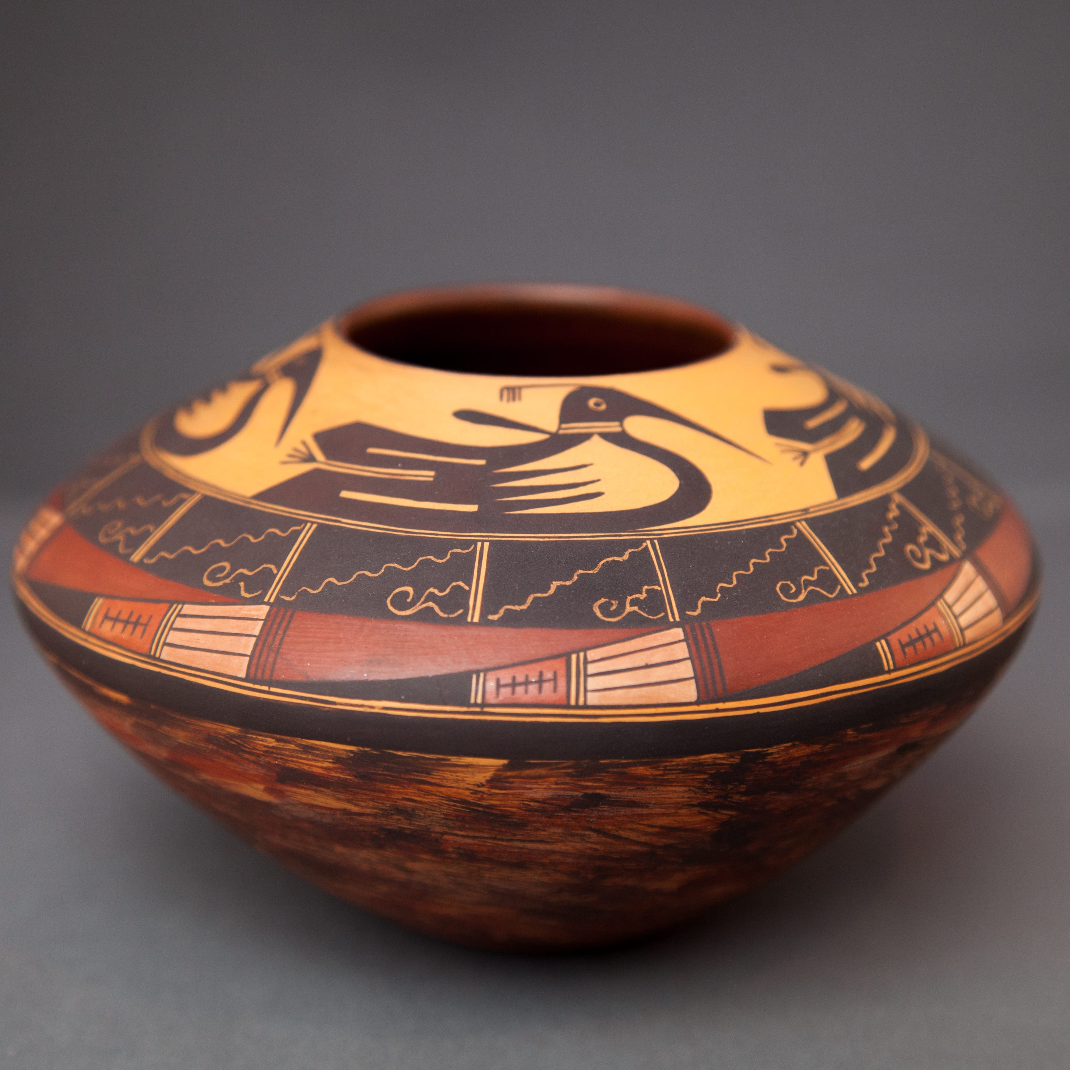
The jar is well-made, with thin, even walls and is centered on its base. The form is essentially two truncated cones joined at their widest dimension. About two-thirds of the pot’s height is below this waist.
Wide sloping shoulders provide a large canvass upon which a potter can organize a design, a technique reintroduced by Nampeyo in the late 1800’s and still used by Hopi and Hopi/Tewa potters. Generally only the top shoulder is painted, with the lower half of the vessel left largely undecorated.
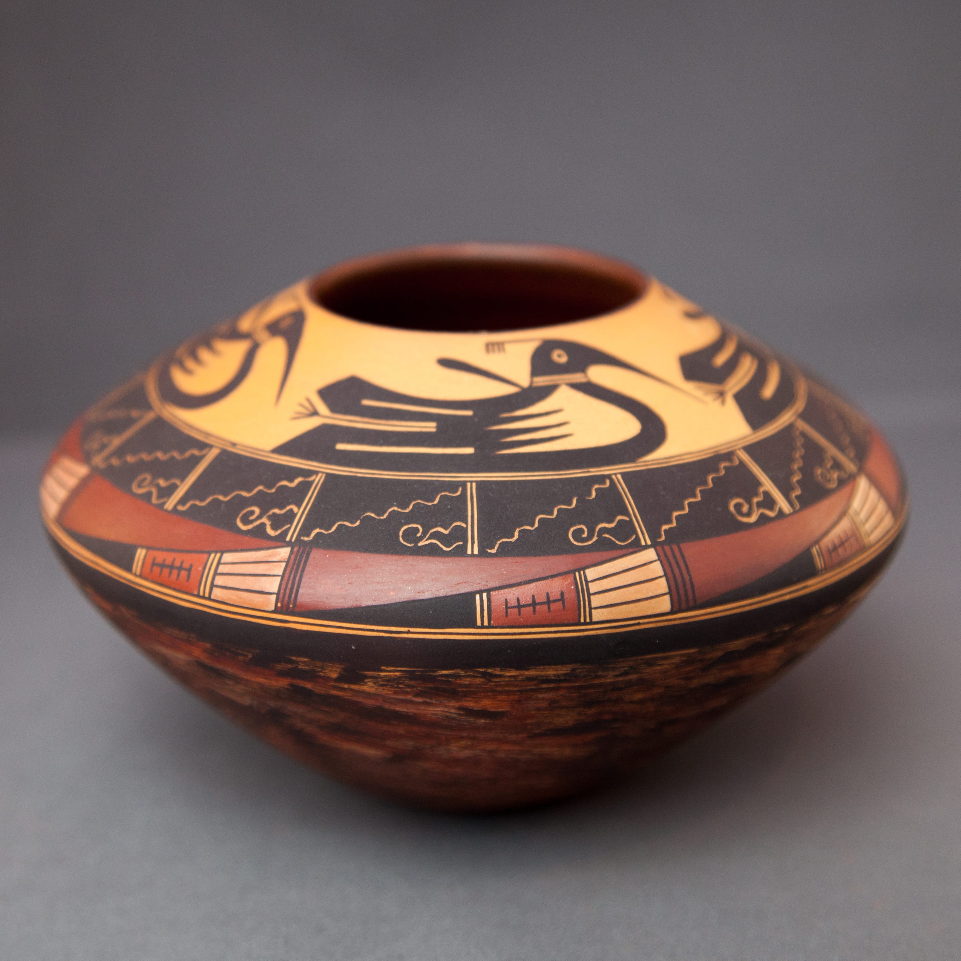
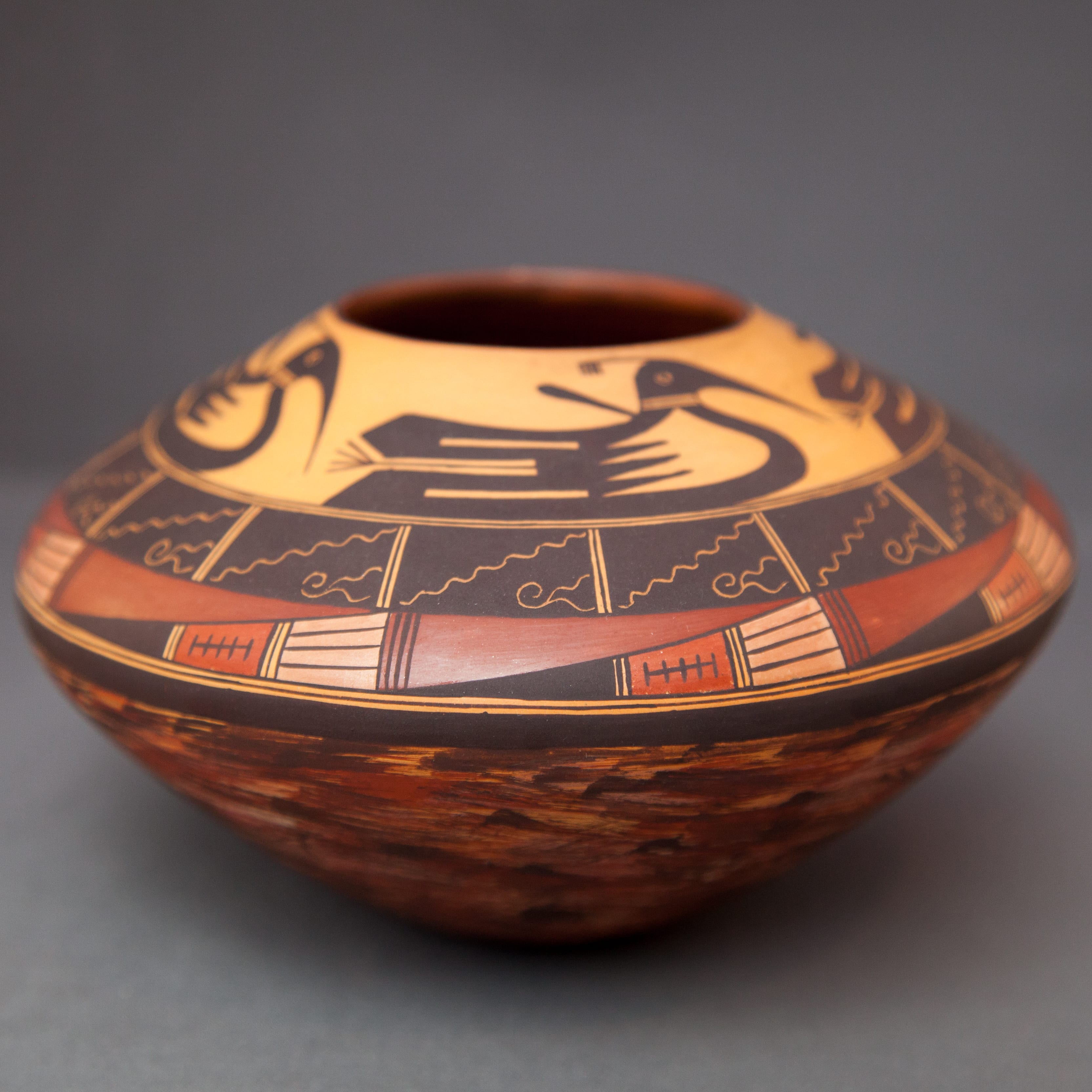
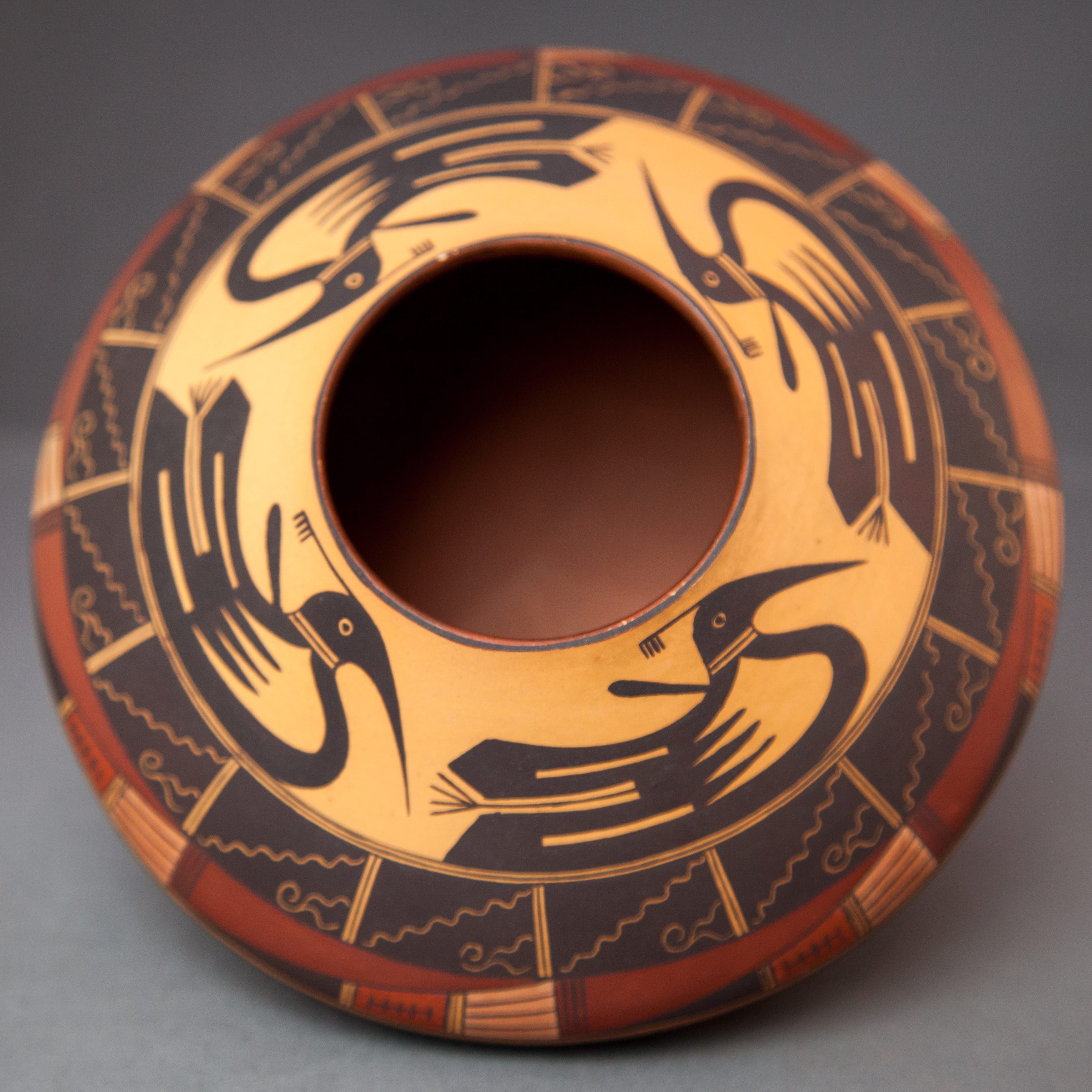
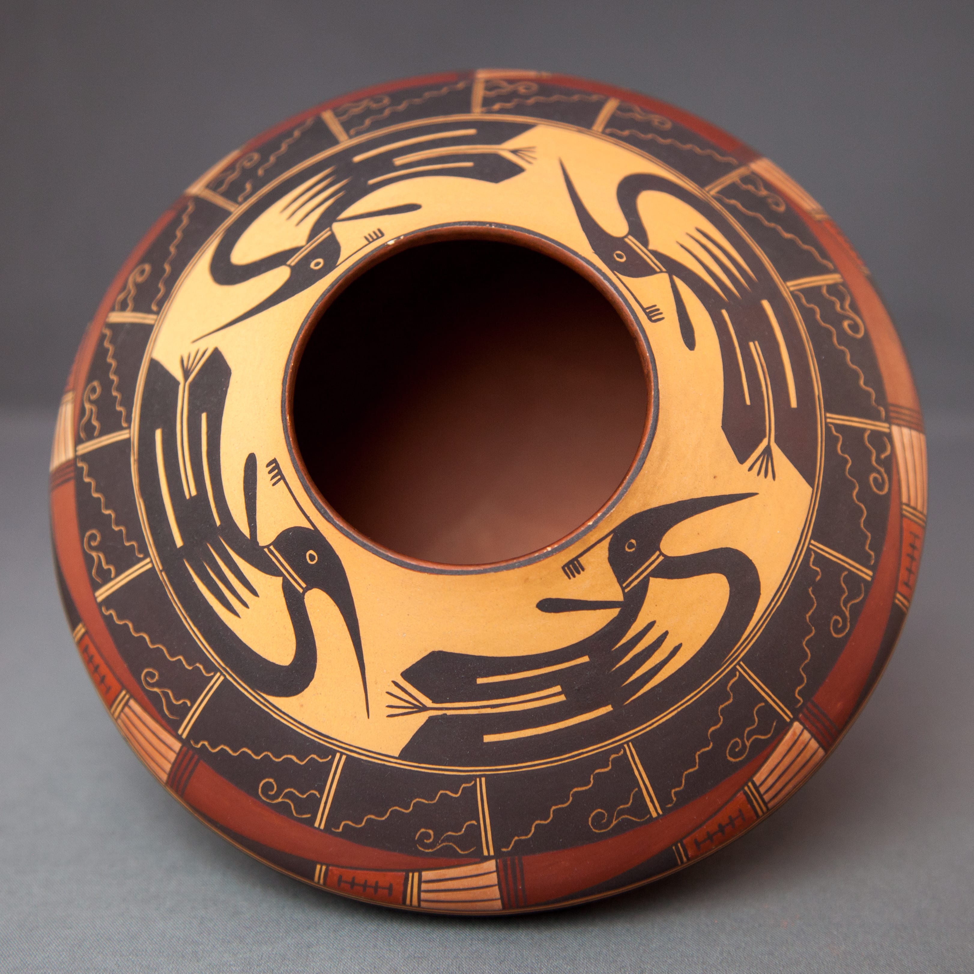
On jar 2016-06, however, Jake chose to decorate the entire surface of the vessel, including the bottom. The decoration is in three bands: 1) The most extensive is a jumble of brush strokes that cover the entire lower section of the pot. 2) Next is a two-layered section of careful inscribed and painted motifs. 3) Third is a procession of monochromatic birds encircling the mouth of the jar, their background the only unpainted surface.
Specifically:
1) Using a fairly broad brush, Jake first painted about 60 fairly large strokes of red paint below the waist of this jar. With a medium brush he then marked this surface with fewer small dabs of black paint. Finally, using a very thin brush he then overlaid these red and black marks with hundreds of hair-thin black lines randomly drawn. Seen in isolation, I don’t find the chaotic result particularly attractive, but then again I’m not a fan of Jackson Pollack’s later work either. This section, however, does provide a basic theme against which the two upper sections of design are seen. This pattern of painting became a characteristic technique used on the bottom of pots during the last 10 or so years of Jake’s life.
2) A single thick black framing line encircles the waist of the jar. Above it, Jake has drawn two elegant bands of design.
The lower of the two bands of design is built from a rectangular pattern of motifs. Each rectangle is diagonally split with the upper half being solid Tuscan red in color. The lower half is considerably more complicated, both in form and color. The design is a pointed form divided by two sets of fine parallel lines into three sections. The point is solid black, the middle section is burnt ochre and contains a longer horizontal line crossed by five shorter vertical lines. Four peach colored feathers form the tail. Jake is noted for the multiple natural pigments he used on his pots: here four colors in a space of 0.44 inch by 2.0 inches. This little section shines like a jewel box and is repeated eight times around the circumference of the vessel.
The upper of the two middle bands consists of sixteen solid black rectangles separated by thin unpainted spaces, each containing a single vertical line. Each of the rectangles is about half a long as the rectangles that form the band of design immediately below. Using a pin, Jake has engraved an undulating line diagonally across the rectangle. The upper section is left undecorated. Below the diagonal Jake has engraved two squiggles that form a design that is quite precisely repeated in each of the sixteen repetitions of the panel. The result is simple and elegant.
Two extraordinarily thin and perfectly drawn framing lines separate these two bands of design from the space above.
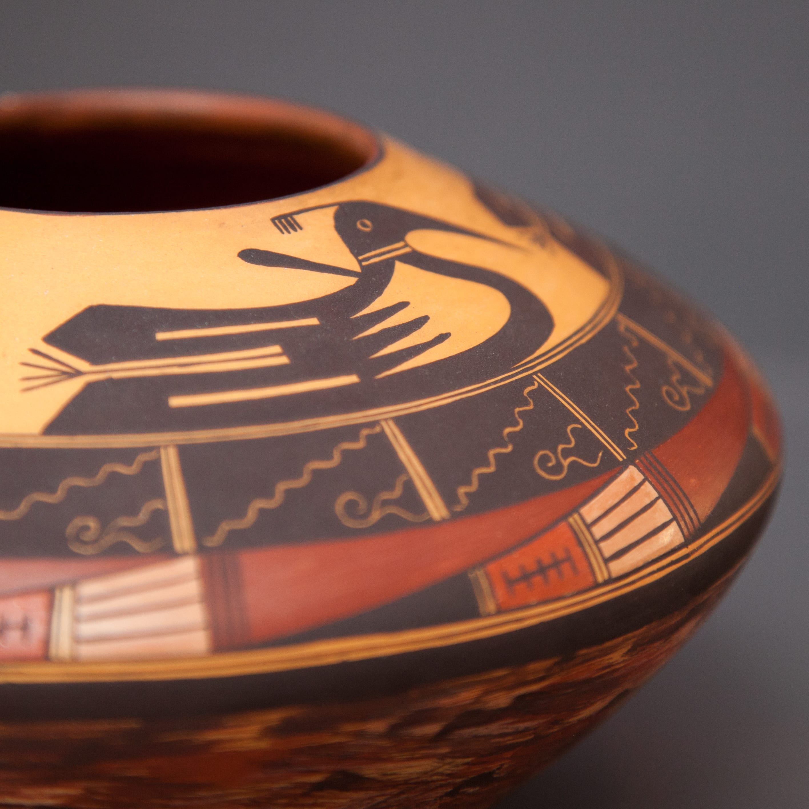
3) Crowning the jar is a procession of elegant birds. In contrast to the lower two sections of design, this top section is monochromatic, with the black color of the birds highlighted against the golden-hued unpainted surface.
The core of each bird breast is unpainted, the rear boundary forming four points embedded in a painted section , thus forming three black points aimed forward. The result is what Lydia Wyckoff calls “figure-ground reversal,” so that when you look at the design “the figure and the background against which it is placed keep changing places, the figure becomes the background and the background becomes the figure (1985:100).” Such visual ambiguity energizes the figures and attracts the eye. Incorporating unpainted surface into the avian outline lightens the visual weight of each bird and makes the image more interesting.
Above each breast , emerging from the rear of the neck, is a small club-like appendage that indicates that we are looking at a spirit figure and not an ordinary bird. The heads of the birds have sharply pointed beaks and display a small top plume. The tail of the birds consists of two large, thick feathers with small, rectangular unpainted areas at their core. Between the tail feathers is an element shaped somewhat like a twig with four short branches at the end. I am not sure what these represent, but they are almost identical to a motif in the Nampeyo corn tray in this collection (2017-04). There they perhaps represent cedar or pine boughs carried in the hands of the Polik’Mana.
 These birds seem descended from the Acoma birds Nampeyo used 125 years earlier on jar 2015-03, but they have evolved into a more sophisticated form. They are not a new design, however. Very similar birds appear on a 100-year-old Hopi storage jar that was offered by Adobe Gallery of Santa Fe in 2017. A photograph of the birds on that storage jar is shown to the right.
In short, 2016-06 is a busy jar, with almost its entire surface covered with design. Four colors of paint, scrafito, three abstract patterns, figural images and patches of unpainted surface compete to attract a viewer’s eye. There’s a lot to look at here and it is a testament to Jake’s craftsmanship that the design holds together and does not fly apart into a visual jumble. But do all these elements cohere into a meaningful pattern?
Tourists and collectors frequently ask Hopi potters for the “meaning” of a design when no meaning exists. Sometimes responses are given merely to please the buyer and sometimes these inventive explanations have become embedded in the lexicon, as with the “migration” pattern of design.
I never had the chance to discuss this jar with Jake, so any meaning I attribute is simply the product of my own imagination, but I find coherence in the design layout. The lower two thirds of the design is layered chaos, like the complex geological structure of the sandstone mesas that are home to the Hopi people. Above are two carefully structured bands of beauty, the lower band containing feathers that help convey Hopi prayers for moisture to the gods. The upper middle band, black like a thundercloud, incorporates images of both thunder and flowing water. Surmounting it all are images of life, here the birds that carry the people’s prayers for moisture. I see a vision of the Hopi world here, rock, beauty and life.
A second reminder is in order here:
“Whether a potter thinks ‘bird’ or ‘feather’ when she stylizes elements of a design to fit on a particular clay shape, only she can say. For white men, if something exists, it must be named; a symbol must have meaning (Kramer, 1996:170).”
Thus I need to re-emphasize that the meaning I attribute to this jar is what my eye and heart tell me; It is not a comment on Jake’s intention.
