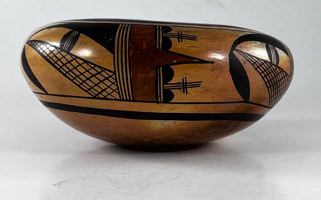
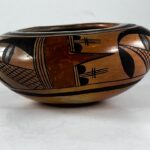
I purchased this small jar from Four Winds Gallery in Pittsburgh (PA) because I thought the design was especially well-done and pleasing. When asked about provenance, the gallery manager Beth Wagttll said only that “I unfortunately do not know any history on the piece. It came out of a private collection in Pittsburgh. I would say the pot is circa 1930’s.” I paid a modest $160 for the pot. Neither of us worried much about the maker.
Over time I have become more knowledgable about pottery by Nampeyo and I now think she made this jar as an experiment in symmetric and asymmetric tensions. A similar reassessment has happened to me one other time, when I reexamined jar 2003-01 and reassigned it as also by Nampeyo. Deciding that a pot is “by Nampeyo” is a matter of opinion and is subject to bias, especially buyer’s greed. I will explain my reasoning below, but first this jar needs to be described.
Form:
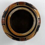
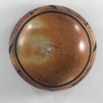
The jar has a rounded bottom that curves evenly upward 4.00-inches to the widest point on the jar and then slopes inward 1.5-inches to the 3.25-inch wide mouth. The bottom of the jar, where it was formed in a puki, and the sides are thin and even and only slightly thicker than the inward sloping top surface. As a result, the jar seems light for its size. The interior junction between the side and top coils is smooth. Because of its rounded bottom, it sits with a tilt on a flat surface. The pot displays variegated blushing, with areas of the bottom dark gold and other areas almost white. The top portion of the jar has a somewhat lighter blushing, but is also variegated.
Design:
There are thick-over thin framing lines around the mouth of the jar and another set (in reverse order) 2.75-inches from the bottom of the jar. Between these framing lines is a 2-inch wide band of design. Unusually the design is neither above or below the waist of the jar but rather is folded over the junction.
The jar carries a single design that is repeated four times around its circumference. At the center of the design are six vertical and parallel lines, a “four-lane highway.” To the right of the four-lane highway is a 0.625-inch wide rectangular red element whose far boundary is defined by three parallel lines, a two-lane highway. There is a gap at the midsection of this second highway, however, and the red element escapes through this gap in the form of an inch-tall isosceles triangle. Flanking this triangle, on the far side of the highway, are pairs of small hills, “black gumdrops.” Between these hills emerge three 0.75-inch-long vertical lines, crossed at their middle by a pair of short horizontal lines.
To the left of the central 4-lane highway is a somewhat more complicated design. Based on the upper half inch of the highway, a triangular black form emerges parallel to the framing lines. As it extends and thins its upper edge curves away from the framing lines until its peak is descending. At this point it morphs into a lunette-shaped element tilted downward until its lower point touches the lower thin framing line. Combined, the triangular form and lunette create an arc. Based on the lower half inch of the highway, a triangular form reaches across the space under the black arc, its point intersecting with the arc where the two sections of the arc are joined. This triangles is crosshatched with between 5 to 9 horizontal and 12 to 16 vertical lines, depending on which of the four renditions are examined. Finally an element composed of two black hills, their bases parallel and separated by a three-lane highway (a seed pod or less gracefully a hamburger in a bun) is placed so that it bridges between the midpoint of the two triangular shapes.
Design Analysis:
As detailed in Appendix B, I believe that Nampeyo developed six design strategies that characterize her mature “Sikyatki Revival” pottery. She did not mechanically apply all six strategies to every pot, but they were a sort of tool box of techniques she could draw upon when painting. The greater the number of these strategies I find on a pot, the more confidence I am that the pot is “by Nampeyo.” No other potter at Hopi systematically employed this range of strategies, except perhaps for eldest daughter Annie when she was painting in her mother’s style and not her own.
The six strategies of design are:
1) A tension between linear and curvilinear elements, often represented as a contrast between heavy and delicate elements;
In the black section of design the crosshatched triangles have linear sides. They are enclosed by thick, curved arches. Between these two elements are black “seedpod” forms that consist of linear lines enclosed by curved black hills. In the predominately red area of design, on either side of the red point, there are additional black hills (with curved upper surface) separated by three linear lines crosscut by two additional linear lines. Thus all sections of the design juxtappose linear and curvilinear elements.
2) A deliberate asymmetry of design;
Overall the design is symmetric: the four panels of design are the same. However, internal to each panel there is striking asymmetry, both in color and form. The section of design that features red is symmetric: the top and bottom could be folded over to create a horizontal crease and the top and bottom sections would overlap perfectly. However the black area of the design is strikingly asymmetric. This asymmetry-within-symmetry is the distinguishing characteristic of this pot.
3) The use of color to integrate design elements;
Since there is only one area of color in each design, color is not used to integrate each rendition. However, when the jar is seen as a whole from either the top of a side view, this color is spread across the circumference of the jar and integrates the pattern of design.
4) The use of empty (negative) space to frame the painted image;
There is substantial open space beneath the black arc and between the four renditions of design and this space works to highlight the design.
5) The use of a thick above a thin framing line on the interior rim of her bowls.
This is not a bowl, but it displays two sets of framing lines.
6) Nampeyo’s painting is confident, bold, and somewhat impulsive compared to the more-studied, plotted and careful style of her daughters, descendants and other Hopi and Hopi-Tewa potters.
Every time I review these six strategies I point out that this is both the most subjective of the six strategies and the most important. The exactitude of the painting on the red right side of the design is striking, as is the ability to paint the same design four times with almost no deviation in pattern. Artists like to paint on a flat surface so the dimensionality of the design is easy to calculate. In contrast, on pot 2000-03 te design is folded over the edge of the jar. This placement projects the design to the viewer’s eyes, but is difficult to paint. Both the details of painting and the placement of the design are the mark of a skilled and confident painter. The design is bold in a number of dimensions. The thick red element is bold, especially when it breaks free of its base and thrusts to a point through the confining two-lane highway. The right side of the design and the left side of the design have a compelling and contradictory energies. The right side of the design is balanced and calm while the left side is unbalanced and fragmented. The red triangle thrusts to the right while the black triangle points both to the left and downward. Combining the two patterns creates a dramatic, bold pattern.There is less“impulsive” evidence than I often find on a Nampeyo pot. The best example here is the great variation in the number of horizontal lines (5 to 9) and vertical lines (12 to 16) in the crosshatched triangle. The painter was not careful with her strokes but impulsively filled in each rendition until it “looked right.”
In short, the painting of jar 2000-03 displays all of the design strategies we expect of Nampeyo’s mature work, though the design shows less impulsivity than we might expect. Impulsivity, often small areas of design with minor variation in detail, add energy to what otherwise might be a static design. Here each of the four panels of design are internally contradictory in both color and form, thus eliminating the need for minor details of impulsive painting. The left side of each panel features red paint; the right side of the panel is entirely black. Central to both sides are triangles, but these point at each other, creating tension, as if dueling.
Perh Generally 1) on a pot from Hopi the elements of design in a panel cohere into a single pattern, and 2) when Nampeyo adds an asymmetric element to her design it is a minor element that creates a subtle imbalance in an otherwise balanced design. Neither convention is the case here. 1) the red triangle that is the nose of the “Kilroy” face on the left in each panel points to the right. The cross-hatched black triangle on the right in each panel points to the left. Neighbors, the two triangles seem to be dueling. 2) This contradictory energy within each panel is the central focus of design and eliminates the need for more minor assymetry.
aps the characterization “impulsive” is constrained here because the symmetric vers asymmetric tension within each design panel creates contradictory internal tension. This makes pot 2000-03 unusual in two ways:
Differences in color reinforce differences in design.
My friend and Nampeyo scholar Vincent Drucker offers a narrative explanation of the design. I am inclined to see the painting in more abstract terms, but he may be correct and his comments about jar 2000-03 are worth repeating. He writes that the mesage of the jar is “clear”:
“We don’t see that what we consider valuable is becoming ensnared.“
- “(Nampeyo uses) clown/katsina face in a totally new and creative way
- Crossed out of sight lines — a negation that I only knew she used.
- Such subtle imagery for a snare— drawn with so few lines.
- Those slightly irregular vertical lines.”
Several other observations about jar 2000-03 deserve note.The jar is particularly well-formed with even walls and an invisible junction between the side and top surface. This delicacy of form is the mark of an experienced potter. The two triangular shapes contradict each other but also visually unify the design. Three elements touch at the same point on the left side of the design, providing a focus that somewhat counterbalances the thrusting red triangle. The red clown face (“Kilroy”) prominent in the design is a frequent motif in Nampeyo’s work (Kramer, 1996:188).
In short, the jar is an experiment in symmetry and asymmetry. The red portion of the design attracts the eye and is symmetrical and calm. The black portion of the jar is asymmetrical and fragmented. When these two patterns are joined, the pattern is internally contradictory and asymmetrical. However, when four renditions of the design are placed equidistant around the circumference of the jar and separated by unpainted surface, the overall impression of the jar is symmetrical. Thus the jar displays symmetry joined to asymmetry folded inside of symmetry. I think this pattern is the raisons d’etre of the pot: an experiment in creative energy. In the hands of a less capable painter these opposing tensions would have fragmented into an inarticulate mess. As presented here, this experiment in pattern and tension attracts the eye. It is this ability to imagine and organize tensions that is the mark of genius and why I believe Nampeyo to be the maker of jar 2000-03.
I believe that jar 2000-03 is an experiment by Nampeyo who is experimenting on using a major asymmetry within a repeated panel of design rather than using a minor asymmetry to create a small imbalance in an overall design. This disjunction, I surmise, creates the same kind of design tension as does small elements of asymmetry that Nampeyo often inserts into her designs, thus eliminating the need for additional asymmetry.
Of course my musings about the intentionality of the form and painting are —of course— post hoc. I cannot know what was in the mind of the artist she she created this bowl, but am simply defining the patterns of evidence that I see. Still, this analysis may offer a glimpse into the creative mind of Nampeyo, and that exercise is satisfying.
The pot is an intriguing joy.

