

Hopi-Tewa Sikyatki revival bowl with abstract avian design floated on a slipped clay body. The external rim is encircled by a split triple-lobed design repeated seven times The extra rim coil, use of background space, internal structure of the design, and impulsive drawing indicate to me that the pot was formed and painted by Nampeyo. The slip has crackled with age. The bowl was broken into four pieces that were glued together. Ed Wade (4/23/09), however, does not think that this is a Nampeyo pot. I disagree.
Of the dozen pots in the collection that were likely both formed and painted by Nampeyo, 1993-04, 2002-03, 2005-16, and 2006-02 most clearly display her unique style. Her distinctive style includes:
First, a tension between linear and curvilinear elements of design (see pot 2005-16).
Second, her Sikyatki revival pottery has design motifs that contradict the symmetry of a design (as in 2002-03) or are elements built into a symmetrical design that contradict the visual flow of design (as in 2005-16).
Third, Nampeyo uses color (usually red) to integrate her designs (see 2005-16).
Fourth, Nampeyo’s work is distinctive because of her willingness to leave large background spaces unpainted to highlight her design (see bowl 1993-04 and Appendix B).
Fifth, her Sikyatki revival bowls use a thick above a thin framing line on the interior rim (see 1993-04 and 2006-11).
Finally, her painting is confident, bold, and somewhat impulsive compared to the more-studied, plotted, and careful style of her daughters, descendents, and other Hopi-Tewa and Hopi potters (see 1993-04 compared to 1994-02).
Of the four pots that seem to most clearly demonstrate these six design characteristics, the most subtle is 2005-16 and 2006-02 is perhaps the most obvious.
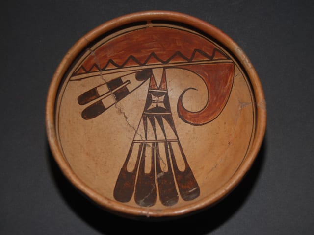
Although bowl 2006-02 is unexpectedly small, and has been badly broken and repaired, its visual effect is big and powerful. As Barton Wright has written (1993:37), Nampeyo’s “decorations … are (often) deliberately asymmetrical, a style of embellishment rarely seen in pueblo pottery.” This asymmetry is featured in the design of 2006-02. On the left, a bold red wave image spirals to the right. On the right, a dark two-feather image aims to the left in pure contradiction. Separating these two images is the central design, a four-feathered fan at right angles to both the wave and two-feathered design. Inside this fan, each feather contains unpainted space that form images that suggest a knife handle and blade. Three of these “blades” skew to the right, which disturbs the downward thrust of the central fan design. The triangular right most blade stops this rightward sweep. Below these negative images and in the center of the design on the bowl is a “windowpane” image characteristic of Nampeyo’s work and containing a carefully drawn two-line cross that ties together both the vertical and horizontal elements of the overall design. The framing line of the windowpane is itself not symmetrical with a longer upper-right corner pointing northeast or sweeping southwest; it’s hard to say. The central four-feathered fan image terminates with a red element. This simple red element is itself contradictory, formed by a central unpainted triangular image thrusting up against the downward flow of the fan and also seen as two red triangular legs with a downward direction that attach the fan to the rest of the design. Finally, underlying all of the design is a plane red “skyband” separated from the rest of the design by two thin lines. Painted in this half-moon space is a simple zigzag black line with eight points forming eight downward pointing and seven upward pointing triangles, reflecting the tension in the upper part of the design.
The genius is in the details. Consider, for example, if the two small triangular “feet” on the fan had simply been painted black rather than red. In that case, the design on the bowl would have simply divided into two black feather designs sitting on a red base rising into a red wave. By making these “feet” red, Nampeyo has tied together the overall design.
Notice also that the design is not centered in the bowl with the red “wave” reaching only about halfway across the interior surface, the two-feathered design even less. The four-feather fan design does reach almost across the bowl, but unpainted space is left to create visual tension between the end f the four feathers and the two framing lines. Perhaps half of the interior surface of the bowl is left unpainted, with the blank background setting off the design. Thick and thin lines that are characteristic of Nampeyo’s work frame both the design and black background into an integrated image. These framing lines have a “spirit break” that is not characteristic of Nampeyo’s work, but other Nampeyo bowls with spirit breaks are known.
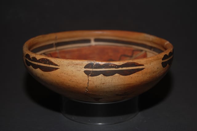
Finally, the painting manages to be confident, bold, and yet casual. For example, the zigzag line in the red skyband is not carefully drawn; the resulting triangles are of somewhat different size and shape. Perfectly drawn to create symmetrical triangles (as I would expect from many of the current young Hopi potters who are conscious of the fine art market), the image would be repetitious and boring. Not so here. The exterior of the bowl is painted with a series of three-lobed, split designs that are repeated seven times and are similar to the exterior design on 2006-01.
Nevertheless, as noted above, Ed Wade does not think this is a Nampeyo bowl.
