
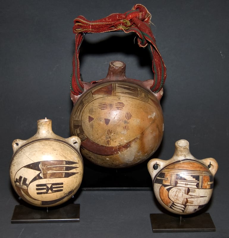
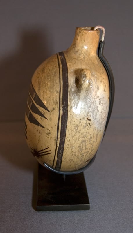
Of the fifteen or so pots in the collection that were probably both made and painted by Nampeyo, this canteen, shallow dish 2002-03 and low-shouldered jar 2005-16 best represent the simple elegance that defines Nampeyo’s iconic style.
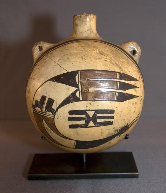
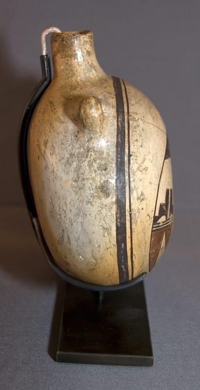
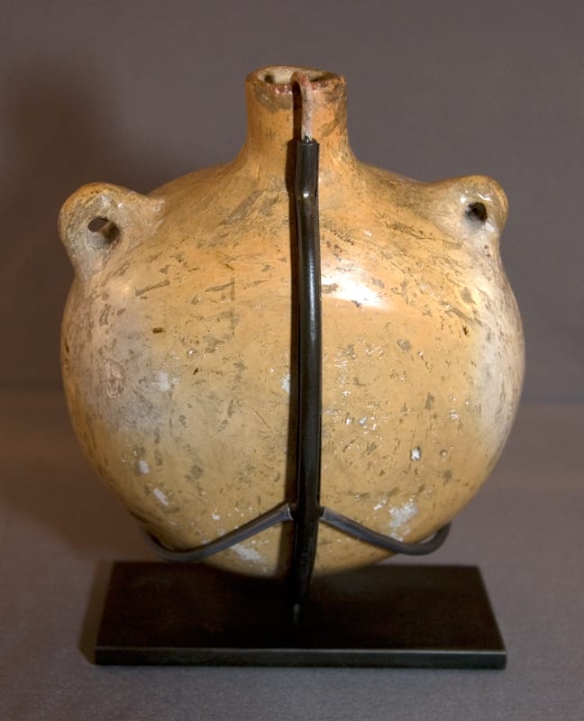
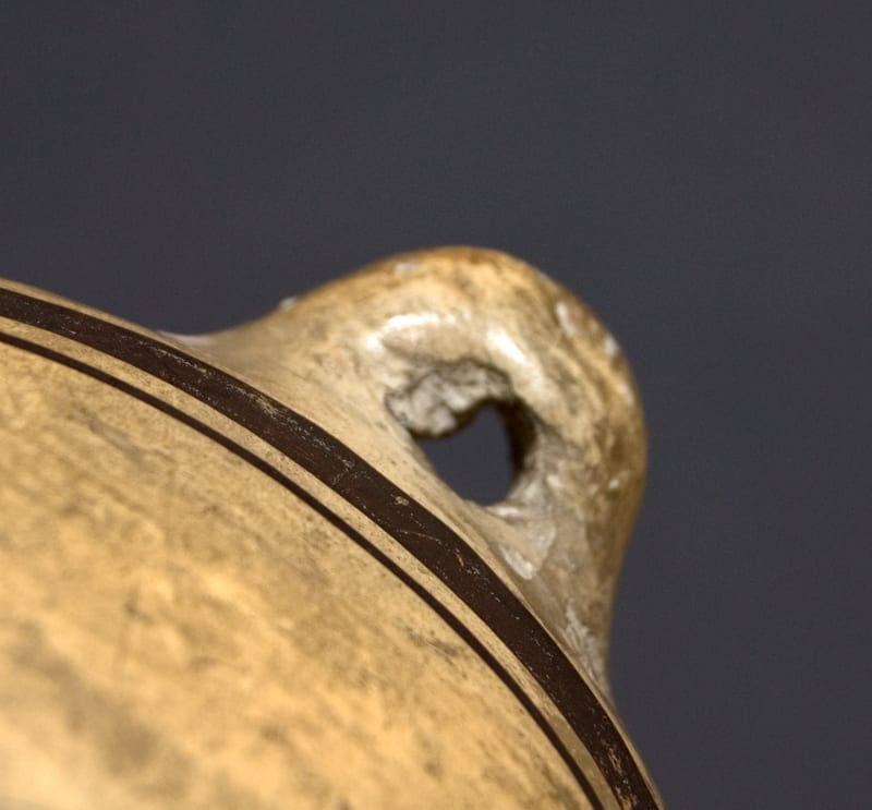
The smooth white kaolin finish on canteen 2010-11 is stone-polished; the color indicates that it was probably coal-fired. Such finish and firing are characteristic of Nampeyo’s work ca 1905-1910. The two handles are similarly placed on the top quarter of the canteen, but are casually formed: one is noticeably larger than the other; the opening of the right handle has some scrap clay in the hole. This was not a canteen that was meant to be used. There is some wear to the finish and a prominent scratch, but overall the painting is remarkably well preserved.
The design omits the red “sky band” half-moon shape that is usually associated with this design. (Cf. 1993-04 and “Bird Hanging from Sky Band Design” in the Category List.) Here the curved avian element flies free within a border and encircles the typical three-pronged “butterfly” or shrine element usually found in this design.
I believe this design played a central role in the development of Nampeyo’s style; for an extensive discussion of this design and Nampeyo, please see Appendix B.
Appendix B contains an analysis of a classic Nampeyo low-shouldered eagle tail jar in the collection (2005-16). That discussion defines six design strategies that mark the full flowering of Nampeyo’s aesthetic:
1) A tension between linear and curvilinear elements, often represented as a contrast between heavy and delicate elements;
2) A deliberate asymmetry of design;
3) The use of color to integrate design elements;
4) The use of empty (negative) space to frame the painted image;
5) The use of a thick above a thin framing line on the interior rim of her bowls;
6) Nampeyo’s painting is confident, bold, and somewhat impulsive compared to the more-studied, plotted and careful style of her daughters, descendants and other Hopi and Hopi-Tewa potters.
All six of these strategies are fully-realized on canteen 2010-11:
1) The contrast between linear and curvilinear in this design is both obvious and subtle.
Obviously the curvilinear avian design contradicts the central linear “butterfly” element. If one covers the left side of the design, the linear “tail” of the avian design at the top of the canteen contrasts with the curvilinear ball-and-line “head” at the bottom. If one covers the top of the design, the linear central element of the design (the “butterfly”) contrasts with the curvilinear “head” of the bird beneath it. In both these latter cases the curvilinear tail is more delicately drawn than the contrasting linear images. Moreover the top red area of the design is linear from right to left; the bottom red area is curvilinear and moves from top to bottom
2) Internal to each of the two design motifs, there is a symmetry. The black design between the two red sections of the avian motif is composed of elements that reflect each other. The red section on the lower quadrant of the canteen is composed of pointed elements that, except that they need to fill a different length of space, reflect each other.
Except for variations in painting, the black “butterfly” design is perfectly symmetrical; the right side could be folded over the left side and fit. The internal symmetry of these elements gives the overall design a kind of Zen calmness. Nevertheless, because the avian image varies in width and doubles back on itself, the overall design is not symmetrical. Folding the design top over bottom or right over left does not result in overlapping images. Internal design elements might be symmetrical, but the overall design pattern is asymmetric.
3) The two red areas of the avian design alternate with black sections. Because the viewer’s eye links the two red areas, the overall design is integrated. Imagine if the bottom red design had been painted black. The viewer’s eye would be drawn off center to the top red area and the rest of the monochromatic design would simply hang from the tail.
4) By omitting the usual half-moon shaped red area, Nampeyo left considerable visual space around the design. Since the shape of the canteen, the space enclosed by the framing lines, and the avian element are all circular, the design floats and swirls in this space. Imagine the loss of this energy had Nampeyo filled in the empty space with cross hatching or some other design.
5) If the convex surface of the canteen were to be made concave (a bowl with the same interior design), the framing lines would be thick above thin, as is characteristic of Nampeyo’s bowls. As noted above, these lines frame the empty space of the design and highlight the energy of the design.
6) The painting has the confidence and clean boldness that typifies Nampeyo’s best work, but the drawing still is a bit impulsive and irregular. The black lines above the tail elements are not perfectly drawn. The same can be said of the white half-moon shapes to the left of the red linear tail design and the width of the black lines that form the “butterfly” design.
There are now three canteens in the collection that I am confident were both formed and painted by Nampeyo: 1999-03, 2009-10, and 2010-11. Strikingly all three are decorated with variations of the “Bird Hanging from Sky Band” design. There are certainly Nampeyo canteens with quite different motifs, but it also seems true that Nampeyo was quite taken by the power of the “Bird Hanging from Sky Band” image on a convex surface. Canteens 1999-03 and 2010-11 have the greater variance in design and the former is smaller than the latter, but it is clear that they were made by the same hands. A very similar canteen decorated with a version of the Sikyatki “man eagle” design, is in the collection of The Museum of Fine Arts, Boston (ID Number 1984.623, photographs on file).
David Grann (2010) describes the work of art historian Martin Kemp:
“The initial thing is just that immediate reaction, as when we’re recognizing the face of a friend in a crowd,” he explains. “You can go on later and say, ‘I recognize her face because the eyebrows are like this, and that is the right color of her hair,’ but, in effect, we don’t do that. It’s the totality of the thing. It feels instantaneous.”
Upon glimpsing the thumbnail image of this canteen for the first time on eBay, I had the same reaction: a visceral jolt that I was looking at a Nampeyo pot. The analysis justifying the response came later.
