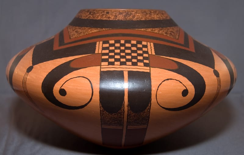
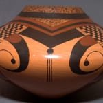
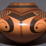
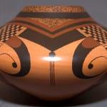
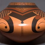
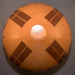
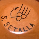
This pot is made with an unusual clay that fires red-tan. The color is neither as light as the grey clay that fires light tan nor as dark as the yellow clay that fires red. The pot is outdoor-fired but is not blushed. Neither is it slipped. The interior is polished for several inches inside the mouth of the jar; the remaining interior, though not polished, has the same color as the polished surfaces. Perhaps Stetson mixed grey and yellow clays to get this effect; perhaps this is the color of an unusual natural clay he uses. The interior clearly shows the striations caused by Stetson’s fingers.
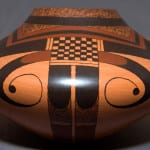
The walls of the vessel are quite thick and the pot is heavy. In contrast, the visual image of the jar is unusually light because of its dramatic shape. With a base only 1.5 inches wide, the mid section expands to over 9 inches, six times wider than the base. The jar then narrows to a mouth that is twice as wide as the base. When the curvilinear painted elements of the design are viewed directly, the unpainted space between them forms a V-shaped area that echoes the overall shape of the jar.
The eagle tail design is a variation of the classic Nampeyo design (2005-16) and, like Nampeyo, Stetson has achieved an effect of grace and power. Like Nampeyo, Stetson’s curvilinear elements are (in part) thin and visually light, though heavier than the Old Lady’s work. Like Fannie, he adds a heavy ball at the end of this design. As with Nampeyo, the curvilinear design contrasts with the heavier linear tail elements. The checkered square that unites the tail and wing elements is linear (thus contrasting with the curvilinear wings) but lighter than the solid black linear tails. This checkered square thus provides a contrast to two elements that themselves contrast, giving the overall design substantial energy.
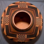
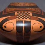
Stetson’s color is unusually dense and dark: the black is a solid and inky, the red a solid dark maroon. These colors harmonize with the natural dark color of the clay body, which unifies the overall visual image of the jar. The first two inches below the rim of the pot are completely painted with stippling or solid designs, giving the pot an emphatically masculine feel.. While the top view of the pot is full of design, the bottom view is simply decorated with maroon tail elements and is largely empty. A side view is richly painted with the design framed by empty space, a Nampeyo strategy that highlights the design.
The pot is full of contrasts: the light curvilinear elements of the design contrast with the thick dark linear elements; the richly painted surface on the wide top third of the jar contrasts with the extensive unpainted space on the pot’s narrow bottom third. Both shape and design indicate an upward thrust that floats the jar on its small base, giving the pot an unusually dramatic and energized feeling.

