

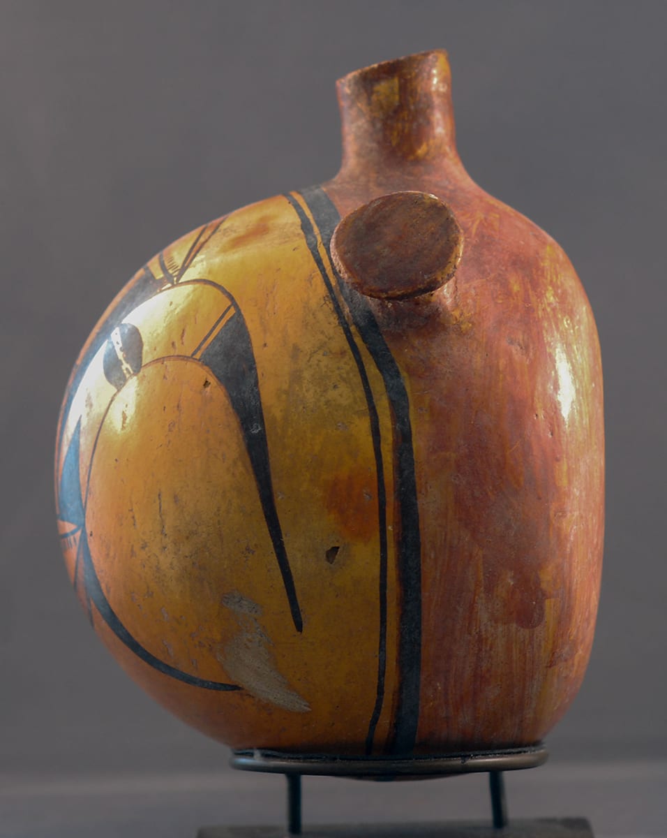
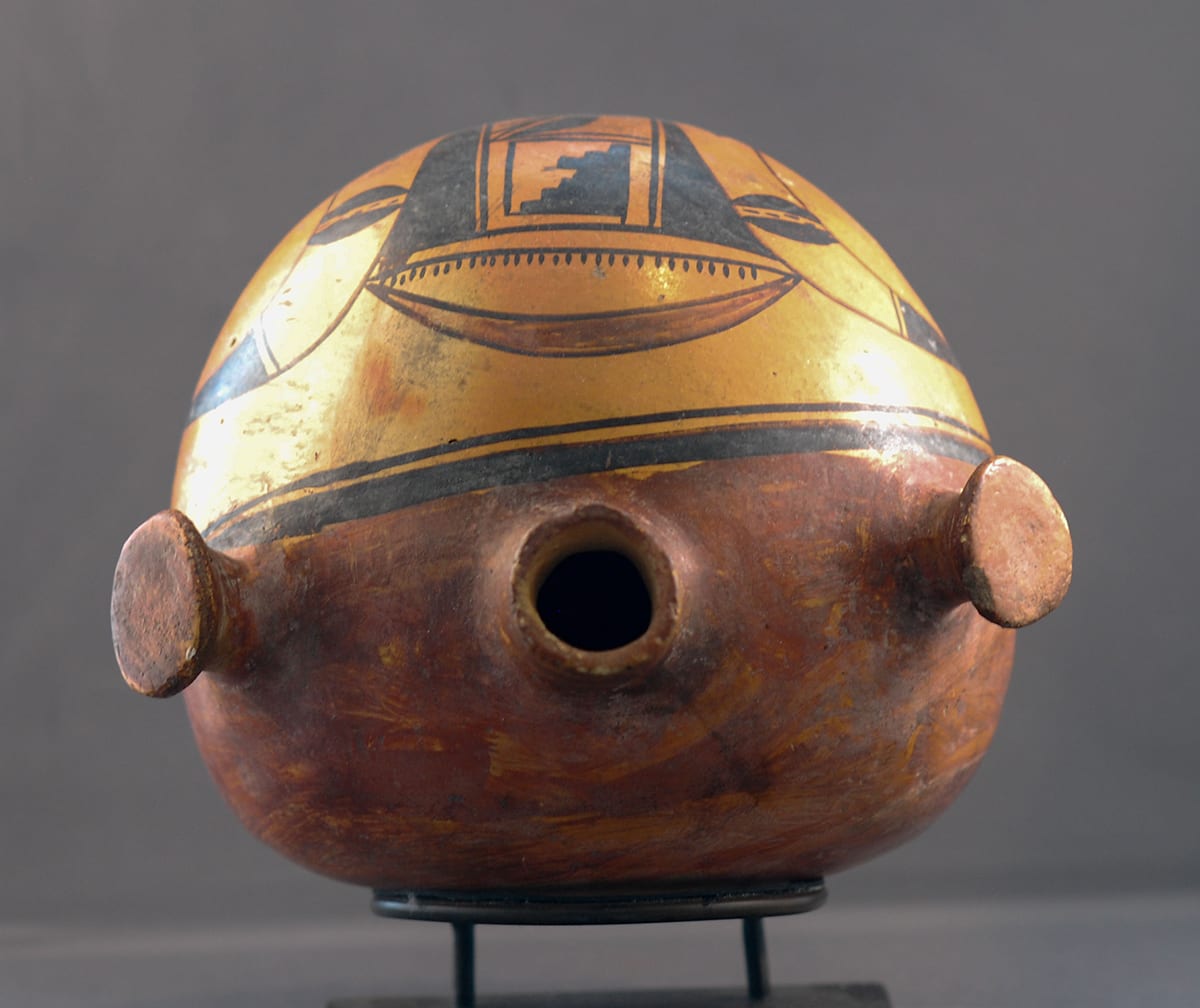
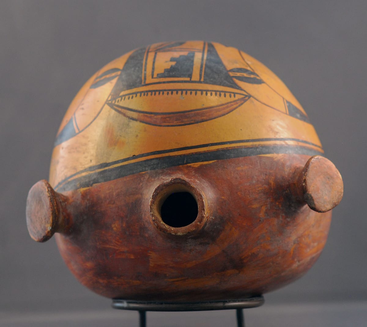
This canteen has a finely formed spout that is sloped slightly to the front—a characteristic of Nampeyo canteens (Struever 2001:108). The spout is quite thin, and although I cannot feel the walls of the canteen body directly, the lightness of the pot suggests that it has uniformly thin walls.
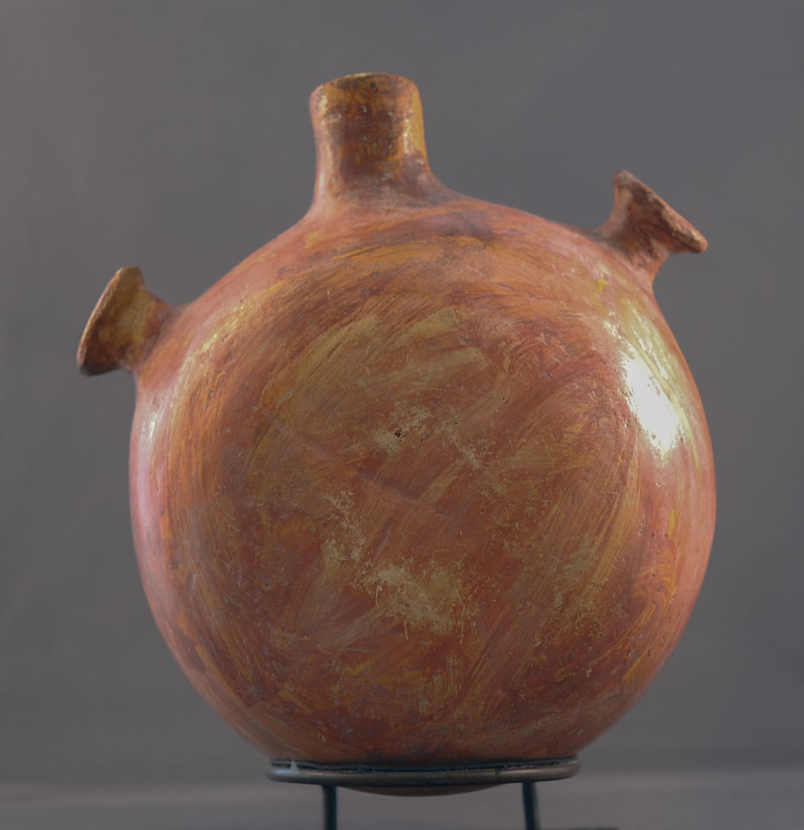
Hopi-Tewa canteens are flat on one side and convex on the other. The extent to which the domed side protrudes, however, varies greatly. Unpainted utility canteens (see 1995-02, 1998-01, and 2003-09) have sharply domed surfaces that maximize the volume of the vessel. Nampeyo canteen 2009-10, although painted, was used by a Hopi-Tewa farmer and has a substantially pregnant look. In contrast, the canteens that Nampeyo made specifically for the tourist trade (1999-03, 2000-07, and 2010-11) are relatively flat with slight convex surfaces used for design. To summarize: Canteens intended for use are large so they can carry a useful amount of water. Canteens made for the tourist trade are small so they can be carried home easily. In these aspects, canteen 2012-13 is more like a utility canteen than a vessel intended for the tourist trade. Its belly protrudes more than any other painted canteen in the collection. It has the size and carrying capacity of a one-person utility canteen. The use of knobs to fasten a carrying strap to a canteen is not unknown, but it is unusual. The Museum of Northern Arizona has a canteen in its collection with this feature (Allen 1984: 52 and 119) that is dated ca. 1900-1915, but other than the knobs, the shape and decoration have little in common with 2012-13. A small Polacca “D” tourist canteen in this collection (2013-02) also has lug handles. Given its utilitarian size and shape and the unusual use of knobs, canteen 2012-13 is an outlier among painted Hopi-Tewa canteens.
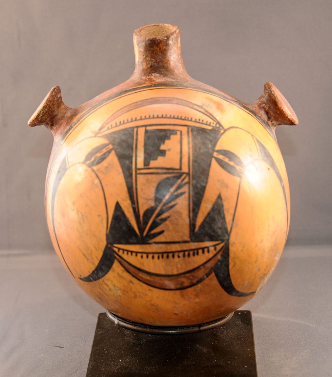
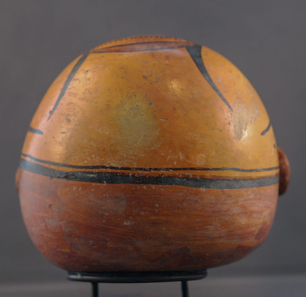
The sequence of procedures used to finish this pot can be discerned. First, the whole canteen was stone polished, and then the rag-wiped red slip was casually added to the flat backside of the pot and about 40% up the sides of the canteen, thus incorporating the two lugs. Nampeyo failed to cover one small section of the spout with the red slip and the stone polish underneath can be seen. Furthermore, the boundary line between the red-slipped rear and the unslipped front of the pot is irregular. The red slip extends closer to the front of the canteen on the top third of the canteen than it does on the lower two-thirds. As a result, when Nampeyo went to draw in her typical thick-over-thin framing lines she was forced to follow the boundary between the red slip and the unslipped section, and these framing lines are thus also irregular. This is particularly noticeable near the lugs: the framing lines pass just in front of the right lug but about 0.25” in front of the left lug. Nampeyo seems to have started the framing lines just to the left of the right lug and continued around the dome in a counterclockwise direction. When she came back around to the right lug she was too close to the rear of the canteen and had to make a fairly abrupt jog in the thick framing line in order for the line to pass in front of the right lug. You can just see where the start and finish of the thick framing line overlap.
The central design is about 6.5” across from top to bottom. About 4.0” of this distance is painted on the top section of the convex surface. As a result, the top red swag is only about 0.5” from the framing lines, while the bottom swag is 3.0” from these lines. The design is intended to be seen from the top. Moreover, the design is not centered on the curved dome of the canteen but is shifted somewhat to the left when the canteen is viewed head-on. As a result, the thin curved line that forms the edge of the design is much closer to the framing lines on the left side of the canteen than it is to those on the right.
Except for the two central motifs, the design is almost symmetrical. Long, thin, curvilinear forms emerge from the top corners of the design and curve downward. Two small isosceles triangles form the base of these curves. As on bowl 1993-04 with a similar element, a “split rain cloud” form was imbedded by Nampeyo in the curve. Similar, but smaller, solid forms emerge from the bottom corners and curve around to almost meet the top curved motifs. Two curved red swags join the top and bottom corners of the design. Except for this color, the front design is black. A black line connects the points or each red swag. Below this line on the bottom swag are 20 short lines. A similar series of 30 short lines is drawn above the line joining the points of the top red swag. Two right triangles (with one side slightly curved) point downward and frame the center of the design.
The two central motifs are completely asymmetrical. The top image is the familiar stepped rain cloud, which forms the third and fourth sides of a crook. The longest step forms the top of this design and the smallest step is the bottom, except that the fourth step is the second longest and creates an irregular sequence. The bottom central design is drawn in a rectangle with its diagonal line left unpainted. Above this diagonal are two half moons; below the diagonal are a series of five thin spikes. The intention to make these central designs asymmetrical could not be clearer.
A small area of the unpainted surface of the front (at about the 4 o’clock position) has been abraded.
The design is probably just an abstract set of motifs, but there is some suggestion that it forms a face with the lower swag the mouth and the two ovals incorporated into the upper curved elements acting as eyes. I’ve seen somewhat similar designs called “buffalo dancer katchinas,” but it’s all a bit of a Rorschach test.
In Appendix B, I define six characteristics of Nampeyo’s mature painting style. It is instructive to see how canteen 2012-13 measures up against these criteria:
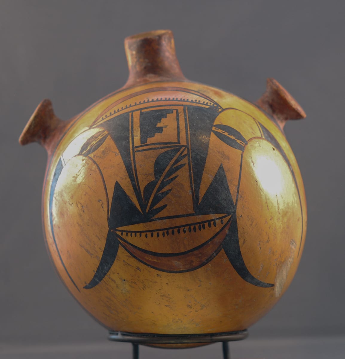
1) A tension between linear and curvilinear elements often represented as a contrast between heavy and delicate elements.
All of the edges of the design are curvilinear and the central area of the design is linear. Between these two patterns are four triangles that are a blend of the other two patterns: they are straight-edged like the center but pointed like the “eagle tails.” The linear central lines of the design are not heavy; rather, the triangular motifs have visual weight and contrast with the lightness of the “eagle tails.”
2) A deliberate asymmetry of design.
As noted above, much of the design is symmetrical with the central two areas dramatically not so. Somewhat more subtly, the number of dots painted between the horns of the top red swag is 50% more than the number on the bottom. The overall pattern of the lines and dots connecting the points of these swags is the same; the asymmetry is in the details.
3) The use of color to integrate design elements.
The red swags are the only color in the front design and only somewhat integrate this design. However, when the canteen is looked at overall, the red swags link the front design with the red knobs, sides, and back of the canteen. If the front design was all black and the rest of the canteen painted red, the front design would not be nearly as integrated into the overall look of the vessel.
4) The use of empty (negative) space to frame the painted image.
Because the front design floats near the top of the unslipped surface, the use of negative space to frame the design is not as apparent here as on Nampeyo’s eagle tail seedpot (2005-16). This placement, however, means that the bottom half of the canteen (approximately from the lower dotted swag line down) is set off by large amounts of negative space. Similarly, because the design is off-center from right to left, the right side of the design is highlighted by empty space more than the left. Overall, when one contrasts Nampeyo’s use of unpainted surfaces with the design layout of her contemporaries and most of her descendants, her use of negative space on canteen 2012-13 is distinctive.
5) The use of a thick-above-thin framing line on the interior rim of her bowls.
As noted in my discussions of her other canteens in the collection, Nampeyo’s canteen decoration is the same as on her concave bowls, only painted on a convex surface. Thus, the thick-over-thin framing lines one expects on her bowls is found on canteen 2012-13, albeit made somewhat irregular by the casual application of the red swabbed paint and the placement of the carrying knobs, as discussed above.
6) Confident, bold, and impulsive painting.
There are some aspects of the painting that are downright sloppy—particularly the application of the red swabbed paint and the resulting irregularity of the framing lines. The points of two “horns” on the left of the design almost touch; those on the right are much further apart. The two red swags are somewhat differently shaped and the placement of the dots inside the two double lobed “eyes” is irregular and quickly done. The shape of the crook in the top center is equally casually painted. The painting on the convex surface has all the hallmarks of Nampeyo’s painting style.
While canteen 2012-13 thus passes the test for these markers of Nampeyo’s work, the design is quite busy (even a bit frenetic) and lacks the centering calm of some of her greatest work. It is not a design I feel compelled to return to again and again, but it is interesting and instructive.
I purchased canteen 2012-13 from Rutt Bridges on 6/4/12. He had purchased it from Marti Struever in April 2001. In her letter of authentication, Marti wrote to Rutt:
“It is my opinion that this canteen was made by the renowned Hopi potter, Nampeyo of Hano. It appears that she also painted this vessel. A favorite motif of Nampeyo’s was the arc, or horn, form that is often found on her vessels. The curving design is seen used on jars referred to (by) the Nampeyo family as ‘the eagle tail.’ It is used here on either side of the central motif. These curved units may represent a bisected bird’s beak. The black oval units within these arcs are often seen in Nampeyo’s painting as well.
The canteen collected by Dr. Joshua Miller, now in the collection of the Arizona State Museum, in the University of Arizona, Tucson, Arizona, exhibits a similar, although much larger shape. (Hopi Pottery canteen, ca 1890-1900, Type C, Catalog #4099) The canteen may be seen on the following web page:
www.statemuseum.arizona.edu/exhibits/nampeyo/details/asm4099.shtml
This canteen (2012-13) and the Miller vessel are both painted on the neck, the handles and the back with a red slip that has been applied in the same casual manner, probably with a swab consisting of sun-dried clay imbedded with sheep’s wool. (Examples of these swabs were collected by James Barrett and are in the collection of the Milwaukee Public Museum, collected from Nampeyo in 1911.) The knobs handles are different than that of the Miller specimen, but there is precedent for Nampeyo doing these knobs on other examples from the 19th century. (Graves-Means collection in my personal files.) The neck/spout of this canteen appears to tilt slightly forward, a characteristic of many of Nampeyo’s water jugs…The canteen was probably made around 1900-1910, in a period when Nampeyo was molding and still painting much of her own pottery.”
