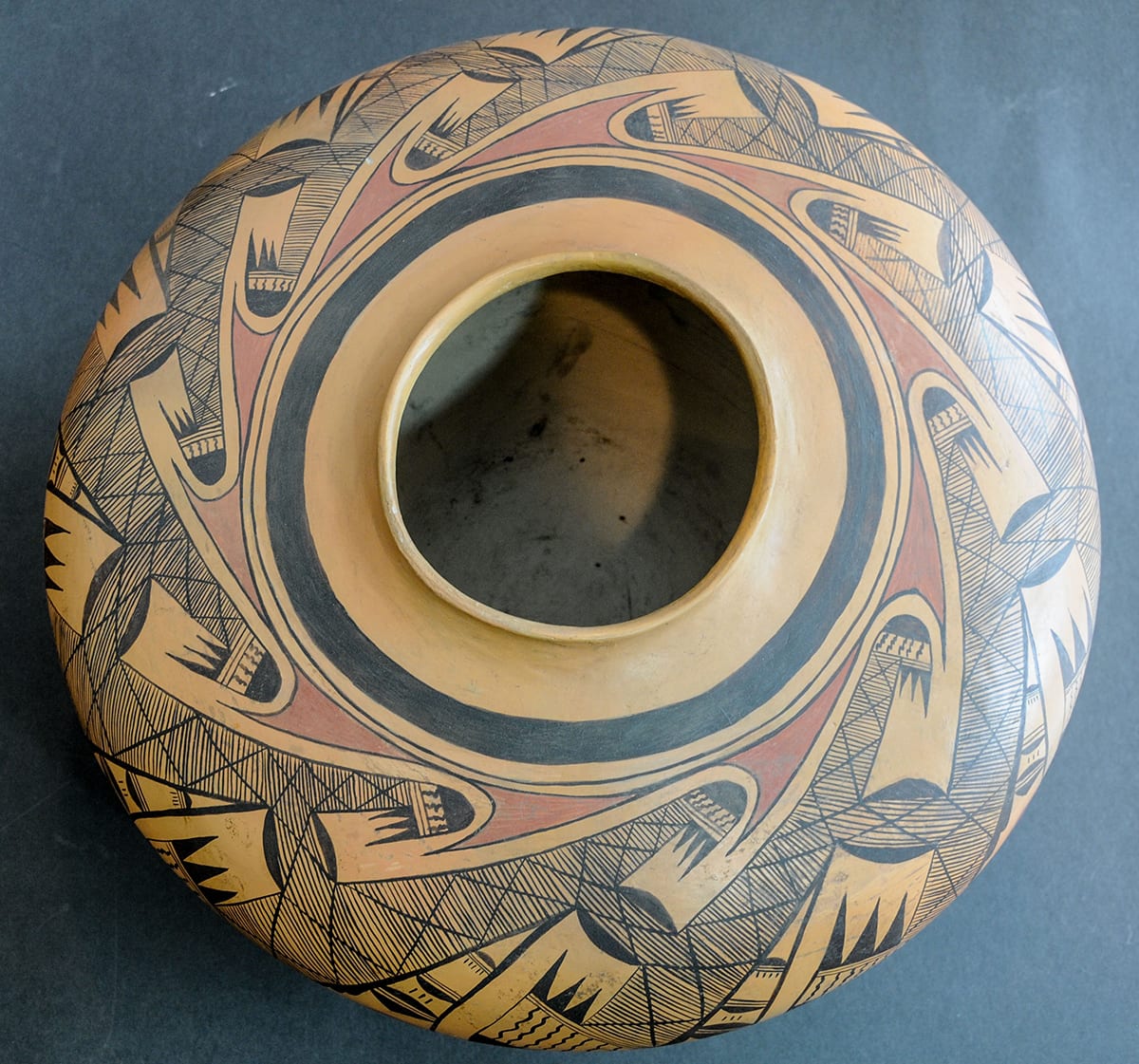
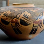
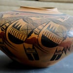
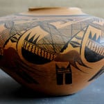
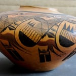
Rachel Nampeyo, who made this pot, is the granddaughter of Nampeyo of Hano. Rachel’s granddaughter was named after her Rachel Sahmie. It happens that these two Rachels made the two largest pots in this collection. (The Rachel Sahmie jar is 2007-17.)
I know of two other pots that are about large as this pot (or larger) and have designs very similar to that on 2012-20. The largest (16” h X 29” w) was offered to the market by a dealer in Sausalito, CA, through Andrea Fisher’s gallery in Santa Fe. Andrea sent me photographs of the pot in September 1999. The next month, I flew to California and had dinner with the pot. Ed Wade and Maurice Bloom, both certified appraisers and Hopi pottery experts, evaluated the pot from photographs and both appraised the pot at about 62% of the asking price. I communicated this information to the California owner and he stopped communicating with me. I have heard (but not verified) that this 29” pot eventually became part of the Wheelwright Museum collection in Santa Fe. Second, there is a pot in the collection of the Museum of Northern Arizona with a version of this same design (MNA pot #E1029, see Allen, 1984:111; photograph on file). The MNA jar is about 12.7” h by 18.1” wide, 1.6-inches taller and 1.9-inches narrower than the pot in this collection.
The 29” California pot is unsigned and was presented to the market as having been made circa 1920-1930. Dan Namingha is a well-known Hopi painter who was born in 1950. Thomas Hoving, former Director of the Metropolitan Museum of Art in NYC wrote a book about Namingha. In the book is a photograph of Dan with members of his family “in the early 1950’s.” Dan appears to be about six years old (Hoving 2000:12).
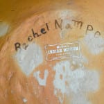
Also shown in the photograph are Ruth James (Dan’s aunt), his grandmother (Rachel Namingha Nampeyo) and his great-grandmother (Annie Healing Nampeyo). Four young children, including Dan, sit against a wall. On the wall appears to be the huge 29” pot that had been offered through Andrea Fisher’s gallery. Ruth James made very little and very simple pottery (see 2008-07). She could not have been the maker of the pot in the photograph. Annie, of course, was an exceptional potter during the first decade or two of the 20th century, but by the 1950s she in her late sixties, was suffering badly from arthritis, and could no longer have made the 29” pot. That leaves Rachel who was in her late forties and in her prime as an artist as the maker of this huge jar. The MNA pot is signed “Rachael Nampeyo” with magic marker that has partially worn off and is recorded as having been made in 1951. Pot 2012-20 in this collection is clearly marked “Rachel Nampeyo” on the bottom. Thus there is convincing evidence that Rachel made a series of large pots similar to 2012-20 in the early to mid 1950s so that is the date range I would suggest for the pot in this collection.
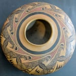
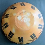
Thick-over-thin framing lines encircle the mouth of jar 2012-20; the base of the jar lacks framing lines. The major design on the jar is a complex motif repeated ten times around the jar. The space between the framing lines and the motif form wave-shaped areas that are painted red so that when viewed from the top the image is of a red spinning sun. Central to each motif is a recurved S-fret wing with black tips and the body filled with cross-hatching, a variation of the classic Nampeyo family “migration pattern.” This design is laid on the pot so as to adapt to the size of the surface available. Thus the upper tips on the frets are smaller and contain four to six wavy lines while the lower end of the fret expands to cover the midsection of the jar and lower tips contain eight to 11 wavy lines. Crosshatched bridges of design (flanked by black half-moons representing clouds) link the nine renditions of this fret. Pendant from the lower half of each fret is a pattern of elements that expand as they reach toward the base of the jar. The first part of this space consists of three split rain cloud elements, followed by a red area that develops into two red curvilinear forms that swing under the adjacent design. Finally, projecting from the red pattern are two geometric elements followed by two linear tail feathers. Except for the red wave are around the mouth of the jar and the red area forming the crescent shapes, the design in monochromatic.
Elements of this design are common in Hopi and Hopi-Tewa pottery—indeed, the central “migration” motif is iconic to the Nampeyo family. However the full design on jar 2012-20 is not reproduced in the modern lexicon for three reasons:
1) The design is so complex that it requires a very large surface to draw it all out. Except near the base of the jar, the design fills all the available space. It is a busy design and the repetition of the elements helps calm the viewer’s eye. It is possible, of course, to take a photograph of the jar and reduce its size. When I do so, it seems to me that the design becomes jumbled, frenetic and not particularly attractive. If the design does require a large canvas, then it is not produced by current potters because of the enormous amount of work involved in building and firing such large pots. The dollar-per-hour return generally is better for smaller pots.
2) The design is conceptually so complex that, drawn by a less-skilled hand, it would become a jumble of elements and visually fall apart, like a too-tall house of cards. It takes practice to arrange the elements so that they remain distinctive and yet flow together into a unified design. If the design does require an exceptionally large surface, then later generations of potters do not have the practice to pull off this complex design.
3) Even if the design could be successfully painted on a smaller pot, the design is so complex and thus requires so many brush strokes as to make it commercially unappealing to modern Hopi and Hopi-Tewa potters. In this sense it is similar to the complex design on the black-on-white Kayenta-style Nampeyo bowl (2012-01). Both take too much work to draw to allow the volume of production necessary to support a family.
Drawn by Rachel on large pot 2012-20, however, the result is impressive and majestic. The overall design fits the shape of jar 2012-20. It is almost as if the repeating design had been printed on a sheer cloth and then draped around the shoulder of the pot. The intricacy of the design engages the eye. The repetition of elements and the large size of the jar allow practice and space for the viewer’s eye to absorb the details. Design and size work together. The result is simply stunning.

