
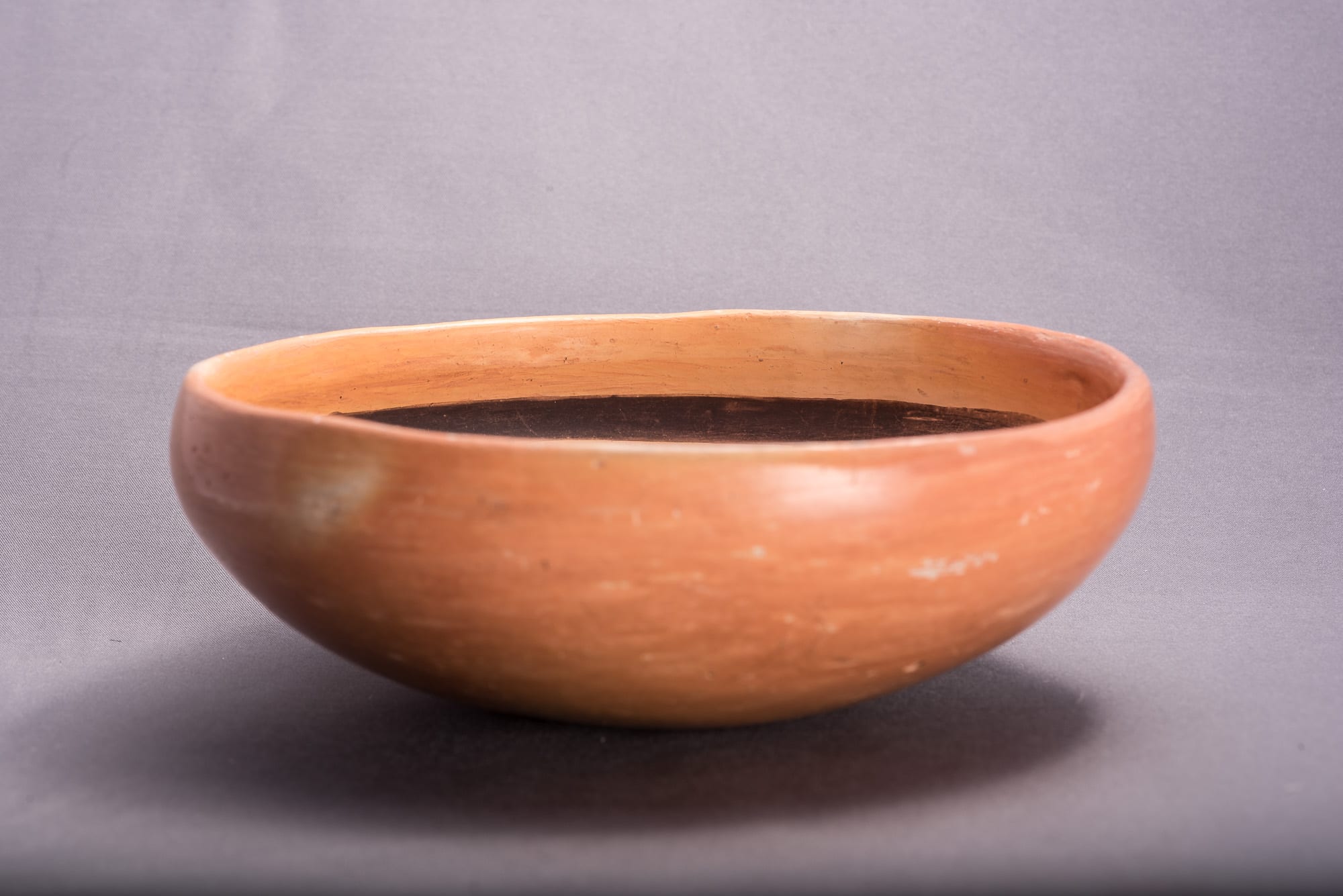
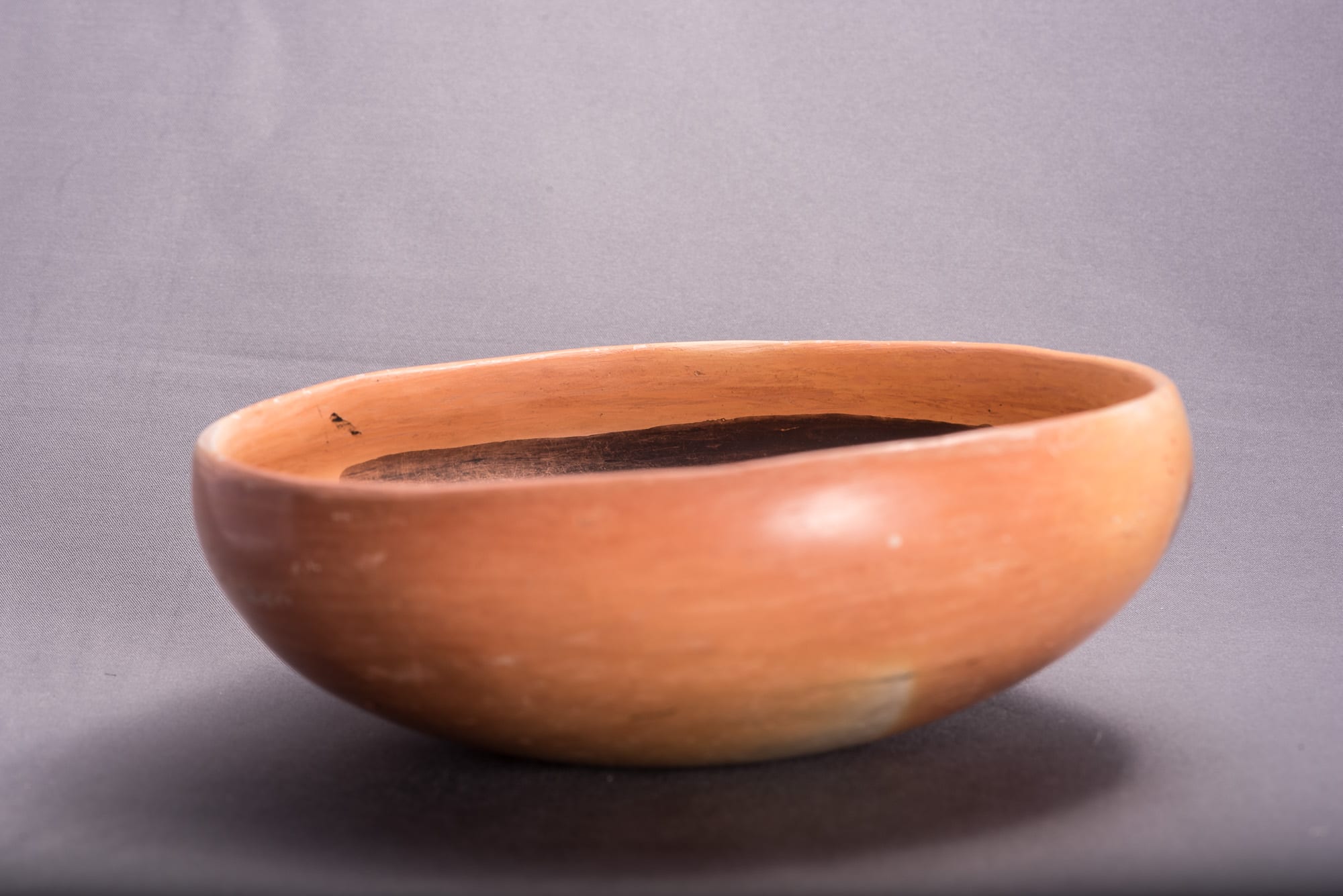
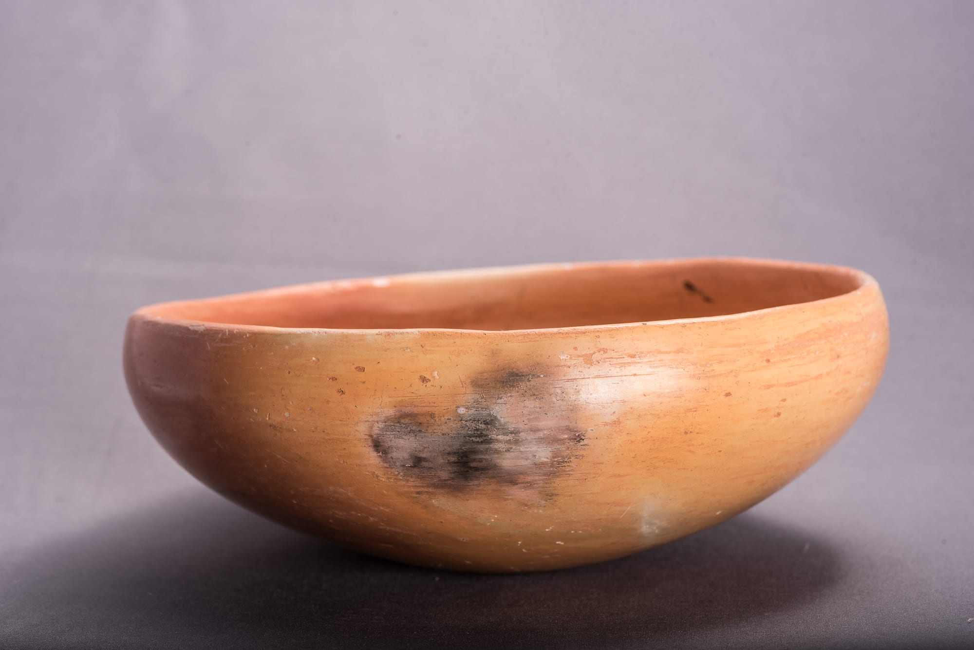
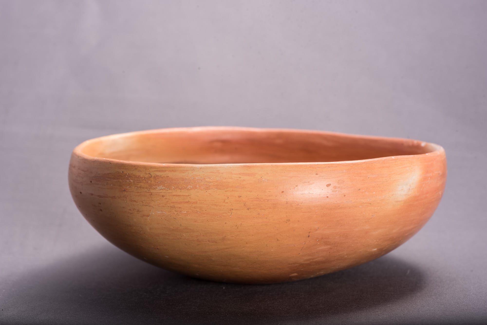
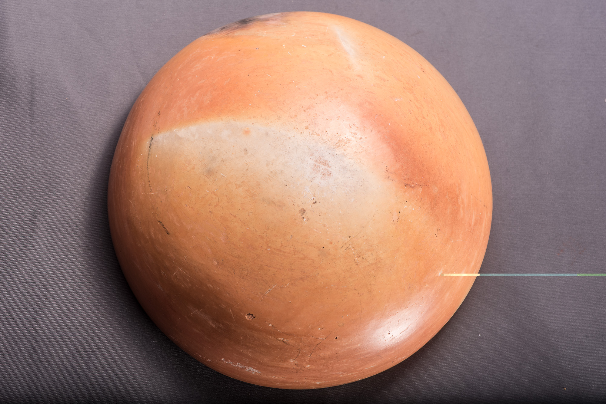
This bowl has a typical Nampeyo shape, somewhat deep with her characteristic extra rim coil. It is well-fired with one area where the fire has smudged the exterior.
There are several areas where the design has rubbed off.
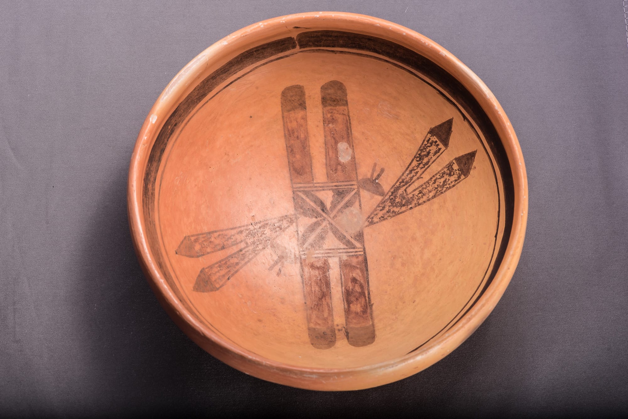
The design is composed of three motifs:
1) A linear series of elements that is symmetrical. At the center of the design is a square with four split cloud elements, a common Nampeyo design. Here, however, the clouds are placed in the corner of the square so that the split lines are continuous and form an unpainted “X.” That X immediately draws the viewer’s eye to the center of the bowl. On either side of this central square are drawn three parallel black lines forming a two-lane road. Next, on either end of this central design, are pairs of feathers composed of long red rectangles caped by blunt black tips.
Were this the only design on the bowl, it would be pretty but float on the interior without energy or motion. The next two design motifs add such energy.
2) Pointed into diagonally opposite quadrants of the central square and thus moving in contrary directions are two pairs of feathers that have an overall “V” shape.
Monochromatic, the body of this element is speckled with solid triangular end on each feather. The tips of the feathers point away from the center of the bowl; the point of the V is touching the central X-filled square. Importantly these elements enter the square at an oblique angle such that the sides of the two V shapes are parallel. Try this experiment: Orient the bowl so the red-painted central element runs from left to right (9:00 to 3:00 on a clock face,) The top V of arrows will enter the central design from the northwest, the bottom V of arrows from the southeast. Working from left to right, number the sides of the top arrow 1 and 2. Then (left to right) number the sides of the bottom arrow 4 and 3. Sides 1 and 3 are parallel; sides 2 and 4 are parallel. Two V-shaped images that have parallel sides: who would imagine? (Except Nampeyo.)
3) Finally, in the acute angle between the first two motifs is a solid half ball with two non-parallel “whiskers” emerging from the curved edge. In a number of ways this simple element ties the first two motifs together. The curved surface of the half ball mirrors the curved black tips of the red feathers. The whiskers form a small v that mirrors the larger V of the monochromatic arrows.
Trapped between the flat side of the half ball and the center of the design is an unpainted triangular area that also mirrors the larger V of the monochromatic arrows. These half-moon shapes with whiskers might be “pahos,” prayer feathers, though these are generally represented as lines flowing from a full ball shape (Fewkes, 1919:241 and plate 78; also 1973:139 and plate 78).
In short, what appears to at first be a rather simple design contains elements that are full of contrary visual motion which give the overall design great internal energy. Simplicity with energy is a Nampeyo hallmark. I discover such internal puzzles of design only in the work of Nampeyo. It’s that elegance of design that I think sets The Old Lady’s work apart from others and defines her as genius.
Elsewhere I have found six defining characteristics of Nampeyo’s mature painting style (Appendix B). When we apply these criteria to bowl 2014-20, we gain new insights into Nampeyo’s creative mind. Four are seen on bowl 2014-20. The purposes of the other two are met, but by means that are unique to this bowl.
The six strategies are:
1) A tension between linear and curvilinear elements often represented as a contrast
between heavy and delicate elements.
When I first saw images of this bowl, I thought “this seems like a Nampeyo, but something is odd.” One difference is the lack of major curvilinear elements of design on bowl 2014-20.
The split cloud design in the center and the two half-cloud elements have curved surfaces, but such curves do not have major visual weight. (Compare this design to that on Nampeyo bowls 1993-04 or 2014-07, for example.) Nevertheless, Nampeyo has accomplished the same result using a different strategy. Linear elements exist on bowl 2014-20, but here the counterpoints are triangular elements rather than the usual curvilinear elements. The juxtaposition of linear and triangular creates the needed tension and energy.
2) A deliberate asymmetry of design.
Everything in the design works to keep the viewer’s eyes focused on the center X motif. It is framed by pairs of eye-catching red rectangular feathers and both pairs of V shaped feather point to the center. Nevertheless, there is strong asymmetric energy in the design.
Often Nampeyo will add a seemingly random element in one part of her design to throw it off balance and add energy (cf bowl 2002-03). That is not the case on bowl 2014-20. All elements of the design appear at least twice and thus superficially the pattern seems balanced. However, by having the pairs of triangular feathers touch the central X element at
diagonal quadrants and in different directions, the design is thrown off symmetry. If the design on the bowl were printed on a piece of paper, it could not be folded so that these triangular feather designs would overlap.
Oddly these same V-shaped feather pairs also add a subtle sense of balance since their sides are parallel, as explained above. The interaction between the central linear design and the two triangular feather pairs is multilayered, complex and energizing.
The remaining four design strategies are fully-realized on bowl 2014-20:
3) The use of color to integrate design elements.
The two sets of parallel red rectangles frame the black square in the central band and link the left and right ends of this motif.
4) The use of empty (negative) space to frame the painted image.
There is substantial unpainted space around the design on this bowl and one can imagine it spinning like a propeller in this area.
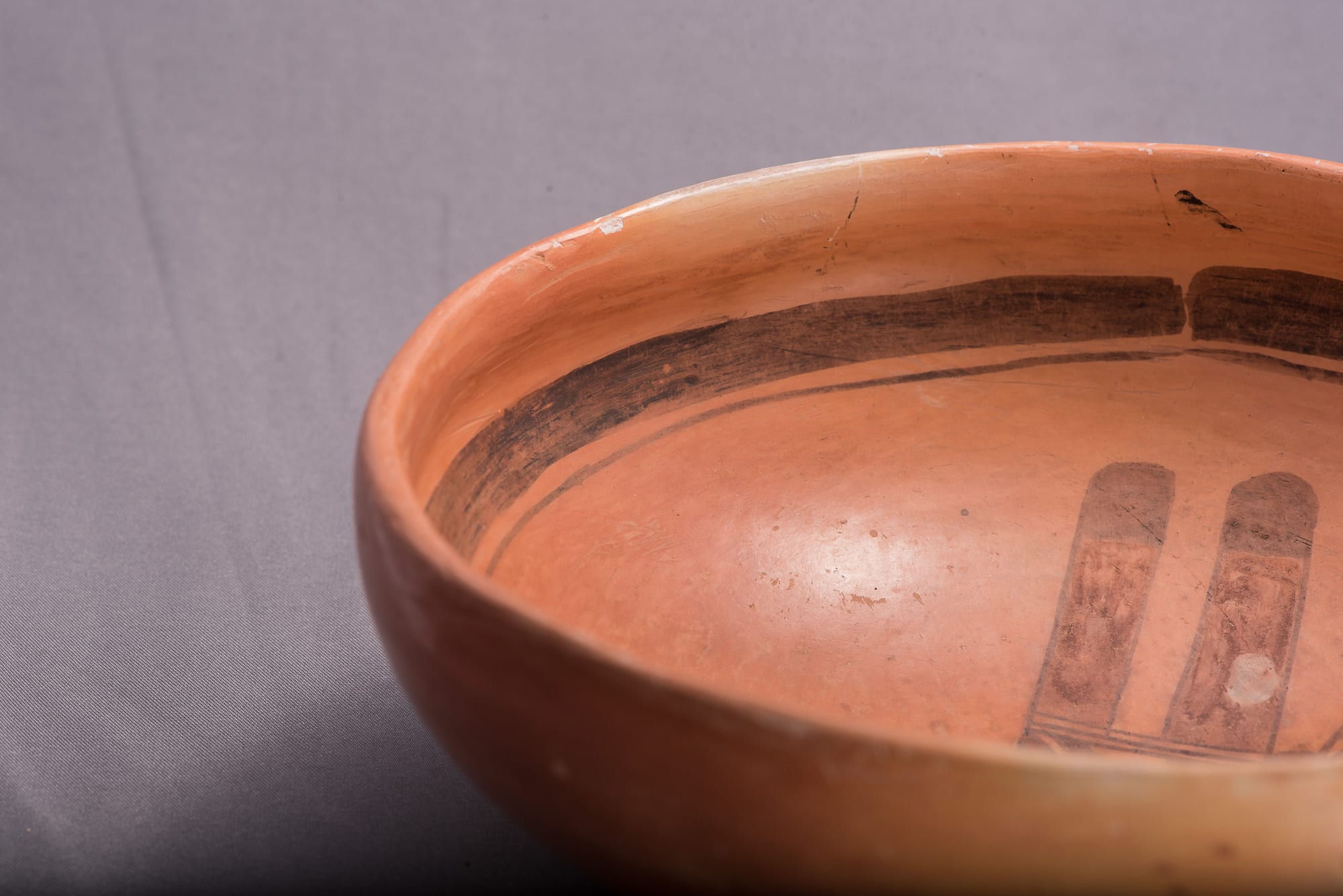
5) The use of a thick above a thin framing line on the interior rim of her bowls.
The design is framed with Nampeyo’s usual thick-over-thin framing lines with a spirit break. Such breaks are known on Nampeyo pottery, but are unusual.
6) Confident, bold, and impulsive painting.
This is the most intangible of the six design characteristics, but is at the heart of why Nampeyo was a master ceramicist. Uncharacteristically the thick framing band has a small paint drip; the thin framing line is a bit wobbly. The central design, however, is done with the confidence and boldness we expect from “The Old Lady.” It’s a minor detail to be sure, but notice that impulsively a boundary line inside one of the triangular pairs of arrows has an extra small line out of place. The painting is heavier than daughter Annie’s but is assertive. The blotchy red ink is typical of Nampeyo’s ca. 1910 work.
I had not thought that bowl 2014-20 would be an especially important Nampeyo pot in this collection. Unexpectedly the original “oddness” of design has resolved itself into two design strategies that create tension and energy in design but were not anticipated by my design typology. Such are the limitations of post hoc Pahana analysis and also the great fun of using her pots to try to understand the creative mind of Nampeyo.
