

Nathan Begaye was a brilliant, iconoclastic potter and this pot is representative of his best work. Thirty years after I first saw it and tried to buy it, it finally entered my collection.
The form:
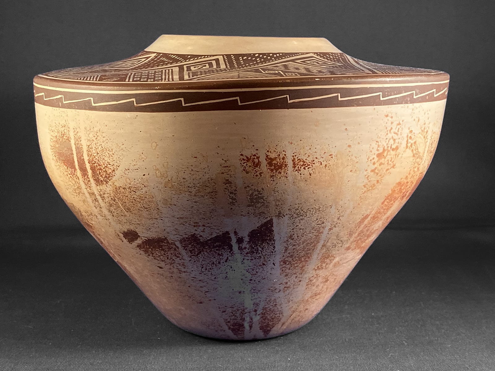
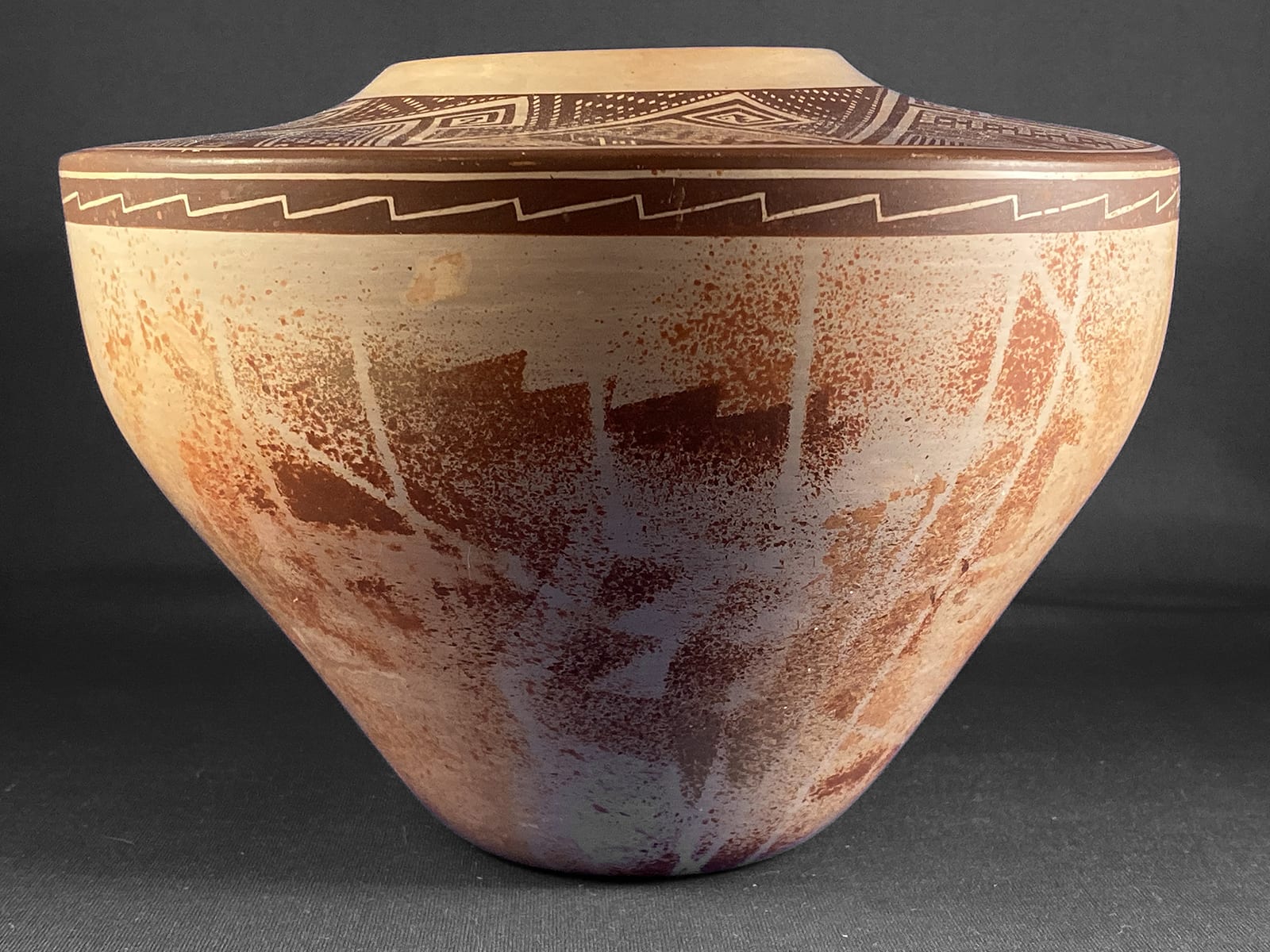
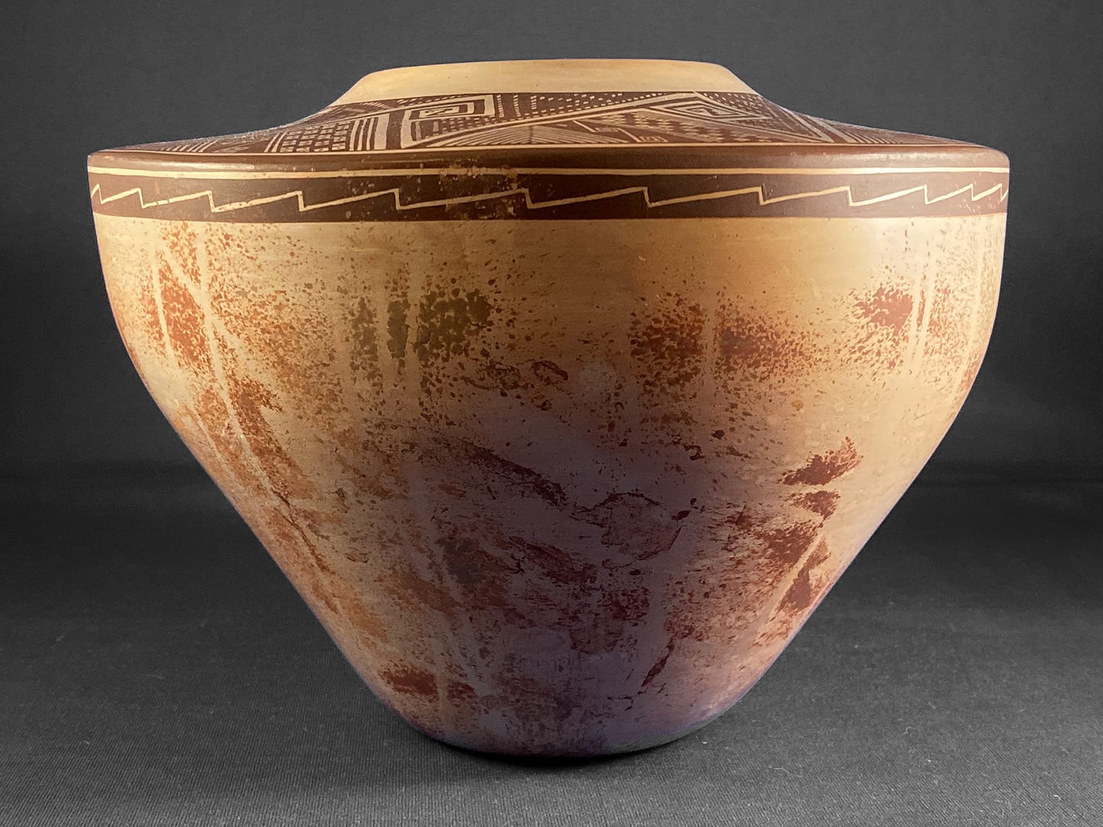
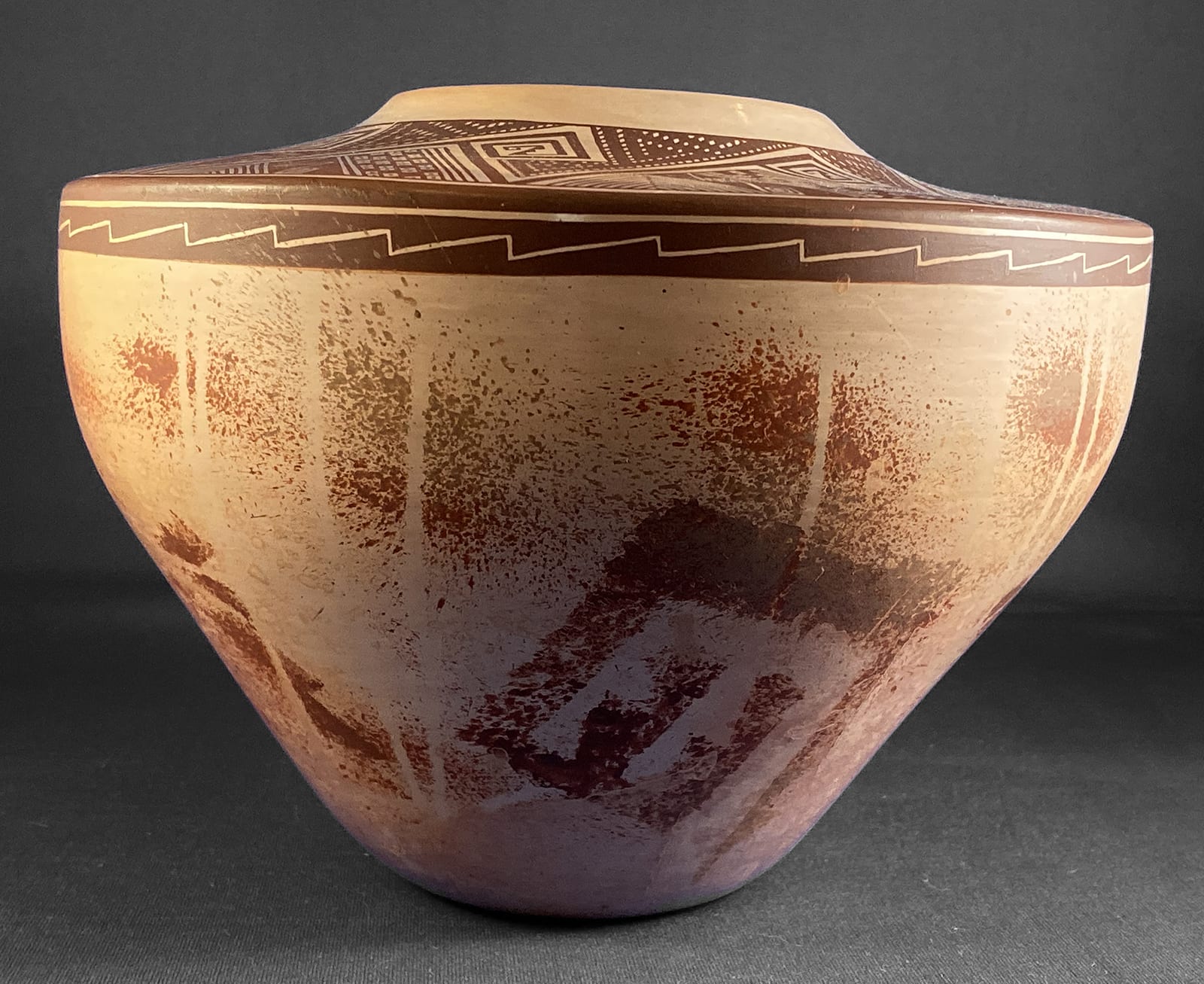
The walls of this pot are thin, but not as thin as those of 2013-01 formed 14 years earlier when Nathan was a young teenager. The vertical walls are slightly thicker than the horizontal top surface since the wet coils of clay on top had to be particularly light to dry without internal support. The widest point of the pot is almost four times wider than its 2-inch base. The walls of the jar taper outward for 3.5 inches from the small base, then turn vertical for 2 inches before they join with the horizontal top surface. A narrow, curved and unpainted rim forms a mouth in the center of the painted horizontal surface. All of these characteristics add to the pot’s sense of lightness and grace.
The clay fired white, which could be native kaolin clay but more likely had a commercial source. When struck with a finger, the pot responds with a dull “thunk,” which indicates a low temperature firing. Nathan sometimes fired in a traditional dung-fueled fire and sometimes placed his pots in a ceramic clam-shell like device and fired in a commercial barbecue.
I find the painting of the pot striking for two reasons. First the casual, subdued design on the bottom sharply contrasts with the intricate, formal design on the top. Second, the patterned detail of the top painting was done freehand with almost no error, which I disbelieve every time I look at the pot. Robert Nichols (who represented Nathan for 25 years) and others who knew Nathan well assure me that he was capable of such detailed freehand design .
The sides:
The vertical walls of the pot carry ghost-like brown images, the clearest a crook with two saw-tooth protrusions. Fainter and more fragmented saw-tooth elements are scattered in several other locations around the circumference. Clouds of misty brown dots cover much of the remaining surface, like the stars of the Milky Way on a clear desert night. About 25 drip lines cut across this already diffuse imagery, removing the paint along narrow paths. The overall impression is soft and enigmatic.
In sharp contrast, the top half an inch of the walls of the pot and the horizontal top surface are painted with clear, black, structured designs. I believe the narrow band of black design at the top of the walls was first painted as a solid stripe and then Nathan returned with a sharp point to scratch away paint and create an image. First he scratched in a single line with about two-thirds of the painted band below the etched line. In this wider band he then scratched a contiguous series of 33 inclined ramps that remind me of the Hopi mesas outlined against the evening sky.
The Top:
Most generally, the top of jar 2018-10 is painted with an eight-pointed star centered around the unpainted lip of the opening. The star seems (mostly) painted on a black background; the area outside the star on the circular top has a white background. The solid band from the side of the jar curls over the edge just a fraction of an inch, followed by a tiny band of white, its inner boundary a black line that is the outer border of the detailed painting that dominates the surface.
First I will describe the painting inside this framing line but outside the body of the star, though this division is somewhat inaccurate. Then I will describe the pattern inside the star. The same detailed pattern is repeated eight times, so that describing one example allows me to extrapolate to the entire design.
The top outside the body of the star:
The pattern outside the star is built around a 2.5″ line that is at right angle to a 1.25″ line, thus forming a triangle with its base the thin circular framing line that encloses the top design. On all sides this black triangle is surrounded by a thin unpainted (and therefore white) space, thus highlighting this form. The two straight lines are not joined at their tips: the shorter line intersects the longer about 0.75″ from the end of the longer line. Beyond this point the longer line forms a square greek crook with six 90-degree turns. At its center is a small Z-shaped element with its diagonal two saw-toothed points and then a thinner final element parallel to the larger crook with a hooked end, like the letter “J” turned on its side. It’s a minor detail, but that tiny saw-tooth design on the end of the crook reflects the much larger saw-tooth design on the side of the jar. Attention to such detail is part of the genius of this jar.
Inside the triangle formed by the intersection of the two lines are a series of five design patterns, the first four of which slope at an angle towards the edge of the pot. First is a series of four parallel lines forming a three-lane “highway,” a motif frequently used by Nampeyo.
Second is a grid of 4 columns by 13 rows, though this pattern is truncated by the curved edge of the jar. The cells are either unpainted with a central black dot or are solid black. The pattern by column is a black square followed by either a) two white squares, or b) three white squares. Column pattern “a” and pattern “b” alternate the eight times as this motif is repeated around the top of the jar. To further complicate matters, the pattern of the first row has two patterns and one variation, either the sequence c) black, white, black white squares or d) three white squares followed by one black square. Again, pattern “c” and pattern “d” alternate the eight times this checkerboard is repeated except that one expected rendition of “c” has a unique sequence of white, black, black, white squares. (Design deviation #1.) These complex patters are not obvious but they are intentionally patterned by Nathan.
The third design pattern is a series of three parallel lines forming a two-lane “highway.”
The fourth design pattern outside the star is a solid black diagonal with an etched pattern. This pattern has two designs. The first is a sequence of two linked greek keys. The top key is formed by two “L” shaped elements with ends that are fit around each other but do not touch. The lower key is a single line with six 90-degree curves that hooks around itself. The second design consists of a straight line perpendicular to the edge of the pot that turns 90 degrees and forms a two-step form, then drops perpendicular again then makes six 90 degree turns to form a small greek key. This small greek key pattern matches the key form in first variation of this section and also echos the much larger greek key projecting off the large triangular form above. In the upper right corner of all eight renditions of this black diagonal there is one white square with a central black dot, an element that seems to have wandered over from the crosshatch section.
Finally, the fifth design pattern is a series 6 to 8 layered pyramid forms. Notice that the ends of the intersecting lines do not meet at their tips but rather just short of this point. The result is a pattern that looks like stacked 2×4 planks leaning against each other for support. Again, two patterns present themselves. In the first the “planks” alternate singly. In the second pattern the planks have been paired together and it is these two-board forms that form a triangle.. These two patterns alternate except that in one instance where we expect a single plank pattern there is a two plank pattern. Thus there are a total of 3 instances of the one board form and 5 of the two board format. (Design deviation #2.)
The top inside the body of the star:
The eight large black crooks set upon a white background intrude into the symmetrical form of the eight-pointed star, but otherwise the design internal to the star first appears to be patterns of white dots set against a black background. Blink and the pattern reverses and seems composed of black lines against a background of white squares. Apparently Nathan first created a grid by crossing lines that were parallel to the long side of the large crooks, with lines that were parallel to the squared end of the neighboring crook. He then painted in adjacent squares to form the pattern of black design and a residual pattern of white squares.
Along the full length of long side of the large crook is a row of white squares. Above and parallel is a black line with a large black check mark emerging about one third of the way from the lower end. The short end of the check mark marks the beginning of clockwise moving triangular greek key. The long end of the check mark forms one side of a second but larger triangular greek key, this one moving counter clockwise and terminating with a solid black triangle at its center. These two elements take up almost all the space in this section of design. A small residual space to the right of the larger key has one row of squares painted black to form a simple triangle. In 5 cases the interior of this triangle has only upainted white squares. In the remaining 2 cases (which are next to each other) the interior contains a small, solid black triangle. (Design deviation #3.)
Overall:
As noted above, the painted black and white top surface extends a fraction of an inch over the edge of the pot, giving this painted surface the appearance of a lid on a jar. Amid all the detail on the top surface, there are only three minor deviations from pattern, invisible except to the most compulsive gaze. The pattern is so intricate that it looks woven rather than painted. I cannot imagine the creative process and intense focus necessary to first imagine and then paint the design. I do imagine that Nathan intended jar 2018-10 to be a tour de force demonstrating the extraordinary ability of its maker.
This creative intention to push limits, and the incredibly detailed painting that resulted, is of the same cloth as Nampeyo’s black-on-cream bowl in this collection (2012-02). Both resulted in designs of immense intricacy that took so much time and effort that they seem impractical to produce for the market. It’s all speculation on my part, but both pots seem to be “see-what-I-can-do” jars that test the limits of the maker’s skill and reflect joy in ability.
Provenance:
Shortly after it was made in 1986 I saw jar 2018-10 in Robert Nichols’ gallery in Santa Fe but could not afford the asking price. Over the years, as I was able to afford more expensive pots, the price of 2018-10 increased faster than my resources. When the pot was not on view, Robert would often find it for me and let me fondly it for a while. When I visited the Nichols Gallery in May of 2017, Robert had increased the price yet again and I came away with only photographs. After a long and kind life, Robert died in 2018. About a month later I visited his gallery, inquired about this pot, and was able to reach a mutually-satisfactory price. Thirty years after I first saw it, the pot came to live with me.
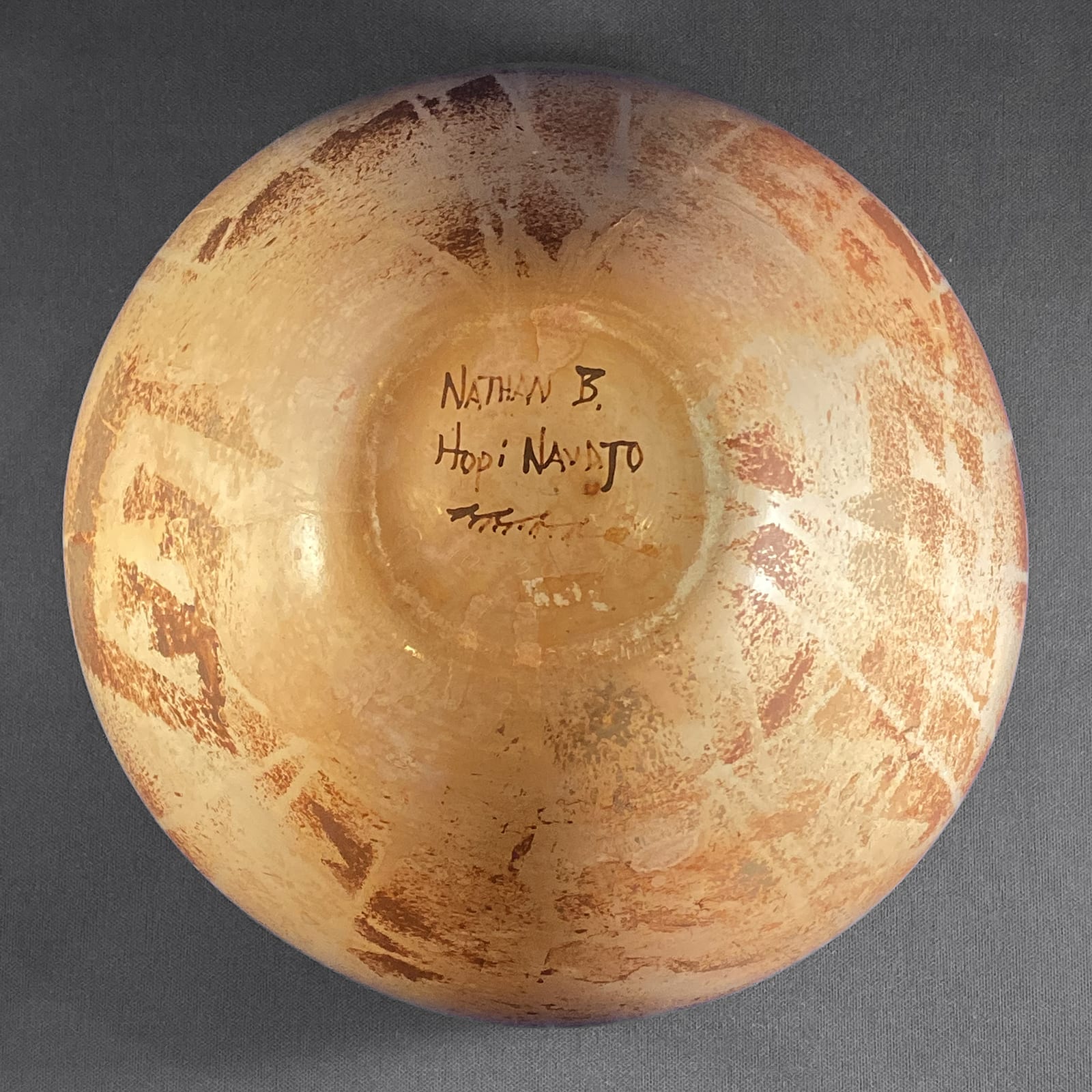
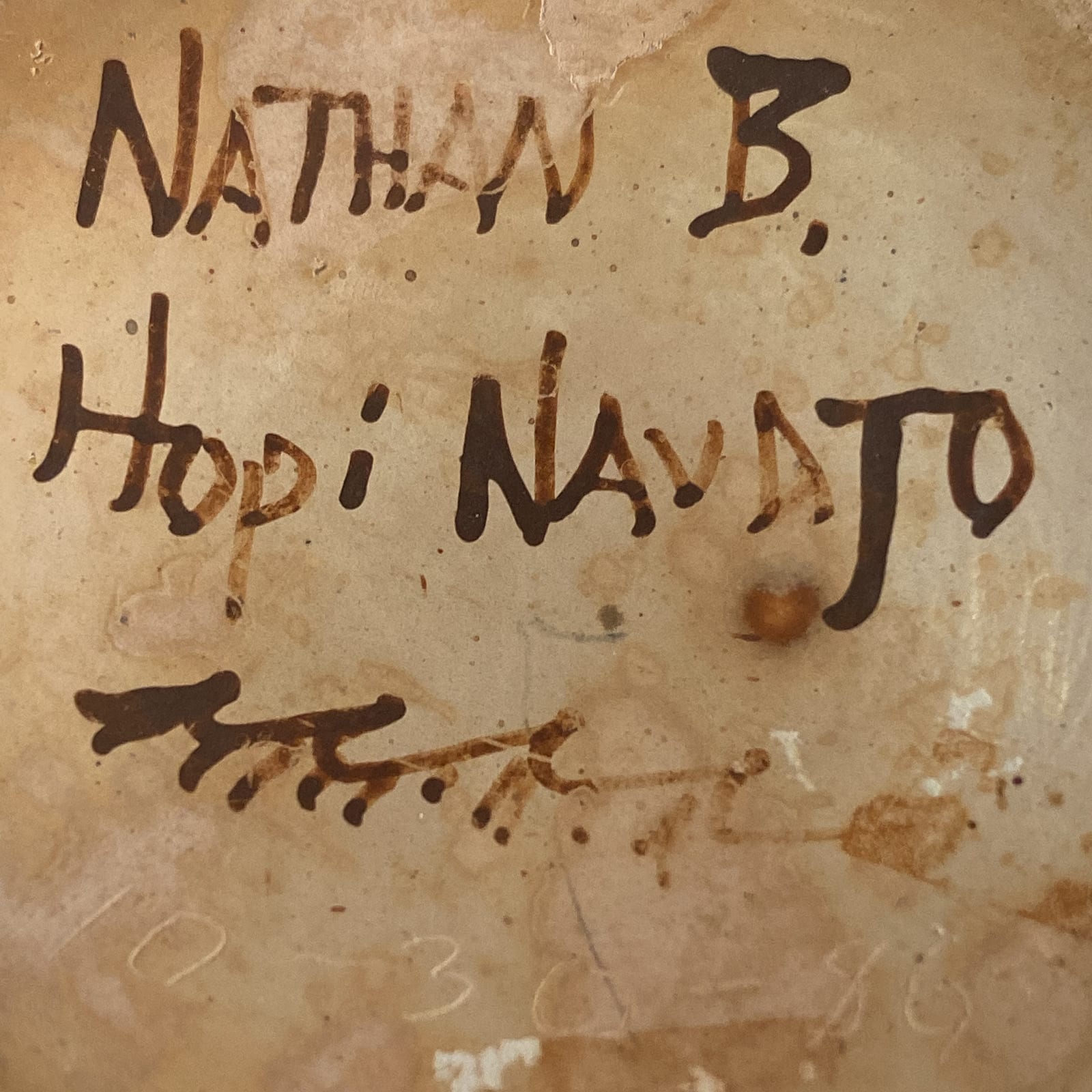
According to Robert Nichols, in 1986 (when Nathan was about 28) Nathan used a SWIA scholarship to attend Alfred University, which was the leading ceramics program in the country ( also Clark 2006:23). According to an inscription on the bottom, pot 2018-10 was made on October 30, 1986. If the school year began in early fall of that year, pot 2018-10 might have been made during his first few weeks of work at Alfred. In any case, the pot displays the incredable talent of Nathan before the bulk of his training in this leading ceramic department.
I was awed and dazzled for 30 years when I visited the pot in the Robert Nichols Gallery and remain awed, dazzled and delighted when I now visit the pot in my home.
