
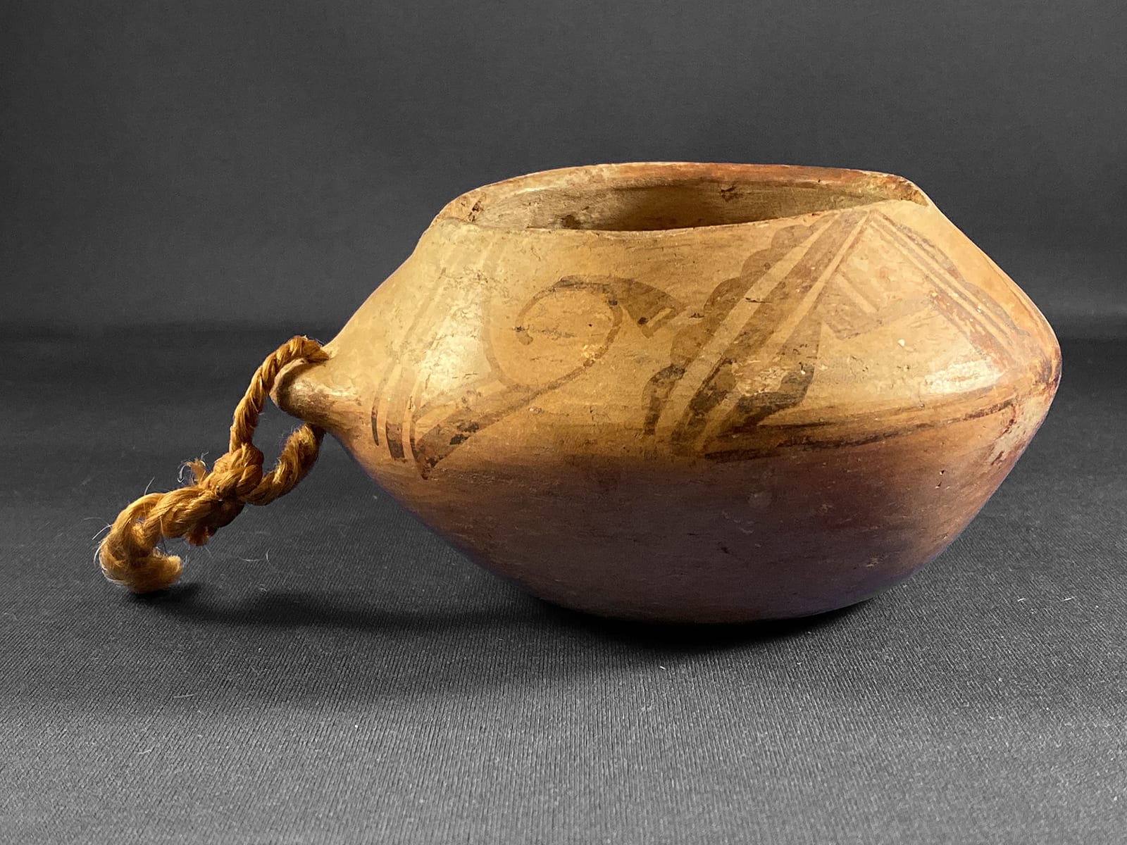

Most pots are in this collection because of their beautiful form, exceptional decoration, or the importance of their maker. None of these criteria apply here. Cup 2019-04 is included because it is only the second Sikyatki Revival painted pot in the collection that seems to have been made for Native use and was not intended to be sold to a dealer or collector. (The other such pot is canteen 2009-10 by Nampeyo.)
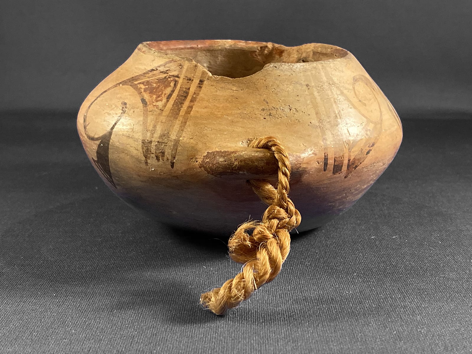
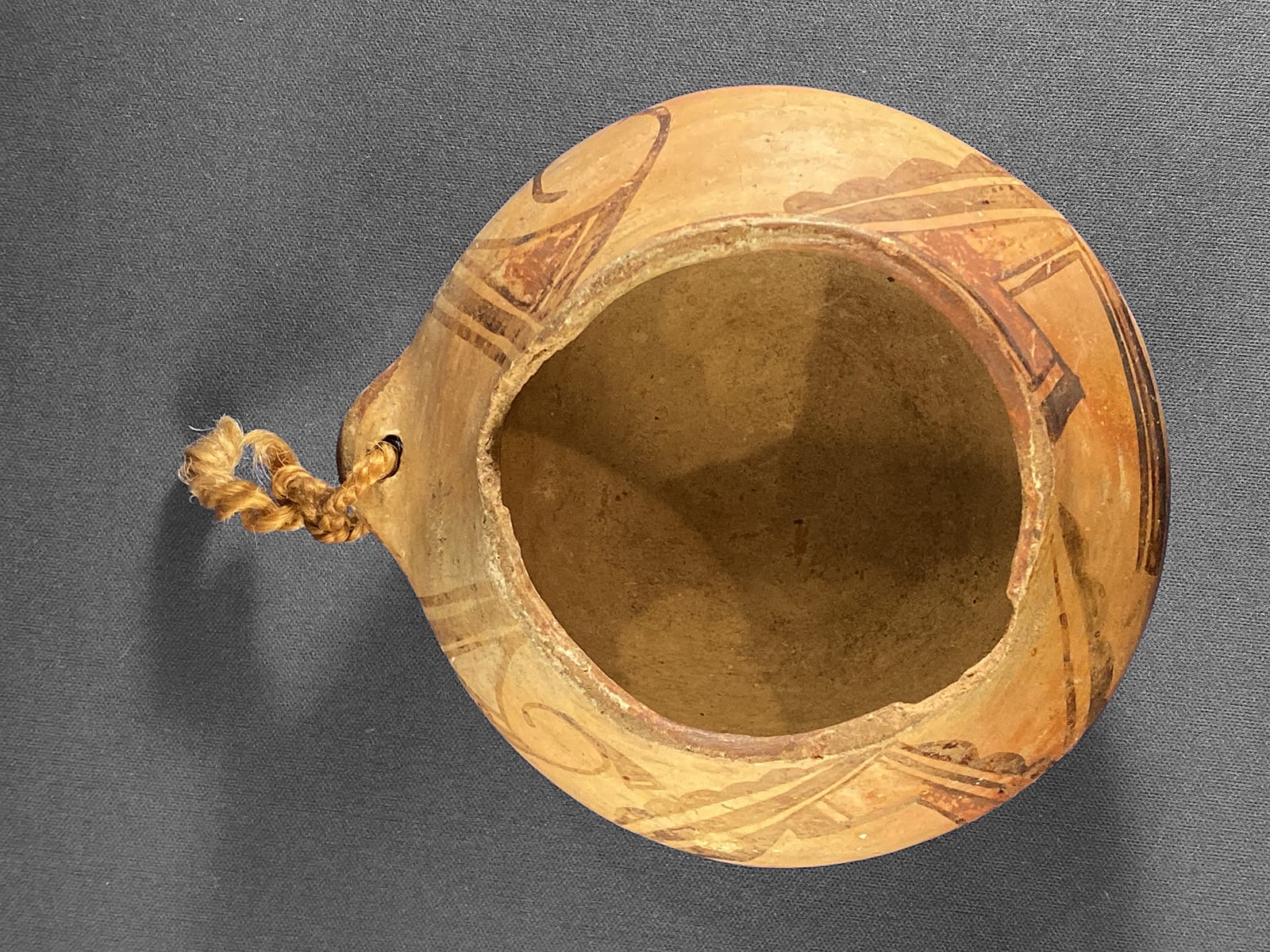
This cup is formed from a small bowl with the addition of shoulder that slopes up from the cup’s rim to the mouth of the vessel. The walls of the cup are quite thick; the walls of the sloping shoulder noticeably thinner. The cup seems heavy for its size. The inside is only roughly finished and the juncture between the lower cup and upper section is easily felt with a finger. At this juncture, but external to the cup, the potter added a substantial 0.3125-inch clay lug through which a string has been tied to secure the cup when carrying. The edge of mouth is chipped in two places: above the lug and about opposite from the first chip.
Almost all of the decoration is above the waist of the cup on the sloping surface. The design is quite worn from extensive handling. There are two basic designs on four areas of the cup. For clarity, I will number these designs 1a, 1b, 2a and 2b.
1a: When seen from above, the design to the right of the lug:
This design begins with a a thin black line that runs perpendicular to the lip and ends at the edge of the slope. Parallel to it is a thicker black line of the same length.
Next is an isosceles triangle outlined in black with its base at a slight angle to the lip and with one long side slightly curved. The interior of this triangle is painted red. Below the base is a thick black line separated from the triangle by a thin unpainted sliver. The slight curve from one long side of the red triangle forms the edge of the thick line and sweeps around to form almost a complete circle.
About three quarters of the way around this circle a black triangle branches off the curve, its short base projecting towards the bottom of the cup. Attached to its short base are two casually-drawn unpainted spaces so that the total form looks to me like a hatchet head with a ground edge. Much of this “hatchet” extends beyond the waist of the cup onto the lower surface, the only part of the cup design that does so. Alexander Steve interprets this triangular form as a “breath feather” that is attached to a “baho” (prayer stick) (Patterson, 1994:203). Shrines of such baho are common in Hopi villages and carry the people’s prayer for rain. Sacred knowledge is kept private at Hopi and protected from the probing questions of outsiders. The Hopi are also very kind and responsive to visitors, so it is not always certain that the answer received is all that might be said or is a polite deflection from knowledge that should not be shared. Stephen (1936) was a gifted ethnographer and lived with the Hopi for a number of years. His interpretation of pottery symbols makes sense to me, but then again I stand in the position of an outsider asking too many questions.
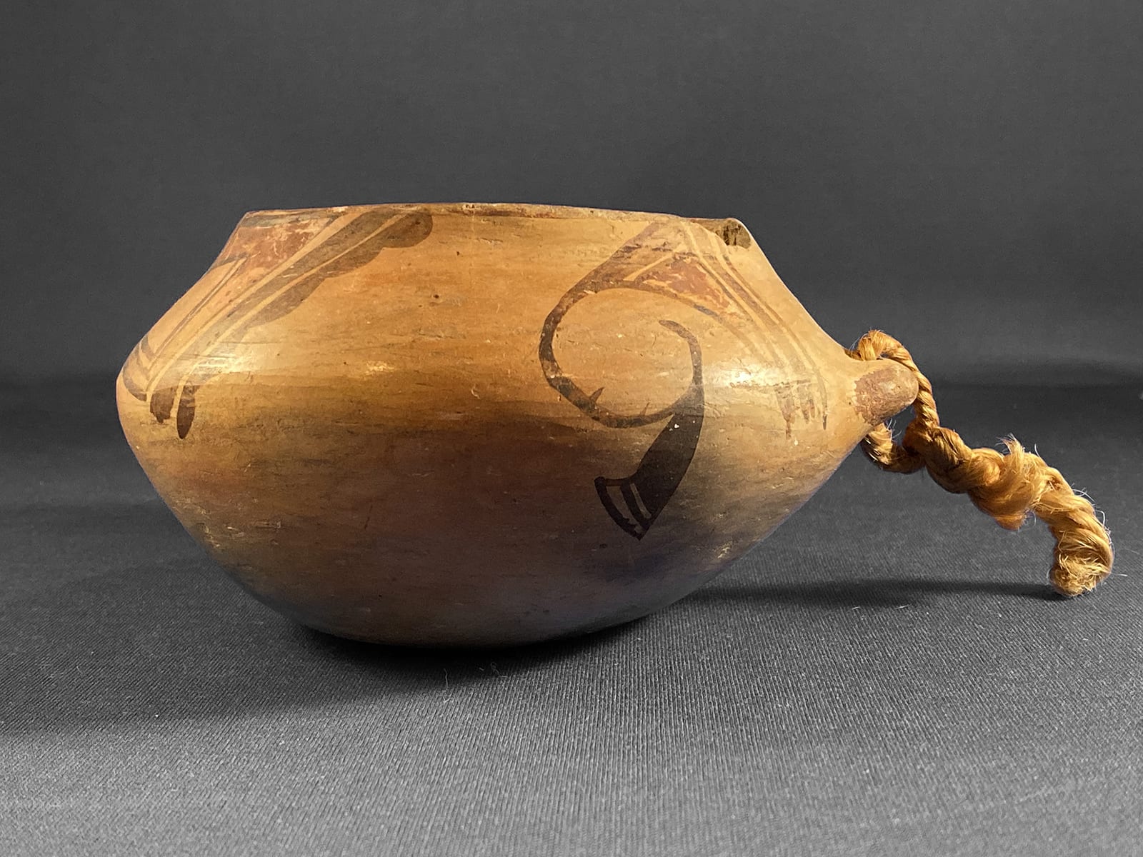
1b: When seen from above, the design to the left of the lug:
This variation of design 1 begins with the same parallel thin and thick lines and then continues with a triangle, but this time the orientation of the triangle is reversed so that the tip touches the lip of the cup. This triangle (prayer feather?) has the same form as in version 1a: one long side is curved, below the base is a (slightly wider) unpainted space followed by a thick black line. In contrast to version 1a, the triangle in version 1b is painted white. As before, the curve of one side of the triangle continues to form an open circle, though this element is smaller than in the first rendition. The black “hatchet” attached to this circle is also smaller and more carefully formed in version 1b than in version 1a.
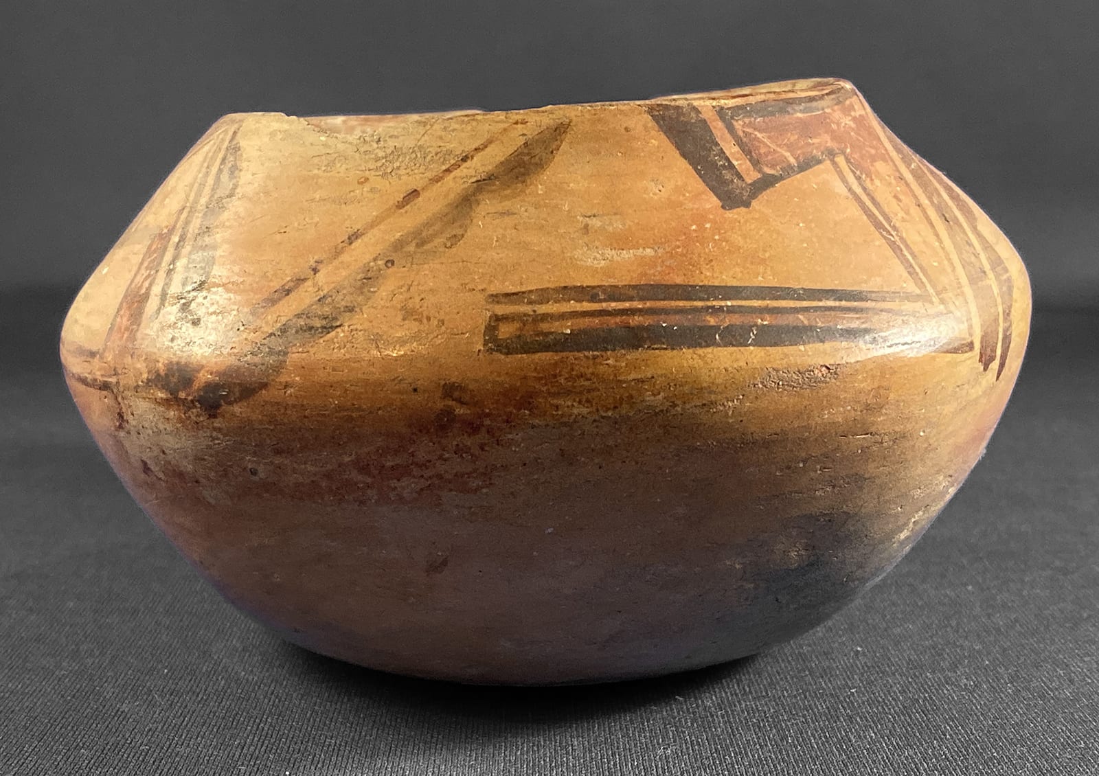
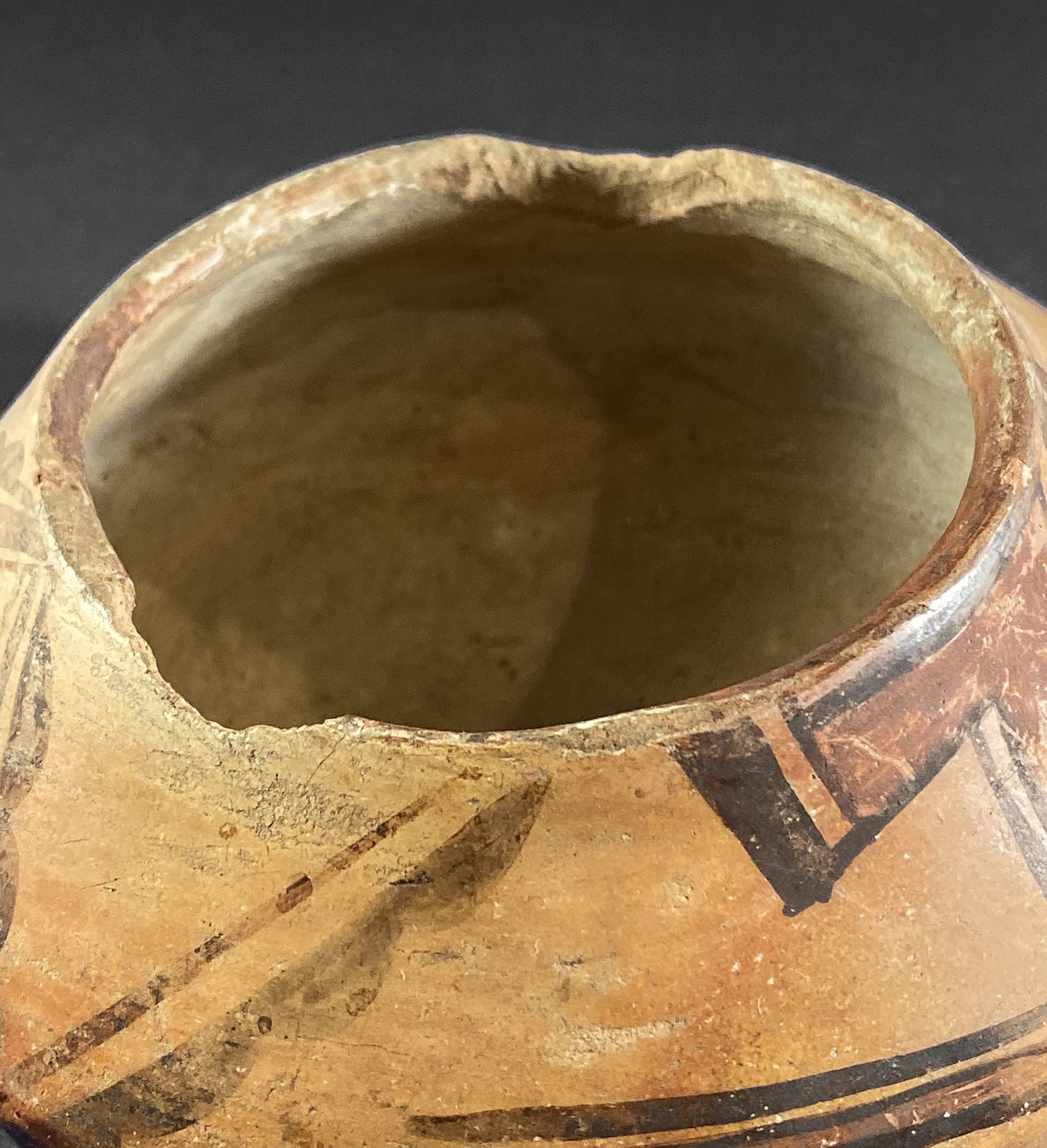
2a: When seen from above, the design at the 5 o’clock position:
This design has four basic elements. First is a thick line that slopes to the left as it runs from the lip to the cup’s waist. The lower edge of this line has a scolloped edge with five bumps; the other edge is straight. Steven believes that the scolloped edge represents banks of clouds, the gracious response to prayers for rain in the dry Hopi environment (Patterson, 1994:143). The second design element, parallel to the scolloped line is a second thick line with straight edges. Third is a large, thick form roughly in the shape of a number “7” lying on its side, its top alined with the two proceeding parallel lines. As a result, the top of the 7 is slightly wedge shaped, the hook off the top is parallel to the lip of the cup and the long stem runs parallel to the waist. This crook shape is hollow with two short sides of the “7” set at some distance from each other while the longer stem is more narrow. Between these borders the form is painted red.
The third basic element of design 1b is a simple thin line that runs just above and parallel to two sides of the crook shaped like a “7.” Finally the short leg of the “7” parallel to the lip is caped with two parallel thin black lines (creating an unpaintes strip) followed by a thick black rectangle.
2b: When seen from above, the design at the 6-to-9 o’clock position:
This design is the most complex and the most jumbled of the four designs. It’s similar in sensibility to design 2a and most of its elements are the same, but there is considerable difference in format. As with design 2a, the layout of design 2b begins with two parallel lines sloped to the left, with the lower edge of the first scolloped. Next a second pair of such lines is painted sloping right so the two pairs join in a roughly “V” pattern. Then follows another red “7” shaped crook in the same orientation as seen in design 2a. However, in design 2b the short leg of the crook is not parallel to the lip (as in design 2a) but is tilted away from the lip. A solid black triangle has been added that connects the two ends of crook, giving the overall design the general shape of a triangle. Finally parallel to the closed-off side of the “7,” there is another set of parallel lines: the straight-edged line comes first and is thicker than before, followed by a line with its scolloped edge facing outward.
Because of the lug, there is a distinct gap between designs 1a and 1b. There is also a substantial gap between design 1a and 2a. Designs 2a, 2b and 1b, however, are almost contiguous.
On 2-14-19, in response to my inquiry, Ed Wade wrote “As for the cup it dates to around 1900 and was native used.”
If Stevens is correct and some of the iconography on cup 2019-04 refers to prayers for rain and the answering rain clouds, such blessings well fit a vessel designed to hold water. Nevertheless, I think the woman who made cup 2019-04 would laugh at my detailed analysis of her work. She formed this bowl so a loved one could conveniently drink and covered it with an appropriate design to make it beautiful. To me her utility cup is both a blessing and art.
