
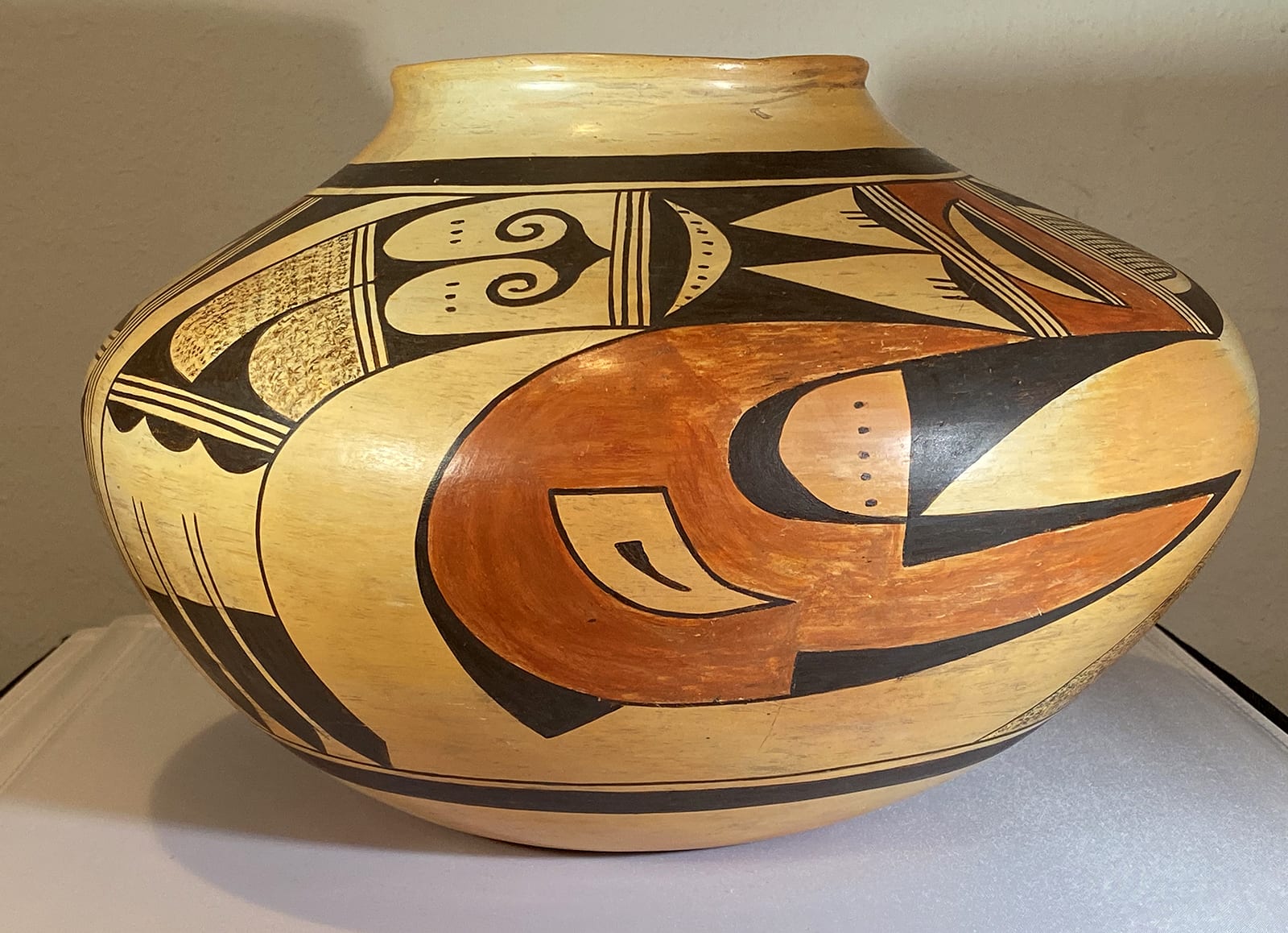
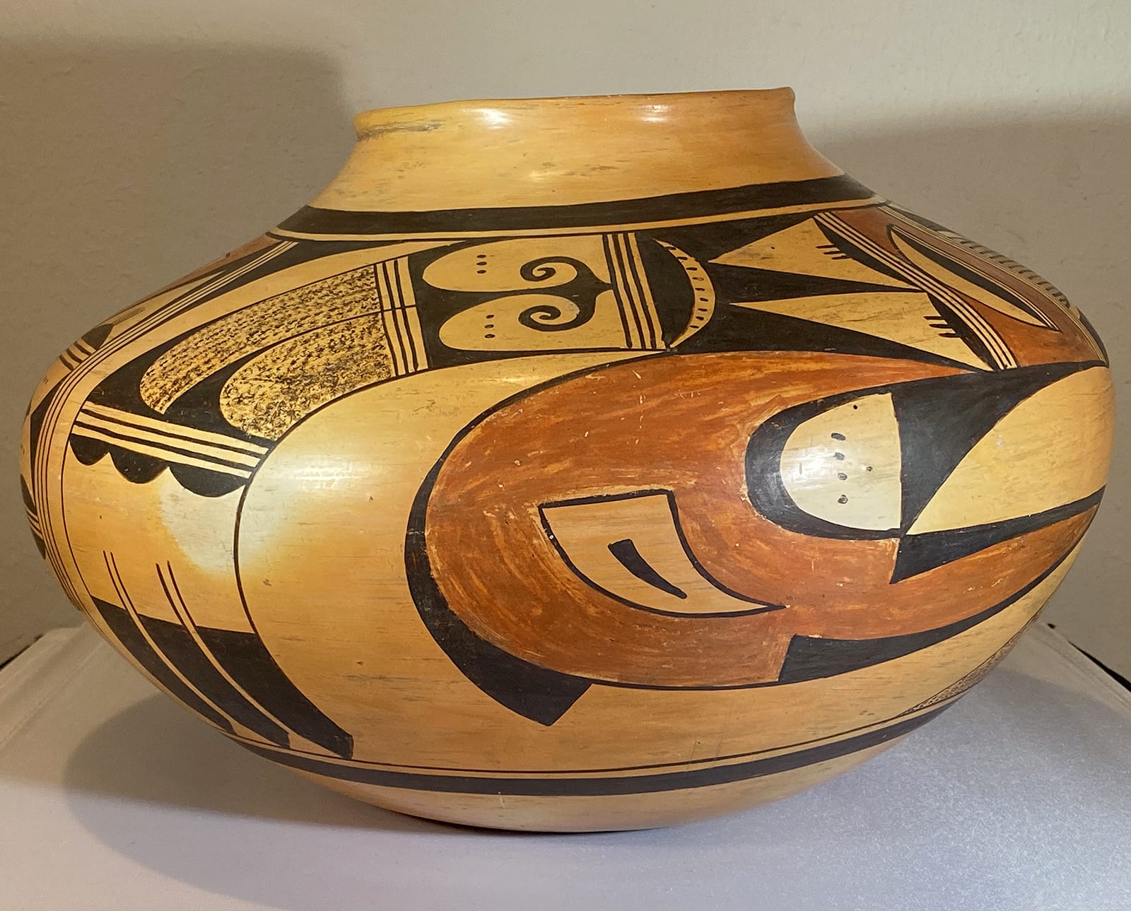


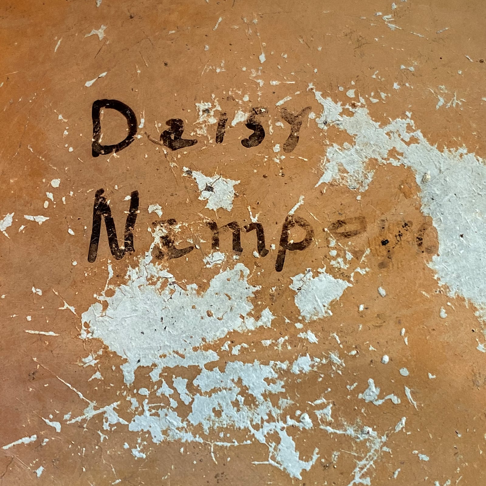
This is a large and visually engaging jar signed by Daisy Nampeyo. A 2007 appraisal says it was formed by Grandmother Nampeyo in 1938 and painted by Daisy, though I conclude that this is unlikely.
Form:
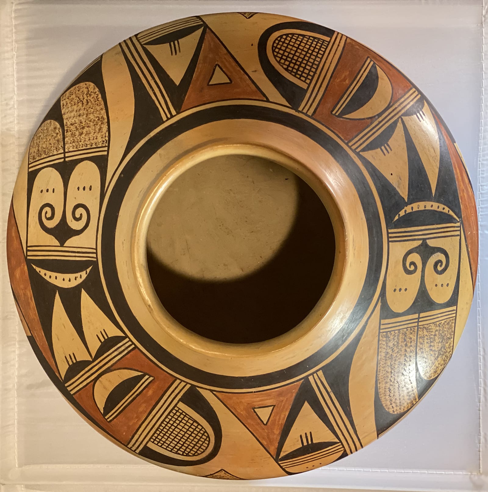
The walls of this jar are substantial but seem thin for a pot this large. Since the bottoms of Hopi pots are begun in saucer-shaped pukis, bottoms are often noticeably thicker than the sides. That is not the case here. The inside walls are smooth and transition around curves with no indication of a junction in the clay. A hand easily fits through the 4.5″ mouth and care was taken to stone polish 2.5″ of the interior of the neck. Striations left by the polishing stone are almost invisible, best seen on the unpainted bottom. The pot was evenly fired with only subtle variation of fire clouds. Unusual care was taken to form and fire this pot.
As explained below, a detailed provenance is known for this jar and it states that the pot was formed by Nampeyo. The quality of the form certainly indicates the pot was made by a master craftsperson and this could easily have been Nampeyo. Granddaughter Daisy, however, was also a master potter and she also was capable of this quality of work. Given that only Daisy’s name appears on the pot, I am not listing it as “Nampeyo 2.” which are pots formed by Nampeyo and painted by a relative. I believe Daisy formed the pot.
Design:
The design fits the pot well, is complex, and full on internal contradictions of motion that intrigue a viewer’s eye.. The scale of the pot is so large that detailed elements of design grace large elements, yet the pattern is not crowded. As is typical of Sikyatki Revival jars, thick-above thin framing lines are drawn above the design with thin-above-thick framing lines below. Within the 7.5″ wide band of design the same pattern of elements is repeated twice.
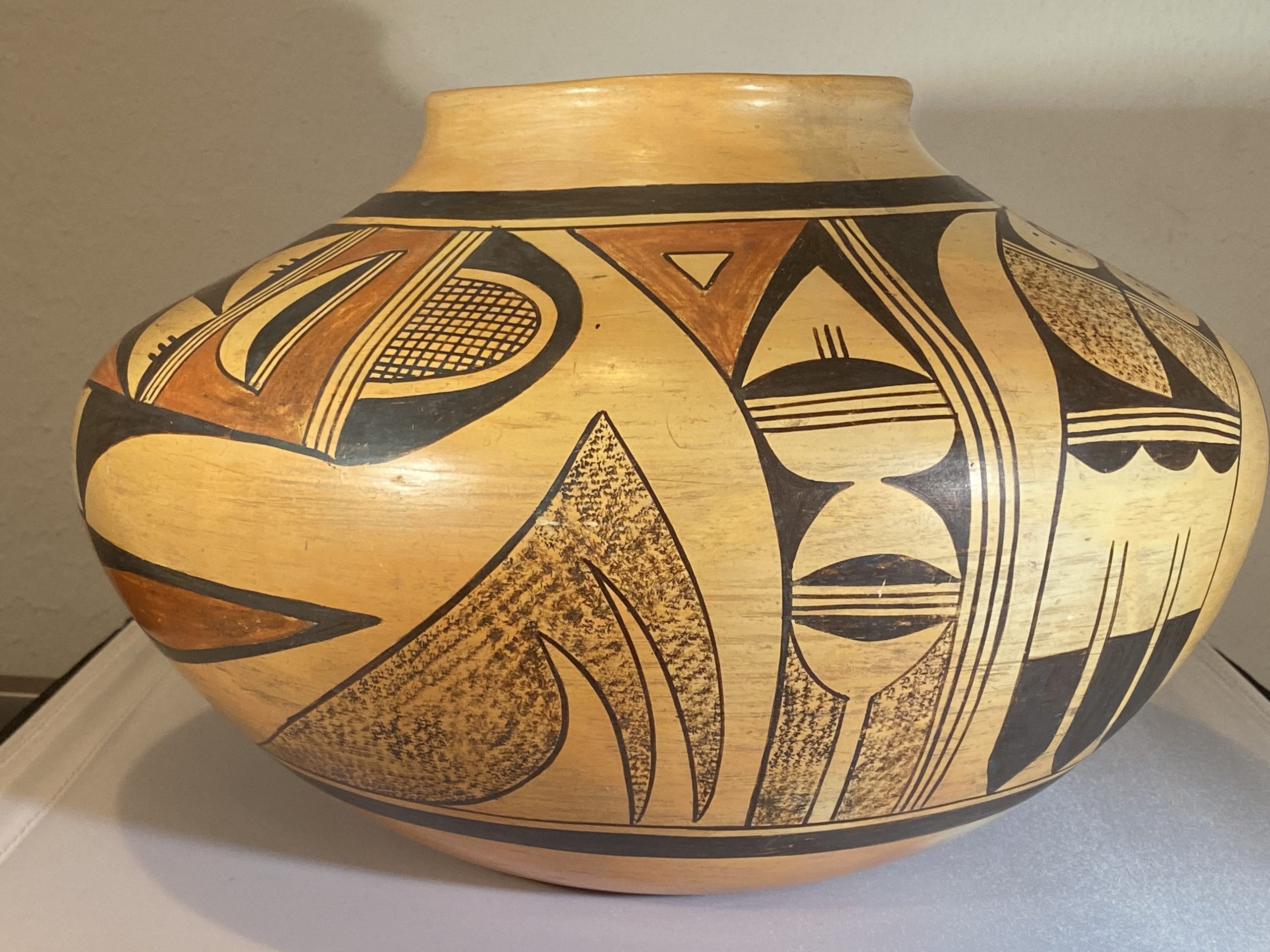
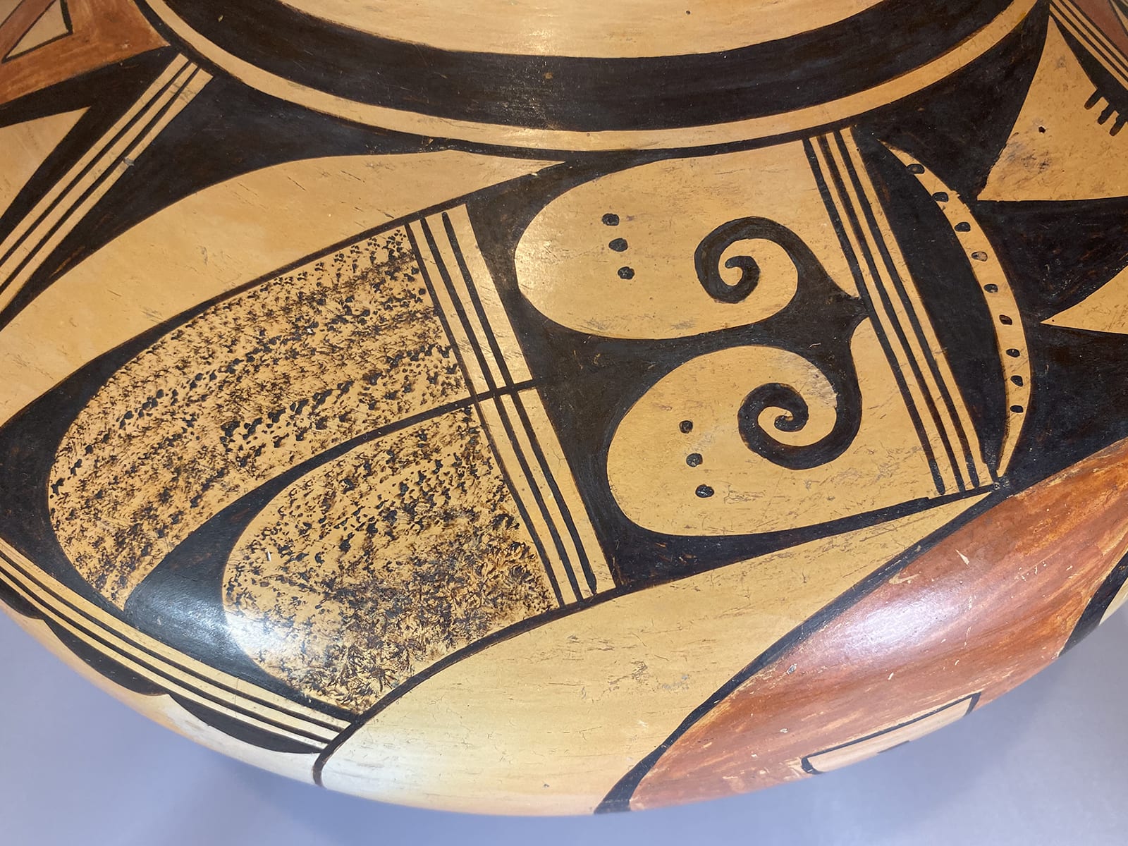
Let us begin with a vertical space that encloses four parallel lines, forming a three-lane highway that run the full width of the design panel. To its left is another vertical panel about 1.5″ wide, though it expands to about 2.5″ at its top. Its left edge is curved. Pilled into this space are a dozen elements. At the top is a wide and thick red triangle encloses a small unpainted triangle that mirrors the form around it. The red color and format act like a bullseye and focus attention on this element. Below is a thin black “V” shaped form with its point touching the thin upper framing line. The arms of this form are neither parallel nor the same width, giving the design energy. Bridging the tips of the V form is a horizontal three-lane highway. Above the highway and based on it is a solid black half-moon sprouting three vertical hairs at is apex. This hill-whisker element is often seen on Nampeyo pottery (cf 1999-03 and 2013-03.)
The empty space above it is an arrow head and this reinforces the upward motion of the black V form above. Below is the familiar highway element and below it is a rectangular space enclosing two black curved-triangular forms with their bases resting on the vertical walls and their points almost touching. The residual space forms an unpainted hourglass shape, except that its lower edge is compromised by another solid black hill, this one without whiskers. this hill is one half of a pair with their bases resting on yet another three-lane highway and thus rising in opposite directions. The lower hill intrudes into a final rectangular space with most of the area stippled black. However a thin central column rises unpainted and flowers out at the top into a half moon, its top edge curved by the intruding black hill and reflecting the halves of the unpainted hourglass above. This lower unpainted form resembles a chalice. A friend suggest that the full range of black/unpainted forms in this stack look like an abstract ostrich feather, but of course no such image might have been intended by Daisy.
To the left is a large unpainted surface and floating in it is a large, wide and irregularly-shaped stippled form. Its sloped upper edge is curved and serves as the base for three forms below it. Two curved triangular points hang from this base and, below them a wide skewed hill. One edge of the hill form and the two points of the triangular forms touch the thin lower framing line.
[Note: To document a pattern of motion in the design, I will highlight the direction of elements.]
To the left of the stippled form is the major pattern of design on pot 2019-16. For purposes of discussion I will first discuss the lower crescent element and then the rest of the decoration, but visually they are one design. The central design in the lower crescent section is a dramatic red curved form that looks like the bow of a submarine plowing to the left (L) through an empty sea. It has a thin black border. The top point of this red form is shorter than the bottom, creating a hook shape and imbalance that provides visual energy. Imbedded in the widest section of this red element is an unpainted tooth-shaped area with a black border that points to the right (R). In its center is a small solid black tooth element that echoes the space around it.
A thin framing line extends round the bow of the red curve and, as it curves back to the right, it thickens and forms a back skewed hill on the surface. The lower red point of the red hook is encased by a black form like a protective cover that reflects the shape of the red point within. The end prongs of this covering expand into long, think wedges that seem to lock this form into place. Nestled against the inside edge of the red hook is a black element that takes echoes the bulbous shape of the red element and reinforces its leftward motion. (L). It has a rounded head and one curved triangular tail that flows along the short upper prong of the red hook. The point of this black form is even to the red point below it. As a result, and viewer’s eye flickers between seeing a hook-shaped red form with uneven sides and a red+black form that has symmetrical arms. Again the ambiguity of forms energizes the design. Both of the red tails of this red form and the black elements that cover and extend them create leftward motion tension (LLLL). At first the red curved hook looks like a simple element, but the elaborate internal and external forms that modify it give it unexpected visual complexity.
Lying atop these curved elements is a 3″-wide band of designs. At the right end is a large black dome consisting of a black arch with a thin point and wider footings. A thin unpainted arch fills the inner surface of the black arch, the residual bullet shape is filled with a crosshatch of 9 vertical and 12 horizontal lines, forming a pattern like an ear of corn. (The number of cross hatch lines is the same in both repetitions of the design.) Visually this large right (R) moving black bulbous arch contradicts the leftward motion of the red bulbous form below, again adding visual tension to the design. The base of the black arch and corn rests on a three-lane highway, followed by a substantially red section bounded by another three-lane highway. Embedded in the center of the red space is yet another black-edged curved form consisting of an unpainted crescent spooned against a black hill, their base a two-lane highway. This forms pulls the viewer’s eye to the left (LL), like the red curved form below but contradictory to the larger black bulbous shape to the right.
The next section to the left is also framed by three-lane highways. The space is solid black enclosing three unpainted elements. First is a set of two unpainted curved triangles that look somewhat like minasour (SP) teeth. Both point to the left (LL). Internal to each and rising from their bases are black half-moon hills with three parallel lines at their apex, the same form we saw earlier. The tips of these triangles almost touch a thin unpainted crescent that moves right (R) and contains a row of 9 dots. I have been analyzing each segment separately, but when the last two segments discussed are seen as a unit, the segment with the triangles can be seen as abstract eyes above the red segment below, which can be seen as a crescent mouth and perhaps tongue. It’s a bit more of a stretch, but the the corn-like segment below might seen as the clothed torso below.
The next section of design is again bounded by highways.
The design in this section is startling and eye-attracting. Two unpainted fingers with smoothly curved ends pointing left (LL) fill most of the space. Near their tips are a row of three black dots. The space these fingers do not cover is black and forms a “W” shape with the outer arms thinning until they touch the right framing highway. It’s that middle arm that blossoms spectacularly. Occupying most of the unpainted area of this section, it rises to a point that touches the framing line. Flowing back from this point are curlicue forms l like the wings in Nampeyo’s eagle tail design. Overall this element is like the pointed head of a medieval lance pointing right (R) with a strong triangular center. The form is also similar to the fleur de lis associated with the French monarchy and other royal houses of Europe. Daisy spent a number of years in France studying at the Echole des Beaux Artes and would have been familiar with this design. (See pot 2011-13 for that story.) This fleur de lis element is not ordinarily seen on Hopi pots, is startling, and it is highlighted on pot 2019-16 by the unpainted space around it. This panel of design has both left and right pointing elements, a visual bomb that disturbs and energizes my eye. The fleur de lis and the large red hook are the most eye-catching designs on the bowl. Notice that they sit directly above each other and pull the viewer’s eye in contradictory directions.
The next section is noticeably wedge-shaped because the band of designs is beginning to turn down, resulting in the upper edge being longer than the bottom. It is again bounded by two or three-lane highways. Most of the area is fuilled with two stippled forms. The top one is knife-shaped with a rounded end truncated by a straight edge. The lower form is shorter and almost thumb-shaped with only the lower short side slightly truncated by the curved framing line. Both stippled elements point to the left (LL).The residual area is solid black and forms two tall thin waves that curve along the upper framing line and between the two stippled forms. These waves narrow to thin lines and I would have expected Daisy to stop these lines at the three-lane highway. Instead Daisy continues one as the upper framing line and has chosen to have the other bisect the three-lane highway it intersects.
Notice that in one rendition the two speckled forms are 30% to 35% longer than in the second rendition. The longer set are based on a three-lane highway; the shorter set on a two lane highway. These are the only differences in design between the two sides of the pot. I infer that Daisy painted this section last and realized that she was running out of room. Thus she was forced to limit the width of the highway and the length of her speckled forms in order to insure that she has room for the final design of tails, which are about the same length on both sides of the pot.
The final segment of design in this band rests on the adjacent three-lane highway and begins with a row of three small black half-moon hills pointing down (DDD) with their bases against the framing highway. The remainder of the design breaks into three feathers that also point down (DDD) with their base and the first section of their shafts unpainted, followed by long black tips.
Of the six design strategies used by the mature Nampeyo (Appendix B), Daisy has used three of them, one critically altered. Like her grandmother Daisy frames her design with thick/thin framing lines, Like her grandmother she also allows substantial unpainted space around the large red hook design so that it is highlighted and becomes the central design element. Nampeyo typically created tension between linear and curvalinear elements, often represented by a contrast between heavy and delicate elements. Daisy emphasizes such tension in her design, but her strategy is different than her grandmother’s. Instead of contrasting linear and curvilinear designs to create tensions, she fills her design with tensions by setting rightward-moving [R] elements in proximity with leftward [L] moving forms, and, in one area, downward [D] moving elements. I’ve highlighted the direction of elements in the discussion above with bold letters. If you scan back over this text and notice the numerous R, L, and D notations, you get a systematic sense of Daisy’s strategy for creating tension and therefore internal interest in this design. Typically Hopi and Hopi/Tewa pots carry a series of designs that fit together into an overall pattern, but rarely does the interaction between these design elements create internal tension. Daisy’s design strategy creates a pattern of internal tension which engages a viewer’s eye. Also notice that each of the three red elements on pot 2019-16 has a central unpainted or substantial unpainted form at its core, thus visually linking these areas. Daisy’s creative power is in full flower when she uses these innovative design strategies.
As explained by the purchase history (below), the description of this pot by the auction house was garbled, but an appraisal of the pot that I saw after the auction gives a detailed explanation of its provenance. The appraisal (#OAT502) by Merlin J. Carlson of Old Adobe Traders in Flagstaff, AZ was signed on August 21, 2007 and reads, in full:
“Description: Historic pottery bowl, Hopi culture, c 1938. Measures 8.5 inches tall and 13 inches in diameter with a 4.75-inch opening at the top. Hand coiled, pit fired, hand painted with pigment paint. This bowl was hand made by Nampeyo and painted by her granddaughter Daisy Naha Nampeyo.
This bowl was ordered in 1938 from the Museum of Northern Arizona by Bernice Million Rotty because she wanted something by Nampeyo. At this time Nampeyo was blind but was still potting and needed a family member to do the painting. Different family members painted. Fannie and Rachel were other embers of the family to paint Nampeyo bowls.
Condition: Excellent condition. Slight amount or restoration and over paint. Appraised Value $22,000.”
Note: Even if formed by Nampeyo and painted by Daisy, the evaluation of $22,000 seems odd, extraordinarily high, and not in line with the 2007 market.
I purchased purchased the pot from John Moran Auctioneers. They described it as having “Slight inpainting to exterior decorations, wear, soiling, paint loss, nicks and scuffing commensurate with age and use,” an observation that might have been triggered by the last sentence of the 2007 appraisal, above. Accordingly I wrote the auction house before the auction and asked them to specify the amount of “inpainting.” They responded:
“September 5, 2019
Thank you for your interest in lot 113! We did blacklight the olla but everything fluoresced the same color so that didn’t tell us much. Due to the nature of the applied decoration it’s tricky to tell just how much of the olla has been repainted but the inpainting appears to be around an approximately 1″ x 1″ area of the rim. I hope this information is helpful, have a good day!
Best Regards,
Jardine Gates
John Moran Auctioneers
With pot in-hand I do not detect any repair to the paint, either on a 1″ X 1″ rim area or anyplace else. Perhaps I do not know what to look for.
A large pot of about the same size and shape as 2019-16 and a somewhat similar design layout by Daisy Nampeyo is part of the Southwest Museum Collection (now part of the Autry Museum) and is published by Collins (1974: #52).
Jar 2019-16 is a large and visually spectacular pot. If formed by Nampeyo, the pot is important as an example of her ability to make elegant large forms. If, as reported, the pot was made ca. 1938, Nampeyo would have been almost completely blind when she made it. The perfection of its form would thus be a testimony to the acuity of her hands. I don’t know of any definative way to tell if Nampeyo made the pot or if such provenance is just family lore. If the original buyer, Bernice Million Rotty, was intent on having a “Nampeyo” pot, the signature “Daisy Nampeyo” might have quenched that thirst.
About 1915 Nampeyo became functionally blind but continued to form pots for about 25 years. Female relatives painted these pots for her. These relatives routinely signed these pots “Nampeyo” because the signature commanded a premium. Later the name “Nampeyo” often was followed by the first name of the relative who did the painting. (See Appendix E and “Nampeyo 3” in the Artist List.) If that were the situation here, we would expect the same names on the bottom of the pot, but with a reversed order: “Nampeyo/Daisy.” Since that is not the case, it is likely that Daisy both formed and decorated pot 2019-16. The pot simply is what it is and that is pretty magnificent.
