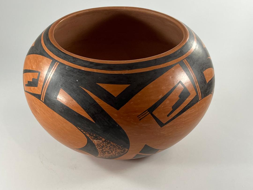
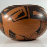
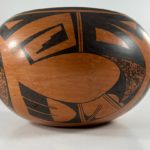
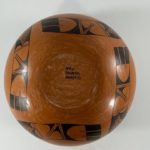
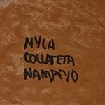
This pot is unusual because it is formed from yellow “sikyatska” clay that fires red. It carries a black design. The elements of design are typical of the Sikyatki Revival, are unusually-organized, crisply-drawn, and are well-fitted to the pot’s shape. All-in-all, it is a superior example of Hopi-Tewa pottery. However, it is included in this collection because of the printed signature on the bottom: “Nyla Collateta Nampeyo.” The six other pots by Nyla in this collection are all signed either “Nyla” or “Nyla Nampeyo”using tiny cursive letters, sometimes with a corn mark and sometimes with 5 parallel lines indicating that she is a fifth-generation Nampeyo family potter. The distinctive block lettering and form of the signature on pot 2022-05 suggests that it was made early in Nyla’s career and predates the other pots by her in this collection. As such, the pot offers us some perspective on the development of Nyla’s career.
Form:
Yellow “sikyatska” clay, which fires red, is more difficult to form than the more common grey clay, that fires yellow with golden blushes. Therefore vessels constructed of sikyatska are uncommon and the sikyatska is more frequently used as a slip over a grey-clay body to achieve the desired red effect. Jar 2022-05’s red clay body is unusual.
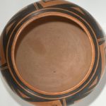
As expected, the puki-formed bottom is somewhat thicker than the wall of this jar and the walls thin further as they approach the rim of the mouth. The waist (widest point) of the vessel is above the midpoint of its height: from a 3.25-inch flat bottom the walls expand outwards 4 inches to the waist and then slop inwards an additional 3 inches to the 5-inch wide mouth. The slope from base to mouth is smooth and gradual. The striations from the stone polishing are clearly visible; the interior is entirely unpolished.
Design:
As with most pots colored red, the design on 2022-05 is a monochromatic black. Just below the rim Nyla has drawn a wide framing line with no spirit break. Just below that I believe she drew a thin framing line, but this line has been almost completely subsumed into the design below it. Only in the fraction of an inch marking the end of the sets of three parallel lines (“two-lane highways”) that are incorporated into the design can this thin framing line be distinguished. The design does not have lower framing lines.
A specific design is repeated four times around the circumference of jar 2022-05, though where one rendition begins and another ends is arguable. I have chosen to organize my discussion of the design around the central, egg-shaped, unpainted oval, its left edge open.
Above the top boundary of this oval space are two patterns of design separated by a set of 1.5-inch vertical and parallel lines, the two lane highways mentioned above. To the the right of this highway are two elements defined by thick (0.375 to 0.500-inch) lines. At the center of the top triangular element is an unpainted isosceles triangle with its tip pointed down. As two of its sides meet to the right, they thin to a point and join the neighboring rendition of design. As two of its sides meet to the left they thicken and become a 0.75-inch wide area. From its lower edge hangs a thick-sided, blade-shaped form, its curved edge upward, its point to the right. At its center is an unpainted space of similar shape and orientation. To the left of the two lane-highway a very long, thin isosceles triangle points down. At its tip is based a similar triangle pointing left and at its tip is based a similar (but much shorter) triangle pointing up, its tip serving as the base of a final triangle pointing right. Because of their different lengths the four triangles form a square crook, its final side a solid triangle with three steps along one edge. Notice also the three parallel lines like whiskers that emerge from the upper-left corner of this crook. Notice also that the unpaited residual space at the center of the crook reflects the three-step black element, an example of foreground/background reversal.
The upper edge of the unpainted oval center is curved and, as it reaches the mid point of the thick-walled knife shape discussed above, it curves abruptly downward and then to the left, forming the lower edge of the oval. From the point of the knife blade to the right a parallel curve emerges, the two curves together forming a 6-inch ribbon of design. The ribbon is 2.0 inches wide at its upper edge as it emerges from the blade, 1.125-inches wide at its midpoint and 1.75-inches wide as its ends with a fan of three feathers.
Unlike the overall design, this curved element is clearly subdivided into three panels by two sets of two-lane “highways.” The end panels are of about the same length; the central panel is a bit narrower. As noted, the base panel narrows as it grows from its base, but internally the central element narrows more abruptly than the external curve, forming a rather squat curved blade with a stippled interior. The residual spaces on either side of this central element form backward-pointing elements with their long sides curved by the edges of the ribbon of design and the curved edges of the stippled core. The base of these solid black blade elements would have been flat against the adjoining two-lane highway, except that Nyla has inserted two unpainted hill (“gumdrop”) elements, thus making this narrow edge of the blades also curved. Notice that the reciprocal orientation of the stippled and black forms results in foreground/background reversal so that this panel can be seen as a) basically stippled with black elements intruding or b) basically black with the large central stippled form at its center.
The middle panel in the curved ribbon is largely empty but has a bifurcated swept wing form pointed into its lower left corner. It is divided by a two-lane highway that begins at the tip of the wing and extends about three-quarters of the way diagonally across this panel.
The last panel of design can be seen as having a largely unpainted base that is framed by a thin painted arch set against its near edge with thin legs that extend the length of the segment. At its far end of this segment divides into three unpainted sections that form the bases for three black-tipped feathers. The three feathers vary slightly in width and the degree to which they are flared, the lower feather being the narrowest and least flared and the top feather displaying more of these characteristics. The spaces between the feathers are defined by parallel lines (“one-lane highways”) that intrude slightly into the unpainted base.
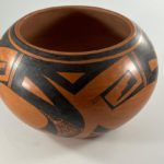
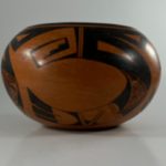
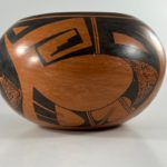
When seen from the bottom, the last two segments of the ribbon seem almost linear and the four depictions organize themselves into a simple box shape. This structured configuration is in sharp contrast to the fluidity of design when the pot is seem on a slant. (See photos, above.)
Design analysis:
The most striking feature of the design is its unbounded placement on the jar. In part this is due to the absence of lower framing lines. More impactful is the absence of clear demarcation marks between the four renditions of the design. At first glance the “two-lane highways” that intersect the top framing lines seem to define the design segments, but the large curved ribbon of design below lies on both sides of this boundary. Visually each curved ribbon is of one piece and it makes no sense to see it as existing in two different segments. Without a segmented structure, the design seems unsettled and flows with eddies across the surface of the pot; a viewer’s eyes roam looking for order. This lack of clear boundaries creates a dialogue between the viewer and the design, much like a viewer’s search for patterns in a pointillist or impressionist painting.
Several other strategies increase the impact of the design, but these are more common. Most obviously Nyla ground her paint throughly and has excellent control of her yucca brush, so the design is a solid, deep black with crisp edges and is striking against the red background. There are multiple varieties of triangles and blade shapes in the design, and the repetition of these forms unifies the design. Like “Grandmother” Nampeyo, Nyla has left substantial unpainted surfaces around her painted design, thus highlighting those design elements. As noted above, several instances of “foreground/background reversal” enliven the design.
Pueblo people in the southwest understand the stepped element at the end of the crook as representing the shape of cumulus clouds with their promise of the blessing of rain. The steps of kivas may take this same form, as a sort of prayer. The three parallel lines seen at the top left corner of the crooks might represent such moisture.
Signature:
I speak with Rachael Sahmie, Nyla’s sister, frequently and sent her a photograph of this pot and its signature. I requested that she show the photographs to Nyla and ask her when she estimated it was made. On 9-15-22 Rachael and I spoke and she told me that Nyla said she had made the pot sometime between 1980 and 1985. Born in 1954, Nyla was probably in her late 20’s when she made pot 2022-05.
I purchased this pot primarily because its unusual signature suggested it was an early-career pot by Nyla. Having now had the time to examine the pot more carefully, I recognize the visual power of its unusual design format. Nyla’s ability to take fairly common Hopi-Tewa pottery elements and create the unique and visually exciting format on jar 2022-05 is a testimony to her considerable ability and a harbinger of her creative career as a potter.

