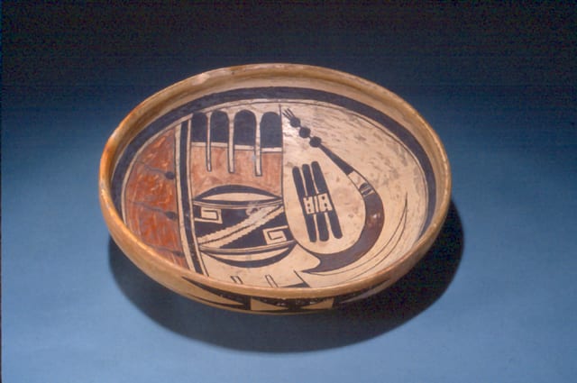
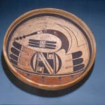
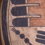
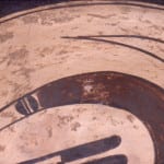
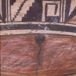
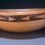
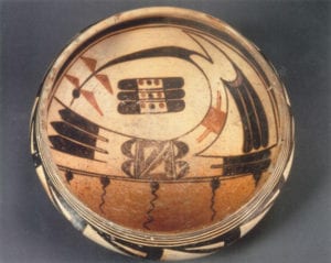
Hopi white-slipped bowl with three-color polychrome Sikyatki abstract-avian image, tadpoles, and sky band by Nampeyo, ca.1895-1905 CE. The first photograph shows Rick Dillingham holding the bowl.
Seen siting by itself without any historical or visual context, bowl 1993-04 needs to be appreciated as a beautiful object. The form and color of the design have considerable visual impact and change me, the definition of great art.
However, as we will explore below, the bowl also a) illuminates historical changes in the style of pottery made at Hopi, and b) gives us insight into the origin of Nampeyo’s design strategies.
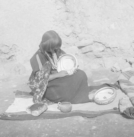
The earliest photograph we have of Nampeyo with her pottery was taken in 1893 and shows her with two bowls with the same “bird hanging from sky band” design found on bowl 1993-04 (Kramer, 1996: 48, 50 and 167; Struever, 2001: 27 and 29) and below.
The design on bowl 1993-04 is taken directly from an ancient Sikyatki bowl that was in the Keam Trading Post at Hopi and was sold by Keam in 1892 to Jesse Walter Fewkes and is now in the Peabody Museum, Harvard.
Apparently Nampeyo saw the ancient bowl at the trading post, was impressed by its design, and adopted the design into her repertoire. One small, seemingly insignificant, detail on the Sikyatki bowl is duplicated by Nampeyo on bowl 1993-04. By its very insignificance it is evidence that Nampeyo was looking closely at the ancient bowl while she painted her’s. On the other hand, our analysis will also show that she modified elements of the design on this ancient Sikyatki bowl to fit her personal sense of aesthetic and these adaptations were design strategies that characterized her later Sikyatki Revival pottery and justify her unique fame. For a detailed discussion of the link between the Peabody Sikyatki bowl and bowl 1993-04, See Appendix B, Section #1.
Here is the ancient Peabody bowl:
Sikyatki polychrome bowl, 1375–1625 CE
Peabody Museum, Harvard #44-13-10/27101
Aside from establishing a link between ancient Sikyatki pottery and Nampeyo’s evolving aesthetic and its aesthetic value as a piece of art, bowl 1993-03 is the pivotal pot in this collection for two additional reasons:
First, this bowl is as close as I am likely to get to that moment when Polacca “D” pottery gave way to the more commercially successful Hano Polychrome/Sikyatki Revival ware that for the last 120 years has defined “Hopi pottery.”
Polacca ware, which was the usual Hopi/Tewa pottery of Nampeyo’s youth, is characterized by its white kaolin clay slip, often crackled, and was the common Hopi pottery type from about 1790 to 1900. Following this tradition, Nampeyo applied a kaolin slip to bowl 1993-04:
“Nampeyo frequently applied a thin slip of white clay to the surface with a swab of wool, and the pot was set aside again to dry (Kramer, 1996:72).”
Over a few years bridging the end of the 19th century and the beginning of the 20th, Hopi pottery radically changed, abandoning Polacca ware forms, finishes and design and replacing them with pottery inspired by the old Sikyatki tradition. See Appendix A for a discussion of this transition.
Bowl 1993-04 is a snapshot of this rapid change. As Nampeyo transitioned from Polacca ware to a revival of ancient Sikyatki forms and decoration, bowl 1993-04 was an intermediate step: still using the old Polacca white slip but now applying Sikyatki designs on it. See Appendix B, Section #3 for a discussion of the evolution of Nampeyo’s white kaolin slips. Soon after bowl 1993-04 was made, Nampeyo began to float her designs directly on the polished surface of her pots, as was the practice of the ancient Sikyatki potters. These pots were a commercial success and were quickly copied by other Hopi/Tewa and Hopi potters. Since Nampeyo was the public face of this Sikyatki Revival style, bowl 1993-04 is not only an example of this transition in Nampeyo’s style, but also an an important marker of Hopi and Hopi/Tewa pottery history.
Second, bowl 1993-04 is a pivotal pot because its interior design, labeled “bird hanging from sky band,” persisted as a central design motif throughout Nampeyo’s painting career, from at least 1893 until she became functionally blind and could no longer paint, sometime between 1916 and 1920. I believe the design played a key role in Nampeyo’s development as an artist. By repeatedly drawing variations of this design Nampeyo trained her mind, eye and hand and absorbed the pottery vision of ancient Hopi potters. Artists today intentionally use the same learning technique when they set up a easel in a museum and copy a master work. As a result of repeatedly drawing versions of this bird-hanging-from-sky-band design, Nampeyo developed six iconic design techniques that would mark her as a “genius” ceramicist. (See the discussion below and Appendix B, Section #4) Moreover, a comparison of the design on the ancient bowl with the design on bowl 1993-04 indicates that Nampeyo was evolving her style even as she painted this bowl.
The form:
Bowl 1993-04 is well-formed. The bottom and sides are of even thickness, substantial but not thick. The rim has the extra coil that characterizes Nampeyo’s Sikyatki Revival bowls. The bowl is slipped on both the interior and exterior, though an extra coat of particularly white slip seems to have been have been applied to the interior below the rim coil. Where the slip has crackled or flaked, it reveals that a light-colored clay was used for the body of the bowl.
The design: interior
The curved interior of the bowl is about 11-inches across. Below the rim coil are thick-over-thin framing lines, which were not a feature of Polacca ware but do reflect ancient Sikyatki convention. All of the designs on the interior are edged with a thin black line. Notice the darker red lunette, about 2-inches wide, 18% of the design width. Evenly spaced in the lunette are four black tadpoles, symbols of the water of spring rains. A 0.75-inch unpainted strip parallels the linear edge of the lunette. At its center is a thick black boundary line that visually separates the lunette from the rest of the design.
Above is the largest element of design: a base with three parallel linear feathers emerging from each side. In its center is a rectangular element bracketed by thick parentheses. The set of feathers to the left emerge from a common light red base, its bottom edge concave against the bracket. The red base of each feather terminates with a thin black line, followed by a narrow unpainted surface. From this point to the curved tip, the feathers are painted a solid black. The feathers to the right are somewhat different. They too emerge from a common base that is concave against the bracket , but this base is unpainted. They too have solid black and curved tips, but –unlike the first set of feathers–the transition from base to tip is not moderated by an intermediate design.
The tips of each curved black parentheses in the base are connected by a thick black line, forming a set of hollow lunettes that are perpendicular to and reflect the the larger red lunette below. Parallel to the linear edge of each black lunette is an unpainted strip with a single thin line at its center, a “two-lane highway” that was frequently used by Nampeyo to separate her elements of design. Between these two strips of highway is a rectangular area at the center of the base.
This rectangle is monochromatic with a diagonal unpainted center strip cutting across the space from the top left to the bottom right. The edges of this strip are notched with 14 steps on the top angle and more than 13 steps on the bottom. (A small worn area of design in this area has obliterated the details.) In the center of the diagonal is what appears –at first glance– to be a thin zig-zag black line. On closer examination, however, this center line is not a continuous brush stroke, but rather a series of more than 24 distinct and conjoint small rectangles. The lower right corner of each rectangle touches the upper left corner of its neighbor. Nampeyo’s decision to draw distinct segments rather than simply a single line is an indication that she was taking her time painting this bowl, paying attention to detail, and enjoying her creative process. As Kramer noted, Nampeyo “had exceptional talent and received an inherent satisfaction in making pottery (1996:161).” Notice that if the white central diagonal is seen as a single form, its linear jagged edge reflects the stepped black line at its center. Embedding one element inside a larger similar element and letting the two images play against each other is the kind of subtle design strategy that you can discover in Nampayo’s work and makes her work unique.
The residual black triangular corners of this rectangular central space are themselves hollowed out at their right angle corners. Into this unpainted square is set a greek key with three 45-degree turns, its base a wide black rectangle, the remaining three lines considerably thinner. Notice that this thick/thin contrast creates a visual tension, a consistent Nampeyo effect. Such internal tension is missing from the work of other potters at Hopi, who probably would have drawn the greek key with a line of consistent width.
This same central rectangle was used by Nampeyo on an eagle-tail seedjar housed in the Indian Arts Research Center at the School of American Research in Santa Fe (catalogue# IAF.1207), illustrated in Whitaker and Parker, 2007:79. On the SAR jar the central diagonal runs from upper right to lower left, the reverse of the bowl discussed here. Also note that a simpler rendition of a rectangle flanked by thick parentheses is found on the exterior of bowl 2012-02 in this collection.
As described above, the right three feathers in the base emerge from a common unpainted area. The top right corner of this area, above the top feather, bulges out to form a stubby thumb. Set around this unpainted form is the base of a large sickle-shaped curved form. Because it conforms to the unpainted thumb, the base of this sickle takes the shape of two points, the top point long and thin while the bottom point is relatively short and wide. The upper and longer edge of the sickle form extends 7.5-inches and below it are four elements of design. For the first 5 inches this curved shape is painted with a solid dark-brown color. The next inch is unpainted except that inset into the near end is a black design consisting of two solid half-spheres (“gumdrops”) with their flat bases facing each other and separated by a thin unpainted space with a line down its middle (a “two lane highway”). Writing in the 1890’s and based on Native informants, Alexander Steven interpreted these gumdrops as cloud images (Patterson,1994:141). The design is a favorite of Nampeyo (cf XXX, YYY, ZZZ……) Following the largely unpainted section is a solid black triangular area that bring the sickle to its point. The black point then continues 2 inches as a thin line and strung on this line are three solid black balls, the final ball sprouting three linear hairs. Walter Jesse Fewkes interprets these balled images as “patois,” prayer feathers that carry hopes for rain (1919:241 and plate 78; also 1973:139 and plate 78).
Back to that unpainted base of the right set of tail feathers: it’s complicated. The upper edge of the brown sickle does not quite touch the upper edge of the top feather, leaving a gap of about 0.25-inches. The unpainted base of the feathers seeps through this gap and expands into an asymmetric form. Starting at this gap, and thus starting also from the base of the brown sickle, a second unpainted black-edged sickle form emerges, its lower edge about 4.75-inches long. The upper edge is shorter (4.0-inches) because as it nears its base it suddenly forms a right angle and runs about 1-inch until it reaches the lower framing line. Visually this short line is at the same height as the top edge of the red feathers to its left, thus visually cohering the feather base design across the width of the bowl. Below this 1-inch line is additional unpainted space that is residual between the three black tips of the feathers and the framing line.
Looking at the two large, sickle forms on bowl 1993-04, my eyes were unsettled and it took a while for me to figure out why. It turns out that because the top sickle form is internally unpainted, it has a complicated impact on the design of the bowl. Whereas both of the sickle forms sweep to the left off their bases, the residual space between then also forms an unpainted sickle shape and it sweeps in the opposite direction, from left to right. Now take another look at the ancient Sikyatki bowl. The shapes of the arches on the ancient bowl are different than on bowl 1993-04, but it also displays two arches that swing from right to left. Between them, below the stubby upper arch, there is a short residual arch form that points right, contradicting the painted arches that frame it. Nampeyo apparently saw this on the ancient bowl, but expanded her two painted arches to make them more-similar in size.
Once this residual unpainted arch was recognized, my view of the bowl’s design pattern shifted. What at first was seen as a design of two painted arches, becomes a design with three arches, two unpainted counterpointing arches above a painted arch, thus enriching the design by introducing increased tension. In addition, by simply outlining the top arch but leaving the interior unpainted, Nampeyo created the impression of expansive open space at the top of the design, thus highlighting the painted design below. Nampeyo accomplishes this to a much greater degree than the maker of the ancient Sikyatki bowl.
Finally, below the arch of the brown sickle and floating freely between it and the feathered base below is a symmetric butterfly-shaped element consisting of an unpainted square core with three solid-black round-tipped feathers emerging from two parallel sides. Notice how these two pairs of three feathers reflect the form of the more elaborate sets of three feathers below them, thus integrating the design. The center of the butterfly is not entirely unpainted but rather is divided into upper and lower sections by two parallel lines, a “one-lane highway.” Above and below this highway are sets of three parallel dashes. Wade interprets this element as a “mother ear of corn” (Wade and Cooke, 2012:236, E).
One seemingly insignificant detail turns out to have substantial meaning. Take a look again at the two sets of three tails that flank the base of the design on Nampeyo’s bowl. Notice that the lines that form the top edge of the top left feather and the bottom edge of the bottom right feather continue past the feather tips. For a long time I saw these as just impulsive errors by Nampeyo who simply continued these lines past where they visually “should” end. Then look carefully again at the image of the ancient Sikyatki bowl. Because of the angle of the photo, only three of the four corner tail ends can be see, but all three examples display this same “extra” extension of the line that form the feather’s edge. I have no idea, of course, why the woman who made the ancient pot incorporated these seemingly unnecessary lines into her design, but by duplicating them Nampeyo provides evidence that she was carefully looking at the ancient bowl when she painted bowl 1993-04 and incorporated this tiny detail.
I’m pressing my suppositions pretty far here, but notice that the lower left feather on the base extends beyond the framing lines. If this feather was drawn first, then Nampeyo did not have the option to extend its bottom edge line, as on the ancient Sikyatki bowl. Unable to copy the pattern of this small element on all four feathers, Nampeyo seems to have settled for two duplications of this detail on feathers diagonally opposite each other. Visually insignificant additions to the design, these short line are a measure of how closely Nampeyo was following the ancient model.
To summarize this complex discussion of the interior design: At first look bowl 1993-04 is a substantial copy of the ancient bowl; the basic designs of the ancient bow and bowl 1993-04 are close to identical in spirit and substantially similar in form. While this is true, it is not the whole truth. Nampeyo also played with the design and molded it to fit her personal aesthetic, in this case increasing the internal tension of the design and emphasizing unpainted space. These two design strategies became hallmarks of Nampeyo’s later Sikyatki Revival pottery. The chain of 24 distinct and conjoint small rectangles at the center of the base indicates how carefully Nampeyo was painting this bowl. This care is seen again when Nampeyo closely followed the ancient model by incorporating visually insignificant lines off the feather tips as prescribed by the ancient design. Engaged with the ancient bowl, Nampeyo both copied and innovated its design, thereby defining strategies of decoration that would soon make her famous.
The design: exterior
The two monochromatic exterior glyphs on bowl 1993-04 seem simple, but repeat some of the visual tricks seen on the bowls interior. The glyphs can be seen as a rectangular core with right angle triangles emerging from each corner. The triangles are oriented so that their 90-degree corners are part of the exterior horizontal line of the glyph. Their hypotenuses merge near their bases so that at end of the glyph the triangles share a common base. Of the four pairs of triangles, in three instances the triangles share a base about o.25-inch wide. For one example, the base is twice as wide, 0.5-inch thick. The center core of the glyph is not solid black, but incorporates two unpainted isosceles triangles, their points facing each other. In short, the glyphs are defined by triangular shapes, four black triangles at the corners and two unpainted triangles at their center. Notice, however, that the unpainted space between the end triangles form a reverse-facing triangle that visually reinforces the central unpainted triangles at the center of the glyph. Thus the pair of right pointing black right triangles at each end of the glyph is accompanied a pair or left facing unpainted isosceles triangles. There is an obvious tension of motion between these sets of triangles that enliven these glyphs.
Glyphs are not found on Polacca ware, but are common on ancient bowls from First Mesa, including Jeddito and Awatovi subtypes. In his exhaustive and detailed review of Painted Ceramics of the Western Mound at Awatovi, Watson Smith details “isolated elements of geometric form,” mostly found as designs on the exterior of bowls. Figure 98 in the publication displays 48 such elements and one labeled “ff” is exactly the same as the embedded triangular glyph found on the exterior of bowl 1993-04 (Smith, 1971:151). In subsequent tables Smith groups this glyph and three similar glyphs together and reports that collectively they were found only 7 times among the 631 glyphs analyzed (Smith, 1971:155). Since the four glyphs together comprise about 1% of glyphs tabulated, the embedded triangle glyph alone would account for substantially less than 1% of the cases, an extremely rare incidence. In short, while the embedded glyph used by Nampeyo on the exterior of bowl 1993-04 was known in the ancient village of Awatovi, its incidence of use was probably very rare.
In a famous quote Nampeyo said:
“When I first began to paint I used to go to the ancient village and pick up pieces of pottery and copy the designs. That is how I learned to paint. But now I just close my eyes and see the designs and paint them (Bunzel, 1929:56).”
The “ancient village” referred to by Nampeyo is Awatovi and is very close to Nampeyo’s home village. It was not excavated during the years Nampeyo was painting, but the surface of the village site is covered with thousands of potshards. It is possible that Nampeyo saw this rare embedded triangle glyph on a shard and copied it. Alternatively she might have invented this design out of her own imagination. It’s one of those things we will never know. Until odd little Hopi canteen 2024-02 entered the collection, bowl 2024-03 was the only time I had seen the embedded triangle design on a pot. Apparently it remains extremely rare.
Using a large number of ancient Jeddito and Awatovi bowls as their sample, LeBlanc and Henderson identified 175 different external glyphs. They believe that these glyphs functioned as individual signatures of either the makers of the bowls or their owners (2009:107-110). None of the 175 glyphs is the glyph found on bowl 1993-04.
Nampeyo’s six Sikyatki Revival design strategies:
While bowl 1993-04 can glibly be seen as a copy of the ancient Sikyatki bowl in the Peabody Museum, we have seen that it is more accurate to say that while some details of the Sikyatki design were directly copied by Nampeyo, the ancient bowl was also an inspiring starting place for changes that Nampeyo introduced into the design. Nampeyo was in her mid to late 40’s when she made bowl 1993-04. She had probably been making pottery for close to 35 years. I began this catalog entry by saying that bowl-1993-04 is a pivotal pot in this collection for two additional reasons: 1) It marks Nampeyo’s transition from Polacca ware and experimentation to settling into a Sikyatki Revival style that would make her famous and change the form of Hopi/Tewa and Hopi pottery. 2) The design on the ancient bowl taught Nampeyo design strategies that defined her later work and mark her as a genius. I’ve suggested several of these strategies already, but here will more systematically organize the discussion.
An analysis of the design strategies on this bowl, combined with the same analysis of seedpot 2005-16, reveals that Nampeyo characteristically used six design strategies on her Sikyatki Revival pottery. For the full discussion of Nampeyo design strategies, see “Appendix B.”
In spite of its transitional nature of bowl 1993-04, most of the six strategies are found on it:
A tension between linear and curvilinear elements.
The six large linear tails in the base and the six smaller tails on the “butterfly” design give a strong linear sensibility to this design. In contrast, the large brown-based sickle shape rising off the base and the smaller lighter unpainted sickle above it add strong curvilinear motion. The less-obvious residual sickle between them has a dual function: it adds to the curvilinear elements, but its motion also contradicts the motion of the two painted sickles that flank it and thus it adds adds additional tension to the design.
A deliberate asymmetry of design
By definition this design is not symmetric. There is no axis where it can be folded and have elements overlap. Notice also the extra intermediate design element in the three left feathers that emerge from the base, a small detail not shared by the three feathers to the right. For Nampeyo, such asymmetry is often subtle, perhaps subliminal for most viewers. These dissident elements throw an otherwise symmetric design off balance and create visual tension and energy.
The use of color to integrate design elements
While this effect is somewhat present on bowl 1993-04, it is not as clearly developed as on Nampeyo’s later Revival pots. It may be that at this stage of her career Nampeyo had not yet focused on the trick of using red to integrate her designs, even though the Peabody Sikyatki bowl fully employs this design strategy. This may be the last of the six design strategies that Nampeyo adopted.
The technique is only weakly present on bowl 1993-04: the red lunette is visually tied to the pale red base of the feathers above it. The design is formed from 5 colors: dark red, light red, black, brown and the unpainted sections internal to the design: an unusually large number. Other than black, there is no color that is used across several sections of design. Thus black might be seen as a unifying color, though on most of Nampeyo’s Sikyatki Revival pottery red serves this function.
The use of empty (negative) space to frame the painted image
The two painted sickles rise into unpainted space, which give these forms room to soar. Moreover the empty space below the painted sickle has the shape of a teardrop that both frames the “butterfly” and adds its own shape and motion to the design.
The use of thick above thin framing lines on the interior rim of her bowls
Such framing lines are present on bowl 1993-03. They were not used on Polacca ware, but are common on ancient Sikyatki bowls.
Nampeyo’s painting is confident, bold and somewhat impulsive compared to the more-studied, plotted and careful style of her daughters, descendents, and other Hopi/Tewa and Hopi potters.
This is the most subjective of the six design strategies, but evidence is available. The bowl is about 33.5″ in circumfrance. The thick and thin framing lines encircle the interior and are a fraction of an inch apart, yet never touch. Precisely drawing two circular lines of this length on the interior of a bowl requires a confident hand. Similarly the many curved lines that form the small lunettes and the larger sickle shapes are drawn evenly and coordinate to form symmetrical points. The large black tails are bold, as is the painted sickle. Interpreted somewhat differently, the terms “confident and bold” can express themselves as a willingness to improvise with unusual combinations of design elements. On this bowl the zig-zag chain of small rectangles at the center of the design base is embedded at the center of an unpainted strip with stepped edges. The result is a dialogue and visual tension between elements of similar form.
Interestingly, however, the painting is impulsive and not perfect. . The lower left black-tipped feather extends beyond the thick framing line and touches the thick framing line above, a seeming “error.” On the exterior glyphs, the base of one set of right-angle triangles is twice as wide as on the other three pairs. On modern Hopi and Hopi/Tewa pots, such errors are avoided. Nampeyo, however, liked to play with her paint and designs and does not seem to have given much weight to such inaccuracies.
To summarize: the earliest photographic evidence we have of Nampeyo painting shows her painting a version of the “bird hanging from sky-band” design found on both the ancient Peabody bowl and bowl 1993-03. While Nampeyo paid detailed attention to the design of the ancient bowl, she did not directly copy the ancient pottery, but was directly inspired by it, modifying its design to fit her own aesthetic. Although bowl 1993–04 is an early transition pot bridging two styles, it already displays 5 of the 6 design strategies that mark Nampeyo’s mature Sikyatki Revival style.
A final note:
One other pot in this collection also combines painting from Polacca and Sikyatki traditions traditions: “Tray with Polacca style interior, Sikyatki Revival exterior” (2017-04). In this case the classic 19th century Polik’Mana interior design was painted by Nampeyo on a smooth thin film of white slip, in contrast to the thick crackled white interior slip seen on bowl 1993-04. The exterior of tray 2017-04 displays standard Sikyatki designs floated directly on the surface of the vessel.

