
-
- Pot 2005-16, ca 1900-1905

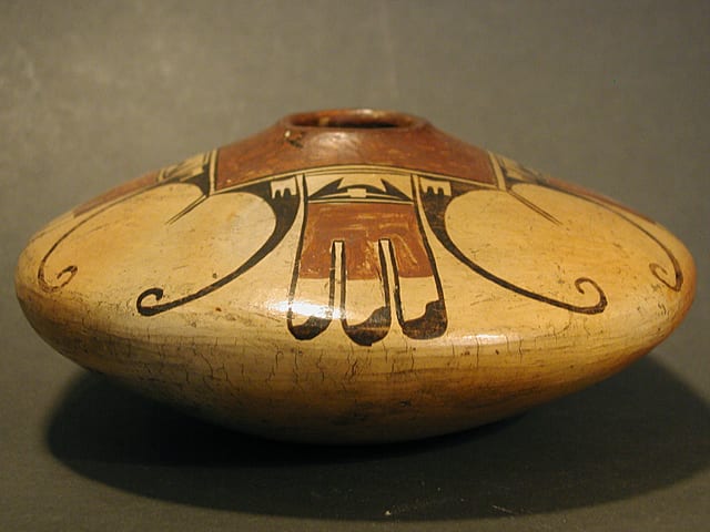
Of all the Nampeyo pots in this collection, jar 2005-16 best represents the fully-developed Sikyatki Revival aesthetic that marks Nampeyo as “genius” and made her famous. There are a number of great Nampeyo pots in this collection, but this is the form and design people immediately associate with Nampeyo: the quintessential Nampeyo pot.
Form:
The vertical distance from the bottom of the jar to its waist (the pot’s widest point) is the same as from the waist to the top of the vessel. On the bottom, the slope of the surface from the center to the waist is exactly 5-inches. On the top, the slope from the waist to the center of the opening is slightly less, 4.5-inches. However, with the pot sitting on a surface, the bottom slope is hidden from view and a viewer’s eye is tricked into seeing a perfectly symmetrical jar floating on its small base.
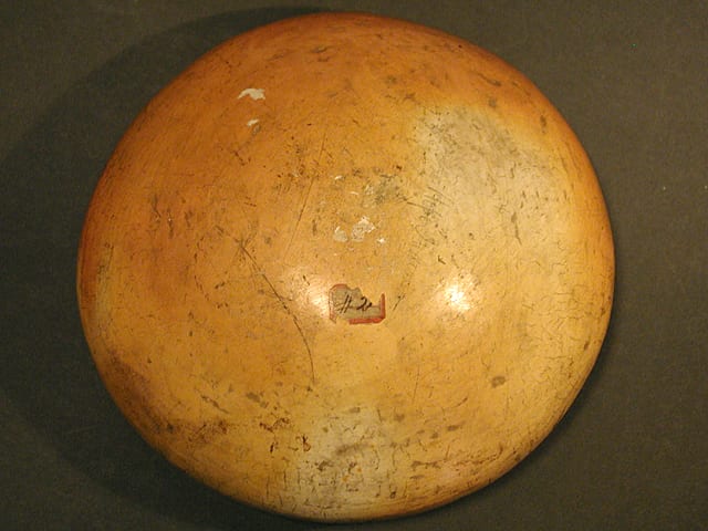
The lower half of the vessel, constructed in a puki form, is somewhat thicker than the upper half, a pattern common with this shape since if the coils of clay that formed the top were too heavy, they would collapse when wet. The walls of the upper half are even and substantial, but not thick. A few flakes of slip on the bottom reveal that the core clay of the pot fired grey and that the pot was covered with a stone-polished slip that blushed tan-to-orange in the fire. Kramer argues that the term “Sikyatki Revival” should be reserved to describe pots of this era that are slipped with clay that is the same as that used for the body of the pot.
This symmetrical shape was “predominant about 1903 (and was quite flat) in profile with… sharply angled upper and lower walls. The widest diameter was about halfway between top and bottom, and the shoulder tapered to a short standing neck (Kramer, 1996:169).” This is an old Sikyatki form that was revived by Nampeyo and became her “signature” shape.
Design:
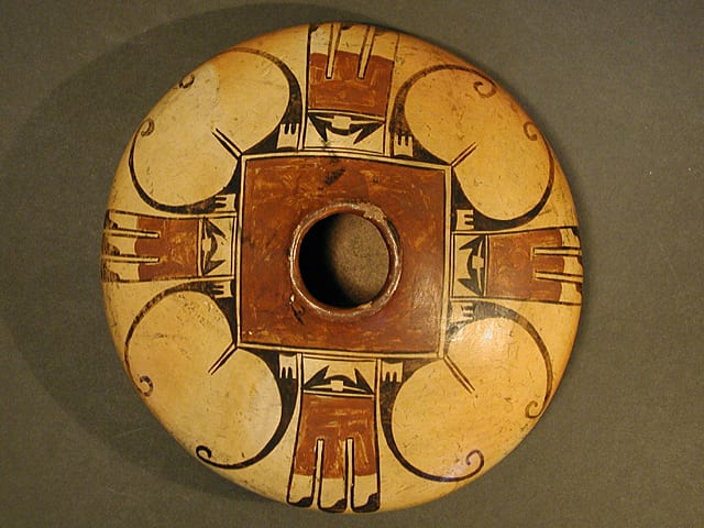
The design is also symmetrical. Surrounding the mouth is a square of red paint, 3-inches on a side. The square is framed by two thin black lines drawn a fraction of an inch apart. From the point of each corner of this square emerge two thin parallel lines like whiskers, pointing directly to the waist. Three sets of these lines are 0.625-inches long, the other 0.25 inches longer (0.875-inches).
On either side of each set of whiskers, and thus on the sides of the red square at its points, are arcs of solid black that are generally referred to as recurved “wings.” These elements have a base about 1-inch wide and would have a length of about 4.25-inches if uncurled. The inner edge of this base is more curved than the more liner outer edge and as a result the base has a somewhat triangular shape, its widest dimension set against the central red square. At its apex this element curls downward, smoothly narrows, and ends with a curlicue. At least six generations of Nampeyo descendants have copied this element, almost never getting this wing element as thin as Nampeyo and, unlike the “Old Lady,” generally terminating the curve with a ball.
In the corner of the base, at the 90-degree angle, is a small unpainted square displaying a painting technique that Lydia Wycokoff calls”figure-ground reversal…when you look at the pot, the figure and the background against which it is placed keep changing places, the figure becomes the background and the background becoming the figure (1985: 100-102).” This element can be seen as an unpainted square with 1) a top edge that curves downward to form an intrusive black hill, and 2) two short parallel black lines rising from its lower edge. Alternatively you can see the base of the recurving wing as solid black with the image of an unpainted three-pronged comb set into it. The viewer’s eye shifts between these two perspectives, enlivening the design. For other pots by Nampeyo in this collection that display this technique, see 1993-04, 2002-03, 2006-11, 2008-06, 2009-10, 2010-11, 2013-03 and 2014-01.
Batman:
Between these recurving wings, and thus at the midpoint of each side of the square, is a design of three linear tails. Between the red section at the top of this set of tails and the red square above is an odd black design set into a unpainted rectangle. This black design has a large hill or gumdrop shape with two triangular “ears.” Set into the center of the hill is an unpainted square with long unpainted horns emerging from either side. A better description might be “a Batman mask against an unpainted background.” Apparently Nampeyo also invented Super Heroes. In Wade and Cooke’s forthcoming book The Call of Beauty (2022:20), they discuss a tile by Nampeyo with “Batman ears” identical to those found on seedjar 2005-16. Interestingly their estimate of the tile’s age (1905) is exactly the same as my estimate of the seedjar discussed here, thus reinforcing my estimate of the age of this jar.
Tails:
The structure of the linear tails is quite simple. The emerge from a large red form, square at its base and then differentiating into three rectangular areas. Notice how this three-pronged red form mirrors the small unpainted combs of the same shape that bracket the Batman’s mask. The otherwise unpainted tip of each feather carries a “yin/yang” pattern, the S-shaped curved edge of the unpainted section fitting into the receptive curved edge of the black tip.
Design evaluation:
The design perfectly fits the pot. When looked at from the side, the design “floats” on the unpainted bottom, which gives the pot a feeling of lightness. This light feeling is continued on the top surface by the thin, delicate incurved wings enclosing large areas of empty space. A heavy hand with these incurved wing elements would draw the viewer’s attention to the positive design. In contrast, the delicacy of the wings Nampeyo painted creates a design that encourages the viewer’s eye to linger on the enclosed empty space. These wing elements end at the widest part of the jar. Like lakes surrounded by oceans, the smaller empty spaces enclosed by the wings flow from the mouth of the design down into the larger empty space below. This downward flow is counterbalanced by the gentle inward curve of the wing ends.
In contrast to the incurved wings, the tail design is rigid, linear, and heavy, but contains contradictory elements. The red color of the three-pronged red “comb” visually connects this area up to the central red square around the mouth of the jar. The three dark feather tips pull the viewer’s eye down to the jar edge. The simple “batman” design at the top separates the central red square from the red on the feathers. Around the central red square, four groupings of this tail design are interspersed with four of the eagle feather designs. The resulting tension between alternate heavy-linear and light-curvilinear elements generates much of the pot’s energy.
There are a series of small details of design that contradict major elements and add energy and tension to the overall design. The empty space enclosed by each curved wing is slightly disturbed by the two parallel lines drawn at the apex, but, again, because these lines are so delicate, they simply arrest the sweep of the viewer’s eye and add interest. As noted above, the incurved ends of the wings interrupt the outward flow of the enclosed space. The two short and parallel lines inset into the unpainted square in the base of the curved wings contradict the overall curvature of this element and create contrast. The pointed and curved elements of the batman design above the feathers contradict the linearity of the overall tail design and gives this heavy design some non-linear lightness. Even within the batman design there is a tension between the black pointed and curved elements and the small negative square.
In short, what looks at first like a rather simple balanced design is full of contrast and contradiction. Overall, the delicate incurved wing design contrasts with the heavier three-feather design; curved elements contrast with linear elements; design contrasts with empty space. The result has delicacy and dynamism, design and space. Although the design is symmetrical, these tensions create great visual energy. The lingering image in the viewer’s eye is monumental, though the pot is small. By the time Nampeyo made this jar (ca 1900), she had found her style and her innovative talents were in full flower.
Kramer writes that Nampeyo “painted this (eagle feather) design throughout her career, each time with variations. She painted the design with particular grace on her low-profile Sikyatki-shaped jar of Period 2 [1900-1910 CE], when jar 2005-16 was made (1996:170).” Having seen the eBay listing of this pot, Ed Wade wrote in an email (8/20/05) that “All traits suggest that this is definitely a Nampeyo c, 1900. The delicacy of the recurved eagle wing feathers is one indicator. The negative motif of a W or M at the top of the eagle tail as well as the negative rectangle above the red banded eagle tail feathers within which is a motif that looks like ‘Bat Man’s’ head gear. All this is her hand.”
This design was very attractive to Anglo collectors and traders and Nampeyo painted many versions of pots with this shape and design over her Sikyatki Revival career. Compared to pot 2005-16, most of these versions are quite large and elaborate. One such pot is in the collection of Dennis and Janis Lyon (Struever, 2001:28). A second version of this eagle-tail design is also in he Lyon collection, is dated 1906, and has a somewhat simpler design. (Heard Museum, 2004:77). A third eagle-tail jar was owned by Robert Ashton and displays a an even more simplified eagle-tail design closer to jar 2005-16 (Ashton, 1976:26). An eagle tail jar with a design even simpler than jar 2005-16 was once owned by Jo Mora, is dated 1900-1905, and was published by Marti Struever in her book Painted Perfection (2001:102). Although jar 2005-12 is not as large as some of these jars and carries a simplified version of the eagle-tail design, it has a large presence that delights the eye. I can (and have) looked at it for hours. As simple as its elements are, why is its visual impact so large?
Nampeyo’s design strategies:
In “Appendix B” I discussed the relationship between a particular ca 1475 CE Sikyatki bowl in the Peabody Museum, Harvard and bowl 1993-04 by Nampeyo, made about 500 years later. Both bowls carry the “bird-hanging-from-sky-band” design and I believe that Nampeyo closely modeled the design on her bowl after the design on the ancient pot. In Section 4 of Appendix B, I defined six design strategies used on the ancient Sikyatki bowl that Nampeyo adopted when painting bowl 1993-04. By repeatedly copying this “bird-hanging-from-sky-band” design during her career, I believe, Nampeyo internalized these design strategies and used them on her Sikyatki Revival pots.
Although bowl 1993-04 and seedjar 2015-12 were made Nampeyo about 10 years apart, they are different in two fundamental ways. First, bowl 1993-03 preceded the Sikyatki Revival; it is a “transitional” pot with a Sikyatki design on a Polacca slip. In contrast, seedjar 2015-12 is the most iconic of Nampeyo’s Sikyatki Revival pots in form, finish and design. Second, painting a design on the expansive interior of a bowl allowed Nampeyo more design freedom than when painting a jar, since the design space on a jar is constrained by the size its side. Ruth Bunzel also noted this pattern during her investigation of Hopi pottery in 1924 and 1925 (1929:42). Although seedjar 2005-12 has a wide shoulder for design, implementing design lessons learned from a bowl onto a jar is a particular challenge. Thus the design on seedjar 2005-12 is a test of my hypothesis that the six design strategies Nampeyo learned from an ancient Sikyatki bowl were used on her Sikyatki Revival pottery.
The design strategies are:
1) A tension between linear and curvilinear elements, often represented as a contrast between heavy and delicate elements;
The thin, recurved, eagle wings stand in sharp visual contrast to both the two parallel whiskers at the apex of the wings and the sets of thick linear tails between the sets of wings.
2) A deliberate asymmetry of design;
This strategy is not obviously present on this jar. The only indiction of asymmetry is that one pair of whiskers at the apex of the wings is 0.25-inch longer than the other three pairs. Often Nampeyo’s use of asymmetry is subtle, so this might be deliberate. Once noticed, this extra quarter inch adds energy to the design, but for most people the effect would be subliminal and it may be just random.
3) The use of color to integrate design elements;
The red of the center square is visually linked to the red base of the linear tails. Indeed, when seen from above, these red elements link to form a coherent cross.
4) The use of empty (negative) space to frame the painted image; and
The large open space embraced by the recurving wings, the small space between the wing and tail designs, and the unpainted lower half of the seedpot highlight the design. As a result, it serenely floats in space.
5) The use of a thick above a thin framing line on the interior rim of her bowls.
This seedjar is not a bowl, so this strategy does not apply.
6) Nampeyo’s painting is confident, bold, and somewhat impulsive compared to the more-studied, plotted and careful style of her daughters, descendents and other Hopi and Hopi-Tewa potters.
This is always the most subjective criterion. The two lines forming the black box around the central red square are a fraction of an inch apart but do not touch. The eagle winds are extraordinarily thin and smooth even as they curved into a curlicue. Such control of a yucca brush is remarkable and the mark of a confident painter. The linear tails, in contrast are thick and bold. The pot is visually perfectly balanced. No impulsive lines mar this effect. The only dissidence I can find in the design is that quarter inch difference between one pair of whiskers and the other three pairs. I’m not sure if a quarter inch can be counted as “impulsive.”
Clearly Nampeyo did not follow all of the design strategies my typology suggests. Seedpot 2005-16 displays 4 of the 5 relevant design strategies but an “asymmetry”of design is not obvious. Except for that small deviance in whisker length, the jar is exceptionally symmetrical in both form and design. It seems that in the case of jar 2005-16 Nampeyo found that the coordinated symmetry between form and design gave the pot a serene presence that was attractive to her and sold well. The jar did not need asymmetry to energize its design.
As noted earlier, the “flying saucer” shape of jar 2005-16 and its eagle-tail design have always been popular with collectors. Nampeyo’s commercial success did not come without costs, however. Tewa and Hopi culture emphasizes hard work and modesty and thus discourages individual recognition. Nampeyo waas the first Native artist known by name in the Anglo world, and praise of Nampeyo’s skill by ethnographers and traders caused tension with her neighbors:
“Preference for Nampeyo’s pieces over those of other Hopi potters, with her attendant fame, ran fundamentally counter to the values of Hopi society which de-emphasizes all forms of individual recognition; according to the famed potter’s great granddaughter Dextra Quotskuyva, village members threw rocks at Nampeyo as she fired her pots (Streuver, 1997:7).”
For a compilation of appreciations of Nampeyo over a 120-year period beginning in the 1890’s, please see “Appendix C.”
The Blairs report that elements of the Nampeyo eagle feather design can be traced to the prehistoric Basketmaker III culture and later Sikyatki and San Bernardo designs( 1999:92-93). The design on 2005-16 is derived from this tradition, several variations of which were excavated by the Awatovi expedition in the 1930s from a refuse talus at the ancestral Hopi village of Kawaika-a (Watson, 2005:176 and 177, fig 10, p, q and r). These excavations occurred a quarter of a century after Nampeyo made 2005-16. Nampeyo’s inspiration must have had another source.
Wade & McChesney (1980:98) and (1981:458-461, discussion 456) show Polacca Polychrome Style D pottery produced from 1890-1900 decorated with variations of the “eagle-tail” design. This is commercial ware was designed to be traded at Keam’s trading post for Anglo manufactured goods.
One example is jar 2019-05 in this collection. This “Polacca Jar with eagle-tail design” was made about 1890, only 15 years before jar 2005-16. It a clunky jar with a crude design oriented differently than was Nampeyo’s style. This Polacca “D” pot represents an entirely different tradition than the Sikyatki Revival jar discussed here, but it carries a variation of the same design. Thus the ancient eagle tail design had been revived at Hopi by the time Nampeyo began experimenting with ancient designs, and these pots may well have been the source of Nampeyo’s renovated design.
The Blairs write that the eagle-tail design is “characteristic” of Nampeyo’s work and is “considered to be ‘owned’ by the Nampeyo family,” and they discuss the construction of this design in detail (1999: 92-93). This collection contains a number of pots with this eagle-tail design. You will find a complete listing under the “Category” tab.
Fannie Nampeyo, the “Old Lady’s” youngest child, favored this eagle tail design, but her black eagle tails were thicker than her mother’s and seem to always terminate with a ball rather than a point. On these jar’s the viewer’s attention is focused on the painted design and not, as on jar 2005-12, on the enclosed space. See 2009-01 for an example by Fannie.
Speaking at a Recursos de Santa Fe conference on “Historic & Modern Pueblo Pottery” on October 18, 1990, J.J. Brody spoke about what makes a pueblo pot “great.” “The symbolism,” he said, was “below the level of consciousness.” The form is simple and basic geometric; the painting reinforces the form; the painting lines are crisp, controlled and harmonious; and “most of all” the pot is “dynamic,” a source of perpetual discovery. He concluded: “you should feel the handwriting and character of the artist (1990b).”
Brody was thinking of seedjar 2005-16.
