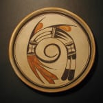
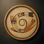
The design on the interior of this bowl is composed of elements that are typically used by Nampeyo; what is extraordinary is their simple, powerful configuration. Of the more than five dozen pots by Nampeyo in this collection, this bowl and two others (2014-07 and 2025-05) best demonstrate the genius of Nampeyo’s designs. They startle my eyes and smile my face. These are the pots I keep near my bed so they greet me every morning.
Form:
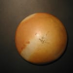
The bowl is of modest size with even and substantial, but not thick, walls. As expected, there is an extra clay coil on the interior of the lip, a Nampeyo trademark (Blairs, 1999:91). The interior of the bowl is smoothly white-slipped; the exterior unslipped and blushed by the uneven heat of the dung fire. These finishes indicate that the bowl was part of the transition between white-slipped Polacca ware and the unslipped of self-slipped style of Sikyatki Revival. (See “Appendix A.”) One small 1.5″ X 2.0″ area on the exterior of the bowl near the rim has a slight dark patch where the fire licked the pot.
Design:
Thick-over-thin framing lines encircle the interior just below the extra rim coil. There is a tiny break in the thin line that may mark where Nampeyo started and ended her yucca brush stroke or it may be a deliberate spirit break line. It is so incidental that I believe it to be inadvertent.
The concave interior surface is 8-inches wide between the framing lines. A single design floats in this space, its core horseshoe-shaped with an opening of about half an inch. The linear distance from this opening of the horseshoe to its apex is about 6-inches. The width of the design is about 5.5 inches. The arch itself is 1.25-inches wide and most of the bowl’s design is within in this space. Both tips of the horseshoe end with linear feather designs; I will discuss the bowl’s design design starting with the right end of the arch.
This end is a pair feathers with black tips. At the top of this element is an unpainted strip with a single line at its center, a two-lane “highway” that Nampeyo customarily used to separate her design elements. Below this the design separates into the two linear feathers with solid black “gumdrop” elements at their base, followed by an unpainted core and terminating with substantial, rounded, black tips.
Above these feathers is a small square space bounded by the two-lane highway elements. All four sides of this space display solid-black hill forms, low versions of the black “gumdrops” at the base of the feathers below. The unpainted residual space is crossed by two sets of parallel lines set are right angles to each other, a form that I believe is unique to Nampeyo and which I have labeled a “windowpane.”
Above the windowpane the arch begins to bend toward its apex so the upper edge substantially longer than its lower edge, like a half-eaten wedge of pie. The design interior to this space consists of three sickle-shaped black forms with a common on base on the left wall. The top sickle spans the entire length of the space, its tip touching the far border of the space. The two sickles below are of equal length and arch only three-quarters of the way across their enclosing space. At first you see what I have just described: three black sickle shapes thrusting to the right into an empty space. However the residual surface forms three unpainted sickles thrusting to the left, a parallel but contrary design. The result is “figure-ground reversal..when you look at the pot the figure and the background against which it is placed keep changing places, the figure becomes the background and the background becoming the figure” (Wyckoff, 1985:100 and 94-103). This instability of perception energizes the design and is often used by Nampeyo.
There is a lot of energy in the design on this bowl, but the next segment of design is simple and calm. All of the design segments on the bowl are bounded by highway elements, and all are two-lane except for those enclosing this segment. These are three-lane: two parallel lines in a linear space. Note that the interior line of these “highways” is slightly thicker that its compnion lines, particularly the right boundary example.The enclosed design is most easily described as three unpainted strips, the top and bottom bridging the entire length of the segment and flat against the thick line of the highways. The center strip is slightly shorter so and has rounded ends. In actuality these three strips are not painted but residual to thin, painted and black forms with the paint around the shorter central segment forming more prominent U-shaped areas. This segment also displays figure-ground reversal, but less emphatically than its sickle-form neighbor.
The next segment of design is another “windowpane” and it is placed directly across the first windowpane in the arc of designs.
Finally, below the two-lane highway that borders this second windowpane is the final element of design, solid red but edged with a thin black line. At the center is a pair of linear tails with pointed tips and these are flanked by slender pointed feathers. The interior flanking feather is just as long as its companion, but is substantially thinner, its final 1.5-inches just its black framing lines merged. The exterior flanking feather is red to its tip.
The sequence of elements on the arch, 1) the “windowpane” followed by 2) paired tail feathers, is seen on three other Nampeyo pots in this collection (1988-01, 2014-07 and 2019-12).
There are two additional areas of design other than those encapsulated inside the central arc.
External to the arc are two black “spines,” elongated versions of the three black “sickle” shapes in one segment of the arc. The spine closer to the red tail is 3.25-inches long and juts away from the arc at a greater angle that the 3.50-inch spine closer to the black tail. Tucked between these spines and the upper edge of the arc are large red tear-drop elements.
In the space inside the arc is a curlicue tail that emerges from a black hill form that is one side of a windowpane segment. This tail curves around inside itself and ends at a point, an extended version of the thin eagle wing seen on jar 2005-16 by Nampeyo. Uncurled, this tail would be 8-inches long, which happens to be the same as the diameter of the bowl between the framing lines. The interior edge of the last 4 inches of the curve sprouts 29 short hairs. If you look closely, you will see that these 29 lines are themselves not parallel and in fact two lines are at almost right angles to each other. It appears that when painting the bowl, Nampeyo adjusted the position of the bowl relative to her hand four times so as to keep her hand motion in a comfortable range, thus creating four segments of hairs in the row.
The exterior of the bowl is undecorated.
In “Appendix B” I discuss the relationship between an ancient Sikyatki bowl and bowl 1993-04 in this collection. The design on the two bowls is similar, and I suggest that by copying and innovating this design over many years, Nampeyo learned a set of design strategies that define her Sikyatki Revival style. Section 4 in Appendix B specifies six of these design strategies and all of them are apparent on bowl 2002-03:
1) A tension between linear and curvilinear elements, often represented as a contrast between heavy and delicate elements.
Obviously the central horseshoe form is curvilinear as is the curlicue at the center of the design. While they are slightly bent, both sets of terminal black and red feathers are strongly linear, as are the three black sickle shapes interior to the horseshoe and the two black spines affixed to the exterior.
Dramatic tension has additional sources in this design. The red and black tails that occupy the tips of the horseshoe are usually found singularly at the end of a design, as on bowl 1988-01. They provide upward visual thrust, like the exhaust of a rocket accelerating upward. On this bowl there is no head to the design, only tails and these tails lift both tips simultaneously toward the apex of design. It seems like the design might snap from the tension at the apex: drama. Simultaneously the central curlicue and two external spines add counterclockwise motion.
2) A deliberate asymmetry of design.
A simple horseshoe is symmetrical, but Nampeyo insures that this is not the case here. Both points of the horseshoe display sets of tails, but they contrast in both color and form, two black tails are set opposite four red tails. The red tails are more visually attracting and occupy more surface area than the black tails. The central curlicue is thrown off balance by those 29 short hairs affixed to one side and even these are not placed symmetrically. More subtly, the panel internal to the horseshoe with three unpainted strips is not symmetrical: the central strip is shorter and has rounded ends, unlike its flanking strips. Moreover [we’re doing detail here], a) the “highways” that separate this segment from its neighbors is three-lane as opposed to the two-lane form used everywhere else in the design and b) the edge line of the highway internal to the segment is thicker than all the other highway-defining lines in the design.
3) The use of color to integrate design elements.
The large red tail is visually tied to the two red teardrop shapes external to the horseshoe. Indeed a line drawn from the middle of this tail across the design so that it bisects the red drop closest to the black tail also bisects the overall design. Thus the red elements draw the viewer’s eye across the breadth of the design. Interestingly Nampeyo also integrated the design with a second strategy. By placing black “windowpane” segments directly above each tail, a viewer’s eye links the two arms of the horseshoe, integrating the design. This is the first time I have seen Nampeyo use of monochromatic elements to unify a design.
4) The use of empty (negative) space to frame the painted image.
There is substantial unpainted area on three sides of the design; this feathered design floats in space. I am reminded of the movie 2001: A Space Odyssey when the renegade computer Hal cuts the lifeline of an astronaut and he slow twirls off into the void.
5) The use of a thick above a thin framing line on the interior rim of her bowls.
Such framing lines exist on this bowl.
6) Nampeyo’s painting is confident, bold, and somewhat impulsive compared to the more-studied, plotted and careful style of her daughters, descendants and other Hopi and Hopi-Tewa potters.
I always note that while this might be the most important marker of a Nampeyo pot, it is also the most subjective. Nevertheless, there is some objective evidence. The central horseshoe is built on two curved exterior lines that are the same form but different sizes, and yet remain a consistent 1.25-inches apart. Similarly, the central black curlicue twists around itself and then smoothly narrows to a point. Drawing such controlled curves accurately with a simple yucca brush is a mark of a confident painter. My eyes see that mass of red feathers as bold, as is the overall design. My eyes remember this image: it has impact. Impulsivity is also subjective, but there is some evidence. Those two black external spines leave the central design at different angles and are of different lengths. This is folk art snd I think Nampeyo simple sketched these elements in so they “looked right” and did not plot them carefully to make them identical. Above the black feathers, the upper line of the two-lane “highway” extends past the lower edge of the horseshoe. Similarly the three-lane highway above the windowpane near the red feathers has a line that is a bit too short to reach the lower edge of the horseshoe. In the segment with the three unpainted strips, the “U-shaped” right cap right of the central strip bleeds over into the adjoining three-lane highway. These are tiny details, but I think that great modern Hopi-Tewa ceramicists such as Mark Tahbo or Steve Lucas would not make such “errors.” However, Nampeyo was impulsively following her own sense of design and not trying to produce perfect pots for a fine art market.
Many other pots in this collection display these six design strategies that mark them as “by Nampeyo,” so why is this design so striking? After all the analysis, an answer must still be aesthetic, from the heart. Because of the simple configuration of the design, these strategies interact with particular efficacy on this bowl . Those terminating tails thrust the design up, the central curlicue (itself unbalanced by those 29 hairs,) spins the design in space. The two external spines add to the counterclockwise motion. The two parallel windowpane segments and the red elements tie the design together and keep it from flying apart. Powerfully torqued, unconstrained and floating in the unpainted space, the design soars and spins freely. Nampeyo was a master of design and this bowl represents the best of her design genius.
I should note that I am not the only collector attracted to this bowl. As shown in the eBay bidding records [on file], three and a half minutes before the close of bidding, the highest bid on this pot was less than 25% of its final cost. Seven seconds before the end of bidding, Steve Elmore of Santa Fe (“Olla”) bid more than four times the high bid; three seconds later I bid higher and won the pot. Clearly both Steve and I saw something in the pot that prior bidders had not seen. A couple of weeks later I was in Santa Fe and visited Steve in his home. He estimates he owns 50 or 60 “Old Lady Nampeyo” pots, having (for example) bought two others the same night that I won 2002-03. “Without question” was his assessment of the relation between this pot and Nampeyo.
For an evaluation of the aesthetic of this bowl in the context of other Nampeyo pots the collection, see Appendix D.


