
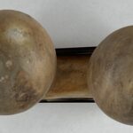
- One lobe has a maximum diameter of 2.6875-inches.
- The second lobe has a maximum diameter of 3.0-inches, 12% larger.
- There is a 0.875-inch gap between the two lobes.
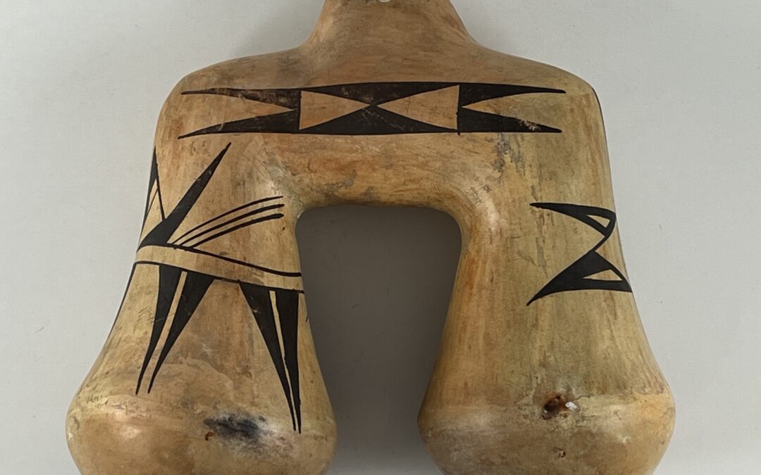
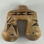
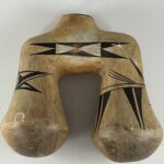
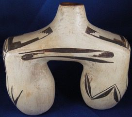
The bimodal shape of this canteen is unique and intriguing. However, the jar cannot stand upright on its own, and thus its form requires that it be seen lying flat on a surface. While some of the painted design can be seen from this perspective, the majority of the design is painted on the top surface and the ends of the lobes and these designs can only be fully seen when the canteen is upright. Thus form and design make contradictory demands on a viewer, something I have not seen before on a pot from Hopi.
The experimental shape of the pot and four familiar designs suggest its maker might be Nampeyo. Nampeyo is particularly known for using unpainted surfaces to highlight her designs. Canteen 2024-02 is an experiment in using a physical void to create this same effect. Much of the painted design consists of triangles. Variations in their orientation are a third design experiment incorporated into this little jar.
Form:
The bridge between the two lobes is just under 2-inches in diameter, as are the upper portions of the two lobes. As the lobes descend they gently flair outward to their maximum diameter, then slope inward to a rounded bottom. I speculate that these ends began their life as small bowls that were then affixed to the upper portion of the lobes. These rounded ends prevent the canteen from standing upright.
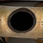
The mouth of the canteen is an oval with a maximum diameter of 1.125-inches. This opening allows us to see inside the canteen and reveals that the horizontal bridging portion of the structure is seamlessly integrated with the vertical lobes; the openings to the lobes are cleanly-formed without extraneous bits of clay.
The walls of the canteen are substantial but not thick. Given its small size the canteen has an unexpected heft. The canteen is slipped with the stone polishing following a roughly “U” pattern incorporating the linear body of the lobes and the bridge between them. This pattern stops suddenly at the widest part of the lobes, where the round bottoms are attached to the end of the lobes. There is abrupt visual disjunction at this point, with the rounded bottoms slipped without polishing striations.
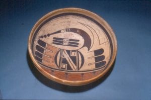
Design:
The designs on the two lobes are different. Note that on one side of the canteen, on the edge of the lip, there is a small white spot cause by the flaking of the polished surface. To help guide our discussion I will call this side the “front” of the canteen and the side without this white spot its “back.” References to the “right” or “left” lobe assume this orientation.
All painting is done with black paint.
The pot displays four areas of design:
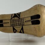
- Top view: the edge of the opening of the canteen is painted. Flanking this opening are ball-and-line motifs.
- On both sides of the canteen the horizontal bridge between the lobes carries a triangular design.
- Only the outer surface of right lobe is painted. The design consists of a “butterfly” element flanked by sets of triangles.
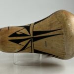
- A set of parallel lines (a “one-lane highway”) encircles the left lobe of the canteen. This highway serves as a base for a variety of triangular elements that also encircle the lobe and are placed above and below the highway.
A more detailed examination of these designs reveals that:
First, the edge of the mouth of the canteen is painted black. On each side of the mouth is a set of parallel lines with a solid black ball at its center.
Second, the design on the bridge of the canteen is formed by sets of triangles. The larger set is black; the smaller set is unpainted. Within each set the points of the two triangles touch, but the sets of triangles are oriented differently. The black triangles point up and down. The smaller unpainted triangles are placed inside the black triangles with their points faced to the right and left. The right and left points of the black triangles intrude onto the surrounding unpainted surface and created unpainted, residual triangles that also point toward the center of the glyph.
Third, The design on the right lobe is only painted on its outward facing surface. At the center of the design is a 5 by 7 cross-hatched rectangle. Each of the resulting 35 squares has a carefully-placed dot at its center. On each end of this rectangle are unpainted combs with two projections forming the base of black-tipped feathers with rounded ends.
External to the long sides of the rectangle curved lines arch across 5 of the 7 squares below, but the placement of this arch varies. On the edge on the front side of the canteen the arc is centered so that one rectangle is on either side of arc. The arc then serves as the base of an unpainted equilateral triangle. The entire left edge of this unpainted triangle supports a black obtuse triangle with an irregular unpainted triangle at its core. The right edge of the unpainted triangle supports a similar black triangle, but this second black triangle does not occupy all of the edge upon which it rests. This gap in coverage throws the design off symmetry.
On the edge of the rectangle on the back side of the canteen the arc again cover 5 squares but it is not centered. Thus two rectangles are left uncovered on one end of the arc and no rectangles are situated outside the arc on the other end. Mounted atop this uncentered arc is a rather sloppy pattern of triangles built around a diagonal line. Much of the area above the line is undecorated, but based on its lower third is a black right triangle with an unpainted right triangle at its core. The area below the diagonal line is fully decorated, but difficult to pattern. Most simply it is solid black with an unpainted obtuse triangle set against its left edge. This is similar to the design above the diagonal except that the curve of the arch intrudes into the black area and the result is a residual black form so unstructured that it is the source of my “sloppy” impression of the overall design.
Fourth, Encircling the left lobe of the canteen are two rather casually-drawn parallel lines, forming a “one-lane highway.” Pendant to this highway are five large and carefully-drawn isosceles triangles, each cut vertically by an additional one-lane highway such that each larger triangle is cut into a pair of two elongated right triangles.
Above the encircling two-lane highway the design is a bit more complex. At its center are two renditions of pairs of triangles. Each pair contains a thin triangle (triangle #1) that slopes away from the center of the design. Growing from the hypotenuse of triangle #1 is a shorter, wider triangle (triangle #2) sloped toward the center of the design. While the two renditions of paired triangles have the same form, their internal coloration is quite different.
In the left-hand pair triangle #1 has an unpainted triangle embedded in its base while the space above is black. In the right hand pair triangle #1 is solid black. In the left hand pair triangle #2 has a white triangle embedded in its base while the upper portion of the triangle is black. This same format —with slightly different proportions— is found in triangle #2 in the right hand pair but this second rendition also has a unique small unpainted parallelogram in its upper black area.
On the front of the canteen, emerging from the two-lane highway to the right of these central triangles, is a set of three parallel and sloped lines. On the back of the canteen this element is drawn as a fan of three non-parallel lines.
Nampeyo’s Design Strategies
I suspect that Nampeyo may have been the maker of canteen 2024-02, but such attribution is always speculative and requires that the evidence be explicitly developed. Here’s my argument:
This collection contains 65 pots that were entirely or partially formed and painted by Nampeyo. Studying these pots has led me to defining six design strategies that are characteristic of Nampeyo’s mature painting. These strategies were not used mechanically by the artist, but were available to her as sort of a toolbox of approaches to design. The greater the number of these strategies I find on a pot, the more confidence I have that the pot is “by Nampeyo.” I have measured bi-lobed canteen 2024-02 against these standards and find:
1) A tension between linear and curvilinear elements, often represented as a contrast between heavy and delicate elements.
Except for the painted circular mouth and the ball and line motif that flank this mouth, there are no curvilinear elements of design on the canteen and thus no other contrasts between linear and curvilinear elements in the design of this pot. A few of the triangles in the design have somewhat curved sides because of exigencies of drawing, but otherwise all other designs on canteen 2024-02 are linear.
However, the curved shoulders of the canteen and the rounded ends of the two lobes create a strong curvilinear presence that interacts with the linear shape of the lobes and the linear design elements.
2) A deliberate asymmetry of design.
Most dramatically the designs painted on each lobe are entirely different. In addition the design on each lobe is internally asymmetric.
3) The use of color to integrate design elements.
The design is monochromatic, so this strategy was not used.
4) The use of empty (negative) space to frame the painted image.
As already detailed, the top designs and the triangular glyphs on the bridge between the lobes are surrounded by unpainted space. The the designs on the ends of the two lobes are physically isolated in space and (as will be detailed shortly) this has the same highlighting effect as if they had been surrounded by unpainted surface.
5) The use of a thick above a thin framing line on the interior rim of her bowls.
This is not a bowl, so this strategy is irrelevant.
6) Nampeyo’s painting is confident, bold, and somewhat impulsive compared to the more-studied, plotted and careful style of her daughters, descendants and other Hopi and Hopi-Tewa potters.
I always say that this is both the most important and the most subjective of the six design strategies. In the case of canteen 2024-02, however, the argument is quite straightforward. These strategies are about painting, but in the case of this unique pot they also apply to form. To try to make such a dangly pot out of wet clay requires great knowledge of the clay’s capability and confidence in one’s ability. Except for the pahos, butterfly element and two groups of whiskers, all of the design elements on canteen 2024-02 consist of configurations of triangles. It takes confidence to take a single basic form and manipulate its orientation multiple ways in order to create an attractive design. The shape of the canteen is inherently bold requiring a willingness to experiment with an unusual and difficult-to-construct form. The embedded triangle glyphs below the mouth of the jar focus a great deal of energy to a central point and thus also fit the moniker “bold.” Although the end designs are different, each strongly projects itself. The characterization “impulsive” might best be seen in the discordant elements of design, since such discordance might be a sign of impulsive painting. The dissimilar painting on each lobe might be evidence for this. The pairs of triangles on either side of the “butterfly” form on the right lobe not only do not match, but each seems awkward in its own right, as if they had been casually applied as a last-minute doodle. Similarly the casually-drawn one-lane highway around the left lobe suggests impulsive brushwork. The two-sets of three lines sprouting up from the one-lane highway on the left lobe have different shapes, one fan-like and one a set of parallel lines. Nampeyo’s designs can be carefully ordered (cf 2005-16 or 2019-12), but here she carefully-laid out only the designs on the upper bridge and then seems to have improvised her designs on the lugs. That suggests “impulsive” painting to me.
In short, of the 5 relevant design strategies, the artist has used 4 on them on canteen 2024-02, omitting only the use of color to integrate the design. This pattern suggests that Nampeyo might well have been the creator of canteen 2024-03
Direct evidence that Nampeyo made canteen 2024-02:
I find the six design strategies a useful standard by which to measure if a pot is “by Nampeyo,” but they are inferred criteria. More directly canteen 2024-02 displays a shape and four design elements that suggest Nampeyo as the maker.
1) Excentric Form:
Nampeyo is known to have an inquisitive nature that sometimes led her to create eccentric forms, for example the “Effigy pot with mountain sheep heads and handle” in this collection (2014-17). While bimodal canteen 2024-02 has a particularly odd shape, it within the expectations we have of Nampeyo’s experimentation. Having seen photographs, Ed Wade agrees:
“Nampeyo was known to make these strange canteens and the precision of the painting also suggest her work. I have a photo somewhere that shows her with a basket full of tourist wear including a vessel like this. Photo dated 1904 (Personal communication 1-29-24).”
The photograph referred to by Ed Wade is published in his book Canvas of Clay (2012:132) and (more clearly) in his book Call of Beauty (2022:212). The photograph does show a couple of jars with tubular protrusions in a basket, but no pot with the exact form of canteen 2024-02.
Of the four design elements that suggest Nampeyo was the maker of canteen 2024-03, three are found on bowl 1993-04, which we are confident was made by Nampeyo:
2) Embedded triangles:
The exterior of bowl 1993-04:
Bowl 1993-04
This glyph is exactly the same as on canteen 2024-02 and it has an ancient history. Glyphs are not found on Polacca ware, but are common on ancient bowls from First Mesa, including Jeddito and Awatovi subtypes. In his exhaustive and detailed review of Painted Ceramics of the Western Mound at Awatovi, Watson Smith details “isolated elements of geometric form,” mostly found as designs on the exterior of bowls. Figure 98 in the publication displays 48 such elements and one labeled “ff” is exactly the same as the embedded triangular glyph found both on the exterior of bowl 1993-04 and on canteen 2024-02 (Smith, 1971:151). In subsequent tables Smith groups this glyph and three similar glyphs together and reports that collectively they were found only 7 times among the 631 glyphs analyzed (Smith, 1971:155). Since the four glyphs together comprise only about 1% of glyphs tabulated, the embedded triangle glyph alone would account for substantially less than 1% of the cases, an extremely rare incidence. In short, while the embedded glyph used by Nampeyo on the exterior of bowl 1993-04 was known in the ancient village of Awatovi, its incidence of use was probably very rare.
In a famous quote Nampeyo said:
“When I first began to paint I used to go to the ancient village and pick up pieces of pottery and copy the designs. That is how I learned to paint. But now I just close my eyes and see the designs and paint them (Bunzel, 1929:56).”
The “ancient village” referred to by Nampeyo is Awatovi and is very close to Nampeyo’s home village. It was not excavated during the years Nampeyo was painting, but the surface of the village site is covered with thousands of potshards. It is possible that Nampeyo saw this rare embedded triangle glyph on a shard and copied it. Alternatively she might have invented this design out of her own imagination. Until canteen 2024-02 entered the collection, bowl 1993-04 was the only time I had seen the embedded triangle design on a pot; it is extremely rare. The fact that this design is found both on an authenticated pot by Nampeyo in this collection and canteen 2024-02 is strong evidence that the canteen 2024-02 is also “by Nampeyo.”
3) The butterfly symbol:
The interior of bowl 1993-04:
Notice that central to the interior design on bowl 1993-04 is a “butterfly” element very similar to that found on canteen 2024-02. Two other pots by Nampeyo in this collection carry variations of this design: 2010-11 and 2015-12. The design found on bowl 1993-04 was repeated by Nampeyo throughout her career. (See Appendix B for this discussion.) She made dozens, perhaps hundreds of bowls with this design, most incorporating this butterfly image. The design, and therefore this butterfly element, is a hallmark of Nampeyo’s work.
4) Pahos, prayer feathers:
The balls with emerging whiskers found flanking the opening of canteen 2024-02 are similar to pahos (prayer feathers) found on an early Nampeyo pot: 2015-03. The pahos found on bowl 1993-04 only has whiskers emerging from one side, as is true for other Nampeyo jars in this collection displaying this prayer-feather ornament (2010-11, 2014-20, 2020-16 and 2020-17). This design is not unique to Nampeyo, but was frequently used by her.
5) Triangular design elements:
Nampeyo’s decision to use configurations of triangles to decorate canteen 2024-02 is similar to her decoration of a seedpot by her in this collection, 2015-04.
These four design elements, but particularly numbers 2 and 3, offer direct evidence that major design elements found on canteen 2024-02 are characteristic of Nampeyo’s work, in one case uniquely so.
Shortly after I bought canteen 2024-02 Ed Wade was asked to sell a collection of Nampeyo pots owned by a man in Phoenix. His collection included a bi-lobed canteen, the only other example of this form that I have seen:
In April 2025 I visited an old friend, Joe Jacoby, at his home in Bowling Green, Ohio. While there Hopi pottery collector Vincent Drucker told me of a pueblo pottery dealer in Ohio. Joe and I visited Doug Salveson at his home in Findlay, Ohio and we thumbed through photo albums of pots he had sold. In 1993 he owned, and eventually sold, this bi-lobed Hopi canteen:

I think this Ohio canteen is the same pot as the Phoenix canteen pictured above. This photo offers a different view. Notice the double-triangle element of the end of the shoulder. This element was not visible in the first photograph. On 2024-01 in this collection the double-triangle design is featured on the side of the canteen. On the Findlay, Ohio example it is placed on the end. To repeat an earlier point, the design is a strong indication that Nampeyo was the maker of both bi-lobed pots.
In spite of their rarity, this collection contains two other bi-lobed canteens from Hopi, but each has an its own unique shape. See 2022-03 by Jean Sahme and 2026-01 by Nampeyo’s middle daughter, Nellie. Both the extended form and the detailed, narrative, painting of Jean’s canteen represent the pinnacle of craftsmanship. In contrast, Nellie’s canteen has an awkward shape and is indifferently painted.
Design Analysis:
Canteen 2024-02 has an insistent shape. It demands attention, but does not advertise its function. Its small size, limited capacity and inability to sit upright suggest that this was a commercial item made for sale rather than use. Unusual care was taken in forming this pot. Even inside the canteen, which most people would not examine, it is seamless and cleanly finished.
As noted above, the canteen naturally rests on its side and this position hides the design around the mouth of the jar and fragments our view of the designs on the lobes. Only the embedded triangle glyph of the bridge is seen clearly in this orientation. In short, the form of the canteen constrains our view of the designs it displays.
The black edge of the opening is rare and is seen on only a few other Sikyatki Revival pots in this collection (cf 2013-14 and 2020-16). The ball and whisker pahos (prayer feather) element, as noted earlier, is seen in this form on another Nampeyo jar (2015-03) but more commonly is depicted with whiskers projecting from only one side. The pair seen here create an elegant tableau flanking the mouth of the pot.
The triangular glyph on the bridge of the canteen is formed by two sets of triangles. The black tips have vertical energy; the embedded triangles have horizontal energy and the design in its entirety focuses on a single central point that is being pressured from all sides. These two drawn sets of triangles create a third, residual and unpainted set of triangles. The result is complex and visually compelling and yet is simply formed from sets of triangles. It’s a masterful design and, as we have seen, is a central piece of evidence that Nampeyo formed and painted this canteen.
The design on the right lobe is centered around a butterfly-shaped element. The 7 by 5 crosshatch (each square with a central dot) at its core is carefully-drawn. The pattern is sometimes said to represent a cob of corn and at other times is said to represent a cultivated field, this difference in understanding being negligible (cf pot 2024-04 and Patterson, 1994: 164). The central element with its wing extensions is strongly symmetrical, but this characterization is not shared by its the surrounding design. The two triangles on the front side of the butterfly form a balanced pattern, but the triangular designs on the back edge of the butterfly do not. This latter set of triangles seem to have been doodled with no regard to creating a matched pair. Because the central “butterfly” element is visually strong, so is view of the overall design.
On the left lobe the encircling two-lane highway is casually drawn, the most casual element on the canteen. The triangular designs off the top and bottom of this highway, however, are carefully drawn. The configuration of triangles below the highway is entirely symmetrical. The triangles above the highway are also symmetrical with one clear exception. The upper-central set of triangles have the same external form, but internally are painted differently. As we noted above, this asymmetry is characteristic of Nampeyo and energizes the design.
Conclusion:
More emphatically than any other pot in this collection canteen 2024-02 demands to be seen from a particular view. The unusual shape of the canteen is an experiment in the limits of Hopi clay and form. The form is dramatic and symmetrical but forces the pot to lay on its side.
While this orientation prevents us from fully seeing the rest of the design, when the pot is held upright, we perceive an unusual interaction between form and painting, a second design experiment. Nampeyo is famous for creating designs that are highlighted by being set in an unpainted space. That strategy is seen here in the unpainted space left around the top designs and the embedded triangular designs on the canteen’s sides. Uniquely, this same effect is achieved on this canteen by physically isolating the designs on the sides of the lobes. Because of the physical form of the lobes, the designs they carry are surrounded by air – actual empty space—and these designs are thus emboldened. All of the designs on the pot 2024-02 are highlighted by space, but this effect is achieved by two radically-different means. The only other pot I know of that uses physical space to embolden a design is canteen 2014-15 in this collection, a copy by Rachael Sahmie of a glorious canteen by Nampeyo.
Triangles provide the building blocks for most of the design on the canteen. Manipulating the shape and orientation of a single element to create attractive designs is an aesthetic challange and constitutes the third design experiment emerging from the creation of canteen 2024-02.
The top designs and side designs on the bridge linking the two lobes were pained precisely and with care. In contrast the designs on the two lobes seem mostly to have been painted without much care or forethought. The design on the two lobes are radically different and –while some of the painting is precise– much of the painting was casually-applied and seems spontaneous, whimsical and inexact. This mix of careful and casual drawing on the same pot seems odd, but we have seen it before on a pot by Nampeyo, see 2018-04 in this collection. From this pattern I think we can infer Nampeyo’s intentionality. The care with which she shaped the canteen and the care with which she patterned and painted the designs on the upper portion of the canteen indicate that these creative tasks were important to her and thus she attended carefully to their creation. In contrast, once the lobes were formed they were of relatively little interest to Nampeyo and she painted them quickly and sometimes casually, insuring only that the results were asymmetric. Of course I cannot go back 120 years and read Nampeyo’s mind, but this is what the form and design of canteen 2024-02 tell me.
All elements of this canteen support the idea that Nampeyo was having a particularly inquisitive day when she made this pot. She managed three design experiments while creating an eccentric pot that is bold and elegant and yet preserves a sense of whimsey. That’s a lot of aesthetic activity in a small space. The evidence I have presented and the argument I have constructed might certainly be challenged. The pot is more than a century old and my understanding of Nampeyo’s creative process can only be inferred. The best I can hope for is that a reader has enjoyed this exercise and feels prepared to make her/his own conclusions.
