


Height includes the 0.8125-inch neck. Width includes the two handles with a combined width of 1.1875-inches or about 0.594-inch for each handle.
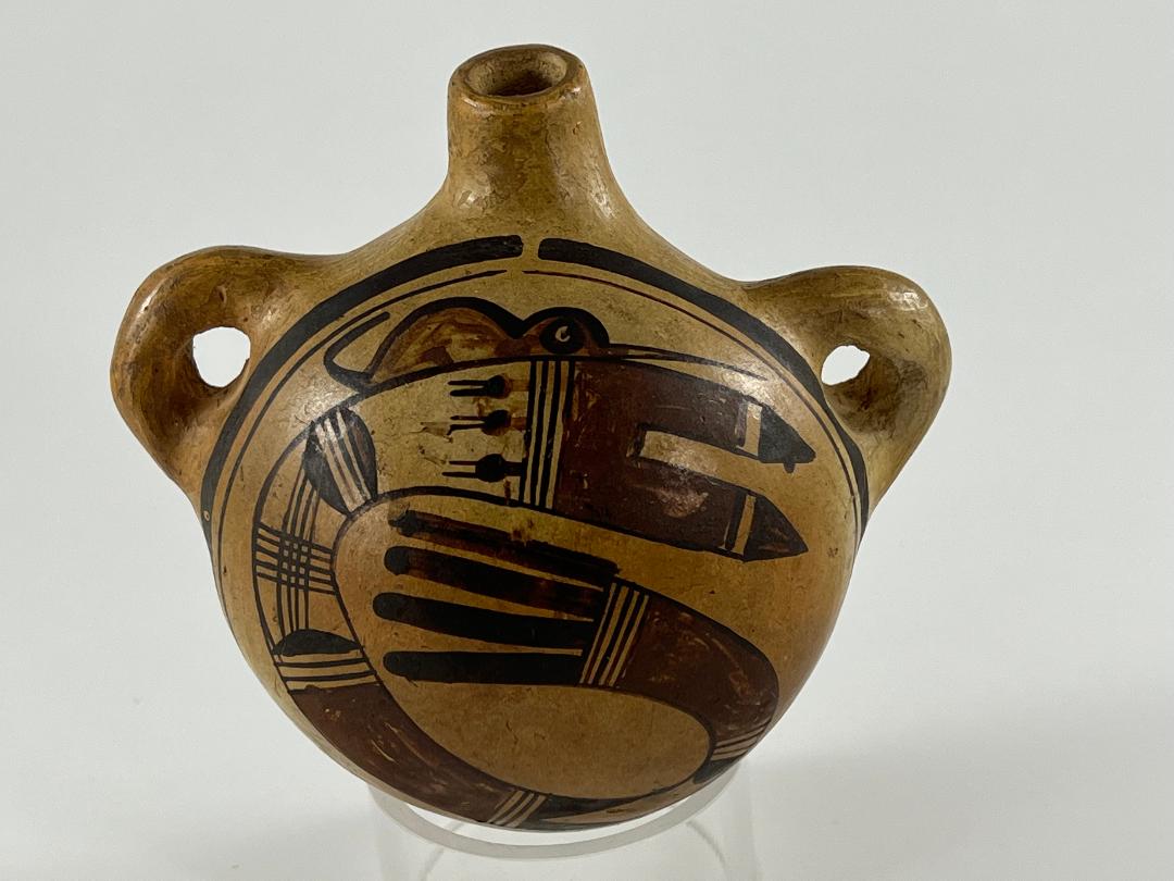
This canteen is small enough to fit into the palm of your hand. The circular feather swirl is elegant; the diminutive, whimisical creature perched on top could not be more folky. Aggregated, these three characteristics make the canteen beautiful and powerful but also cute. It’s a curious collection of traits: like a small child with a variety of moods, all of which make you smile.
I believe this canteen is by Nampeyo; the evidence for this attribution is presented below. To date this collection has 65 “Nampeyo” pots. (See “Artist” list and Appendix D.) Some of these pots are masterpieces, some tourist trinkets, some eccentric, but only one other (2012-21) has the folky humor of canteen 2020-17.
Form:
Of Nampeyo’s canteens, Ed Wade writes that:
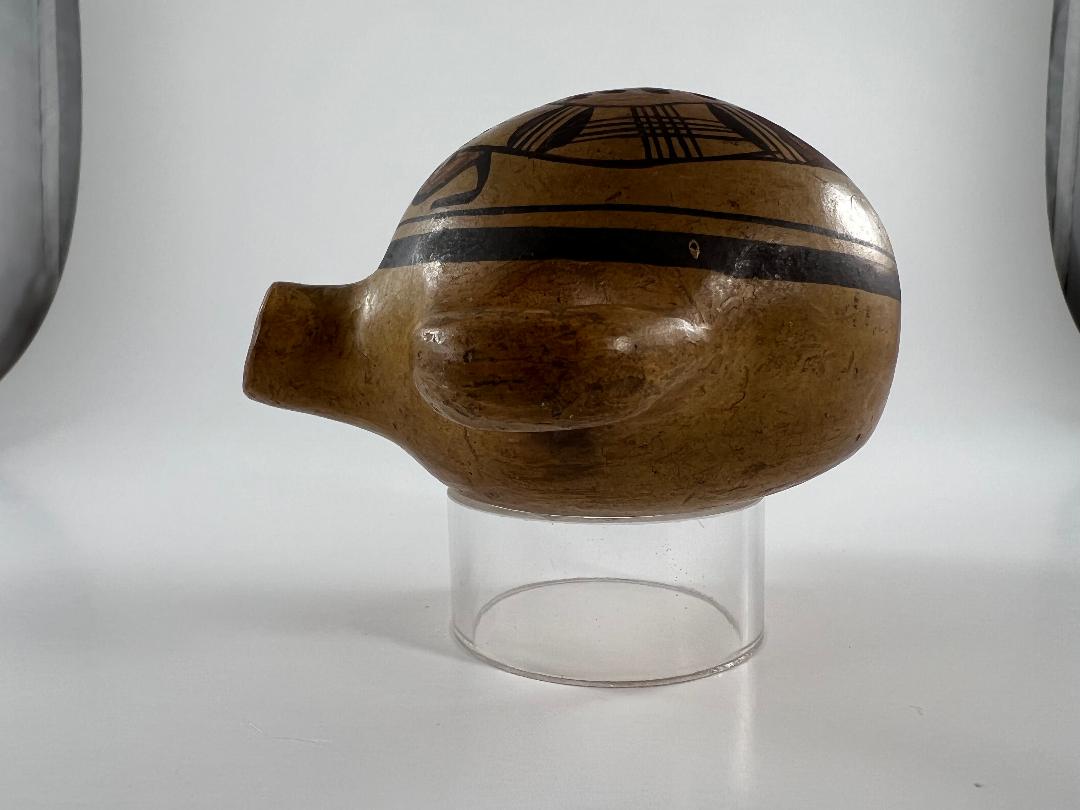
“The shape of her vessel was based on the undecorated Polacca utilitarian canteen (cf 2003-09), sporting….half circular handles with a forward thrust to the spout….Around the turn of the century Nampeyo once again economically adapts her art to the needs of the tourist market by shrinking the size of her canteens from functional forms to miniaturized curios” that could easily be packed into a suitcase (Wade and Cooke, 2012:133-134).”
Canteen 2020-17 has such a forward-thrust spout, as expected of Nampeyo’s work. Other potters, including her daughters, produced canteens with straight spouts. It’s also worth noting that canteens meant for use had a more bulbous convex fronts (cf 1998-01 and 2009-10) than canteens design for the tourist trade, such as this pot. Of the 8 Nampeyo canteens in this collection, 2020-17 is the smallest.
Design:
The exterior form of a jar constrains a design. In contrast, painting on the interior of a bowl allows an artist an unrestricted space to draw. Since canteens are essentially bowls made convex, they also provide a wide expanse for design,
All design elements on canteen 2020-17 were outlined with black paint before the artist began filling in the design. While Sikyatki Revival bowls generally display thick-over-thin framing lines, that order is generally reversed on canteens. Thus, as expected, this canteen displays thin-over-thick framing lines. The diameter of the design space within these lines is only 3.75 inches. The craftmanship of the framing lines is an important indicator that Nampeyo made this pot, as will be explained below.
The design of the central circular motif involves 16 elements, 5 of them sets of parallel lines I call “highways.” Our discussion begins at the top with the two pointed arrows and ends with the terminal set of four solid-black tails.
- This format of tails with a red base and black tips is found on several Nampeyo pots in the collection: 2014-20, 2015-03 and 2017-15. Here the two tails are more carefully drawn than in other renditions, with the triangular tips separated from the red base by a narrow, unpainted, space.
- Following are four parallel black lines in an otherwise unpainted space, forming a three-lane “highway.” This element is very common on Nampeyo pots.
- Projecting from this highway in a relatively large, unpainted space are three solid balls with two parallel “whiskers” sprouting from the last line of the highway. These represent “pathos,” or prayer feathers. For a more detailed discussion of this element, see jar 2020-16, Section IV, #7. For other examples by Nampeyo, see 1993-04, 2009-10, 2010-11, 2014-20 and 2015-03.
- Following is a solid black lunette, which I think of as a “gumdrop” facing right. It is a very common element used by Nampeyo as sort of a filler. Examples are many: see 2011-16, 2012-13, 2013-03, 2014-01, 2014-17, 2017-04, 2018-13 and 2019-12.
- Supporting the base of the lunette gumdrop is another three-lane “highway.”
- Following is another “gumdrop,” also with its base against the set of four parallel lines and facing left.
- The following space is arch-shaped because of a curve in the circular form and contains four parallel and vertical lines crossed at right angles by a similar set of five horizontal lines. The result is a grid of lines I have labeled a “window.” The design is a hallmark of Nampeyo’s work.
- Next is another solid black lunette-gumdrop facing right.
- Following is the expected three-lane highway.
- A rather long section of the swirl (1.25-inches) follows, painted solid red.
- Again, a three-lane highway element provides a boundary.
- This next section demonstrates a painting technique called “figure/background reversal.” This is a curious painting technique where a painted figure and its background seem to change places, thus enlivening the design. This section can be seen as an unpainted rectangle with two right-angle triangles extending from its leading edge and a black “gumdrop” set against its far wall. Alternatively it can be imagined as a black rectangle inset with a an unpainted arrow head element. This visual trick is regularly found on Hopi and Hopi/Tewa pottery. For other examples, see 1993-04, 2002-03, 2005-16, 2006-11, 2008-06, 2009-10, 2010-11, 2013-03, 2014-01, 2020-06 and 2020-09.
- Another three-lane highway marks the end of this section and
- The start of another 1.25-inch-long solid red element.
- The red section ends with another “highway,” but this one is four lanes wide.
- Finally, based on this highway, a set of four parallel and solid black tails , each about 1.25-inched long, complete the design. Note that the lower tail is a bit thicker than the rest while the upper tail is both the thinest and extends a bit beyond the black edging line of the design. This suggest that the lower tail was painted first and the artist realized she was running out of space as she ascended. Thus the top thinest tail was pushed outside the original black edging line.
The cute critter:
The design on this canteen would be complete if it only carried the central circular motif. Unexpectedly, perched at the 12-noon mark, just below the break in the framing lines, is a folky creature: perhaps a mouse. It’s a bit squeezed between the central design and the thin framing line, sort of like it is in hiding waiting to steal Hopi corn. The set-up makes me smile.
If the circular motif were the only design on this canteen I would call the painting “majestic.” Canteen 2010-11 by Nampeyo in this collection allows us to glimpse a similar presentation. Although the central designs of the two canteens are a bit different, their energy is quite similar and they exhibit the same aesthetic. The addition of the creature on canteen 2020-17 is visually unnecessary.
Notice that the unpainted space between the thin framing line and both the right and left edges of the design is about the same. Ignoring the critter for a moment, there would be about 0.625 inches between both the bottom and top of the central design and the thin framing line. This unpainted area seems deliberate, reflecting the original intention of the artist to use a symetrical unpainted surface to highlight the design. However, Nampeyo has used virtually all of the top space for her creature: its belly rests on the circular motif and there is only a sliver of space between the curled tail and thin framing line. Given this pattern, I imagine that the creature was an afterthought, added by the painter for her amusement into a space that was originally intended to be vacant. Such analysis is “forensic ceramics,” an attempt to understand the mind of an artist more than 100 years after the creation of a work of art. It’s all supposition, of course, but perhaps it does provide a glimpse into the mind of a creative genius. That’s a rare experience and well-worth the risk that my scenario is in error. Evaluating this supposition is left to the reader.
Was Nampeyo the maker of canteen 2020-17?
Since, as expected, the canteen is unsigned, the designation of its maker is simply an attribution. I believe the maker to be Nampeyo and the reader will notice that in the discussion above I have often assumed Nampeyo was the maker without providing evidence. Here is the evidence.
In Appendix B, Section 4 I outline six design strategies that I think are characteristic of the painting of Nampeyo’s Sikyatki Revival pots, such as canteen 2020-17. She did not use all of them all of the time, but they were design tools available to her. When a cluster of these strategies is found on a pot, it suggests Nampeyo as the maker. Applying this framework to canteen 2020-17 should help us decide if Nampeyo was the maker. The six strategies are:
1) A tension between linear and curvilinear elements, often represented as a contrast between heavy and delicate elements.
There is an obvious tension between the linear tails that sprout from each ends of the design and the dramatic curve of the central design.
2) A deliberate asymmetry of design.
The design is visually circular, but without symmetry.
3) The use of color to integrate design elements.
The use of red to highlight the body of the creature, the top red tails and two additional segments of the circular design encourages the viewer to gaze at the full range of design. Imagine if the final red segment of the design were black rather than red. The final five segments of design would be black and seem simply stuck on the earlier enlivened design. The actual distribution of red elements prevents this disjointed view.
4) The use of empty (negative) space to frame the painted image.
As detailed above, the original intention seems to have been to surround the circular design with empty framing space. The addition of the mouse creature violates this pattern, but the central design is framed by empty space on three sides.
5) The use of a thick above a thin framing line on the interior rim of her bowls.
Such framing lines exist, though the order is reversed on the convex surface of the canteen.
6) Nampeyo’s painting is confident, bold, and somewhat impulsive compared to the more-studied, plotted and careful style of her daughters, descendants and other Hopi and Hopi-Tewa potters.
A frequent user of this website might notice that I always begin my discussion of strategy #6 with the disclaimer that I recognize that it is subjective, but also the most important of the six strategies. Ultimately this is not a logical dimension but an emotive, aesthetic, response: like recognizing the face of an old friend in a crowd. Yet, after the first shock of recognition, there are specific features that supports the assessment of ‘confident, bold and impulsive style.”
One was discussed by Bobbie Silas talking about a display of 32 Hopi-Tewa pots at the De Young Museum (Summer 2021 — Winter 2023) that featured Nampeyo’s work. Silas said he could distinguish Nampeyo pots because of her ability to draw long, curved lines with one stroke of her yucca brush: “I can tell her work because of her one drag with the paint brush…She just did it once….Her one drag is what sticks out as really unique.” [For the full quote see Appendix B, Section 4.] Other potters at Hopi do not have the dexterity to form a continuous line but must lift their brush and turn a pot in order to complete a long, curved line.
Look carefully at the top, thin framing line on canteen 2020-17. Except for the spirit break, all 360 degrees of that line were drawn without the artist lifting her brush from the pot. Both hand and pot would have to move to complete the circuit of the brush. Moreover, this thin line maintains an almost consistent distance from the thick framing line below it. The central design is a sweeping circular motif that doubles back on itself and then continues for another half-turn. The black outer edge of this element is 8.25-inches long and was drawn with two sweeps of the brush. The juncture of the lines is visible below the left handle, 39% (3.25-inches) into the draw. The inner edge of the curved element is 5.75-inches long and requires two abrupt changes of direction of the brush, yet it was formed with one-draw of the brush, a striking feat of draftsmanship. The thin framing line and particularly the inner edge of the central design demonstrate extra-ordinary skill and, as Bobby Silas says, are strong indicators that Nampeyo was the maker of this canteen.
Notice also the grid of 4 by 5 straight lines in the central design. Recently I have seen this “windowpane” used by a couple of young potters, but 100 years earlier the design was unique to Nampeyo. Thus, like the extra coil on the rim of her bowl, a windowpane element is strong evidence that Nampeyo painted the pot. For examples of this element on other jars by Nampeyo in this collection, see 1988-01, 1996-05, 2002-03, 2006-02, 2013-03, 2014-01, 2014-07 and 2019-12.
Nampeyo is generally adverse to symetry, inserting small dissident elements into a design to unbalance it and add energy (cf. 2002-03 and 2019-12). The design on canteen 2020-17 would have been simple, powerful and complete without the whimsical creature perched on top of the feather swirl. Without the creature, the design would be similar to that on another small Nampeyo in the collection, 2010-11. On canteen 2020-17 Nampeyo has used the creature to interrupt the circular energy of the design and create visual dissidence, though she does it more intrusively than is typical of Nampeyo’s efforts to avoid a balance of energy in her designs. The addition of the impish creature on top seems like an impulsive afterthought.
Finally, the central circular design is one that Nampeyo turned to regularly. One example, made about 1910, is now in the collection of the Gilcrease Museum, Tulsa, OK (cat. #5437.43960):

The museum jar is 12-inches in diameter, its design painted on a large surface. The design on canteen 2020-17 is painted on a small surface. The Gilcrease design swirls in a clockwise direction; that on canteen 2020-17 is painted counterclockwise, yet the two depictions are essentially the same. The museum dates their jar as 1910. Kramer comments “Nampeyo painted [this pattern of design] for a short period, about 1912-1915 (1999:151 plate 9).” This circular design is found on other published Nampeyo pots. The Blairs (1999: color fig. 2.31A) feature a 10.5-inch wide bowl with a very similar design covering the interior of a bowl. This rendition is more intricate than that on the Gilcrease jar, but still not quite as complex that on my small canteen. Another relatively simple example is seen on a jar belonging to the American Museum of Natural History (NYC) and illustrated in Ruth Bunzel’s treatise on pueblo pottery (1929/1972:39). The simplest rendition I have seen is on a jar in the collection of the School of American Research, Santa fe (catalog #3011), see Kramer, 1999:157, plate 22).
Although the space between the framing lines on canteen 2020-17 is only 3.75 inches in diameter, the central circular design has 16 elements plus that creature on top. It is surprising that published examples of Nampeyo’s pottery with this design are both a) much larger than canteen 2020-17 and yet b) their circular design is less complex than canteen 2020-17. The creator of 2020-17 was highly invested in the painting of this pot, pushing boundaries to see if she could create an intricate, elegant of design in a minimum of space, while still preserving sufficient unpainted areas to highlight the central image. I surmise that she was enjoying the challenge. The addition of that folky mouse suggests she did not take the process too seriously, but designed with pleasure. Reading the mind of an artist 125 years after the fact is at least problematic, but the pattern of design clearly indicates confidence in ability.
In short, the design on canteen 2020-17 is “confident” because of those long “one-draw” lines, the ability to express a complex design in a small area and yet preserve empty space to highlight the design ; “bold” because it avoids symmetry and its swirl gives it energy; and “impulsive” because of the addition of the small creature into the design. Moreover it incorporates a windowpane element and a central circular design, both characteristic of Nampeyo’s work. In addition, the forward-thrust spout is typical of Nampeyo’s canteens and was not duplicated by other artists.
That’s the logic of my analysis of the form and design of canteen 2020-17, but ultimately I think this canteen is by Nampeyo because of the familiar delight it brings to my eyes. A second pot carrying a feathered serpent design and by Nampeyo is in this collection. See 2021-09. The circular motif on the Gilcrease jar alternates with an abstracted katchina design. James Garcia Nampeyo, four generations removed from his great-grandmother Nampeyo, has used this same pair of motifs on jar 2011-08 in this collection.
Ed Wade and Allan Cooke have a forthcoming book titled Call of Beauty that features Nampeyo pottery, especially that in the Cooke Collection at The Museum of the West, Scottsdale. In the book Wade dedicates several pages to Nampeyo’s feathered serpent images, alternatively designated as either Paluliikon or Um-tok-ina. Look for this discussion with accompanying photographs on pages 105-109 when the book is published.
