

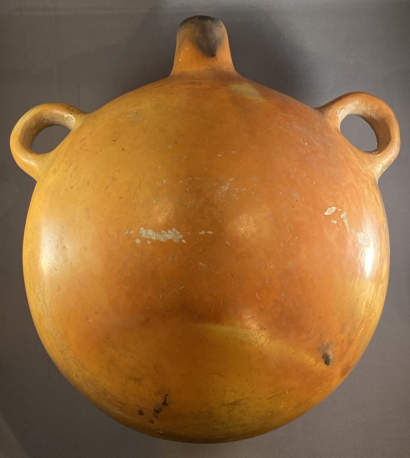
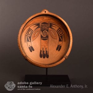
10.25″ wide; 6.5″ deep.
This is a magnificent, perhaps flawed, masterpiece. Carefully constructed and painted, the elements of design are classic Nampeyo. Her red paint fired blotchy and off-color and this interrupts the serenity of design. Anglo collectors might see this red as a mistake; Native artists of the early 20th century were used to their yellow clay slip firing into a wide range of red colors and probably saw the result as an expected variation of local materials.
Form:
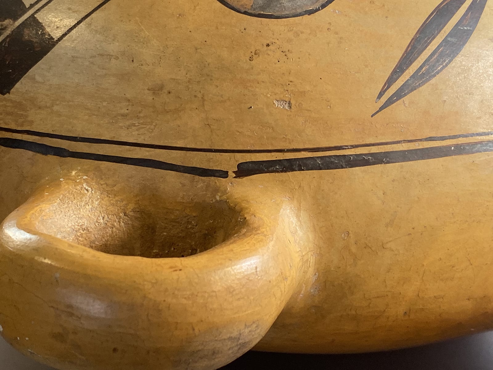
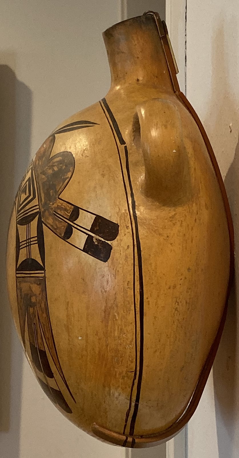
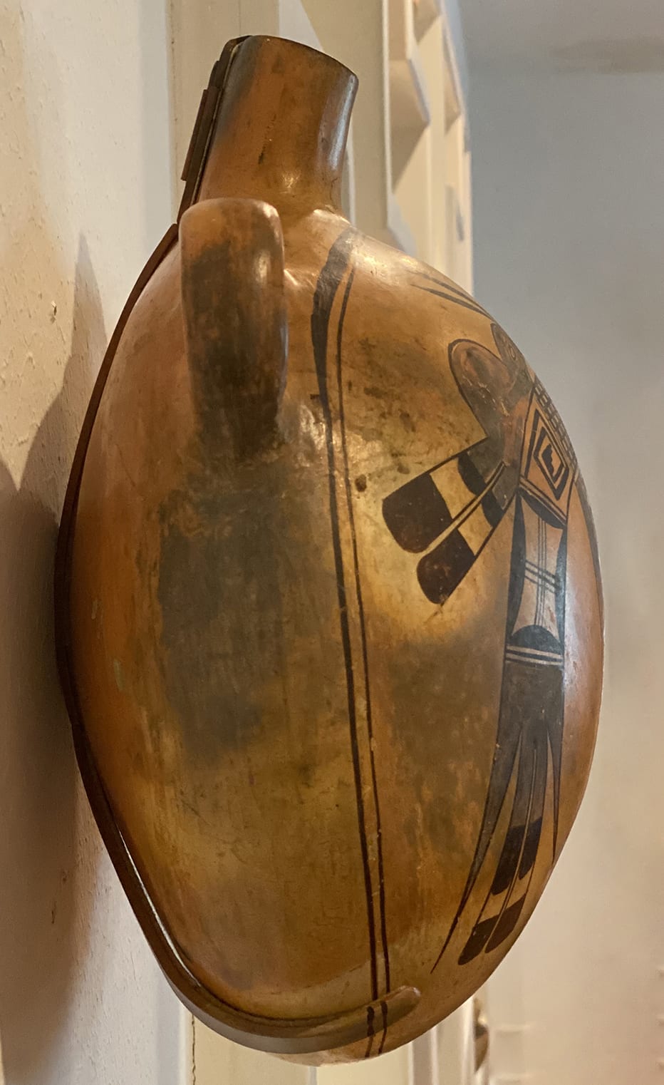
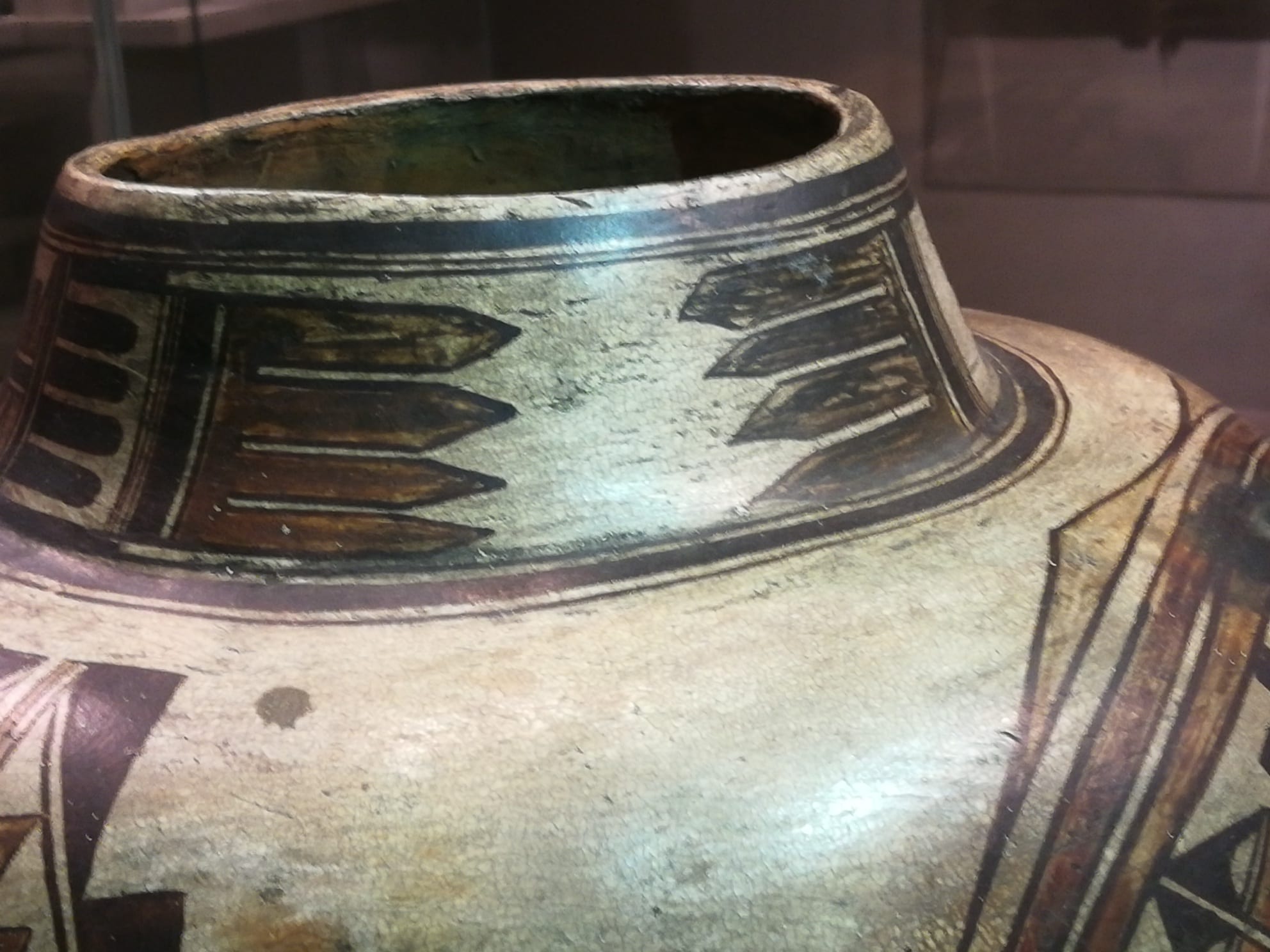
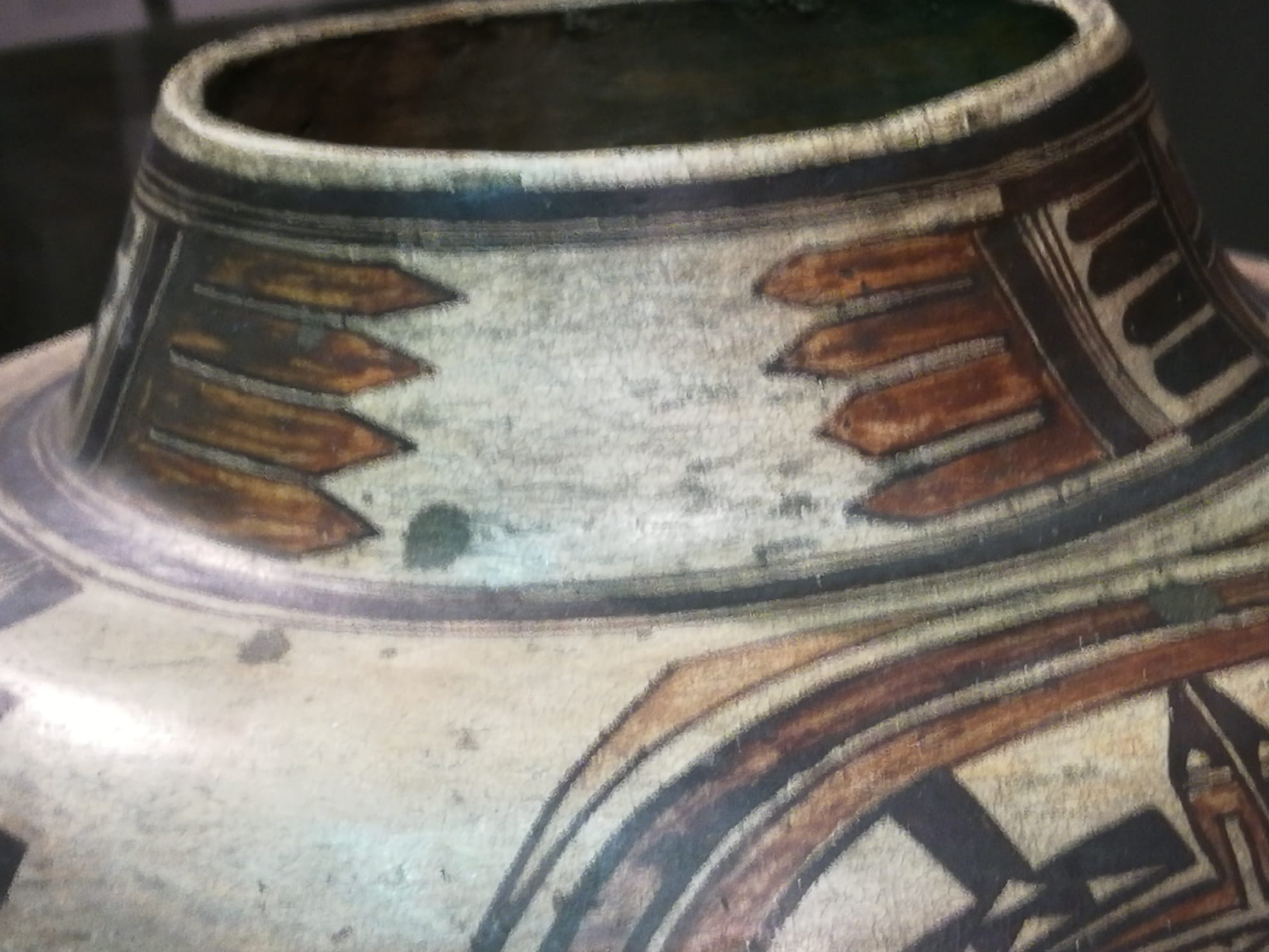
Judging from the spout and overall weight, the walls of this canteen are substantial. The handles are placed high on the shoulder and the spout is bent, both characteristics of Nampeyo’s canteens (Streuver, 2001:108). The canteen is strikingly blushed from the firing. The fire touched the surface and left dark patches in two spots: the rear of the spout and around the left handle, mostly below the framing lines.
Large, flat surfaces are particularly subject to stress of when fried. Thus large canteens often display distorted or cracked flat backs (cf. utility canteen 1998-01 and Nampeyo canteen 2017-05). At times Nampeyo formed large canteens with wide backs and took a chance that they might crack when fired (2014-15), but on canteen 2019-12 she seems to have tried to avoid this problem by making the back somewhat convex, thus minimizing the risk of cracking. The strategy worked, since the canteen is intact.
In an email to me on 9/22/19, Ed Wade wrote of canteen 2019-12: “Particularly the size of the vessel suggest a presentation piece made for the Harvey Hopi House c. 1907.” Without other evidence, I accept Ed’s evaluation.
Decoration:
As is typical, Nampeyo painted framing lines just above the handles. On bowls these are ordered thick-over-thin lines. Her canteens are painted like bowls made convex and the order is reversed (cf. 2010-11 and 2012-13). On canteen 2019-12 the outer “thick” line is somewhat broad from about 10 o’clock to 5 o’clock but becomes thin thereafter. Typical of Nampeyo there is no intended spirit break in the line. Nampeyo began to paint this line just above the right handle, moving both clockwise and counterclockwise from this point in two strokes until the two lines met. The result is a small (I think accidental) break in the line at the start point. Nampeyo applied some pressure to her yucca brush when it was full of paint at the beginning of the stroke, leaving a relatively broad line at first. Later, towards the end of each stroke, Nampeyo lightened her pressure on the brush and the resulting line is thinner. The thinner inner framing line does not have an equivalent break, but shows some disjuncture of thickness at about the 11 o’clock point, which might indicate a start point. The two framing lines are about 33 inches long and require considerable rotation of a brush to paint. They are a fraction of an inch apart and yet do not touch. Concentric circles are a simple form; drawing them with such perfection is masterly.
Most simply, the design inside the framing lines is an arch of elements with a pair of birds purchased on the outer shoulders and a flag-like element suspended beneath.
The form of the birds is part of the Nampeyo family repertoire (see 2010-20 and 2019-08 by Nellie), but this is the first example by Nampeyo in this collection. The birds are bounded by a thin black line. The head, body and base of the tails are a single bi-lobed shape painted muddy-red.
The head begins with a pointed beak touching the arch below, its lower edge a short curve that returns to the arch and extends into a belly nestled against the arch. The upper edge of the beak slopes upward about 2.5 inches creating a head about 1.25 inches wide, then inclines down to a point about 0.75 inches from the arch below, thus forming a neck. A small, unpainted, almond-shaped form in the middle of the head the eye, a small black dash its pupil.
A hump about 1.75″ wide defines the central body of the birds. Extending from the rear are two tails about 2.25″ long, their base the last of the muddy-red color that highlights the birds. The remainder of the feathers consists of a black “gumdrop” shape, its curve extending unto an unpainted space that is caped by 1-inch long black tips with blunt, rounded ends.
The birds perch on an arch of designs, its upper edge about 13″ long, the arch having a width 1.25″ at its peak. The central element is a checkerboard of black and white squares, about 10 rows by 17 or 18 columns, the variance due to the curve of the arch. Black/white checkerboard designs were common on “Polacca C” bowls that were the standard Hopi ceramic during the first 30 years of Nampeyo’s life (1860–1890) (Wade and McChesney, 1981:309-311). Working with Hopi informants in the 1880’s, Alexander Stephen interpreted this black and white crosshatching as representing the blessing of still water on a field (Patterson, 1994:244-245).
Nampeyo frequently used a grid of black and white squares as the central motif in her designs, the foxes on jar 2012-08 in this collection being one example. The squares in the grid on this canteen have varying sizes; the decision to paint larger or smaller squares apparently random. In spite of this variance, I am impressed by the ability to draw 175 or so small squares using a chewed-down yucca brush in an area of about 1.25″ by 2.5″.
Flanking the central checkerboard motif are ribbons of design that flow downward. Each ribbon consists of the same three elements separated by a two-lane “highways” of parallel lines. These renditions are identical.
The first panel of design is a crook with seven counterclockwise 45-degree turns terminating with four-step rain cloud element or naktci (Patterson, 1994:141-145). As I have noted when discussing other renditions of this design, Alexander Steven writes that, for the Hopi, these swirls represented the “roar and commotion of the waters at the early sipapu” (Steven, 1936:772; Patterson, 1994:240-241), the place of emergence of people into this Fourth World. The sipapu is a salt spring near the mouth of the Little Colorado River at the bottom of the Grand Canyon and is also the entrance to the home of Masau, the God of both fecundity and death. Here Masau gave permission for people to enter this world and taught the Hopi how to grow crops. Pilgrimages are made from Hopi to gather ritually important salt from this location. (See 2009-15.) Thus both the crook and the terminating cloud element represent the promise of water, life and growth.
Such crooks are a consistent Nampeyo theme, sometimes squared, as on this canteen (cf 1993-04 and 2017-05) and sometimes triangular (cf 2012-02, 2014-01 and 2009-08).
The middle design on each ribbon is an unpainted rectangle (with black curved sides) cross-cut by perpendicular sets of three parallel lines. I term this design a “windowpane” and it is both 1) a frequent design element used by Nampeyo, and 2) unique to her.* For examples, choose from Nampeyo pots 1988-01, 1996-05, 2002-03, 2006-02, or 2013-03 in this collection. Since the design seems to have originated with Nampeyo, I have no idea what it may mean, if anything.
*(I have seen the windowpane design recently used a couple of times by Steve Lucas.)
Finally there is a red area that branches out into two sets of tail feathers. The central pair is linear, share a common red base, and then extend into distinct red sections. Following is a substantial black element with a flat base and a curved end, then a short unpainted element followed by a second black section, its curved end forming the tip of the feather. Flanking this central set of feathers are two long, thin triangular feathers that grow out of the red base of the tail and extend this color to their tips.The rendition of the set of feathers on the left side of the arch is somewhat smaller and more delicate than the right rendition.
Linear tails with round ends flanked by pointed feathers are a favorite design of Nampeyo and are found on many of her pots. For examples, chose from 1988-01, 1996-05, 2002-03, 2013-03, 2014-17, 2015-12, 2017-04, or 2017-05 all by Nampeyo and all in this collection.
The sequence of elements on the arch, 1) the “window” followed by 2) the paired tail feathers, is seen on two other Nampeyo pots in this collection (1988-01 and 2002-03). The auction house listing for canteen 2019-12 did not identify a maker. When I first saw an image of the canteen, this sequencing of elements grabbed my eye and announced “Nampeyo.”
Hanging from the center of the arch below the central checkerboard is a red banner, its lower edge an arch flanked by two pointed forms that would have been right triangles if their bases had not merged into the red space above. Four parallel one-inch black lines emerge from the central curve and extend toward the bottom of the canteen. Turn this element upside down and we’ve seen this form before. Jar 2005-16 is the iconic Nampeyo eagle tail seedjar. Crowning the three central tail feathers on 2005-16 is a black element consisting of a arch flanked by two triangular “ears.” Unlike on canteen 2019-12, the design on the seedjar is hollowed out with a central unpainted space and the ears are tilted toward each other, but the basic shape of the two renditions is the same. Commenting on seedpot 2005-16, Ed Wade commented “All traits suggest that this is definitely a Nampeyo….The negative motif of a W or M at the top of the eagle tail…which is a motif that looks like ‘Bat Man’s’ head gear….All this is her hand (email 8/20/05).”
Evidence that Nampeyo was the maker:
So far I have presented evidence that indicates that Nampeyo both formed and painted canteen 2019-12. There is always room for doubt, however, especially when there is a suggestion that eldest daughter Annie might have been involved. Annie could paint very much in the style of her mother and attributing a specific pot to one or the other can be problematic.
Such a suggestion is raised by a bowl that Al Alexander, Jr had for sale in the fall of 2019. A photograph is showed here:
Al reports that this bowl was originally sold in 1995 by Marti Streuver, a recognized Nampeyo authority. At that time Marti attributed the painting to Annie, without explaining her reasoning. Notice how similar the design on this bowl is to the design on canteen 2019-12; the designs are different, but they are cousins. If Marti is correct and Annie painted the bowl, perhaps she also painted canteen 2019-12.
In Appendix B I defined six design strategies that characterize the mature Sikyatki work of Nampeyo. Perhaps applying those standards to canteen 2019-12 will help us decide if Nampeyo was the maker.
The six design strategies are:
A tension between linear and curvilinear elements, often represented as a contrast between heavy and delicate elements.
Curvilinear elements dominate this design, from the great arch to the curvy bodies of the birds and the curve on the lower edge of the banner. The four pairs of black-tipped tail feathers are linear, however, and are prominent since they define the left, right and lower extremities of the design.
A deliberate asymmetry of design.
This strategy is not obvious, since at first look the design seems that it could be folded vertically in half and almost all elements would overlap. The one exception would be the large crooks. First, these are painted at slightly different angles in the arch. Second, and more importantly, the naktci (stepped cloud element) that terminate the two large crooks are oriented in exactly the same direction, which disrupts the symmetry of the design. Imagine the naktci on the right as a hand with the top finger pointing down the length the ribbon of design below. To be symmetrical, the top “finger” of the naktci on the left should also point down the ribbon of design below it. Instead it points the “wrong” way, towards the central checker board element. In short, the naktci elements are oriented identically, but this throws off the symmetry of the design. Nampeyo’s insertion of asymmetry into her designs can be subtle (see 2002-03), so the variance in the orientation of the naktci is likely intentional.
The use of color to integrate design elements.
The top of the design (birds), its bottom (thin, triangular feathers) and the center (banner) are all painted red, so the viewer’s eye is attracted to the full scope of the design. Although blotchy and of irregular hue, this color integrates this design.
The use of empty (negative) space to frame the painted image.
The top third of the design is fairly tightly packed within the framing lines, except for the “V” shaped unpainted space between the heads of the birds. Between the bodies of the birds is a large, circular, unpainted space, its opening defined by the incurving thin red tails feathers. Notice how this space mirrors the circular shape of the canteen, pulling the viewer’s eye to the center. From the waist of the birds to the bottom of the canteen, the design is surrounded by unpainted space.
As intended, this considerable empty space highlights the painted design.
The use of a thick above a thin framing line on the interior rim of her bowls.
As noted earlier, the expected framing lines are found on canteen 2019-12, though the width of each varies somewhat.
Confident, bold, and impulsive painting
Notice how the black lines that define the edge of the arch form a smooth curve. Remember how the two 33-inch circular framing lines encircle the canteen a fraction of an inch apart without touching. The artist that painted this canteen was deservedly confident.
Designs in early 20th century Hopi were painted freehand, without marking the pot before painting. This design has multiple elements and the result could seem disorganized if attempted by a less-confident painter.
The design itself is bold and well-structured, almost like a family crest.
Overall the painting seems well-planned but not impulsive. The one exception might be the central cross-hatch at the apex of the arch. Although the number of squares per inch is impressive, the painter did not take the time to insure that the vertical and horizontal lines forming the grid were evenly spaced.
Organizing the evidence:
- The placement of the handles high on the shoulder of the canteen and the forward-tilting spout are trademarks of Nampeyo.
- The canteen displays all six of the design strategies we expect of Nampeyo’s mature style, though the argument for “impulsive” painting is weak.
- The two elements of a) the windowpane, and b) the linear tail flanked by triangular tails are either unique or iconic of Nampeyo. When paired together on a pot, the conclusion that she was the painter is reinforced.
- Most significant are internal patterns of design that are not found on the work of other potters, including Nampeyo’s daughters. Specifically, a) the way the unpainted central area of design is used to reflect the form of the canteen, and –most importantly– b) the subtle asymmetry of design introduced by the orientation of the naktci cloud symbols on the crooks are idiosyncratic patterns that reflect an inner Nampeyo aesthetic. Such detail was overlooked by her contemporary and later First Mesa potters –including her daughters– and is generally unnoticed by collectors of Hopi pottery. They are, however, markers of Nampeyo’s genius.
For these reasons I conclude that Nampeyo both formed and painted canteen 2019-12.
So if Nampeyo was such a ceramic master, why is the “red” paint on this canteen so blotchy and off-color?
Red paint:
Lydia Wyckoff distinguishes between two types of Sikyatki Revival Polychrome pottery. The earlier “Style A” pottery was produced from about 1903 to 1930 and “the black and red colors used for the designs are made with the same pigments used in (the earlier) Polacca Polychrome. …(T)he red and the black are more ‘dense’ and the red is ‘muddy.’ (Walker and Wyckoff, 1983:73).” The change to “Style B,” began as early as 1910 (Walker and Wyckoff, 1983:74) but became the norm after 1930 because of the insistence by the Museum of Northern Arizona that pottery entered into the Hopi Craftsman Exhibit of 1930 (and thereafter) have a consistently “good” color. Writing for the Museum, Katharine Bartlett explained to to be accepted into the this Exhibit the colors on pottery must be “clear,” since until the Museum set these standards “the red often ha(d) a splotchy look which is poor, and sometimes a muddy brown instead of red (1936:3 reprinted in 1951:97).”
Canteen 2019-12 is a prime example of the “splotchy…muddy brown” red paint about which Bartlett complained. The oldest Nampeyo pot in this collection (2015-03) exhibits a similar muddy brown red paint as does jar 2012-08. Other early Nampeyo pots have fairly pure black, red and brown colors, though often applied unevenly (cf. 1993-04).
In a conversation with me on 10/2/19, Bruce McGee, now head of the gift shop at the Heard Museum but a man who spent much of his early life at the family trading post in Keam’s Canyon, said that the color “red” on Hopi pottery was the “most troublesome, variable and difficult” of all colors.
“Sikyatska” clay is yellow found at Hopi, but turns red when fired. To make red “paint” this clay is simply ground and water is added until the correct consistency for painting is achieved. Rachael Sahmie is a Hopi/Tewa potter and a friend. (See “Artist List.”) In a conversation with her on 2-1-2020 I asked her why the Sikyatska paint might fired burnt, dark or off red. “It’s the fire,” she responded. “If the fire gets too hot the yellow paint will darken and burn.” If she feels there is danger of this, Rachael will move the burning dung patties away from the shards protecting the pots in her fire. “If the wind picks up before you can cool the fire, the red on that side of the fire may burn. If you are using coal the fire burns hotter and you can’t move the fire away from the pots, so you can’t control the heat as well,” she added. On 1-15-20 King Galleries posted a bat wing jar made by Steve Lucas in 1993. Of the red paint, Steve commented: “When I first learned to make pottery, the red slip painted in the designs was difficult to work with. It wouldn’t take heat very well and would scorch and turn black.”
This can be seen as a fault, the position of the Museum of Nothern Arizona beginning in 1930. After this date potters at Hopi began to increasingly produce with an eye on trends in the Anglo market and a less-splotchy, more consistent red increasingly became the norm. Since the off-color was simply the result of the production process, potters at First Mesa, including Nampeyo, produced pottery with a muddy black/red color for many years. Most famous is a large Nampeyo jar that dates from 1895 to 1900 in the Dilker collection at the Metropolitan Museum of Art, New York . Purchased at Bonhams & Butterfields Auction in December 2010 for $350,000 dollars, it displays variations of the same off-color red seen on canteen 2019-12:
(Click on photo to expand)
The muddy red on canteen 2019-12 apparently represents a Native standard that did not particularly bother potters until outside Anglo/museum values were imposed. The reader is invited to judge for her or himself whether the muddy black/red on canteen is attractive because it is an original (uncorrupted?) Native standard, or if it is a flaw because it is not a pure color. Since the 1930’s. most Hopi and Hopi/Tewa potters have adopted the Anglo standard.
