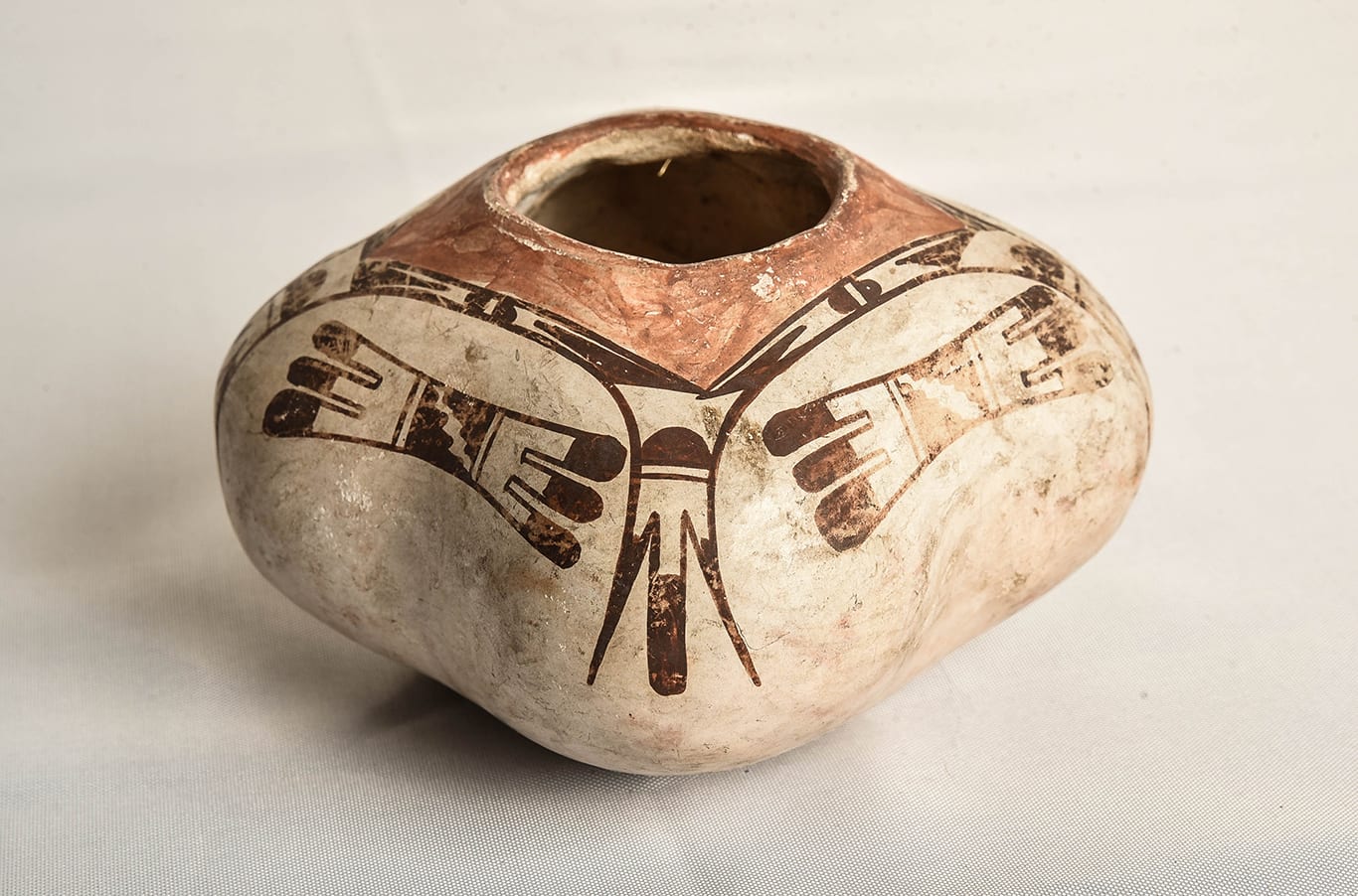
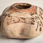
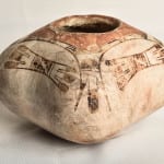
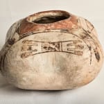
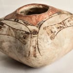
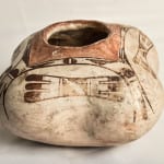
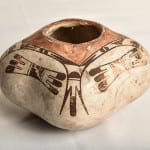
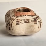
The form of this jar is unusual; lobed pots are not generally made at Hopi. The painting features motifs that are typical of Nampeyo’s work.
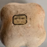
A notation on the bottom of the jar indicates that it was purchased in 1917. Because Nampeyo had substantial visual impairment by then, an earlier version of this catalog entry concluded that Annie probably painted the jar. For reasons explained below, I now conclude that Nampeyo both formed and painted jar 2015-12. Before explaining why I revised my assessment, I need to first discuss the form and design of this unusual pot.
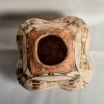
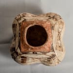
The walls of the jar are reasonably thin and thus the pot is fairly light for its size. The lobes have been formed by pushing out the walls of wet clay from the inside. Although the interior of the pot is quite rough (particularly on the bottom), the exterior of the bowl is very smooth and almost perfectly shaped. The lobes are equal in form and size and the bottom view is of a symmetrical lobed square. Such perfection is evidence that the pot was formed by an experienced master artist.
There is some photographic documentation that Nampeyo experimented with a variety of eclectic shapes around 1905, perhaps in response to her experience working for the Harvey Company at Hopi House where she would have seen crafts from a wide variety of cultures (Wade and Cooke, 2012:132).
I have not been able to document another lobed pot by Nampeyo. Both Ed Wade and Rachael Sahmie tell me there is such a jar in the collection of The Museum of Northern Arizona, but Elaine Hughes, the Museum’s Collection Director, sent me photographs of 1) all of the Nampeyo pots in their collection, and 2) photographs of all their Hopi pots with unusual shapes, and no lobed pots were seen. (Emails from Ms. Hughes, May 2016.)
During the last few years Rachael Sahmie has made lobed jars somewhat similar in shape to 2015-12. (See jar 2016-05.) A photograph of Rachael holding both jar 2015-12 and her own lobed jar is shown in the catalog entry for 2016-05. Jake Koopee made one grooved (but not lobed) minature jar to demonstrate to his cousin Alton Shupla how the Santa Clara lobed form might translate into Hopi clay (2008-04C). These are the only examples of lobed or ribbed Hopi jars of which I am aware.
It is not clear what type of clay was used to form the body of the jar. In the few spots where the slip has flaked off, the body seems starkly white, as if it too had been made from kaolin clay. On the other hand, there are a few small areas (particularly one lobe) that have a slight golden blush. and this would indicate that the body is formed of grey clay that blushes when outdoor fired. Perhaps the body has been slipped with white kaolin clay that has been stone polished so that it does not “scab” like the earlier Polacca slip. However, if the body is formed from kaolin clay, then the jar was not slipped, only polished. A pot formed entirely from kaolin clay would be very unusual; a Nampeyo pot formed from kaolin clay even rarer. The ivory-like white finish on jar 2015-12 is the result of coal firing. Held in the hands with eyes closed, the jar is sensuous, like a water-smoothed rock.
On the bottom of jar 2015-12 is a “From the Hopi Villages” label that was used by the Harvey Company on pottery for sale at their Hotels and gift shops in the southwest. Written in pencil above the label is the word “Albuquerque” and below the date “May 1917.” The Alvardo Hotel in Albuquerque was the largest hotel in the Harvey chain and was opened in 1902. Presumably jar 2015-12 was purchased in 1917 at the “Indian Building” that shared space with the Alvarado: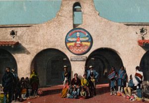
The bottom half of jar 2015-12 is undecorated. The entire painted surface is above the midline. The design is symmetrical. From a top view, each quadrant of the design has the same design elements as the other three quadrants, a layout that Watson Smith termed “radial symmetry” (1971:80-81).
Framing the round mouth of the jar is a red square. The rest of the design is painted black. Bordering this red area is a thin black line. Lying atop each lob is a single linear tail flanked by two outwardly-curved and pointed feather elements. This is a favorite design of Nampeyo. (See pots 1988-01, 1996-05, 2002-03 and 2013-03 in this collection.) Midway up each linear tail is a single line parallel with the top of the jar. Above this line is a hill-shaped form painted solid black.
The outward curve of the pointed feathers begins an arch that spans the width of the jar and becomes the same curve of the pointed feather on the adjoining lobe. This bridging element thus links the four panels of black design around the circumference of the pot. Above this arch, between it and the black framing line around the red surface, is a small gap. Inside this gap on all four sides of the red square is painted the same design: two downward-pointing isosceles triangles flank a split oval cloud symbol (Patterson, 1994:141). One repetition of this design is quite clear; to varying degrees the other three renditions are tightly-squeezed in the small space and somewhat distorted.
Below the arch and between the lobes is a three-lobed “butterfly” motif first seen in this collection on an early Nampeyo bowl (1993-04) and copied by her from an ancient Sikyatki bowl now in the Peabody Museum at Harvard (Streuver, 2001:29). Wade and Cooke term this Nampeyo form a “mother ear of corn” (2012:236E, 238F). The three black feathers on either side of its center have rounded ends and are black-tipped. The center of the design is a black rectangle flanked by single lines. Diagonally bisecting this black area is an unpainted stepped line that may represent lightening (Patterson, 1994: 190, 192, 211).
All of these design elements are characteristic of Nampeyo’s work, but does this pattern of design indicate that Nampeyo painted the jar?
In Appendix B, I specified the defining characteristics of Nampeyo’s mature style:
- A tension between linear and curvilinear elements often represented as a contrast between heavy and delicate elements:
Such a tension exists in the design on jar 2015-12. The relatively thick linear black tipped tail on top of each lobe contrasts with the thinner curved and pointed feathers that flank it. The two sets of three feathers that fringe the “butterfly” element and the butterfly element itself are slightly curved but overall have a linear thrust, especially when contrasted to the arch that frames this motif. - A deliberate asymmetry of design: Although a regular convention for Nampeyo, such asymmetry simply does not exist in the design of this jar. A top view image of the design could be folded so that all four lobes of the jar rested on top of each other and (except for slight variations in painting) all elements of the design would also coincide.
- The use of color to integrate design elements:
This strategy is also characteristic of Nampeyo’s polychromatic work, but is absent here. The large square of red paint around the jar opening provides a dramatic visual focus, but it is the only colored area of design. The rest of the design is black and hangs from this central square, draping over the upper surface of this pot. - The use of empty (negative) space to frame the painted image:
Such use of negative space is seen on this jar. The design on the lobes is thrust out above the surface of the pot into space, with the flanking feathers extending down into the unpainted lower half of the jar. The four “butterfly” elements float in the empty space below their respective black arches. - The use of a thick above a thin framing line on the interior rim of her bowls:
Pot 2015-12 is not a bowl, so this design characteristic does not apply. - Nampeyo’s painting is confident, bold, and somewhat impulsive compared to the more-studied, plotted and careful style of her daughters, descendants and other Hopi and Hopi-Tewa potters. The painting of this jar is masterful and carefully done without being over-controlled. The feathers on the “butterfly” element are well done and vary somewhat in thickness and orientation. One of the solid black “hills” at the top of each lobe is not carefully formed and was this painted casually, maybe impulsively. Assessing the quality of painting is the most subjective of the six characteristics of Nampeyo’s painting, but it is also the critical dimension that prevents her designs from being formalistic. Working together, the form and design of jar 2015-12 create a jar that is elegant. My eyes thought this a “Nampeyo” jar the first time I saw a tiny photograph of the pot online. Their opinion has not changed.
Here’s the logic for believing that Nampeyo was the painter. The elements of design are classic Nampeyo forms. Perhaps Nampeyo felt particularly experimental the day she made this unusual lobed pot. Given that she was playing with an unusual shape, she might also have been playing with unusual design strategies to fit the shape, such as using color to focus the eye rather than integrate the design. That would explain why only one red element was used on the pot.
Moreover, lobed shape constrained the range of design strategies available to Nampeyo. Other Nampeyo jars in this collection and published in the literature have an uninterrupted surface on which to paint. Such an expansive canvass allows for a great range of design choice. This is especially true of the broad-shouldered “flying saucer” shape often favored by Nampeyo. (See 2005-16, for example.) In contrast, on jar 2015-12 the circumference is broken by the lobes into four discreet sections and thus the design within each section is constrained.
An additional constraint is created by the artist’s decision to limit the detailed painting to a narrow band. While the size of the jar (2.7” h X 4.6” w) is fairly typical for a Hopi jar, very little of the potential space is painted black. The red square on top extends a short way down the sides. The lower half of the jar is unpainted, leaving just 1.25” (43% of the height) within which to paint the black design. Painting this pot is the equivalent of decorating four small canvasses. As a result, the black line work is very fine and the design elements very small.
In short, because Nampeyo chose to experiment with an unusual lobed form when building jar 2015-12, this form imposed design constraints. To fit the canvass, Nampeyo had to to simplify her design and omit elements that would imbalance it. Since the lobed shape is inherently balanced, perhaps Nampeyo felt a balanced design best fit the pot. This interaction of form and design explains why this pots lacks two of the five design strategies I expect to find on a Nampeyo pot of this vintage: a) the use of color to integrate the design, and b) asymmetry of design.
The pot is dated as having been purchased in 1917, at a time when Nampeyo had significant visual impairment and probably could not do the fine-line work displayed here.
Initially the lack of two of Nampeyo’s typical design strategies and the date of purchase led me to believe that Nampeyo probably formed the vessel and Annie probably painted it. However, I was uncomfortable with my own conclusion and ended the original catalog entry with the comment:
“My eyes and my heart still tell me that Nampeyo both formed and painted this pot. Logic argues.”
My unease prompted me to bring the jar to Ed Wade when I visited him in Sedona in the spring of 2016. Ed had a quick and forceful response to the pot:
“It’s absolutely by Nampeyo and only sold in 1917 because it’s a ‘failed pot.’ It was probably made about 1903–1905.”(Conversation, May 12, 2016.)
Since I love the aesthetic of this jar, I was bothered by Ed’s use of the term “failed pot” and wrote him for clarification. He responded:
“”My use of a ‘failed pot’ description only addressed the rarity of the vessel which suggested its unpopularity with the tourist. Visually it’s fine.” (Email 5/31/16 0n file.)
With Ed’s expertise (and finger on the scale of judgement), my revised conclusion is that Nampeyo both formed and painted this jar in the first few years of the twentieth century. Sometime thereafter it came into possession of the Fred Harvey Company, but did not sell for more than a dozen years because its unusual shape was not how tourists imagined a Hopi jar.
Of course this reconstruction of the jar’s history is only supposition, but the form and design speak mastery, which suggests Nampeyo as the artist.

