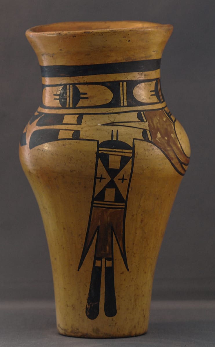
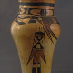
The shape of this jar is European, not at all Hopi or Hopi-Tewa. The design is a catalog of Nampeyo design elements.
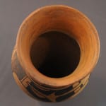
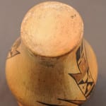
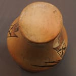
Compared to traditional Hopi-Tewa shapes, the form of this vase is complicated. The smallest width is the base at 2.0”. From there, the walls curve upwards at an increasing slope up to a maximum width of 3.875”, then curve inward to form a 2.625” neck that then flares out to a 3.25” mouth. Done on a potter’s wheel, such transitions of diameter would flow smoothly from the hands of its maker, but Nampeyo constructed this pot from thin coils of clay, a complex process. While the exterior form is elegant, an examination of the interior shows evidence of the difficulties of this form. From the base up to the beginning of the bulge, the interior is even and smooth. So too are the interiors of the neck and the flared lip (which has been polished). The interior of the bulge, however, is a mess: there are sharp unfinished junctures attaching the concave bulge to sections of the pot above and below this feature. This is an uncommon form for Nampeyo and the building of the bulge was not done with finesse, at least on the interior. Given this complicated form, it is not surprising that the vase is slightly asymmetric. Nevertheless, the jar soars upward from its narrow base, unfolds like a flower to its maximum width and then ends with a trumpet mouth. To the Anglo eye, it is an attractive and vibrant shape. Hopi-Tewa pots are polished using a smooth stone. Generally, the polishing movement is fairly random, but here the polishing stone has been rubbed in the same direction as the axis of the vase. The resulting “onion skin” pattern serves to heighten the verticality of the vase. Polishing in parallel lines requires more intention of motion than is usual and is therefore uncommon.
Nampeyo’s bowls usually have thick-above-thin framing lines. On this shape, there is only a single thick framing line about an inch below the lip of the pot. Between this line and the maximum diameter of the vessel the pot is densely decorated. Running in a band around the narrow neck of the vase is a freeze of unpainted ovals separated by two unpainted lines, these elements being formed by the absence of black paint. Inserted into each of these ovals is a bifurcated black disk which Alexander Stephen interpreted as a cloud image (Patterson 1994:141), a single line dividing the halves and parallel lines emerging from their apex. It seems that Nampeyo intended to repeat this pattern four times but ran out of room, the last rendition being only the left half of a full oval.
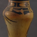
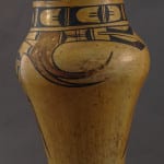
Bowl 1993-04 displays a “Bird Hanging from Sky Band” design and is perhaps the central pot in this collection, thus warranting an extensive essay about its significance (Appendix B). The orientation of bowl 1993-04 is problematic, but, if the red lunette is oriented to the top, Nampeyo has lifted the central image from this bowl and adapted it to vase 2013-03. On the vase, versions of this design run horizontally around the neck of the vessel, with red curvilinear elements sweeping down and then curve back up towards (what I am calling) the rear of this design set. Apparently, Nampeyo intended to repeat these elements twice on the vase, but (again) she miscalculated the space and one set is full developed and one truncated.
Let’s discuss the fully rendered set first. Starting from the rear are two black tail feathers with sloped points, one feather parallel to the mouth of the jar and one tipped slightly toward the bottom. The linearity of these feathers is upset by unpainted curved elements set into each. Moving to the left (toward the center of this design), the feathers are caped by a black half disk, which reflects the pattern above it. As with the band of such bisected disks around the neck, two parallel lines emerge from the half disk, but here they continue across a space to a mirror image of the half disk. These connecting lines are crossed at right angles by two other parallel lines; this forms a “window frame” image. Next is a red area that extends downward to form the two curvilinear arcs. To the left of the red area are two black half-disks separated by an elongated “V”; the disks and V together form what Kramer has called a “clown face” (1996:188). Finally, one finds two additional black tails, but, unlike the first pair, these have rounded tips and rectangular unpainted inserts. All in all, this is complicated iconography.
Apparently, Nampeyo miscalculated her space and the second rendition of this sequence of designs is severely truncated. The pointed black tails feathers appear, followed immediately by the red space branching downward to form the red curves and followed by two stubby squared-off tails. There was no room for the other design elements, except that the red area has a boundary painted to form a red “V,” thus mirroring to some degree the black clown face in the first set.
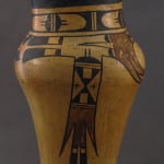
The designs I have discussed (except for the red curves) lie above the midsection bulge of the vase and run horizontally around the neck. The other major design on the pot is rendered twice, each time emerging from the band of designs just to the left of the red area and extending vertically almost to the base of the vessel. Except for slight variations of orientation and form, these two renditions are identical.
At the top of the pattern is the familiar black half-moon with parallel lines that emerge from the top. Below this is a complicated rectangle of design. Most basically, the rectangle is formed by two black triangles alternating with two unpainted areas, which also form triangles. Imbedded in each of the black triangles is an unpainted square, thus breaking this element into three smaller triangles. Inserted into each of the unpainted triangles is a black cross, which adds visual interest. Three thin black lines follow and form two unpainted stripes. Below these lines is a large red form consisting of a central rectangle flanked by two pointed feathers. Emerging from the central red rectangle are two black feathers with rounded tips. Imbedded in the base of each is an unpainted rectangle containing a simple black half-moon.
A reader patient enough to follow these details of design on vase 2013-03 will understand the complexity of its painting. Stepping back from this detail and looking at the overall pattern provides a different perspective. The framing line and band of ovals below provide a circular elegance.
The complex horizontal design below the neck of 2013-03 contains great tension because each end seems to represent tail feathers flying toward the center. Additional tension is provided by the red curvilinear elements that in both shape and color contrast with the black linear design above.
This is the same artistic device used on bowl 2002-03 in the collection. The form and color of the design on 2002-03 are different than on vase 2013-03, but the techniques used to create a dynamic design are the same: a string of elements capped at each end with tail feathers that push toward the center and a curvilinear element emerging below. Bowl 2002-03 and vase 2013-03 make a particular interesting pair since together they offer some insight into how Nampeyo adopted similar aesthetic insights to very different shapes. The design on the bowl is simpler than the vase, but three elements (blunt-tipped black feathers with inserts, parallel tail feathers with pointed red side feathers and a window-pane rectangle) are shared by the two vessels,
If the design of 2013-03 had stopped above the widest point of the vase, the design would still have been compelling but it would have simply perched on the wide upper half of the jar and not fit the overall shape of the vessel. The vertical pattern of design that emerges from the top band and runs to the bottom of the vase draws the eye down so the viewer is encouraged to appreciate both the form and design of the entire vessel.
Appendix B summarizes six characteristics of Nampeyo’s mature Sikyatki style. Five of the six apply to vase 2013-03. (The exception is #5, the use of thick above thin framing lines on her bowls.)
1) There is a tension between linear and curvilinear elements.
The contrast between the paired curvilinear red arcs and the other design elements is clear. This is particularly true of the relation between these arcs and the linear design that runs to the bottom of the vase. Often the linear/curvilinear contrast is reinforced by a contrast between heavy and delicate elements, but that device is not evident here.
2) A deliberate asymmetry of design.
The top ring of ovals and the vertical element that reaches to the bottom of the vase are symmetrical, but the major horizontal band of design between is severely asymmetric and powerful. The vase can be rotated to see the entire design, but every single view is asymmetric. The tendency toward asymmetry is also seen in the treatment of the two pairs of pointed feathers in the horizontal band of design. In each of the renditions, the top feather is parallel to the mouth of the jar while the lower feather has a downward slope.
3) The use of color to integrate design elements.
The pair of red arcs emerging from the horizontal band and the red area in the vertical design visually link these elements and integrate the overall visual pattern.
4) The use of empty (negative) space to frame the painted image.
While the design is particularly busy, large amounts of the jar below the shoulder are empty. It is possible to rotate the vase so that almost the only design seen below this shoulder are the ends of the red arcs surrounded by a sea of unpainted clay.
6) Confident, bold, and impulsive painting.
Lines are continuous and do not show over painting where a less-confident painter would have stopped and then started again. The drawing is somewhat casual: imbedded squares are not exactly square; parallel elements are slightly differently shaped. Most obviously, while painting both the ring of ovals on the neck and the band of design below it, Nampeyo misjudged the space available and had to truncate design elements. This is not the work of a painter who plots out every detail before she starts painting.
In short, vase 2013-03 has all of the design characteristics one would expect of the mature Nampeyo.
More than any other pot in the collection, vase 2013-03 is a catalog of Nampeyo design elements. Seven of these elements can be found on other Nampeyo pots in this collection:
a) Linear tails with rounded ends are also found on pots 1993-04, 1996-05, 1999-03, 2002-03, 2005-16 2006-02 , 2012-21, 2014-20, 2015, 12 and 2017-15.
b) Linear tails with round ends flanked by pointed feather elements are also found on pots 1988-01, 1996-05, and 2002-03.
c) Curvilinear elements (here two together) are also found on pots 1993-04, 2009-10, and 2010-11.
d) Bifurcated cloud elements are also found on pots 1993-04, 2012-13 and 2017-15.
e) The windowpane design is also found on pots 1988-01, 1996-05, 2002-03, and 2006-02. Vincent Drucker, a pottery collector and friend, thinks that this design is unique to Nampeyo—and he may be correct.
f) Clown faces are also found on pots 1999-03 and 2011-16.
g) The “squares imbedded in triangles” design is also found on the exterior of pot 2012-21.
As a catalog go Nampeyo’s design motifs, it has much in common with Jake Koopee’s jar 2020-20 on which he employed a great range of his design techniques.
Vase 2013-03 is satisfying in a number of ways. It has an unusual and pleasing form and a design that fits the pot well. It reflects painting techniques that characterize the mature Nampeyo style and serves as a catalog of many of her favorite design elements. However, the density of design elements on this small vase creates a bit of visual clutter and lacks the serenity of what I judge to be Nampeyo’s best work.

