
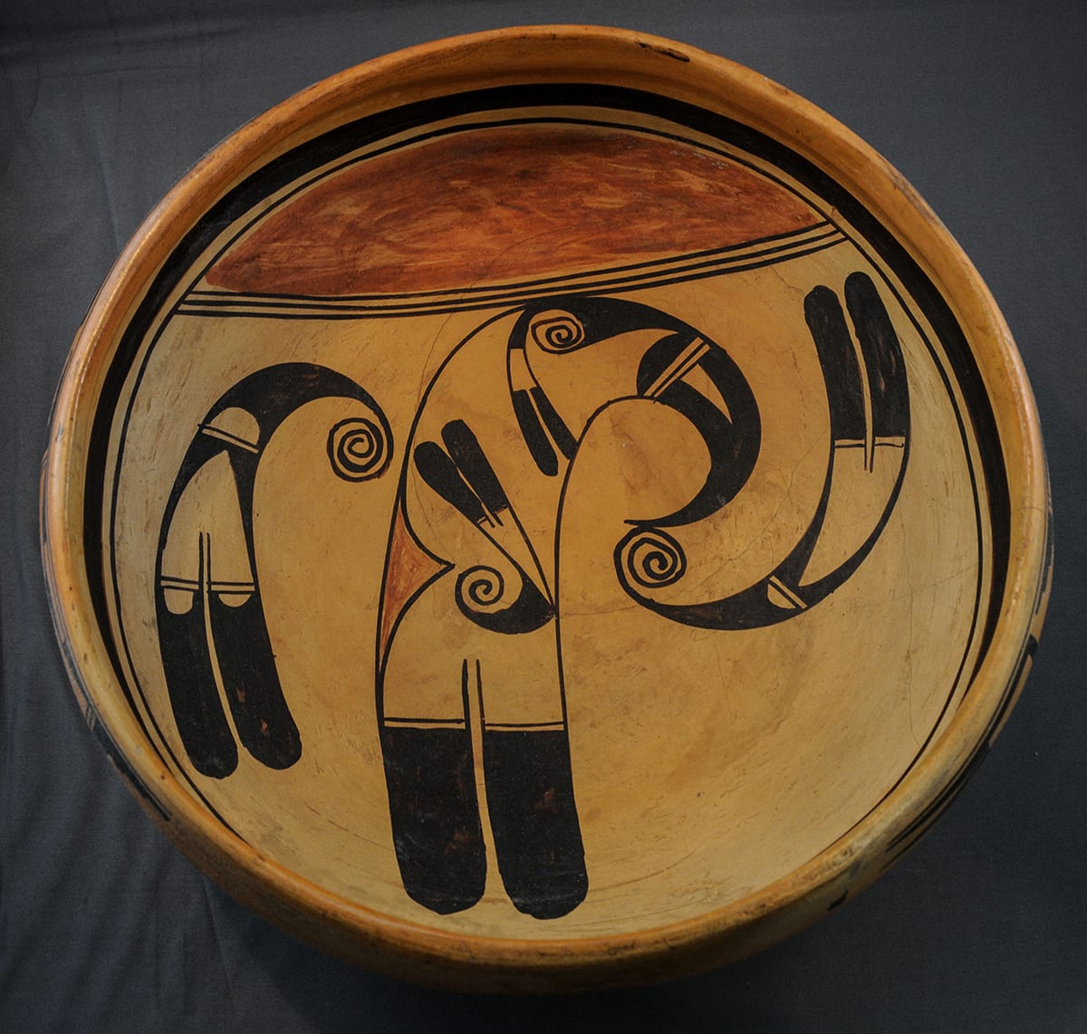
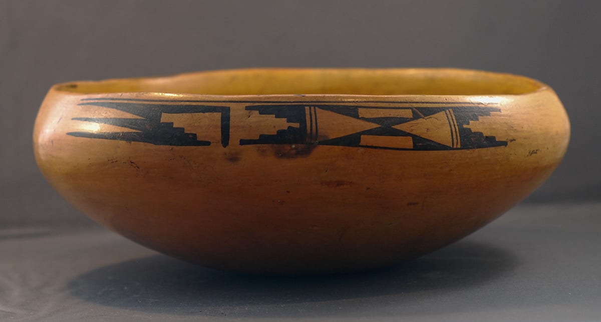
If there is a continuum from “fine” to “folk” art, this bowl is closest to the “folk” end than any other Nampeyo pot in the collection. Amusing and wonderful, a flock of hummingbirds buzz around the inside of this bowl. The image tickles the eye and is directly accessible. [For another Nampeyo pot with a folk art element, see 2020-17.]
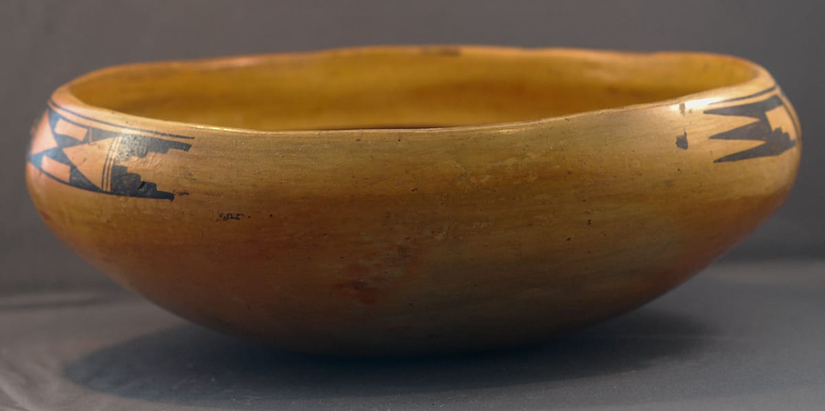
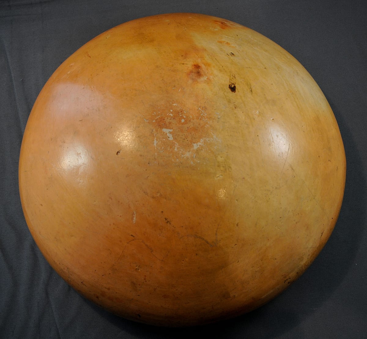
The bowl is more casually formed than most of Nampeyo’s work; most notable is the uneven rim. The body does not flair out to the rim, but slopes inward slightly forming a 1.5” shoulder on the pot. If the pot is oriented so that the red lunette is at the top, there is a 4.25” crack in the bowl at about the 3:30 o’clock position that is particularly noticeable on the exterior. That exterior is shiny and may have been shellacked at some point, presumably by an Anglo owner. It has some variation in blush from firing, with a couple of darker spots.
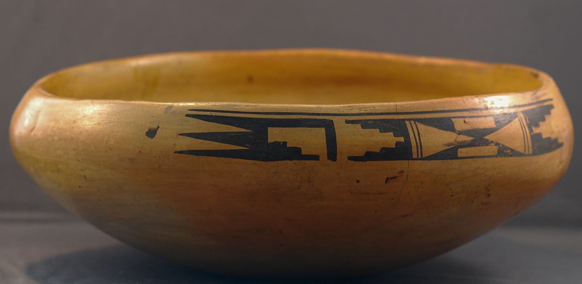
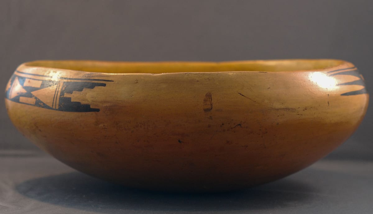
Some Nampeyo bowls lack an external glyph (see 1988-01, 1996-05, 2002-03, and 2006-11) while some carry an external design (see 1993-04, 2006-01, and 2006-02). Of the Nampeyo bowls in this collection, the external glyph on bowl 2012-21 is the most elaborate. About 7.5” long, the glyph is monochromatic and contains two major elements, one about twice the length of the other. Above the two elements there is a simple black line that unifies the two elements into a single design.
The central design in the larger element consists of two black equilateral triangles with points touching to form an hourglass pattern. These triangles are not solid but have been hollowed out by unpainted rectangles. To the right and left of this design Nampeyo has drawn two parallel lines. The resulting pattern is of two sets of triangles with all four points touching, one painted set and one unpainted set. But then again, it’s not so simple. (You start to see Nampeyo’s genius here.) Because the unpainted rectangles have been imbedded in the two black triangles, each black triangle is broken up into a set of three smaller black triangles, and the viewer’s eye flips back and forth from seeing either two black triangles or two pairs of three triangles in relationship to the large unpainted triangles.
On either side of this central motif Nampeyo has drawn a pair of cloud designs, straight lined on the outside of the pattern and with four steps facing each other. Here, too, Nampeyo uses a visual trick, since the two black elements together surround an unpainted area that is a pyramid image with four steps, the mirror image of the black stepped forms flipped and joined together. Again, the viewer’s eye first sees the black areas as the dominant image, and then considers the central unpainted form as the major design element.
More ambiguity, more energy—like a great chef who takes simple ingredients and creates a culinary masterpiece.
To the left of the larger element, Nampeyo has drawn a simpler, smaller glyph. The core of the image is a stepped rain cloud image, much like forms that finish off the ends of the first glyph element. An L-shaped line forms the right edge of this pattern, separating it from this first glyph. Because the unpainted area is thus enclosed, both the black image and the unpainted surface have the same complementary design. The left end of this glyph is formed of three elongated points thrusting left, the outermost being each a half of the central point. These black forms create two complete unpainted points that thrust to the right, producing the same visual ambiguity already discussed.
The internal structure of the smaller glyph does not repeat its internal design, and is thus unbalanced. As a result, there is visual tension between the elements. If you define this glyph by its black paint, the stepped rain cloud thrusts to the right while the three black points thrust left. Seen with the unpainted forms dominant, these directions are reversed but still contradictory.
This ambiguity energizes the eye, like an M. C. Escher print, though Escher was of an age that he might have been Nampeyo’s grandson. Lea Wyckoff calls this eye play “figure-ground reversal” or “negative design,” and defines it as “when you look at [a] pot the figure and background against which it is placed keep changing places, the figure becomes the background and the background the figure” (1985:100 and 94-103). The technique is not unique to Nampeyo’s work and is frequently used today, but Nampeyo was the master of the technique. At first impression the glyphs on bowl 2012-21 seems like only an intricate doodle, but the eye is drawn to the figure-ground reversal. Every element of the glyphs is part of this process and the viewer’s eye becomes enchanted by the mastery of form and technique.
I don’t know, of course, if Nampeyo developed such a sophisticated design for her own satisfaction or if she expected Anglos to notice and find the effect an inducement to buy. It’s all speculation, of course, but I think the Old Lady was just doing what pleased her eye. It would be most of 100 years before the non-Native world began to appreciate “tribal” as “art” and not just “artifact.”
LeBlac and Henderson (2009) argue that the external glyphs on ancient Jeddito bowls were consistently more casually drawn that the designs on the insides of the bowls. The reverse seems to be true of bowl 2012-21. The outside glyphs seem carefully drawn and sophisticated. An initial glance at the interior design indicates that it is casually painted.
About 20% of the interior surface of bowl 2012-21 is filled with a red lunette, a frequent layout in Sikyatki and Sikyatki Revival bowls. (See the listings for “Bird Hanging from Sky Band” design in the Index of Categories.)
While the avian figures associated with this design are a variation of a standard Sikyatki design, here Nampeyo has developed an entirely original avian motif.
Four (or maybe five) birds swarm around the inside of the bowl. Curlicue tongues on four of the images suggest hummingbirds, but it’s a matter of opinion. Central is the largest image; internal to this figure is a red wave-like element on her back, the only red element among the swarm of birds. The left and right-most birds are of medium size: the bird on the left is flying head-up, and the bird on the right is flying upside-down. Inside the large central figure is a small head-down bird image almost suggesting an internal embryo. Unlike the other bird images, the largest “mother” design has a large, solid, curved beak. Her eye, however, is represented by a spiraling line that also serves as the tongue of a second small bird, which is flying upright inside its “mother.”
With the placement of the medium and small birds, Nampeyo has achieved both balance and contradiction. The large “mother” bird establishes the dominant orientation of the design, and the two medium birds external to her fly contradictory orientations, as do the two small birds internal to her design. As the viewer’s eye sweeps from left to right, the four small and medium images alternate orientation. The very central area of the design, which incorporates just the head of the mother (including the small eye bird), swirls in circular motion. Variation, balance, and motion: the pattern pleases the eye.
The technique of “figure-ground reversal” that characterizes the external design is absent from the interior, but the inclusion of the small avian image (that is both a small bird and forms the eye of the large “mother” bird) indicates that Nampeyo had not given up playing eye tricks with her internal design.
As detailed in the discussion in Appendix B, there are six defining characteristics of Nampeyo’s mature painting style:
1) A tension between linear and curvilinear elements often represented as a contrast between heavy and delicate elements;
2) A deliberate asymmetry of design;
3) The use of color to integrate design elements;
4) The use of empty (negative) space to frame the painted image;
5) The use of a thick above a thin framing line on the interior rim of her bowls;
6) Confident, bold, and impulsive painting.
All six are easily seen in this design:
1) Most obviously, the linear tails of the five birds sharply contrasts with their curvilinear beaks. The linear tail of the left-most image is set against the curved beak of the lower bird internal to the mother. The large curved beak of the mother is placed near the linear tail of the right most bird.
2) The fact that there is only one large central image keeps the design from being symmetrical as does the fact that this “mother” image is the only bird among the five represented with both a eye and a solid beak. Nampeyo uses asymmetry to keep her designs from being static. (See bowl 2002-03.) Given all the centrality of motion in this design, being static is not an issue here.
3) The one small wave-like patch of red in the large mother bird visually ties this design to the red lunette above. As I have suggested when analyzing other Nampeyo bowls, imagine the bowl with this red area absent or painted with black paint. The 80% of the design composed of black avian figures would just sit next to the red lunette and the two areas would be unrelated. The addition of the red area in the avian design integrates these areas into a single design.
4) The use of unpainted surface to set off the individual elements is most pronounced below the right-most bird in the design. Overall, there is sufficient negative space in this design that it is filled with a swarming energy: hummingbirds swoop and buzz as if around a feeder For a similar use of space by Nampeyo, see pots 2002-03 and 2010-11 in this collection.
5) The expected thick-above-thin framing lines are present on the bowl. Youngest daughter Fannie claimed that Nampeyo never drew a traditional break in these lines and indeed six of the seven other Sikyatki revival bowls in the collection painted by Nampeyo lack a line break. This bowl and bowl 2006-02 do have line breaks and the literature indicates that such breaks were sometimes incorporated by Nampeyo into her designs (Wade and Cooke 2012:168).
6) Nampeyo’s painting is characteristically more confident, bold and somewhat impulsive compared to the more-studied, plotted, and careful style of her daughters, descendents, and other Hopi and Hopi-Tewa potters. Assessing this dimension of Nampeyo’s work depends on experience seeing a large number of her pots and comparing this work to those of her daughters and other master potters. Of the six defining characteristics of Nampeyo’s mature style, this is the most subjective to judge. The “confident and bold” pattern is seen as lines drawn with a fairly heavy hand without hesitancy or the need to over paint using a second stroke. Her “impulsive” style is most clearly seen on pots with fairly complex designs with lines that cross boundaries as well as a lack of concern to get minor detailed exactly “right.”
The clean, clear, single line over the two glyph elements is what you would expect from Nampeyo’s hand. One of the renditions of the small external glyph has three steps in the rain cloud element; the corresponding rendition in the second small glyph has four steps. That is a minor piece of evidence in favor of “spontaneity.” Since the basic internal design is five renditions of very similar and simple hummingbird images that are flying unattached to each other, there is less opportunity for Nampeyo to draw lines that cross boundaries. The best that can be said is that the four renditions of the curlicue tongues of the birds are quite variable ranging from “carefully drawn” to “almost sloppy.”
I recently saw a film of Picasso drawing a series of paintings. He worked quickly and confidently, but without much regard for the exact placement of his paint. It seemed to me that the phrase “playful assurance” described his style and is also the style of Nampeyo on bowl 2012-22.
Occasionally, Nampeyo seems to have drawn an image just for her own amusement. Kramer (1996:155, plate 17) offers an excellent example of a whimsical figure seemingly just dropped into a design by “the Old Lady.” Bowl 2012-21 is as whimsical a design as I have ever seen on a Hopi or Hopi-Tewa pot and—romantic that I am—I believe it reflects the spirit of master potter Nampeyo: visual joy.
