

Height includes spout; width includes handles.
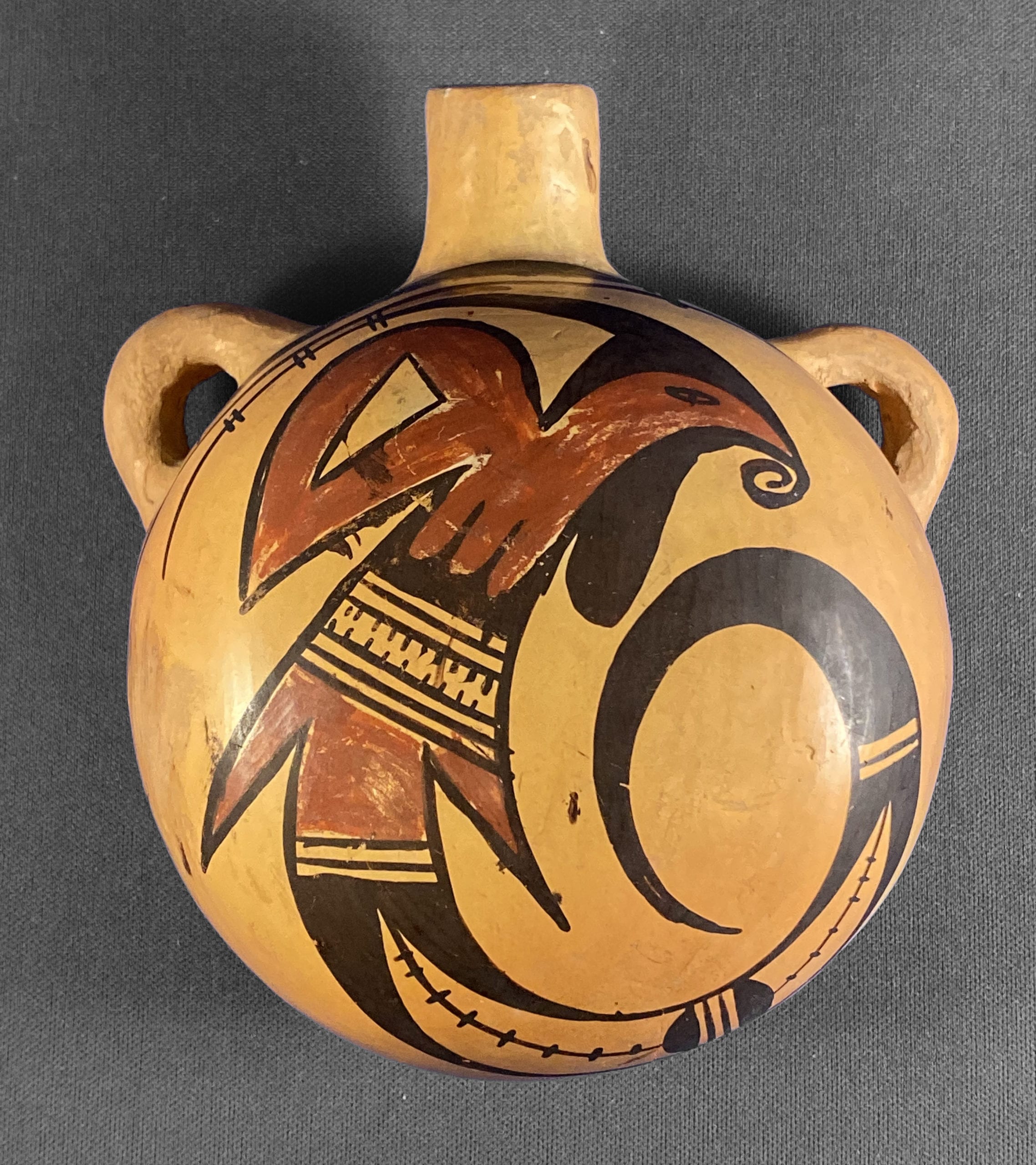
This is a gem of a canteen with an elegant and energized avian design. Whether it is by Nampeyo will require analysis, judgement and some uncertainty of conclusion.
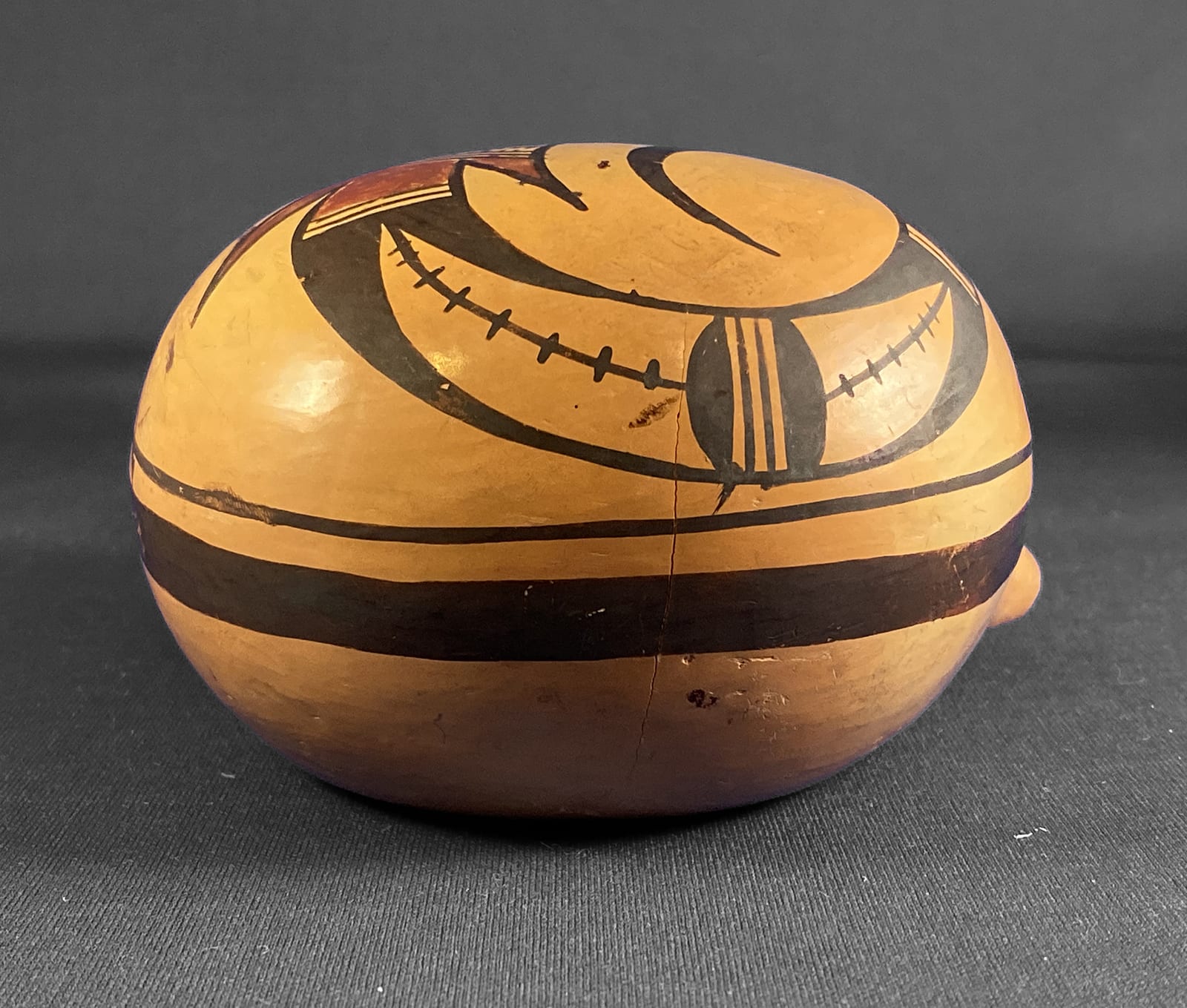
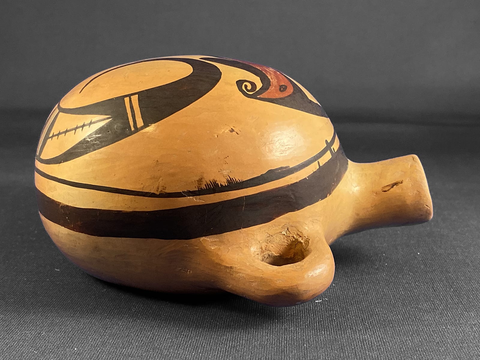
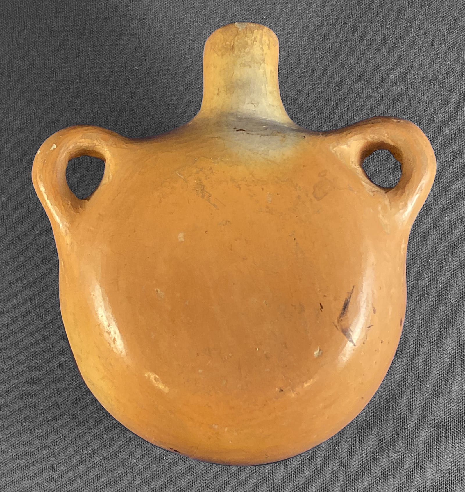
The canteen has substantially thick walls and thus is quite heavy for its size. The spout has a forward tilt, a characteristic of Nampeyo’s canteens. The handles are attached high on the body, another Nampeyo characteristic. The body is well-polished, with almost no polishing marks visible. Blushing from the outdoor dung fire is pronounced, particularly on the flat back.
There is much in the design that indicates Nampeyo is the maker. However there are small drips and paint smudges that mar the design and these are not what we expect to find on her work.
This collection has six other canteens formed and painted by Nampeyo. Two are identical in size, form and style of painting to the canteen discussed here (1999-03 and 2010-11). The other four are larger and more particular in their form or design (2009-10, 2012-13, 2017-15 and 2019-12). Nampeyo’s Sikyatki revival bowls have thick-over-thin framing lines. Her canteens are painted as convex bowls, thus all six of the other Nampeyo canteens in this collection have thin-over-thick framing lines and this is also the case with canteen 2018-13.
Canteen 2018-13 features an elegant Sikyatki bird gliding through space. She is elaborately presented, but all elements of the painting are classic Nampeyo designs.
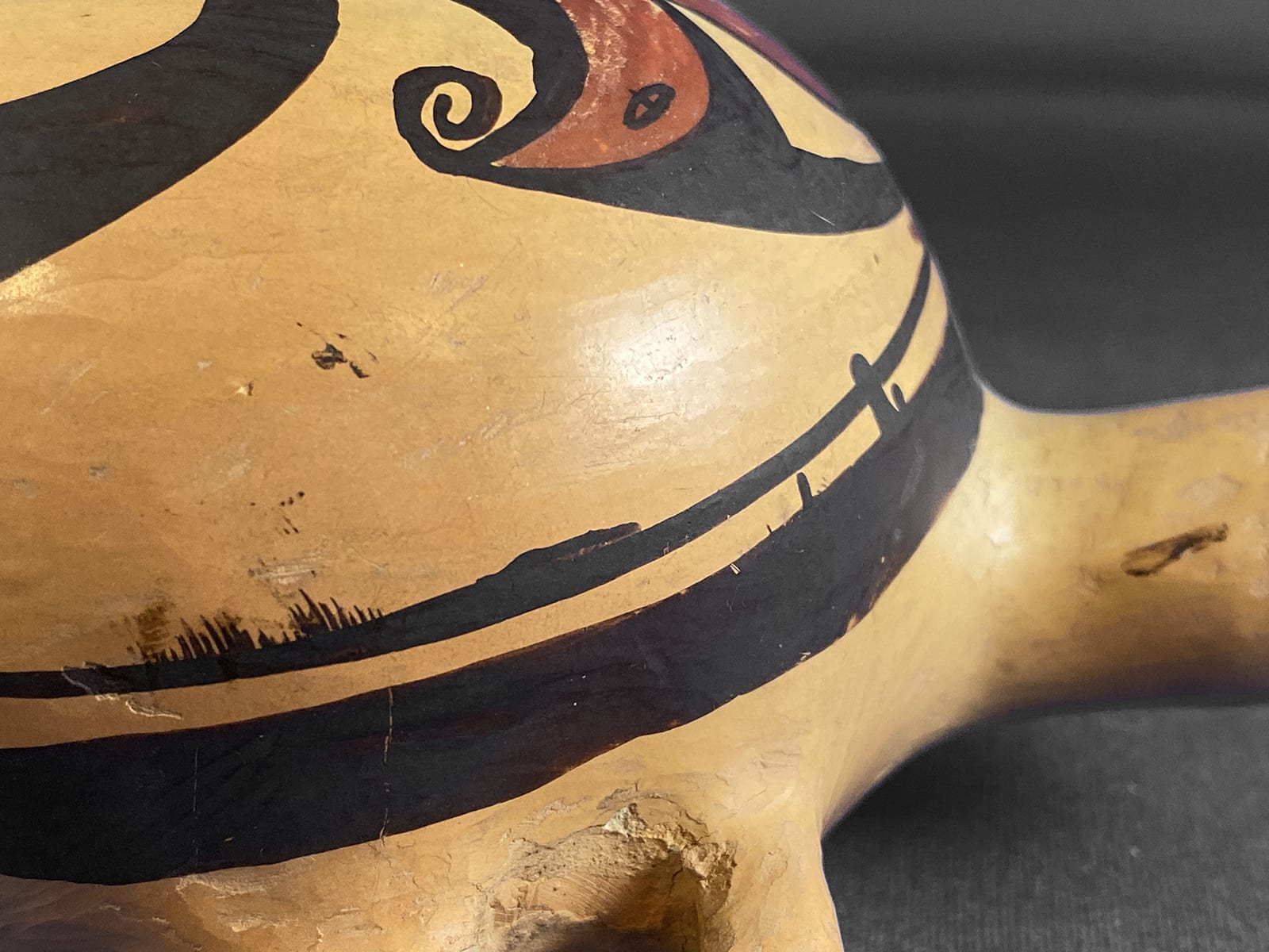
The bird’s pointed red head features a small almond-shaped eye with a tiny black pupil. Surrounding this red head is a multipurpose black element. Below the head it forms a large wattle; at the tip of the beak it twists in a clockwise spiral tongue. Above the head this black element forms a half-moon cap to the head and at the top branches off into a 3-inch arch with a thick base that narrows to a thin line. After this point the line is crossed by three pairs of two short and narrow lines.
The red head element expands towards the rear of the bird. Above the core of the body it grows upwards into a large domed wing with a flat base. In the center of the wing is a small unpainted right triangle. The rear edge of the red area forms three lobes that embed themselves into a black element, the black filling the area between the lobes and taking the form of four spikes. Next is the familiar pattern of three parallel lines forming a two-lane “highway.”
Following is a narrow almost unpainted section, followed by another two-lane highway. Growing out of the facing walls of this open area are rows of 9 and 10 short hair-like lines. Next is another red section that forms the cylindrical core of the tail flanked by red triangular elements that are frequently found in Nampeyo’s designs and here look to me like small side -firing rockets. The body of the bird already described is about 3.25-inches long. The long black tail that unfurls from the body at this point would be about 7-inches long if uncurled.
The tail is rooted on a familiar two-lane highway element and then sweeps to the right and upwards to curl around to almost touch the bird’s head, then swings down and almost touches itself. The last 3 inches of this bold form is solid black, as is its base. In between, in the center of the tail, is an open 3-inch section with pointed ends. Towards one end is a classic Nampeyo element, sometimes described as a “split cloud” form: two hills with their flat bases parallel and separated by four parallel lines, forming a three-lane highway. Running the length of the open area but interrupted by the split cloud element is a line crossed by 14 short lines.
This bird flies with great energy and elegance in the small space provided by this canteen.
But is it by Nampeyo?
In Appendix B I defined six design strategies of Nampeyo’s mature Sikyatki Revival painting and I apply these criteria to determine if Nampeyo is the painter of a pot, or not. As applied to canteen 2018-13, strategies are:
A tension between linear and curvilinear elements, often represented as a contrast between heavy and delicate elements.
There is obvious curvilinear energy to this design; the bird and that great black tail swirl within the circular framing lines. The linear elements are less pronounced: The base of the red wing is one clear example. The central section of the bird’s torso is a cluster of five linear lines that form two patterns. The unpainted triangle in the red wing and the two flanking red triangular forms near the base of the tail also add linearity to the design.
A deliberate asymmetry of design.
The design is by definition asymmetrical. No part of the design can be folded over and match any other part.
The use of color to integrate design elements.
The main body of the bird is composed of two red areas interspersed with smaller black designs. This form then rides on that magnificent black swirling tail. The red unifies the body, yet if this curled-up tail was straightened out, about 70% of of the length of the bird would be uninterrupted black. Another way to see this pattern is that if you draw a slanted line across the design, from the 2 o’clock to the 8 o’clock positions, most of the design above the line would be red and all of the design below the line would be black. That’s less design integration by color than is typical of Nampeyo.
The design does adhere into a single image, but not because of the integrative use of color. The viewer’s eye is attracted to red of the body, but that long sweeping black tail does not detract from that focus since the curve of the tail brings the eye back to the central red form. On this canteen color focuses the viewer’s eye, but form integrates the design.
The use of empty (negative) space to frame the painted image.
There’s a lot of detail and activity in the 4.75 inches within the framing lines, yet the artist has left substantial unpainted areas to the right and left of the painted image so that the bird does not appear crowded into its space. The design has great energy and it is unconstrained because of that surrounding space.
The use of a thick above a thin framing line on the interior rim of her bowls.
As noted above, such framing lines appear on this pot, but in reverse order because the design is painted as if on a convex bowl.
Confident, bold, and impulsive painting.
Every time I discuss Nampeyo’s design strategies, I comment that this is the most subjective and yet is the most important criterion for deciding if a pot is painted “by Nampeyo.” It was the character of the painting that initially drew me to this canteen.
Confident: It’s taken me more than 1,000 words to describe the painting in a circle with a diameter of less than 5 inches. There’s a lot going on in here and most artists would lose control of so many elements and produce a cluttered, disorganized design. That the design is coherent, graceful and free to fly within this small space shows indicates exceptional confident talent and this looks like Nampeyo to me. For example, look at how the curve of that black tail covers more than 360 degrees without hesitation. This same great curve is seen on bowl 2014-07 by Nampeyo and the curve on this canteen seems done by the same confident hand.
Bold: Of the Nampeyo canteens in this collection, the design of this canteen has the most energy and is the most bold. One of her other small canteens (2010-11) is also distinctive in this regard, but does not top the canteen discussed here. That big splash of red and the dramatic dark swirl of the tail (which almost collides with the head) on canteen 2018-13 create large drama in a small space.
Impulsive: Whereas modern pueblo potters tend to draw error-free designs on their fine art pots, Nampeyo operated in more of a folk art tradition and generally did not worry much about perfection. She seemed joyful and expressive in her art and her design is often full of small inexactitudes. Yet I do not find such “errors” on canteen 2018-13. Working in a particularly confined space, the potter seems particularly careful about the placement of her yucca brush. Notice again how carefully that dot of a pupil is placed in the tiny eye.
And yet: There are several sloppy specks and smudges of paint on this canteen that seen totally out of character for Nampeyo. See the area between 12:30 and 2 on the fine framing line, for example. A couple of specks of paint are also apparent at the 8:30 to 9:00 position on this line, accompanied by a rather large smudge where someone seems to have be partially sucessful at wiping off drops of wet paint. A small spot of paint sits between the great curve and the red tail. Below the left handle in the unpainted side an back of the canteen there is additional random paint.
I can’t explain the sloppy paint. Perhaps something happened to the canteen after it was painted but before it dried. Perhaps a young daughter touched the pot or a yucca brush was jostled and splattered. It’s all just a guess. The smudge at the 9:00 position between the red triangular tail and the framing line is evidence that the splatters of paint were seen as a problem by the maker and some corrective action was attempted when the painting was still wet.
I showed a photograph of this canteen to Ed Wade, he ruled out it being by Nampeyo because of these drib and drabs of paint.
And yet, I will cautiously conclude that canteen 2018-13 was formed and painted by Nampeyo. First, as noted earlier, the form and polishing of this canteen are exactly the same as two other small canteens by Nampeyo in the collection (1999-03 and 2010-11). I am more certain of the attribution of those canteens and so rely on them to substantiate my claim for 2018-13.
Second, the canteen fits 5 of the 6 criteria I set to judge if a pot was made by Nampeyo. The internal logic of her design is familiar to me as Nampeyo’s. In my experience no other Hopi/Tewa or Hopi potter has this pattern of thought design, the only possible exception being Annie when painting in her mother’s style. (Her own style was quite different.) The dimension “color used to integrate the design” is absent, but this integrative function was a consideration of the painter and was met using another technique. The maker was paying attention to this criteria, not a typical concern among other Hopi and Hopi/Tewa potters other than Nampeyo As usual, I place extra weight on the last of the six design characteristics (“confident, bold, and impulsive painting”) and I find the painting on this small canteen meets her standard. In short this canteen is exceptionally well-painted and contains a thoughtful structure of design that I do not find in the work of any other potter and marks a pot as “by Nampeyo”
What of the sloppy smears and drips so uncharacteristic of Nampeyo? The detailed care of the painting on the canteen (remember that eye pupil?) suggest a care sharply at variance with the sloppy drips. I propose that Nampeyo carefully painted that canteen as we would expect of such a master, and then “something” happened after the painting was finished that added the drips and smears. That’s all supposition on my part, of course, but there is slight evidence that I may be correct. The mostly obliterated drip and consequent smear at the 9:00 p.m. position between the red tail and the framing line is evidence that someone tried to correct the drips while the paint was wet. Such drips were not the sloppy standard of the painter. I suggest Nampeyo tried to correct them and then stopped given the smear.
Ed Wade has written that
“The ‘Nampeyo’ proudly displayed in many collections is an act of wishful thinking, one sustained by the dearth of solid scholarship (Wade and Cooke, 2012::126)”
I am, of course, fully susceptible to such error, especially since Ed believes the drips preclude this canteen from consideration as a Nampeyo pot. Nevertheless, given the indicators of both form and design that Nampeyo was the artist, I will list canteen 2018-13 as hers. And I’m about 85% confident that I am correct.
