

The eccentricity of this pot makes the following analysis both complicated and detailed. As a guide, this catalog entry has the following eight sections:
I. Introduction
II. Form
III. “Pure Abstraction,” an unusual design motif
IV. Design
V. Evaluating the pattern of design against Nampeyo’s Sikyatki design strategies.
VI. Evidence that Nampeyo did not make this jar.
VII. Jar #23 in the Cooke Collection.
VIII. Conclusion
I. Introduction:
This pot is at the cusp between Polacca ware and Sikyatki Revival traditions; it is also at the limits of what we know about Nampeyo’s evolving design strategies. Few similar pots are known in the literature, and thus there is little comparative data available to guide our discussion. Any statements about its maker must be tentative. I believe this is an early Nampeyo jar based on design elements and their pattern. Evidence for this conclusion is specific but limited. Some painting is awkward and well below the standard we expect of Nampeyo while the painting of other design elements is characteristic of Nampeyo’s accomplished style. Sections of the design simply pile elements together without regard to framing space, while other sections frame the elements with empty space, as we would expect of Nampeyo. Given these contradictions, I’m about 70% sure Nampeyo is the maker, but of course this is just an informed guess, perhaps biased by my collector’s greed.
II. Form:
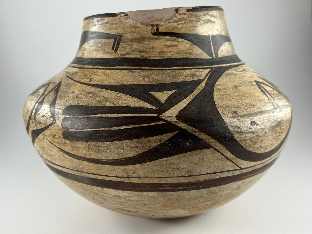
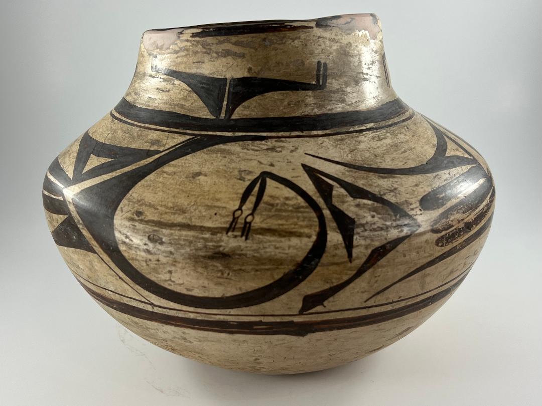
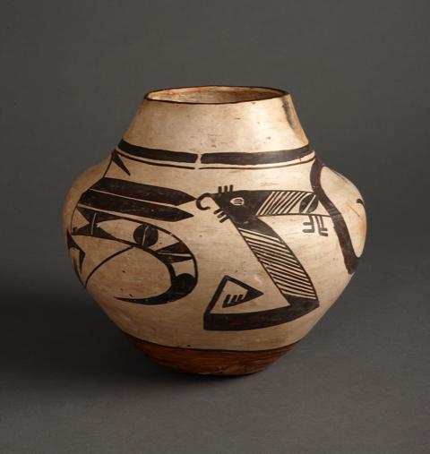
The slip on the bottom of the jar has been worn, revealing a coarse light-grey clay. The bowl expands gradually outward from a flat base curving to a height of about 3.8-inches. It then flexes inward and slopes up to a 1.25-inch neck. The stone-polished slip is a finer-grained product of the same clay used for the body. Although more grey than white, the slip on jar 2020-16 is the “white kaolin slip with intermittent, streaked coverage” with only slight craklature that I discuss in Appendix B, Section 3B. I believe that this irregular, streaked, surface on Nampeyo pots is due to her applying only one coat of slip rather than multiple coats, which would have polished to a smoother finish. Such intermittent coverage is unusual and below Nampeyo’s typical standards. In Appendix “B” I speculated that she used this quick one-coat method when her primary interest was in the design rather than the finish. That the design on jar 2020-16 is particularly innovative may be some support for my speculation.
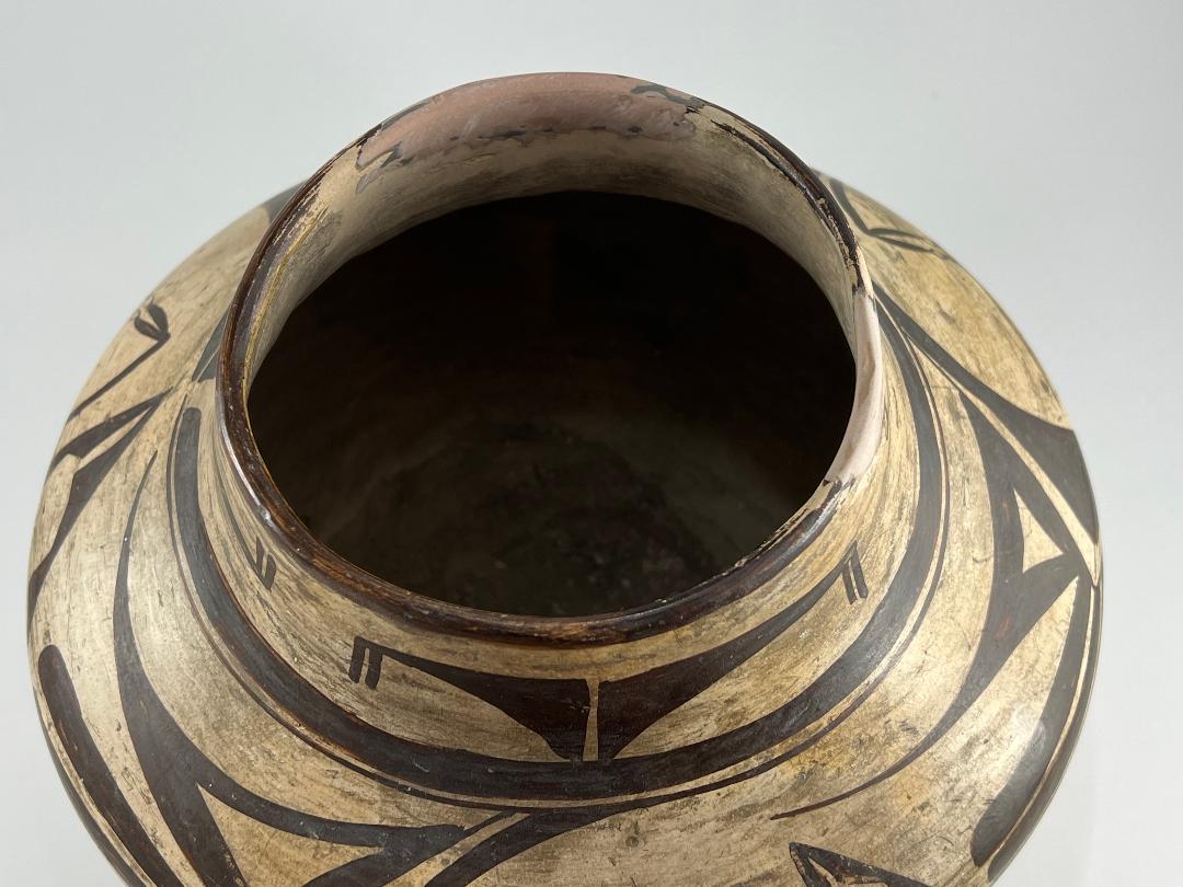
At some point in its history, the rim of the pot was significantly damage and crudely repaired, probably with plaster filler.
III. “Pure Abstraction,” an unusual design motif
In “Appendix A” I trace stylistic changes in Hopi pottery during the last quarter of the 19th Century. The decade of the 1890’s was particularly experimental (Polacca D) as old Polacca designs persisted but potters sometimes added figural or old Sikyatki design elements to attract Anglo buyers. By about 1900, however, the Polacca tradition had been replaced by a revival of ancient Sikyatki forms and design. Nampeyo was in the vanguard of this change, but her artistic vision was not linear and was not constrained by any one tradition.
Jar 2020-16 probably dates from the 1890’s, but the design is neither Polacca nor Sikyatki Revival. Instead it is an unusual example of a type of innovative design that Nampeyo briefly experimented with and then went on to other styles of decoration. I have called this design “pure abstraction” and heretofore it has been represented in this collection by only two pots: a bowl (2006-11) and a seedjar (2015-04).
Ed Wade calls this design approach “Curvilinear Abstraction” (Wade and Cooke, 2012:127) and writes that it is:
“…among the most interesting of Nampeyo’s compositions…(Such pots) are relatively rare ….(T)he designs are abstracted geometrics with little if any reference to Sikyatki or any other Puebloan art tradition. The compositions range from serially repeated geometrics to free-form calligraphic swirls, filigreed S-forms, elongated double lobed triangles, and lancelets. They represent the deeply personal design studies by an uninhibited artist engaged in art for purely art’s sake (Wade and Cooke, 2012:132).”
The maker of jar 2020-16 seems simply to be having fun playing with the relationships between geometric forms floating in space. As far as I am aware, Nampeyo was the only potter around the turn of the last century at Hopi playing around with geometric elements to form these “pure abstraction” designs. “Genius is the ability to hear something that no one else has heard,” or in Nampeyo’s case, draw what no one else has drawn.
However, there is a dichotomy in the quality of the painting on jar 2020-16. Much of the painting is awkward and clunky, while other elements are refined and graceful. Such variance in quality creates serious doubts about a claim that Nampeyo made jar 2020-16. The next section explores the design elements in detail so that we might make a more informed decision about the jar’s maker.
IV. Design:
All of the painting on the jar is done with black paint.
The black lip of the jar is unusual for Nampeyo. Only three other vessels by Nampeyo in this collection have black rims (2013-14, 2014-17 and 2017-04). Note that all three of these pots are unusual: two are figurative and one a rare rectangular shape painted using both Polacca and Sikyatki traditions. Jar 2020-16 fits this eccentric pattern since it is a transitional jar between Polacca ware and Sikyatki Revival traditions and carries the rare “pure abstraction” design.
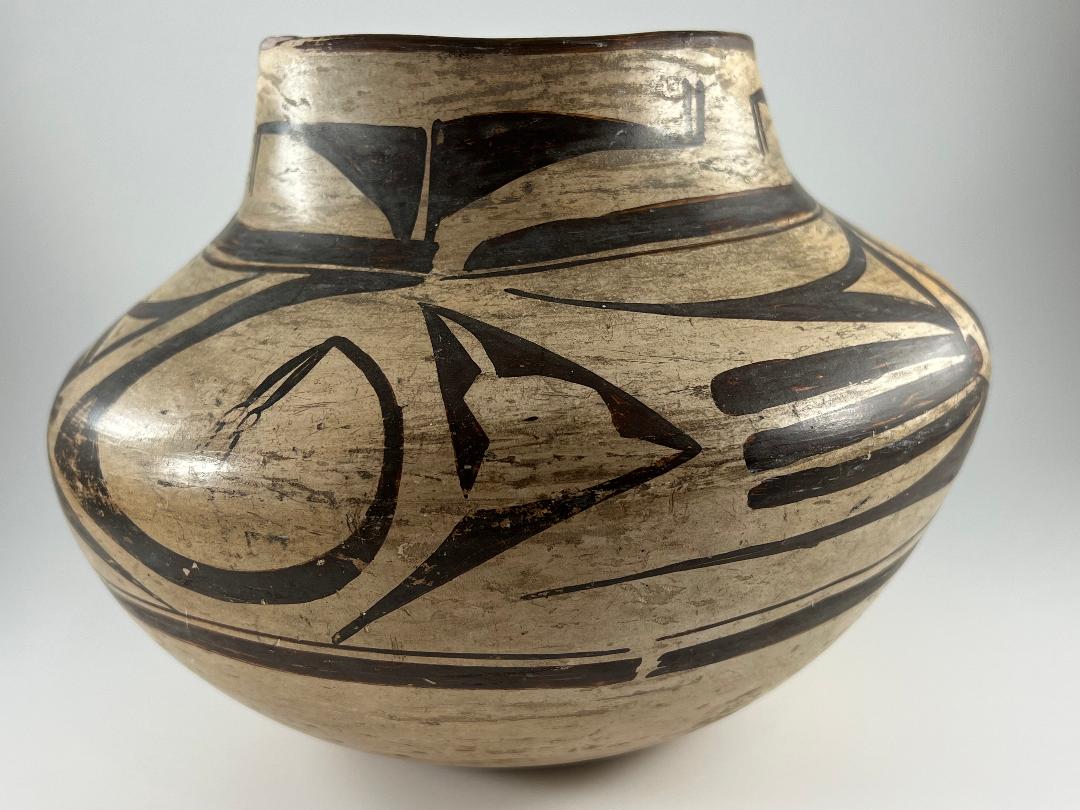
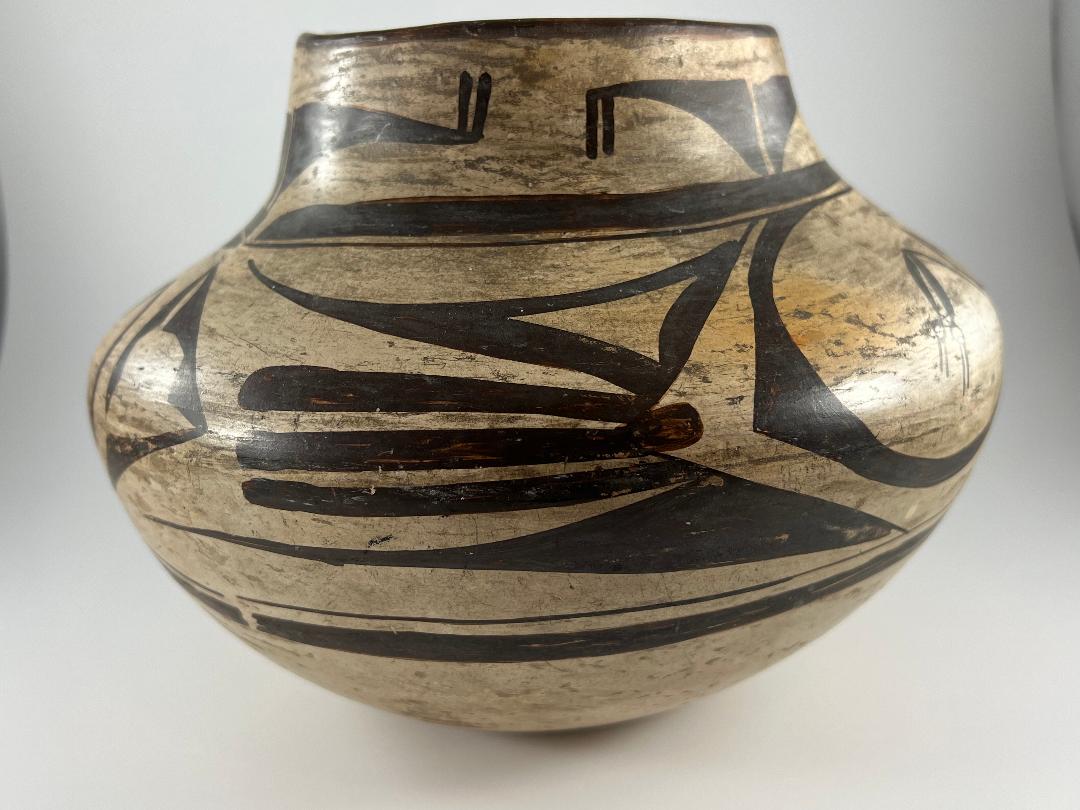
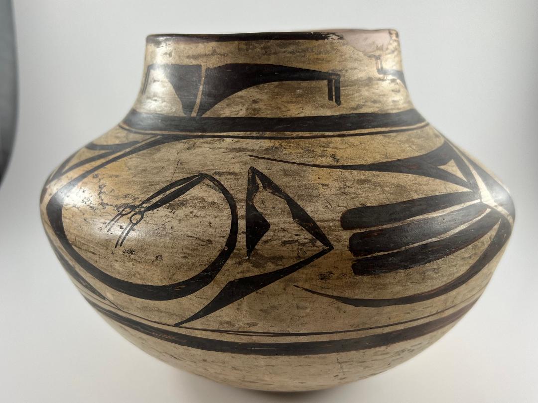
Around the neck are rather awkward elements, repeated in three panels. Each panel contains two solid-black right triangles, their 90-degree corners oriented upwards and facing each other, separated by a thin sliver of unpainted white slip. The hypotenuses are curved inwards. The point where the short end meets the hypotenuse rests on the thick framing line below, sometimes directly and sometimes using a short rectangular extension. The point where the long end meets the hypotenuse sprouts two short parallel lines. On the left triangle of the pair these lines point down; on the right triangle they sprout upwards. The form and painting of this design are inferior to what we expect of Nampeyo.
The jar carries two sets of framing lines, thick-over-thin around the neck and thin-over-thick below the design panel. Both sets of framing lines have line breaks at roughly the same point of the pot’s circumference. The upper set of framing lines was more carefully-drawn than the lower. Notice particularly that the upper thin line seems to have been drawn around the whole circumference of the pot in one motion, without lifting the yucca brush. As we will see below, the precise curve of this framing line is important evidence that supports Nampeyo as the maker of this jar. In contrast to the upper rendition, the lower thin framing line shows paint-over and line separation into two threads. This suggests that the vessel was painted top to bottom: the top framing lines were painted before the base of the jar and thus the artist had a secure grip on the vessel. When it was time to paint the bottom framing lines, much of the surface was wet and thus perhaps painting the bottom framing lines was more difficult and the painting more tentative.
Framing lines were not used on traditional Polacca ware but were extensively employed in the older Sikyatki tradition. Thus, in spite of its white kaolin wash, the presence of framing lines certifies that jar 2020-16 is transitional between Polacca ware and the emerging Sikyatki Revival style.
Between the upper and lower framing lines is a panel of designs repeated with minor variations three times around the circumference of the jar. Within each panel are seven design elements. Several touch, but I will discuss the seven elements separately:
- Directly below the line break in the upper framing lines is a triangular crook, its sides formed by conjoint triangles. Similar triangular crooks are seen on a number of Nampeyo pots in this collection: see Appendix F, “triangular crooks.” Notice especially the very similar triangular crooks on two Nampeyo pots: bowl 2012-02 made about 1895 to 1901 and also small plate 2009-08. All three pots carry irregular white slip and unusual monochromatic designs; their manufacture was probably contemporaneous. The triangulated crook on jar 2020-16 almost an exact copy of crooks on bowl 2012-02 . That bowl has extraordinary documentation as “by Nampeyo,” and this specific element seems limited to Nampeyo’s work. Moreover, both pots are rare transition pots with Polacca white slip but designs that are neither Polacca nor Sikyatki and both probably date from the late 1890’s.
- To the right of the crook is a three-tiered design. On top is a triangular element framing an unpainted triangular center. The form only approximates a right triangle. In two renditions the hypothenuse is dramatically curved inward; none of the nine sides of the three triangles is especially linear. All three versions of this triangle have long sweeping tails, which gives this element a sense of graceful motion. This form is unusual, but we have seen a hollowed out version of it before on experimental “pure abstraction” seedpot 2015-04 by Nampeyo. Moreover, both seedpot 2015-04 and jar 2020-16 carry rare “pure abstraction” designs that seem to capture Nampeyo in a playful mood.
- The right angle of this triangle rests on a set of three solid linear tails. The other five design elements on the jar are asymmetric and have a sense of motion, but these three thick black lines seem stuck in place, perhaps the stolid core around which all the other designs whirl. The linear black tails are an uncommon design on Nampeyo pots, but appear in almost exactly this form on canteen 2020-17. A more precise version is found on one of the other “pure abstraction” pots in the collection (2006-11). For a somewhat less impressive example, see 2012-21 . Solid black tails do regularly appear on Nampeyo’s pots as part of the “butterfly” element found her on bowls carrying the “bird hanging from sky band” design (cf 1993-04 and 2010-11).
- Below these tails are black forms very much like element #2 (above), but here the three renditions vary from “clearly triangular” to elongated like a sickle blade, also with left-pointing tails. This shape is unusual but is seen seven times on “pure abstraction” seedjar 2015-04 by Nampeyo (elements #8 through #14). These two pots might be contemporaneous.
- To the right of this three-element stack of designs, and separated from them by a V-shaped thin line, is a large circular motif, its smooth inner curve about 8-to-9 inches long, depending on the rendition. The distance between the inner edge and outer edge of the form is narrow at the ends but grows increasingly wide toward the center. About a third of the way from the top, the distance between the lines suddenly wides dramatically, reaches an apex and then narrows quickly. The result is a solid black curve, relatively thin at its ends but forming a dramatic left-pointing triangle towards its center. On the Nampeyo pots in this collection, I find no other rendition of this exact form. The closest I can come –with elements of similar sensibility but not form– are designs on bowl 2006-11, another “pure abstraction” pot. As discussed below, the precise, clean inner curve of element #5 is important evidence that supports Nampeyo as the maker of this jar.
- Pendant from the upper tip of element #5 are two parallel long-leaf-shaped forms. These pendant leaves are a characteristic of Nampeyo’s work (1996-05, 2006-11, 2017-15, 2019-12, 2019-19, 2025-05) . Note that, like the jar described here, bowl 2006-11 is one of the rare “pure abstraction” pots in this collection.
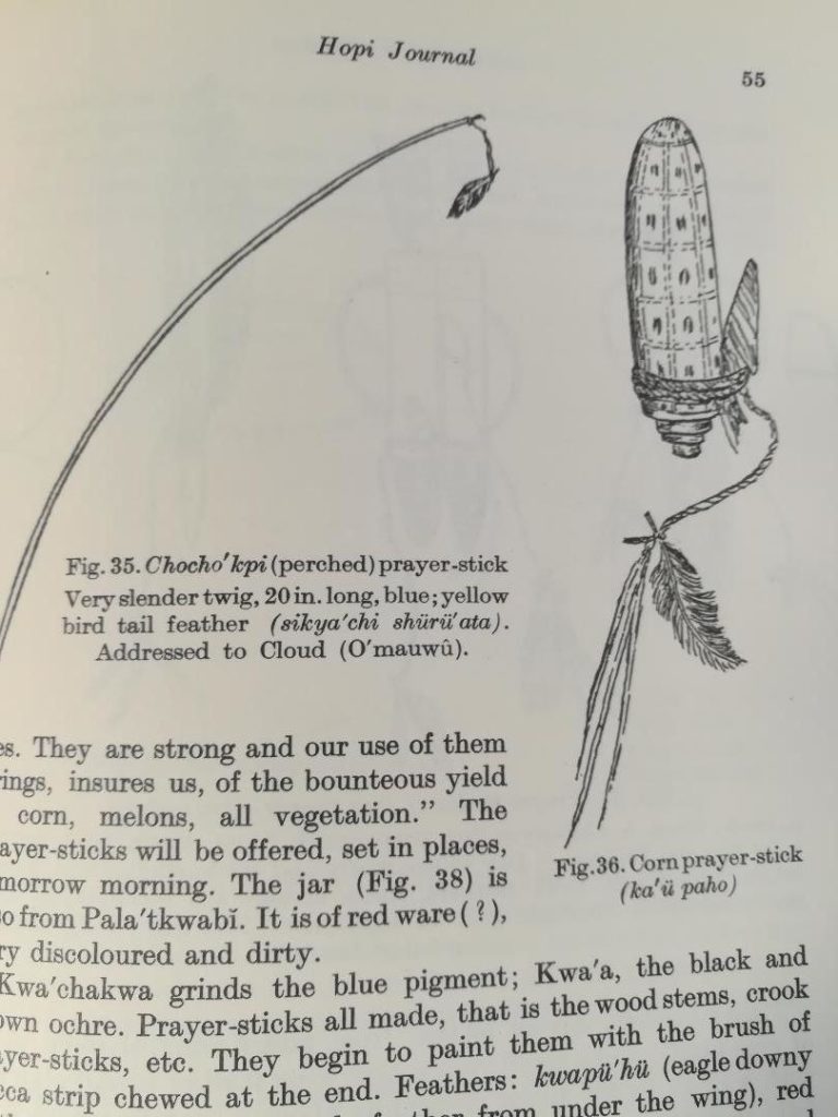
- Hanging from the end of each leaf is a circle with two parallel lines sprouting from its far side. Alexander Stephen was an anthropologist living with the Hopi during the last decade of the 19th century . His Hopi Journal is an exhaustive reference book of Hopi life. Following Steven (1936:55), I believe the circles at the tips of the leaves are prayer feathers: While he was at Hopi, Steven catalogued dozens of pottery designs. Among these were prayer feathers, in Hopi “pahos” or “bahos” (Patterson, 1994:201-207). Since birds can carry prayers between the earth and the heavens, feathers play a central part on Hopi religious practice. Pahos are made with different feathers, depending of what a man is asking for. (Only men make pahos.) The sun god Tawa “sees the prayer-sticks and prayer-feathers and comes to them and inhales their essence and takes them. He does not take up the material sticks and strings and feathers, but their breath body (Stephen, 1936:1271-1272).” Steven catalogues dozens of variations of pahos on pottery, but the form we see on jar 2020-16 is only reported by Steven on two ancient (1625 – 1680 CE) San Bernardo bowls (Patterson, 1994:94-95, external design). Nevertheless, I believe that the images on jar 2020-16 are intended to represent pahos. .
 The prayer feather pahos are found on two other Nampeyo pots in this collection (1993-04 and 2015-03) that –like jar 2020-16– are white-slipped and transitional between Polacca ware and Sikyatki Revival pottery. Pendant pahos were also employed by Nampeyo on her later Sikyatki Revival pottery in this collection (2010-11 and 2014-20), including one canteen apparently used by a Nampeyo family member (2009-10). It should be noted, however, that other white-slipped transitional pottery not by Nampeyo also used such pahos elements (cf. 1999-09a).
Summarizing the evidence listed above, the triangular crook offers the most direct design evidence that jar 2020-16 is “by Nampeyo.” However, almost all the elements of design on jar 2020-16 are found on other Nampeyo pots, thus placing jar 2020-16 at the center of Nampeyo’s design oeuvre. Moreover, one of the two other “pure abstraction” pots in this collection (2015-04) shares designs of triangular crooks, and sickle and leaf forms with jar 2020-16 while the other “pure abstraction” pot in this collection (2006-11) also displays sickle and leaf elements. These overlapping design patterns link jar 2020-16 to Nampeyo’s oeuvre, like finding out that your DNA connects you to otherwise unknown cousins.
V. Evaluating the pattern of design against Nampeyo’s Sikyatki design strategies.
In “Appendix B” I defined six design strategies that distinguish Nampeyo’s painting during her “mature” period, roughly the first two decades of the twentieth century. At that time she was focused on designing Sikyatki Revival pottery. Jar 2020-16 was probably made about a decade earlier, and pottery by Nampeyo of this period is not expected to conform to these design strategies. Nevertheless, comparing the painting on jar 2020-16 to these six design standards may give us some insight about the pot’s maker.
The six strategies are:
1) A tension between linear and curvilinear elements, often represented as a contrast between heavy and delicate elements.
Pot 2020-16 displays an interesting pattern of tension between linear and curvilinear elements. The obvious linear elements are the three solid black tails. Immediately to their left is the crook with outer linear edges but curvilinear inner edges, while the overall shape is bent, neither quite linear nor curvilinear. To the left of the crook is the magnificent long curved edge of the swirl, its tip ending in two linear leaf elements. Thus, as a viewer’s eye moves from right to left in each panel, the design elements progress from linear to curvilinear, with the small linear pahos elements returning to a linear image.
2) A deliberate asymmetry of design.
There is nothing symmetrical about the design elements in each panel. Indeed the jumble of design needs to be studied to find any pattern of order.
3) The use of color to integrate design elements.
Since an a priori decision was made to paint this jar monochromatic black, integrating the design with color is not relevant.
4) The use of empty (negative) space to frame the painted image.
The largest block of design elements, the linear tails with their associated triangles, is crowded and employs empty space only interior to the top triangle, which somewhat lightens the impression of this design. However, the remaining two elements are framed by space: 1) the triangular crook is highlighted by both its empty core and the surrounding space, within which it twirls. 2) To its left, the long curved edge swirls in space, foretelling the shape of the wings on the classic Nampeyo edge-tail jar (2005-16). This curved edge encloses a sea of space, with the pointed pahos drawing a viewer’s eye to its center. Thus we face another dichotomy: much of the jar displays a use of space to frame the design, as we expect from Nampeyo’s classic designs, but a large chunk of the design does not follow this strategy.
While I think the six design strategies we are discussing help us distinguish Nampeyo’s pots from those of other potters, they are an academically-derived formulation that I infer a century after Nampeyo’s painting career. For her they were not fixed, formalistic rules. Note: 1) these strategies best fit the interior of bowls, since the interior of a bowl is an expansive canvass that allows an artist great freedom of design. The linear design panel on the exterior of jars and bowls tends to constrain design elements into a narrow band that often precludes the use of space to frame design elements. 2) However, such was the genius of Nampeyo that she developed a number of strategies for painting the exterior of jars and bowls that allowed them framing space.
Thus while some Nampeyo jars display crowded designs that lack negative framing space (cf 2002-11), she was also able to incorporate unpainted framing space around design elements even in a tight linear band of design (2021-09). Often Nampeyo avoided a confined design band by forming “flying-saucer” shaped jars, their broad upper surface allowing empty areas around design elements (2005-16). Rarely she formed lobed pots to similar effect (2015-12). Finally, Nampeyo sometimes segregated her design so that some elements lack framing space while other elements float freely against a background (2013-03). This latter strategy might be her intention on jar 2020-16, with the pile of elements crowding around the linear tails lacking framing space, while the triangular crook and D-shaped element float against an unpainted background.
In short, when applying strategy 4 to the design on jar 2020-16, we are once again in a pattern of saying “on the one hand….on the other” with no definitive design statement possible. This lack of certainty is frustrating, but (reframed) it is also intriguing. If jar 2020-16 is in fact “by Nampeyo,” we get a sense of Nampeyo developing her craft, a sense of her playing with possibilities, a sense of process from a jar with a fixed design. To the extent such analysis is valid, it is a fascinating insight into the mind of a design genius.
5) The use of a thick above a thin framing line on the interior rim of her bowls.
Although not a bowl, jar 2020-16 has both an upper thick-above-thin framing line and a set of lower framing lines that reverses this order.
6) Nampeyo’s painting is confident, bold, and somewhat impulsive compared to the more-studied, plotted and careful style of her daughters, descendants and other Hopi and Hopi-Tewa potters.
As I always point out, this is the most subjective of the six design criteria, but it is also the most critical. What is confusing about jar 2020-16 is that it both emphatically fails the test of confident painting and also demonstrates this ability, both on the same pot: a) The design on the neck is awkward and shows little confidence or boldness. The same can be said of design elements #2, #3 and #4, as detailed above. b) Yet the upper thin framing line seems to have been drawn with one sweep of a yucca brush as was the long, sweeping curve of element #5. Moreover, the crook (element #1) is drawn with a confident, skilled, and bold hand. Both of these latter two elements are highlighted by the space around them.
When focused on only the crook and its neighboring curvilinear element #5, my eye sees “Nampeyo,” like spontaniously recognizing the face of a friend in a crowd.
The precisely drawn upper framing line and the long sweeping edge of element #5 are particularly significant. Speaking about a display of 32 Hopi-Tewa pots at the De Young Museum (Summer 2021 — Winter 2023), potter Bobbie Silas was asked by the museum curator how to tell if a pot was “by Nampeyo.” He responded: ““When you look at Nampeyo’s work, I know I can tell her work because of her one drag with the paint brush…She just did it once….Her one drag is what sticks out as really unique because she went all the way around her pots [to form the framing lines]…It’s not like it is now where potters (they) go over it maybe once or twice to perfect it. She was making it her style. Very fine work (minutes 39:11 to 40:16 on the Youtube video).” By this standard, the smooth “one drag” inner curve of the circular motif as well as the “one draw” upper framing line, indicate that Nampeyo is the maker of this jar. Similar single-stroke thin framing lines can be seen on almost every Nampeyo bowl in this collection (cf 1993-04) but the perfection of her one-drag line stroke is even more dramatic when used to highlight a central design motif, as on her classic “eagle tail” design (2005-16), bowls 2002-03 and 2014-07 and canteen 2020-17.
Any commentary on this pattern of design elements is simply supposition, but here’s mine. As I mentioned earlier, in Appendix B, Section 3B, I suggested that the “white slip with intermittent, streaked coverage” characterizes a few pots by Nampeyo and is evidence that she was more excited about painting those pots than taking the time to create a smooth white finish as her canvass. Applying that same logic to the design on jar 2020-16, I suggest that Nampeyo was so focused on playing with the “abstract modernist” designs around the belt of the jar that she did not in vest much time or care in the decoration of the neck or elements #2, #3 and #4. Why this dichotomy of quality is a matter of speculation.
To summarize:
Of the 5 relevant design strategies that characterize Nampeyo’s later Sikyatki revival work, jar 2020-16 surprisingly meets all of these criteria. The most problematic are strategies #4 and #6, but the existence of both awkward and more confident painting on the same jar leave me believing that the artist could paint with some confidence, but sometimes chose not to do so. Our review of the internal pattern of design on pot 2020-16 suggests that Nampeyo might well have been its maker. For a jar with 1) a Polacca-style red rim and Polacca kaolin white slip from the 1890’s that 2) was likely painted by Nampeyo with a fully Sikyatki-Revival design, see 2025-05.
It is certainly true that other Hopi-Tewa and Tewa potters used design elements also used by Nampeyo. Oldest daughter Annie seems to have been able to paint both like her mother and also with her own, busier and lighter style. However Annie was born in 1884 and probably did not begin making pottery until the 1890’s, at the very end of the production of Polacca ware. Jar 2025-05 (noted above) has a Polacca red rim and kaolin slip and was likely formed by Annie in the 1890’s but painted by her mother (2025-05). While Annie could paint in the style of her mother, I know of no pots painted by Annie on the Polacca white slip found on jar 2020-16. In a letter to me dated July 31, 1997 Barbara Kramer write that the earliest documented jar by Annie is in the Gilcrease Museum and was made about 1912. (See catalog entry for 1994-02.). None of Nampeyo children, grandchildren or other potters at Hopi created designs with the internal logic specified by the six design strategies discussed above and all of them would have been too young or unborn when pot 2020-16 was made. Some modern potters, especially Rachael Sahmie and Steve Lucas have adopted many of the six strategies, but pot 2020-16 is 100 years older than that. If you think of these 6 design strategies as a toolbox, only Nampeyo used these six strategic tools during the time period when jar 2020-16 was produced.
VI. Evidence that Nampeyo did not make this jar.
There are two substantial challenges to a claim that Nampeyo made jar 2020-16, one focusing on the quality of painting and the other concerning design layout. 1) Much of the painting on jar 2020-16 is inferior to the painting on Nampeyo jars with better provenance, and 2) important sections of the design do not employ empty space to frame the elements, a design characteristic we expect of Nampeyo.
The least capable painting is around the neck of the jar and the shaky thin lower framing line. Only somewhat better are the set of black tails and their conjoint triangular elements. Overall, the drawing on jar 2020-16 is not up to the standards of Nampeyo’s other transitional work (1993-04, 2012-02 and 2015-03).
In another venue I criticized the central argument of a book that claims that all of the Polacca ware in the Keam Collection of the Peabody Museum (Harvard) is by Nampeyo. The author acknowledges that the pots in the Keam collection vary in quality of the painting, but asserts that the less-well-painted pots simply represent Nampeyo’s early work while the better-painted pieces represent her later work. Would not a simpler explanation be more compelling, I suggested: All of the pottery was done at roughly the same time by different potters of varying competence. There is no compelling logic that they were made by one potter over time and no explanation why that one potter might be Nampeyo. This same critique might be offered in response to my argument that an inexperienced Nampeyo made jar 2020-16. Given its often indifferent paint job, why do I simply assume that it was done by Nampeyo? Why not simply assume it was done by an unexceptional potter at Hopi? “Hoisted by his own own petard,” might be a good description of my position. I have one remaining defense:
VII. Jar #23 in the Cooke Collection:
Jar 2020-16 is similar to jar #23 in the Cooke Collection at The Museum of The West (Scottsdale) and published by Wade and Cooke in Canvass of Clay (2012: 104-105).
Of this jar, Ed Wade writes:
“Occasionally one encounters an artwork that has no equivalent within art tradition. It’s just out there by itself, forging a whole new aesthetic. The most honest response to such stand-alone genius is a simple ‘WOW, where did this come from?”
In the case of this jar, both its shape and design suggest the work of Nampeyo. However, if it is she, it is one of her most eccentric compositions — and on some levels one of her most exciting. The raw kinetic vitality of the fantastical abstract motifs floating pendulous upon the creamy white slip of the jar prefigures the modernist thinking of American scluptors such as Alexander Calder, David Smith, and Ibram Lassaw that would engage us some forty years later.
Here we are witness to one of those mystical moments in world art when an artist slips out of time. Nampeyo ascended the structures and aesthetic covenants of her tribal origins and suddenly presaged the intellectual tenents of Abstract Expressionism and the lucid Constructionism of the mobile makers.
This would not be the only occasion when Nampeyo experimented with such abstraction. There exist a few bowls and a number of ceramic tiles in which similar compositions appear. Yet these ceramic forms constrict rather than liberate the composition, which inly becomes three-dimensional upon the bulbous convex body of a jar (Wade and Cooke, 2012:104.”
Obviously Ed likes this jar. He does not, however, specify the criteria he used to conclude this pot is by Nampeyo. Thus we are left with a pot said to be by Nampeyo that we can compare to jar 2020-16, but have no guidelines for this comparison. It’s obvious that the Cooke jar is more-precisely painted that jar 2020-16 in this collection. I could fall back on the explanation (which I did not accept when it was the central argument of a book) that both pots were painted by Nampeyo, only mine was done earlier, when she was not as accomplished an artist.
On the other hand, notice that 1) some of the painting on jar 2020-16 is well done, evidence that the maker was a more capable painter than her more shaky design elements would suggest. Moreover, 2) both the Cooke jar and mine are a) transitional pots carrying Polacca ware kaolin slip but having Sikyatki-like framing lines (suggesting they were both made in the 1890’s), b) are monochromatic, c) display solid black linear tails, d) triangular crooks and e) sets of small parallel lines as adornments to larger elements of the design. The curved “bird head” element on the Cooke jar is reflective of Sikyatki (and Sikyatki Revival) design, while my jar carries more idiosyncratic elements of design.
I emailed Ed photographs of jar 2020-16 and his initial response was “It’s an early Nampeyo.” Later he noted that he would have to hold the jar to confirm an attribution.
VIII. Conclusion:
The “pure abstraction” designs on jar 2020-16 are an outlier of ceramic painting at Hopi. Thus, except for the Cooke jar, there are no other jars I am aware of to which it can be compared to inform its origin. There may have been other potters at Hopi in the 1890’s experimenting with such abstract painting, but we do not know their names. We do know that Nampeyo was experimenting with “pure abstraction” designs during the time when this pot was made. Unexpectedly, the design of jar 2020-16 substantially fit the six design strategies that characterize the later work of Nampeyo (SectionV). Section VI highlighted the poor painting on much of the jar and the inconsistent use of space to frame the design, central arguments that jar 2020-16 was not made by Nampeyo. Comparison with Cooke pot #23 reveals both similarities and differences between his jar and mine.
If all of the painting and design layout was like the least competent painting and the most crowded layout on jar 2020-16, then it would be easy to conclude that the jar was “by an unknown potter.” If all the painting was like the most competent painting on the jar and all of the layout provided for empty framing space, then it would be easy to conclude that the jar was “by Nampeyo.” This jar ain’t that simple. The mixed message of jar 2020-16 does tell us something, however. The jar was painted by an inconsistent artist capable of work that was as fine as that done by Nampeyo.
The following logic fits this mixed data about jar 2020-16, but is clearly just speculation on my part and may be without merit. Earlier (Section II) I described the slip on jar 2020-16 as: “white kaolin slip with intermittent, streaked coverage” and pointed the reader to Appendix B, Section 3B, where I speculated that Nampeyo used this used this quick one-coat method when her primary interest was in the design rather than the finish. Thus I claim to be able to read Nampeyo’s mind more than 100 years after the fact. The logic of this conclusion is detailed in Appendix B, but might also be applied to understanding the painting of jar 2020-16.
We take every Nampeyo pot seriously, as a gift from the genius potter that she was. The variety of form and quality of her work in this collection (see Appendix D) suggests that she took herself less seriously.
“Nampeyo…was ferociously innovative and productive. She experimented freely with prehistoric vessel shapes and designs and invented many fresh figurative and geometric compositions. As her art reveals, she was extremely independent and could be wildly risk-taking. Nampeyo was no reticent, illiterate matron…(Wade and Cooke, 2012:13).”
Such innovation and playfulness is clearly evident in this collection, both with form (2014-17) and painting (2019-19). I am suggesting that Nampeyo had the same casual, innovative and playful attitude when slipping and painting jar 2020-16. Somewhere in this mix also showed her best: the triangular crook and that great circular sweep ending in the two prayer feathers, both framed with space. Innovation marked the last decade of pottery production at Hopi in the nineteenth century, when pot 2020-16 was probably made. Innovation is also the very definition of Nampeyo’s “pure abstraction ” style that characterizes this pot. Within this context jar 2020-16 can best be understood as Nampeyo in process having fun developing her craft.
“Tentative” hardly captures the speculation of such an argument, hence my conclusion that I am about 70% sure jar 2020-16 is by Nampeyo, a considerable degree of uncertainty. In any case, the jar is an experimental bridge between the fading Polacca ware pottery tradition and the increasingly influential Sikyatki Revival tradition, which came to dominate Hopi ceramics shortly after 1900. One hopes that in the future other similar jars are recognized and provide additional information that might clarify the lineage of Jar 2020-16.
