
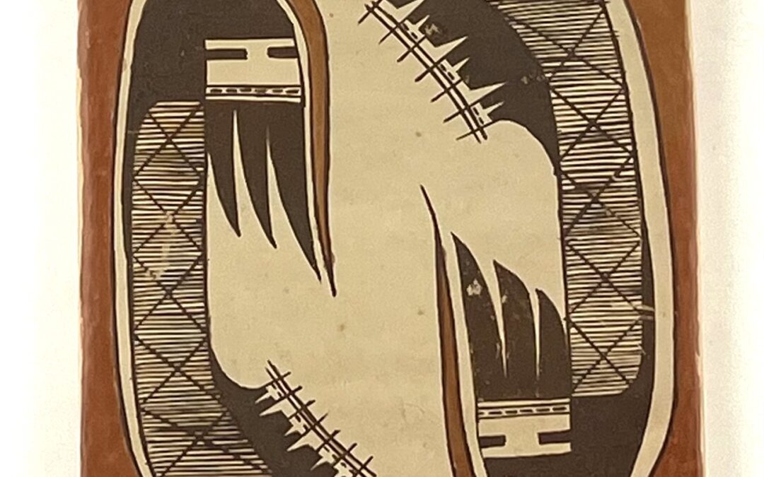
The fine-line migration design has become a standardize design used by potters at Hopi, and, at first glance, that is what one’s eye sees here. Randall Sahmie (1950-2008) is best known for his katchia carvings and painting. He was an extraordinarily creative artist however, and sometimes applied his talent to pottery. Here he has taken the basic migration design and —with only minor adjustment—transformed it into something unexpected: reciprocal images of abstracted long-hair katsinas.
Form:
Just a fraction of an inch off-square, the tile is slightly warped, bowed out on the bottom. The front was smoothed and covered with a slip that fired a pale tan. The back is only roughly finished and is also pale tan.
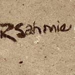
It is signed RSahmie, with the capitalized letters larger, darker and fancier than the rest of the name.
Design:
The standard form of the migration design was painted by Randall’s Mother, Priscilla (1991-05) and his sisters Rachael (2023-01) and Bonnie (2007-05) among others, but on this tile Randall has extracted two of the S-frets from the standard format and isolated them on parallel sides of the tile. On the standard rendition used by Priscilla and her daughters,
“each wing consists of a rounded end cap above three slanted and parallel lines, a ‘two lane highway.’ The upper lane is about twice as wide as the lower and contains 4 or 5 dashes, the number depending on the rendition. Below the right edge of the highway is a set of three conjoint black isosceles triangles (from 2023-01).”
Randall has only slightly modified this pattern and yet produced strikingly different results:
- Half of the rounded end cap has been extended downward, first with a wide segment that then narrows to a thin, long point. The point morphs into a black framing line, then turns a corner and becomes a thicker line forming the base of the figure.
- The unequal width of the two-lane highway below the cap has become even more unequal with the upper lane containing two large dashes, each emerging from a vertical wall and extending about a third of the way across the space. The lower lane has become a very thin unpainted strip containing six tiny dashes.
- The set of three conjoint black isosceles triangles below is unchanged from the original format, except that these triangles curve slightly toward the center of the tile rather than away, the usual orientation.
With these few changes Randal has taken the standard geometric pattern and transformed it into the head of a long-haired katchina, an entirely different (and original) conception:
- The section of the black cap that retains its traditional position has become the short hair over the face.The cap extended downward has become long hair, after which this being is named.
- The central two-lane highway has become both the slit eyes and the mouth of this spirit being.
- The conjoint isosceles triangles below are now seen as his beard.
The torso is the same pattern of large X-forms cross-cut by parallel lines that gives the standard design the label “fine line.” On this tile there are six such large X-forms. The torso is thinner near the head and broadens and curves toward the center of the tile as it descends. Along the inner edge of the lower section is a black design that looks like a series of mesas in profile against the sky. Dan Namingha paintings often show similar silhouettes. Each of he two renditions show 7 mesas, but they are patterned differently. Sprouting from the top of each mesa is a vertical line. Connecting these vertical lines is a pair of horizontal lines that run from mesa 1 to mesa 7. Below these lines, and between each pair of poles, are two tiny dashes, though one of these pair of dashes is missing. If mesas were connected by telephone wires strung on poles, this would be their profile, but no such infrastructure exists.
The design described thus far is black and has a curved back. From the base of the figure upward the space between the back of the figure and the edge of the tile is filled with red paint. This red form narrows as it curves over the head and then further thins as it descends to a point in front of the face. The final shape thus looks like a large red “J” and is separated from the black body by a thin, unpainted line. The shank of the “J” is somewhat thicker in one rendition than the other.
Design Analysis:
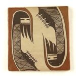
Notice that some of the black paint is worn, particularly on one katchina face. While this is unfortunate, for me it does not distract from the power of the design.
Because the two katchina images are curved, they have motion. Because their orientation is reciprocal, this motion is circular and pulls the viewer’s eyes toward the center of the tile. The red elements frame the design, keep it contained, and encourage the viewer toward the red points of the J at the center of the tile. Thus all of the elements of design center a viewer’s eyes.
As befits this spirit being, these renditions of the Long-Hair kachina are dignified and serene. While the interpretation of the kachina heads is clear, the meaning of the mesa-like pattern is ambiguous. Kachinas bring blessings to the Hopi mesas, so a mesa identification makes sense. Such blessings are bestowed on all the mesas, so perhaps this is why Randall chose to link them with the structure of lines, but this is only my speculation.
Most Hopi tiles display pleasing geometric designs and are merely decorative. The anthropomorphic images on tile 2023-12 create a sacred sensibility about this tile, a blessing.
