
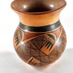
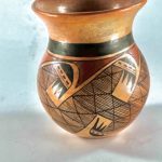
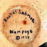
This is a small jar with a graceful shape displaying the classic Nampeyo family migration design. It is included in this collection because of its date of production. Its maker, Rachael Sahmie, was born in 1956; the jar is signed as made in 1974. Rachael was thus about 18 years old when she made this pot.
This collection has XX pots made by Rachael, the most of any potter excepting her great-great grandmother, Nampeyo of Hano. Rachael had been working with clay for about 4 years when she made this jar. This is the earliest pot by Rachael in this collection and thus allows us to see her skills at the beginning of her more-than-50-year career. It exhibits traits that make it a harbinger of the future greatness of this Tewa-Hopi artist.
Form:
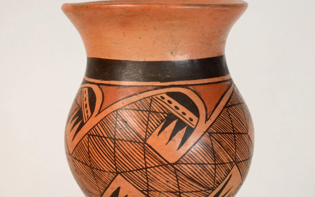
Matt Wood, who sold me this pot, calls this shape “spittoon.” The wide flaring mouth justifies this appellation. The form is unusual, the only example in the collection. Importantly, the diameter of the waist is exactly the diameter of the lip, a unique ratio with a major impact on the visual appeal of the jar.
The walls of the pot are substantial, which gives it noticeable weight. Because pots from Hopi are formed in a puki, their bottoms are often thicker than their sides. That is not the case here. There is one 0.375-inch shallow “ding” on the surface of the neck which seems to have occurred before the pot was polished. (Third photo above.)
The surface of the vase fired to a dark golden color, with variation to a lighter color on the interior, where the heat of dung firing would be cooler.
Design:
All elements of the design on jar 2023-01 are the standard format for a Nampeyo-family rendition of this classic “migration design.” [See the “Category List’ for other pottery with this design in this collection.]
At the base of the unpainted neck is a particularly wide framing line above a thin framing line. There are no framing lines below the design. The design panel is 2.75-inches wide. Pendant from the thin upper framing line is a red element that encircles the jar consisting of a linear upper surface and a 5-pointed lower edge. The points of this band intrude between the wing shapes that mark the upper ends of S-shaped forms that also encircle the jar. This band is the only red design element on the jar.
The 5 S-frets display identical black wing elements at both ends of each fret. Using the upper wings to illustrate the pattern of design, each wing consists of a rounded end cap above three slanted and parallel lines, a “two lane highway.” The upper lane is about twice as wide as the lower and contains 4 or 5 dashes, the number depending on the rendition. Below the right edge of the highway is a set of three conjoint black isosceles triangles. There is a distance of 1.25-inches between these wing tips on either end of a fret and midway between them is 0.6875-inch wide bridge connecting neighboring frets. As a result there is only a small space between the points of the three black conjoint triangles and the bridge connecting adjoining frets. Because the frets are slanted, the top wing of an S-fret to the left points directly at the bottom wing of its neighbor S-fret to the right.
Each S fret has about 3.25-inches between its upper and lower wing ends. In this distance Rachael has painted about 83 parallel lines that fill the inch-wide body of each fret and continue across the connecting bridge to its neighboring fret. These parallel lines encircle the jar and provide the bulk of the design. Crossing these closely-space lines are 5 lines drawn at an angle about 0.5-inches apart within each fret. These more-widely-spaced lines encircle the jar although all but the central line is interrupted by the upper or lower ends of the fret. Visually one imagines that these lines should proceed smoothly around the circumference of the jar. In fact they approach and leave the unpainted space around each wing at slightly different angles, suggesting that they were added to the design last and had to accomodate the already-established design elements.
Design Analysis: An odd number of frets is difficult.
Speaking to Charles King about her work, matriarch Dextra Quotskuyva (Nampeyo) said of the fine line migration pattern:
“This is the one design that was really stressed for us to use, the migration pattern. Nothing but lines, representing the migration of all the people to all the places, incluiding down below and up above. [The pot being discussed] has seven points at the top and bottom. All the x’s represent life from the bottom and top, telling you the universe is one. The thin lines, I just wanted to paint them real fast and real close to try and include everyone (King, 2017:37).”
For a discussion of the problematic meaning that artists at Hopi attach to the “migration design,” please see the discussion in the catalog entry for 2021-17.
As suggested by Dextra, the “migration design” has a special function within the Nampeyo family. Both Priscilla and Rachael explained to me that drawing this design successfully is a graduation exercise for family members. It assumes this function because all the frets are linked and if one element is “off” —say an S-fret that is too slanted— that error is compounded as the design proceeds around the jar and other elements need to respond to the misplacement. If a young potter is able to sucessfully paint this design, she is no longer considered a student but graduates to the status of an independent potter that can produce up to Nampeyo family standards.
Most pots from Hopi have a balanced design: similar design elements are placed in pairs on opposite sides of a jar (Bunzel, 1929/1974: ) Such a format has a practical value. When a design is laid out in pairs, the space for each design element is guaranteed.
Spacing a design with an odd number of elements on a pot is far more difficult. With an odd number of elements, the last element painted might occupy a space that is either too small or too large, thus throwing the design off balance. Try cutting a pie into 7 equal slices.
Of the XX pots in this collection with variations of the migration design, only three have an odd number of frets:
- 7-fret pot 1994-12 by Rachael Namingha Nampeyo, Rachael Sahmie’s grandmother,
- 7-fret pot 1991-05 by Priscilla Namingha Nampeyo, Rachael Sahmie’s mother, and
- 5-fret pot 2023-01 by the young Rachael Sahmie Nampeyo discussed here.
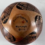
The symmetry or lack of symmetry of a migration design design is particularly noticeable when looking at the bottom of the jar, particularly the shape of its unpainted center. For example, look at 8-fret migration pot 2021-07 by Bonnie Chapella Nampeyo and its perfectly-symmetrical bottom design.
Grandmother Rachael had the skill to achieve almost perfect symmetry of the bottom design of her jar. The unpainted center of Mother Priscilla’s bottom design is not symmetrical. Similarly the residual star-fish pattern on the bottom of jar 2023-01 is not symmetrical, though Rachael comes closer to this ideal than her mother.
In short, while the painting of jar 2023-01 is not perfect, by the age of 18 Rachael Sahmie Nampeyo was making pots that were every bit as good as her mother’s and easily meeting the Nampeyo family’s standard of quality.
Design Analysis: Unusual characteristics of jar 2023-01.
This small jar has four notable features:
1) One expects the base of a jar from Hopi to be thicker than its walls because the pot was built from a slab of clay in a puki. That is not the case here, with the bottom of vase 2023-01 the same thickness as its walls.
2)The small base and upward thrust of the “spittoon” lip makes this jar seem to be floating off its base. The expanding lip seems to lift the body of the jar off the surface on which it is placed. That would be true of any jar with this lip shape, but it is particularly effective because the radius of the lip is the same as the radius of the waist. The effect of the out-flairing lip, therefore, is oversized, seeming to pull the (relatively) small-waisted jar upward. Moreover, the identity of size between the lip and waist of the jar give it a particularly graceful shape.
3) The strikingly-wide framing line focuses attention and arrests the eye.
4) The approximately 83 parallel lines that fill the interior of each of the 5 frets are not perfectly-spaced but rarely touch. To fill the design Rachael had to draw about 400 straight lines in a design panel only 2.75-inches wide. The ability to consistently draw so many straight lines in such a constrained space shows remarkable control of her small yucca brush. The resulting lines are almost identical to the pattern her mother Priscilla painted on migration pot 1991-05.
Of these four notable characteristics of pot 2023-01, Rachael’s ability to form even walls and her precise control of her yucca brush became marks of the excellence of her pottery for the next 48 years, including vase 2022-14 that I bought from her shortly before her death. That she demonstrated such talent so early in her life is an indicator of the fierce creative talent Rachael embodied.
