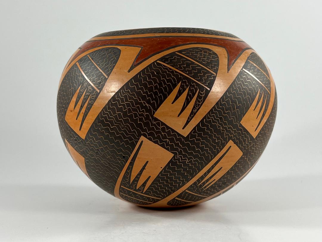
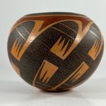
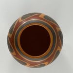
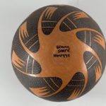
The “fine-line migration design” on jar 2021-07 is iconic to Nampeyo family pottery and is used as sort of a graduation exercise. If a young potter is able to draw this pattern, she is considered a successful artist by her family. Since this collection contains seven generations of Nampeyo family pottery, it also contains many renditions of this design. One skillful example of the traditional format is by Bonnie (2007-05). The complexity of the design makes it a good test of skill, but the family has produced thousands of pots with this design over the last 125 years and my eye has become somewhat indifferent to the pattern. On jar 2021-07,Bonnie has introduced an innovation into the migration pattern and, as a result, the painting on this jar seems fresh and exciting.
Form:
The jar has substantial but not heavy, walls of consistent thickness. The base is only 1-inch wide, the waist about 5 times wider, and the mouth spans 2.5-inches. As a result the bowl seems visually light. Overall the shape is somewhat bulbous, like a sphere with a small patch sliced of its base and a larger slice removed from its top. The inside has been sanded smooth; the exterior is so finely polished that striations from the polishing stone are difficult to distinguish. The unpainted areas of the exterior display a rich golden-orange blush with no variation in color. Either Bonnie used a slip that she knew would fire this color or the outdoor dung firing was so well-controlled that it resulted in the even color.
Design:
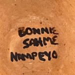
A fraction of an inch below the lip is a 0.3125-inch wide framing band. Just below this band is a red element with a smooth upper surface and 8 pointed lower edges that also encircles the jar. The points of this red bands intrude between the wing shapes that mark the upper ends of 8 S-shaped forms that parade around the surface of the jar. This band is the only red design on the jar. Crossbars at the midsections of the S-frets link each long form to its neighbors. As is usual with this design, the wing ends have a rounded cap set above a linear section. Below to the right are a set of three isosceles triangles of slightly different lengths, the tallest toward to outside of the wing. Below to the left of the linear section is the beginning of the body of the S-fret that terminates on the bottom of the jar with identical wing ends. Thus, with 8 S-frets on the jar there are 16 depictions of these wing shapes. When viewed from the bottom the 8 lower wings created a residual, unpainted, form that looks like a starfish, its center displaying the name”Bonnie Sahme Nampeyo.”
The design is well-done, graceful and serene and exactly the format we expect to see on a pot carrying this design. The typical rendition of this migration design (2012-20) has the interior of these frets filled with a series of large “X” shapes drawn over a background of closely-drawn parallel lines.
This is where Bonnie innovates her design. I believe Bonnie painted all of the elements of her design solid black and, after the paint dried, took a sharp stylus and etched wavy lines into these black designs. The thin scratch lines are the rich orange-gold color of the surface underneath the paint: gold lines against a black background. Inscribed into the black paint of the framing band, and perpendicular to the lip, are 86 short wavy lines. This is the first time I have seen a framing band that was not simply solid black. As near as I can count, another 592 wavy lines decorate the interior of the eight S-frets. At the midpoint, where bridges of design link the frets, the wavy lines extend from the right edge of one fret to the left edge of its neighbor. The etched lines are mostly parallel, but occasionally touch or are broken. There are about about 7 or 8 waves per inch, the drawing being irregular.
Design analysis:
The result is elegant, like a beautiful woman dressed in an all-black outfit, accented with a single red rose and gold jewelry. The one red element grabs attention and focuses a viewer’s eye to the top of the design. The painting is very controlled, as evidenced by the perfectly-balanced residual starfish shape on the bottom of the jar, which would have been unbalanced if any element of the design had been out-of-place. The pattern of etching is subtle and a viewer’s eye is attracted to the textured richness, trying to understand its sparkly surface. The slight irregularity of the waves enlivens the design, like the unbalanced elements Nampeyo frequently painted on her pottery to the same effect. Lines across the connecting bridges help link the S-frets. All the colors of the jar have a rich, luxurious tone, reinforcing the attraction of the etching. The traditional design, having become uninteresting by repetition, now appears refreshed and engaging.
Pueblos along the Rio Grande to the east of Hopi began to etch thin-line designs on their pottery in the 1970’s. These Rio Grande potters influenced the first generation of male Hopi/Tewa potters such as Thomas Polacca (2005-09) and Wallace Youvella (2017-11) who were trying to define their own style of pottery. It’s just speculation on my part, but perhaps these stylistic trends also influenced Bonnie.
Bonnie’s older sisters (Jean, Nyla and Rachael) live at First Mesa and are renowned potters. (Though Jean retired and now lives with a daughter in Phoenix.) Perhaps because Bonnie has lived off-reservation in Winslow for many years and is removed from the necessary raw materials, she makes relatively little pottery and is known for her quilts. When she has made pottery (see Artist List), her pots are relatively small. Jar 2021-07 is one of her larger pots.
All people make choices in life, including Hopi-Tewa artists. Bonnie decided to focus her talents elsewhere, but jar 2021-07 is both an interesting contrast to her traditional version of the design (2007-05) and a reminder of the extraordinary talent she has when she choses to work with clay.

