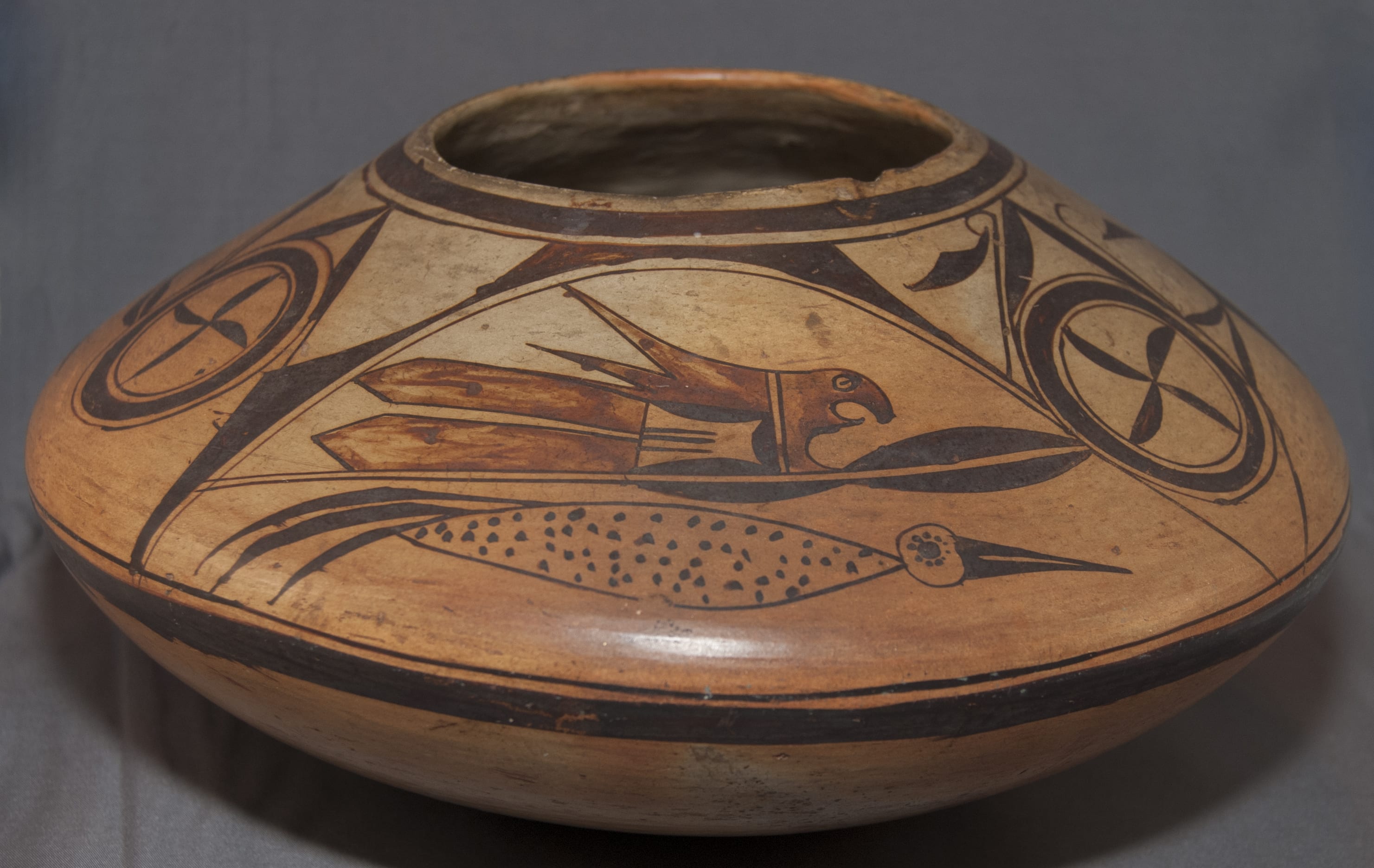
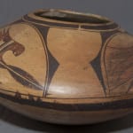
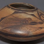
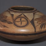
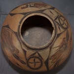
This is a Hopi pot, made of Hopi clay using Sikyatki Revival form and techniques and probably made at First Mesa about 1900-1905. However the design has strong Zuni elements. The iconography is full of spirit, motion and humor – a classic piece of American folk art. A careful examination of the design allows us to sequence the order of the painting and have some insight into the maker’s creative process. There is a theory, discussed below, that it was made by a Zuni woman who married a Hopi man and lived at First Mesa for many years.
Her work is easily as fine as the finest work of Nampeyo. Because of her promotion by ethnographers, traders and the Harvey Company, Nampeyo became the first Naive artist individually recognized by the Anglo world. Pot 2011-28 is evidence that there were other artists contemporary with Nampeyo who also were exceptionally-skilled. We just do not know their names.
Form:
This is a large pot and from its base to its waist (widest point), the clay feels quite thick. The upper surface slopes 4.875 inches from the waist to the mouth. This surface is somewhat thinner than the bowl-like base, though still substantial. This pattern is often found on Hopi jars with a sloped upper surface since, if the wet coils of clay that form the top surface were too heavy, they would collapse when wet. Because of the thickness of its walls, the pot seems quite heavy for its size. I’m not sure if the pot is slipped. If it is is, the slip has not crackled or flaked and appears to be made of the same color clay as the body. As expected, the surface is stone-polished. As expected of pots made with Hopi grey clay, one side of the jar, both above and below the waist, has lightly blushed orange where the heat of the fire was hottest. The shape is characteristic of ancient Sikyatki pottery (1375 to 1625 CE ) but was not used for Polacca ware (1780 to 1900 CE).
Design:
Almost all of the design is painted on the sloped upper surface. The design has thick-over-thin framing lines at its top edge and a second thin-over-thick framing line painted just below the pot’s waist. Both sets of framing lines have spirit breaks. Framing lines are not characteristic of Polacca ware but were common on ancient Sikyatki pottery. Thus both the clay, shape of the jar, and the framing lines are Sikyatki conventions being reintroduced at Hopi, ca 1890-1905..
The design can be thought of as consisting of three sections: 1) pairs of birds with a linear element between them, 2) the arches over each pair of birds, and 3) circular rosettes with an internal pinwheel and associated curlicues and leaves/flowers. With the exception of the rosettes, each of these designs appears three times on the jar.
Of the three pairs of birds, the top bird is the most dramatic, but the bottom three birds are slightly different from each other and thus I will use these differences to label the pairs. I cannot identify the species of these long, sleek birds, but they remind me of cormorants, so that is the name I will use.
Cormorant #1 has a single thick black feather as a tail, with a thin black line below it. Its partner parrot above is also labeled #1.
Cormorant #2 has three thick tail feathers. Its partner parrot above is also labeled #2.
Cormorant #3 has a single red feather as a tail, with a thin black line below it. Its partner parrot above is also labeled #3.
Bottom birds, cormorants:
Coolly moving to the right at the bottom of each arch are streamlined birds that seemingly glide along, like cormorants under water. (I realize that it’s been a geological age since there was enough water at Hopi to consider cormorants.)
Cormorants #1 and #2 are monochromatic and have circular heads with long, pointed beaks divided by a thin unpainted line. Cormorant #1 has a simple circle with a central dot as an eye. On cormorant #2 the eye circle is solid black and is orbited by 10 dots of black. Behind the heads on both birds is a 3.5-inch long lens-shaped body, though the lower edge has a bit of a sagging belly. Largely unpainted, this body is decorated with 60 to 64 black dots. At their rear, each bird has a tail composed of long arched black feathers. The tail on cormorant #1 has one large and thick feather drawn over a thin curved second feather. Cormorant #2 displays a tail with three large, thick black feathers.
Unlike the other two, cormorant #3 is not monochromatic. The shape of the head and the bill is the same as its siblings, but the central eye is a large solid black dot. Unlike the other two, his bird has plumage on its head and neck. Two smaller curved feathers rise from its head; a large curved single feather emerges from the juncture between its head and body. The body behind the head is again largely unpainted and decorated with about 60 black dots. It too is lens-shaped with a sagging belly, but it is an inch shorter than the other two bird because its rear point has been truncated and thus it ends with a flat border. Three casually-drawn parallel lines follow, a two-lane “highway.” Emerging from the rear of the upper half of the highway is a relatively large, curved red tail feather, pointing down. The line that forms curve of the belly just ends in mid-space at the rear of the bird. Drawn above it and continuing past its end is a thicker black line in the form of an arch that curves up past the end of the two-lane highway and then reverses direction so it curves downward parallel to the red tail above. Just above this thin line and just to the left of the two-lane highway is a dot of red paint. The gap between the belly line and the curve above seems unplanned, the result of the kind of spontaneous decisions that characterize folk art.
Top birds: parrots.
Because of the shape of its bill, the top bird is easily identified as a a parrot, a bird that is not native to the U.S. Southwest but was an ancient trade item from what is now Mexico. Two effigy pots of parrots in this collection have the same head profile as the birds on this pot, 2016-09 by Rachael Sahmie and 2019-06 byMichael Hawley. On this pot the heads and the immediate area around them are red, the mouth open, and the eye glaring. Their concave mouths are paired with a second concave area below, forming an odd sort of wattle.
Parrots #1 and #2 have the same format, parrot #3 is a bit different.
Behind the head areas of parrots #1 and #2 are two parallel black lines with an slight unpainted space between them, a one-lane “highway. To its left and immediately behind the head the red design continues as a broad swath that then branches into two pointed and curved tails. Below and still to the left of the highway there is a rectangular area that is substantially unpainted. However the right and the top and bottom walls have solid-black thin hills affixed to their sides. The left wall lacks such a hill but is simply marked with a thin black line. Growing out of this line and pointing right toward the head are parallel black lines, three in once case and four in the other. To the left of the line are two long and solid red tail feathers with pointed tips.
Parrot #3 has a somewhat different format of design behind the head and, as a result, its body is a bit wider. A particularly narrow one-lane highway separates the head from the following design. A 0.375-inch wide rectangle of largely unpainted space follows, its left boundary another one-lane highway. This space spans the entire width of the bird’s body. Internal to it and affixed along the length of its right wall is solid black hill of substantial width. To the rear is the same design element we saw in the first two birds: an open space bounded on three sides by low black hills, the remaining side a line with five parallel lines growing from it. However on this third bird this familiar element has been turned 90 degrees so the parallel lines point up rather than right toward the head as on the other two parrots. To the left the design continues in red as with the other two birds, but this rendition has three pointed and curved tails on top instead of two. Below are the same red pointed feathers seen on the first two birds.
These perky parrots are the most alluring image on jar 2011-28. The birds are very energized: riding those big red tails and racing forward, mouth open like the classic photograph of a person screaming as they top the crest of a rollercoaster and headed down a long drop. Because the cormorants are painted closer to the waist of the jar, these sleek lower birds are longer than the parrots above them, seem to surge ahead of the parrots, and have a more confident, calm and demure presence. The contrast in color, shape and sensibility between these two avian elements gives the design energy and an abundance of humor.
Below all three parrots are two parallel thin lines. Above and below the right ends of these lines are low black hills. Below parrots #1 and #2 are pairs of hills each pair forming a coffee-bean shape. This design below parrot #3 has a different format: only one black hill is drawn above the line and two below, forming one coffee-bean image and a single black half moon.
The arch over the birds:
There is an arch of design over each pair of birds, but it is fully-realized over only one pair. Such elements are common on Zuni pottery and are called “deer houses” since they often contain an image of a deer with a heart-line. These arches are rare on Hopi pottery. Over the 3rd set of birds, a thin curved line rises off the lower framing line and forms a complete symmetrical arch. Above it is a thicker arch composed of two pairs of linked triangles that at the apex merge with the thin framing line above. Over pair #2 the thin arch is skewed to the right. The left leg of the thicker arch above is complete, but the right leg has only one black triangle because the arch is truncated when it reaches the rosette to its right. Over pair #1 of birds, neither the thin arch nor the thicker arch above are complete since the right leg of each terminates when they meet the rosette to their right. Of the three solid triangles along the upper arch of this pair, the left-most is well-formed, the top triangle is distorted by being squished against the upper framing line, and the right-most seems squeezed into the small remaining space and is right skewed.
It may be worth noting that Nampeyo herself employed the Zuni “deer house” motif seen on 2011-28 on at least two of her jars. See Wade and Cooke, 2012:156 and a large jar in the collection of The Denver Museum of Art catalog #1929-72, photograph on file.
The rosettes:
Between bird pairs #2 and #3 is a circular rosette, its center a propeller of four black blades, the same elements we saw as hills internal to the parrots and below them organized as halves of coffee beans. The circular form is composed of a thick black line flanked by one internal and one external thin circle. This circular form is supported like a marble in a “V.” Two long solid blade shapes rest against each other over the circular design, their tips touching. Parallel to the flat outer edge of these blades is a thin hook shape, curved end upwards. From each end dangles a solid black triangular form, like a flower hanging from a stem. Another set of set of black blades in a “V” format emerges over the 3 o’clock position of the circle, its point to the right. The 9 o’clock position on the circle has no such ornamentation.
Between bird pairs #1 and #2 is a second, simpler rosette. It contains the same four-blade center and circular format as the first rosette. The circular design touches flanking design elements but is left hanging in midair with no lower support. Crowning the rosette are the same two black blades touching at their tips that we saw above the first rosette, but these lack the attendant crooks and flowers.
Between bird pairs #3 and #1 there is no rosette, leaving an unpainted area roughly in the form of an hourglass, about 1.25″ wide at its waist.
The design process:
The painting on jar 2011-28 is exceptional, easily equal to the quality of Nampeyo’s finest work. However, the sequence of designs on this jar is distorted and incomplete.
Our discussion of the decoration on jar 2011-28 allows us to 1) infer the sequence with which it was painted, 2) imagine the thinking of the marker as she tried to fit her design into a limited space and thus 3) explain the design imbalance. Bird pair #3 is the most detailed and full-developed and I believe it was the first design painted on the jar. The painting proceeded to the left from this point. The circular center of the rosette to the left of bird pair #3 was painted with flourishes of design added at the 12, 3 and 6 0’clock positions. At this point the artist realized that her lateral unpainted surface was more limited than her design intention and so did not add an external design at the 9 o’clock position on this rosette. Together this bird and its associated rosette occupy about 37% of the pot’s circumference. Obviously repeating this pair of elements three times would have exceeded the pot’s 33-inch circumference. The artist then drew the thin arch along the left edge of this first rosette and added bird pair #2 under it, but substantially shortened the length of the parrot by eliminating one design element used in the body of the first parrot image. Even with these adjustments she found that she had no room to complete the right leg of the thick outer arch over this stack of birds. To the right of bird pair #2 she drew her second rosette but eliminated all but the upper external flourish to gain more lateral room. Both arches over the final set of birds (pair #1) have shortened right legs. Had these arches been completed, bird pair # 1 would have to have been shifted to the left, thus using up more valuable design space. The remaining space to the left of this third set of birds is not sufficiently wide to hold a third rosette, hence we find three sets of birds but only two rosettes on jar 2011-28. Instead of the expected third rosette, we find the hour-glass shaped unpainted space.
Modern versions of pot 2011-28:
One of the stated purposes of this collection and website is to make available to present-day potters the work of artists of prior generations as a source of inspiration. Several years ago Mark Tahbo saw jar 2011-28 on this website and was apparently struck by its design. He began using variations of the bird pairs on his pottery:
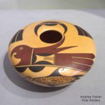
By Mark Tahbo
His friend, Racial Sahmie, also began using the distinctive parrot and cormorant images on some pots. After Mark’s death, I asked Rachael if she would make me a pot using elements of design found on jar 2011-28. She decided to replicate pot 2011-28 and it joined this collection as 2020-03. Rachael has great skill and an extraordinarily active artistic imagination, which is why this collection includes more of her pottery than any other artist, with the exception of “Grandmother” Nampeyo. She is also aware of the standards of the marketplace in 2020. Thus, unlike the maker of jar 2011-28, Rachael planned her spacing carefully and completed the arches over all the pairs of birds. However, she adhered to the original format by replicating the original bird pairs as depicted 100+ years ago and maintained the two-rosette layout. Thus we are able to see pot 2011-28 with its beauty and flaws and then click to 2020-03 and see the “same” pot with some of its inconsistencies corrected. It’s an odd sort of “before” and “after” experience I associate with advertisements for skin-care products and home decoration shows, but instructive nevertheless.
So why is there a Zuni-derived design on a Sikyatki-derived pot form?
A set of about a dozen Hopi pots with Zuni-derived designs is known and the disjunction between place of origin and design has long intrigued Ed Wade and a number of other Hopi scholars and collectors. Ed has written that:
As late as the turn of the 20th century Pueblo women marrying into a different ethnic community were expected to cease production of their former pottery and adopt the ceramic traditions of their new home (Wade and Cooke, 2012:91).
If the maker of jar 2011-28 moved from Zuni to Hopi, her stylistic transformation was incomplete.
In an article in the Spring/Summer 2002 issue of Plateau, Ed wrote that:
“….prior to (Nampeyo’s Sikyatki) revival came a brief but brilliant moment when Nampeyo and a few other master Hopi potters turned their eyes to the broader Pueblo world in search of the birds who had fled the northlands centuries before. One of these unknown potters adapted the old Zuni style with its rosettes and ‘deer houses’ into a canary cage for a perky plumed feathered friend. This fleeting period between 1898 and 1905 preceded the full commercial success of the new Revival pottery that would channel Hopi aesthetic experimentstion into an increasingly narrow expression (2002:60-61).”
Wade illustrates his discussion with a photograph of a jar decorated with this Zuni style.
Jar 2011-28 in this collection seems to be by the same hand.
Eleven years after the Plateau article, working with a couple of other Pueblo pottery scholars, Wade has located 10 vessels possibly by this potter, of which 2011-28 is probably the most recent. One of these 10 pots, looking like a classic Zuni vessel but made of Hopi clay, is in the Weisel Family Collection now in the Fine Arts Museums of San Francisco (Robb and D’Alessandro, 2014:55). One is in the Arizona State Museum, Tuscon. The rest are in private collections. Reading a draft article by Wade and others, it is apparent that there is not yet in agreement about the source of these 10 pots. Wade is most convinced that the collection was produced by a single person; another author is substantially more unceetain. Similar rosettes appear in many of these 10 pots; “deer houses” are apparent on most. The designs on 9 of the 10 pots contain parrots, but the open-mouthed avain seen on 2011-28 is found on only 6 of the 10, as near as I can tell from small photographs. In addition, the authors have identified an eleventh jar, probably made by the same potter, and sold through Dewey Galleries in 1985, current location unknown. From the Dewey advertisement it seems that this jar has rosettes, deer houses and open-mouthed parrots very similar to those on jar 2011-28.
It’s difficult to be sure from a single-view photograph, but the “parrot-over-cormorant” pairing found jar 2011-28 in this collection is found on 7 of the 11 jars identified in the Wade et al. article (including the jar advertised by Dewey Gallery). Ten of the jars jars were made in the late 19th century. Jar 2011-28 was likely made about 1900-1905 and is the most recent pot in this set. All the other jars have an olla shape; seedpot 2011-28 has the flying-saucer shape characteristic of both an Sikyatki potters snd the Sikyatki Revival promoted by Nampeyo. Thus both age and shape distinguish the pot in this collection from other Zuni-influenced Hopi pottery.
More recently Ed Wade and Allan Cooke have published a second book focused on Nampeyo and the Cooke Collection. In it Ed presents examples of these Zuni-influenced Hopi pots, dissects their iconography, and speculates about the background of the maker (2022 forthcoming: 59-62). These pots carry versions of the parrot/cormorant and arch/rosette designs found on jar 2011-28. It seems that all of these pots were the product of the same hand, though Ed acknowledges that they may have been made by potters working within a single family’s tradition. Recently (3-18-22) I was able to examine one of the other pots in this set now in a private collection. Its owner believes they were all made at Third Mesa, where the Zuni influence on Hopi was strongest, and were made by a variety of potters. Pot 2011-18 is part of an intriguing creation mystery that is likely to remain unsolved.
In any case seedjar 2011-28 is a masterpiece of pueblo art, folk art, and American art. It was made at about the time that Nampeyo was at the height of her design skills and thus is direct evidence that there were potters at Hopi that were of similar skill level to Nampeyo but whose careers were never recorded. We do not know the name of the woman who made seedjar 2011-28, only the beauty she created.

