

-
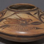
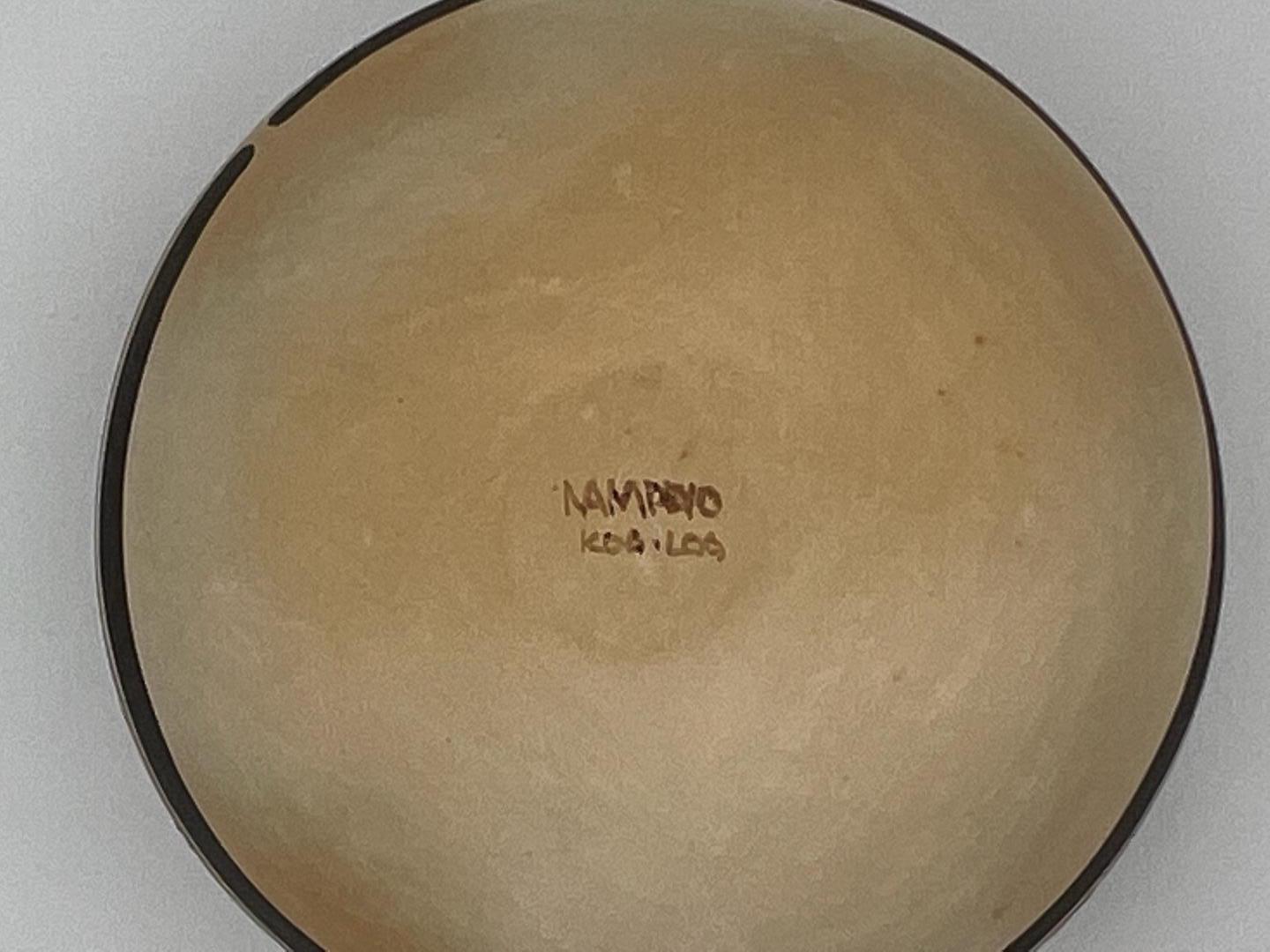
- Jar 2011-28 made ca. 1900-1905

This small seedjar jar sits firmly on a table, but it does not sit alone.
Rachael used 100+ year-old jar 2011-28 in this collection as a model for pot 2020-03, but also exercised her artistic license to modify both the form and design as she saw fit.
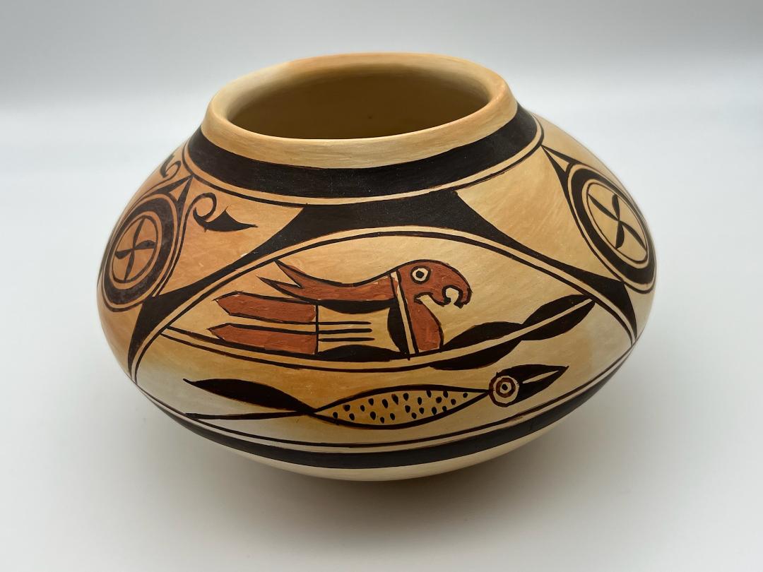
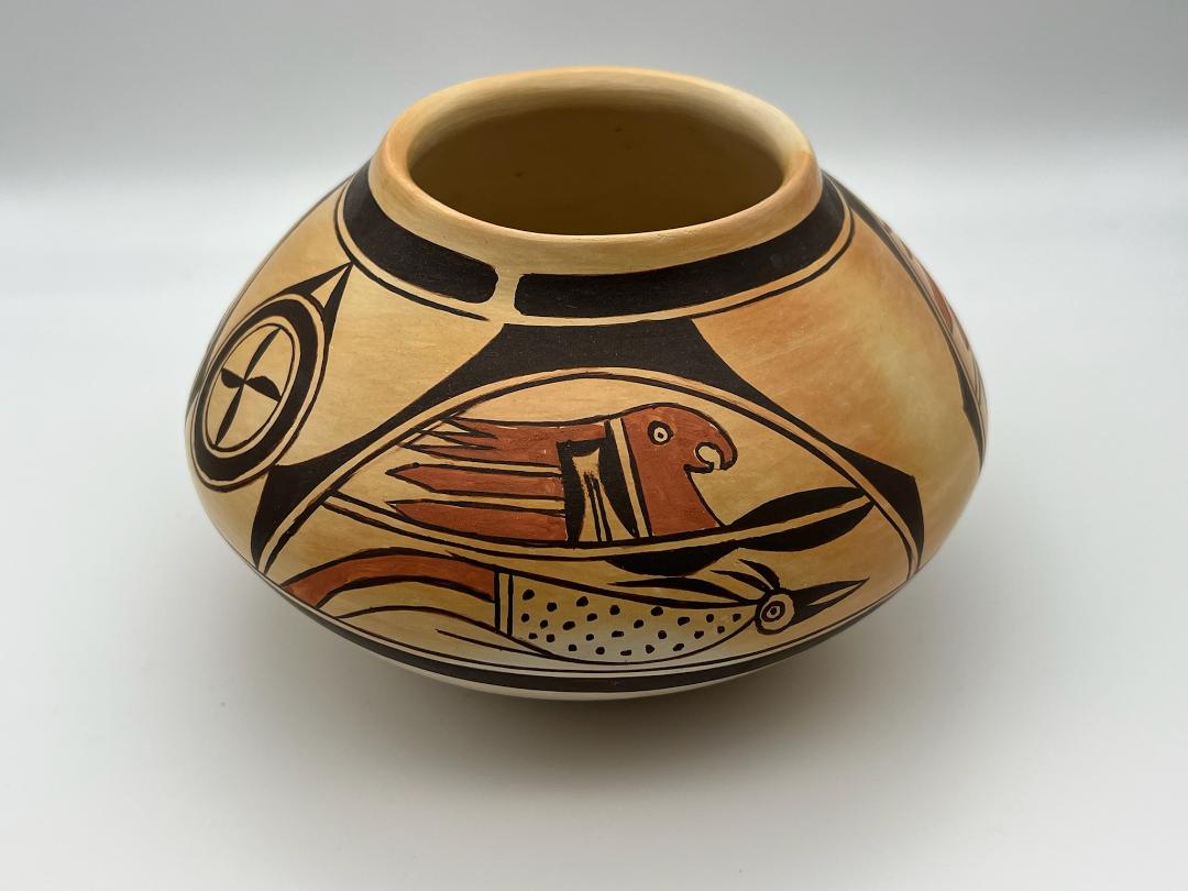
The older pot: Seedjar 2011-28 is particular in that it carries Zuni iconography on a pot made of Hopi clay, with a Hopi shape and Sikyatki Revival framing lines. The artist, probably a Zuni woman who married into Hopi during the late nineteenth century, was an exceptional artist. Her painting is easily equal to Nampeyo’s best. However, as a folk artist, she innovated as she painted the band of design on the pot and began to run out of space as her painting progressed. As a result, the “deer houses” over the paired birds are complete for only one pair of birds and the houses over the other two pairs are progressively incomplete and distorted. Moreover what I believe to be the first parrot painted is more elaborate –and takes more room– than the subsequent parrots. Finally. I believe that the maker of 2011-28 intended a rosette to follow each bird pair but she ran out of room and left an hourglass gap where the third rosette “should” be. For the details, see the catalog entry for 2011-28.
Rachael Sahmie has extraordinary artistic vision and skill and as a result this collection has more pottery by her than any other modern Hopi potter. Faced with the imperfections of the original pot, Rachael decided to copy most –but not all– of the design elements seen on that pot. Her modifications and sequencing of the design distinguish this jar from the original.
Form:
The walls of Rachel’s jar 2020-03 are substantial and even but not thick. The form is taller and less saucer-shaped than the older pot. About two-thirds of the height of jar 2020-03 is above the waist. This shape creates a relatively wide upper surface to paint the design. However, this new pot is dramatically smaller than the older pot; the upper surface of pot 2020-03 is about 60% as wide and its circumference 56% as long as the older pot. Given that the maker of the original pot constrained her design format due to space limitations on a larger surface, reproducing this design on the dramatically smaller space of jar 2020-03 was a major challenge for Rachael.
The pot is lightly blushed from the firing, particularly on the upper surface in two areas.
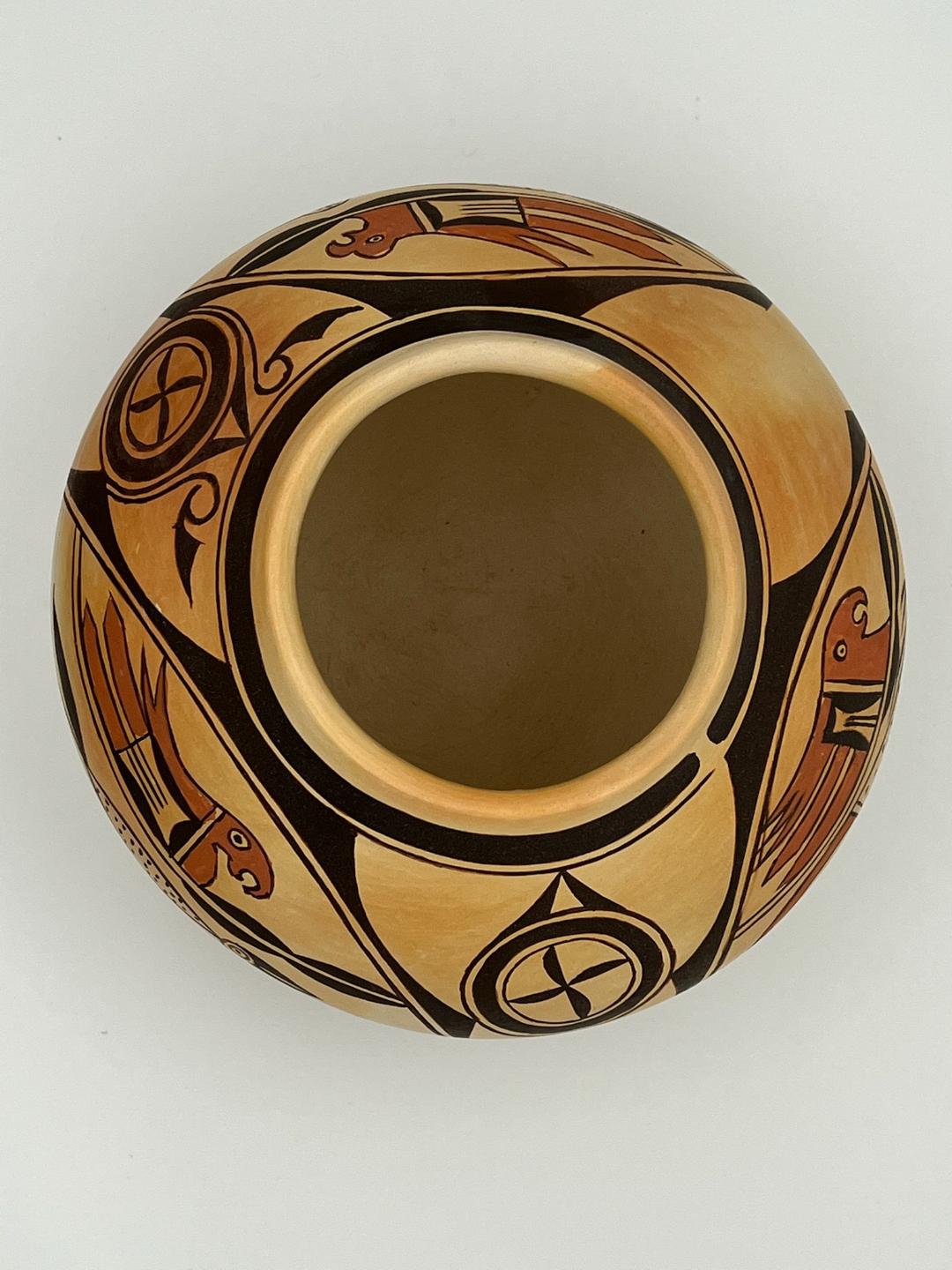
As on the older pot, Rachael drew sets of framing lines both above and below the band of design and incorporated spirit breaks in both sets.
Design:
The bird pairs:
Rachael chose to replicate the basic design of the older pot. The parrot-over-cormorant pairing remains the same. Thus my discussion of the design on pot 2020-03 will use the same identification labels as was used for the original version.
Cormorant #1 has a single thick black feather as a tail, with a thin black line below it. Its partner parrot above is also labeled #1.
Cormorant #2 has three thick tail feathers. Its partner parrot above is also labeled #2.
Cormorant #3 has a single red feather as a tail, with a thin black line below it. Its partner parrot above is also labeled #3.
It’s hard for me to know how to evaluate the design on pot 2020-03. On the one hand it stands alone as a piece of art and can be evaluated in its own right. On the other hand, Rachael clearly was looking at images of historic pot 2011-28 when she painted her pot and I can evaluate how closely she replicated the original design.. I’ve decided to ask the reader to review the catalog entry for historic pot (2011-28) and use that discussion to understand the aesthetic of Rachael’s new pot. I will not repeat the full discussion of the design here. Instead I will use this catalog entry to point out how closely Rachael’s pot matches the original made more than a century ago.
For bird pair #1, all of the elements of design are the same, but on Rachael’s pot the beak of the cormorant is thicker, the eye relatively larger and neither the thick black tail nor the thin line below it are curved, as they are on the older pot. The parrot above has a thicker and less sharp beak and both varieties of red tail feathers are stubbier than on the original.
For bird pair #2, the cormorant has the same elements as on the original and the proportions and sensibility of these elements is very much the same, excepting the lens-shaped body is a bit more streamlined. The parrot’s mouth has a somewhat different shape and the upper red tail feathers behind are again a bit stubbier than on the original.
For bird pair #3, the cormorant is very much like the original, including how the bottom edge line of the belly extends beyond the body form. The body is not quite as bulbous as on the original. There is a substantial deviance from the original in the tail of the cormorant. The red tail does not narrow towards the tip, as on the original, and the thin black line below it is not as curved. The small red dot of paint above and at the base of the thin curved line on the original is missing on Rachael’s pot.
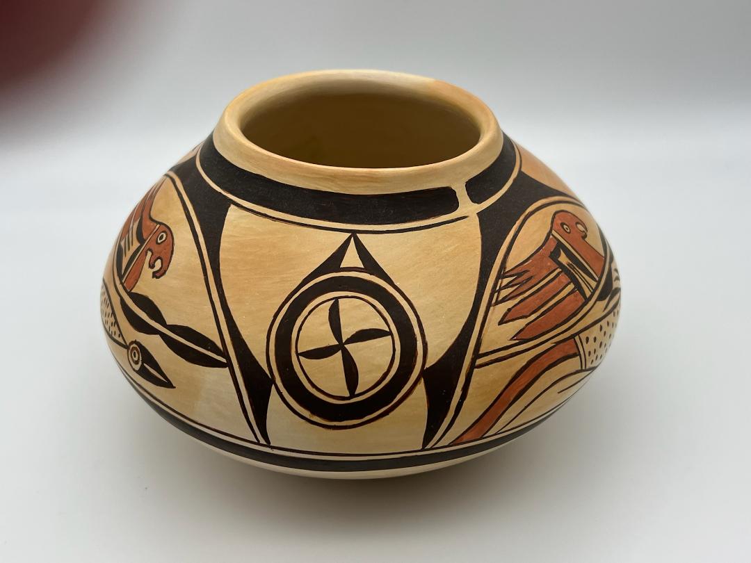
Ironically the format of parrot #3 on Rachael’s jar contains the largest variance from the original. On older jar 2011-28 this parrot is the most fully-developed: 1) it has one familiar element turned 90 degrees from its orientation in the other two parrots and 2) has three upper tail feathers, one more than on the other parrots. These elements are captured by Rachael, though 1) Rachael has only two thin lines in the 90-degree element while the original has five and 2) the relative sizes and shapes of the upper three red feathers and the two lower linear red feathers are out of proportion to the original. Most strikingly, the original pot parrot #3 contains one design element not seen on the other two parrots, a vertical rectangular space behind the red head with a solid black hill affixed to its leading wall. This element is missing from Rachael’s pot. On the original pot I believe that parrot #3 was the most fully-developed because it was painted first, before the artist realized she was running out of room. On Rachael’s pot parrot #3 seems to have been painted last and she realized she was running out of room and thus truncated the original design. Even missing the one element that is in the original, Rachel’s parrot #3 is crowded in its space, its upper three red feathers touching the thin inner arch above.
The arches over the birds:
On the original ca 1905 pot, the maker drew complete thick-over-thin arches over only bird pair #3, but was constrained from doing so over the other two pairs because of space limitations. On pot 2020-03 Rachael corrected this imbalance by taking the complete set of arches painted on the original pot and setting them over all three pairs of birds. Note that this adjustment used additional lateral space.
The rosettes:
The original ca. 1905 pot had two circular rosettes in its design layout, one more simply designed than the other. Rachael has followed this format. The simpler rosette has a center composed of a propeller of four black blades. Around it is a circular element formed by a thick black line flanked by one internal and one external thin circle. Two long solid blade shapes rest against each other over this circular design, their tips touching. The rosette is supported by points from the flanking thick arches that touch it at about 4 and 8 o’clock on its circumference. This is exactly the format used on the older pot, except that the older rendition is only supported at the 4 o’clock mark.
Rachael’s more elaborate rosette also follows the pattern set on the original jar, with modifications. This rosette has all the features of the first plus some additions. Parallel to the central circle and then the flat outer edge of each top blade, is a thin hook shape, curved end upwards. From the end dangles a solid black triangular form, like a flower hanging from a stem. These same elements appear on the original jar, but Rachael has organized the original layout and made it more symmetrical. The original version of this rosette rested in a V-shaped element and the the design of the touching blades at the top of the circle was repeated in the 3 o’clock position. Both of these design elements are missing on Rachael’s jar. Instead she supports this rosette as she did the first, simpler, rosette.
On the original jar, the elaborate rosette was placed to the left of bird pair #3 and the simpler rosette to the left of bird pair #2. Rachael has changed these positions, with the elaborate rosette placed to the left of bird pair #1 and the simpler rosetted found to the left of bird pair #3.
As on the ca 1905 pot, Rachael has left an unpainted hourglass shape in place of an expected rosette #3.
The design process:
On the original pot I believe the design was painted in the order: bird pair #3 followed by bird pair #2, then bird pair # 1. See the catalog entry for pot 2011-28 for the reasoing behind this conclusion. This sequence moves clockwise around the jar. On Rachael’s jar, because parrot #3 seems most squeezed into its space, I think that bird set #3 was painted last by Rachael when she had used up most of her design space. I believe she started her painting at the right edge of the hourglass form and painted bird set # 2 first, then bird set #1 and finally bird set #3. This sequence moves counterclockwise around the jar.
Both artists painted the elaborate rosette before the simple, but because the order of painting the bird sets was changed, the elaborate rosette lands up between bird sets #3 and #2 on the older jar and bird sets #2 and #1 on Rachael’s version. It follows that the simpler rosette is between bird sets #3 and #1 on the older jar and #1 and #2 on Rachael’s jar. As with older jar 2011-28, we get some insight into the painting process by paying attention to the details of space and sequence on jar 2020-03.
In short, although she uses the same basic design elements found on older jar 2011-28, Rachael’s jar is also fundamentally different because 1) Rachael’s jar has a much different shape, 2) she completed the arches over all three bird sets, 3) she modified details of several design elements, and 4) by changing the direction of painting and order of the bird sets, she changed the placement of the two rosettes. Thus while pot 2020-03 at first seems like a simple reproduction of older pot 2011-28, it has the same spirit but its design is an approximation of the original.
Both the woman who made jar 2011-28 and Rachael miscalculated the space necessary to full realize their original design intention. I smile in response. It pleases me greatly that two such masterful artists working more than a century apart found themselves in the same predicament when trying to draw this design. Life on the Hopi mesas has changed a great deal since the turn of the last century. It comforting to know that some of the challenges of being a pottery artist have remained the same.
