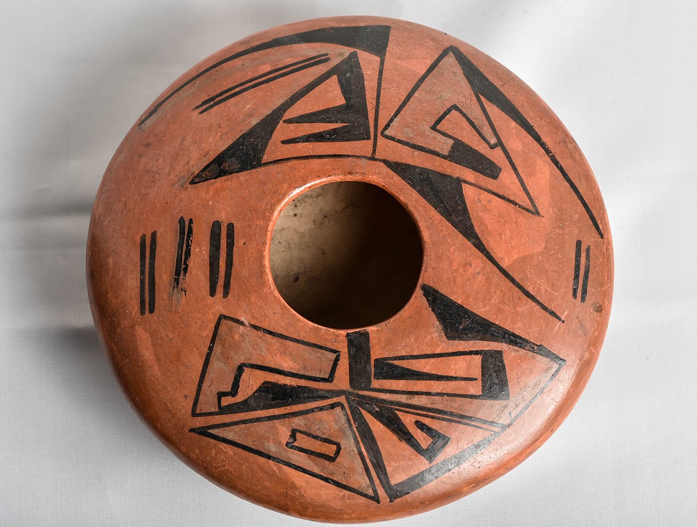
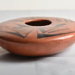
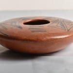
This seed pot is spectacular in form with an unusual abstract decoration.
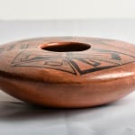
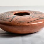
The vessel rises symmetrically from its base to form a bowl, then curves inward to enclose the opening of the bowl, leaving a 2.5” mouth. The junction between the bowl and the top is particularly well-rounded, giving the jar a singular, organic shape. So flat is the top of the seed jar that about 75% of the pot’s overall height is accounted for by the bowl base; from its maximum width to the seed jar’s mouth the height of the pot increases only 0.68 inches. The flatness of this upper surface is striking, the only comparable example in this collection being utility seed jar 1986-01. To form such flat upper surfaces is extraordinarily difficult since wet coils of clay tend to collapse without support. All parts of the seed jar have walls of even thickness, but the top surface is noticeably thinner that the bowl-shaped bottom.
Of the 600+ pots in this collection, this jar has the second highest width-to-height ratio: 2.965, meaning its width is about 3 times its height. [The only jar with a higher ratio is 2007-11, a seedjar by Nyla Sahme with the extraordinary ratio of 3.854, which cracked during firing.]
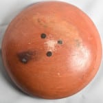
Judging from the color of the clay body revealed by the unslipped interior and a worn spot on the bottom, jar 2015-04 is constructed of gray clay. This clay may be slightly micatious, as can be seen in the interior but not on the small area revealed on the bottom. The exterior of the seed jar was slipped with yellow clay (“sikyatska “) that turned dark red upon firing. This red color is not even, but curiously blotchy at several points on both the upper and lower surfaces.
The decoration of the jar is totally abstract. Until very recent times, such abstraction has not been characteristic of Hopi or Hopi-Tewa pottery, with Nampeyo being the exception.
The design on jar 2015-04 perhaps can be best understood as a doodle. Somebody was having fun here.
The design on this jar, and hence the discussion of this design, is complex.
To clarify
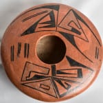
- I have numbered 15 different elements of shape so that my references are not ambiguous. (Photograph #2, above.)
- Five areas of the pot have a fugitive bluish-white color and I have labeled these area with letters A through E to distinguish them from the numbered shapes.
For this discussion of the design on jar 2015-04, orient the jar so that the singular set of parallel lines (#1) is to the right (at the 3 o’clock position) and the grouping of three sets of parallel lines (#2) is to the left (at the 9 o’clock position). Thus one set of angular design is below the mouth of the jar and one above.
A glance at jar 2015-04 shows a design that looks pleasant but random.
A longer and studied look reveals a complex structure of design.
The following analysis will reveal six design strategies.
Carefully-placed at different points on the surface, similar forms and similar color link the design elements on jar 2015-05 into a complex unity of interactions.
First: Three designs on seed pot 2015-04 are angular variations of an open crook, two in the lower set of designs moving in a counterclockwise direction (#4 and #5) and the one to the left in the upper set moving clockwise (#6). Notice that all three of these angular crooks have a different form.
Second: Three sickle blade elements grace the upper set of design, although they are not exact replicas of each other. To the left one scythe (#8) points to the left and curves down along the rim of the jar. This image is almost mirrored to the right, although this upper right sickle shape (#9) is placed further from the edge of the jar. Directly below it is the third sickle element curving up (#10), though its base is more triangular than the top two renditions. Together two sickle shapes (#8 and #9) frame the top right quadrant of the seed pot’s design and surround other elements in much the same way that Nampeyo’s curvilinear elements surround the feathers on her “eagle tail” pots (cf 2005-16).
Third: As noted above, sickle shaped element (#10) has a triangular base out of which emerges its “blade.” This triangular shape is repeated five times on the surface of jar 2015-04, twice in the top (#10 and #11) and three times in the bottom set of designs. (#12, #13 and #14).
Fourth: In the top left quadrant of the design is a single set of long parallel lines (#16) that mirrors the shorter single set to the right (#1) and the three sets of lines in the 9 o’clock position (#2). Patterson (1994) has argued that Hopi pottery symbols have meaning. On katchinas such sets of parallel lines may represent Corn Mother and on a seed jar such sentiment would make sense, but set among the other elements of doodle these lines are equally likely to be unburdened of meaning.
Fifth: in the top right quadrant there is a thick and curved element that is has been referred to as a “key,” (#15). It has an open interior and a solid black tail. A similar open-interior key is found in the lower left quadrant (#3) and an open-interior triangle occupies the bottom center position of the jar’s design (#7).
Note that the L-shape key in the lower left quadrant (#3) has one step built into the interior crook. Stepped designs are an ancient symbol for rain clouds and are seen on pre-historic Hopi Jeddito ceramics (cf 1994-15) and modern Sikyatki Revival ware (cf 2010-22). So ubiquitous is this stepped symbol that I suspect that the painter of this pot simply spontaneously incorporated it into the design rather than using it with intention. Again, it could be argued that a rain symbol on a seed jar is appropriate and intentional, but among the overall pattern of design I would suggest that this is “cherry-picking” and likely misleading. This pot was painted about 110 years ago, so interpreting the meaning in the mind of its creator is inherently problematic.
Finally: The open interiors of elements #3, #7 and #15 are painted with a fugitive whitish-blue color (A, C and D). Two other areas of this color float freely in the design, unbounded by a surrounding shape (B, E).
The EBay listing of jar 2015-04 had good photographs and seemed to show areas of light bluish-white paint, but the color was so thin that it was difficult to be sure what I was seeing. In a phone conversation shortly after I purchased the jar, Ed Wade said that when white kaolin clay is over-fired, it tends to take on a bluish hue. Moreover I know that sikyatska yellow clay (which fires red) has a particularly fine-grained and smooth surface and painted designs on such a surface easily rub off and become thin. White kaolin clay is also fine grained and so the combination of the white on red clay is highly likely to rub off or at least rub thin. Thus I conclude the the painter of jar 2015-04 intended to highlight five areas of the design with white color and what we see is a pale and miscolored evidence of her intent.
In summary: These six patterns of form and color link areas of design so that what at first glance seems a random doodle, on studied analysis becomes a highly interconnected pattern. The wonder of creation is that for all its internal order, the design still seems spontaneous and delights the eye.
Reasons to believe that Nampeyo formed and painted bowl 2015-04:
Nampeyo was a superb shaper of clay and there are documented examples of her work, including the Smithsonian example below, that have the same extraordinary flat top as jar 2015-04. Wade and Cooke define a Nampeyo design strategy they call “curvilinear abstraction…indigenous modernism (2012:127, 132-133).” Given the difficulty of form and its unusually abstract design, I purchased seed jar 2015-04 thinking that it likely was both formed and painted by Nampeyo.
Bowl 2006-11 in this collection has a clear example of a “curvilinear abstract” design by Nampeyo. The design on jar 2015-04 is very much the same style and seems to be by the same hand, including a triangular shape at the base of design for both pots. I have never seen an early 20th century Hopi or Hopi-Tewa potter other than Nampeyo employ such an abstract “modern” design. Nampeyo’s designs are often formed of simple elements creating an interconnected overall pattern. Such internal logic of design is not found in the work of her daughters of later Hopi or Hopi/Tewa potters. This internal structure of design on jar 2015-04 is what makes a typical Nampeyo pot “great.” Moreover, Nampeyo also painted black designs on red clay (cf 1988-01 in this collection) and black-and-white designs on red clay (cf Blairs, 1999: XVI, fig 3.22C).
Annie seemed to be able to paint both in the style of her Mother and in her own lighter, more delicate style, so I expect she had the skill to work in her Mother’s “curvilinear abstraction” style if she had chosen to do so. However, I am not aware of any pots that were painted by Annie using this abstract style. Barbara Kramer writes that:
“Annie was a fine technical potter, but her designs were not as spontaneous as her mother’s nor did she improvise with varying design elements (1996:162).” Bowl 2015-04 is an exceptional example of innovative painting, so Kramer’s observation reinforces my sense that Annie was not the painter of this pot.
Finally, a similar jar attributed to Nampeyo is part of the collection of the National Museum of the American Indian, Smithsonian Institution (catalog #26/459):
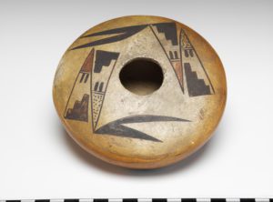
264459
The museum estimates that their pot was made about 1920. As near as I can tell from the one museum photograph, the form of the Smithsonian pot and 2015-04 are very similar. The designs on the two bowls show similar abstract elements, though the design on 2015-04 is more complex. These similarities help validate pot 2015-04 as “by Nampeyo” and suggests a date for its creation.
For these reasons I believe that Nampeyo likely both formed and painted jar 2015-04 and doubt that Annie was involved in its production.
Reasons to believe that Annie Healing formed and painted bowl 2015-04:
There is a contrary argument that we ought to consider, however. It can be argued that Annie was both the potter and the painter of jar 2015-04.
Ed Wade has pointed out that Nampeyo typically built her designs on jars by painting a central motif around the mouth and then “growing” other design elements from this central core. (cf 2005-16).
Annie, Wade commented, was less likely to use a centering focus on her jars. I have been quite certain that Nampeyo formed abstract bowl 2006-11 in this collection. However, if Annie in fact painted seed jar 2015-04, my attribution of Nampeyo as the painter of bowl 2006-11 may be erroneous. On the other hand, the abstract design on jar 2015-04 breaks all Hopi painting conventions, so the lack of the “typical” central motif does not necessarily imply that Nampeyo was not the painter.
Some of Barbara Kramer’s research inclines us towards Annie as the painter:
“…..Annie’s typical work was recognizable: she liked to paint black and black-and-white designs on red slip…Certainly she did not always paint black or black-on-white designs on red-slipped vessels. They happen to be the most easily recognizable (Kramer, 1996: 162 and also 172).”
Thus the slip and paint colors on jar 2015-04 are typical of Annie’s work, though the design is not. Also there are flat-topped jars like 2015-04 that are attributed to Annie Healing, evidence that she had the skill to form this jar. In short, based on the evidence of form, slip, paint colors and the lack of a centering motif, it is reasonable to believe that Annie might have both formed and painted jar 2015-04.
I conclude:
What is striking about jar 2015-04 is the abstract design. Since a) Annie was not inclined toward innovative design elements and b) I do not know of similar designs by Annie and c) I believe that Nampeyo painted a similar “curvilinear abstract” design on bowl 2006-11, I conclude that Nampeyo both formed and painted jar 2015-04. The documentation of the similar Nampeyo jar in the Smithsonian collection reinforces my belief. If later research finds documented examples of Annie painting in this style, then based on her affinity for black and white paint on a red background, I would change my assessment and conclude that Annie probably formed and painted jar 2015-04.
Authorities agree that the overlap of the ability between Nampeyo and Annie can make it unclear who painted what, so our uncertainty is common.

