
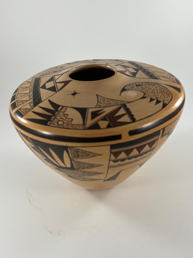

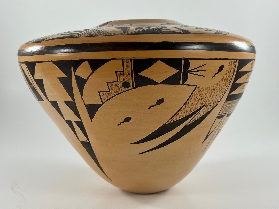

The conical form of this pot makes it unsteady, though visually dramatic. It is not particularly large, but because of its unusual shape virtually all of its surface is visible and available to decorate. Eleven unattached design motifs float across this broad surface: traditional on top and radically innovative on the sides. Both form and design are done with a high degree of skill. Jar 2021-11 is evidence of Alice Dashee’s exceptional imagination and ability. Alice has been making pots since 1970, is of the Eagle Clan, and lives at Polacca on First Mesa. The collection has only one other pot painted by her (2014-02) and its design is also exceptional.
Form:
From a small 1.75-inch base, the walls of the vessel expand outward 5.75-inches to the waist and then turn abruptly inward to form a 2.875-inch-wide flat surface. This flat top rises slightly at the mouth, which is 2.00-inches wide. The jar is 4.43 times wider than its base and gives the impression of soaring off a table on which it is placed. This ratio also makes the jar top-heavy and always ready to tip over and shatter. It’s a beautiful but not very practical form, much the same shape as Nathan Begaye’s extraordinary 2018-10 jar. This impractically of shape is also shared with Jake Koopee’s tall svelte jar 2013-08, which can barely stand on its own. Rachael Sahmie offers a particularly large version of a small-base jar (2012-01). I think the precariousness of these shapes makes viewers uneasy and heightens attention. Its a clever artistic strategy, but also a threat to the physical safety of the pots.
The walls of jar 2021-11 are even and substantial. The weight of the jar is surprising given its light form. There seems to be an endless supply of clay dust inside the pot.
Design:
Alice ground her paint well. The colors on the jar are deep, solid and rich. Both black and red paint are used, but the red is closer to a brown-maroon color. At Hopi red paint is simply a yellow “sikyatska” clay that is ground to a powder and mixed with water to the desired consistency. In firing, the yellow turns red. There are multiple sources of sikyatska on the reservation and the clay color varies, resulting in a variety of bright red tones on the fired pots. I have not seen this brown-maroon color on a pot from Hopi before and am not sure if it is the result of an unusually colored sikyatska or if Alice chose to mix some black paint into the yellow slip to darken the fired color.
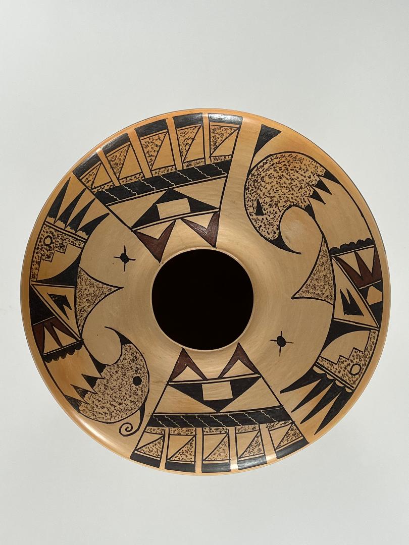
The designs on the top and the sides of the jar have strikingly different formats. The top has 3 design elements, each repeated twice. In contrast, the sides of the pot display 8 patterns of design and none are repeated; they are simply presented laterally.
Top designs:
Ruth Bunzel spent the summers of 1924 and 1925 interviewing pueblo potters, including those at Hopi and including Nampeyo. The author spent a good deal of time trying to understand the principles of design used on Native pottery and quotes Nampeyo as saying:
“The best arrangement for the (wide shouldered) water jar is four designs around the top, —two and two, like this (indicating the arrangement). The designs opposite each other should be alike (1929/1972:41).”
This convention of paring designs on opposite sides of a design space is still typical today at Hopi and is the convention followed by Alice Dashee on the upper surface jar 2021-11, although she places a tiny third element among the larger forms.
The top of the jar carries three designs.
Design #1:
The first design is a quite realistic image of a bird, a frequent motif on pottery from First Mesa. The two depictions are substantially the same, with some variance in detail. Both have elegant, stippled heads with curved black beaks and triangular black eyes. One displays a curlicue topknot, the other’s topknot is triangular. The stippling slightly branches into four stubs at the base of the neck. Each stub is caped with a black triangle set against an unpainted surface. At the far end of this unpainted segment five small conjoint hills (“gumdrops”) rest with their bases against two parallel lines, a “one lane highway.” Following is a rectangular section cut diagonally by a one-lane highway running from upper-right to lower-left. The triangular space above the diagonal contains a black element with two triangular peaks. Below the diagonal the space is bifurcated by a one-lane highway at right angles to the diagonal. Both sections display “foreground/background reversal,” where the background and foreground forms keep changing places. The right section contains a red element in the form of a base with three points pointing right, a triple crown. Two large while triangles form residual elements pointing left. The design can be seen as white triangles against a red background. The left area below the diagonal is most easily seen as an unpainted triangular space with three smaller black triangles in each corner, though it can be seen as a solid black space with a white traingle in the center, its points truncated.
The design in the next section is also complicated. The lower left half the space is occupied by a large stippled staircase with an unpainted dot in its base. The diagonal corner above contains a right triangle with a curved hypotenuse. The residual unpainted surface between is thus curved on one edge and has a stepped shaped on the other edge. Following another one-lane highway are four black blade-shaped tails. The bases of these tails, against the highway are unpainted but take different forms. On the bird with the curlicue topknot these bases are simple roughly-define unpainted elements. On the other bird, these elements take the form of unpainted “gumdrop” hills.
Design #2:
The second top design is a presentation of tail feathers that extends from the jar’s mouth to the edge of the upper surface. Two red and asymmetric “V” shapes top the design, their tips pointed upwards, the points of their ends resting on a one-lane highway. Below the highway a large black pyramid points downward, its center an unpainted square. Below a second one-lane highway is a 0.375-inch wide black strip. The design in this strip is inscribed. A parallel line has be scratched a fraction of an inch below the top edge. Below were inscribed 7 or 8 wavy lines, the number varying between the two renditions. Immediately following (without an intervening highway) are four 1.125-inch rectangular tails. Their base is stippled with inset unpainted right triangles. Following one-lane highways, they have squared-off black tips.
Design #3:
Just above the tails of the two birds, about halfway to the jar’s mouth, are small solid-black dots. Emerging from these dots in the four cardinal directions are short, thin, lines.
Side designs:
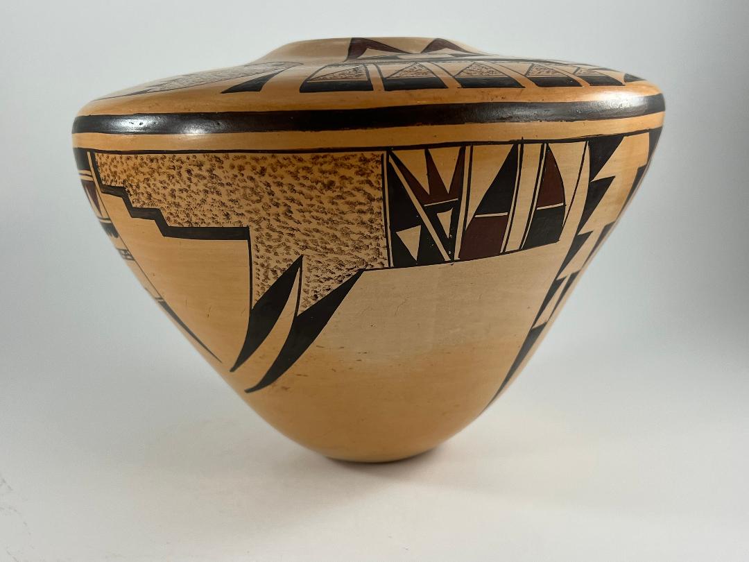
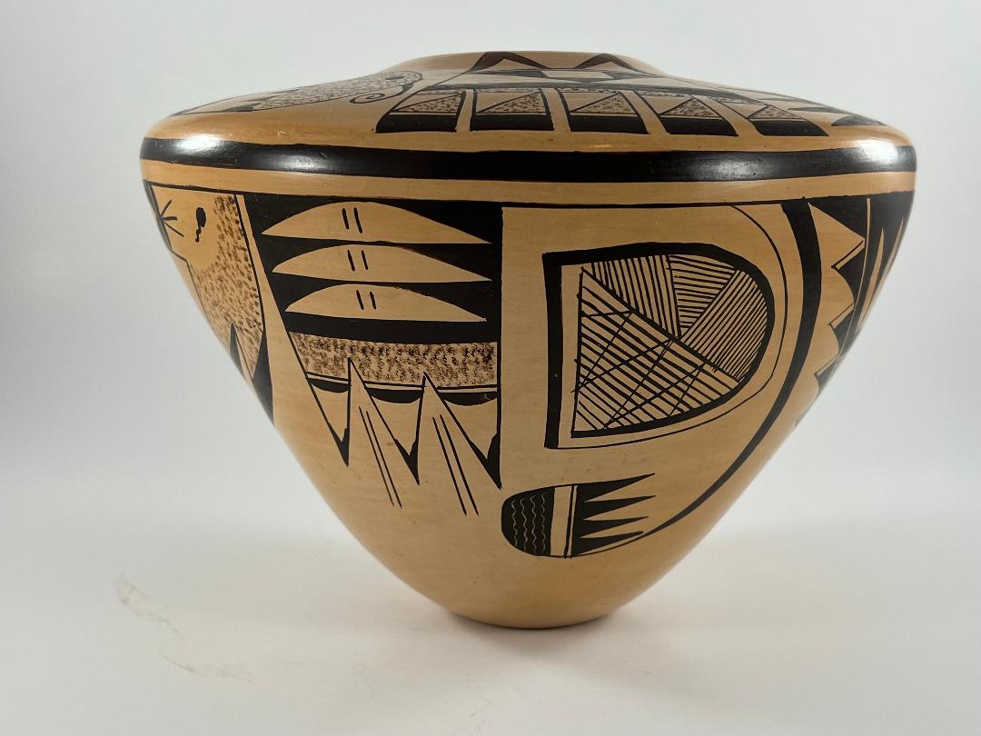
Below thick-over-thin framing lines, a parade of eight discrete design motifs parade around the circumference of the jar. All eight designs emerge from the thin framing line. While they incorporate a few elements regularly found on Hopi pottery, most of these designs are unique to this jar. Of the eight designs on the side, one is 6-inches wide and the widest on the jar. Our discussion will start there and move to the left. Note that designs # 4 and #5 contain three red elements and the remaining six side designs are monochromatic.
Design #4:
The bulk of this design is a wide band. along the thin framing line The right segment of this band contains two forms in the shape of wide knife blades, points upwards. The blades are divided internally by a horizontal unpainted line. The tip of the right bland and the base of the left blade are painted red. A 0.25-inch unpainted space separates the two blades, its edges one-lane highways. To the left is a section of design that is bisected by a one-lane highway running from upper left to lower right. At right angles and above this diagonal is a tiny unpainted line, dividing the space into upper and lower sections. The upper section displays a smaller version of the red crown we saw on the top surface. The area below is a black triangle with an unpainted triangle at its core. The lower triangular section below the diagonal is solid black with an embedded unpainted triangle that mirrors its neighbor to the right.
To the left of these two sections is the largest design element on the pot, a broad stippled expanse whose right lower edge has the form of two triangles, followed to the left by a straight edge followed by a kiva stepped edge. Based on the stippled triangles and swooping downward and to the left are long, curved, black feathers.
Design #5:
This design is basically box-shaped with two points off its lower edge. The top is a wide black bar, its lower edge a two-lane highway. Below is a space with four red equilateral triangles pointed downward and thus two halves and three whole residual unpainted triangles pointed upward. Following is a one-lane highway with seven conjoint small black hills (“gumdrops”) based on the highway and facing a wide unpainted area. Notice also that there is space for another half a gumdrop. Alice seems to have fractionally miscalculated her painting. The middle of this wide unpainted space is bisected by a thin, intricately designed bar. The bar began as a two-lane highway. Imposed on top of this design is a zig-zag line with 11 points and two half-points. The result looks like a woven tapestry. Below there is considerable unpainted space but extending from the lower corners of this space are two different feather images.
At this point the design gets oddly complicated: similarity embedded in contradiction. The feathers are different: the right is pointed, the left has a square end. At the base of the right (pointed) arrow is a one-lane highway. From there to the point the arrow is black. The square end of the left feather has no highway divider and is subdivided by a diagonal, thus creating two internal triangles. The right internal triangle is black, the left unpainted. Comparing the right and left feathers, they have different shapes, but both display black triangles, though the orientation of these triangles is different. Comparing the right and left triangles, they have different shapes, but both contain triangles with the same orientation, though their colors are different. Usually feathers emerging from the same base are of the same shape and paint design. Alice has chosen a different strategy here and the resulting visual pattern is complex.
Design #6:
I’m not sure what word would describe the overall shape of design #3, perhaps “prickly.” It’s a conglomeration of triangular forms. The central element is blade-shaped. Adhering to its outer edge are additional triangular elements, those on the right quite different than those on the left edge of the blade. Internally the blade is divided into a broad upper section and a pointed lower section. The upper section displays “foreground/background” reversal. It is perhaps most easily seen as painted solid black with three leaf-like form growing from its base. Alternatively the section can be seen as essentially white but with black borders surrounding two downward-pointing black elongated triangles. A one-lane highway divider is expected here, but is missing. The bottom design fills the end of the blade and is therefore triangular. It is filled with a crosshatch of 12 vertical by 9 horizontal lines, somewhat casually drawn.
The right edge of the central blade supports four isosceles triangles. These are double-walled. The inner triangles are filled with 10 to 14 horizontal lines. The narrow space between inner and outer triangles is stippled. The left edge of the central blade has four smaller sawteeth and a larger black triangle against the framing line. These are separated from the central blade by a one-lane highway. The sawteeth have an unpainted edges.
Design #7:
The design is a 4.5-inch long sweeping curve, thicker at the base and narrowing to a long, thin point. Attache to the upper end of this point is a substantial rendition of the “bear claw” element, more often seen as the terminal element on pots with “fine-line migration” design (cf. 2019-10). As is usual, the front edge of the bear claw is a solid black dome, followed by a linear space, then a one-lane highway followed by a set of four long, thin and conjoint isosceles triangles. The relatively heavy bear claw looks like it might snap off the thin point of the long curve on which it rests.
Design #8:
Within the space encompassed by design #4 is a large (almost) double “D” shape. One “D” form is inside the other, yet neither has the complete shape of the letter. The outer “D” shape is a branch of the thin framing line, curves outward as it descends, then turns back parallel to the framing line above. To complete the “D” shape it would need to bend upward, and it does, but transforms into a thick line. This thick line then rises, turns, descends and turns back to its start, almost completing the complete form of “D.” However, just before closure it stops. The dome-shaped space internal to this heavy-line “D” is patterned with thin lines. The space is cut by a diagonal. Below the diagonal is a roughly triangular space that is crossed by 13 horizontal lines. Zig-zagging across them is a three-pointed line. The domed space above the diagonal is cut into three wedges, like pieces of pie. All three are decorated with fine lines, but the pattern in each contradicts the pattern in its neighbors.
Design #9:
This design is slightly wedge-shaped with three feathers at the bottom. The top half of the design has three white lunettes embedded in a black background. Each lunette has two small vertical lines at its widest point. Below is a substantial stippled area that can be seen as ending with a one-lane highway.
Then things (again) get complicated. The stippled area ends with a one-lane highway followed by triangular, downward-pointing, arrows. At the base of each arrow is a black hill (“gumdrop”) followed by an unpainted arrow-shaped space caped by a sharply-pointed black “V.” Thus there are three arrow images within this one element: 1) the outer form, 2) the internal unpainted space and 3) the black tip. But the complexity does not end there. Alice has extended the black edges of each arrow until it intercepts the edge of its neighbor arrow and forms a point. The resulting two upward-thrusting arrows extend past the base of the downward arrows and into the stippled area, calling attention to their presence. Moreover, in the open lower end of these upward-thrusting arrows, Alice has drawn two parallel lines, suggesting (perhaps) arrow shafts, further focusing a viewer’s eye on these oddly-positioned upward arrows. In short, not only do the downward arrows encompass three arrow forms, but these open-ended upward arrows add a fourth counter thrusting arrow element.
Design #10:
This is the second widest design on the exterior of the jar and has an overall form somewhat like the widest (Design #4). The top of the design is a wide band of elements that has two wing elements descending from its lower right edge. The remaining lower edge is distinctly concave. The wide band is a jumble of elements. Its top right corner is stippled and is the largest form in the design. At its center a tadpole lazily swims upward. The lower stippled edges divide into two points. These points are them mated to black blades to form larger blades that sweep down from the corner of this design. The top left edge of the stippled area is bounded by a one-lane highway. Based on this highway, and intruding to the right into the stippled space, are two conjoint hills. From the valley between them emerge a fan of three straight lines. On the left side of the highway is a black rectangle with an unpainted diamond at its center.
Following another one-lane highway is an area containing six elements whose format is almost identical to the last body segment of the bird, immediately above it on the top of the pot. The lower left half the space is occupied by a large stippled staircase with a black dot in its base. The diagonal corner above contains a right triangle with a curved hypotenuse. Set into this triangle is an unpainted wedge. Between the black triangle and the stippled kiva steps is a residual unpainted surface, curved on one edge and stepped shaped on the other edge. The lower left corner of this design segment is a small black triangle, forming a nascent version of the two wings on the opposite corner.
Overall, design # 10 gives the impression that this was the last design space painted and Alice wanted to use as many leftover motifs in the space as possible. dada art.
Design #11:
This is a simple, downward-pointing black isosceles triangle with slightly concave sides. Inset into it are a series of four unpainted and upward pointing triangles. Like those images of a string of bigger fish eating littler fish, the triangles subsume each other. The lowest triangle is almost complete, with only its tip disappearing inside the triangle above. The second triangle is further engulfed by the triangle above, with each succeeding triangle more truncated than the one before.
Design analysis:
The top surface of jar 2021-11 carries traditional Hopi design elements and has the traditional format of paired elements. The elegant upper surface is all about feathers, attached to birds or otherwise. In contrast, the side designs are largely unique and are not paired: each design motif appears just once. This contrast creates tension and eye appeal. Moreover the use of empty space around all elements highlights their form and increase their visual impact.
Dark maroon paint is used sparingly on the pot, so that when casually seen the design looks monochromatic. The maroon color enriches, but the “almost monochromatic” coloring is understated. Drama on jar 2021-11 is not defined by color, but by the shape of the jar, the contrast between top and side decoration and the unusual design motifs on the vessel’s side.
The minor differences in design of the birds on the top surface (Design #1) are intentional. It’s likely that one is male and the other female. Notice that both sections at the core of these birds are diagonally subdivided. One body section of the birds has a simple linear diagonal. The design in the next section is also subdivided, but here by the sawtoothed right angles of a kiva-step form. Variation adding interest.
Design #2 contains several particularly interesting design strategies: 1) The top maroon-red “V” elements point to the mouth from both sides of the jar and draw the viewer’s eye to this opening. 2) Moreover, these “V” elements reflect the single large black “V” on which they sit, unifying the design. 3) Unexpectedly the middle panel of design #2 is inscribed, adding an element of glittering interest.
While the format of the top and side designs are strikingly different, there are a couple of linkages, First, the red W crown internal to both birds on the top (design #1) is echoed by a smaller red version of this crown in design #4 on the side. Second, design # 10 on the side is linked to the bird immediately above it on the top: both incorporate kiva steps next to a residual lunette, also with stepped edges.
My first impression of design #5 is that it is boringly box-shaped with two pendant feathers. A more considered look sees interesting features, then a surprise ending. The four red triangles are elegant surrounded by dark-black elements. The central band with lines and zig-zags pleases my eye and looks like a woven belt. It’s a bit jarring to have the two terminal feathers be of different shapes, but the interaction of their shape and internal design produces a fascinating pattern. The left feather both doubly reflects and doubly contradicts the feather to its right. They contradict because the tip of the left feather is square and the tip of the right feather is triangular. Because the left square tip is internally subdivided into triangles, the left unpainted half has the same triangular orientation as the neighboring right feather but a different color. The right black half of the square tip also has a triangular shape, has a different orientation than the right feather, but the same color as that feather. Parallels within contrasts: what a treat.
The boxy form of design #5 in sharp contrast to prickly pointed form of its neighbor, design #6, and this change of form keeps a viewer’s eye engaged. Alice has drawn crosshatched areas on both design #6 and #8, thus visually linking them.
Design #9 again plays with arrows, to great visual effect. The embedded unpainted lenses that occupy the top half of this design are of no particular interest. The lower half, however, is engaging. The three terminating and black feathers in this design emerge from a stippled area and point downward. What is unusual is that Alice has extended upwards the defining edge line of each of the three feathers so that each edge line intersects the edge line of its neighbor. They meet above the one-lane highway within the stippled space. As a result, they form reciprocal arrow shapes headed upward. The downward moving black-tipped arrows are visually predominant but the two lighter reciprocal upward arrows are larger and they compete for attention. The two parallel lines inside these upward forms are like arrow shafts, further attract a viewer’s attention to this contradictory design. Downward and upward moving arrows, all in the same design band. It’s an unexpected surprise.
Apparently Alice was is fond of playing with arrows. Like design #9, design #11 uses triangular forms to create interest in the design. The overall shape of the motif is a large downward-pointing black triangle, but the internal white triangles. thrust upward. This contradictory movement increases visual interest. Addition tension is created as the internal triangles subsume each other.
Jar 2021-11 has a dramatic shape. The warm glow of the surface and the stark black and subdued red colors are elegant. The traditional designs on the top surface are graceful; the innovative designs on the side are engaging. Dramatic, warm, elegant, graceful, innovative and engaging: jar 2021-11 is a jewel.
