
Hopi is a matriarchal society. This is a clay tile by an artist of paternal Hopi descent who grew up at Zuni, currently lives at Zuni, and was trained as a potter at Hopi by Dextra Quotskuyva Nampeyo, the leading Hopi-Tewa potter of her generation. It is made of commercial clay, was kiln-fired, and carries a throughly abstract, modernist design done with acrylic paint after firing, though the design was inspired by ancient Native petroglyphs. Compare this tile to another tile by the same artist (2016-02). That tile is also commercial kiln-fired clay, but the design is a throughly traditional Polik’Mana figure. However it’s not really a painted tile at all since the design was painted on cloth that was glued to the tile backing. But the cloth was a remnant from the artist’s mother who used the cloth to create ceremonial clothes that were used at Zuni.
Les is certainly of Native background, but given the commercial materials from which they are made and the European form of the design on tile 2022-07, are the two tiles by Les in this collection authentic “Hopi-Tewa,” “Hopi” or even “Native art”?
The question itself is likely inappropriate:
Isn’t art simply art, whatever its origin? Why should an artist of Native background be constrained by her or his heritage? Polik’Mana tile 2014-10 by Nampeyo is my standard of a classic Hopi tile, though Nampeyo was Tewa, not Hopi, and her tile form was an Anglo-inspired invention in the late 19th century. Neither tile by Les Namingha fits the Nampeyo standard, which confuses me. Les is not constrained by his Native heritage, but grows from these roots in a totally self-directed way. I tend to be attracted to traditional Hopi-Tewa/Hopi craft, so my encounters with Les’ art generally push my boundaries and demand new perspectives. I don’t relate well to most abstract art and the design of tile 2002-07 is certainly abstract. Yet I can’t help smiling when I see its joyful design, which is certainly a relationship. Les gets to me.
Form:
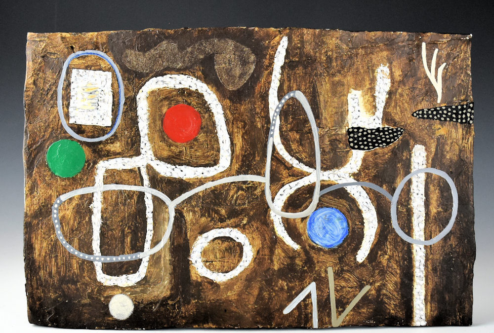
While 2022-07 meets all the criteria of a “tile,” its rectangular form and large size announces itself as a “plaque,” and when the design is added, as a “mural.” The back is smooth and pure white. The front has an irregular brown surface that was added by Les after the initial forming of the clay.
Design:
Organizing the design elements by color is a bit arbitrary since somewhat different forms touch and might be counted as one element or two. I have chosen to distinguish such elements. I see the plaque as carrying 8 white, 4 grey, 2 black line forms and 1 green, 1 red and 1 blue balls, for a total of 17 design elements.
Some of the color is quite solid: the red and green balls and the grey paint, for example. The paint of the white and blue balls is more splotchy. The three smallest white elements are painted with smooth brush strokes, but the remaining 5 larger white designs are pointillist collections of white dots. There is a grey circle surrounding a white square in the top left corner of the plaque and a small V-shaped grey element on the edge of the plaque near the bottom right corner. The 2 remaining grey elements horizontally span the center of the design and consist of three irregular circles connected by two arches. One might imaging these are two pairs of eyeglasses sharing a common central lens. The left two circles and their connecting arch are light grey and I distinguish them from the right arch and lens, which are darker. Notice that both rims of the left pair of “eyeglasses” are interrupted by sections of darker grey and inset into these sections are 10 white dots (right lens) and 24 white dots (left lens). The small V-shaped grey element near the lower right corner points down. Parallel to it and pointing “up” is a similar white “V”. Intruding into the upper-right quadrant of the plaque are two black blobs, the right-most cut off by the edge of the plaque. Set against the black are closely-packed white dots. Polka-dot amoebas: who knew?
Design Analysis:
As noted above, the front of the plaque is not smooth but rather Les textured the surface and covered it with uneven brown paint. Form and color reinforce each other so that the surface of the plaque mimics the weather-stained cliff faces at Hopi.
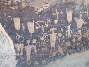
Petroglyphs on a cliff face near Hopi.
The ancients used the dark, weathered, surface of cliffs to paint and etch their designs. Les has recreated this surface on which to paint his modern petroglyphs.
The typology of shapes detailed above completely misses the aesthetic impact of Les’ design. The design on plaque 2022-07 has both horizontal and vertical thrusts. A horizontal pattern is formed by the circle-arch pattern of “eyeglasses.” Vertical energy is provided by the white pointillist designs, particularly the 3 largest: 1) the figure-8 form on the left side of the plaque, 2) the abstract anthropomorphic figure consisting of two U-shaped with touching apexes, and 3) the linear pole rising up from the lower right corner. Two strings of circular forms [green + red] and [solid white, white pointillist and blue] drift across this scene, enlivening it and adding color.
The painting on this plaque is like a a Joan Miro lithograph, setting abstract forms in space to form a pattern that attracts and pleases the eye. Solid, pointillist and spotted painting keep my eye energized. A circle contrasts with the square it encloses. A human-like figure raises its hands in praise, its gesture echoed by the white hand-like element in the upper-right corner of the plaque. The large white 8-shaped form and those horizontal eyeglasses strike me as goofy; the spots of color make me smile. That’s a lot of dimensions of appeal and yet these varied stimulations also play together to form a coherent canvas.
I purchased this tile from Charles King Galleries. His description of the tile reads:
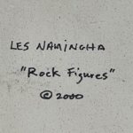
“Namingha, Les – “Rock Figures” Clay Tile (2000)
Les Namingha has created an exciting series of tiles. Each piece is coil built and hand painted. This tile is entitled “Rock Figures”. The piece has a textural surface and then painted with figures. Les said that he wanted to try and create the idea of “modern” petroglyphs on the piece so the background was textured like “rock” and then he painted on it. If you look closely, the white and black areas are made up of small dots. The tile is signed and dated on the back, “Les Namigha”. It is in excellent condition with no chips, cracks, restoration, or repair.”
When Charles was asked about the tile’s provenance, he responded:
“I asked Les about it and he said he made a few pieces that were inspired by petroglyphs and rock art. I had a painting from this series a while back as well, so it rang a bell. He said he originally sold it through Robert Nichols gallery, which sound right as well. I remember about that time that Robert had quite a few of Les’s tiles. It’s the only one that was in the collection [that I bought].”
Perhaps now I am in a position to suggest an answer to the question that began this catalog entry: Given its modernest, abstract design, can plaque 2022-07 be called “Native art”? I think an unambiguous “yes” is in order. First of all, for me to impose my culture’s evaluation of “authenticity” on a Native artist exactly reproduces the colonial exploitation that characterizes the history between our cultures. I don’t want to be part of such a system.
Second, Les’s impulse to doodle his way across an uneven surface matches what might have been in the mind of the ancient ones who drew on the cliffs around Hopi. Note that both the ancient petroglyph cliff face shown above and Les’ plaque feature a range of forms from the somewhat representational to the totally abstract. Some of the ancient designs might have had sacred meaning; some designs might have been just doodles or statements that “Kilroy was here.” The age and form of this ancient art intrigue me and leave me in awe that I stand where ancient artists stood. Similarly, the design on plaque 2022-07 appears as a series of doodles, suggests meaning, intrigues me, and certifies that “Les was here,” creating, having fun, and making me smile. I am grateful for the ancient petroglyphs that connect me to the past. I am grateful for these modern petroglyphs that make me smile in an often troubled present.
For another tile-like form also created by Les in 2000 and painted with an abstract version of the traditional “bird hanging from sky band” design, see 2024-08.
