
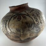

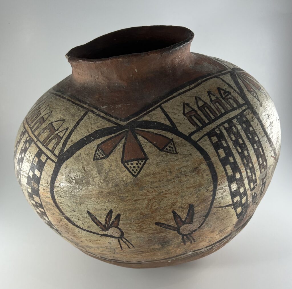
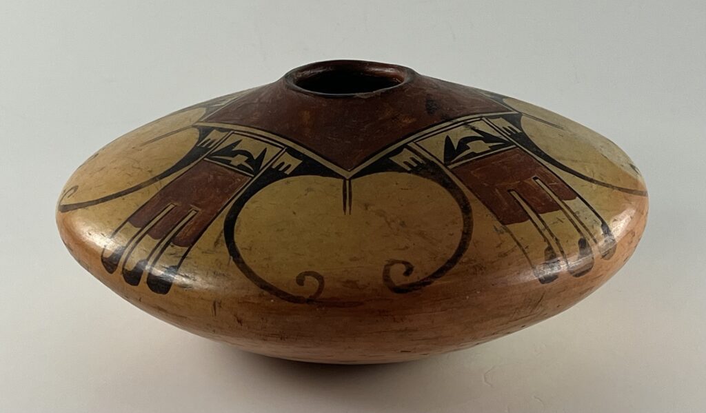
The neck is about 1.0-inch high.
This rather worn and crudely-painted pot turns out to be a gold mine of information, but learning its story requires an extended investigation and discussion. As a result of these discussions I can say with high confidence that jar 2025-13 was made by Nampeyo.
Nampeyo’s reputation is based on her production of Sikyatki Revival pottery made during the last decade or so of the 19th century until she went functionally blind about 1915. This body of work was developed in response to the marketplace demand of Anglo traders, ethnographers, and tourists.
There is evidence, discussed below, that jar 2025-13 was made by 1892. Its size and wear pattern are evidence that it was made for domestic use at Hopi and as such it shows Nampeyo developing her aesthetic and playing with design guided by the values of her Tewa-Hopi culture. Not a great deal is known about Nampeyo’s work before the Anglo marketplace made her famous. Jar 2025-13 tells some of that story. It’s neither Polacca ware nor Sikyatki Revival, but something in-between, a marker on the path leaving one tradition and proceeding to the next, but fully-sharing neither. This is what Nampeyo’s pottery looks like when she was early in her career and working for herself, independent from Anglo demands for form, style or perfection.
The design on jar 2025-13 is both casual and complex, a prototype of Nampeyo’s best-known Sikyatki Revival design: the “eagle-tail.” Two of the elements of that design figure prominently on jar 2025-13, but the pot also features elements that are foreign to the eagle-tail motif. Ironically it is particularly two unusual elements that are at the core of our claim that Nampeyo was the maker of jar 2025-13. Our discussion will review an article in the American Indian Art Magazine, analyze 7 other pots, and consider an observation by Nampeyo researcher Vincent Drucker. Although pot 2025-13 is earlier than Nampeyo’s Sikyatki Revival pottery, I will measure it against the six design strategies typical of her later work and then add my own observations of this pot before our analysis is complete. In the end we will be able to offer three comments about the development of Nampeyo’s career that are new to the literature.
Form:
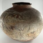
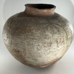
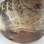
As is expected of most pottery from Hopi, the bottom of the jar, formed in a puki, is substantially thicker than the walls above it. Enlarge the photograph of the jar’s bottom, last photo above. You can see that this thick slab bottom has been severely worn in an irregular, roughly-circular, pattern about 5-inches in diameter. Perhaps this is where a large flake of clay was blown off during the pot’s firing. This eroded patch is not centered on the bottom. Traditionally cooking pots were nestled into a sand floor near a fire when food was being prepared. Given the worn surface of design on one side of the jar, it seems more likely that the worn area on the bottom is from use. Had the bottom of pot 2025-13 not been so thick, that worn area would have become a large hole. As it is, there is a tiny hole in this worn patch. Had the bottom surface been intact, I believe the bottom would have been spherical, lacking a defined flat bottom. Just on the edge of the worn patch is an old catalog number:
-
- The hole from inside the jar.
-

- The catalog number.
I have not yet discovered the source of this carefully-written inscription. I’m told that starting at the end of the 19th century there was a substantial increase in the number of universities establishing departments with an interest in pueblo cultures of the southwest. The collections these universities established often labeled their collection items with numbers that either began with an “A for Anthropology or an “E” for Ethnography. That might be the source of this label, but this is just a guess.
For the most part the surface of the jar has been sanded smooth. However, much of the red underbody is rough and pitted, with only a small relatively smooth area, as can be seen in the enlarged last photograph, above. In places the red on the bottom has flaked off or been worn off. The red square around the mouth of the jar is more intact, but here too there is one large flake of paint. The rim shows chips.
Polacca ware (1790-1900 CE) was slipped with white kaolin clay that tended to flake or “scab” because when fired it expanded at a different rate than the clay body. In the 1890’s Nampeyo learned to polish this kaolin slip, which largely prevented its flaking (Wade & Cooke, 2012:133). On jar 2025-13 the design area between the red areas was slipped with white kaolin clay and probably polished to reduce its scabbing. Nevertheless, the white surface is irregularly covered, probably because Nampeyo only used one coat of the kaolin. (See Appendix B, Section 3 for a discussion of Nampeyo’s white slips.)
Design:
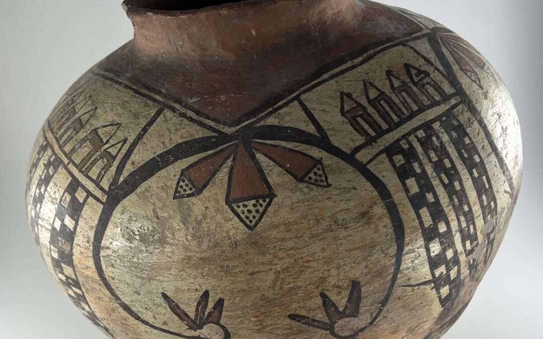
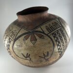
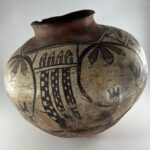
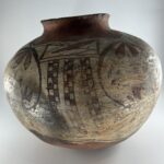
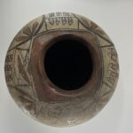
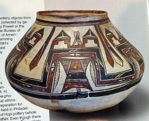
The jar is 38.25-inches in circumference at its waist. The same design motifs were drawn off the four points of the red square around the mouth. However, probably from use, two if these repetitions are substantially worn off, as can be seen in the photographs, above. One of these worn designs can still be distinguished; the other is half obliterated. The most significantly worn areas total about 11-inches in width, about 29% of the pot’s circumference.
The red square around the mouth is defined by two thin black framing lines. The sides of this form are not of consistent length, but the inner framing line averages about 5.56-inches on a side while the outer line is about 6.11-inches on a side. The lower framing lines are casually-drawn, as can be seen in the 5th photograph above. They are about 33-inches in circumference and are drawn a fraction of an inch apart.
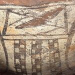
The design has two patterns: 1) the curved black “eagle-tail wings” and 2) the section of linear “red rockets” and “neckties.” I will discuss the general format of each, pointing out variations between the renditions.
Curved eagle wings:
Each black wing is about 6.75-inches long, if uncurled. As laid out in a circular shape, the design is 4.25-inches tall and 5.5-inches wide. From its apex, at the corner of the red square, hangs a cluster of three feathers, narrow at their base and expanding to a triangular point. The body of these feathers is red; the tips unpainted except they contain 6 black dots in the flanking feathers and 8 to 12 dots in the tip of the center feather.
From a central point at the curlicue’s end emerge three curved thin lines. The very tip of the curlicue sprouts a bouquet of three red triangular shapes, perhaps feathers.
Linear Rockets and Neckties:
Between the sets of curved black wings is a pattern of linear designs pendant from the square framing lines around the mouth of the jar. The top section of this area is sectioned off by two parallel lines (a “one-lane highway”) with substantial space between the lines. This width of this top section varies by rendition, ranging from 1.5-inches to 2.25-inches in the three instances where it can be measured.
In two of the three visible top sections there are a series of mostly-red “rockets,” although they also look like a child’s drawing of a house with a large open door and an unpainted, peaked, roof. One rendition displays 4 such rockets, the other 5 rockets. These seem relatively-carefully drawn compared to the design in the third top section. At the center of this third section is a crudely-drawn red lens shape. [8th photograph, above.] Somewhat “V”-shaped black elements are drawn on either side of the lens. The left “V” seems to also carry two black triangles. Visually this third top section is only a scribble pretending to be a design. The top section of the fourth rendition is obliterated and I do not know how it was painted.
Below these top sections are sets of 3 long and pointed forms, “neckties.” Their length is filled with two columns of a checkered pattern, the segments alternating black and unpainted so that any one row has an example of each. The length of these elements varies by rendition, averaging 4.08-inches, 4.25-inches and 4.58-inches by cluster. The number of rows of squares in these neckties varies from 13 to 18, though in one case on the worn surface I can count only 10 rows. I believe that Nampeyo painted these “neckties” by column, since the individual squares vary considerably in height and the rows of squares often do not align. Some neckties are also noticeable thinner than other examples.
We now turn to evidence that Nampeyo made jar 2025-13.
Design Analysis, Section A: In this section we will examine three design elements on jar 2025-13 that convincingly prove that Nampeyo was its maker. First, in 2013 David S. Schramm published an article that uncovered a unique “necktie” design element that can be used to decide if a Polacca ware pot was painted by Nampeyo. Second, a Nampeyo jar that is part of the collection of the Kansas City Museum has the “red rocket” design that we find on jar 2025-13. Third, Vincent Drucker, a Nampeyo researcher, believes that during the early years she was painting only Nampeyo used a squared element around the mouth of her eagle-tail jars, an element also found on jar 2025-13.
Design Analysis, Section B: The arguments in Section A are sufficient to claim Nampeyo as maker of jar 2025-13. However I have also published a set of 6 design strategies that I think can identify of a Sikyatki Revival pot was painted by Nampeyo. Jar 2025-13 was made before the Sikyatki Revival became the dominant style at Hopi, but in Section B of this Design Analysis I apply these strategies to jar 2025-13. Doing so offers us an important insight into Nampeyo’s development as an artist. In this section I also will offer my own aesthetic response to this jar.
Design Analysis, Section A1: The Schramm Analysis, Neckties.
In the Autumn 2013 issue of American Indian Art Magazine, David Schramm applied a systematic process for determining if a particular jar in the collection of the National Museum of Natural History was made by Nampeyo (Vol 38, #4, pp. 68-81). Much of the evidence uncovered by Schramm is relevant to the jar in this collection. Developed by Giovanni Morelli in the late 19th century, the method….
“….looke(s) for clues of authorship in minor details (which tend to reflect basic motor skills) rather than broad treatments, which were more likely to be seized upon by students, copyists and imitators. These design attributes often reflect a subconscious decision by the artist and are very difficult to copy. The more works there are with very similar details or idiosyncratic stylistic signatures, the more convincing the attribution.”
Schramm added that “…(A)ny attribution’s ultimate acceptance rests with the critical acumen of an experienced reader (2013, Vol 38, #4: 75),” which means you, dear reader.
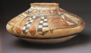
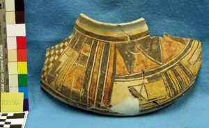
The key pot that Schramm uses in his analysis is in a private collection (2013, Vol 38, #4: 73). Its white crackled finish is characteristic of Polacca ware, the dominant pottery tradition at Hopi from about 1790 to 1900. Thus Schramm names this pot “the Polacca jar”:
About this pot, Schramm wrote:
“ The stylized feather elements that drop from the framing line around the neck of the Polacca Jar…are (a) unique design feature of this piece. As painted, they look more like neckties than feathers, though this obviously was not the intention of the artist…(2013, Vol 38, #4: 79).”
By about 1900 the dominant pottery made at Hopi became “Sikyatki Revival” ware which was not slipped, but had the design “floated” directly on the pot’s polished surface. Of Nampeyo’s Sikyatki Revival pottery, her best-known pottery carries an “eagle-tail” design. This collection contains such a classic Nampeyo eagle-tail pot (2005-16). Having discussed the “Polacca pot” (above), Schramm then “ties it” [literally] to a Sikyatki Revival jar made about 1900-1905 featuring Nampeyo’s eagle-tail design:
Schramm notes that this pot:
“,,,features…two geometric compositions , each with a single ‘necktie’ element extending down below the mid-body….(T)his unusually depicted feather element is not seen on other examples of Hopi or Hopi-Tewa pottery from this period (2013, Vol 38, #4: 79).”
This Sikyatki Revival eagle-tail pot is the missing link, Schramm’s Rosetta Stone. It is both the classic Nampeyo eagle tail design and includes neckties. Thus Polacca jars with this unique neck tie design are inferred to also be by Nampeyo.
Vincent Drucker is a Nampeyo scholar, sleuth of Hopi pots extraordinaire, and a friend. Before the auction he explained the importance of jar 2025-13 to me and encouraged me to bid. After the auction he provided me with several documentary photographs. Two are additional Nampeyo eagle-tail pots that also feature neckties.
Here’s the second example we have of a Nampeyo eagle-tail pot with neckties:
This one has direct Nampeyo provenance. It is part of the collection of the Arizona State Museum and was part of the collection of` Dr. Joshua Miller, who treated Nampeyo for trachoma in the 1890’s and was given pottery by Nampeyo in exchange for his services. He amassed a large and well-documented collection of First Mesa pottery. In 1916 the Arizona State Museum purchased his collection (Blairs, 1999:243, FN 11).
Vincent tells me he has located one other Nampeyo jar displaying neckties that is in a public collection, but he does not have permission to publish its photograph.
To summarize the argument this far: Schramm found one example of a Nampeyo eagle-tail jar that displayed neckties and used this jar to conclude that Polacca ware pots with this design were by Nampeyo. Jar 2025-13, with its abundance of “neckties,” is thus certified as “Made by Nampeyo.” Thanks to Vincent Drucker’s work, we are able to add two additional examples to this argument.
I can point to two other Polacca pots with necktie elements, though their attribution to Nampeyo is less certain.
One is a bowl was formerly in the Lyon collection:
The pot is published in a book edited by Marti Struever (2001:117) with the caption “Polacca Polychrome jar, 1890-1900. This finely crafted jar was formerly in the collection of Lucy Davison Peabody. It is a replica of a prehistoric or protohistoric jar, conceivably by Nampeyo.” Notice, of course, the prominent neck ties. Schramm’s analysis would certify that this Lyons jar is also by Nampeyo.
In passing, Schramm refers his readers to a pot casually inserted in an overview of Hopi potters that was edited by Gregory Schaff, noting that it also has prominent “neckties”:
In Schaff, the caption for this jar reads “Polacca Jar, sold by Thomas Keam in 1892. Photograph by Richard M. Howard.(Schaff, 1988:16)” Schaff made no effort to determine if this jar is by Nampeyo, but Ed Wade believes Nampeyo made it (2012:125). Schramm’s analysis would also conclude that she was the artist. I do not know the pot’s location.
Schramm does not suggest a source for the necktie design. Its speculation, but a fragment of an ancient Sikyatki bowl in the Keam Collection in Harvard’s Peabody Museum displays a necktie design and might have been seen by Nampeyo at Keam’s trading post:
Catalog #10056, Peabody Museum
On the last page of his Autumn 2013 article Schramm presents a chart schematically displaying his argument that the jar in the National Museum of Natural History is by Nampeyo. In the chart he lists five distinguishing design elements that define Nampeyo’s early work. The 5th motif is “Neck tie pendant feathers,” a major design motif on jar 2025-13 in this collection and all of the jars cited above.
Thus we have one design element on jar 2025-13 that links it to known jars by Nampeyo.
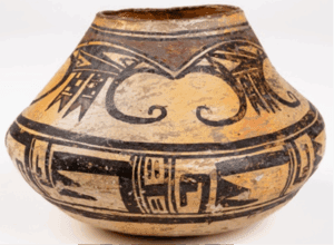
Design Analysis, Section A2: The Kansas City jar, Red rockets.
The photograph below shows a Nampeyo jar in the collection of the Kansas City Museum, Kansas City, MO:
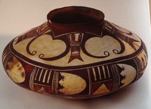
Catalog number 1940:514.
This Polacca ware pot is featured in Wade and Cooke’s second book on Nampeyo, The Call of Beauty (2022:118-119). There it is presented as a classic example of Nampeyo’s eagle-tail design. It is also featured in a second American Indian Art Magazine article by Schramm (2014:Vol 40, #1, p. 66) which defines it as a Nampeyo jar dated 1890–1895. Notice the two red “rockets” between the black curvilinear “wings.” These red elements are like the multiple red rockets seen on jar 2025-13 above the neckties. This rocket design element is rare; the Kansass City jar and Jar 2025-13 are the only examples known to me.
A Polacca polychrome jar by Nampeyo ca 1885-1890 in the Cooke Collection at the Museum of the West is also an early rendition of the “eagle tail” design (Wade and Cooke, 2012:100-101). It has design elements like these “red rockets” on jar 2025-13, but these are pointed down, like the neckties discussed above. As such, this vessel is a bridge between these two elements on jar 2025-13. Particularly interestingly, Wade reports that:
“…a number of scholars were…perplexed by the ‘mistakes’ in the composition, ascribing them to the inexperience of a younger potter. They were particularly baffled by the one out of six U-forms within the black eagle tails that was left negative and not infilled with paint. The supposition was that the potter had somehow overlooked or forgotten to paint the sixth element. Likewise it was correctly noted that on of the three rectangular bird bodies was smaller and had only four rather than five tail feathers. What had gone wrong?….
The potter, likely Nampeyo, was intentionally having fun, playing around …This jar is painted just as the potter wanted it (Wade and Cooke, 2012:100).”
Thus my argument is exactly the same developed by Schramm in his 2013 article, simply substituting “red rocket” for Schramm’s “neckties.” If a jar established as having been made by Nampeyo carries this unique red rocket design, then my jar 2025-13 with that same red rocket design, must also be hers.
Thus we have a second design element on jar 2025-13 that links it to known jars by Nampeyo.
Note that to the extent that dates are offered, all 8 of the jars discussed above are believed to have been made about 1892, probably to be sold to Keam for use in the Hopi Exhibition at the 1983 Chicago Exposition.
Design Analysis, Section A3: The Drucker Analysis, Square framing around the mouth.
Three of the jars discussed above [The Arizona State jar, the unpublished museum jar and the Kansas City jar] have an additional characteristic that ties them to Nampeyo. All three have a square design surrounding their circular mouths.
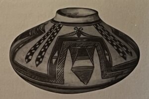
The “eagle-tail” is Nampeyo’s best-known Sikyatki Revival design and we have one such jar in this collection (2005-16). It has a red rectangular element around its opening. I had assumed that placing such a square red element around the mouth of an eagle-tail jar had always been a practice at Hopi. I was wrong.
Vincent Drucker is a Nampeyo researcher who persistently searches out pottery from Hopi in order to compile a virtual collection of approximately 100 masterful Nampeyo pots. He has had these pots photographed in 3-D so they can be manipulated and examined online in great detail. He was the person who recognized that jar 2025-13 was by Nampeyo and encouraged me to bid on it.
Apparently drawing such a squared element around the mouth of a jar was not known in the Polacca-ware tradition dominant at Hopi during Nampeyo’s lifetime until she was in her 30’s. Having reviewed:
- About 2,000 Hopi pots obtained by the Smithsonian Institution in the 1870’s and 1880’s,
- Ancient Sikyatki pots that Thomas Keam collected that are now in Harvard’s Peabody Museum, and
- Being familiar with historic Acoma and Zuni pottery,
Vincent concludes that:
“It is difficult to point to any other ceramics where [Nampeyo] might have seen…(s)quare framing around a jar’s round opening…Nampeyo started doing this in the early-1890’s. In later years this became the foundation for many of her compositions (email 1-15-26).”
Vincent points out, however, that a square framing line around a jar’s round opening was unusual, but known on ancient Sikyatki pots. He specifically referred me to three such pots published by Billy Schenck (2024:9.57 and 9.62, perhaps 9.63). The jar illustrated on page 9.62 is part of the Autry Museum Collection (catalog # 268.G.135) and was made about 1400-1425 CE. It is also published in Wade and Cooke’s second book on Nampeyo, The Call of Beauty (2022:41). Significantly Wade and Cooke pair this ancient jar with a bowl made by Nampeyo, also at the Autry (catalog #30.L.4). The design on the Nampeyo bowl is centered around a circle, itself surrounded by a second circular design, with both these elements surrounded by a square element. On the flat service of her bowl Nampeyo has reproduced the essence of the three-dimensional ancient Sikyatki jar. Vincent tells me that “(W)e know Nampeyo looked at (the Sikyatki jar) after it was acquired by Peter Gates at Hopi in August 1901. But there is nothing in Nampeyo’s output that suggests she saw this Sikyatki jar before Gates acquired it (email 1-15-26).”
Steve Elmore makes a similar observation about Nampeyo’s use of a square element around the circular mouth of her jars (2015:150) and publishes a photograph of three Nampeyo eagle-tail jars:
“…(N)ote the blank square around the mouth on the first jar, a red [squared] line around the mouth on the second jar, and then the [squared] area completely filled with red in the last jar…This squared off design around the mouth of the jar becomes one of (Nampeyo’s) characteristic features (2015:184).”
The Nampeyo eagle-tail pot with the necktie that is central to Schramm’s argument does not have a squared element around its mouth. The argument here is not that every Nampeyo eagle tail pot displays this element, but a) that typically eagle-tail vessels painted by Nampeyo have this squared element and b) other potters working during the early years Nampeyo was painting do not use this squared design. Three of the 4 Nampeyo eagle-tail pots pictured above have this squared red element around their mouth. Note that the other eagle-tail Polacca ware pot in this collection (2019-05) is not by Nampeyo and does not have a square element around its mouth.
Because of developing blindness, Nampeyo stopped painting pots by 1915. When her female relatives began painting for her, they and subsequent generations of Nampeyo family members copied Nampeyo’s eagle-tail layout almost exactly (cf 2009-01), including the square element around the mouth, almost always painted a solid red.
Jar 2025-13 has a red square around its mouth, thus we have a third unique design element that links this jar to known jars by Nampeyo.
Section B: My Analysis of jar 2025-13.
The pot exceeds the size and weight that would be attractive to tourists and thus I believe was made for home use. The jar was probably nestled into a sandy floor and held in place at an angle. The result was the off-center worn patch on the bottom that developed a small hole. The section of obliterated design is likely the result having been repeatedly handled. Pottery made with an intention to sell is generally in perfect condition [See Wade-McChesky,1981:143]
Early in 1892 Jesse Walter Fewkes, Director of a private expedition to Hopi sponsored by Mary Hemenway of Boston, purchased a collection of nearly 3,000 ancient and contemproanious Hopi pottery from Thomas Keam, who owned a trading post 13 miles south of First Mesa (Wade and McChesney, 1981:2). This collection is now at the Peabody Museum at Harvard.
Vincent Drucker believes that about this same date the 7 pots displaying “neckties” or “rockets” discussed in “Design Section A” were all ordered by trader Thomas Keam from Nampeyo for display at the 1893 Columbia Exposition in Chicago. Its obvious that the design on my jar is much cruder that the designs on these jars. Either:
- My jar is actually older than the jars made for the 1893 Chicago Exposition and thus represents Nampeyo’s work before she had fully developed her skills, or
- My jar was also made about 1892 but since it was for home use rather than designed to appeal to an Anglo trader, Nampeyo’s line work was much more casual.
We do not yet have objective evidence to chose one of these alternatives over the other. There is some collector bias to wanting to have “the oldest” Nampeyo pot, which would favor the first explanation. However both Vincent Drucker and my sense is that the difference lies in the pot’s purpose and not because of a difference in the date of production. The 7 jars with necktie or rocket designs pictured above are the known universe of pots with these designs and all were produced just before the 1893 Chicago Exhibition. Thus it is reasonable to conclude the jar 2025-13 with its neckties and rockets was also made at this time. These 7 pots were made for the commercial market while jar 2025-13 was made for home use. We think that this difference of purpose explains why these 7 jars are more-carefully painted than jar 2025-13.
I conclude that Nampeyo used different standards of painting on pottery depending on its intended use. Pots intended for the market were more-carefully painted than pots intended for home use.
This is a new insight that I have not seen in the literature.
A reader of this website knows that I have developed six design strategies that I think typify Nampeyo’s Sikyatki Revival pottery. These strategies are not used by her on every pot; they are simply available in her aesthetic toolbox. However, the more of these design techniques I see on a pot, the more confident I am that Nampeyo designed the pot. These criteria emerge from studying Nampeyo’s Sikyatki Revival pottery made late in her career for sale to the Anglo world. Jar 2025-13 was made much earlier, apparently for domestic use, and was not a commercial product. However, to see how this early jar might compare to later pots by Nampeyo, I will apply the six defining design strategies to jar 2025-13 and the pattern that emerges is informative.
The six strategies are:
1) A tension between linear and curvilinear elements, often represented as a contrast between heavy and delicate elements:
The contrast of the dark black curved “wings” and the array of massed linear “rockets” and “neckties” is the central visual feature of the decoration on this jar.
2) A deliberate asymmetry of design:
One linear section displays 4 red rockets, its neighbor 5 rockets.
Giovanni Morelli’s focus on “minor details” to distinguish an artist’s work may be especially relevant here. Nampeyo regularly introduced a minor asymmetry into her designs, presumably to energize them. Her descendants and other potters from Hopi failed to include this detail. As discussed earlier, and can be seen in photographs #8 and #10 (above), in one rendition Nampeyo replaced the red rockets above the neckties with an odd scribble. This is pattern certainly adds asymmetry to the design, but is a larger and less-structured design than I would expect based on her later work.
3) The use of color to integrate design elements:
The square around the opening and the area below the framing lines are solid red. Between them, in the design panel, the group of three feathers at the apex of the curved element and the flower-like elements at the tips of these curved elements are also red. Above the neckties are red rockets. Thus a viewer sees some red across the range of painted design.
4) The use of empty (negative) space to frame the painted image:
Especially the curved black “wings” are set off by substantial unpainted space. The linear “neckties” and the red “rockets” are somewhat more crowded, but still highlighted by unpainted surface.
5) The use of a thick above a thin framing line on the interior rim of her bowls:
This is not a bowl, so technically this design dimension should not apply. Nevertheless, there are a pair of two thin framing lines below the design panel that are particularly-casually drawn.
6) Nampeyo’s painting is confident, bold, and somewhat impulsive compared to the more-studied, plotted and careful style of her daughters, descendants and other Hopi and Hopi-Tewa potters:
As I point out every time I apply these six design strategies, this 6th strategy is both the most important and also the most subjective. As usual, let’s consider these descriptors in order:
Confident: The design (before it was worn) had four sets of three neckties, at least two sets of 3 or 4 red rockets, four sets of curved black wings, each with a cluster of three red arrows and terminating in a patterns of red and black elements. It’s a large pot, but that is a lot of complex painting. Imagining this design takes confidence, but critically the painting itself is awkward and the forms inconsistent. The casual, inexact framing lines, photograph 8 (above), and the inconsistent width of the neckties are clear examples. The painting is rather sloppy and is not confident.
Note, however, that the great sweep of the curvilinear “eagle wings” are cleanly-drawn with more precision than the other design elements. Also the placement of the dots in the apex feathers (with a greater number in the central feather) seems intentional and controlled. At points Nampeyo took care in her painting of this pot, but this care is not characteristic of most of the design. Speaking of a Zuni-like style of pottery Nampeyo produced for sale from about 1880-1900, Ed Wade notes that “Even at this early time her linework was impeccable…(2012:130).” Jar 2025-13 made for home use contradicts this assertion.
Bold: Again, the overall design is complex and striking, but its conceptualization is more bold than the rather repetitious implementation of the pattern on the jar. This is not a serene design; it is busy and strains the eyes.
Somewhat Impulsive: Drop the “somewhat.” The outstanding characterization of the painting on jar 2025-13 is certainly “impulsive,” though a better word might be “sloppy.” The casual framing line is again relevant here, Also notice that one of the two intact renditions of the red rockets has five rockets, the other four.
As noted above, Nampeyo generally adds a small detail to throw off her symmetry, but here above one set of neckties the red rockets have been replaced by a rectangle with a roughly red lens at the center and a squiggle of triangles and lines surrounding it. (Photograph #8.) I can’t imagine what Nampeyo was thinking when drawing this design segment. Was she simply tired of repeating the same detailed forms? Did she allow a toddler Annie to play with her paint? There’s no basis for either of these suggestions and I have no reasonable explanation. The impulsive nature of this scribble goes far beyond the small inconsistencies we see on other painted Nampeyo pots.
These six design strategies were developed based on Nampeyo’s Sikyatki Revival work, which is not the lineage of jar 2025-13. Nevertheless, it is striking that we find evidence for the first five strategies on Polacca jar 2025-13. Much of Nampeyo’s Sikyatki Revival design genius is present on jar 2025-13. What jar 2025-13 lacks is design strategy 6. Its painting strikingly lacks “confidence” and has an excess of impulsive design when compared to her Sikyatki Revival pottery, but the basic design strategies that defined her later greatness are already present.
This is the second time we have reached this conclusion: Nampeyo used different standards of painting on pottery depending on its intended use. The difference between the rather crude painting on pot 2025-13, intended for home use, and the more exact standard of painting on commercial Sikyatki Revival pots, is the most important insight about Nampeyo offered by jar 2025-13.
It is significant that the sweeping, curved, “eagle wings” and the pattern of dots in the apex feathers are carefully drawn. Apparently Nampeyo could draw precisely when painting this pot, but (overall) chose not to do so.
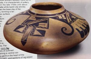
The eagle-tail design:
Comparing the version of the eagle-tail design on jar 2025-13 to Nampeyo’s later Sikyatki Revival rendition of the eagle tail painting (2005-16) also is instructive.
-
- ca 1892
-
- ca. 1905
Three obvious points:
- The 1892 jar is globular while the 1905 jar is disk-shaped.
- The 1892 jar is Polacca ware slipped with white kaolin while the 1905 jar is Sikyatki Revival ware with the design painted directly on the polished surface.
- There are obvious difference in the painting of the two pots, but the essential elements are the same: curved black “eagle wings” flanked by sets of linear elements.
There are additional differences between the two pots. The 1892 pot has a large, dramatic cluster of feathers at the apex of the black eagle wings. The 1905 displays only a set of short, parallel lines at this spot. The 1895 black wings have no internal design; the 1905 black wings have an unpainted element imbedded in their apex. The 1892 pot displays design elements at the ends of its curlicues. The 1905 jar lacks these flourishes.
Both pots have linear designs with an upper segment and longer pendant elements below, but the substance of the designs is radically different. The upper segments on the 1892 pot have sets of red rockets in this location, plus that odd scribble in the third location. The 1905 pot has a design that looks like Batman’s mask. Both of these pots have clusters of three linear designs flanking the curved black wings. On the 1892 pot each of the 3 “neckties” cluster together and each contains about 28 white and black squares. On the 1905 pot three simple feathers emerge from a red comb base, have a short unpainted segment and are tipped with rounded black ends.
It is clear that the design on the 1905 Sikyatki Revival eagle-tail pot is radically simpler and more carefully-drawn than on its 1892 Polacca ware sibling.
These two Nampeyo eagle-tail-design pots add an additional dimension to our major conclusion:
Nampeyo used different standards of painting on pottery depending on its intended use. Pots intended for the market, such as 2005-16, were more-carefully painted than pots intended for home use, such as jar 2025-13.
Our comparison of the two eagle-tail jars allows us to an add additional caveat: Jars painted for the market had simpler designs than jars painted for home use.
Pottery making for ones family or friends was an ancient women’s craft and intricate designs could be used on these pots, since apparently time was not much a concern when fulfilling domestic chores. When producing for an Anglo market, an entirely different calculation was necessary. Quotas of pots needed to be made in an agreed-upon time frame and inferior pots might be rejected by the trader. Additionally, Anglo traders and collectors found the traditional Polacca designs “crude” and appreciated the simpler designs that were characteristic of ancient Sikyatki ware. Such market pressures encouraged potters to use simpler designs that could be applied quickly but with a high standard of exactness demanded by the market. (See the discussion of bowl 2012-02 for a similar conclusion.) Thus Sikyatki Revival pots tend to have rather simple designs when compared to Polacca ware pots formed for home use.
To Summarize:
Jar 2025-13 adds three insights to our understanding of Nampeyo:
First:
I do not believe that there is any discussion in the literature comparing painted pots Nampeyo made for home use to painted pots she made for the commercial Anglo market. The reasons for this are obvious. We know that women at Hopi made pottery for home use, but we simply do not have a collection of painted pots made by Nampeyo for use in her home.
Observations based on a sample size of one are inherently unstable, but if jar 2025-13 was produced for domestic use at roughly the same time as the commercially-traded jars referenced above, then we have evidence that Nampeyo’s painting style was radically-varied depending on the use she intended for her pots. Even when Nampeyo had the technical ability to paint precisely, she sometimes chose not to do so. Her pottery made for the market had more-carefully-drawn and simpler designs than the painting found on pottery made for home use. I don’t believe that this observation has appeared in the literature before.
This conclusion might well be challenged if other examples of Nampeyo’s early domestic pottery become available.
Second:
The design strategies that typify Nampeyo’s acclaimed Sikyatki Revival pottery were all evident early in her career when she was making Polacca ware pottery for her family, with the exception of the generally lower-quality painting on the Polacca pottery.
Third:
The basic elements of her famous Sikyatki Revival eagle-tail design were already in place ca 1892 when Nampeyo made Polacca ware jar 2025-13 for her family.
*********
- Jar 2025-13 is a big jar measuring 10-inches by 12-inches and weighing about 6.6 pounds.
- It also has a weighty impact on our understanding of Nampeyo’s development as an artist.
