
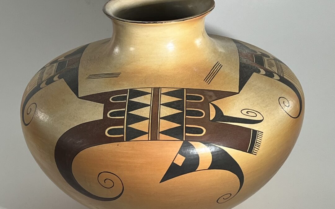
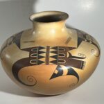
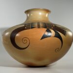
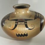
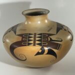
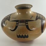
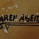
Many of the design elements on this jar are common on pots from Hopi, but the firing, the arrangement of design elements, the exquisite detail of painting and the contradictions within the design are extraordinary. That quality is typical of Karen Abeita’s work.
Form:
The walls of the jar, including neck of the jar and as far into the jar as I can feel, are very even and quite thin. The jar is not particularly light, however, which suggests that the puki-formed bottom is fairly thick. From the 1.75-inch bottom the walls slope evenly outward 5.875-inches to the waist, then slope inward 3.125-inches to a 1.25-inch-tall neck that flares slightly outward around a 2.125-inch mouth.
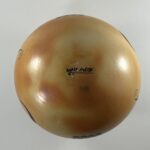
There are almost no visible striations from the stone polishing. The color of the surface is mottled, with color ranging from light tan to a dark golden. The pot is clearly signed, though as can be seen in the above photograph, the finish on the bottom around the signature has been lightly worn, probably from having been moved around on a shelf.
Design:
A thin black line encircles the edge of the rim.
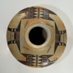
There are two design patterns on the jar, each alternatively repeated twice. All four designs have a straight-line upper edge, and these boundaries extend so that they just touch, leaving a residual square about 4.42-inches on a side around the neck of the jar. This space is left unpainted except for four sets of four parallel thin lines. These lines are differently placed near the corners of the square. Opposite corners have the same placement so that a slanted view of the pot shows discordant pairs.
The design with the large volute I will call “Design 1” and the design with the small volutes and four pendant feathers I will call “Design 2.”
Design 1:
The design is centered around a vertical maroon stripe that bisects a square. The stripe is bordered by two thin black lines forming tiny “one-lane highways.” Flanking this pattern are a series of 4 unpainted isosceles triangles The middle three unpainted triangles are complete, while the remaining triangle is split into two right triangles and placed at the top and bottom of the sequence. These unpainted triangles are surrounded by black, which fills the remaining space in the square, resulting in 4 residual black triangles.
The outer edge of this central square is bordered additional thin one-lane highways. Set against this edge, on both sides of the square, are large hook-shaped maroon forms. These forms do not duplicate each other. The hook to the right maintains a more-traditional shape while the long handle of the left hook morphs into a large curlicue. Both versions of the hook exhibit bowls that end in a point. Both versions of the hook have three black bullet forms embedded in their base, perpendicular to the walls of the central square. These bullet shapes are draped with a thin, unpainted stripe, creating additional foreground/background reversal. These are either black forms intruding into an unpainted space or thin white strips intruding into a black space.
Beyond these similarities, the treatment of these hook-shaped forms is quite different.
Right hook: The handle of the right hook is caped by a thin unpainted space followed by a brush-like form consisting of a black handle with a fringe of 13 parallel hairs. This right hook is additionally embellished by two eccentric black elements. Both are horizontal to the base of the jar. The first grows out of the bowl of the hook. It has a crescent base which support a form like a knife blade from whose tip flies a delicate volute ending in a dot. The second eccentric element hangs from the lower edge of the maroon hook. It looks somewhat like a caricature of a fish, with a pointed face exhibiting an unpainted square eye followed by curved body. The body features an unpainted section and then narrows to a point that becomes another delicate volute.
Left hook: This form is relatively simple. The thick handle of the hook extends and curves to form a large maroon volute about 2.5-inches in diameter which, if unrolled, would be about 7.5-inches long. Note that this large hook can be seen as a continuation of the thick maroon handle of the right hook, the two halfs interrupted by the central square of designs.
Design 2:
This is a modern rendition of the classic Nampeyo eagle tail design first seen on jar 2025-13 and perfected on jar 2005-16. There are many versions of this design in this collection. One elegant rendition is 2017-09. For other examples, see the Catalog listing.
On jar 2026-03 the central feathers are flanked by two black elements consisting of a horizontal isosceles triangles with pendant pointed bodies ending in thin curlicues. The bodies incorporate two unpainted crescent shapes. Think abstract seahorses.
Between these black forms is a complicated pattern of design above the pendant feathers. Occupying most of this space is a truncated triangle, its sides defined by thin sets of parallel lines. The top 40% is a solid maroon form sitting above a solid black element. Below is an unpainted space containing series of vertical lines. These lines are casually but carefully-drawn. In both renditions the central line is the longest and the lines at the end the shortest. These end lines are attached to longer sloping lines, becoming up-side-down check marks. Forming the lower boundary is a series of 5 parallel horizontal lines, a 4-lane highway, if you like that analogy.
Because this form is a truncated triangle, space is created on either side of its upper portion. A pattern of small triangles fills this space. Downward-pointing obtuse triangles fill most of the area and are painted maroon. Above them are small equilateral triangles, about 0.5-inches on a side. These are unpainted, but featuring a cross hatch of lines. An average of about 8 lines in each direction form this pattern. All 8 sets of these lines are completely parallel; none touch.
Below are 4 pendant feathers 2.4375-inches long. For most of their length, their body is unpainted except for a thin 1.5-inch-long line at the center. Crossing the ends of these lines are a set of short parallel lines, forming miniature Crosses of Lorraine. The edges of the feathers are defined by thin lines that reach from base to tip. The tips of the feathers are black, with funnel-shaped unpainted intrusions at their base.
Design Analysis:
The high waist and the prominent neck on this bulbous jar create an attractive, graceful form. The mottled color variation from the dung firing is unusual and provides a patterned glow, an attractive canvass on which the design is painted. Because the design extends below the waist of the jar, the design well-fits the jar’s shape. Karen carefully prepared her paints. The colors are unusually dense and even. The maroon replaces the usual red color found on most pots from Hopi. Both colors have the same intensity and both are used in both designs. As a result the design is unusually vibrant and the distribution of colors helps the design cohere. That the upper surface of both designs touch and form a square around the mouth of the jar also helps unify the overall pattern of design.
Nevertheless, Design 1 is complicated and teeters on the edge of fragmenting. The white triangles at the center of the design form diamond shapes that focus the eye toward the center. At the same time these white triangles and the accompanying black triangles create a dramatic pattern of foreground/background reversal. This has two consequences: 1) the pattern of oppositional triangles energizes the design, but as a result 2) this central explosion threatens the coherence the design. This centrifugal energy is increased by the two sets of outward-pointing black bullet elements. However, these same elements also add a contrary tension. Notice that the design on either side of the central maroon stripe is the same: 1) rows of white triangles, 2) rows of black triangles, 3) rows of black bullets, and 4) identical points on the maroon hooks. This symmetry balances the design and encourages coherence. After more than 65 years of collecting pottery from Hopi, I have never before seen a pattern of design that exhibited both centrifugal and centripetal tendencies at the same time. It’s unsettling.
Significantly, but perhaps sublimilaly, the handle of the right hook can be seen as the stem of the large volute that defines the left hook. Analyzing the design, it took me a while to notice this linkage, but once seen it become a powerful unifying force to Design 1.
And then…..contrarily…..that black “fish” hanging off the left side of the design throws the pattern off-center again. The small curlicue emerging from the bowl of the right dipper has about the same visual weight as the curlicue that is the tail of the fish, though one uncurls to the left and one uncurls to the right, creating tension. Nevertheless, these two right curls help balance the much larger curl defining the left half of Design 1. Notice that the lower two of these three curlicues are placed at the same vertical height on the bowl, somewhat balancing each other.
Balance, difference, cohesion and dissonance are all woven into Design 1 and give it great complexity. Design 1 is unique, an invention by Karen, and is a testimony to her artistic gifts.
Design 2 is more coherent than Design 1 but still contains complexity. Because of its elegance, the “eagle-tail” design has been rendered many times by so many artists that its presentation has become quite standardized. This example by Karen Abeita breaks this mold. It is probably the most intricate eagle-tail rendition in the collection and yet this elaboration increases the design’s elegance.
In contrast to the overall pattern of Design 1, the eagle tail of Design 2 is perfectly-balanced. If printed on paper you could fold it along the line at the center of the feathers and the elements on each side would overlay. The sweeping curves of the black feathers contrasts to the linearity of the tails and gives the design great energy, which I think is why this design is so often used at Hopi. The two unpainted crescent inserts in each wing add interest.
The curlicue of the left wing is visually the neighbor of the upper curlicue in Design 1 and has a similar shape. Similarly the curlicue of the right wing, though smaller, is visually near the large curlicue of Design 1 and mirrors its shape. These patterns help link the two designs.
The upper portion of truncated triangle above the pendant feathers has a solid maroon section above a solid black section. Bordering the maroon section are those perfectly-crosshatched triangles and these sit above the larger maroon triangles. Thus in one small space Karen has managed to draw both linear and triangular shapes with three paint patterns so that no shape touches a similar shape and no paint pattern is next to the same pattern. That’s a great deal of diversity in a small space and this pattern attracts and please the eye. Moreover, the lines forming the crosshatching are perfectly parallel and do not touch, in spite of the small space they occupy. These four triangles are a measure of both talent and care.
The designs on jar 2026-03 are carefully and formally-drawn, like an heraldic pattern on a signet ring. There are two exceptions to this pattern.
- The sets of four lightly-drawn parallel lines painted near the corners of the square surrounding the mouth of the jar are identical in form but differ in placement so that when seen on a slant, the sets of lines seem casually placed.
- As described above, the central section of Design 2 just above the feathers is largely unpainted, but displays a series of 7 vertical lines and two check marks. The unequal length of these lines and the flanking check marks are carefully drawn on both renditions of Design 2, but the thinness of the lines, their unequal length and the addition of the check marks gives this pattern a light and casual appearance.
Together both examples of thin lines violate the careful, formal, and bold painting on the jar and add a minor, but discordant, theme and hence some additional energy.
The dark black and maroon colors provide dramatic contrast. Color and pattern are both emphatic, tempered only slightly by those two occurrences of thin lines. Details are drawn with as much care as major elements of design. Equally important are the multiple contrasting patterns of coherence and dissonance that permeate the design.The result is a jar of beautiful form and great visual power, a testimony to the exceptional skill of its creator.
