
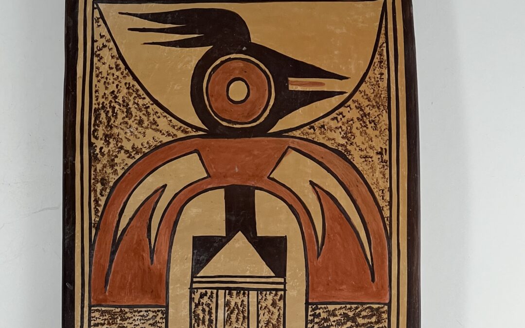
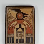

This tile is of ordinary size, but extraordinary design. Although sold as “artist unknown,” the design is so bold and intriguing that the front of the tile announces its maker, an intuition confirmed by the lightly scratched “RS” “ (which looks like a “B”) on the rear’s upper right corner.
For much of her career Rachael Sahmie signed her work with this light scratch mark. For the last period of her career, before her death in 2022, Rachael painted her signature as “Nampeyo Koo.Loo,” Tewa for “Nampeyo, Corn Clan.” Tile 2026-04 is thus an earlier work by the artist and it validates the advice that an art work ought to be judged by its appearance and not an attached signature.
Form:
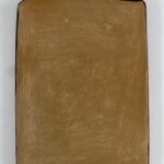
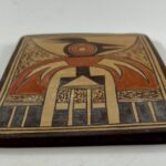
Although a simple form, tiles are difficult to make since they tend to curl as they dry. Nevertheless, tile 2026-04 is almost completely flat, rocking only slightly when on a flat surface. The unpainted areas on the front of the tile are a uniform golden color, showing no polishing striations and no variation in color from the outdoor firing. The unpainted back has the same uniform color as the front, but it shows two slight dimples, some light polishing striations and a small section of parallel scratches.
The scratched signature “B” on the upper right corner of the rear is easily seen in the photograph (above) but is barely discernible to the naked eye.
Design:
The edge of the tile is painted black and this color extends onto the front of the tile. A 0.25-inch-wide strip on the front inside this black edge is filled with two thin black lines, forming a rectangular frame around the central design.
The dramatic red eye and thick red arch immediately attract the eye to the center of the tile.
The oversized red eye is a doughnut: its center empty, its edges thin black lines. Surrounding it is a thin unpainted strip. The rest of the head is black, its rear following the curve of the eye, but most of the remaining portions of the head are pointed. Two points form the large open beak which displays a thin red tongue. Three points define the backward-pointing crest. The points of the crest create foreground/background reversal.
The design contains three arches: 1) Most obviously is the central red arc thrusting upward. 2) Behind the head is a wider, unpainted arch thrusting downward. 3) The center of the red arch is a smaller, residual, unpainted arch.
Emerging from the neck of the bird are large stippled triangular forms, their curved sides defined by the edges of the first and second arches.
Embedded in the sides of the red arch are large unpainted elements consisting of pointed, curved, shapes emerging from a common base. The result is, again, foreground/background reversal. These unpainted shapes can also be seen as a single red point jutting into an unpainted space. The ends of the arch display stippled rectangles, followed by three parallel lines forming a “two-lane highway.” Pendant from these lines are three black, rectangular, tails.
Centered in the space below the red arch is a black form consisting of 1) a stepped element with 2) an embedded unpainted triangle, its base three parallel lines. Pendant are 3) three linear tails. The base of the tails are stippled, followed by a small unpainted square and ending with a long black rectangular tips.
Design Analysis:
The design on tile 2026-04 is startling to the eye, and this is no accident. Layers of design strategy produce this impact.
Since the design is abstract, the biological identity of each element is problematic. I see the red arch as the wings of the bird, each wing hollowed out and lightened by the unpainted element. Due to foreground/background reversal, these embedded designs also energize the wings.
The central black design, topped by the stepped form with the embedded triangle, thus becomes the body of the bird, terminating with three additional (but larger) tail feathers. Focus on this black form and you get an eyeful of Rachael’s talent. On the one hand the base is a horizontal rectangle and this contrasts with the vertical rectangle it supports. But the base is not really a rectangle since it is hollowed out by the central unpainted triangle. What’s left are two residual black equilateral triangles tipped so that they rest on a point. These triangles create a version of foreground/background dissonance since 1) a viewer sees both unpainted and black triangles at the same time, and 2) they have contrasting orientations. This simple body core is thus both a set of rectangles and sets of triangles all in tension trying to control what your eye sees. The effect is very much like the simple triangular glyph that Nampeyo used on the exterior of Nampeyo’s bowl 1993-04 and the neck of 2024-02. Both patterns use simple forms to create complex visual results.
Given its thick red wings, this is a stolid bird, striking but heavy. The triangular stippled triangles emerging from the neck add lightness and lift to the image, as to a lesser extent do the 5 smaller, sections of stippling.
The dramatic curves of the arches and the bird’s eye are contradicted by the linearity of the 9 black tails that form the base of the design, adding tension, a strategy characteristic of “Grandmother Nampeyo” (to use Rachael’s appellation).
These design elements create vertical energy, but notice that the emphatic right-facing open beak points with such force that the feathered crest of the head seems to blow in the wind, adding horizontal thrust. The crest is additionally energized by its foreground/background reversal.
The thin red tongue is almost unnoticeable, however its color links it to the nearby red eye and its linearity contradicts that round eye. Its visual insignificance indicates the care with which Rachael painted this tile.
A number of other design elements have an outsize visual impact. The central arch of red pulls the viewer’s eye upward toward the oversized red eye, which seems like an archery target. The top and bottom unpainted arches thrust toward each other, providing a curious mixture of design coherence, tension and calmness. The iris of the eye, the thin space surrounding the iris, the inserts in the wing, the triangle at the core of the body and sections of the central linear tails are all unpainted and their wide distribution help the design cohere.
Similarly, the stippled shapes emerging from the bird’s neck and the stippled sections above the black sections of the feathers are calming, add visual texture, and their placement also helps unify the densely-packed design. Notice that while these 7 stippled sections are visually calming, they have three shapes (triangular, vertical rectangle and horizontal rectangle) and thus they also add complexity to the design.
Nine feathers form the base of the design. Eight of these feathers are about the same width, the exception being the central feather on the left wing. It is narrower than its companions. I hypothesize that Rachael painted this section last, found that she was squeezed for room, and slightly adjusted her design.
In short, both the shape and color of every element of design add to the energy of this image.
Rachael and I had a friendship for more than 30 years and we regularly spoke about her designs. She had tremendous energy about her art, often telling me that she had woken up in the middle of the night with such a strong image of a design for an unpainted pot that she had to get out of bed and begin painting. Her pattern of design seemed unconscious.
For example, the interior of bowl 2021-21 depicts a complicated, abstract, design originally found on an ancient Sikyatki bowl and copied by Rachael at Steve Elmore’s request. Years later Rachael used the design on the interior of bowl 2021-21 and I see the design as a highly erotic depiction of a male and a female serpents intertwined. When I mentioned this interpretation to Rachel she verbally shrugged and said:
“Maybe, but I just painted what I saw (on the ancient Sikyatki bowl). You’re welcome to see what you want,”
The most detailed discussion I had with Rachael about her design intent was in regard to bowl 2020-09, itself a modification of the design on an ancient canteen. Here I quote from the catalog entry for that bowl, Rachael said:
“….that she was not aware of the depth shown in the original ancient design and did not think about the design meaning. ‘I just get into the flow of working the paint and do not really think about the meaning.’
Rachael’s sensibility has a long heritage. Almost 100 years ago Ruth Bunzel pointed out a pattern of design to a Hopi potter. ‘Yes, that is right,’ replied the potter, ‘We always do it that way, but I never thought about it before,’ to which Bunzel comments ‘She (the potter) has experienced (the design) unanalytically as a configuration….(Potters) have a perceptual rather than an intellectual approach to the aesthetic problem…(S)ensation and intuition play a larger role than intellect in the creation of design (1929:53).’ I suspect this is true of most great artists: they create what pleases them and generations of academics scurry after them trying to explain meaning.”
Rachael was certainly thoughtful about the design on tile 2026-04, but I believe her design process was subliminal and totally aesthetic.
This collection is blessed by 69 pots that I believe were wholly or in part created by Nampeyo. Generally Nampeyo’s designs contain an interaction of design elements that link together to form a pattern –an integrated story– that is missing from the pattern of design of other potters from Hopi. With few exceptions even extraordinary pots from Hopi present a collection of design elements that may form a pattern but lack strong integrating linkage. This understanding of Nampeyo is totally subjective, but Rachael’s work is unique in recreating this “Grandmother Nampeyo’s” aesthetic. Her ability is why this collection contains more examples of Rachael’s pottery than any other artist, other than Nampeyo.
Small tile 2026-04 brilliantly displays this genius. It is a bejeweled masterpiece.
