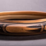
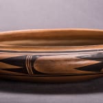
This a gorgeous bowl, both in form and design.
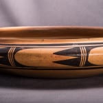
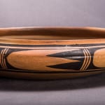
The walls of this bowl are a bit thick, the form exceptionally shallow with a sharply defined shoulder and a slightly raised lip. Held in the hand with eyes closed, the bowl has a solid, sensuous and organic feel.
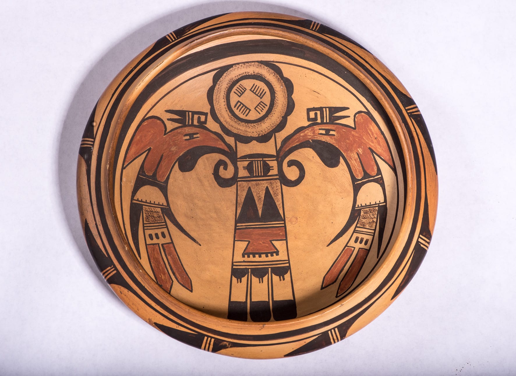
Prehistoric Jettito and Sikyatki renditions of this design (Fewkes, 1973: 59 and 129) present it as a single bird with the central design representing the body flanked by two wings. Native artists have played with this layout, sometimes rendering it as a pair of birds with a deminuative design between them, sometimes omitting the central core entirely. On bowl 2014-18 the design clearly presents itself as two birds, but a viewer’s eye is also drawn to the central motif, in part because of the powerful circular element at the top and the linear thrust of the body terminating in three tails. As a result, the viewer’s eye jumps between seeing the design as a single bird and seeing the design as two birds flanking a linear core. Such visual uncertaintly adds energy and interest to the bowl.
Thick over thin framing lines frame the interior design.
The design has the moniker “Man Eagle” and is frequently applied to Hopi and Hopi/Tewa pots. (See the “Category List” for other examples in this collection.) Of the pots with this design, the painting on bowl 2014-18 is the finest. Indeed it is one of the finest-painted pots in this collection.
The head of the body core is in the form of a flower with 10 petals, the thin framing line seemingly hiding an eleventh petal. Inside this frame of petals is an area of speckled paint. Spraying pottery with drops of paint is a technique seen on both prehistoric, historic and modern Hopi pots and is sometimes said to represent the rain that insures a good life. What is particular about its application here is that two distinct rings of such are painted on this flower, separated by an unpainted circular area. It would have been much easier for the painter to simply fill the whole area with paint spots. That she did not is a testimony to the care with which this pot is painted.
In the center of the flower is another black circle; inside its borders are four comb-like elements. The combs are painted in pairs, with two facing combs having 5 teeth and the second pair having 6 teeth. Such painting is done with forethought and the unequal size of these combs adds a subtle energy to the design. Because of the unusual painting technique, this flower element seems to “pop” off the surface of the bowl.
The linear core of the bird is composed of familiar Hopi design elements. Notable is the section with two black triangles thrusting up contrary to the downward energy of the overall pattern. The two upward triangles create a speckled space with two half triangles and one whole triangle lightly thrusting downward, creating tension within this segment. Below this section is a red element with a shape somewhat like a dovetail used to fasten the corners of wooden drawers. Finally, the three rounded black tail feathers thrust downward and confirm that we are looking at the head to tail core body of a bird.
Except for minor variations in scale, the two flanking birds are identical in design. Their heads are crowned with an intricate glyph that is often incorporated into the “man eagle” design. The bodies of the birds are outlined in black. Behind the crowning glyphs this border is smooth, but from the glyph forward to the body core, the line forms three small hills that reflect the flower petals above. It’s this attention to detail that makes this bowl a masterwork of Hopi design.
A red area defines both the head area and the short, stubby wings of each bird. Note that the lower end of this section forms two red round-tipped feathers, which visually link shape to the pointed red tails at the end of the birds. If you draw a line from the red head of one bird to the red tail of the other, the line will pass through the red “dovetail” element in the center of the design. Repeat this for the other bird and you get a large “X” that links all the red elements and integrates and focuses the design.
A black wattle hangs below the red head of each bird and extends into a curved tongue reminiscent of a hummingbird.
The tails of the birds display two red feathers with pointed ends. These are flanked by two curved black elements. This design motif is typical of Nampeyo (cf pots 1988-01, 1996-05, 2002-03, 2013-03 and 2014-17 in this collection).
The exterior of the bowl is painted with a glyph repeated eight times. Two black triangles rise off a base of two black lines and thrust into an unpainted oval. The design plays tricks with the eyes, however, and the pattern can also be seen as an unpainted blunt-nosed form with a triangle and two half triangles at its rear thrusting like a rocket to the left. Like an Escher painting, the viewer’s eye is unsure of the form of this design and the resulting tension energizes the overall decoration of the bowl. Because of the inward curve of the rim, these exterior glyphs are seen even when the bowl is viewed from the top, though the visible portions of the exterior glyphs appear entirely different from this angle.
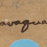
It is frustrating that we do not know the name of its maker. A jar with a quite similar design was offered by Santa Fe Auction at their 8-12-25 sale, Lot #223. My thanks for their permission to use their photos:
The design on the bowl in this collection seems somewhat more-skillfully painted than that offered by Santa Fe Auction, but the circular flower element is distinct. As can be seen in the third photo above (tap to enlarge), jar is signed “Navaquavi,” an artist about whom I can find no information. Bowl 2014-18 seems somewhat more-skillfully painted than the jar being auctioned. Given the bowl’s quality, earlier suggestions were that Fannie Nampeyo or some other member of the Nampeyo family painted it. The maker is still uncertain, but “Navaquavi” is a good suggestion. Santa Fe Auction noted a provenance of “Collection of Hugh Zimmer, 2017. The Ralph T Coe Center for the Arts Collection” for the jar and estimated it was made ca 1935. That date might also be a good estimate for bowl 2014-18 and might explain why we do not have information about Navaquavi.
Nevertheless, art should stand independent of its maker, and bowl 2014-18 is magnificent, one of the most skillfully-painted pots in the collection.

