
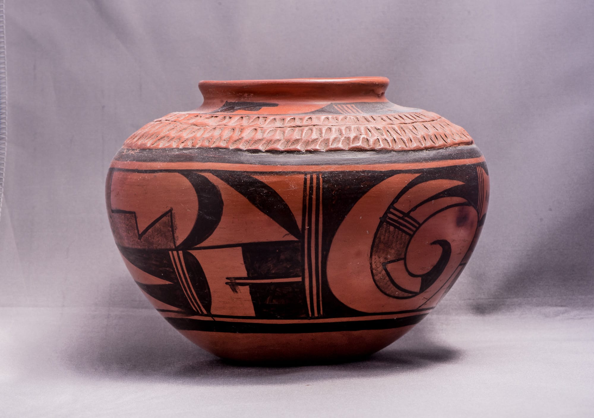
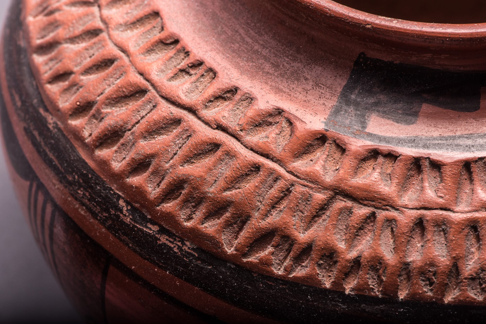


This jar is formed of yellow clay that fires red (sikyatska), which is more difficult to work than the more usual gray clay that fires yellow/orange. The pot is somewhat thick-walled and thus heavy for its size. The base of the vessel is particularly heavy with the walls thinning out somewhat as they rise toward the lip. The unusual feature of the pot is the three-coil area of impressed design on its shoulder. The indentations were added before the pot was polished, and then was buffed with a stone, giving the corrugated area a slightly worn and mellow look. It’s a strikingly attractive format.
Around the neck of the jar is a design of a split-tail avian form ending in a stepped cloud element. This design is repeated twice. Below the corrugation is a thick framing band with the lower design forming a clean edge below.
The design below the shoulder of the pot consists of a band of elements repeated twice. Each band incorporates three sections separated by four parallel lines. Starting from the left, the band includes a curved avian element incorporating a stippled area, followed by two vertical sections with solid black over stippled elements, followed by a section divided into upper and lower rectangular areas. The upped rectangle contains a stippled roughly L-shaped element with an “eye” followed by two solid black crescents of different orientation. The lower rectangular section uses black paint and unpainted areas to form (to the left) “ground reversal” images of pointed forms and (to the right) a double tail feather starting with a black cloud image, followed by an unpainted section and ending in parallel black tails.
On the typical Hopi pot fired with a yellow/orange background, red areas add interest and contrast to the otherwise black design. On this red pot Paqua has employed an ingenious technique towards the same end. While all the paint used is black, the stippled areas of design allow the red clay to show through, providing areas of color and texture that engage the eye and enrich the design, similar to the effect of red paint on a typical Hopi pot.
The bottom of the pot is signed with Paqua Nana’s typical frog mark with pointed toes unlike the webbed toes used by her daughter.
The painting on pot 2014-03 is confident and clean, clearly superior to most of the pots of its day. (Pre-1955.) Nevertheless, the design elements seem to be simply laid out in linear order without purpose in their pattern. As detailed in Appendix C and the discussion of other Nampeyo pots (cf. 2014-01 and 2014-07 and the Artist List), the internal structure of Nampeyo designs seem much more purposeful. What is striking about jar 2014-03 is not its form or design but the use of a corrugated shoulder to engage the eye.
