

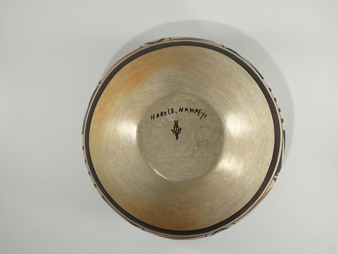
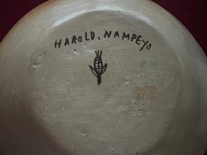
This design is part of the standard repertoire of Fannie Nampeyo and was also frequently used by her daughters on their pottery. Pot 2020-18 is well-formed and painted. What is unusual is that it is signed with the name of Fannie’s son, Harold (Polacca) Nampeyo. I know of only four pots signed with Harold’s name.. One was item #30 in the 1983 exhibit “Nampeyo of Hano and Five Generations of her Descendants” at the Adobe Gallery, then in Albuquerque. (Catalog on file.) A second pot was part of Rick Dillingham’s collection and is illustrated in his Fourteen Families book (1994:31). A third pot signed “Harold Nampeyo” was sold on Ebay several years ago, provenance unknown, though the buyer is looking for me. Finally there is pot 2020-18, which may also have been purchased from Adobe Gallery. (See “Purchase History,” below.) I added pot 2020-18 to this collection, not because it is a great pot. but rather because it seems to represent a rare link between grandmother Fannie Nampeyo and Harold’s three pottery-making children (Clinton, Vernida, and Reva).
The signature is clear and unambiguous. Yet the pot may have a story to tell that is radically different than what its signature indicates, but this suggestion needs to be held until pot 2020-18 is described.
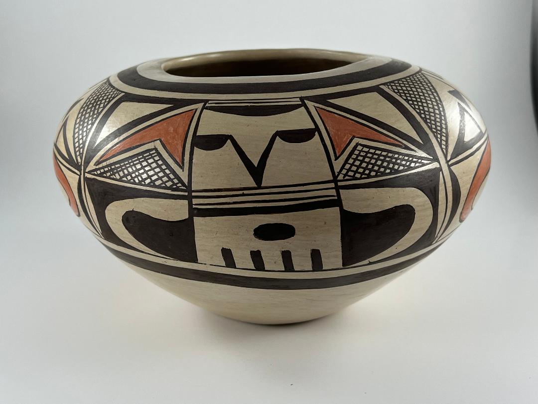
Form:
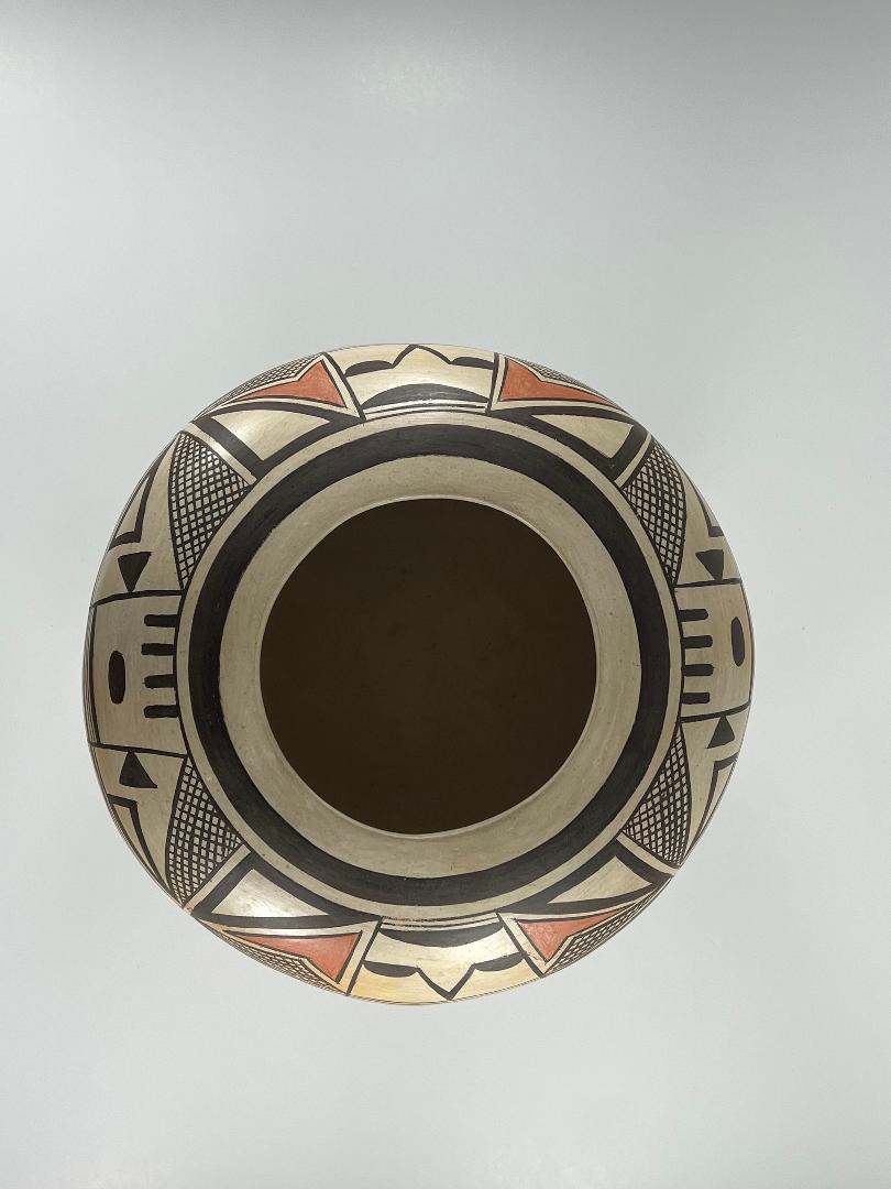
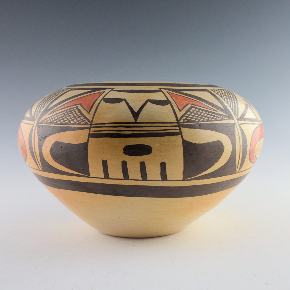
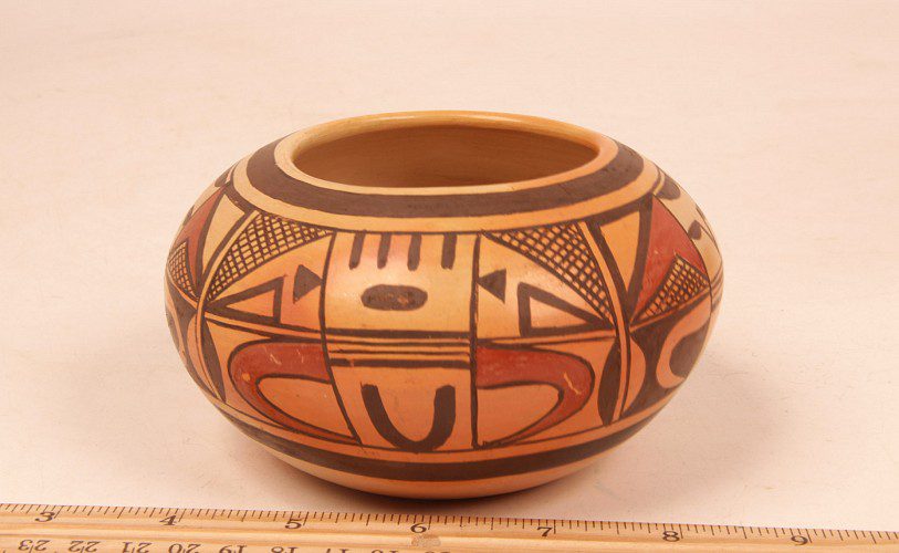
The bottom of pot 2020-18 is somewhat thick but the vertical and incurving top walls have a thinner, even gauge. As a result, the pot is a bit lighter than one would expect for a pot of this volume. The exterior is stone-polished. The 4.3125-inch wide mouth is large enough to admit a hand, thus allowing the interior to be scraped smooth, probably with the edge of a piece of dried gourd. The pot displays only faint blushing, evidence of a well-controlled firing.
Design:
The design band is 3.1875- inches wide and encircles the vessel. The pot carries thick-over-thin framing lines on top of the design and a set of reverse framing lines below the design. In both cases the thin framing line forms the edge of the design band. Equidistant around the circumference of the jar are four vertical elements consisting of two parallel lines (forming one-lane “highways”) that connect the upper and lower framing lines and thus divide the design band into four segments. The four design segments display two design motifs, alternately.
Additionally, each of the design segments is divided into equal upper and lower sections. Moreover these sections are each subdivided into three roughly-equal subsections. Thus each design motif has six subsections, three above and three below the midline.
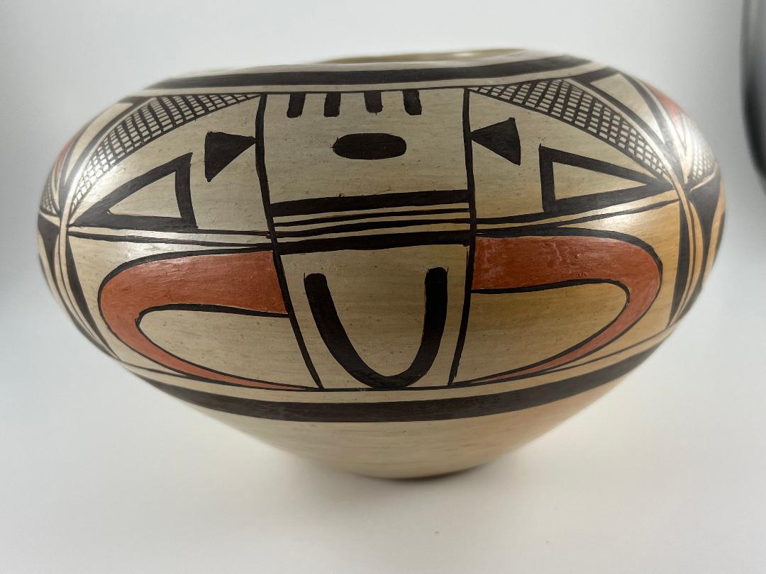
First design:
The center segment of the top of this design displays a large “clown face” (“Kilroy”) that Nampeyo often inserted into her designs (Kramer, 1996:188). (See cf 1999-03 and 2012-02.) The face consists of two black “gumdrops” with their flat side up forming eyes and these are connected by a large black “V” suggesting a nose. Above a larger black gumdrop with its flat side against the framing line forms a forehead.
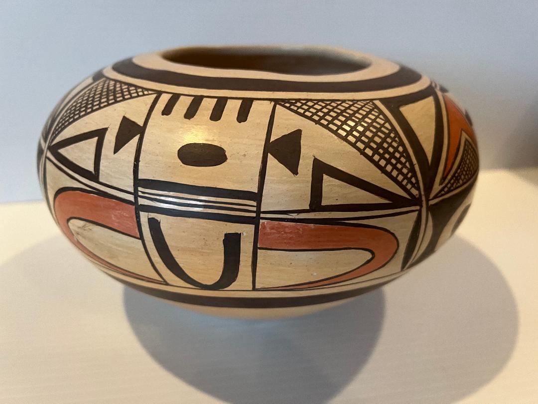
The top flanking sections mirror each other. A thick diagonal line cuts the square in half and forms the hypothenous of a black triangle with an unpainted core that occupies the upper half of this section. Below the diagonal, a cross hatched triangle rests on the base of this area. This segment is repeated four times on the pot. The four renditions of this triangle display varying numbers of crossed lines, with one having 5 by 13 lines: both the smallest and largest number of lines among the four renditions. Each time this design panel is drawn, a solid red, somewhat-hatchet-shaped, form is placed between the black and crosshatched triangles. Below the point of Kilroy’s nose are three thin and one thick parallel lines, forming a three-lane highway.
The central panel of the lower half of this design contains a solid black oval floating in the center. Below are four thick vertical lines with their short base resting on the lower thin framing line.
The lower flanking squares also mirror each other and use a painting technique called “foreground/background reversal” where the foreground and background visually change position, thus energizing the design. 1) These squares can be seen as having been painted solid black, except for an irregularly curved unpainted “U” with its points horizontal against the central segment of design. At the outer edge of these flanking segments, an unpainted large flat “gumdrop” element rests with its base against the flat edge of the adjoining one-lane highway. 2) Alternatively, these flanking squares can be seen as unpainted areas with a black thumb protruding from the center panel and an irregular black hourglass form occupying much of the remaining unpainted space. A viewer’s eye flips between these two possibilities.
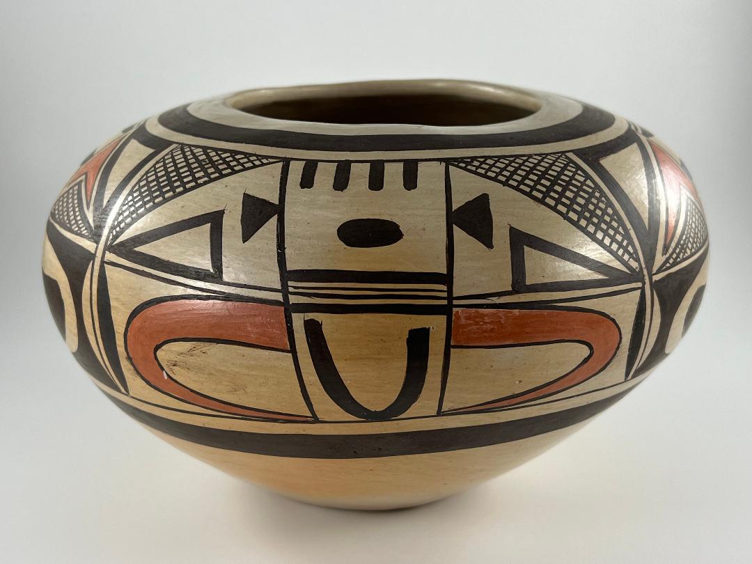
Second design:
The second design is constructed using many of the elements contained in the first design, but they are organized differently.
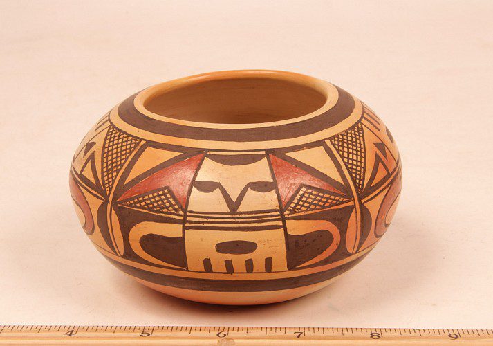
The center segment of the top of this design displays exactly the same elements as the central bottom section of the first first design, but up-side-down. Four thick parallel black lines drop from the top framing line; below a solid black oval floats in the unpainted space. Below the oval are four parallel lines forming a three-lane highway that we saw in the first design, but here both the top and bottom lines are thick.
As in the first design, the two top flanking squares are divided by a sloping diagonal which forms the hypothenuse of a triangle that fills the upper section. This triangle is crosshatched, but unlike the smaller crosshatched triangles we saw in the first design, each of the four renditions in this second design incorporates exactly the same number of lines: 19 vertical and 10 horizontal. Positioned in the unpainted lower half of these flanking squares are 1) black triangles with unpainted cores resting on the one-lane highway below, and 2) smaller, solid black triangles with their points against the boundary of the central segment.
The central panel of the lower half of this design is unpainted except for a black “U” floating in the space with its points upward.
At the center of the bottom flanking squares are large red hooks, with wide bases against the boundary of the central lower segment, that taper rapidly to a point as they curve back toward their starting line.
Design meaning and patterns:
Elements of design are thoughtfully presented, but at first glance do not seem to form meaningful patterns. Like the elements of a Cubist painting, meaning seems open to interpretation. The elements have pattern, but discovering this pattern requires study.
Most obviously, the top and bottom central segments of design #1 form a complete stylized face, from forehead to beard, drawn in black against an unpainted background. The four-lane highway below the nose and above the mouth might represent decorative face paint. The white curved elements in the bottom flanking squares might be arms. If so, the artist has thrust the head forward and receded the arms, a dramatic, almost menacing, pose.
If design #2 has any meaning, it is more illusive but becomes clearer with focus. I’d suggest that the top central segment could represent a bang of hair over an oval mouth, the two small black flanking triangles representing ears. Below the two thick parallel lines enclosing two thin parallel lines might be the abstracted representation of the cedar ruff worn by plaza dancers. Directly below, the large “U” would be the torso of the figure. Those great red hooks are arms, thick biceps growing out of the shoulders and ending in thin points of hands. The figure here seems more upright than that in design #1, and less menacing.
When I first looked at jar 2020-18 I saw only fragments of pattern. Having now regarded the jar more carefully, my eyes quickly discern the two anthropomorphic forms discussed above.
The elements of design are integrated by a number of design strategies:
- The top panels feature crosshatched triangles. These designs are likely purely decorative, but somewhat similar clusters of crosses are said to represent cultivated fields (cf 2010-22). In any case, the use of these crosshatched elements in all of the top flanking sections integrates the design.
- The bottom panels feature curved hooks. Flanking segments of both designs contain hook-shaped elements, although these are presented quite differently. The large black “U” in central lower segment of design #2 also reflects the shape of the red hooks that flank it. The use of these hook elements in the bottom sections also integrates the design.
- The design is mostly monochromatic, but the smaller red elements in the top segments of design #1 visually link with the large red hooks in the bottom segments of design #2. This color draws the viewer’s eye across the full range of decoration.
- Notice that in design #1 two unpainted gumdrops in the lower flanking sections reflect the similar black gumdrop at the top of the central section, thus forming a visual triangle that helps tie the design together.
- In the lower segments, the wide white “gumdrop” along the edge of design #1 mirrors the similar black gumdrop a fraction of an inch distant, just over the border in design #2. Yin/Yang gumdrops.
The history of pot 2020-18: A radically different possibility.
On July 8, 2005 I visited Harold’s daughter Vernida at her home along Polacca wash. She showed me her lovingly-tended corn field and her pottery. I’ve wondered about the history of pots signed with Harold’s name and asked her if her father had ever made pottery. She replied “I don’t think so.” I agree with her, and here is why:
Pottery at Hopi is coil-formed and begun in a “puki,” a shallow curved form into which a disk of clay is placed, the walls being built up along its upper edge. Thus it is common to find Hopi and Hopi-Tewa pots with bases that are relatively thick compared to the walls, which are scraped and sanded thiner as the pot is finished. When the walls of a pot curve inward toward a mouth, these more-horizontal walls generally are formed from thinner coils of clay than the vertical walls, since horizontal wet clay tends to collapse from its own weight. Beginning potters tend to produce pots with particularly thick puki-formed bases and avoid incurving walls. Experienced potters will show a gradation of thickness in the walls of their pots, but the variance from puki-formed base to incurving walls will be small.
There is variance in the thickness of the walls of jar 2020-18, but this variance is small, indicating it was made by an experienced potter. The faint blushing on he pot is also an indication of experience controlling the outdoor firing process.. Harold Polacca Nampeyo’s name may be signed to more than the three pots I know of, but I am confident that the number of pots carrying his name is not more than a handful. It seems unlikely that a man who made only a few pots could do so with the skills of an experienced potter.
The prototypical Hopi-Tewa or Hopi pot carries abstract elements that are organized with the same elements directly opposite each other across the expanse of design (Bunzel, 1929/1972:41; cf 1983-02). Romantic that I am, the way this kaleidoscope of elements finds pattern seems to be a visual metaphor of the way a person’s life experiences can find order over time. Less frequently the design of a pot made at Hopi will be pictorial (cf 2007-13), its meaning directly accessible. Most difficult to create are abstract designs that also contain figurative elements, as on jar 2020-18. These designs contain contradictory impulses: 1) their abstract nature encourages the viewer to create their own meaning out of the swirl of design, while 2) the figurative elements are the voice of the artist insisting that a viewer see a specific image. If a design is awkwardly drawn, these contradictory purposes reduce the design to a jumble of elements that serve neither purpose. Creating a well-structured hybrid design requires experience and skill. I doubt that the hybrid design we see on jar 2020-18 could have been imagined and implemented by an unexperienced potter.
Consider again that in design #2 the four examples of the crosshatched triangles in the top flanking sections each have exactly 19 x 10 crossed lines and that these lines are perfectly parallel and do not touch, except at their intersections. Remember also the 5 design strategies that provide an integrative structure to the design. These details show a degree of intentionality and skill that marks a potter as “masterful.” Again, I doubt that a man who made only a few pots in his lifetime would have the ability to conceptualize and then implement the abstract-figurative design on pot 2020-18.
So who formed and who painted pot 2020-18? Multiple Choice:
So if Harold Polacca Nampeyo did not form or paint pot 2020-18, who did? One answer seems likely: his mother, Fannie Nampeyo. First, Fannie had a long and prolific pottery-making career and her skills were easily capable of forming, painting and firing pot 2020-18. Second, we know that this design was part of Fannie’s repertoire, with many examples known. When we compare pot 2020-18 signed “Harold Nampeyo” to pots with the same design but signed “Fannie Nampeyo,” the similarities are striking.
Len Wood’s Indian Territory Gallery in Aliso Viejo, California has a jar that carries the same design as Harold pot 2020-18 and is signed by Fannie. The Fannie jar (2.75-inches high x 5.0-inches wide) is smaller than the Harold pot in this collection (5.6-inches high x 9.0-inches wide). Nevertheless, side-by-side comparisons of the two pots are striking:
[The photographs of the Harold pot are larger than those of the Fannie jar, which also contain images of a ruler. . Please roll your curser over the image for the signed name. Double click to expand.]
-
- Harold
-
- Fannie
-
- Harold
-
- Fannie
While the shape of the two pots is somewhat different, the details of design are almost identical. For example, note that in Design #1 (Kilroy) the black “thumbs” in the lower flanking panels on both jars have the same shape, including a slight indentation in the top edge. Look at the three-lane highways above the mouth of Design #1 (Kilroy) and below the mouth of Design #2. Earlier we pointed out that the ratio of thin-to-thick lines in these highway elements varied from Design #1 to Design #2 on the Harold jar. That same variance is found on the Fannie jar. Pick any design element and compare the two pots and it seems that the weight of the brush strokes and the shape are the same.
The one difference is also in design #1 (Kilroy), the top flanking panels. On the Harold jar the red element has a slight border of empty space. On the Fannie jar this red element does not float in space but shares boundaries with its neighboring elements. This difference might be easily explained by the difference in size between the jars. Harold’s jar is so large that it allows more room for adjusting the design whereas the Fannie jar is much smaller and requires conjoint elements. In short, a comparison of the designs on my “Harold” pot and Len Woods’ “Fannie” pot strongly suggests they were painted by the same person.
A comparison of the signatures adds additional evidence:
-
- Harold
-
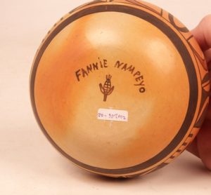
- Fannie
Most obviously the handwriting of the name “Nampeyo” is the same on both pots. So is the corn clan identification mark.
Moreover, in “Appendix E” I analyze the history of pottery made by Nampeyo of Hano and signed with her name. What I discovered was that when the name “Nampeyo” was spelled with a capital “E,” the pot was painted by Fannie, who always signed with this format. Other relatives who helped Nampeyo signed her name using lower case letters. The “Fannie Nampeyo” pot (above) has the expected capital “E.” The signature on the Harold pot also carries the capital “E.” Since Fannie was the only family potter to capitalize the “E,” there is specific evidence that Fannie signed the Harold pot and thus a good basis to conclude that she both formed and painted jar 2020-18.
There is no deceit here, just cross-cultural difference. Native culture encourages identity with village, clan and family and discourages people from emphasizing individual exceptionality. Thus for many years Native potters did not sign their work and when the Anglo tourist market demanded identity, most potters marked their work with a simple hallmark. The Nampeyo family signed their pottery earlier than most potters and it was common for members of the family to work together on pottery and sign Nampeyo’s name, since she was well-known to Pahanas. (Again, see Appendix E.) Signatures are a response to the Anglo market; when Al Alexander, Jr. asked for Nampeyo family pots, Fannie may have responded, adding Harold’s name to the collection. Selling pots was Fannie’s business and marketing was required.
But then, thanks to interviews done by Rick Dillingham for his book Fourteen Families in Pueblo Pottery, the evidence gets a bit trickier.
The “Harold” pot in the Dillingham Collection published in Fourteen Families is captioned as “Pot painted by Fannie Nampeyo…ca 1975.” Perhaps then I am wrong and Harold did form pot 2020-18 and Fannie only painted it. But other explanations are also possible.
When Rick interviewed Harold’s daughter Vernida, she said “I worked with my dad [Harold Nampeyo] when he was well. He would make them (pots) and I would paint for him (1994:31).” So maybe Vernida painted pot 2020-18.
Given all these possibilities, perhaps the best we can conclude is that Harols “might” have formed pot 2020-18, but likely he did not paint it. Probably either his mother (Fannie) or his daughter (Vernida) did the painting. In any case, pot 2020-18 is well-formed and carries a complicated, expressive design. It is what it is, no matter who made it.
Note: On June 8,2022 I spoke with Al Alexander, Jr about his 1982 show “Nampeyo of Hano and Five Generations of Her Descendants” which included a pot by Harold (#30). He told me that all of the pots in the show were from his personal collection. Since the 1960’s he had been driving out to Hopi from Albuquerque about every two weeks with a particular intent to “fill in the Nampeyo family tree,” including pots by lesser known makers. Al particularly remembers trying to get Randall Sahmie to make him a pot.
Al opened his gallery in Albuquerque in 1978 and noticed that all the large galleries in Santa Fe had big shows around Indian Market. In an attempt to draw some of that business to his gallery in Albuquerque, he decided to sell his Hopi collection in the summer of 1983.
Priscilla Namingha was a particular help soliciting family member’s pottery, but Al doesn’t remember that Fannie played any particular role amassing the collection. Al is pretty sure he asked Harold directly to make him pottery and bought pot #30 directly from him, but will check his records. In short, the history of the show does not support my supposition, above. Still, listening to my theory, Al said “It’s possible.” The reader is left to decide which scenario she finds most persuasive.
