
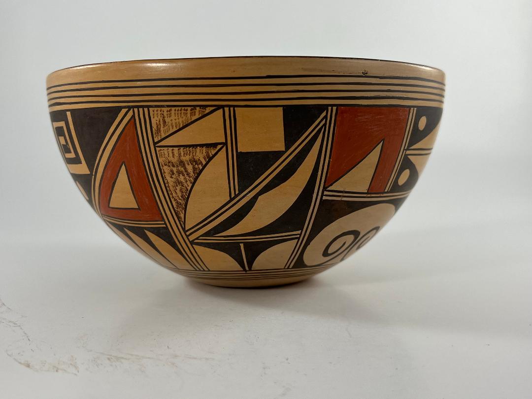


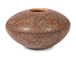
The design on this bowl is organized into three panels, two narrow and one wider. I had trouble determining this pattern because the design elements seem crowded and frenetic: great energy packed between framing lines. The bottom of the pot carries the penciled number “11-75,” which I interpret as meaning that the pot was purchased in November of 1975, about five years after Rondina began making pottery. Later she miniaturized design elements and created mosaic-like patterns on her pottery. Pots carrying patterns of tiny design won Rhondina great acclaim, including “Best of Show” at the 1996 Santa Fe Indian Market. Thus bowl 2021-08 is an early product by an artist in the process of finding her distinctive style, its crowded design a harbinger of a pattern that would characterize her success.
Form:
The bowl rises at a consistent rate from a 2-inch base, creating a 4.125-inch wide surface between base and lip. The walls, including the base, are of consistent thickness: substantial but a bit thin. As a result the pot feels lighter than expected. Both exterior and interior of the pot have been stone polished; my hands ask to caress the surfaces. There is slight blushing from the outdoor firing on the exterior; the interior is relatively pale.
Design:
The rim is painted black. Below is a small unpainted gap followed by 5 thin framing lines that border the 3-inch wide panel of design and encircle the pot. The same set of fine framing lines is repeated below the design. In each set, the innermost line is incorporated into the decoration. As noted above, the painting is presented in three panels, each repeated twice. The panels are separated by sets of three or four parallel lines, forming two or three-lane “highways.” Two-lane highways are also used internal to each panel to separate design elements.
Panel #1:
This is the narrowest panel. It is monochromatic and subdivided by three sets of highways. All the design segments in this section display forground/background reversal, where the foreground and background elements seem to change position, thus enlivening the design. One highway runs from the upper right corner to the lower left, ending two-birds down the left boundary of this section. Above and perpendicular to this slope is another highway, dividing this upper section in two. The left section can be seen as brown stippled with two triangular shaped intruding from the right wall. Alternatively, this section can be seen as unpainted with two stippled triangular shapes intruding from the left wall. The section to the right is either solid black with the intrusion of a white square in the upper-left corner, or unpainted with two conjoint black triangles to the right.
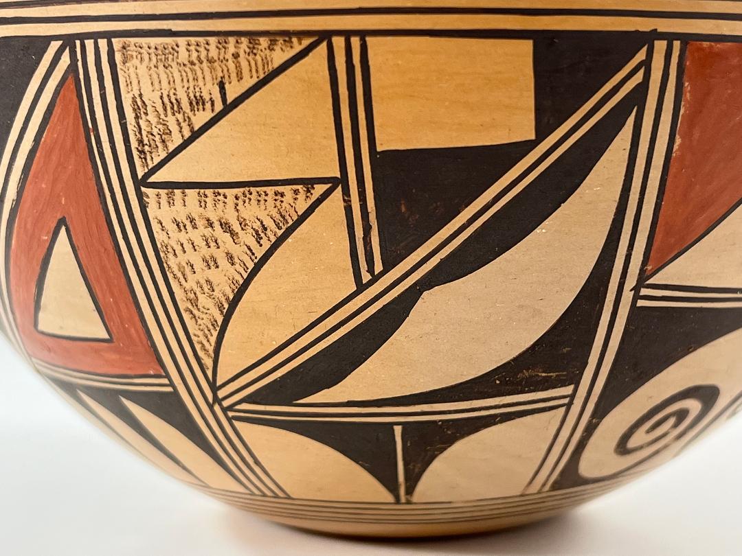
Below, and extending the length of the diagonal, is a black right triangle almost completely filled by an unpainted, elongated, hatchet head, though this section can also transform using foreground/background reversal. The bottom one-third of this panel is segregated from the top by a horizontal highway bisected by a vertical one-lane highway, forming a “T.”. The designs on either side of this vertical highway mirror each other. They can be seen as black right triangles with curved hypotenuses set into a while space or white fans intruding into a black space.
Panel #2:
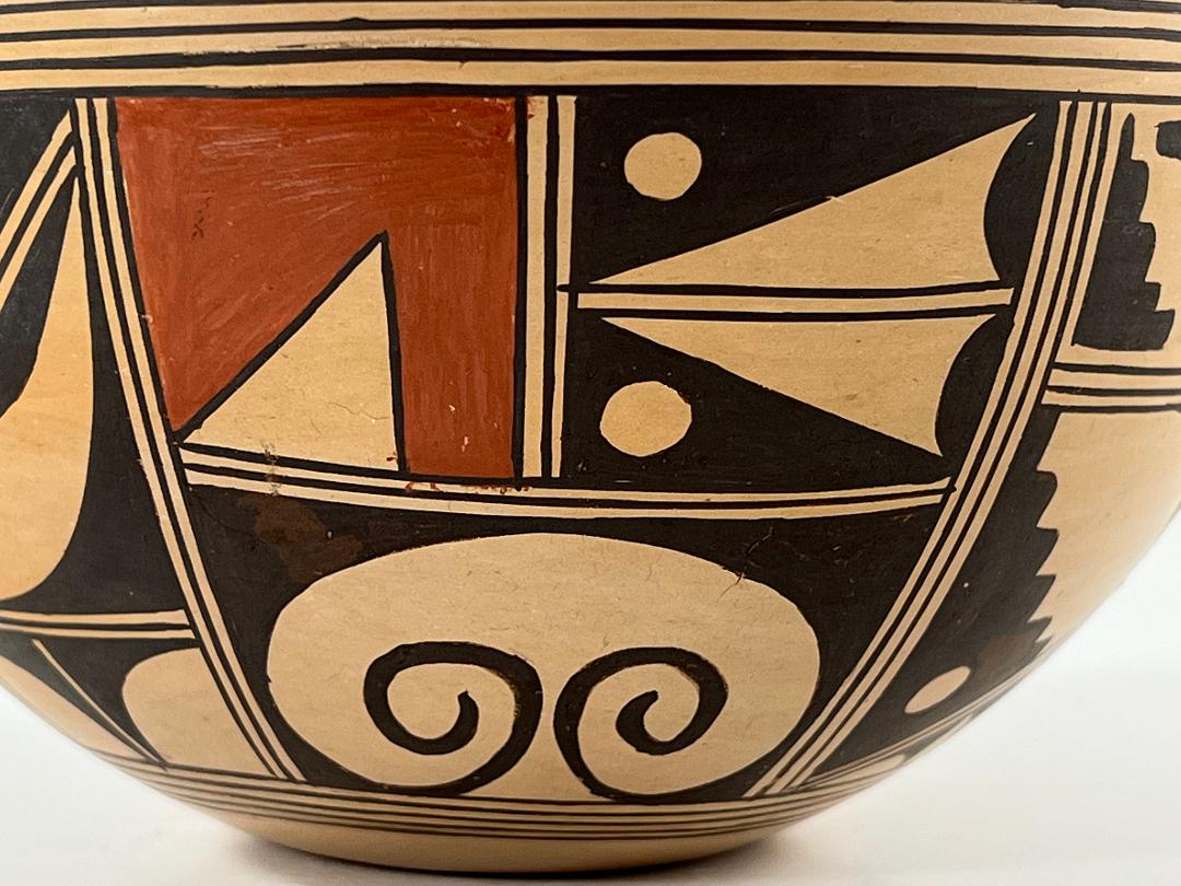
Also quite narrow, the layout of this panel is relatively simple: a horizontal highway drops half way down the height of this space and is caped by another highway, forming an inverted “T.” In the upper left quadrant an unpainted right triangle emerges into a field of red, one of two red designs on the bowl. This would seem to have the potential for another foreground/background reversal, but the broad red design seems to squelch that dynamic. The quadrant to the right is divided by a horizontal highway, upper and lower section carrying the same design: the two halves of this quadrant together forming a swept-wing form shooting to the left. Two unpainted circles bracket its nose.
Below the inverted head of the “T” a single curvilinear element fills the space. Two right triangles are set into the top corners, their horizontal points merging into an archway. The third point of each triangle flows down the horizontal walls, pools into smaller triangles at the corners, then thins and swoops upward to form curlicues highlighted by the unpainted central space. The dramatic impression is similar to the eagle tails on Nampeyo family pots (cf. 2008-16). The appearance of such a curved form among all the linear elements is startling, having an effect similar to the unusual curvilinear form on a magnificent jar by Daisy Hooee (2019-16).
Panel #3:
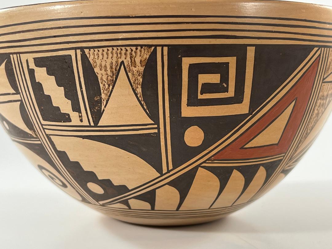
This remaining panel of designs is almost as wide as the previous two panels added together, but its design is only slightly more complex than the first panel alone. A diagonal highway cuts the space from upper right to lower left. The space above the diagonal is the most complex: a vertical highway descends from the framing line to the midpoint of the diagonal. To the left, a horizontal highway bisects this vertical highway at its midpoint. This highway is, in turn, bisected at its midpoint by a short vertical highway. As a result, the smallest elements in this panel are in its upper left corner. To the left two black kiva-step or cloud elements face each other, the residual space between them a stepped diagonal. Immediately to the right the small rectangular space carries a complicated design. Two solid black hills rest their bases against the vertical walls. Between them is an unpainted equilateral triangle, its base on the space’s lower edge. The residual space is filled with stippled brown paint. Below these two small spaces is a larger area, its lower left a large kiva step with an unpainted circle in its base. Diagonally opposite, a right triangle fits into the corner, its hypotenuse curved. Finally —still above the large diagonal— to the right, a residual black triangle has two elements set into its left side. On top is an unpainted square and intruding into this space is a squared crook with seven 90-degree turns. In the small residual black triangle below is an unpainted circle.
The space below the diagonal is cut by a horizontal highway. Below this highway 6 unpainted knife-blade shapes rise into a black background. Alternatively (foreground/background reversal), one can envision six elongated right triangles with curved hypotenuses dropping down in an unpainted surface, like stalactites. The residual space below the diagonal, but above the horizontal highway, is a solid red right triangle, with a smaller, unpainted, triangle at its center. This is the second of two red elements in the pot’s design.
Design analysis:
I’ve been a bit intimidated trying to verbally describe the design in bowl 2021-08. Although I’ve tried to describe the designs on the three panels clearly, the layout and designs are so complex that a simple presentation is not possible. My difficulty, however, says something substantive about Rondina’s talent. Even on a jar made about five years after she began painting clay, her designs are far more controlled, complex and integrated than is seen on the typical Hopi pot.
For example, the 10 framing lines above and below the design panel waver just slightly, but remain distinct and controlled. Repetitively drawing such lines around the circumference of the pot with such exactitude is impressive. Viewed at an angle, the black rim and parallel framing lines below add a calm and ordered sensibility that contrasts with the intense panel of designs below. The effect is like a calming mat around a busy print. Without such framing the design might explode off the jar.
Each panel of design is painted exactly opposite the same panel of design on the other side of the bowl. Looking at one rendition you cannot see its partner, yet there is almost no variance in the painting of the design elements. The biggest difference is in design panel #1 in the upper right corner. One version displays a perfect unpainted square; when the design is repeated this unpainted form is slightly rectangular. In short, Rhondina is able to reproduce patterns with exactitude.
As detailed above, multiple elements in the design display foreground/background reversal so that a viewer’s eye keeps shifting between one view and another. This technique adds extra energy to the already crowded design panel.
The two red elements in the design are spaced so that, at a minimum, any view of the bowl places them at the edge of the observable area. This draws a viewer’s eye across the breadth of the decoration. Moreover, while the two red elements are different, they are visually related. In one an unpainted right triangle intrudes into a red field. The other red form employs this same unpainted triangle as the center of a surrounding red triangle of the same shape. Thus in two ways the red elements help unify what might otherwise be a chaotic design.
Notice also that panels #2 and #3 each contain two unpainted dots. Like rivets, these also attract the eye horizontally across the design and add coherence. Similarly, in panel #2 the kiva steps in the upped left corner of design are repeated in the large panel below, adding vertical coherence.
Rhondina says of her painting:
” When I started my painting [in the early 1970’s] I wasn’t that good. I used old designs but painted them very large. I started trying to improve and improve….In the late 1970’s [I first went to Indian Market, Santa Fe]. It was when I was there that I realized that if I was going to sell my pottery I needed to do a better job…In the 1980’s I improved [my painting] a lot…I do most of the painting freehand. When I look at a pot, I already know what design I’m going to put on there. I can visualize what I’m going to paint, and it is never the same. I don’t really use a pencil—I’m afraid it won’t come off. I try to just measure with my hand to space out the designs.” Rondina Huma, Spoken Through Clay, pp 309 and 312″
I am particularly attracted to Hopi and Hopi-Tewa pottery that is calming, such as seedjar 2017-09. That is not the sensibility of this bowl by Rondina Huma. Yet it is obvious that a few years into her career she had an extraordinary ability to conceptualize intricate design and control her brush. While she became dissatisfied with the sort of design we find on bowl 2021-08, we can see how the crowded design on this bowl evolved into the complex micro-mosaic patterns that would later make her famous:
Bowl 2021-08 is a marker of great talent in evolution.
While the auction house that sold me bowl 2021-08 did not provide me any provenance, the bowl is published in Gregory Schaaf’s book Hopi-Tewa Pottery (1998:53) and appears to have been part of Dick Howard’s collection. I believe that he penciled the notation “11-75” on the pot to record its date of purchase.
