

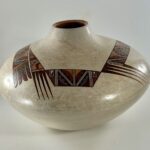
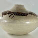
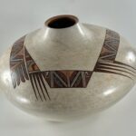
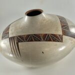
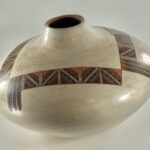


Caressed in my hands with my eyes closed, this bulbous jar has a full and perfect form. Bejeweled ribbons form an irregular square on the jar’s surface, its mottled finish highlighting their eight-color luminosity.
The core design on these ribbons is a complex square pattern (“tiles”) repeated 16 times This regularity of pattern is interrupted by 5 sets of feathers and design bands of varying length and geometric shape. Below the waist, and thus out-of-sight, are several paint drips with orange/red terminuses.
Everything about the jar is unique—-the usual pattern of Nathan’s work. I have become very fond of Nathan’s innovative pottery; the collection contains 15 other examples of his work. Jar 2025-07 is perhaps the most peaceful.
Form:
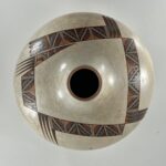
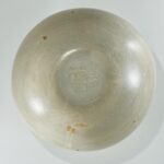
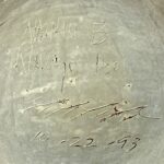
The jar has a 3-inch-wide flat base inscribed:
Nathan B
Navajo Hopi
[cloud cypher]
10-22-93
…… the final line being the date of production. From the base the walls curve outward 4.75-inches to the waist, then curve inward 4.5-inches to 1-inch neck. The walls of the jar are 0.25-inches thick at the 1.75-inch wide mouth. This rim is tapered inward and painted a light reddish-orange. The interior of the jar is exceptionally smooth and seems to have about the same light gray color as the polished exterior. A slight bluish tint is more pronounced on the interior than the exterior. The exterior surface shows faint striation marks, wisps of brown and random tiny black spots, giving the unpainted surface a somewhat mottled appearance, particularly on the upper surface of the pot. My iPhone has a particularly sensitive camera; the mottling is more pronounced in the photographs than when seen by eye.
Design:
Tiles: Much of the design is formed by tile-like rectangles 0.8125-inches wide by 1.125-inches tall, though the size varies a bit with repetition. There is a standard design to these tiles: From an upper corner three parallel white lines form a diagonal to a lower corner, forming a “2-lane highway.” The tiles alternate the direction of this diagonal. Presented as a set of two tiles, these diagonals together form a “V,” sometimes pointing up and sometimes down. In groups of tiles these diagonals form a zig-zag “Z.” The two tiles in a set are separated by 2-lane highways. Sets of tiles are separated by 3-lane highways.
Internal to each tile, set against these diagonals, are two half-moon forms with one edge serrated by two steps pointing toward the diagonal and the curved edge pointing away from the diagonal. The upper half-moon is painted purple; the lower half-moon is colored blue. Above and below the diagonal (in the space into which the serrated steps project) the background is black. The corner space above the upper moon is a light tan-orange color. The corner space below the lower moon is dark red. (I’ve just spent 197 words describing what can be seen at a glance in the photographs, above.)
Side 1,” the third photograph, above: The core of this side is formed by one set of tiles, their diagonals forming a downward-pointing “V.” Along both the left and right edges of this pair are sets of 4 parallel lines, 3-lane highways. The right end of the design is a purple right triangle pointed downward. At its 90-degree corner is an unpainted square filled with a crook terminating with a finial displaying 2 steps.
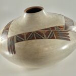
Off the left end of this design is a large triangular form, its base a 2-lane highway. The triangle is divided into 4 sections, all separated by 2-lane highways.. The base is tan-orange with an insert red triangle, its hypotenuse modified by 3 steps. The next section is a darker blue triangle with a small lighter-blue inset followed by a red section, with a tan-orange hill set against its upper boundary. Finally, at the apex, is a purple triangle with a small blue rectangle set against its left-lower wall. Returning to the 2-lane highway base of the triangle, pendant to this highway are a set of 4 black very elongated isosceles triangles.
Side 2, the fourth photograph, above: The design is formed by a single tile to the left, followed by two sets of tiles. The diagonals on these 5 tiles form a zig-zag that visually links the 5 tiles into an overall pattern. The left edge of the set displays 5 parallel lines, a 4-lane highway. Pendant from this highway is an elongated solid-black isosceles triangle. To its left, hanging from the upper framing line, hangs a set of three longer isosceles triangles. At the right end of the series is the same purple triangle enclosing a black crook that we saw on side1.
Side 3, the fifth photograph above: The series of tiles that form this design are the same as on Side 2, a single tile followed by two sets of tiles. The left end of this series displays a 4-lane highway followed by a set of three complex feathers. Each feather is 2-inches long, the first inch its base is colored by 3 diagonal bands: tan-orange, red and blue. The tip of the arrow is divided lengthwise. The blue diagonal continues along the right side of the tip to its end. The left side of the tip is painted purple.
Side 4: the sixth photograph above: The design is formed by four tiles, a set of two tiles flanked by single tiles. Off the left end of the series are the same set of three complex verticle arrows we saw on Side 3. The right end of the series sprouts a series of four horizontal feathers that are also complex, but unique. The feathers share a common brown comb, the teeth having slanted points. The upper two teeth slant upwards, the lower two teeth slant downwards. Fit onto these teeth are blue elements that extend halfway along the remaining length of the feather forms to form knife blades. The upper two blades face down while the lower two blades face up. The residual reciprocal spaces to the tips of the arrows are also somewhat blade-shaped, have the same orientation as their blue base, and are colored purple. Floating above side 4 is the large triangular element that sprouts from the left end of side 1.
“Drips” the tenth photograph above: On the upper surface of the jar there are two small drips of blackish-blue paint. On the lower half of the jar there are 9 drip marks. Three are colorless and are simply disturbances in the finish; 6 show this colorless tracking and end with a spot of tan-orange paint, as if a lump of color had slid down the surface of the vessel during firing. Charles King commented on these marks, as quoted below in the “Purchase History.”
Design Analysis:
The bulbous form thrusts the design on the jar up towards the viewer’s eyes. The slight bluish tint of the jar, wisps of brown, random tiny black spots, drip marks and slight striations are all subtle markings, but their cumulative effect gives the unpainted surface of the jar its own character that contrasts with the vibrant coloring of the ribbons.
The core of the design is16 tile-like forms. Except for the direction of the white diagonal, each tile has the same fixed design. Nevertheless Nathan uses four strategies to unsettle a viewer’s eye and make the overall design challenging:
- Pattern of tiles: Two of the sides of the roughly square layout contain five tiles, a single tile followed by two sets of tiles. One side contains four tiles, a set of tiles flanked by single tiles. The final side contains just two single tiles. Varying the length and form of the tile sequences adds visual interest.
- Shape of the sides of design: The roughly linear shape of three sides is interrupted by the small parallelogram shape of side 1 and the large triangular shape that floats over side 4 but is actually attached to side 1. Thus one side interrupts the visual pattern of the other three sides.
- Feathers and other elements: All four sides have pendant feathers, one side displaying two clusters of different feathers with different orientations. Small purple triangles cap three ends of two rows of tiles. These elements add considerable interest to the linear flow of the tiles.Two small dark spots are splattered on the upper surface, seemingly randomly. The nine drips slightly “mar” the lower surface of the jar and add character. These drips create tension with the otherwise perfect painting of the rest of the design.
- Color of tiles: Most pottery from Hopi displays two colors: black and red. Sometimes white kaolin clay is added. Jar 2025-07 is extraordinary in that its design is formed from 8 clay-based colors: white, purple, dark blue, light blue, black, tan-orange, dark red and brown. These eight colors bedazzle my eye, like fancy ribbon on a holiday gift or a Klimt painting. The light blue and brown are each only used once to color small elements.
The diagonals of the tiles in pairs form a “V” pattern with the point sometimes up and sometimes down. When individual tiles are placed next to pairs, the “V” becomes a zig-zag. In either case the diagonals link individual tiles into an overall pattern. Such patterning moderates the busy energy of the tiles and allows the overall design pattern to cohere.
All aspects of this jar add to its visual impact. The bulbous shape is a full and fecund form that shows off the design. The overall design is a dazzling show of color and form that is organized around the repetitious use of 16 tiles, but modified by the addition of grouped feathers and triangular shapes. The mottled unpainted surface has a subtle character that stands in contrast to the rich hews of the painted design and cools the busy design.
Jar 2025-07 is both visually challenging and calming, like vibrant flowers in a Zen garden.
A review:
I have become particularly enamored of Nathan’s pottery since buying my first piece twelve years ago. The order in which I purchased the sixteen Nathan Begaye pieces in this collection, however, does not reflect the order in which they were created. Since all except the oldest are dated, it is possible and instructive to reorganize this pottery into the sequence in which they were made. The pottery in this collection spans a period of 33 years:
Name Catalogue number Date produced
Red slip pot 2013-01 about 1973 [Nathan age 15. He was born in 1958.]
Star jar 2018-10 10-30-86
Shepard with sheep 2022-16a,b,c 3-2&7-91
Ribbon jar 2025-07 10-22-93
Moon face canteen 2017-06 1-25-94
Anasazi-inspired bowl 2019-24 10-25-96
Mask 2023-02 4-1-97
Maiden effigy pot 2019-20 12-5-97
Toads hunting ants pot 2014-04 1-16-00
Lizard man shard pot 2023-04 5-13-00
Fish man shard pot 2023-03 5-17-00
Abstract shard pot 2013-10 6-14-00
Incised canteen 2013-09 1-25-02
Incised serpent pot 2022-15 1-25-02
Tawa plaque 2017-07 2005
Nude male bowl 2015-02 9-5-06 [Nathan age 48. He died 4 years later.]
I see three periods of production here:
First, the red slip pot (about 1973) is extraordinary because of its size, bulbous shape, thinness, dramatic red color and its Sikyatki-inspired but innovative design. Very few Hopi or Hopi-Tewa potters of any age can do work this fine. That it was done by a boy in his early adolescence is unnerving. Its Sikyatki style is the most traditional among the Begaye pots in this collection.
The second category of pots, from 1986 through 2002, contains 13 of the 16 pots in this collection and represents Nathan using his full creative power. Each of these pots has a unique form or design, though we are beginning to see some patterns. All three shard pots were created within about a month of each other in 2000. The two incised pots were fired on the same day in 2002. As with many artists, apparently Nathan experimented for a while with one technique and form and then moved on to explore a different expression. Because this collection contains a rather large number of Nathan’s pots, these patterns emerge.
The final group of two pots have a poignancy about them that is not apparent in his earlier work. These are among the last pots Nathan created before he stopped potting several years before a long illness and death. While the Tawa plaque is full of blessing and seems to incorporate the artist into this vision of hope, the note that Nathan wrote to acompany the plaque is full of bitterness and dispair. Finally I read a similar message of personal despair into the image of the nude, truncated, Native male on the 2006 bowl. For me this image is the emotional equivalent at looking at Emile Serate’s painting of a freshly butchered cow.
Nathan stopped making pots sometime during the last five years of his life; he died on December 21, 2010. However the collection does contain a drawing he made dated 4-13-2008:
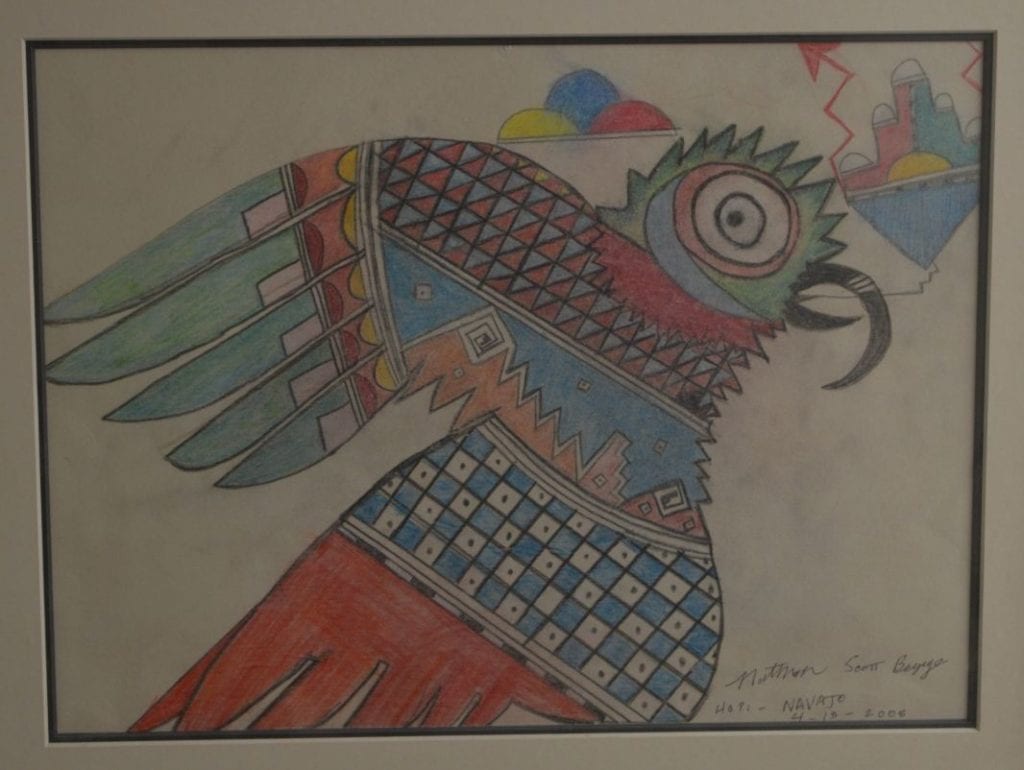
It’s speculation on my part, but drawing on a piece of paper is a simpler process than forming, painting and firing a pot, so perhaps Nathan turned to drawing as an artistic outlet during his final years when he was ill. Unusually –but like Tawa plaque 2017-07-– Nathan added his middle name “Scott” when signing this drawing. The image of a creature with symbols emerging from its mouth is an ancient Hopi motif; see bowl 1997-05 in this collection. Such images are generally understood as germination prayers, though it is not possible to know what a potter 600 years ago intended. I do not know what meaning, if any, Nathan attached to this drawing, but the element emerging from the mouth is a rain cloud, a clear blessing in the desert southwest. Germination and renewal might be concerns of a person near the end of his life. At least the drawing does not reflect the anger I perceive in the poem accompanying pot 2017-07 or the image on plate 2015-02, both created during his period of decline.
