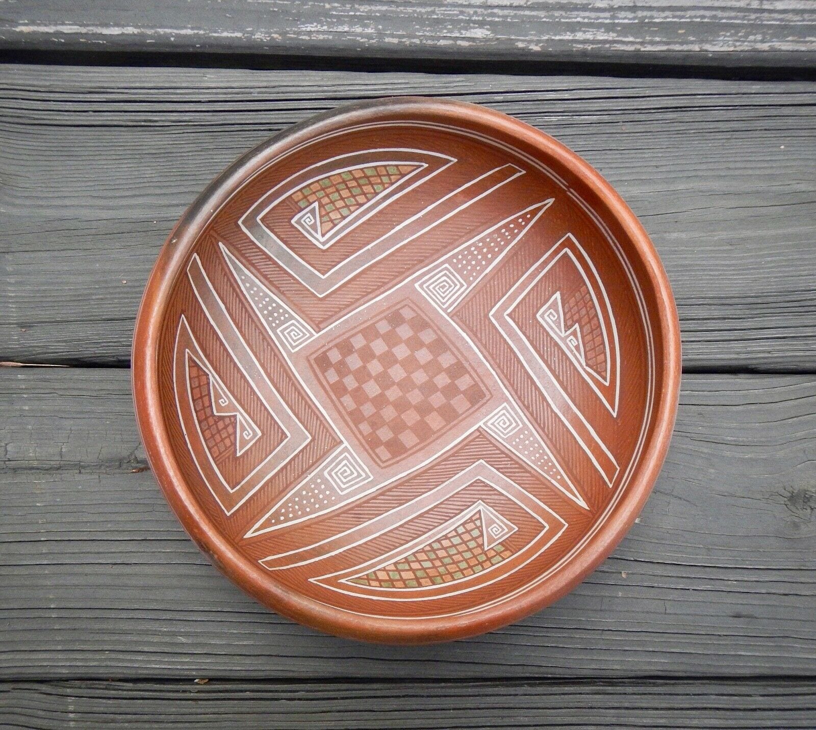
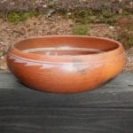
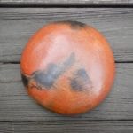
Nathan Begaye’s earliest work as a teenager is strikingly well-painted using a variation of an ancient Sikyatki design (2013-01). Thereafter, while his work remained rooted in Native aesthetic, his exceptional creativity produced a dazzling variety of new designs. Bowl 2019-24 was produced at the height of Nathan’s career, but it is unexpectedly a return to decorating with ancient motifs, albeit with some creative adaptations.
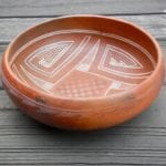
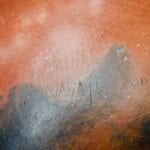
The walls of the bowl are thin and evenly formed, its lip incurved as on a piki bowl (1993-05). Obviously the body of the bowl appears brick red, but it is not clear if this is the clay used to form the bowl or is an applied slip. Slight chipping on the bottom around the first two letters of Nathan’s name suggest that the body may be formed from a lighter clay. The red surface is slightly micaceous, which also suggests that the bowl has a slip. During its firing, flame scorched the outside of the bowl, leaving dark clouds on the exterior of the bottom and and a 6-inch section of the rim. The bowl is scratched-signed as expected on the bottom:
Nathan B
Navajo Hopi
His rain cloud cypher.
10-25-96
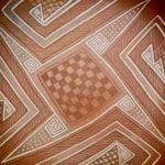
The interior design has two white framing lines with spirit breaks over two black framing lines, the lower black line forming the border of the interior design. The design is organized around a central 8 by 8 square checkerboard of unpainted and black squares within a single-line black frame. Surrounding this form is a white line that is parallel to the sides of the square but at each of the four corners rises to form a long isosceles triangle with a point almost touching the framing lines. The right leg of the triangle rises off this white line while the line itself continues to the interior of the triangle to form a square greek key above each corner of the checkerboard, with (in order) 12, 16, 11 and 13 forty-five-degree turns. The left leg of the isosceles triangle passes downward to the left of this greek key and continues parallel to the next side of central checkerboard. The area of the four white triangles above the greek key is filled with 18 to 29 white dots in 8 to 11 neat rows, though in one case the alignment is jumbled.
Between adjacent white triangles is an unattached second element of double white lines. A backwards “L” shape provides the framework. From the end of the short arm of the L another long side emerges, its double-white lines curved to parallel the framing lines. At its peak it narrows and drops down toward the short leg of the L, then turns to create a small square greek key within a triangle. One version has a single triangle and second version has elemental greek keys embedded in two triangles. These patterns alternate so there are two examples of each. Adjacent to these triangular forms, and thus internal to the larger design, is a checkerboard of sage green and salmon colored squares.
Within the framing lines, the residual space not incorporated into white-edged forms is painted with a crosshatching of pale black paint, thus creating a pattern that completely fills the interior with design and mirrors the white elements.
This interior design is both balanced and intricate. The varying intensity of the colors adds an additional layer of complexity, as does the sparkle of the red micaceous slip. Relatively faded in the center is the checkerboard of unpainted and light black squares. This same muted black paint is used for the linear cross-hatched elements, producing a light, almost ghost-like impression against the brick red surface. In contrast, the white color is vibrant and highlighted by the red surface. So dominant is the white color that when I first saw the bowl it took a second look for me to notice that each quadrant of the design contains a mosaic of sage green and salmon tiles.
The exterior of the bowl is painted with white paint, A single thin line encircles the bowl about 0.25″ below the rim. Below it is a chain of 32 connected ramp-shaped elements with projecting points, their bases just below the encircling line. In contrast to the white paint on the interior, the exterior white is thin. In places it fades away almost completely and in other areas the exterior design is obscured by the black smudge from the firing. Both the simple encircling line and the chain of ramp-like elements have spirit breaks at roughly the same point.
The design on the interior of bowl 2019-24 draws from three ancient ceramic traditions 1) Kayenta Polychrome, 2) Four Mile Polychrome, and 3) Polacca Polychrome. (My thanks to Ed Wade for suggesting these sources.)
Kayenta Polychrome (1225 to 1320 CE):
is characterized by “Black design(s that) often have narrow lines outlining the red area; horizontal and diagonal hachures in rectangular or triangular panels between red areas; wide staggered lines between series of narrow lines. White design(s) usually (have) narrow white lines outlining black lines; sometimes white outlining red areas (American Southwest Virtual Museum: Kayenta Polychrome).”
Four Mile Polychrome (1300 t0 1400 CE)
is a subset of White Mountain Red Ware, a class of pottery that was the most abundant and had the largest distribution of all southwest painted ceramic types (at the time)…These were produced in the Cibola district west of Zuni Pueblo. “The final evolutionary stage of White Mountain Red Wares is witnessed in the advent of Four Mile Polychrome…when white paint was incorporated into design elements on the interior of bowls and on the exterior of vessel forms (Moulard, 2002:137).”
Hopi Polacca Ware, especially type “C” (1860-1890)
frequently displayed black and white crosshatching as a central motif (Wade and McChesney, 1981:309-311). Working with Native informants in the 1880’s, Alexander Stephen interpreted this crosshatching as representing the blessings of still water on fields (Patterson, 1994:244-245).
The sage-green and salmon checkerboard colors are a modern innovation.
The black firing smudges on the exterior of the bowl are unintentional. The bowl is about 26″ in circumference. There is one 5″ stretch and another 7″ area on roughly the opposite sides of the bowl where the external white design fired clearly. The remaining 14″ of external design is faded and shadow-like or overlay by the black firing smudge. I believe that Nathan intended all of the external design to appear like the two clear sections. The furtive white design on the exterior is the result of firing error. I am less sure about the muted black of the interior. The interior of a bowl remains cooler than the exterior when fired. Perhaps because of a cooler firing or an imbalance in the ratio of hematite to beeweed in the black paint, the internal black paint did not adhere well. Or perhaps Nathan intended his interior black design to visually recede. As fired, the lightness of the black allows the white and multicolored designs to be more emphatic and this pattern gives the bowl a subtle, almost impressionistic, look. Had all colors of the interior been of the same intensity, the visual effect would have been quite different. After the fact I cannot guess Nathan’s intention. I’m left with a flawed bowl of substantial appeal.
A review:
I have become particularly enamoured of Nathan’s pottery since buying my first piece six years ago. The order in which I purchased the ten Nathan Begaye pieces in this collection, however, does not reflect the order in which they were produced. It is instructive to reorganize this pottery into the sequence in which they were made:
Name Catalogue number Date produced
Red slip pot 2013-01 about 1973
Star jar 2018-10 10-30-86
Moon face canteen 2017-06 1-25-94
Anasazi-inspired bowl 2019-24 10-25-96
Maiden effigy pot 2019-20 12-5-97
Lizard/toad pot 2014-04 1-16-00
Shard pot 2013-10 6-14-00
Incised canteen 2013-09 1-25-02
Tawa plaque 2017-07 2005
Nude male bowl 2015-02 9-5-06
I see three periods of production here.
First, the red slip pot (about 1973) is extraordinary because of its size, bulbous shape, thinness, dramatic red color and its Sikyatki-inspired but innovative design. Very few Hopi or Hopi-Tewa potters of any age can do work this fine. That it was done by a boy in his early adolescence is unnerving. Its Sikyatki style is the most traditional among the Begaye pots.
The second category of pots, from 1986 through 2002, contains 7 of the 10 pots in this collection and represents Nathan using his full creative power. Each of the pots has a unique form or design that could not have been predicted from the other six pots in this group.
The final group of two pots have a poignancy about them that is not apparent in his earlier work. These are among the last pots Nathan created before he stopped potting several years before a long illness and his death in December of 2010. While the Tawa plaque is full of blessing and seems to incorporate the artist into this vision of hope, the note that Nathan wrote to acompany the plaque is full of bitterness and dispair. Finally I read a similar message of personal despair into the image of the nude, truncated, Native male on the 2006 bowl. For me this image is the emotional equivalent at looking at Emile Serate’s painting of a freshly butchered cow.
Nathan stopped making pots sometime during the last five years of his life; he died on December 21, 2010. However the collection does contain a drawing he made dated 4-13-2008:
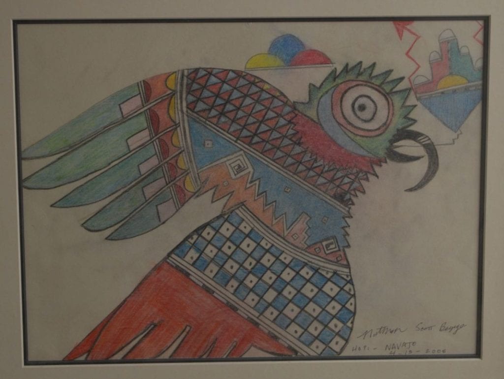
It’s speculation on my part, but drawing on a piece of paper is a simpler process than forming, painting and firing a pot, so perhaps Nathan turned to drawing as an artistic outlet during his final years when he was ill. Unusually –but like Tawa plaque 2017-07-– Nathan added his middle name “Scott” when signing this drawing. The image of a creature with symbols emerging from its mouth is an ancient Hopi motif; see bowl 1997-05 in this collection. Such images are generally understood as germination prayers, though it is not possible to know what a potter 600 years ago intended. I have no idea what meaning, if any, Nathan attached to this drawing, but germination and renewal might be concerns of a person near the end of his life. Blessedly the drawing does not reflect the anger I perceive in the poem accompanying pot 2017-07 or the image on plate 2015-02, both created during this period of decline.

