
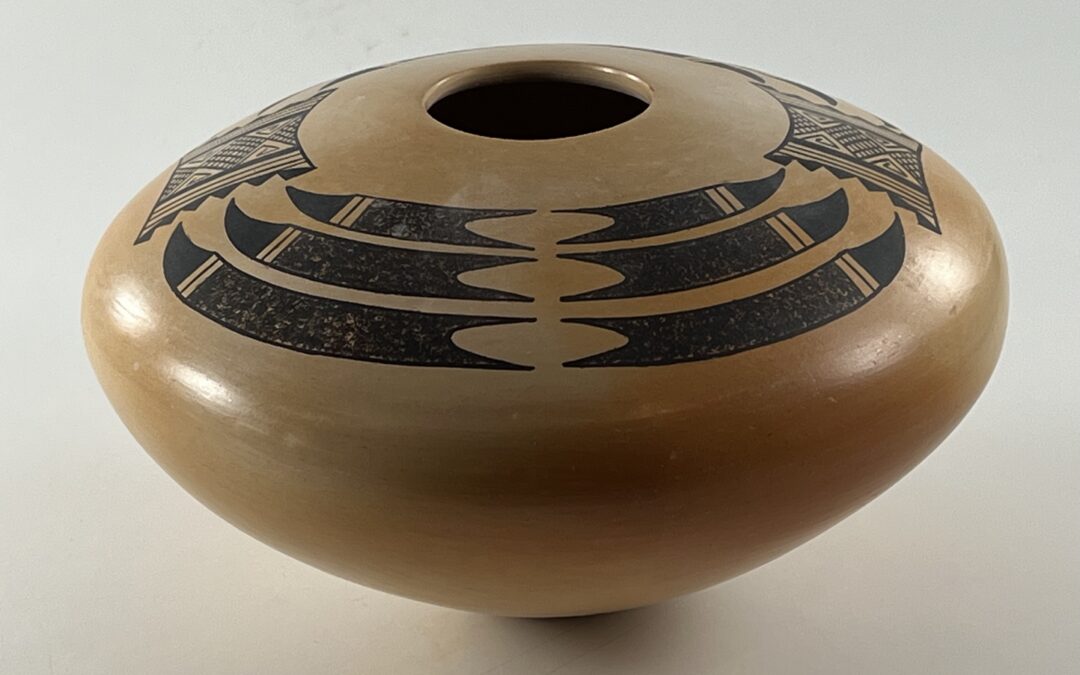

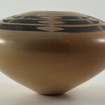
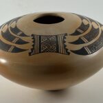
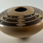
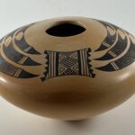
This jar’s upward-expanding shape, unique designs, and blushed background are both unsettling and exceptional. The jar is also rare. Pam does not make much pottery; the collection has only one other pot by her, 2014-05.
Form:
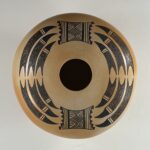
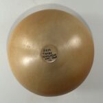
From a 1.325-inch base, the walls expand outward 4.0-inches to the waist, then curve inward 3.125-inches to a 1.6875-inch-wide mouth. The waist is more than 60% of the vessel’s height above the base. The jar below the waist is thicker than the top, which is quite thin. The interior of the top is also more-finely-finished than the bottom interior. All of the decoration is on the top surface. The tan surface is lightly-blushed from the outdoor dung firing, with two patches of slightly-darker golden color on opposite sides of the vessel below the waist curving upwards onto the upper surface.
Design:
All of the design is black with much of it is stippled. The design is composed of two different patterns: 1) a gradation of three sets of pointed, horn-like, elements and 2) a somewhat square design with a central cross-hatched element, like a miniature saddle blanket. Each design is alternately painted twice on the upper surface of the pot.
Design 1, Horned elements:
Each of the three rows in this design is composed of a pair of pointed elements. These elements have a notched tail intruding into a densely-speckled space that is the core of the design, which is caped by three parallel lines forming an unpainted “two-lane highway.” Based on the highway is a pointed dark black shape with a concave upper edge and a convex lower edge, a knife blade. These forms are placed with their notched tails almost touching, thus creating an oval residual space between them. Since they conform to the shape of the jar, each set of two pointed elements is also slightly curved.
The bottom set of elements is 6.625-inches long. The middle set averages 5.28-inches long and the top set is 3.75-inches long. Only the middle set has any variation in length between the two renditions.
Design 2, Blanket:
This almost-rectangular design has lozenges with cross-hatched cores as the central design with triangular crooks set into their sides. Edging this space are thick framing lines followed by 3 or 4 thin parallel lines (the two renditions differ). Finally, on the slightly concave vertical edges of the design, are fringes of six conjoint equilateral triangles.
Design Analysis:
The thin, even, top and modest weight of this jar, and the almost exactly-same lengths of the elements in the two renditions of Design 1, are evidence of the high skill of its maker. Both designs on jar 2026-02 are unique to this pot. I have not seen them on other pueblo pottery.
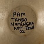
Pam was born on September 22, 1961 and is both Mark Tahbo’s sister and was his pupil. Mark is known for his dramatic monochromatic designs set against pot surfaces richly blushed by the outdoor firing (cf 1992-02) and his near-monochromatic designs displaying much of the the same effect (cf 2015-01 and 2022-09). Jar 2026-03 has a somewhat similar resonance.
Much of the pot’s visual impact is due to large amount of unpainted space that highlights the design. The core of the horned design in Design 1 is stippled, which increases its visual texture and interest. This is the highest percentage of stippling I have seen on a pot from Hopi. Both the stippling and the subtle blushing soften the pot’s visual impact, as can be seen by comparing this jar to pot 1992-02 by brother Mark, which has more dramatic blushing and solid monochromatic painting but also has an unusual amount of stippling.
The solid black blade-shaped elements in Design 1 contrast to the neighboring stippled section, increasing the pot’s visual energy. The ladder of unpainted ovals formed by the notched tails in this design echo the circular mouth of the jar, thus visually linking form and decoration.
The long outward-curving unpainted surface below the waist upwardly-thrusts the design on the upper surface. Looking at the pot is disorienting. I feel like I am in a planetarium with the night sky projected on the curved dome of the ceiling above me.
Of course I do not know what Pam was thinking when she painted jar 2026-02, nor do I think that I can “read” meaning into the designs on this jar. I am struck, however, by how much “Design 2” looks like a textile, a saddle blanket at first glance and the standard design on a Hopi ceremonial sash after a more considered look:
-

- Kachina Sash
-
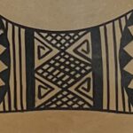
- Jar 2026-02 Blanket
For at least 150 years the designs on the sash worn by kachina dancers have remain unchanged. Weaving, at Hopi, is a male task. Writing in the 1890’s, Alexander Stephen wrote that “like the women potters, the men weavers have, to a great extent, lost the significance of many of the designs in textile fabrics (1936:35).” Nevertheless, in the 1970’s Ed Wade interviewed weavers at First and Second mesa and found patterns of understanding. Although the same design was standard at both mesas, the meaning at the two mesas differed, A First Mesa the zigzag represented the teeth and the lozenges the eyes of the Wuyak Kuita or Broad Face Kachina (1973:4-5). On Second Mesa each design on the entire sash carried meaning, and “Taken as a whole it symbolizes the portion of the earth in and near the Hopi villages…the man-influenced and cultivated portion of the earth (1973:6-7).” Pam would certainly be familiar with such dance sashes, since they are frequently part of the prayer dances at Hopi. She may have used this design because it was part of her cultural heritage or she might have had a specific intent when drawing it on Jar 2026-02, or perhaps the link between textiles and the design on this pot is only a product of my imagination.
The design elements on jar 2026-02 are both unique and endearing. The upward thrust of the pot projects this pattern upward with an effect that is unsettling to my eyes. Form, blushing and design work together to create a restrained elegance.
