
This jar is a miniature masterwork: elegant of form and carrying a creative rendition of a classic design. It’s also a bit of a mystery since the signature —taken literally— is unknown. Yet even if it had not been signed, the gentle blushing and the quality and innovation of design announce its maker clearly: Mark Tahbo.
Form:
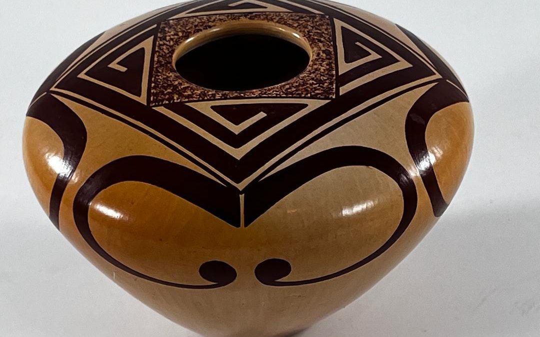
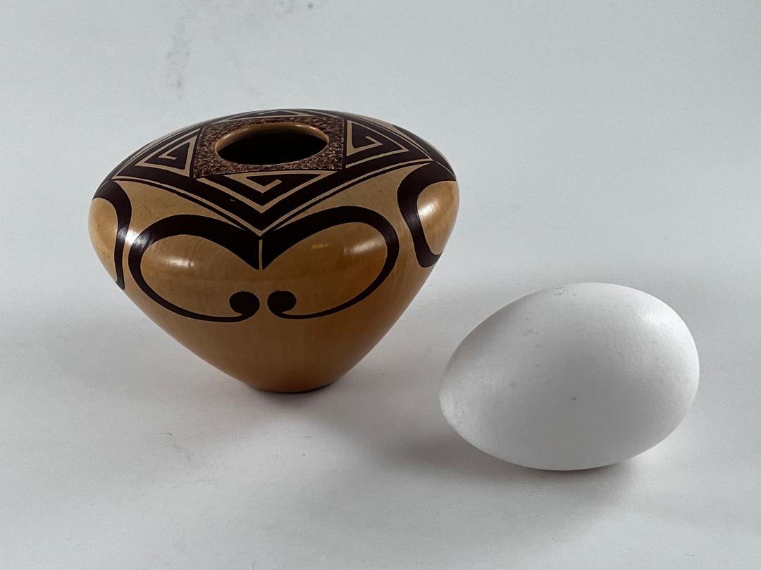
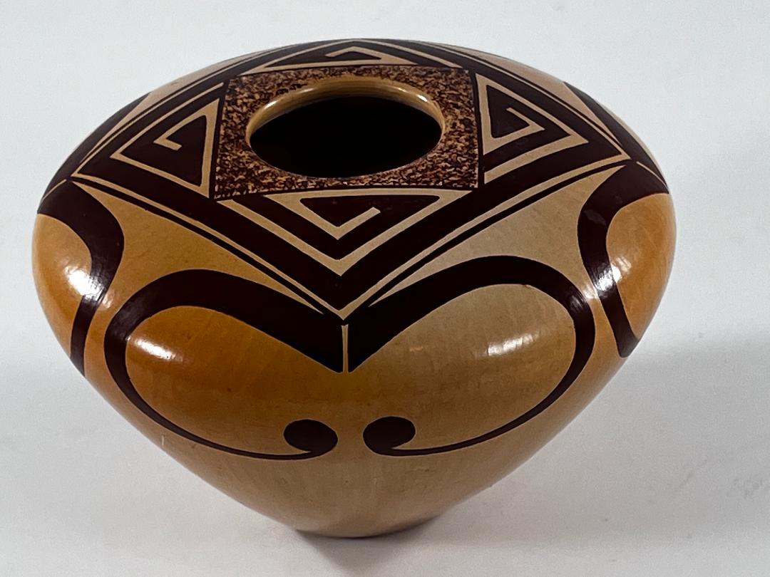
Expanding off a 1.125-inch base, the sides extend 2.625-inches upward to the waist and then curve inward to form a 1.75-inch wide upper surface. The mouth is 1.125-inches in diameter. The bottom is somewhat thicker than the vertical walls and these walls are somewhat thicker than the horizontal surface. The walls are even and well-formed; the jar is somewhat lighter than one might expect. Mark took the trouble to buff his polishing stone from top to bottom in parallel lines, thus creating an “onion skin” effect, which gives the jar a subtle texture. The surface of the jar gleams brightly, an effect Rick Dillingham once told me Mark achieved by using “Mop & Gloo” rather than the more traditional sheep fat (1995-10). The jar is lightly-blushed with one area near the base and one at the shoulder a bit more intense.
Design:
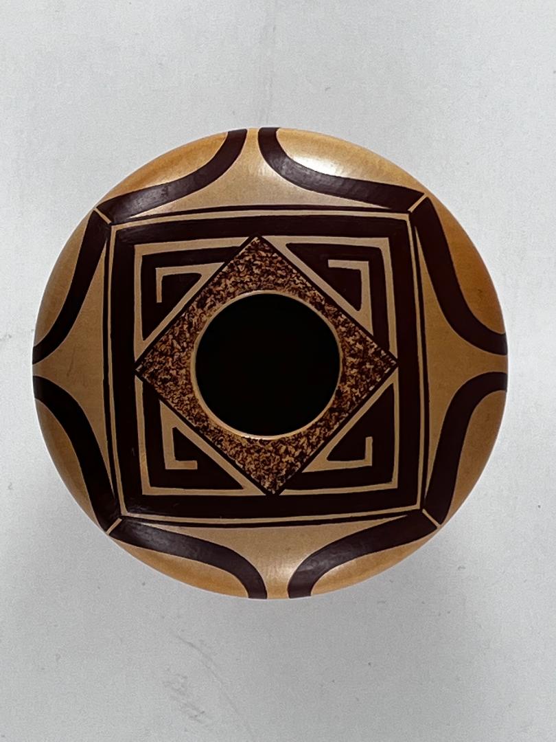
The circular mouth is surrounded by inner and outer squared designs. The inner design is simply a square of lighter color than the rest of the painting, with a densely stippled surface that looks like heavily-veined marble. It is bordered by a single thin line.
The outer design is more complex. It is sharply linear, with thick densely painted elements. Its boundaries are define by two framing lines, a thin line outside of a thick line.
The inner and outer squared designs are offset, the corner points of the inner square exactly bisecting the midpoint of the sides of the outer square. As a result, the corners of the outer design are cut off and become semi-detached elements in the form of right triangles. Within each triangle is a pointed crook, its head a set of conjoint triangles pointing right. The fragmentation of the outer square is prevented by those thick-over-thin framing lines that encircle the entire pattern of design on the upper surface of the pot, thus unifying it.
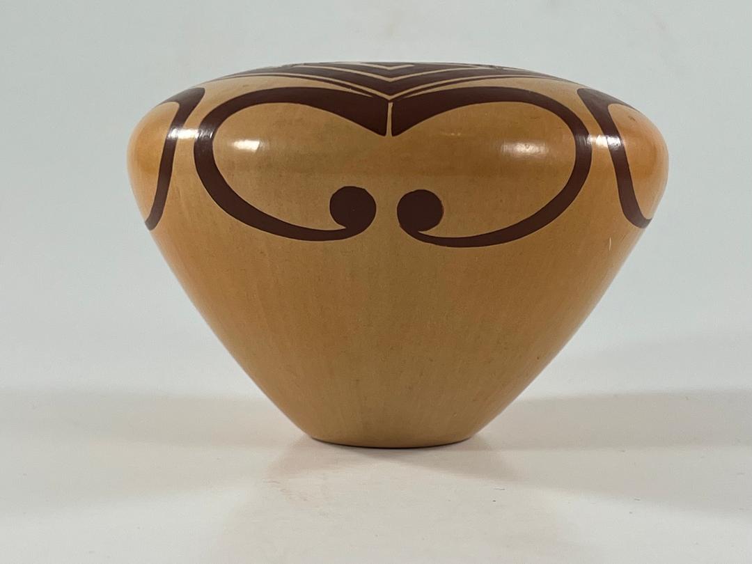
Pendant from the corners of these outer framing lines are curvilinear elements that drape over the jar’s waist and extend down the surface below. These are the “wings” that are central to the “eagle tail” design as defined by Nampeyo (2005-16). At the point where the corner of the upper framing lines touch the curvilinear wings there is a tiny unpainted slit that divides the thickest portion of the wings in half. Each half of this curved form is thicker at its base and then thins as it reaches its terminus, which is marked by a solid round ball.
Design Analysis:
The four pointed crooks on the top horizontal surface seem ready to burst out of their confined space; collectively they provide a strong counterclockwise direction to the outer square. The two squares that form the design on the upper surface interact powerfully. They carry contrasting patterns of design, putting the two squares at odds. The counterclockwise thrust of the outer square is stymied by the intrusion of the inner square. Overall this geometric pattern reminds me of an art deco aesthetic.
While seemingly simple, Mark’s rendition of the eagle-tail design is particularly innovative, and yet demonstrates variations of several of Nampeyo’s classic design strategies.
- The stippled paint around the opening is not a true red, but it is sharply different in appearance than the solid black paint used for the rest of the design. The pattern attracts the eye to the center of the design, much as Nampeyo used a central patch of solid red on her eagle-tail pots to the same purpose. Mark adds a second function to this design area, one not imagined by Nampeyo or her other descendants, The red square used by Nampeyo and her descendants has been replaced by the intricate square-within-square design, resulting in a striking linear pattern.
- A central feature of both Nampeyo’s rendition and those her descendants of the eagle-tail design are pairs of linear tails interspersed between the curved wings (cf 2008-10). Mark has omitted these tails from his design. Thus the “wings” on jar 2022-09 almost touch.
- Much of the visual energy of the eagle-tail design comes from the tension between the linear tails and the curvilinear wings. Mark has preserved this tension, but moved the linear energy into the double-square design around the jar’s mouth. Notice that the thrust of the top design is counterclockwise while the motion of the wings is soaring and vertical.
- Because the wings on jar 2022-09 encircle the jar, they are completely surrounded by unpainted surface, this highlighting their form. Indeed the lower half of the jar below the wings is entirely unpainted.
These four innovations are related. The central stippled square attracts a viewer’s eye to the mouth of the jar and the center of the design. The complex linearity of this upper design contrasts with the simple curvilinearity of the pendant wings below, their form highlighted by the unpainted surface that contains them.
Notice that, for all his innovation, Mark has accomplished three of Nampeyo’s classic design strategies: a) a tension between linear and curvilinear elements, b) the use of color (here a stippled focus) to integrate the design , and c) the use of empty/negative space to frame painted elements.
There is such a contrast between the top linear and lower curvilinear portions of the design on jar 2022-09 that these two areas might lack visual linkage. Mark has avoided this with three decisions. 1) the points of the inner stippled square direct a viewer’s gaze to the space between the wings below. 2) the points of the outer linear square point directly to the center of the wing elements below. 3) At this point of contact, the wings are divided by a thin unpainted slit. This thin slit reflects the unpainted edge of the outer square.These three design strategies link the top and side designs.
Moreover, with that tiny slit, Mark introduces an innovation that makes a major difference. In the standard format of this design these wing elements have a dramatic, sweeping form that visually dominate the design (cf 2009-01). On pot 2022-09 Mark has reduced their visual impact by slicing the element into two parts. This division is subtle: just a thin unpainted line. Nevertheless, like a spring cut into two at its center, this small unpainted surface interrupts the power of the element and transforms each half unto a less powerful form than they would be if united.
Thus Mark engages in a bit of contradictory design: the splitting of the wings into two parts reduces their visual impact while setting them in an expansive unpainted surface highlights their form. Such contradiction adds interest to the design, particularly when set against the larger contrast between the linear design of the upper surface and the curved wings below.
Interpreting the signature:
Currently there are 13 pots in the collection by Mark Tahbo. Two are unsigned (2014-12, 2018-08). The remaining 11 pots carry 5 different signatures:
- “Mark Tahbo”— six pots, 1992-02, 1995-01, 1997-08, 2017-03, 2018-01, 2018-08
- “Tahbo”— one pot, 2014-19
- “MT” — two pots, 2015-01, 2019-13
- “M. Taho” — one pot, 1995-10
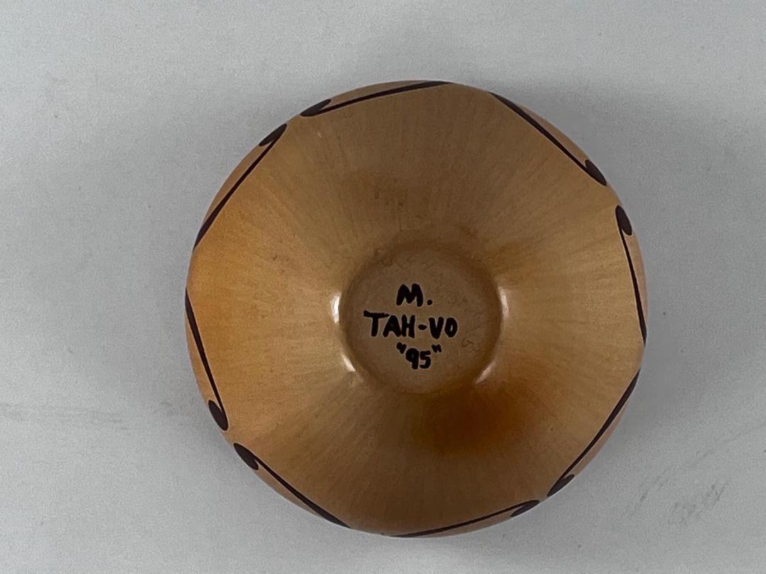
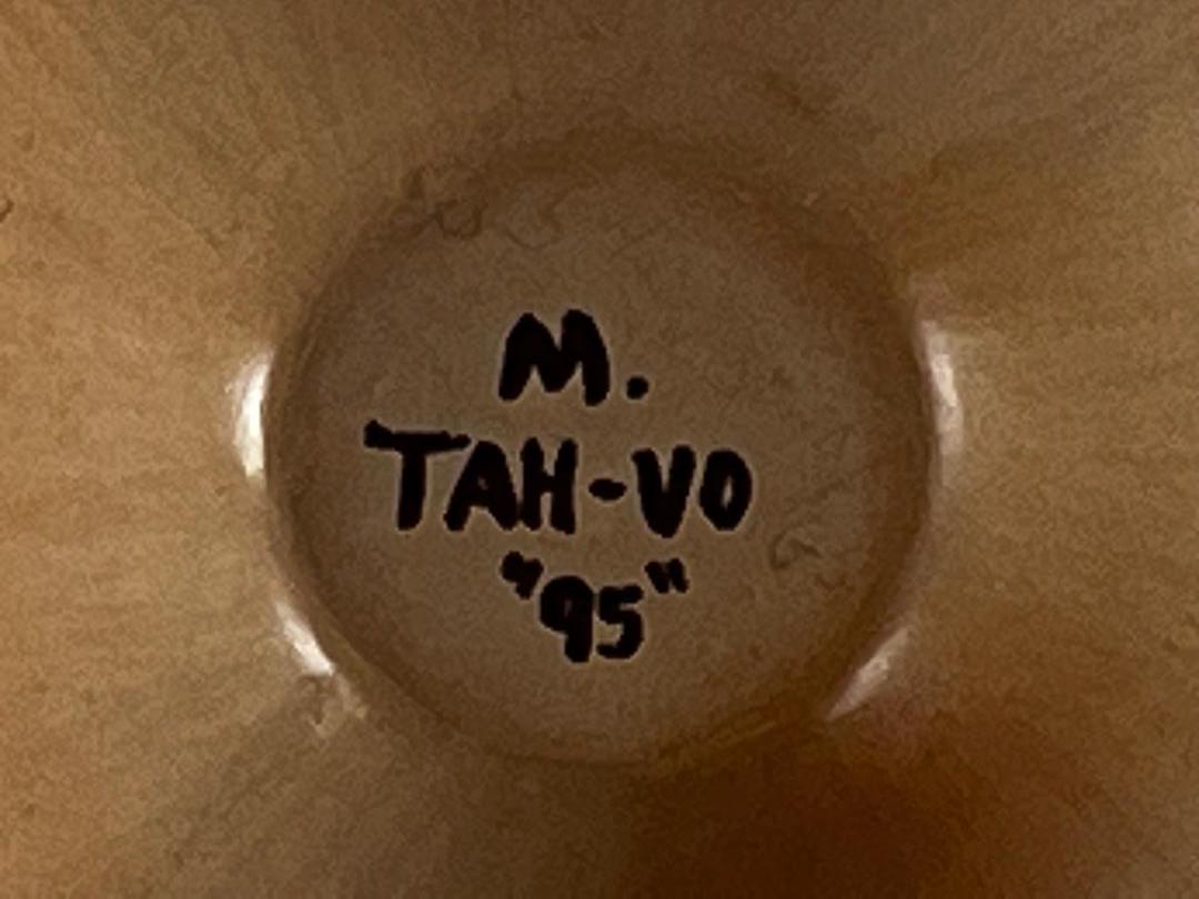
- and “M. TAH-VO” — the pot discussed here.
This is a small sample, but it does establish that Mark varied his signature over his career. The closest to the signature on pot 2022-09 is the spelling of his name “M. Taho” on 1995-10. I bought this latter pot in 1995, but I had first seen it several years earlier. Pot 2022-09 is marked as having been made in 1995, so we know that both pots were made in the mid to early 1990’s or earlier. It’s a tenuous connection, but it does show that fairly early in his career Mark sometimes spelled his last name unusually, either “Taho” or TAH-VO.” The spelling M. Tah-vo on pot 2022-09 is a particular spelling, but pronounces similar to the usual spelling of his name, Tahbo.
Eight months after I wrote this catalog entry, a jar was offered on Ebay that confirms my earlier speculation:
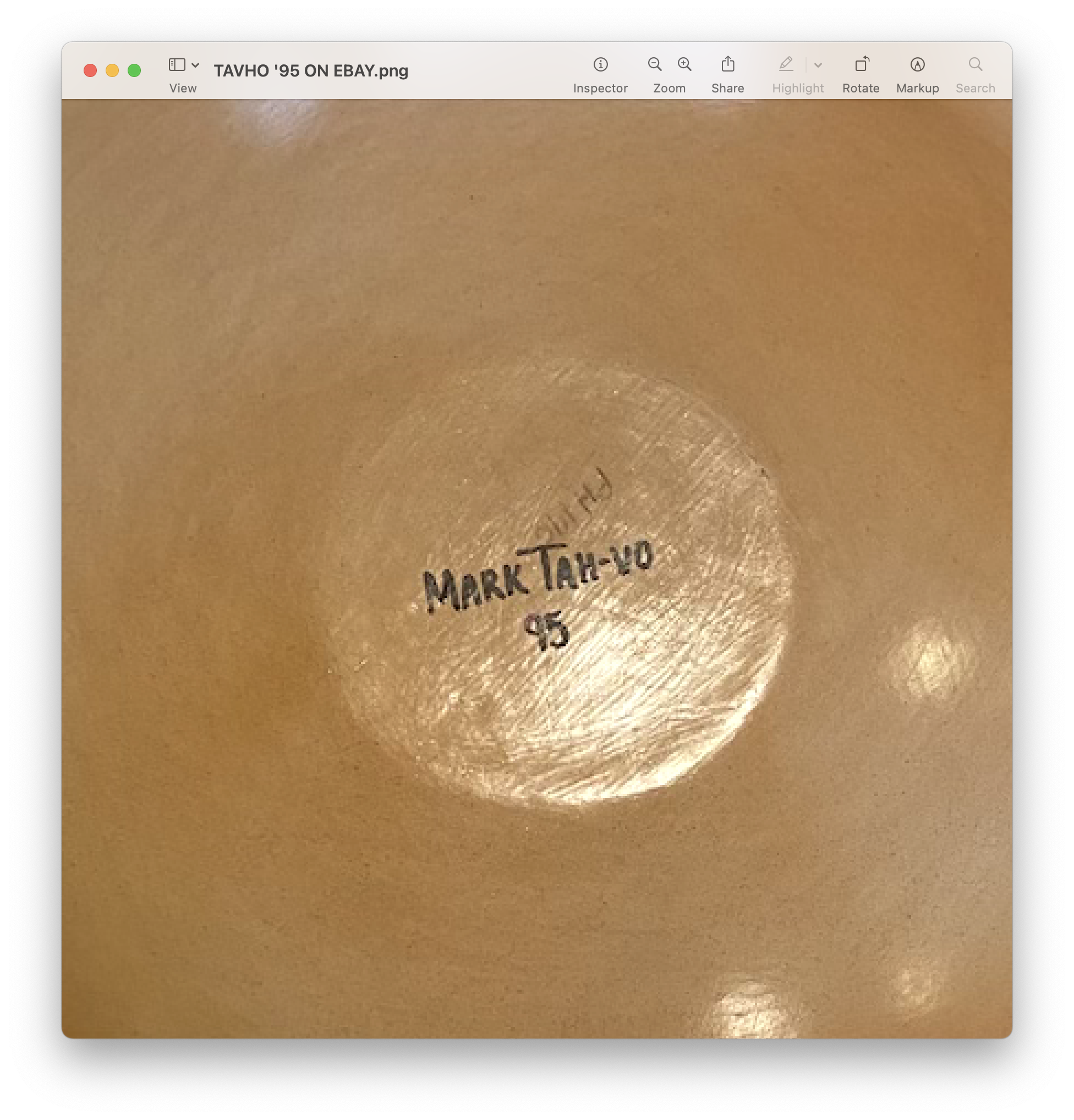
A few weeks later, Adobe Gallery of Santa Fe offered a Mark Tahbo pot with the same signature:

Note that all three examples of pots with this unusual signature are dated 1995. Apparently this format was Mark’s choice of the moment.
In his most recent book, Ed Wade writes that:
“The most distinctive of Nampeyo compositions is the so-called Eagle Tail. Where the name for this design unit originated is uncertain, but we know that the form is adapted from an original Sikyatki Polychrome (1375-1625) configuration (2022:119).”
In the six or so generations since Nampeyo, this design has been used thousands of times on pottery, often by descendants of Nampeyo. Polacca ware examples of the design ca the 1890’s are casually-drawn (2019-05) and do not have the symmetry and grace of Nampeyo’s work ca 1905 (2005-16). Lively examples of the design are still being produced (2017-09), but all to often the eagle tail design has been applied mechanically, almost like a decal, and has often lost its vitality. (See “Eagle Tail” in the “Category” listing.)
Jar 2022-09 by Mark Tahbo is an exception to this trend. His formulation of the eagle tail is original, unexpected and elegant, resulting in a jar that is a delight to the eye.
