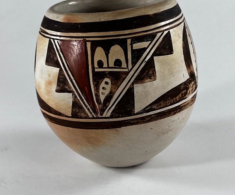
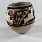
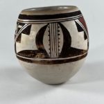
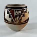
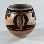
This is a particularly undistinguished Hopi-Tewa pot. It is included in this collection because of its historical, not aesthetic, value.
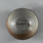
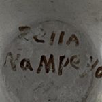
Its maker, Zella Nampeyo, is the daughter of Nellie, Nampeyo and Lesso’s third child and middle daughter. Nellie was not as involved in pot-making as her older sister Annie or her younger sister Fannie and Nellie’s eight children were not much involved with clay either. This collection contains pots by Zella’s sisters Marie (1994-17 and 2019-10) and Agusta (1995-08), but none of these sisters had much of career as a potter. Jar 2022-11 is only the fourth pot by Zella of which I am aware. I know one of these pots only by its photograph (Anthony, Jr:1983, pot 57) and another of these four pots already is in this collection (2009-16), but it is not clearly-signed. Jar 2022-11 is clearly signed and so joins the collection. The fourth Zella pot was offered on Ebay by the same person who sold me pot 2022-11.
Form:
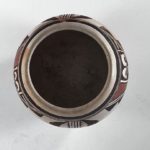
From a 1.375-inch base, the sides expand outward and upward about 1.625 inches as if forming a small bowl. This is the widest point of the jar. From here the walls rise and curve slightly inward for a distance of 2.25-inches to the jar’s lip. The mouth of the jar is 2.375-inches wide. The walls are even but quite thick. There is blushing on one side of the jar, most noticeable below the waist of the vessel.
Design:
Just below the lip is a thick framing line over two thin framing lines. Just above the widest point of the pot are drawn thin-over-thick framing lines. The design fills the 1.5 inches between these lines.
The painting consists of a panel of designs repeated twice. In the middle of each panel are two largely unpainted strips that emerge from the lower framing line at almost the same point and then slope upward and outward until they touch the upper framing line, 2.1875-inches apart. Thus they form a large “V.” Its edges are defined by three parallel lines, two-lane “highways.” This large “V” is a dominant pattern of design.
In the interior of this “V” another unpainted strip [a one-lane highway defined by two parallel lines] emerges from the lower framing lines and slopes upward until it reaches the upper framing lines, thus cutting the large “V” in two sections. Each side of this highway takes the form of an inverted right-angle triangle, though the triangle to the right of the highway is about twice as large as the triangle to the left.
The left triangle is painted red, the only red element on an otherwise monochromatic jar. The right triangle is subdivided by two short single-lane highways at right angles to each other, creating three spaces. The square space to the left of this juncture I will label area #1. The small triangular space to the right of this juncture I label area #2. The triangular space below this juncture I call area #3.
Area #1 contains a pair of unpainted arches, the remainder of the square being painted black. Inside each arch, resting on its floor, is a large black dot. Area #2 is also painted black, with a wide unpainted rectangle set at its center, parallel to the framing lines above. Area #3 continues the pattern of being painted black but incorporating an unpainted element. This unpainted form is drop-shaped, point downward, with a line of three small black dots at its center.
The large “V” form we have been discussing sits at the center of each design panel. Flanking it are two identical patterns of design contained within trapezoids, their sloped sides formed by their boundary with the central “V.” Inside each trapezoid, painted on its sloped edge, are a line of three solid pyramids. The far wall of the trapezoid is defined by five vertical lines, forming a four-lane “highway.” Set against its edge interior to the trapezoid are a line of 7 to 10 short hairs, the number depending on which rendition you examine. Arched over this line of hairs is a thick, black, crescent shape, its upper point touching the upper framing lines. Its lower point is subsumed unto the thick end of a black wedge that points to that large “V” structure.
As a result of this organization of elements, the trapezoids in adjoining panels share 4-lane highways and hence these highways are bounded on both sides by thick, black, crescent shapes. Highways in parentheses. This parenthetical pattern forms a second dominate pattern of design.
Design Analysis:
I don’t have a lot to say about this design. The two dominant patterns, that large “V” and the set of thick parentheses, organize the elements of design, but the overall effect is still a bit of a jumble. The design is patterned but fragmented.
I don’t know much about Zella and certainly hope she had a good life, but pot 2022-11 is evidence that being the granddaughter of Nampeyo is not a guarantee of excellence in clay.

